Mannings & Guardian Store
Creating a Flow of Healthy Beauty

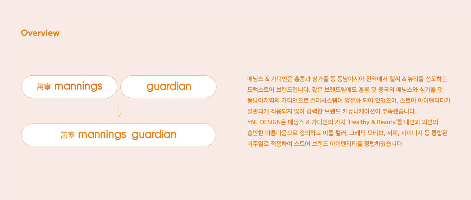
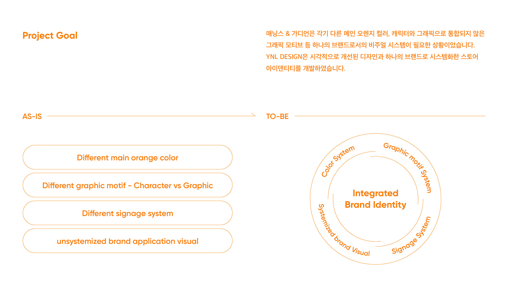
Mannings & Guardian is a leading health & beauty drugstore brand in Southeast Asia, including Hong Kong and Singapore. Despite being the same drugstore subsidiaries, since Mannings is in Hong Kong and China and Guardian is in Singapore and Southeast Asia, they had dichotomized color systems and visual communication designs, so the store identity was not consistent.
Mannings & Guardian은 중국과 홍콩, 싱가폴, 베트남 등 동남아시아 7개국에서 Healthy & Beauty를 선도하는 드럭스토어 브랜드입니다. 기본적인 의약품 및 건강 기능 식품까지 다양한 건강 관련 상품을 제안하고 새로운 코스메틱 트렌드를 파악하고 상품을 큐레이션 하여 제공합니다. Mannings & Guardian은 Healthy 상품에 기반한 드럭스토어로 건강함이 아름다움이라는 가치를 전하는 브랜드입니다.
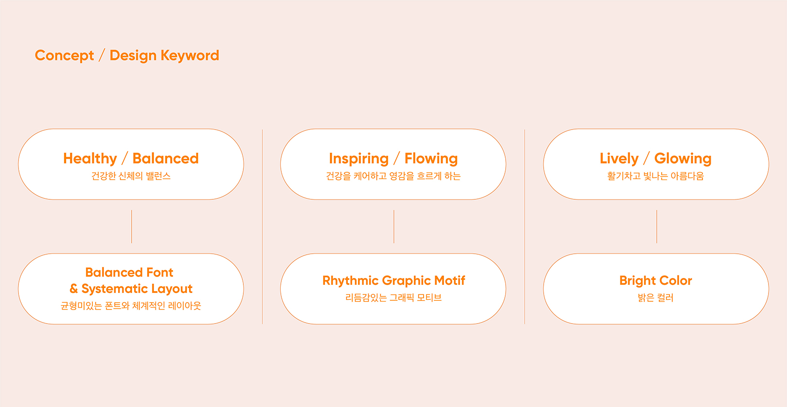
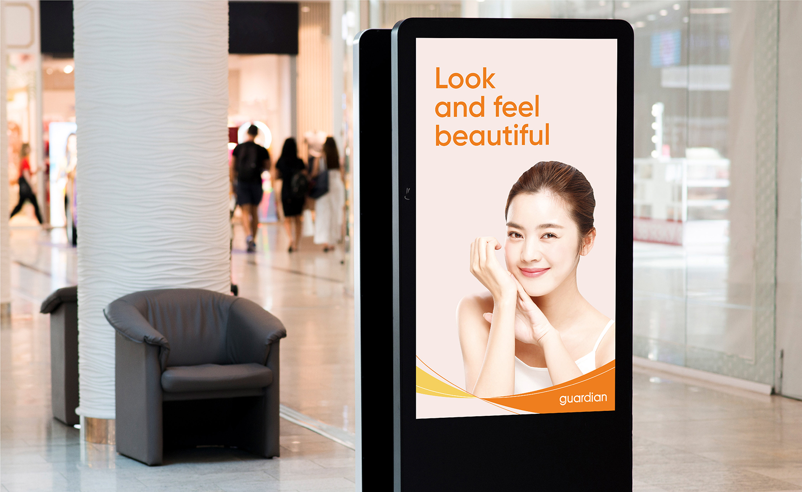
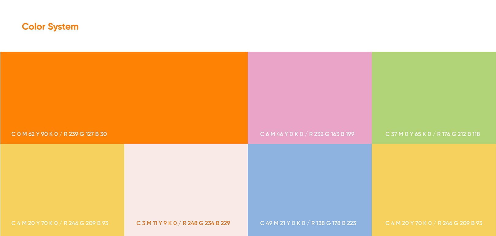
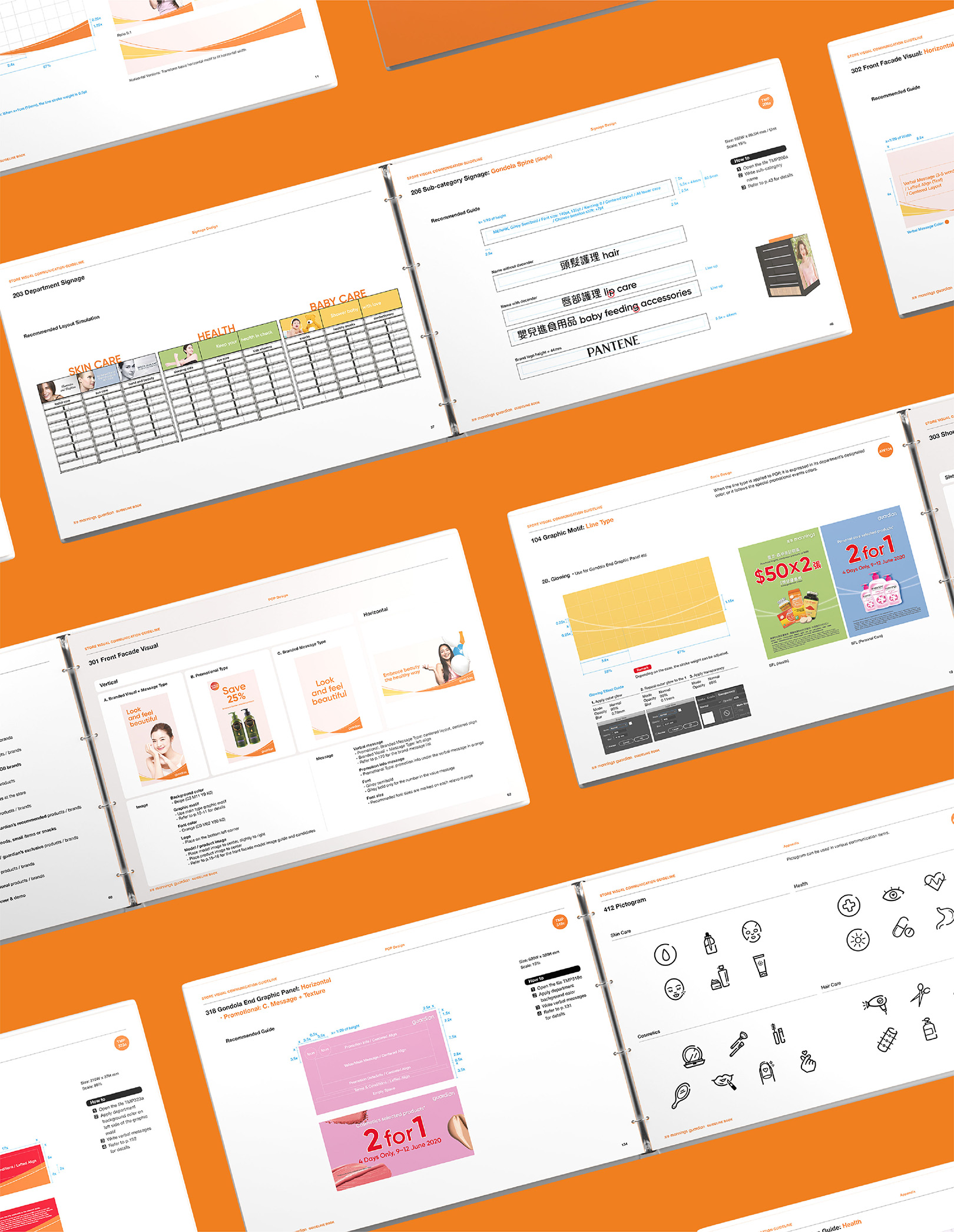
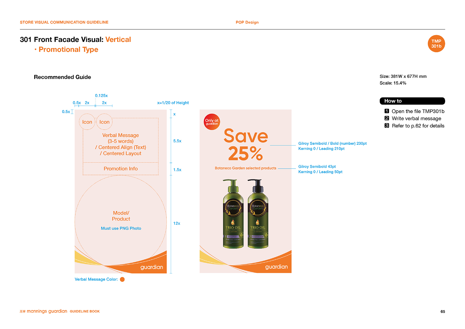
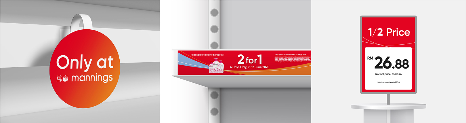
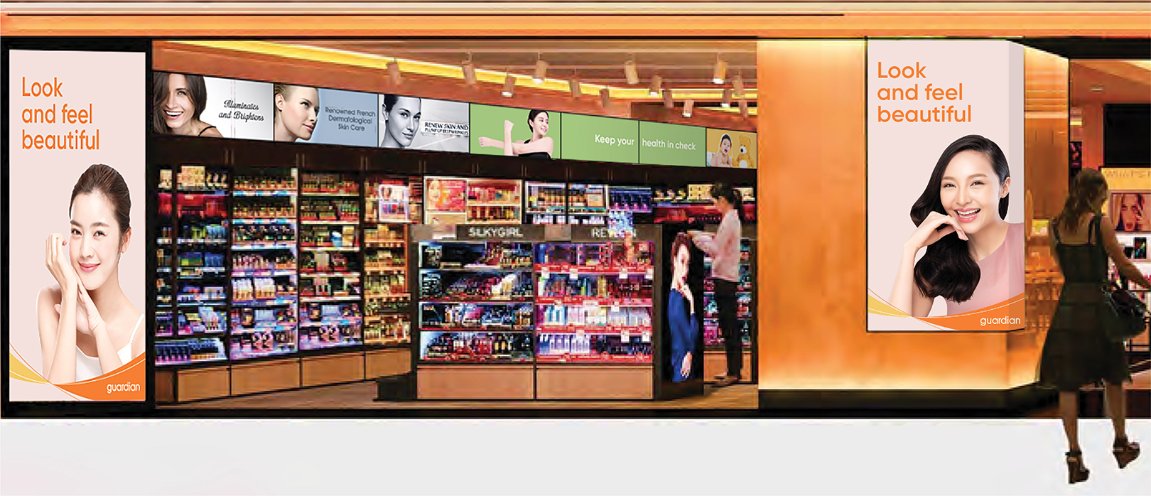
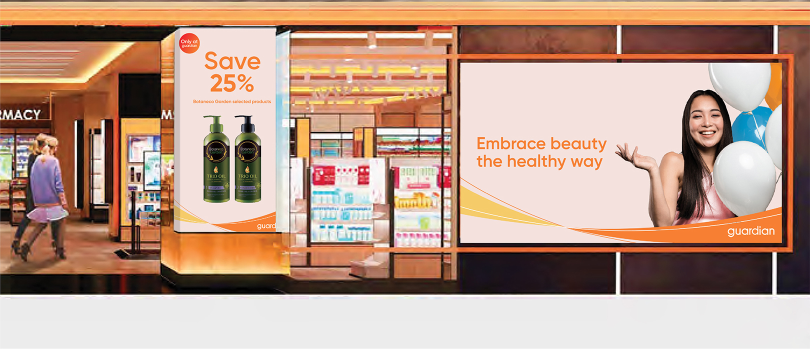
YNL Design defines Mannings & Guardian's brand value, 'Healthy & Beauty' as 'Flow of a healthy lifestyle,' and integrates color systems, graphic motifs, store-wide signage, etc. to establish visual communication and strengthen the store's identity. To renew the existing store image, we have assigned each department's color to the store signage, which does not seem to stand out to consumers before; therefore created a design plan that can clearly distinguish the navigation. We have also integrated the graphic motif of Mannings' cat character and Guardian's sunflower.
Mannings & Guardian은 동일한 브랜드임에도 홍콩 및 중국의 매닝스와 싱가폴 및 동남아시아 지역의 가디언으로 네이밍과 컬러시스템이 양분화되어 있었습니다. 스토어 아이덴티티도 7개국에 일관되게 적용되지 않아 강력한 브랜드 커뮤니케이션이 부족했습니다. YNL Design은 시각적으로 개선된 디자인과 하나의 브랜드로 시스템화한 스토어 아이덴티티를 개발하고자 했습니다.
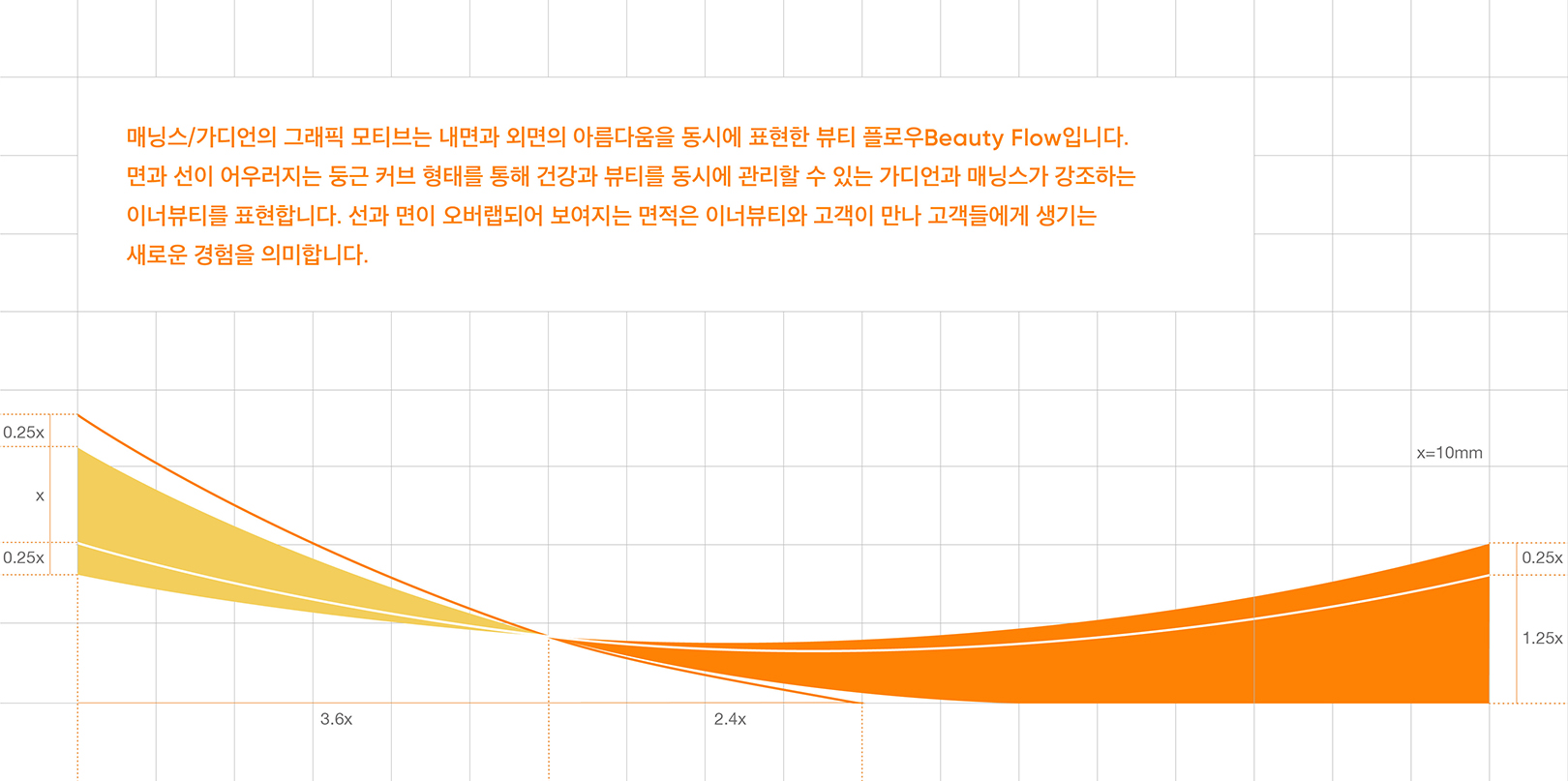
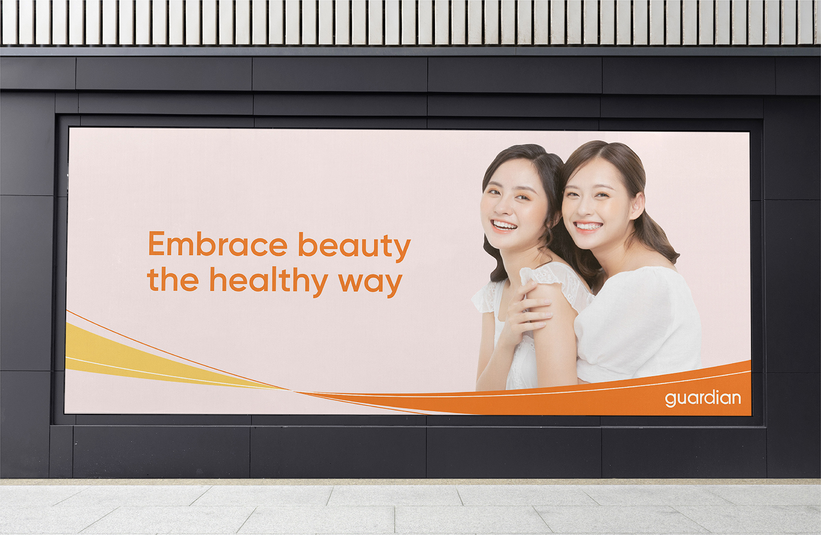
The graphic motif of Mannings & Guardian represents beauty flow, which is inspired by the healthy beauty and simultaneously expresses the inner and outer beauty. The graphic motif represents the balance of feeling beautiful and looking beautiful, which refers to the brand's belief that outer beauty begins with inner wellbeing. Using the graphic motif in the form of a round curve that harmonizes planes and lines, we visualized Mannings & Guardian's concept of healthy beauty; managing health and beauty at the same time. The side that reveals the main brand color, orange, and the sub color, yellow, represents a new experience and satisfaction given to customers when they meet their inner beauty. Also, we assigned a key color to each area of the shop that was previously invisible to consumers and applied a consistent graphic motif, to set up a navigation for each category. By introducing the newly updated store guide ‘Tornado 2.0+,’ they needed a design strategy to enable consumers to navigate in the shop, we gave it an organized design system to each department signage and category.
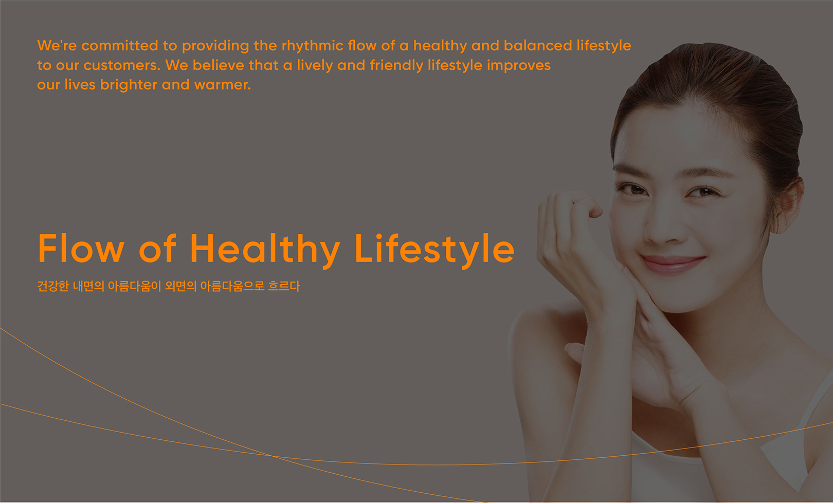
Mannings & Guardian은 건강한 신체와 마인드가 진정한 아름다움이라 여깁니다. 내면의 건강과 외면의 뷰티를 모두 케어하여 더 나은 삶을 약속하는 브랜드입니다. YNL Design은 내면과 외면의 아름다움을 동시에 나타내는 ‘Beauty Flow’를 컨셉으로 건강한 내면의 아름다움이 외면의 아름다움으로 흐른다는 브랜드의 핵심 가치를 표현했습니다. 면과 선이 어우러지는 둥근 커브 형태로 건강과 뷰티를 동시에 관리할 수 있는 Mannings & Guardian의 헬씨 뷰티를 그래픽 모티브로 시각화했습니다. 브랜드 메인 컬러 오렌지와 서브 컬러인 옐로우가 보이는 면은 이너뷰티와 고객이 만나 고객들에게 생기는 새로운 경험과 만족을 의미합니다. 또한, 기존 소비자의 눈에 띄지 않던 매장의 디파트먼트에 키 컬러를 부여하고 일관된 그래픽 모티브를 적용함으로써 카테고리별 네비게이션을 구축했습니다. 새로 업데이트된 매장 가이드인 토네이도 2.0+를 도입하면서 소비자가 매장에서 네이게이션 할 수 있도록 하는 디자인 전략이 필요했고 각 디파트먼트 사이니지와 카테고리에 체계화된 디자인 시스템을 부여했습니다.