MS PREtea Cafe
Bringing the Joy of Nature into Every Cup

MS PREtea is a milk tea house in Beijing, China, pursuing taste and health using select ingredients. Unlike other brands that use powder, MS PREtea boasts distinguished recipes as they are determined 'to bring out a great taste by using the fresh base, brewed with select tea leaves.' It also has its own emotional brand story to offer joy and happiness through fresh tea leaves grown in nature.
MS PREtea는 엄선된 재료를 사용해 맛과 건강을 추구하는 중국 베이징의 밀크티 전문점 브랜드입니다. 파우더를 사용하는 타브랜드와는 다른 '엄선한 찻잎으로 우려낸 신선한 베이스를 사용하여 좋은 맛을 낸다'는 차별화된 레시피를 자랑하고 있으며, 자연에서 자라난 신선한 찻잎을 통해 기쁨과 행복을 선사한다는 MS PREtea만의 감성적인 브랜드 스토리를 지닌 브랜드입니다.
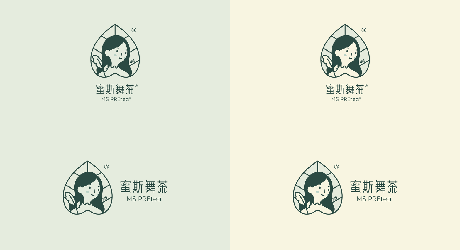
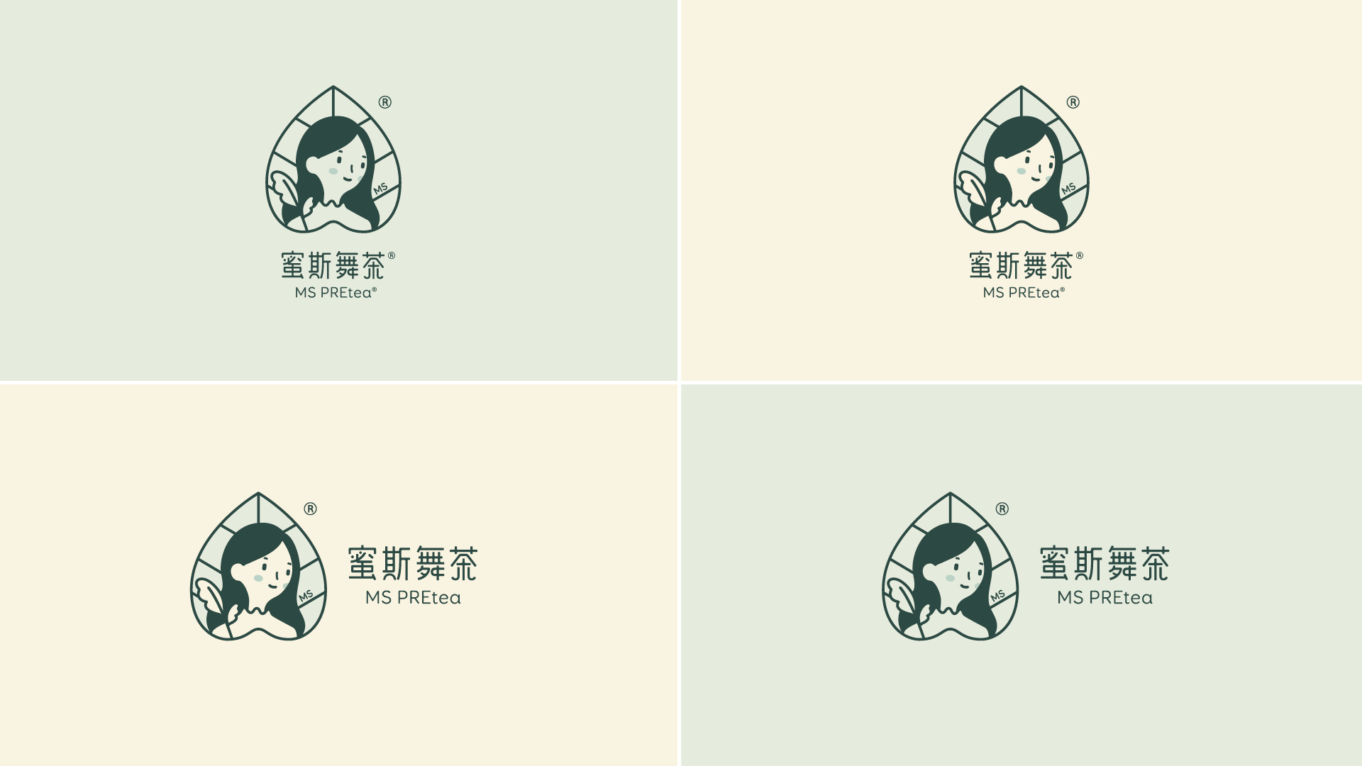
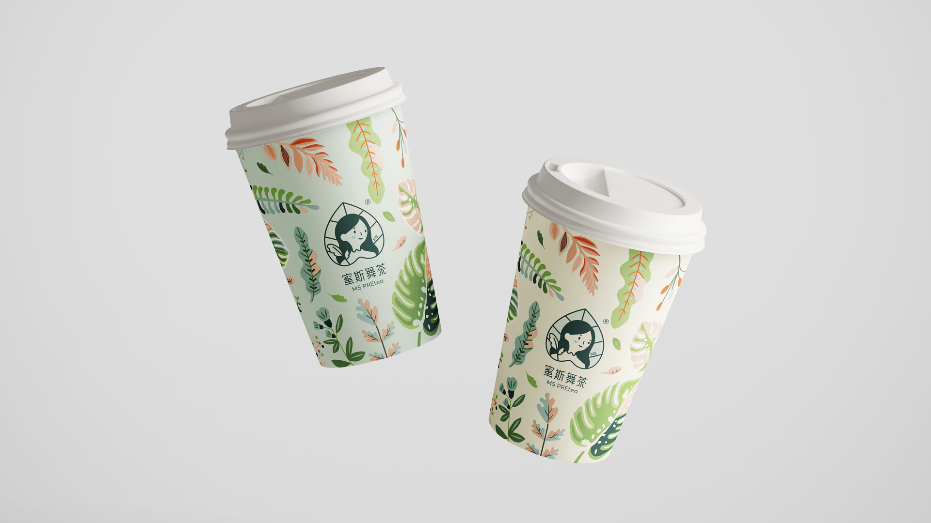
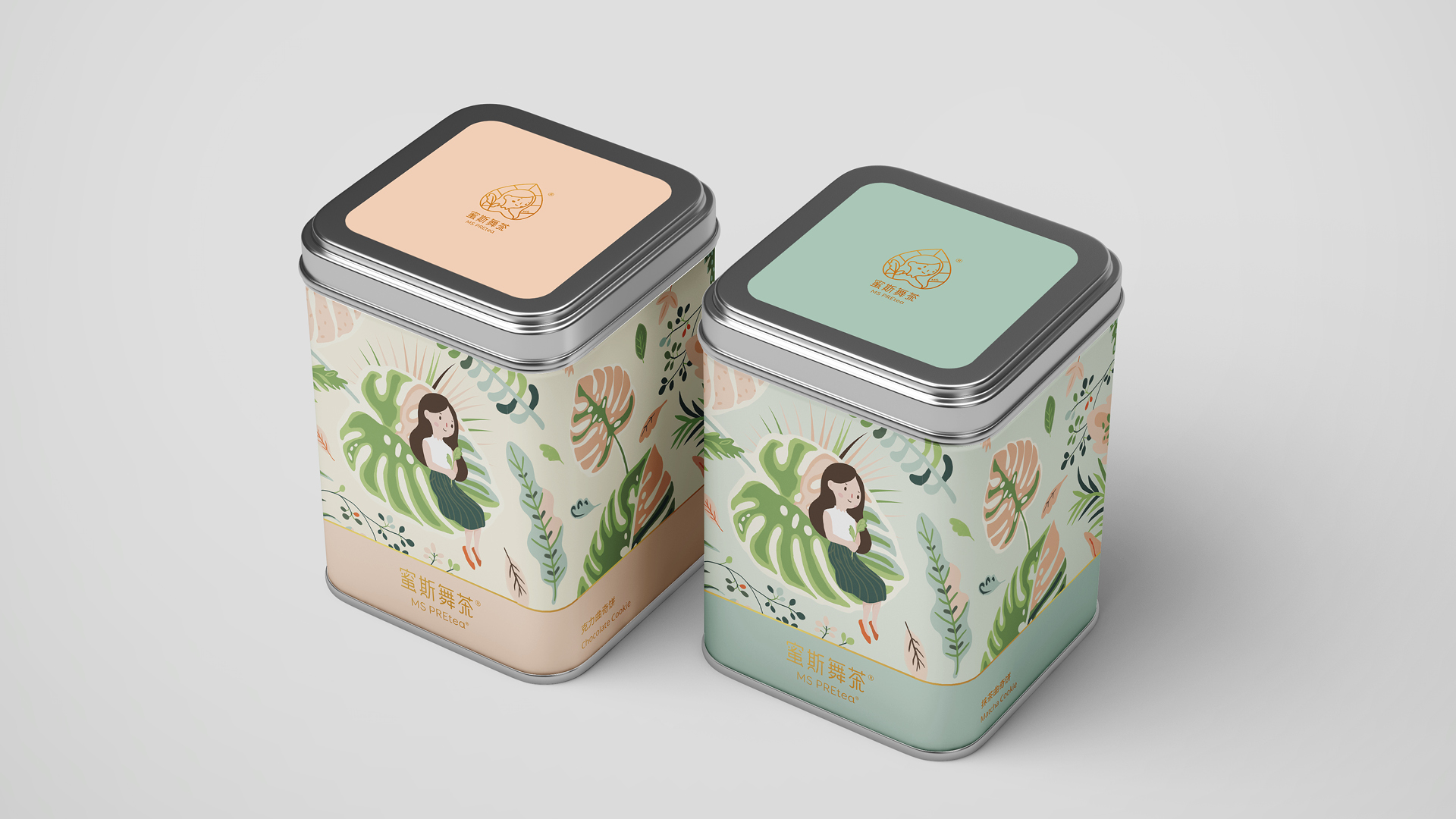
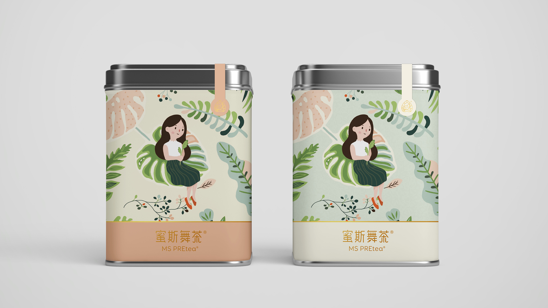
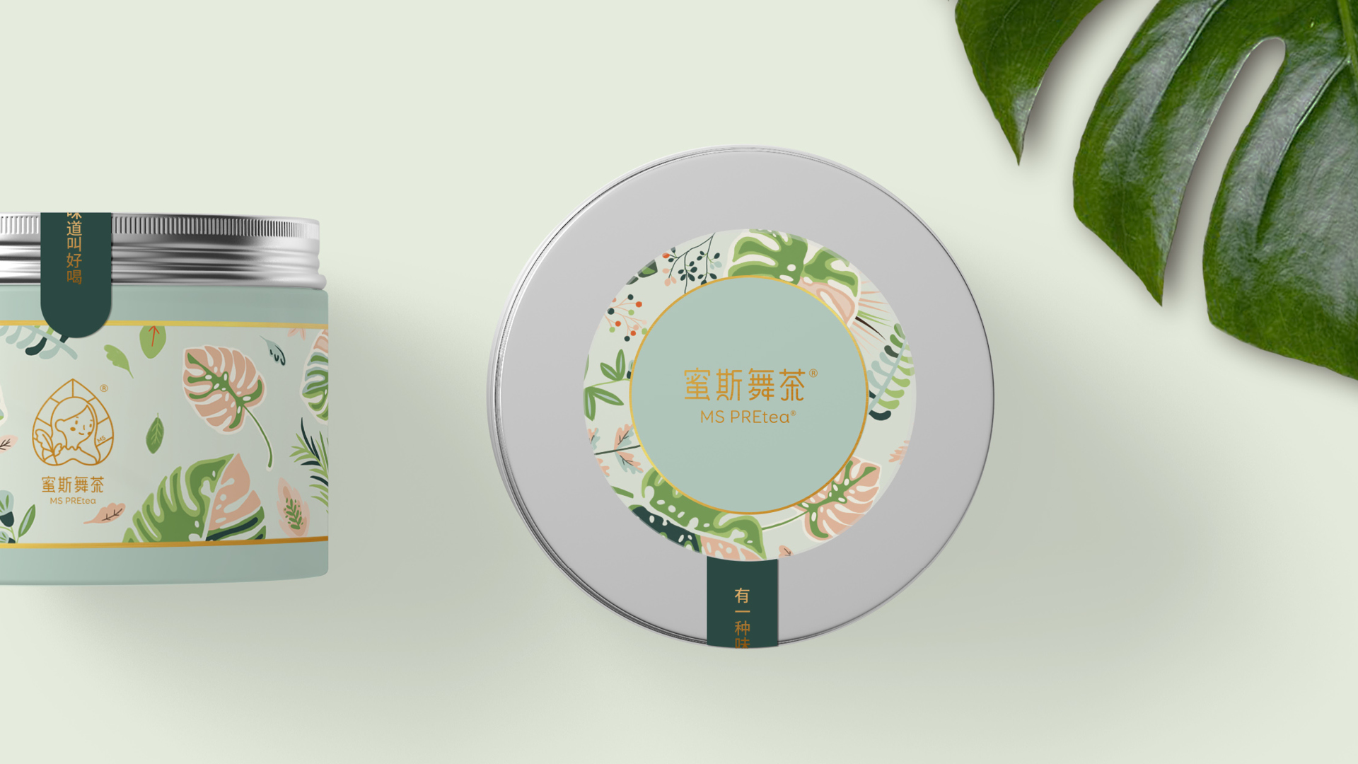
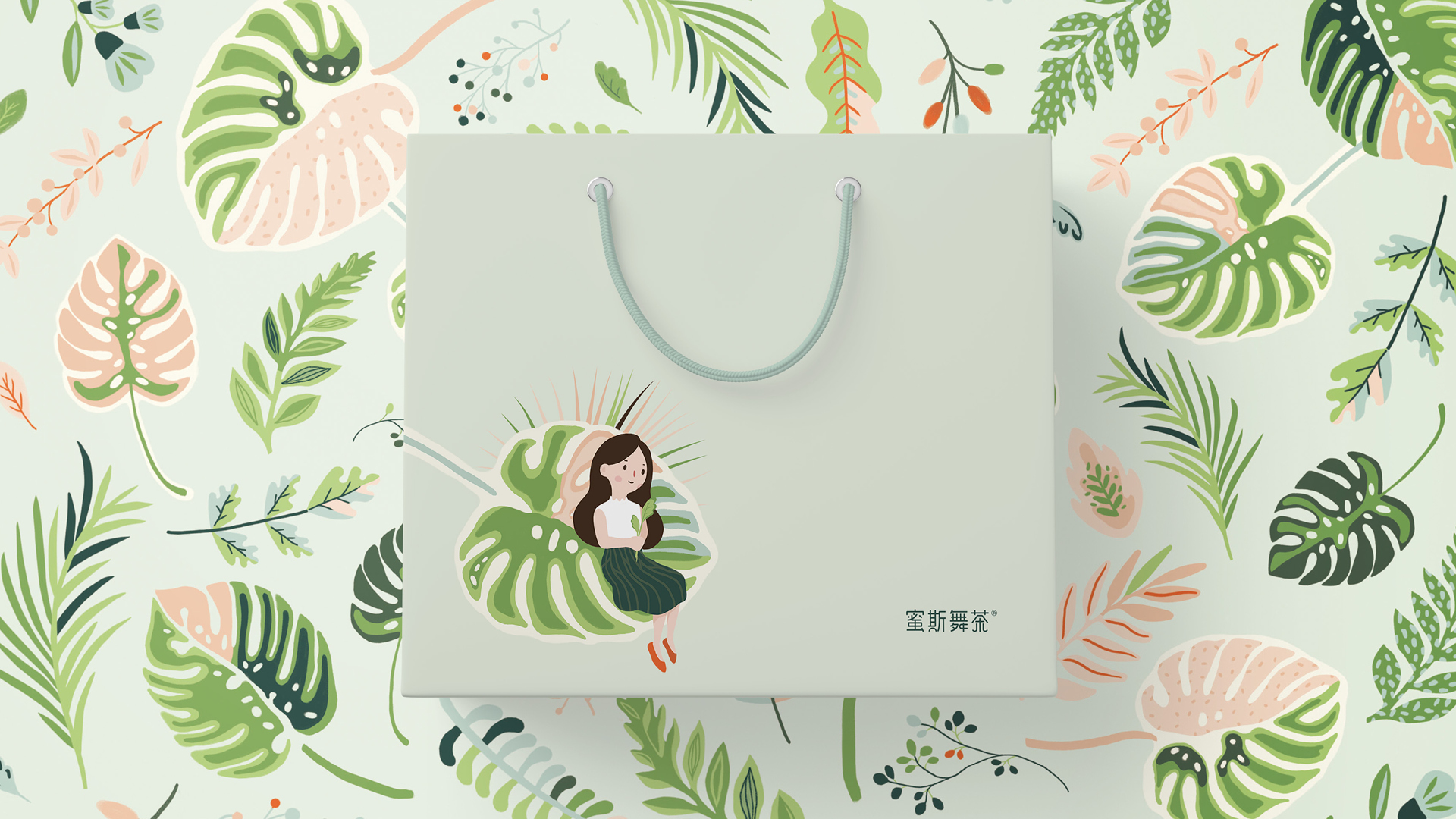
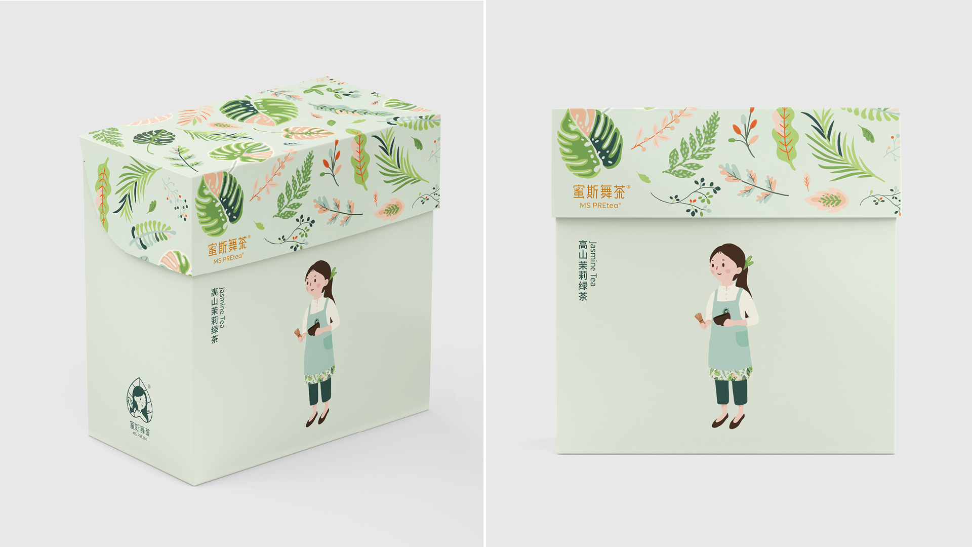
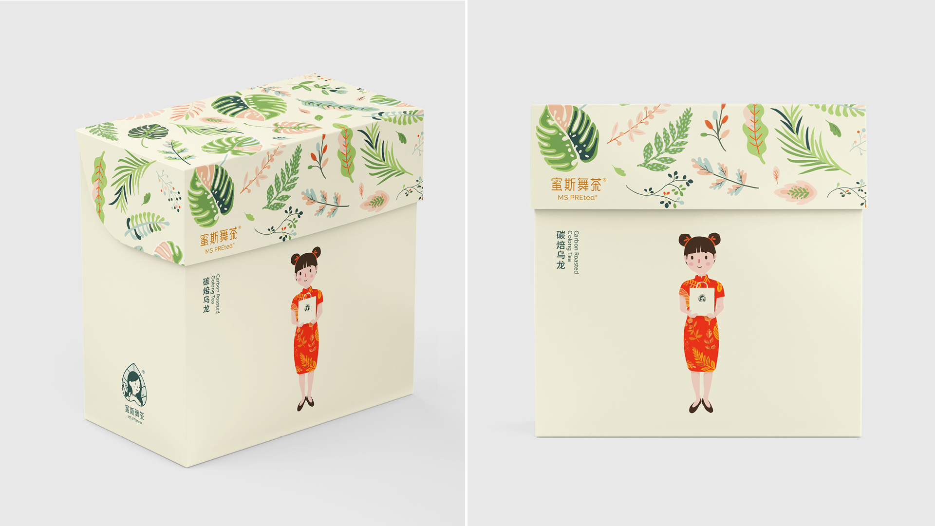
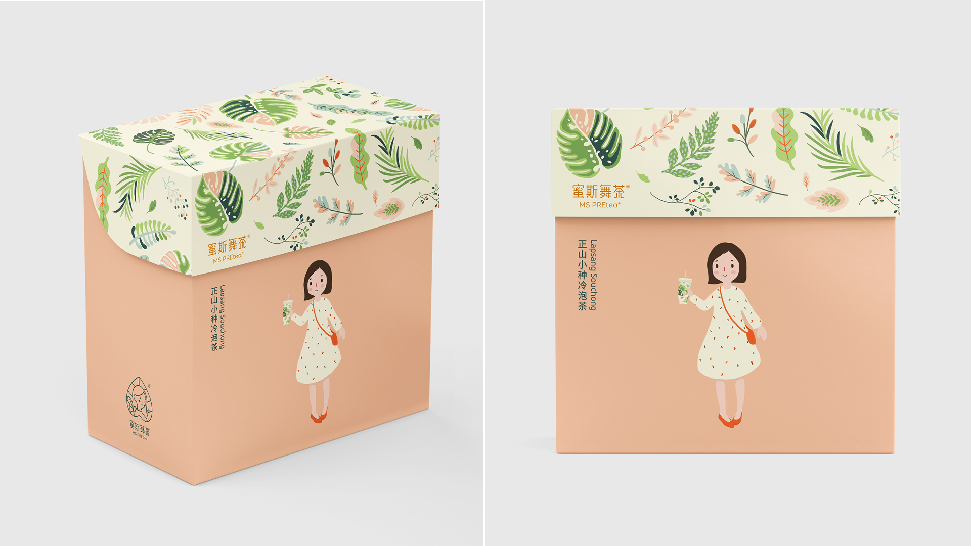
YNL Design aimed to develop a brand identity that can convey the distinctiveness and brand story of MS PREtea and expand it into a package design system to communicate with customers effectively. Inspired by the story of Mary in Frances Hodgson Burnett's masterpiece, 'The Secret Garden,' where she plants flowers and trees in the garden to bring joy and happiness to people, we developed a character that symbolizes MS PREtea. In the illustration expressed on the package, we described the pleasure that nature offers in a warm feeling with the healthy taste brewed with carefully selected tea leaves.
YNL Design은 MS PREtea가 지닌 차별점과 브랜드스토리를 전달할 수 있는 브랜드 아이덴티티를 개발하고 그것을 패키지 디자인 시스템으로 확장하여 고객과의 효과적인 커뮤니케이션이 이뤄지는 것을 목표로 했습니다. 프랜시스 호지스 버넷의 명작 ‘비밀의 화원’의 메리가 화원의 꽃과 나무를 가꾸어, 사람들에게 기쁨과 행복을 가져다준 스토리에서 영감을 얻어 MS PREtea를 상징하는 캐릭터를 개발하였습니다. 패키징에 표현된 일러스트레이션에는 엄선한 찻잎으로 우려낸 건강한 맛으로 자연이 주는 기쁨을 따뜻한 감성으로 표현하고자 했습니다.
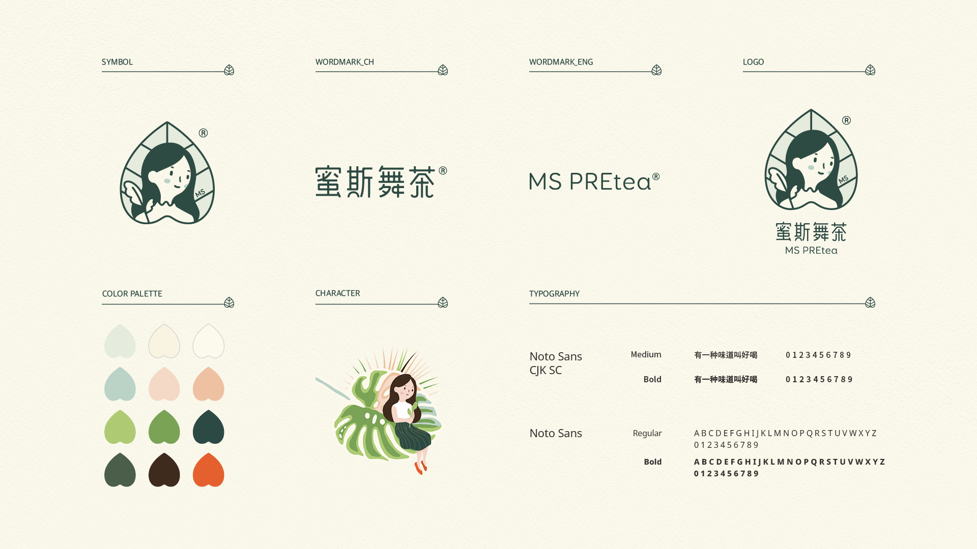
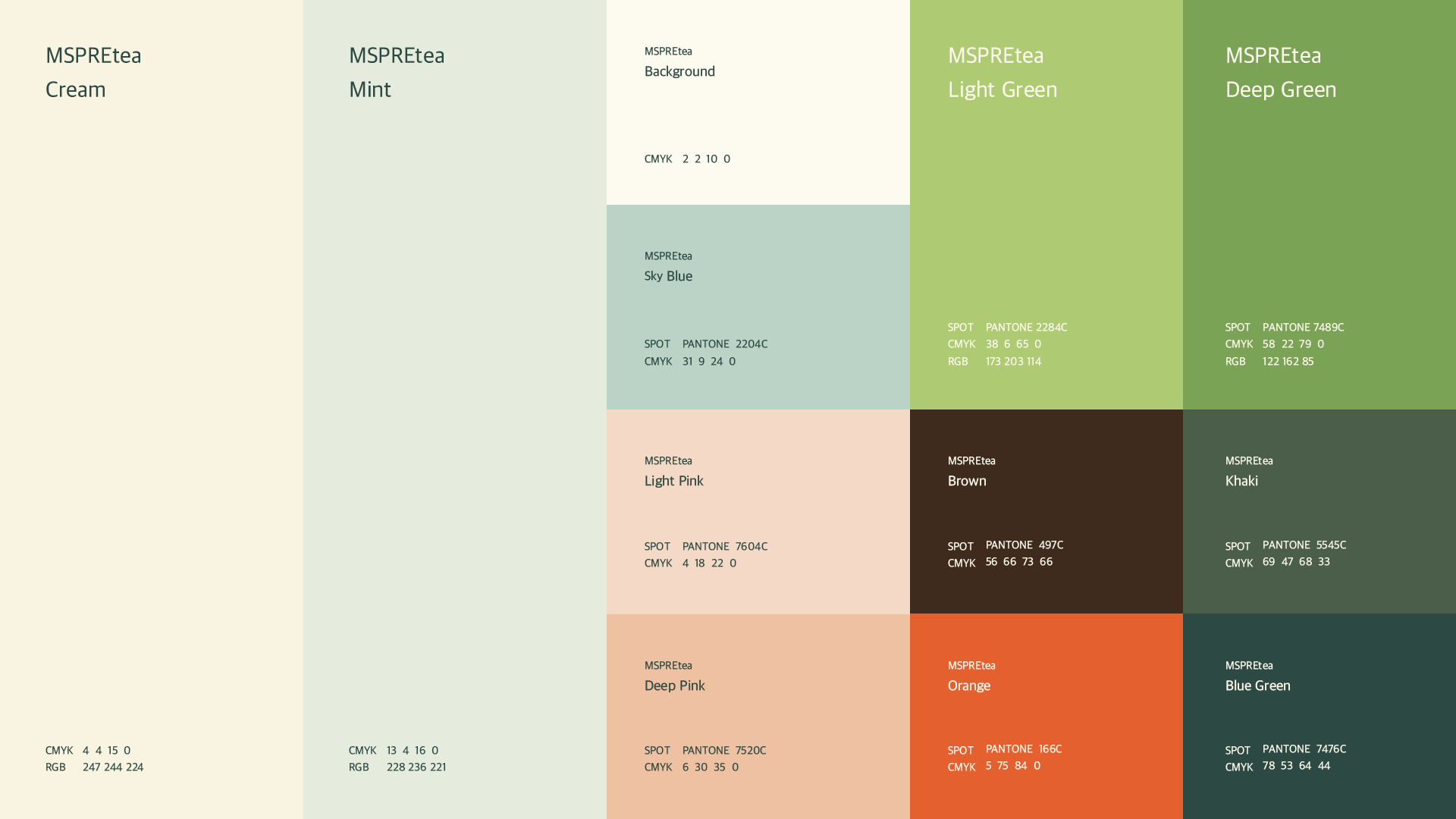
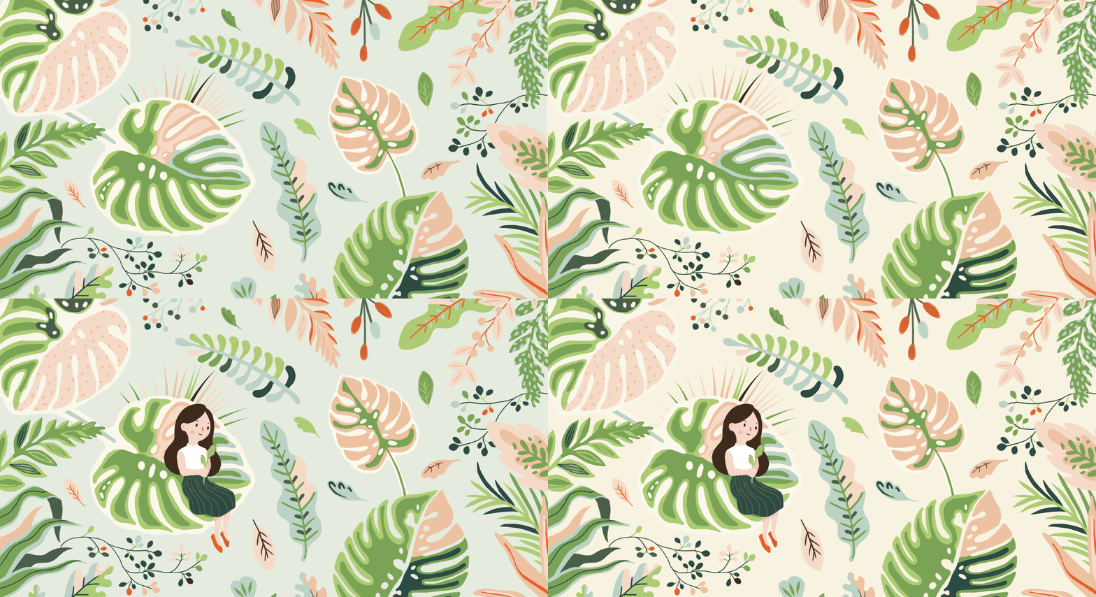
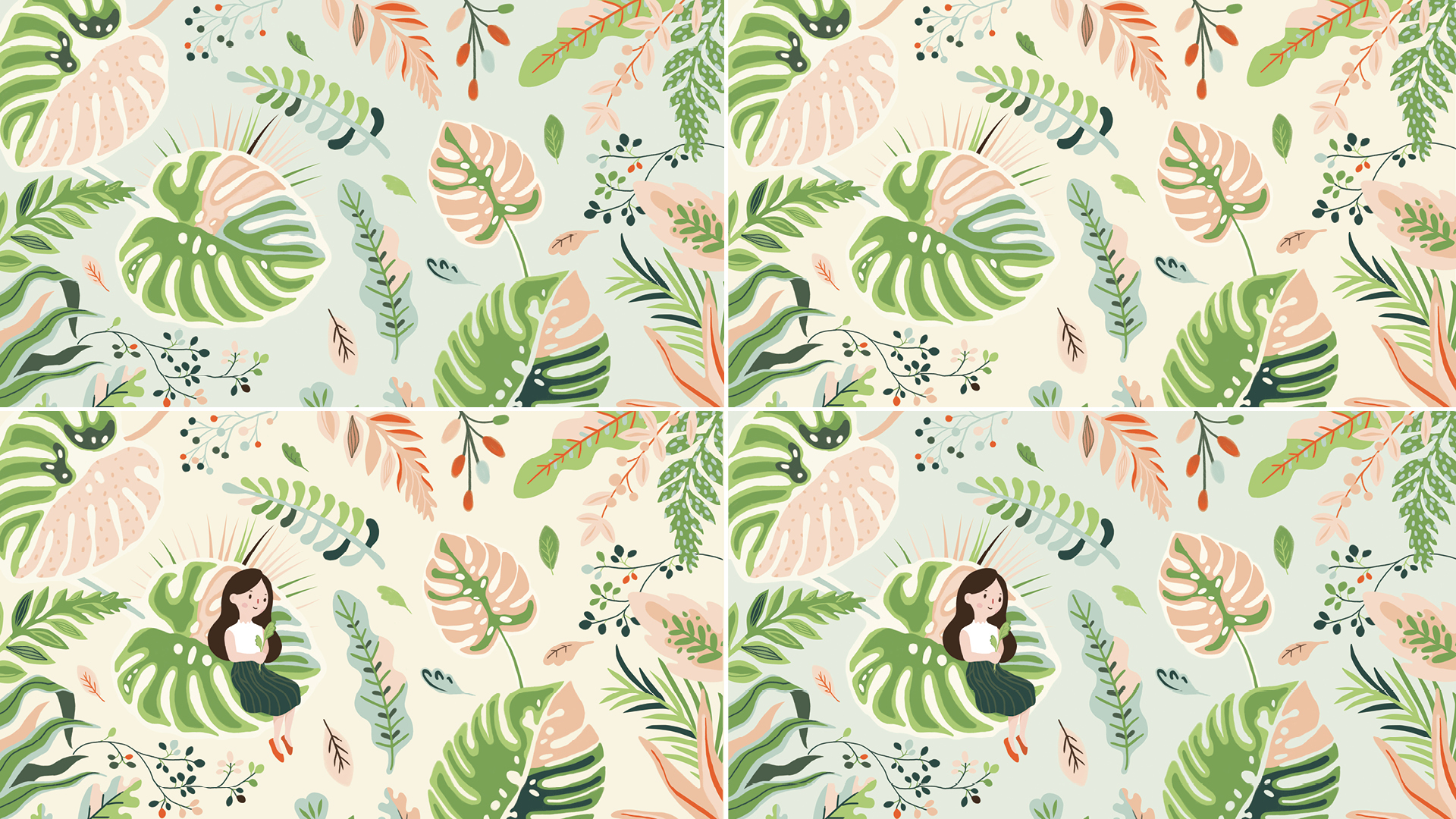
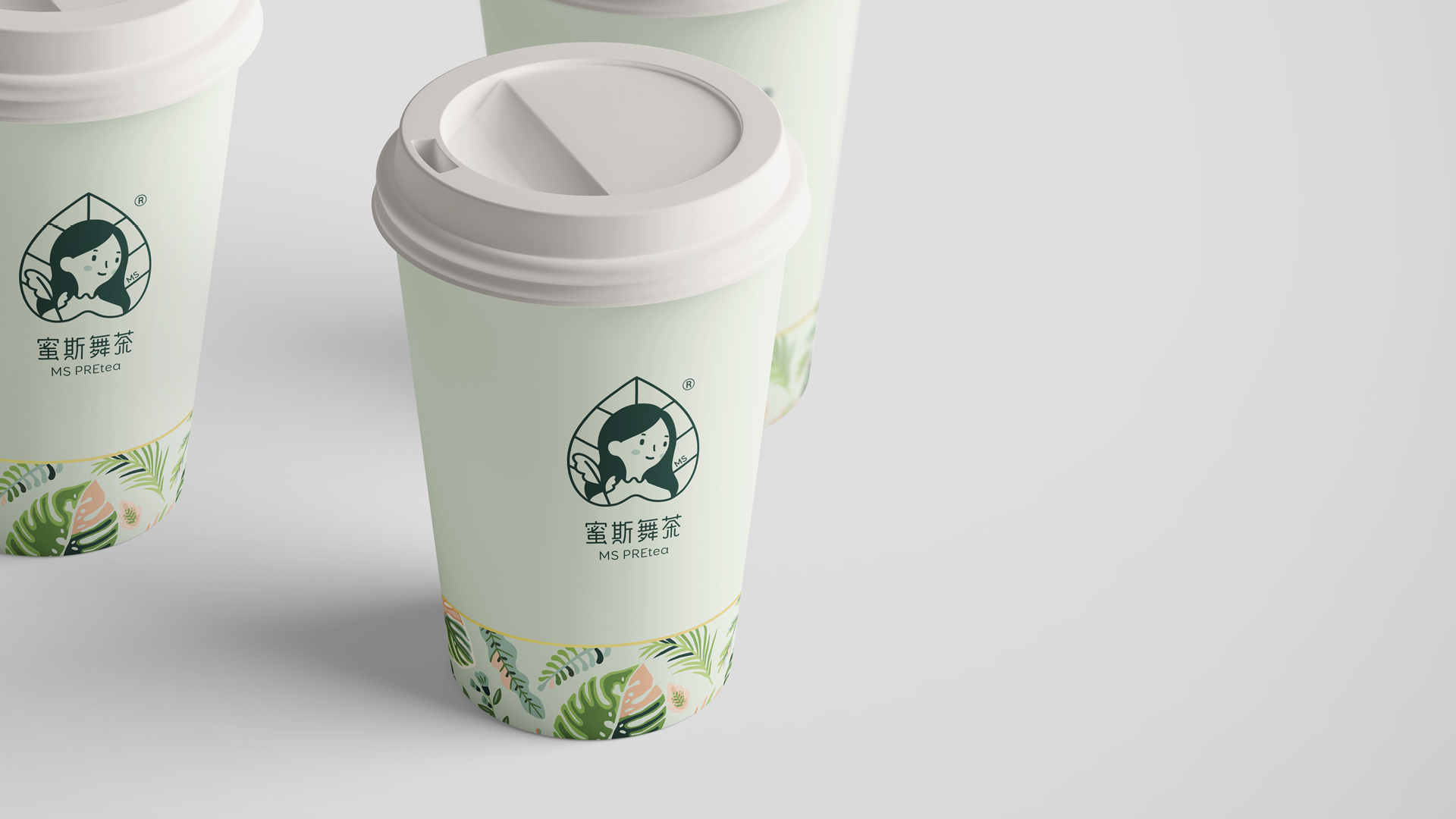
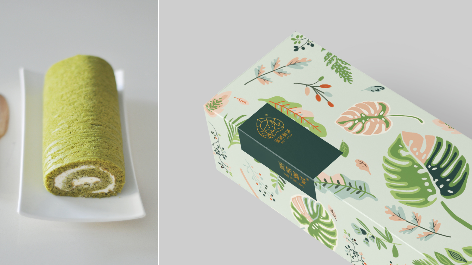
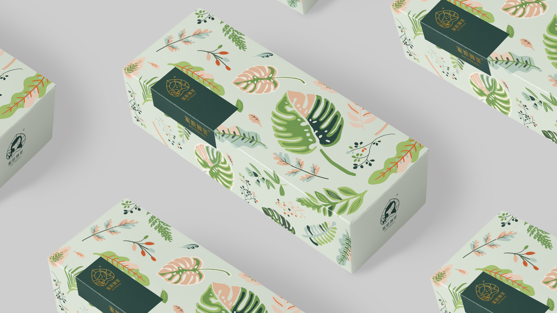
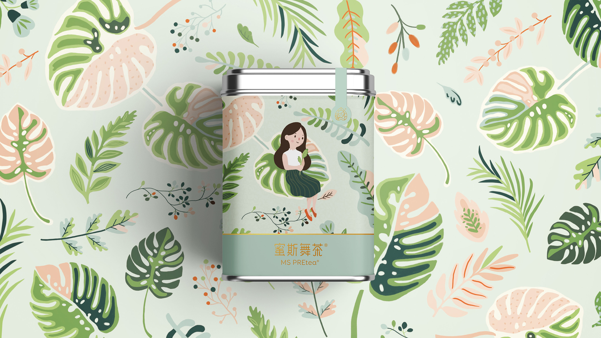
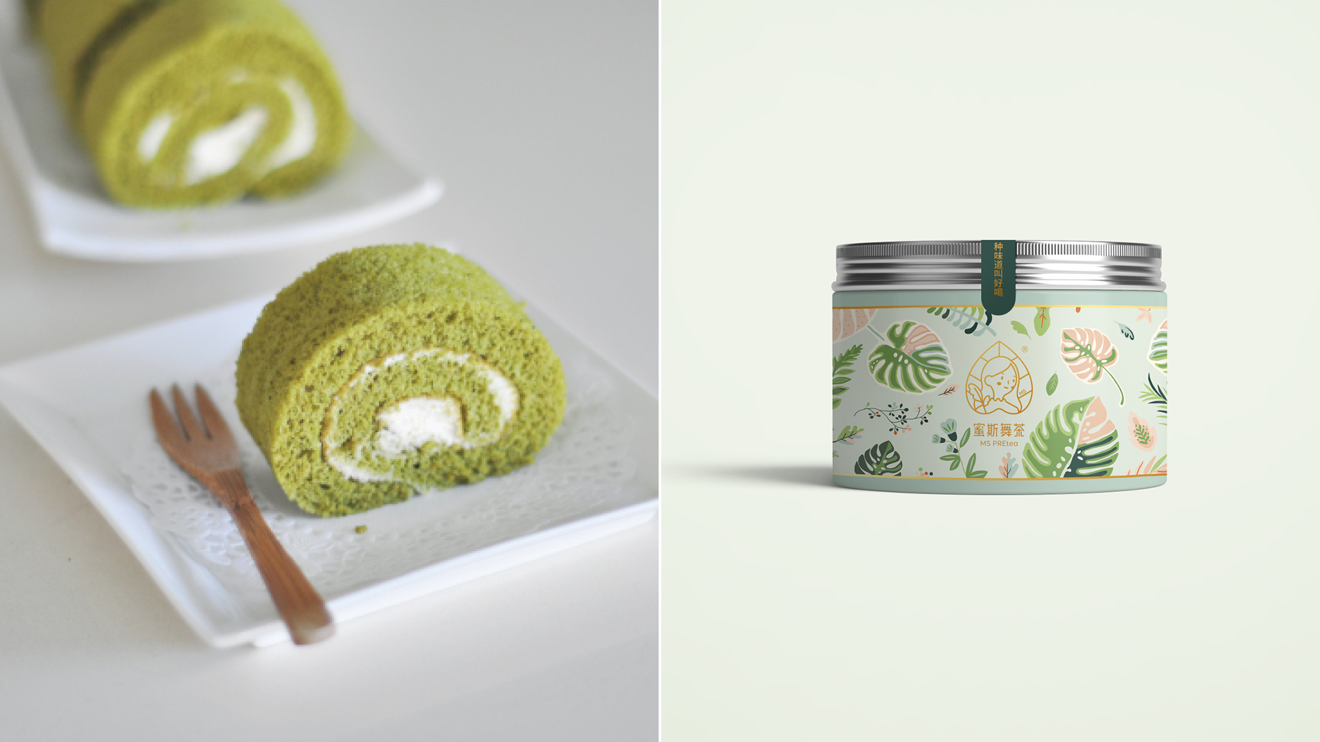
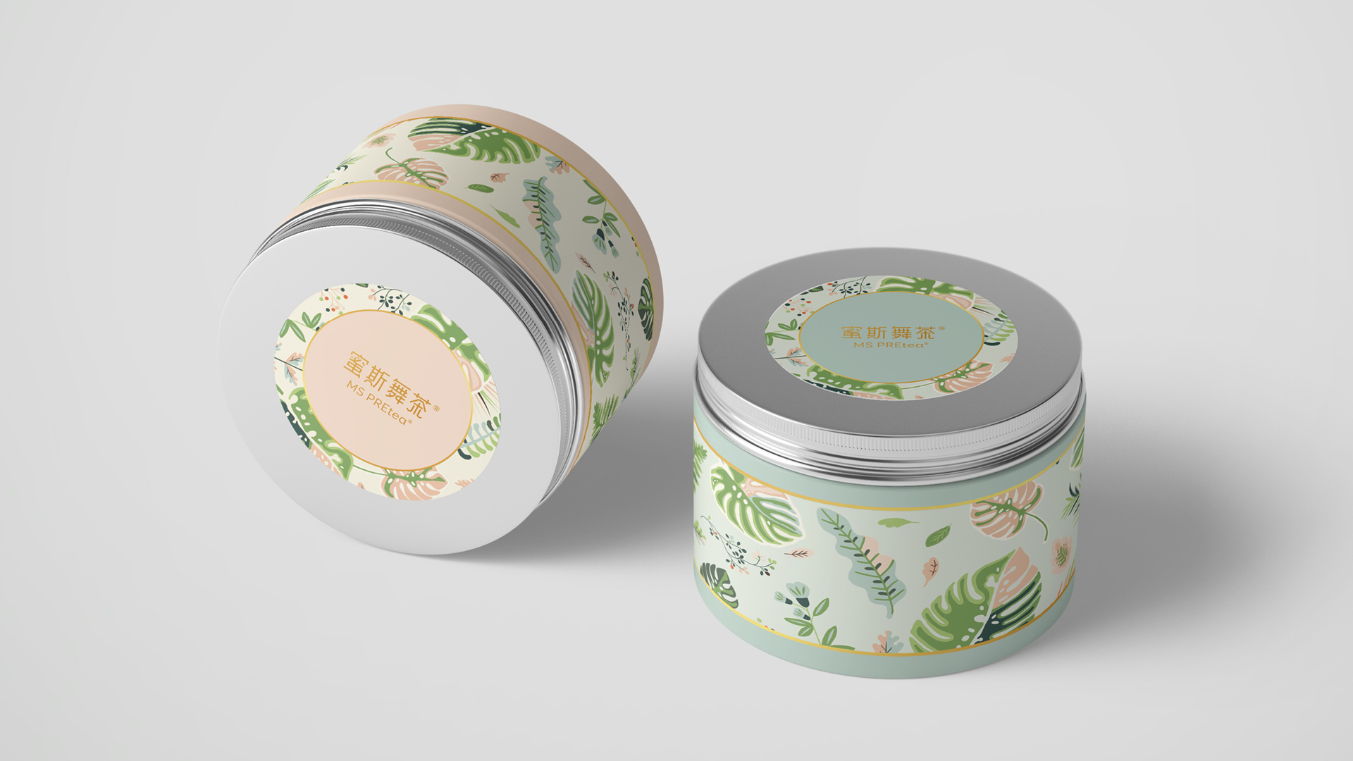
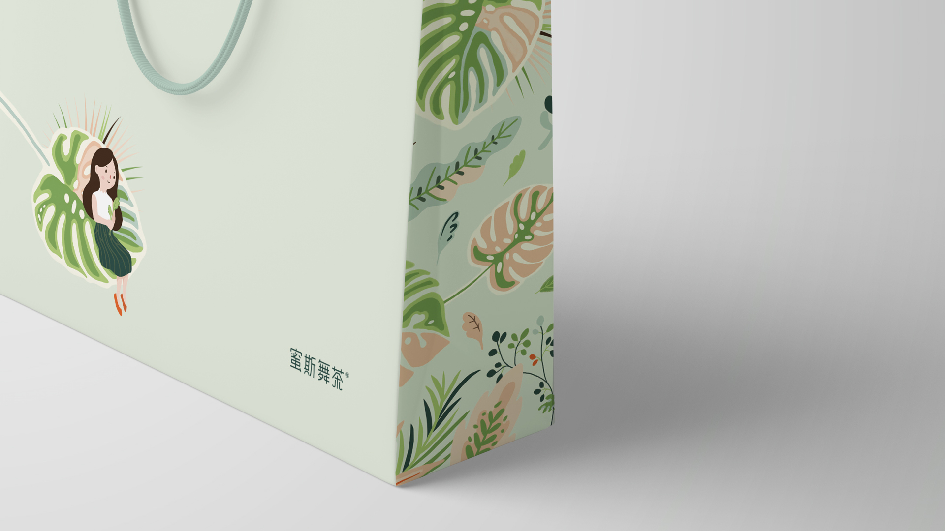
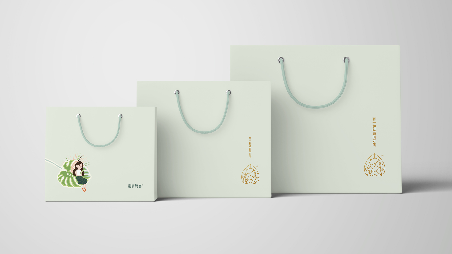
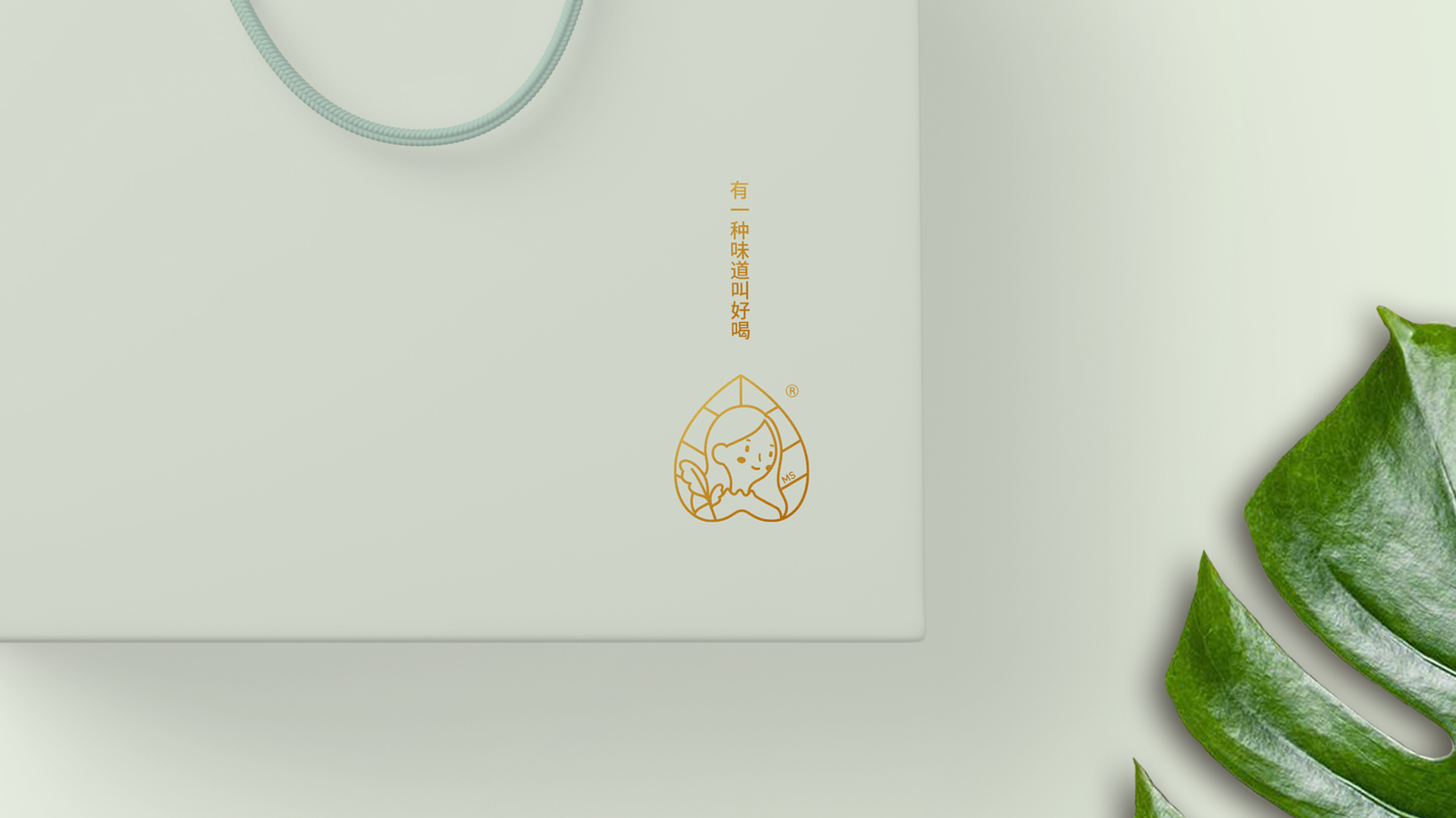
YNL Design rendered the brand message, 'the joy and happiness that nature gives' through the image of a girl sitting on a tea leaf of MS PREtea. To convey the meaning of 舞 in the logotype 蜜斯舞茶, which translates into ‘active/vital,’ we expressed freshness with vivid and unique illustrated artwork instead of repeating patterns. As for the color, we used the dusty color harmoniously to deliver a more friendly and warm brand image. We considered various application items for efficient design composition for customers and employees and developed a specific design by reflecting the earlier design.
YNL Design은 MS PREtea의 찻잎위에 앉아있는 소녀의 심볼을 통해 '자연이 주는 기쁨과 행복이라는 브랜드 메세지를 구현했습니다. 로고타입 蜜斯舞茶에 사용된 舞의 ‘활동적인/활력이 넘치는’이라는 의미를 전하기 위해, 반복되는 패턴이 아닌 생동감 있는 유니크한 일러스트 아트웍으로 신선함을 표현하였습니다. 색상은 더스티 컬러를 조화롭게 활용하여 보다 친근하고 따듯한 브랜드 이미지를 전달하였습니다. 다양한 적용 품목들이 고객뿐만 아니라, 근무 직원들을 위한 효율적인 디자인구성에 대해 고민했고, 앞서 도출한 디자인을 반영하여 구체적인 응용 디자인을 개발하였습니다.