GAYEOP KOREAN DINING

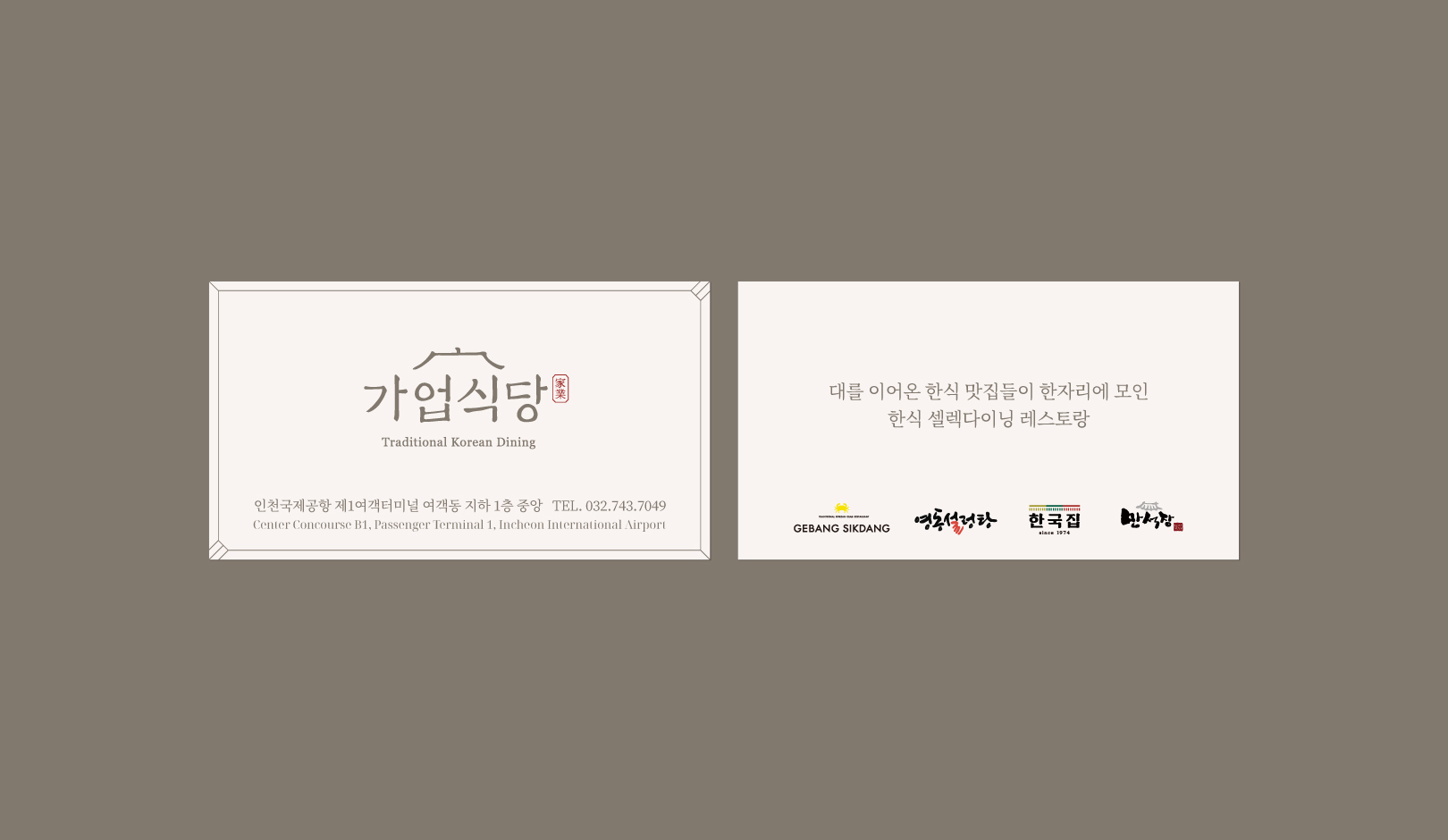
GAYEOP KOREAN DINING is a restaurant of CJ Foodville located in the first basement of Incheon International Airport's Passenger Terminal 1. It is a select dining concept brand for Korean food that put together famous Korean restaurants that have operated for generations in one place. With the belief that the taste of Korea is the most global, we present dishes that represent Korea. GAYEOP KOREAN DINING provides a fabulous experience of Korean dishes to Koreans and foreigners coming to Incheon International Airport.
가업식당은 인천국제공항 제1여객터미널 지하1층에 자리한 CJ푸드빌의 레스토랑으로 대를 이어온 한식 맛집들이 한자리에 모인 한식 셀렉다이닝 컨셉의 브랜드입니다. 한국의 맛이 가장 세계적인 맛이라는 믿음으로 한국을 대표하는 음식을 선보입니다. 인천공항을 찾는 외국인들은 물론이고 내국인들에게도 매력적인 음식 한류의 경험을 제공합니다.
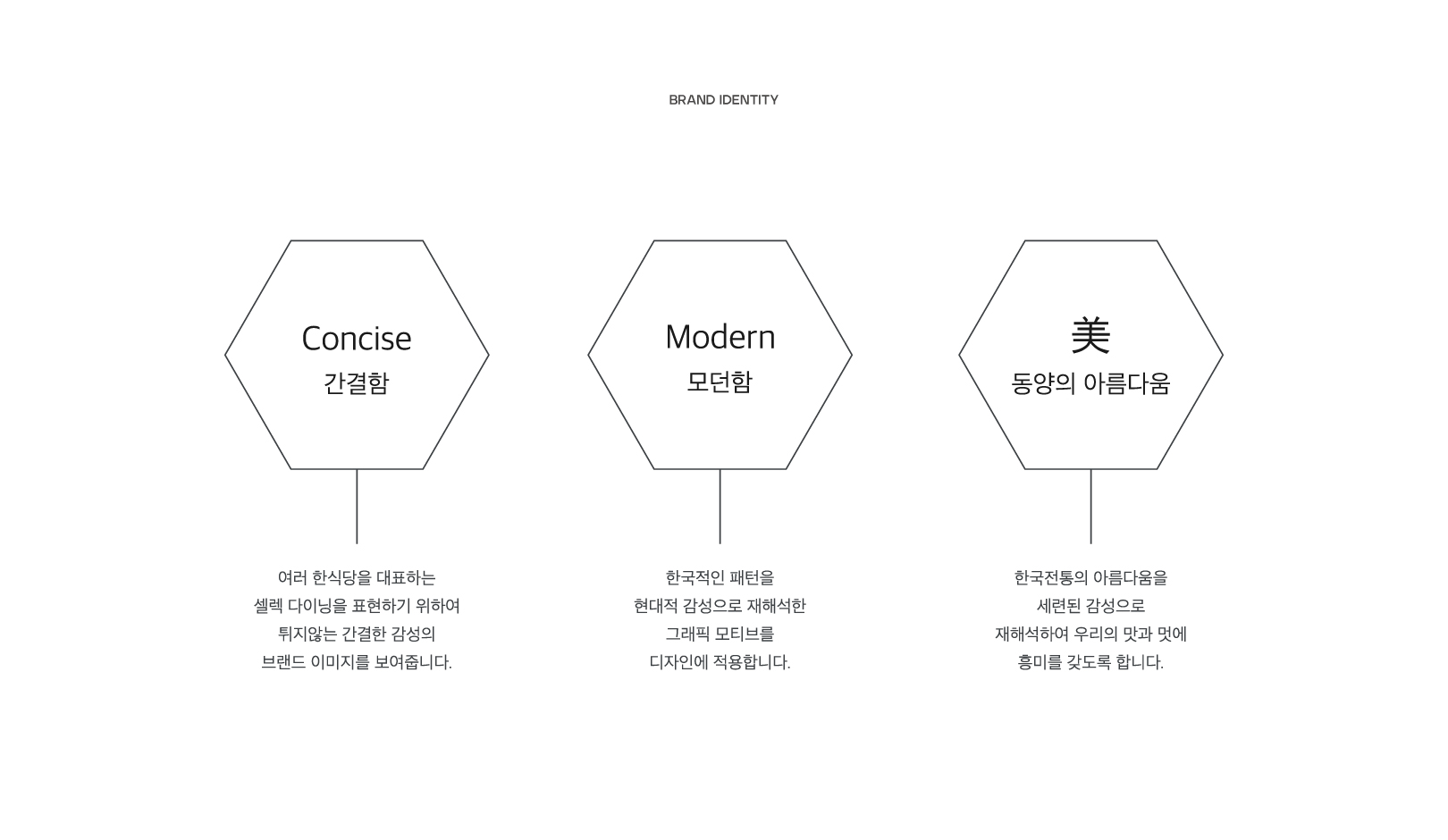
YNL Design reinterpreted Korean beauty in a modernistic way to build the brand identity of GAYEOP KOREAN DINING. To express the identity of select dining, which brought together several Korean restaurants in one place, we considered a straightforward design and intended to deliver a brand image that can comfortably approach anyone through a more modern sensibility by reinterpreting Korean patterns and traditional beauty with a sophisticated sensibility.
YNL Design은 가업식당의 브랜드아이덴티티 구축을 위해 한국적인 아름다움을 모던하게 재해석했습니다. 여러 한식당을 한 곳에 모아둔 셀렉 다이닝의 아이덴티티를 표현하기 위해 간결하고 심플한 디자인을 고민했고, 한국적인 패턴과 전통의 아름다움을 세련된 감성으로 재해석하여 한층 현대적인 감성으로 누구에게나 편안하게 다가갈 수 있는 브랜드 이미지를 전달하고자 했습니다.
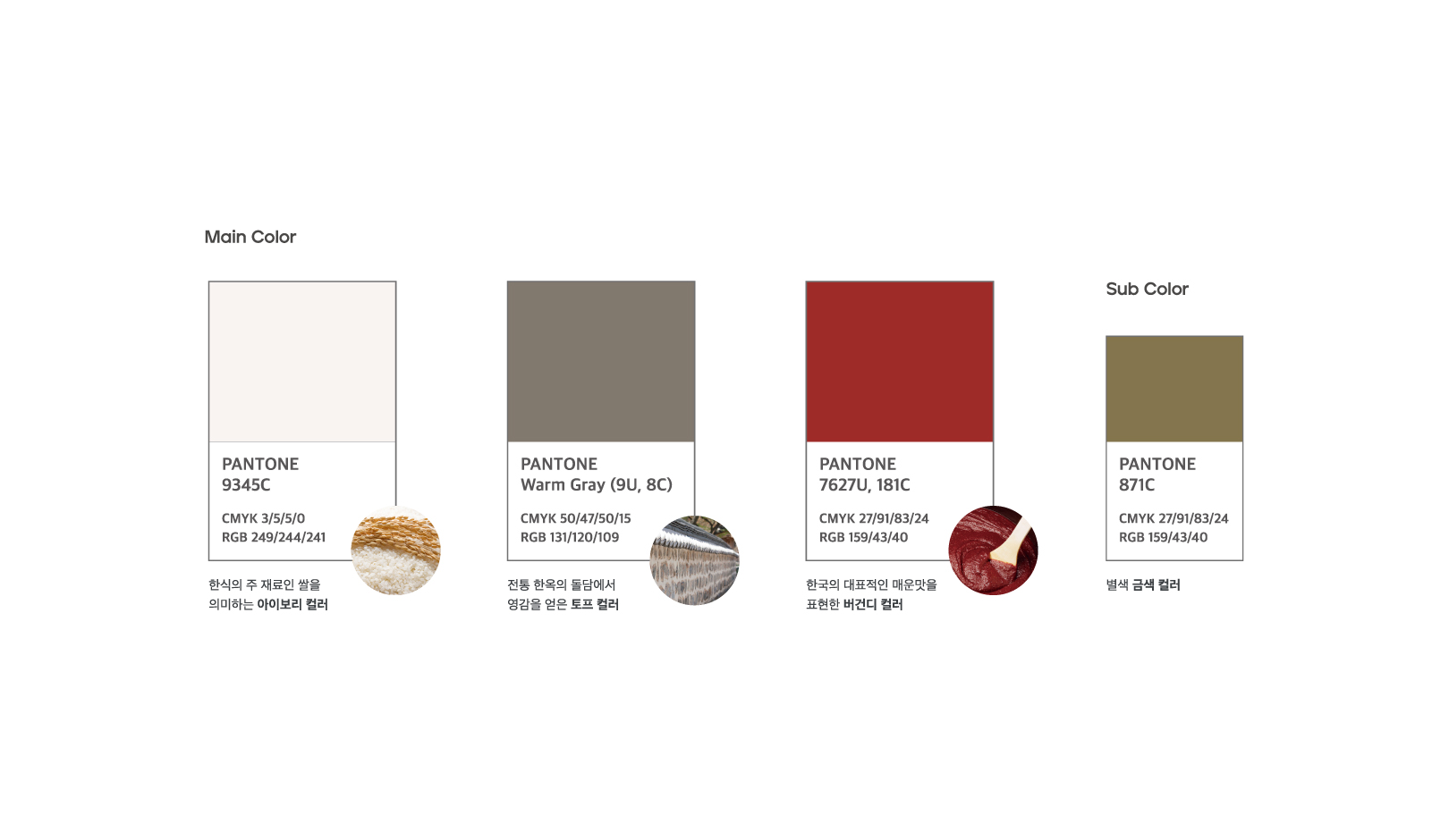
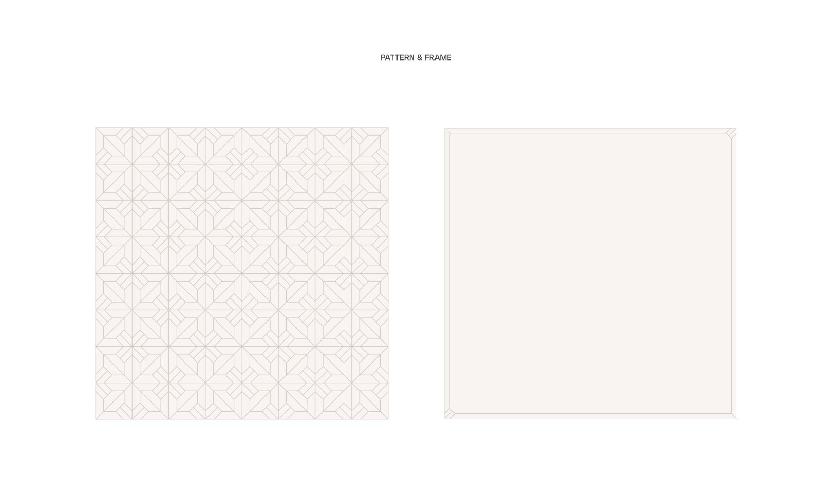
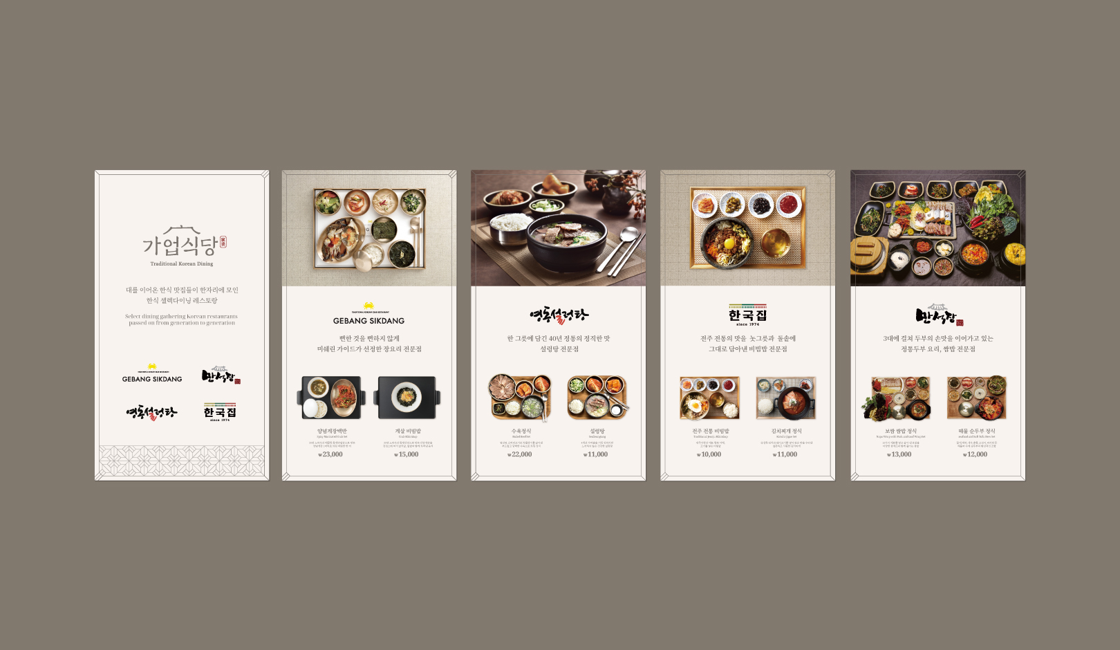
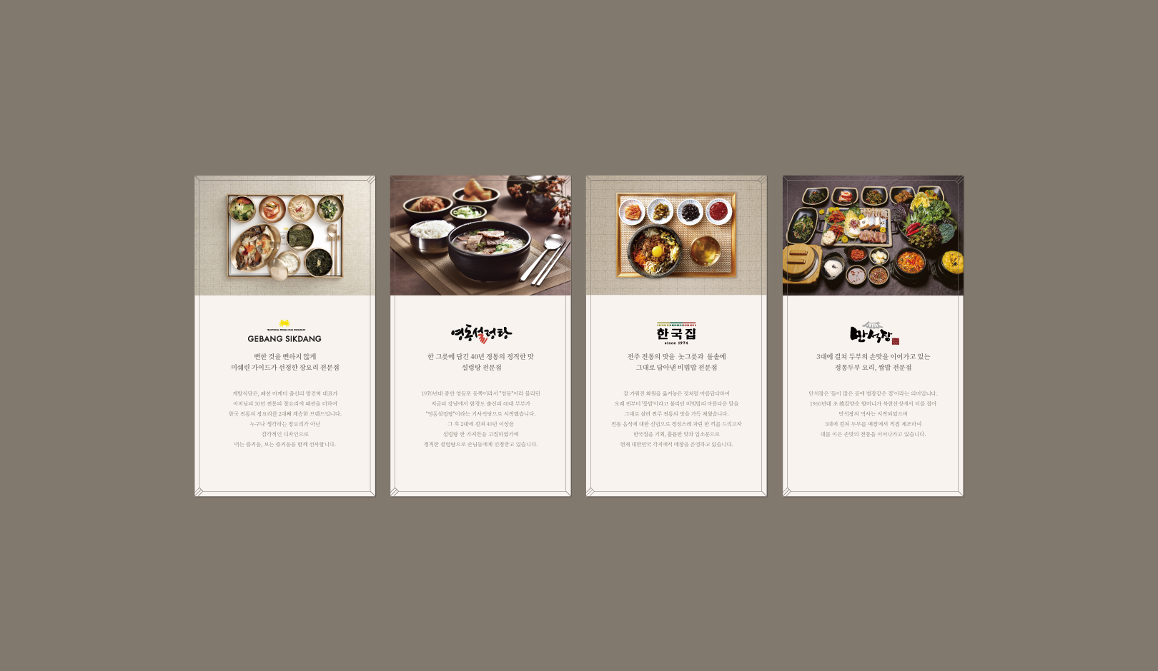
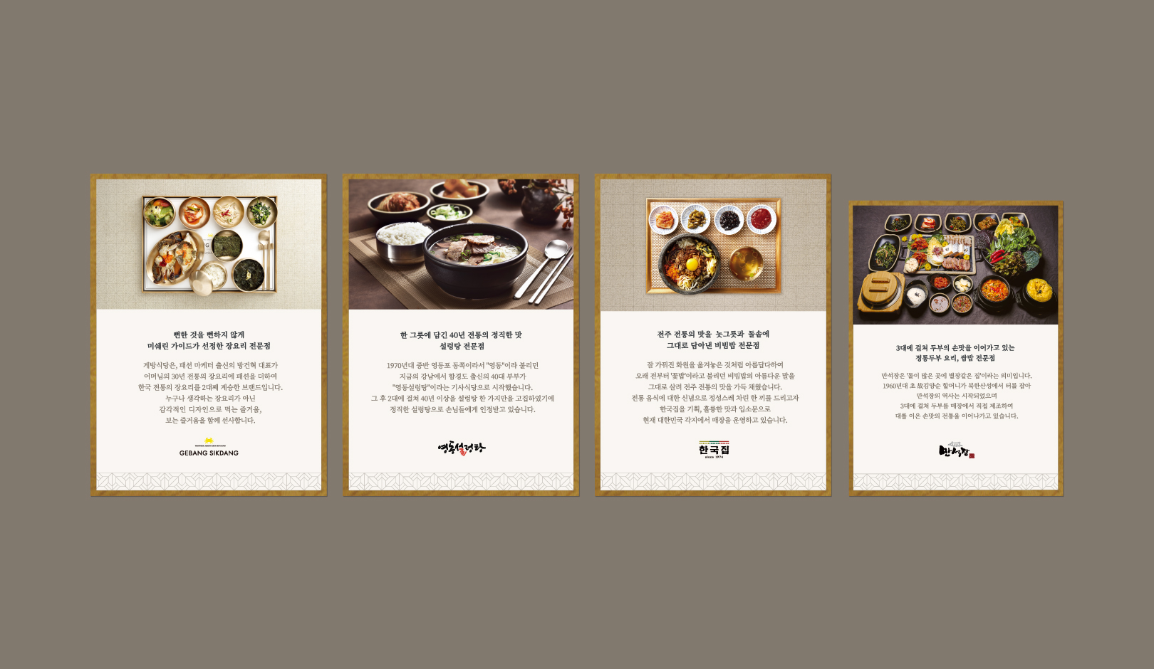
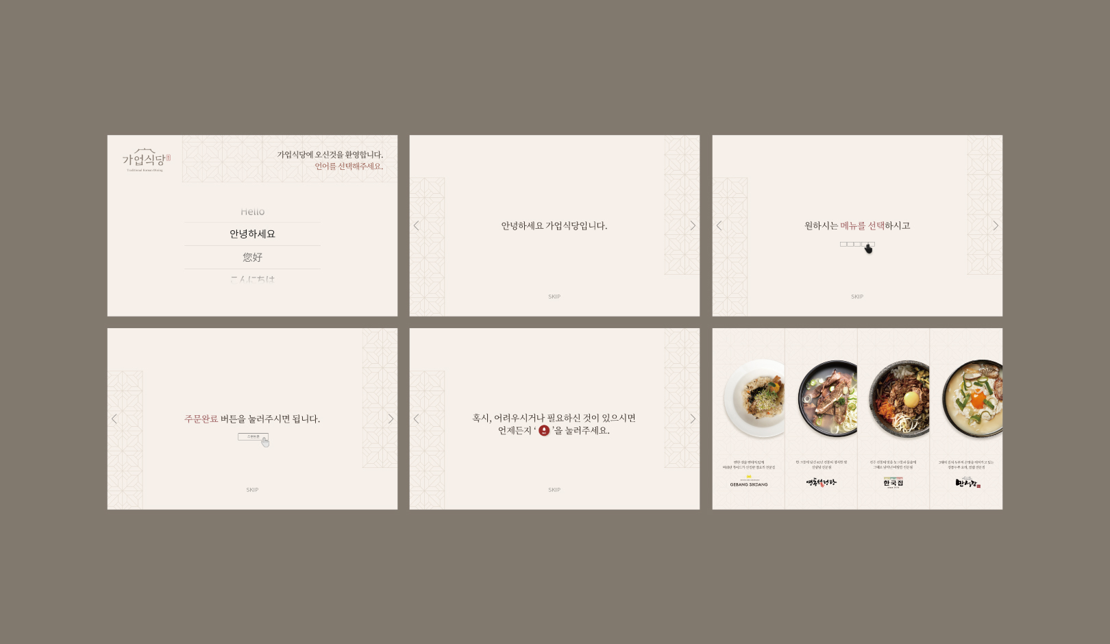
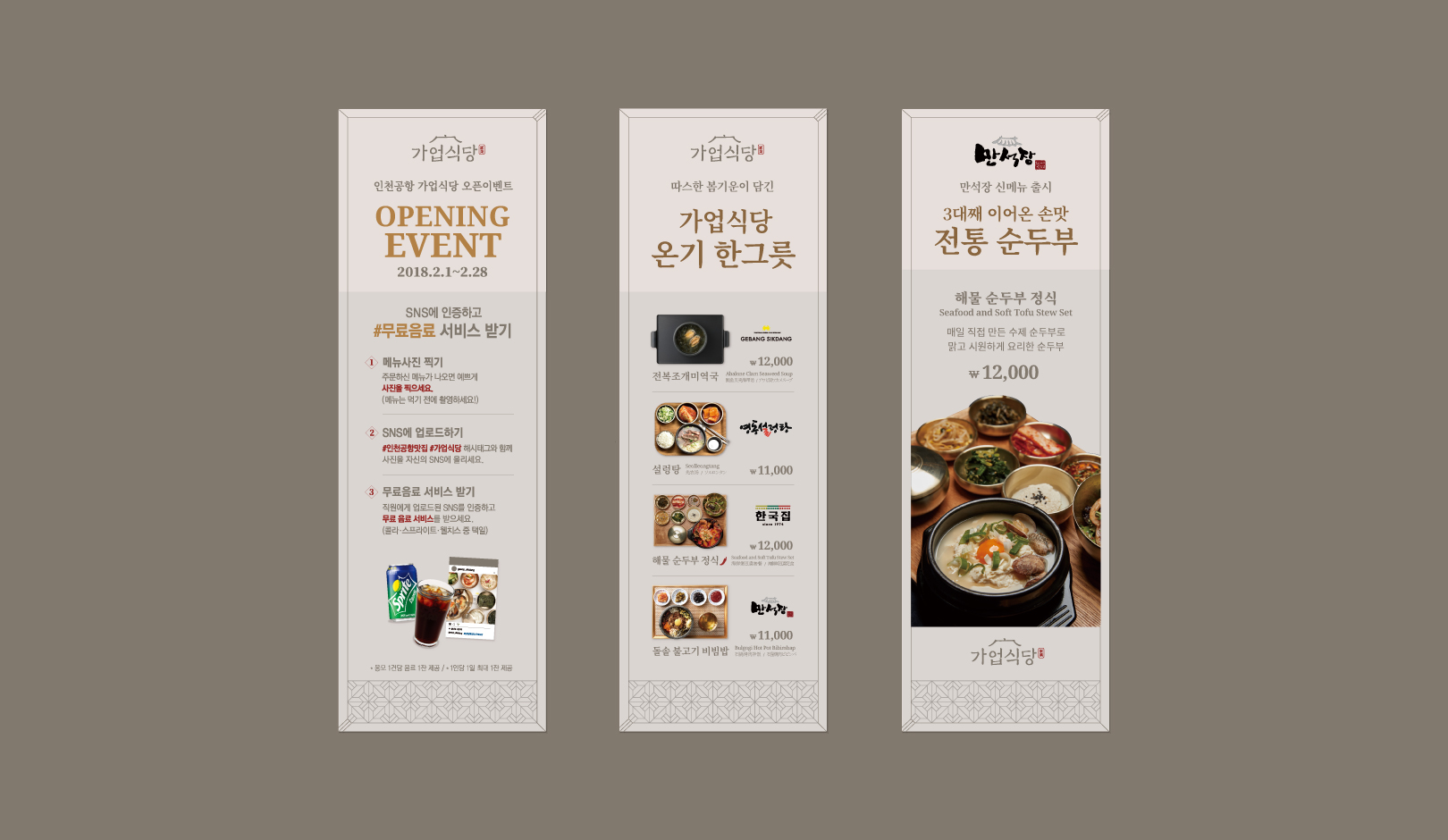
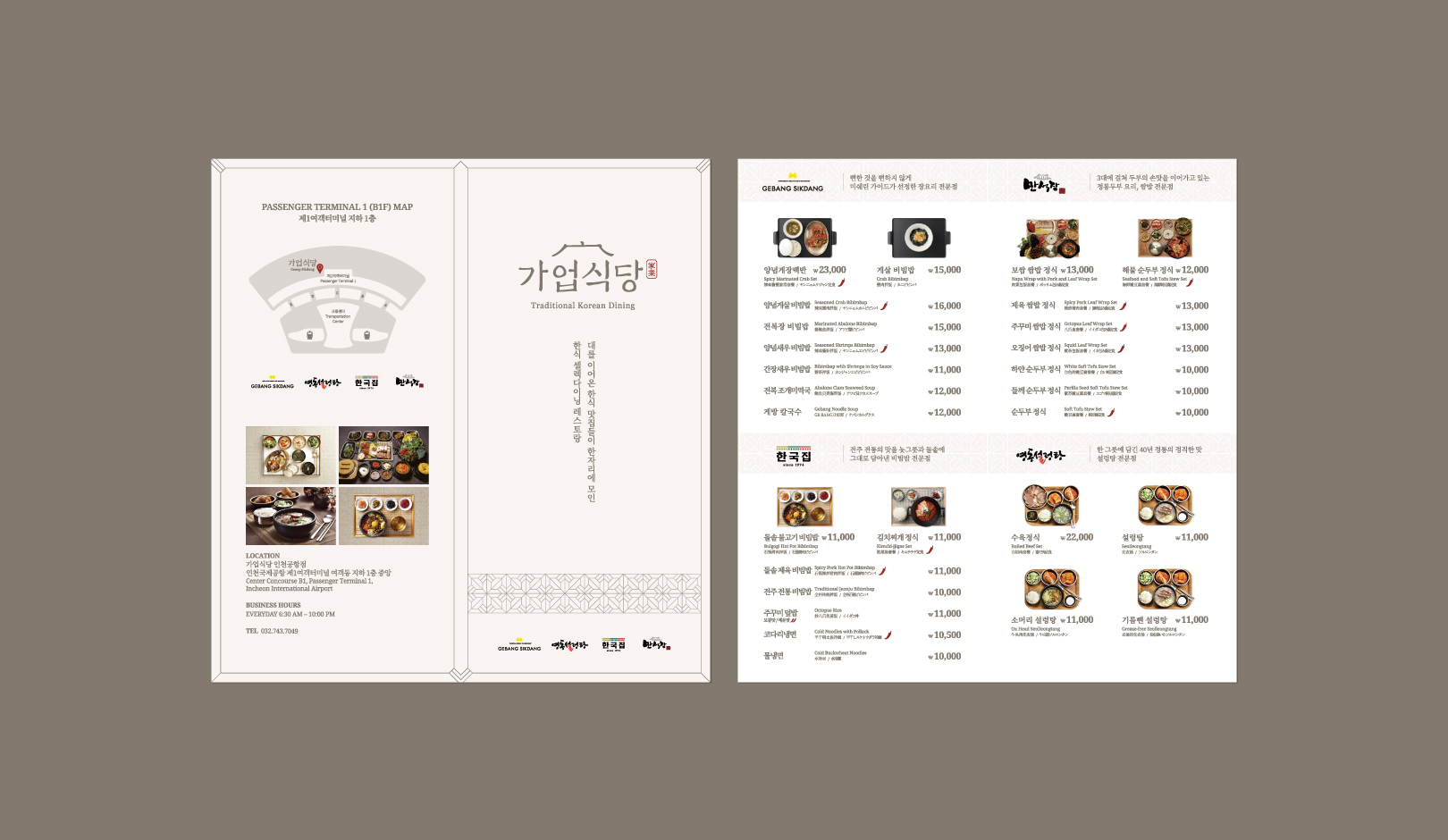
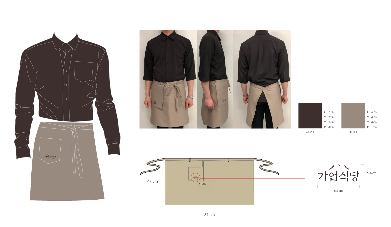
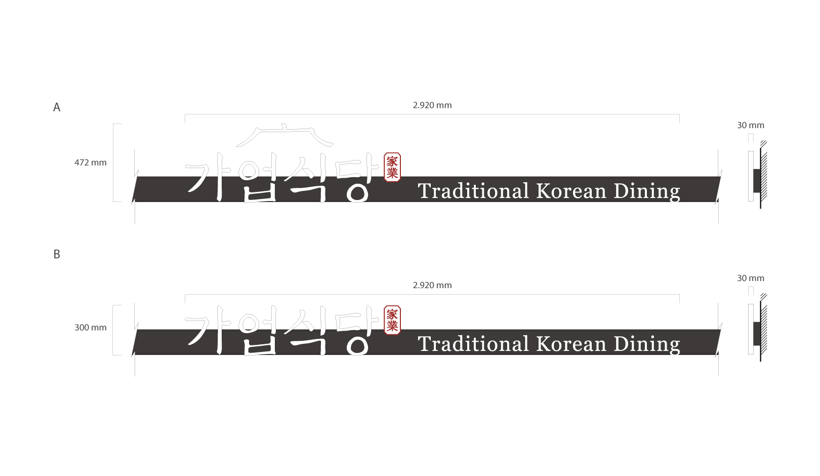
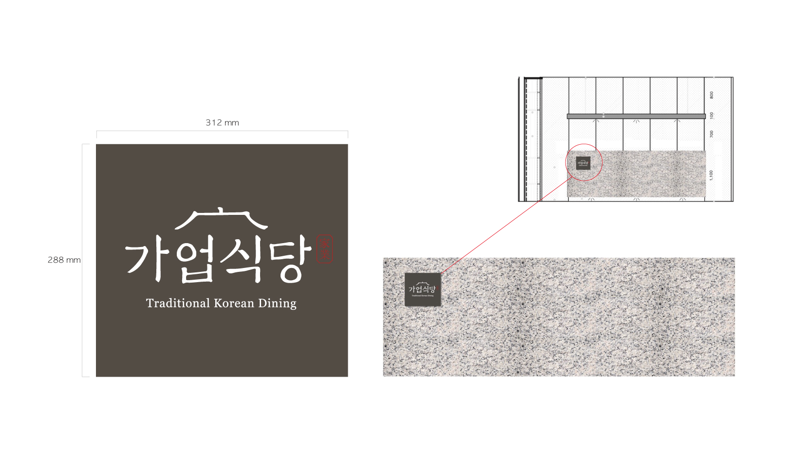
We built a concise Korean brand image to express the brand image, 'select dining,' which brought together the Korean restaurants that have been operating for generations. Also, we visualized it through various application designs such as smart pad menu pages by developing graphic motifs representing GAYEOP KOREAN DINING. We used a system of warm colors with reduced saturation and tried to create a moderate and elegant tone for the layout design to express the beauty of the east. YNL Design developed various application designs such as a basic brand identity system for GAYEOP KOREAN DINING, storytelling frame for each brand, external DID, tablet menu page (smart order page), menu, uniform, and bill.
대대로 내려오는 전국에서 입소문이 난 한식당을 한곳에 모아둔 ‘셀렉다이닝’이라는 브랜드 이미지를 표현하기 위하여 한국적인 간결한 감성의 브랜드 이미지를 구축하였으며 가업식당을 대표로 표현하는 그래픽 모티브를 개발하여 스마트패드 메뉴 페이지 등 다양한 응용 디자인에 시각화하였습니다. 또한 동양의 아름다움을 표현하기 위하여 채도를 낮춘 난색계열로 컬러시스템을 활용하였으며 레이아웃 디자인에는 절제되고 우아한 톤을 만들고자 노력하였습니다. YNL Design에서는 가업식당의 기본 브랜드 아이덴티티 시스템과 브랜드별 스토리텔링 액자, 외부DID, 테블릿 메뉴 페이지(smart order page), 메뉴지, 유니폼, 빌지 등의 다양한 응용 디자인을 개발하였습니다.