THE OTHER BEANS
Elevating Coffee through Simplicity and Craft

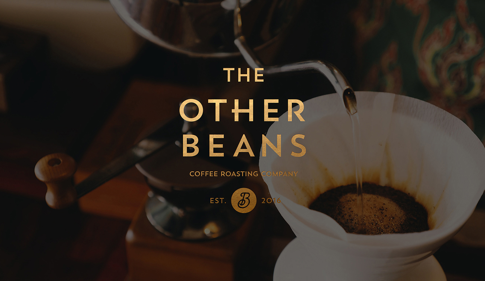
The Other Beans is a specialty coffee house that pursues something different from others. The Other Beans provides the highest quality coffee that satisfies all five senses through a light roasting technique that preserves coffee's original taste, aroma, and character. As a café that continuously studied and developed roasting services and coffee beans excellent with passion and professionalism, it has established the image of a brand that satisfies customer needs and communicates with them, providing the best coffee experience.
디아더빈스[The other beans]는 남들과 다른것을 추구하는 스페셜티 커피 전문점이라는 뜻을 의미합니다. 디아더빈스는 커피가 가지고 있는 본연의 맛과 향, 개성을 살리는 라이트 로스팅을 통하여 고객의 오감을 만족시키는 최고 수준의 커피를 제공합니다. 열정적이고 전문성이 돋보이는 로스팅 서비스와 원두를 끊임없이 연구하고 발전시키는 카페로서 고객의 니즈를 충족시키고 소통하며 최상의 커피 경험을 제공한다는 브랜드의 의미를 갖고 있습니다.
YNL Design deliberated on the distinctive brand identity and naming of The Other Beans amid overflowing roasting cafe brands. We expressed the sincerity and passion of The Other Beans, which proposes unparalleled methods and the best coffee beans to satisfy customer needs while being faithful to the basics, coffee beans, and roasting, in which all coffee brands should try to excel. In addition, we intended to develop a brand identity that graphically expresses the essential elements suggestive of a coffee brand while emphasizing the uniqueness of The Other Beans.
YNL Design은 넘쳐 나는 로스팅 카페 브랜드 속에서 디아더빈스만의 차별성 있는 브랜드 아이덴티티와 네이밍에 대해 고민했습니다. 커피 브랜드라면 당연히 추구해야 하는 원두와 로스팅이라는 기본에 충실하지만 고객의 니즈를 만족시키기 위해 남다른 방식과 최고의 원두를 제안하는 디아더빈스의 정성과 열정을 네이밍으로 표현하였습니다. 또한 커피 브랜드를 연상시키는 기본적인 요소들을 그래픽으로 표현하는 동시에 디아더빈스만의 특별함을 강조하는 브랜드 아이덴티티를 개발하고자 했습니다.
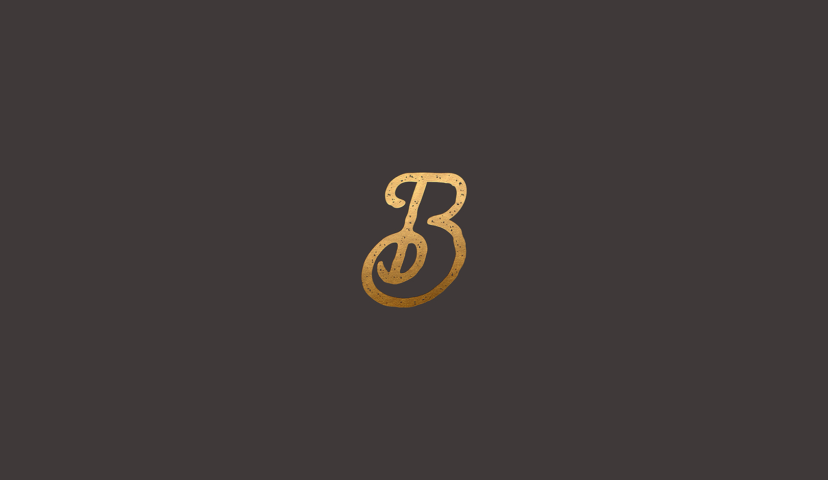
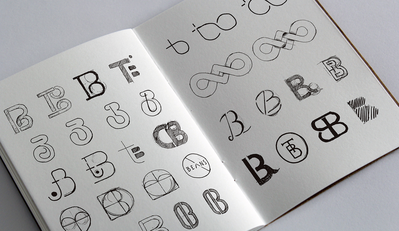
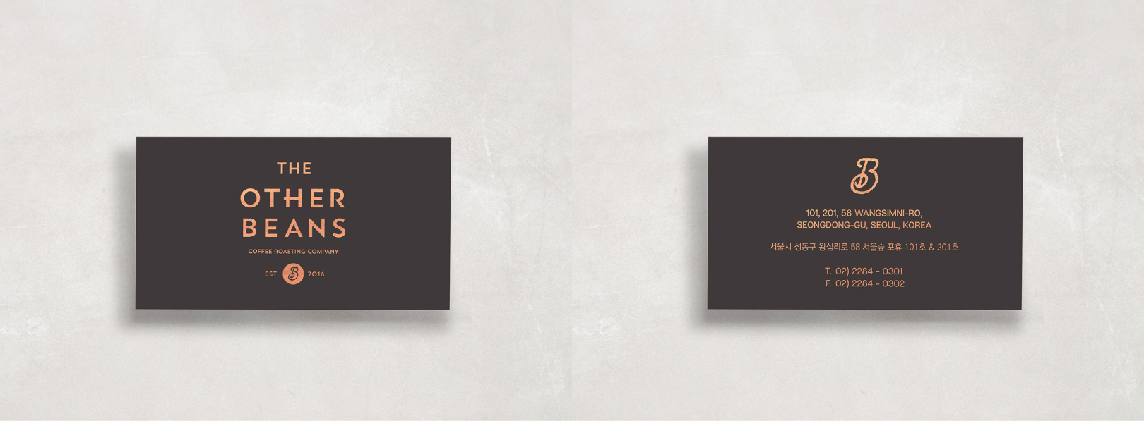
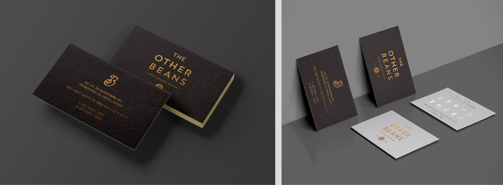
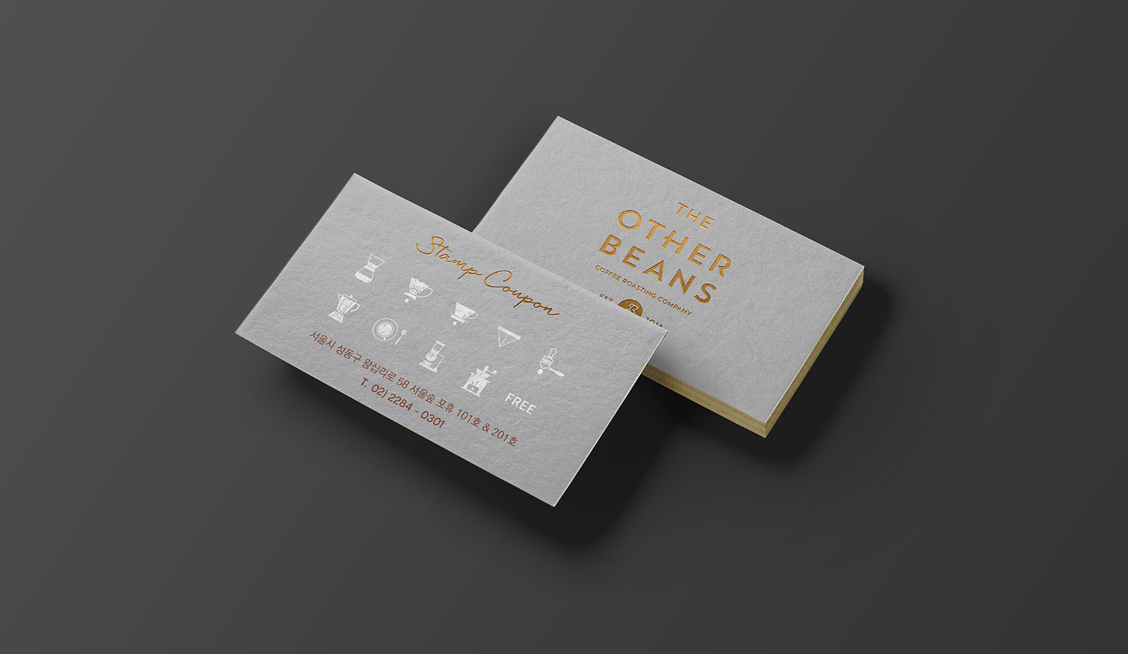
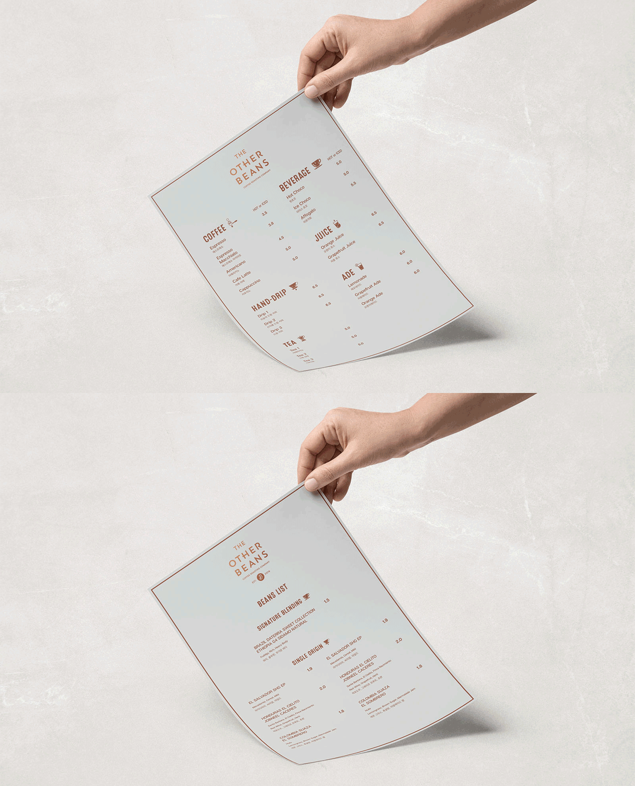
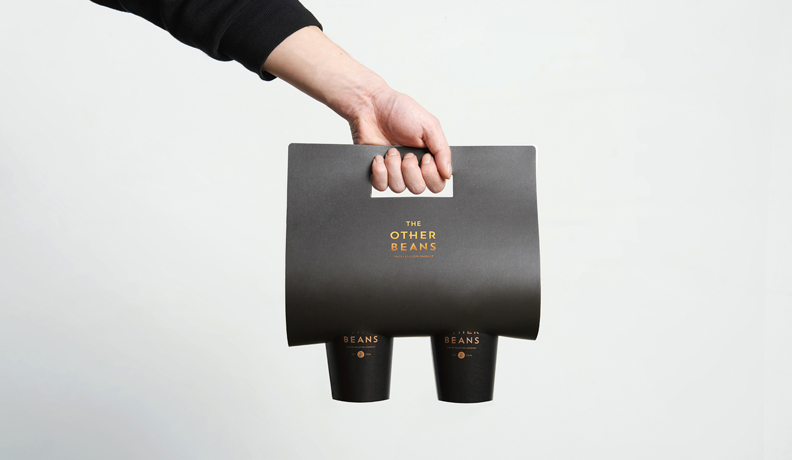
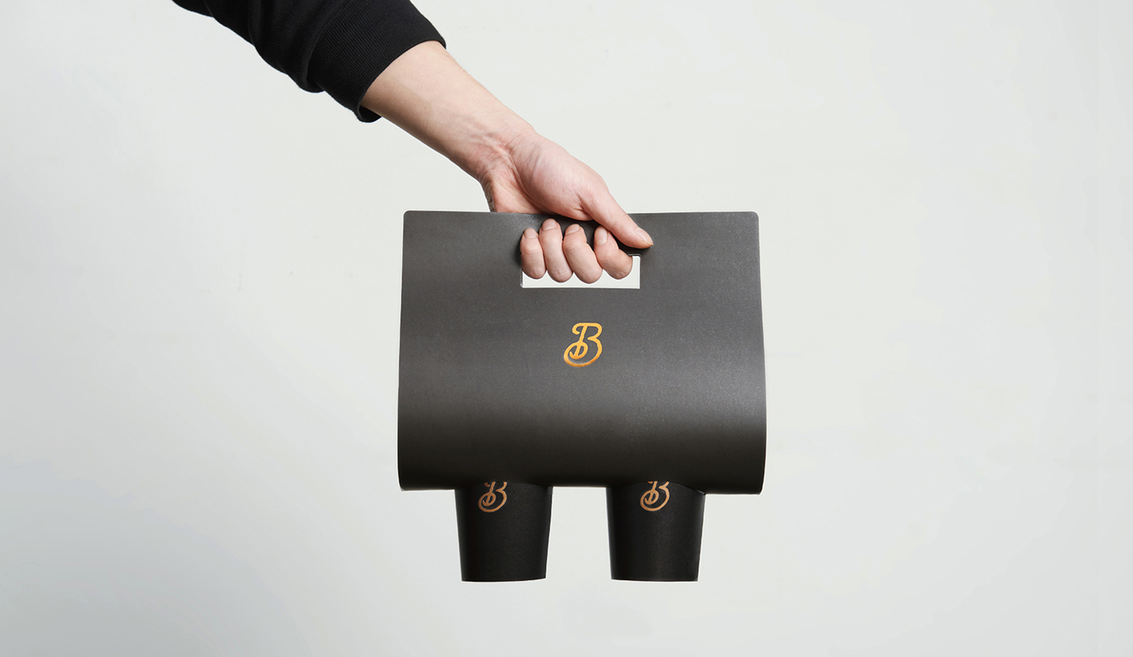
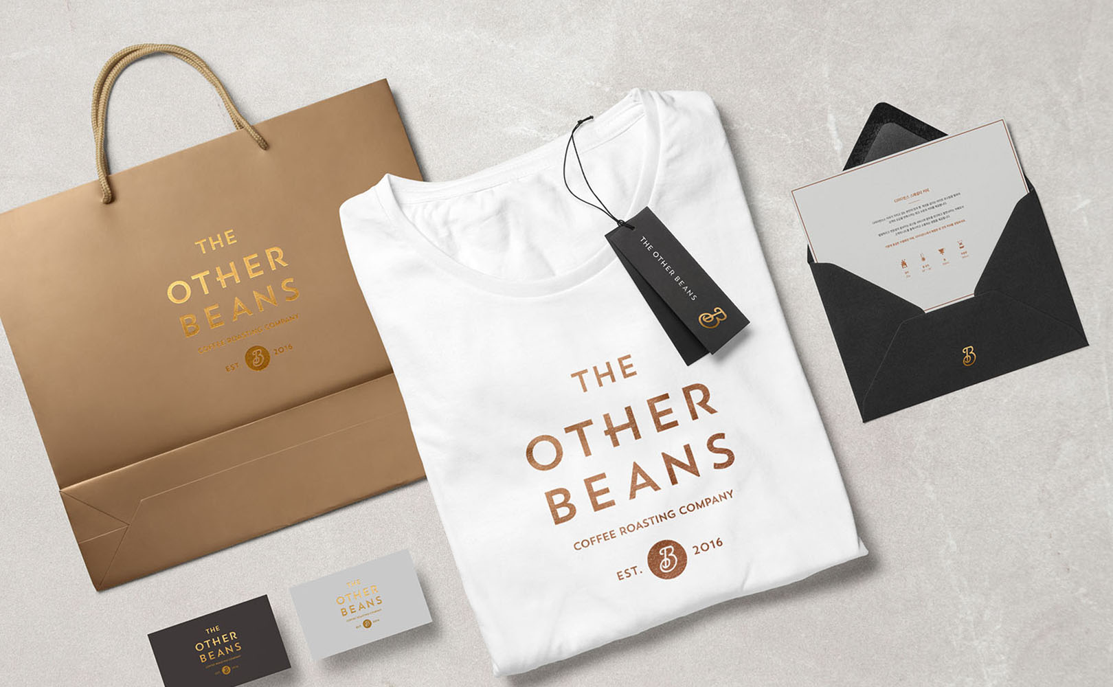
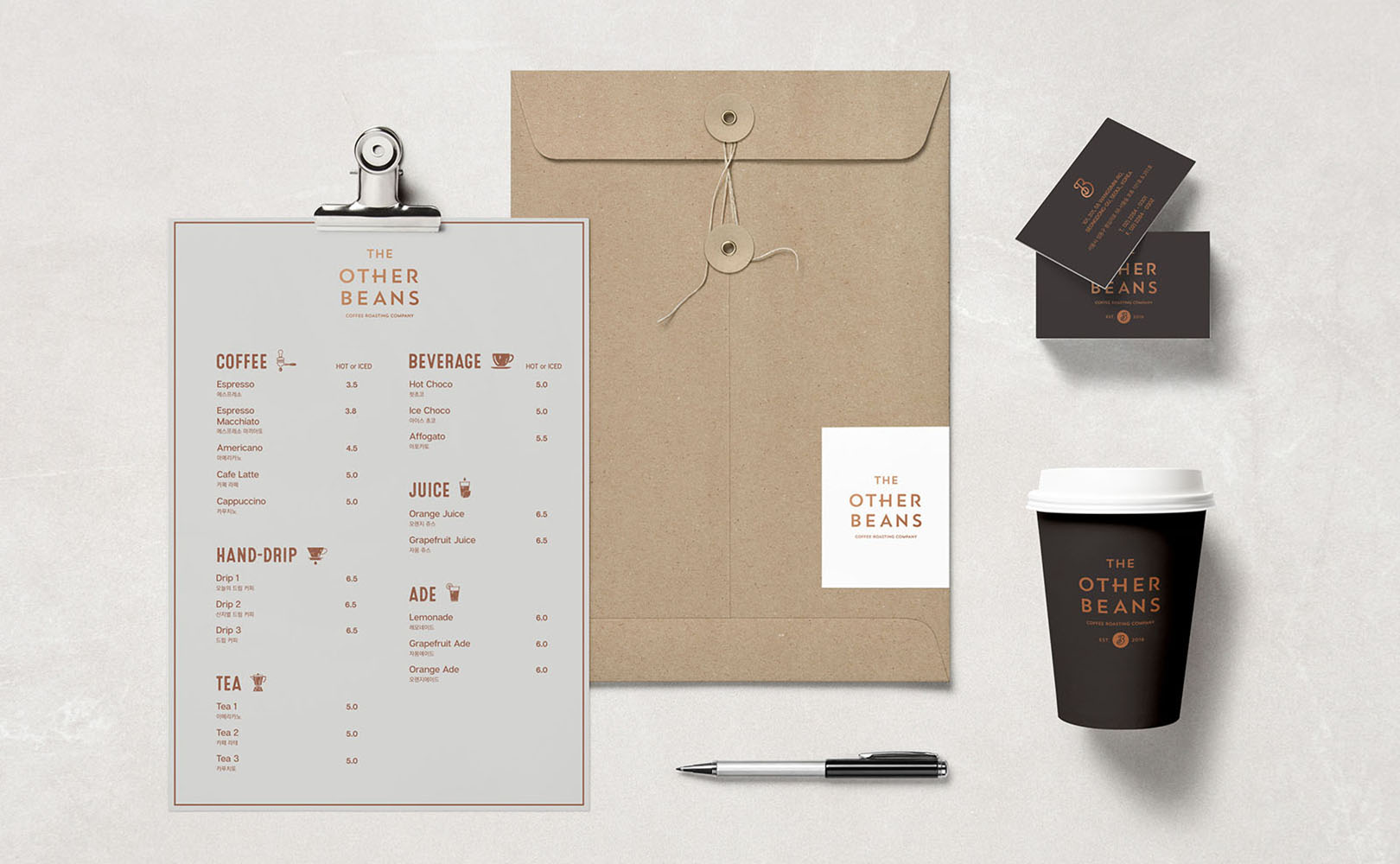
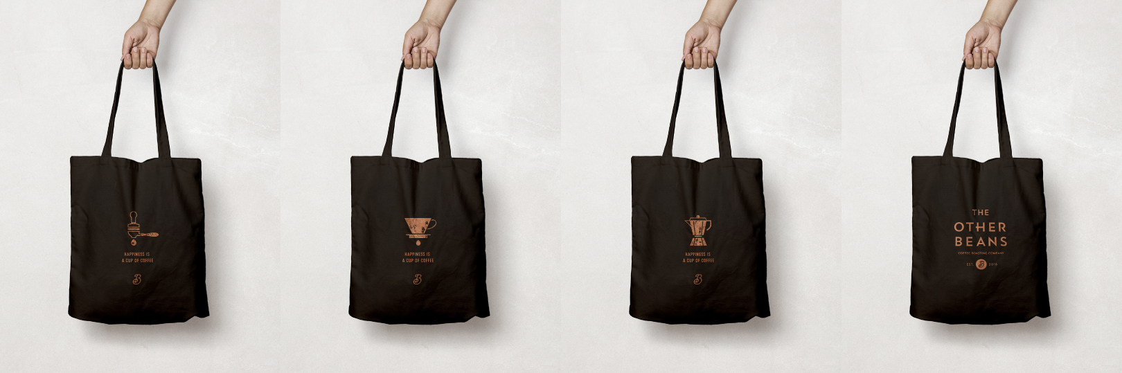
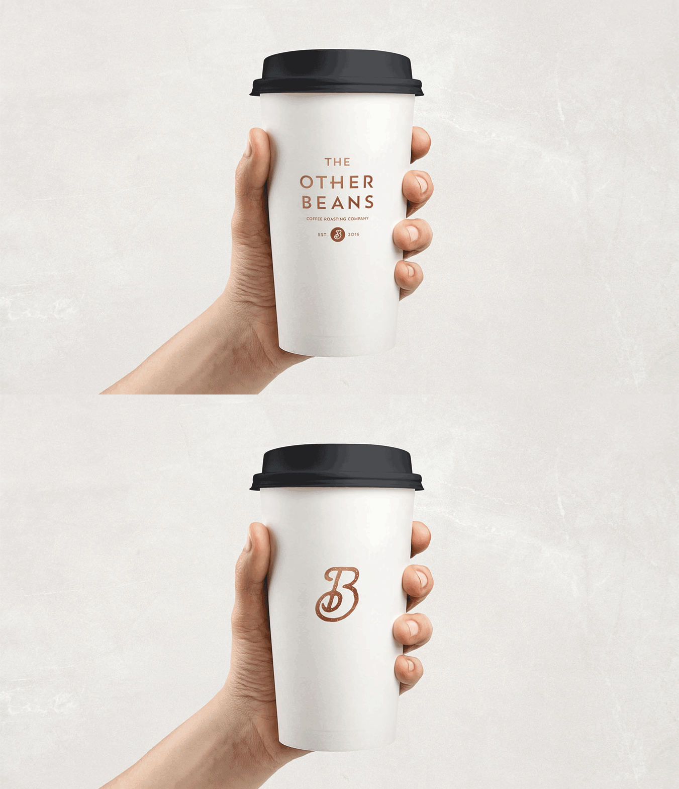
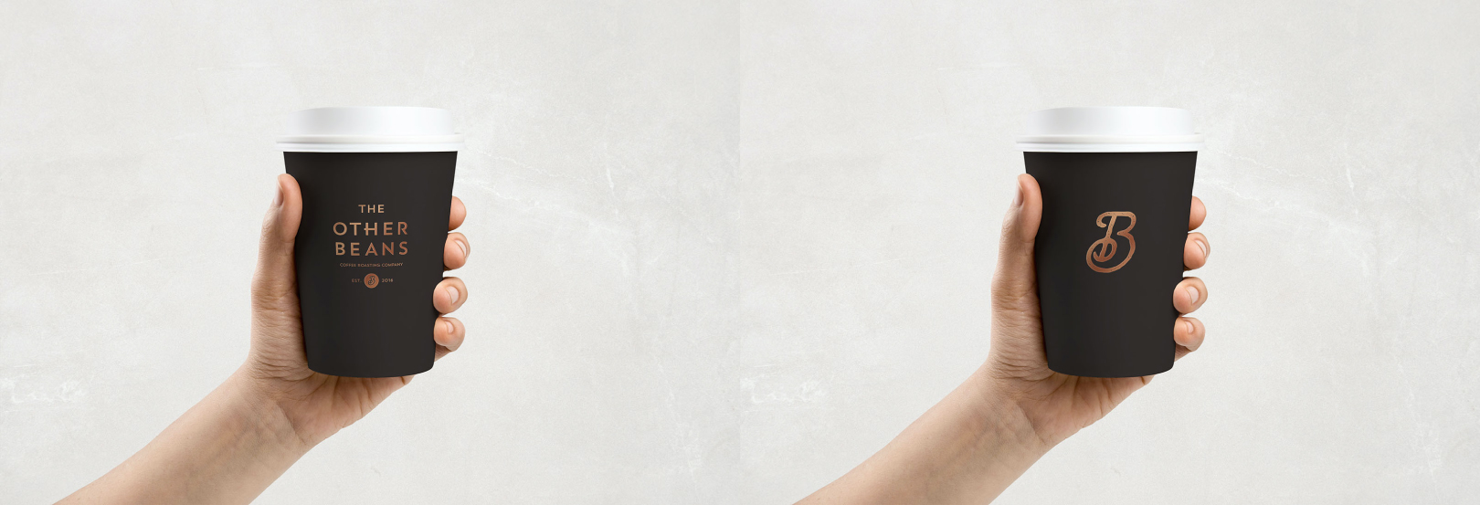
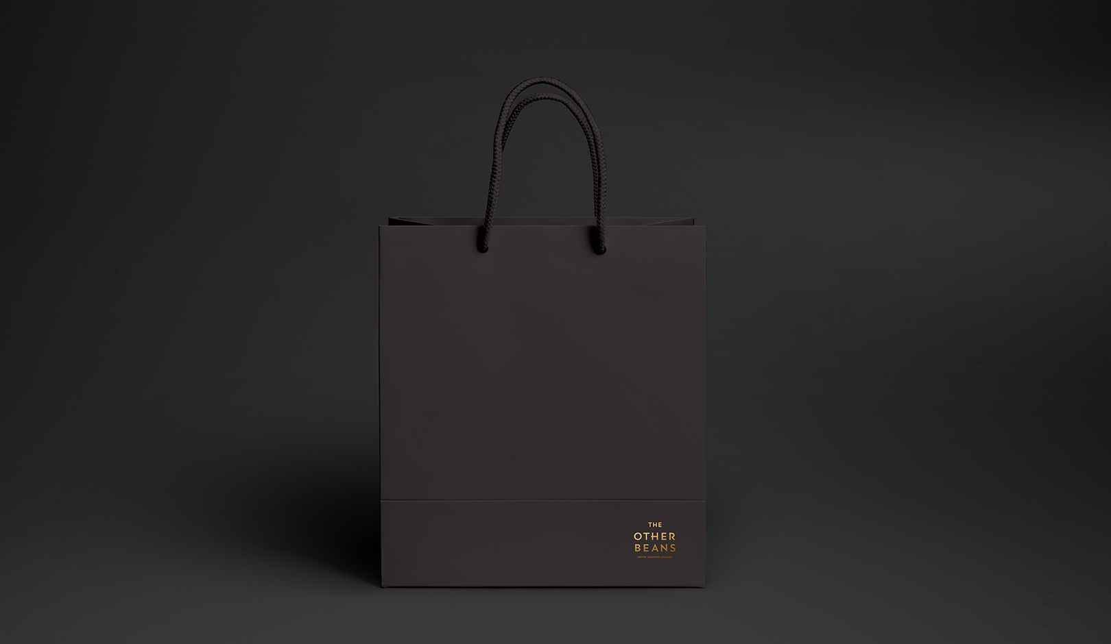
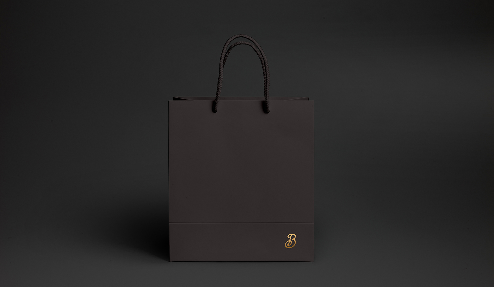
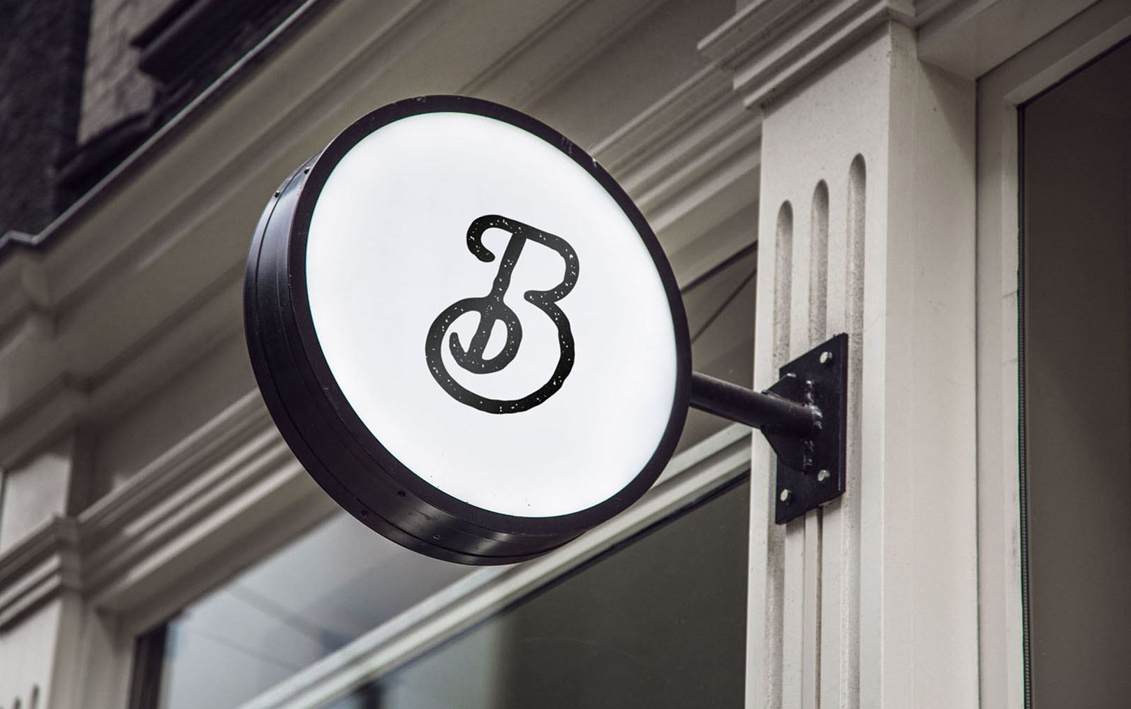
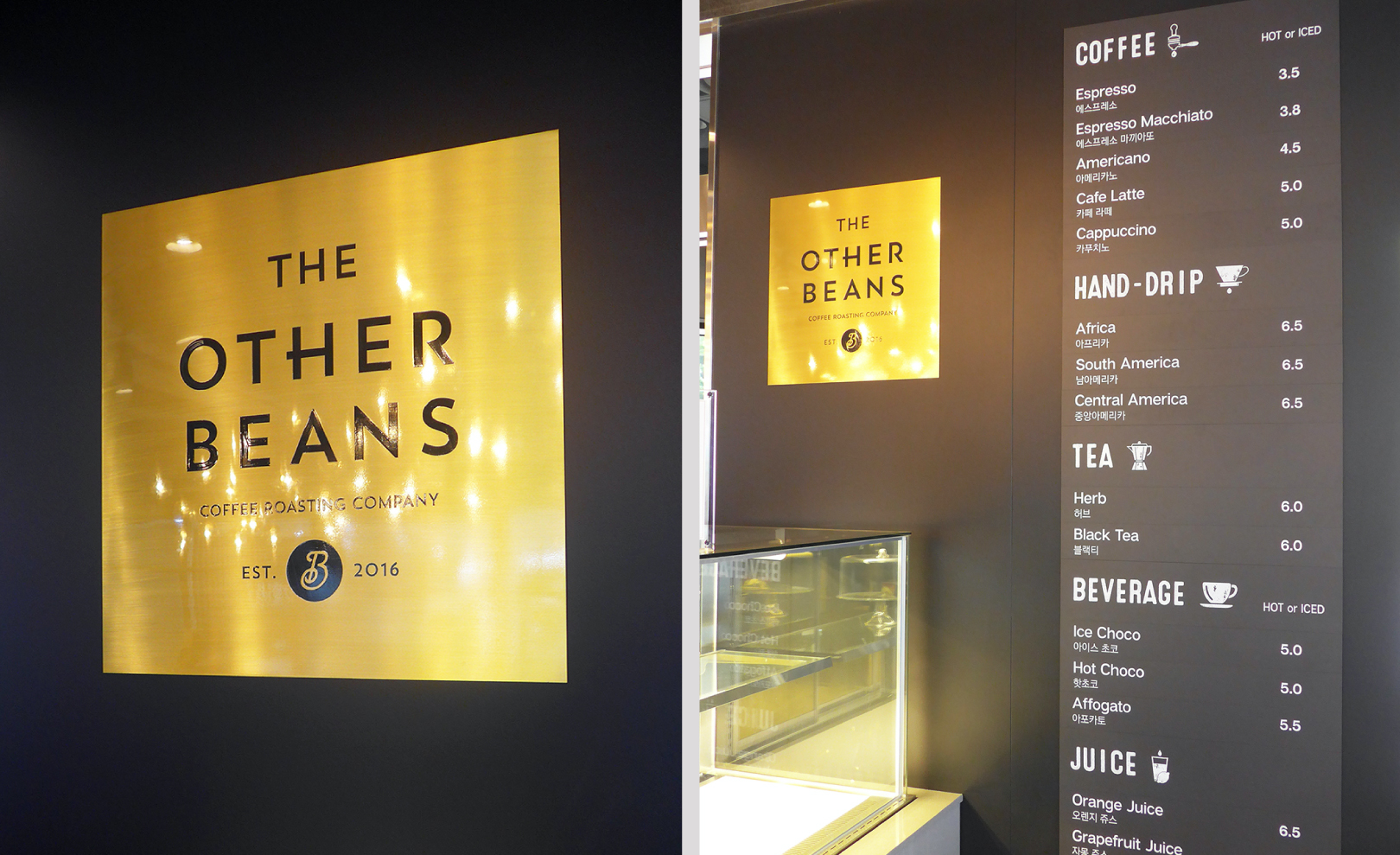
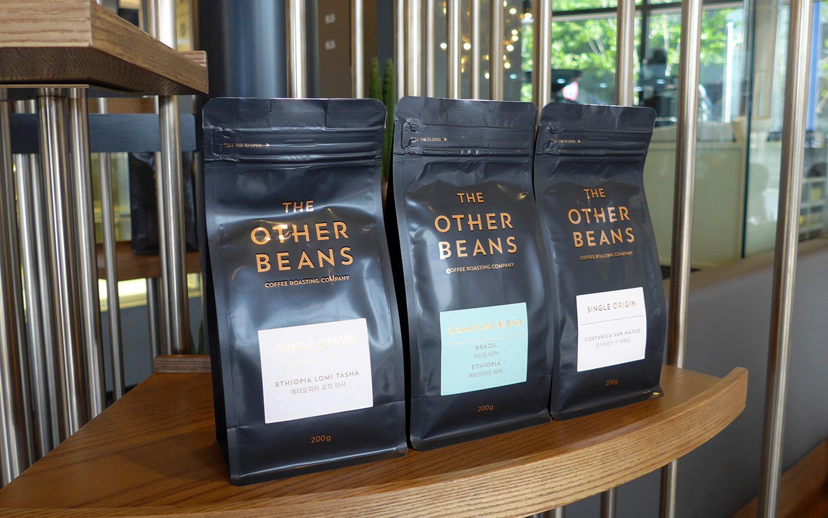
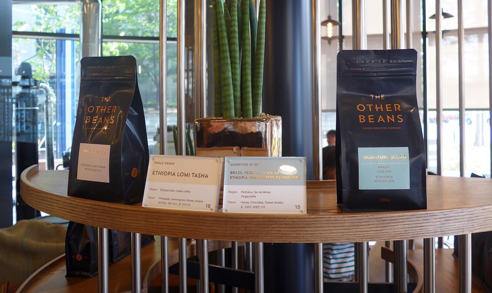
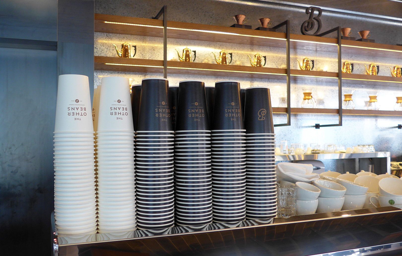
YNL Design created a simple but outstanding design by making the best of the identity concept, which is faithful to the basics, and delivering a premium café experience with the finest coffee beans. We made it stand out through simplicity and sophistication as a scalable design that can provide a consistent brand image from logo and symbol to bean packaging and sign design. The character ‘B’ embodied T.O.B, the initials of The Other Beans, and at the same time, it intended to be shown in the form of a bean. The overall coffee bean packaging exclusively used bronze and black, which look modern and sophisticated. Also, we emphasized the brand identity of a premium café, which is faithful to the basics, by using the texture of coffee beans.
YNL Design은 기본에 충실하면서도 최고급의 원두로 프리미엄 카페 경험을 전달한다는 아이덴티티 컨셉을 살려 심플하지만 돋보이는 디자인을 구축하였습니다. 로고 및 심볼, 원두 패키징, 사인 디자인까지 일관된 브랜드 이미지를 전달할 수 있는 확장성있는 디자인으로서, 심플하면서도 세련미가 돋보이도록 했습니다. 심볼 ‘B’에서는 THE OTHER BEANS의 이니셜인 T.O.B가 형상화되어있으며, 동시에 원두의 형태로 보여지도록 의도했습니다. 전체적인 원두 패키징에서 현대적이고, 세련미가 느껴지는 브론즈와 블랙을 전용색상으로 표현하였으며 커피 원두의 질감을 살려 기본에 충실한 프리미엄 카페의 브랜드 아이덴티티를 강조하였습니다.