PENNY LANE
Bringing a Healing Journey into Everyday Life

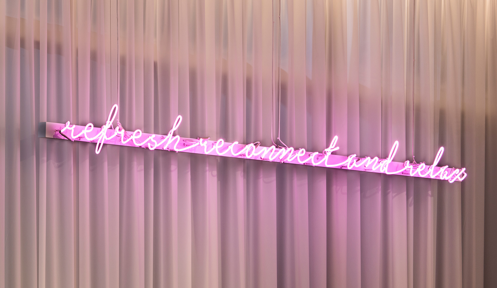
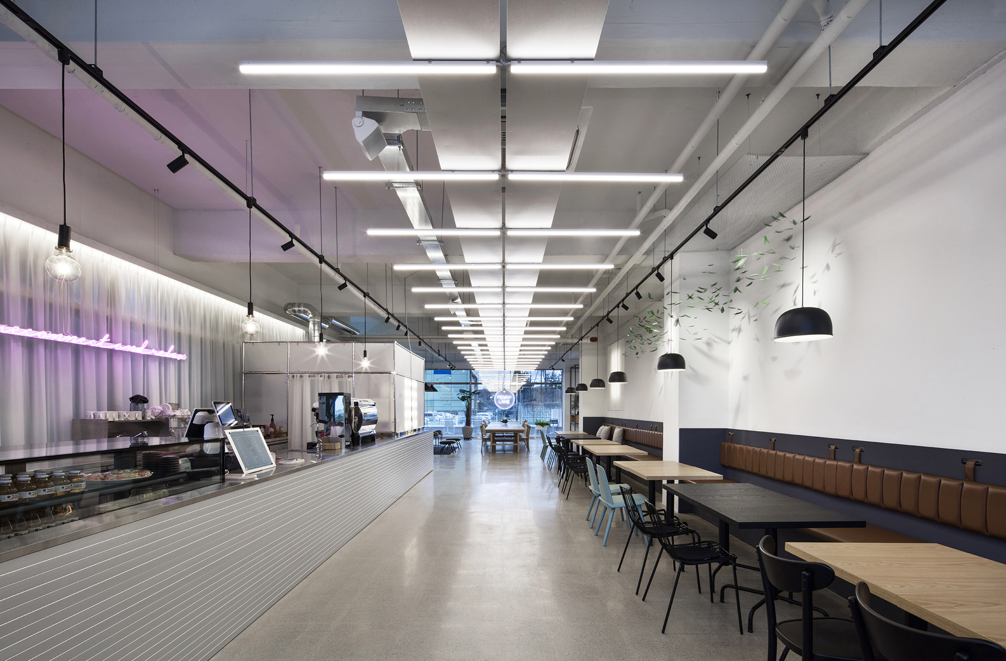
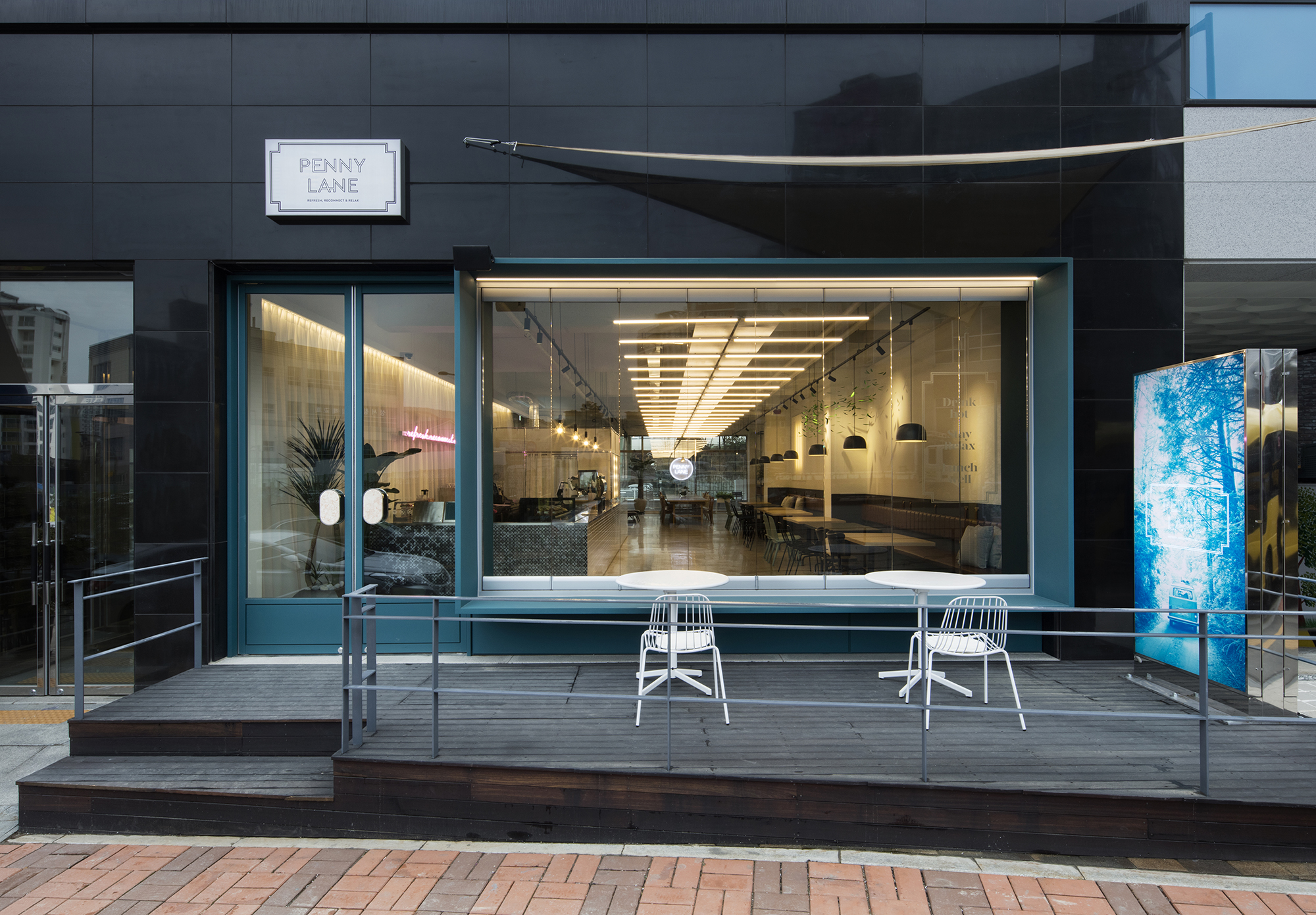
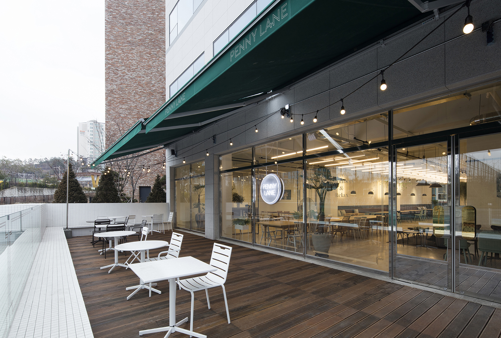
PENNY LANE is a coffee shop located in Gwanggyo. We intended to create a comfortable resting and healing space with the slogan, "REFRESH, RECONNECT & RELAX," and a charming brand image. The client wanted to add sincerity and distinctiveness to the café he opened and asked for emotional branding that conveys these qualities to customers.
페니 레인은 광교에 위치한 커피전문점으로 REFRESH, RECONNECT & RELAX 라는 슬로건으로 공간 내에서 편안한 휴식과 힐링을 주는 공간과 매력적인 브랜드 이미지를 만들고자 했습니다. 클라이언트는 자신이 만든 페니 레인 카페에 진정성과 차별성이 더해졌으면 하였고 마음으로 전하는 감성적인 브랜딩을 의뢰하였습니다.
YNL Design tried to convey a story on an attractive theme, taken from the famous Beatles' song 'PENNY LANE.' We intended to build a differentiated brand image by expressing various elements that may be unfamiliar but makes us feel the value of a fascinating lifestyle.
YNL Design은 비틀즈의 노래인 ‘PENNY LANE’에서 모티브를 삼아 매력적인 컨셉으로 스토리텔링을 전달하려 했습니다. 낯설지만, 매력적인 라이프스타일의 가치를 느낄 수 있는 다양한 요소들을 표현하여 차별화된 브랜드 이미지를 구축하고자 했습니다.
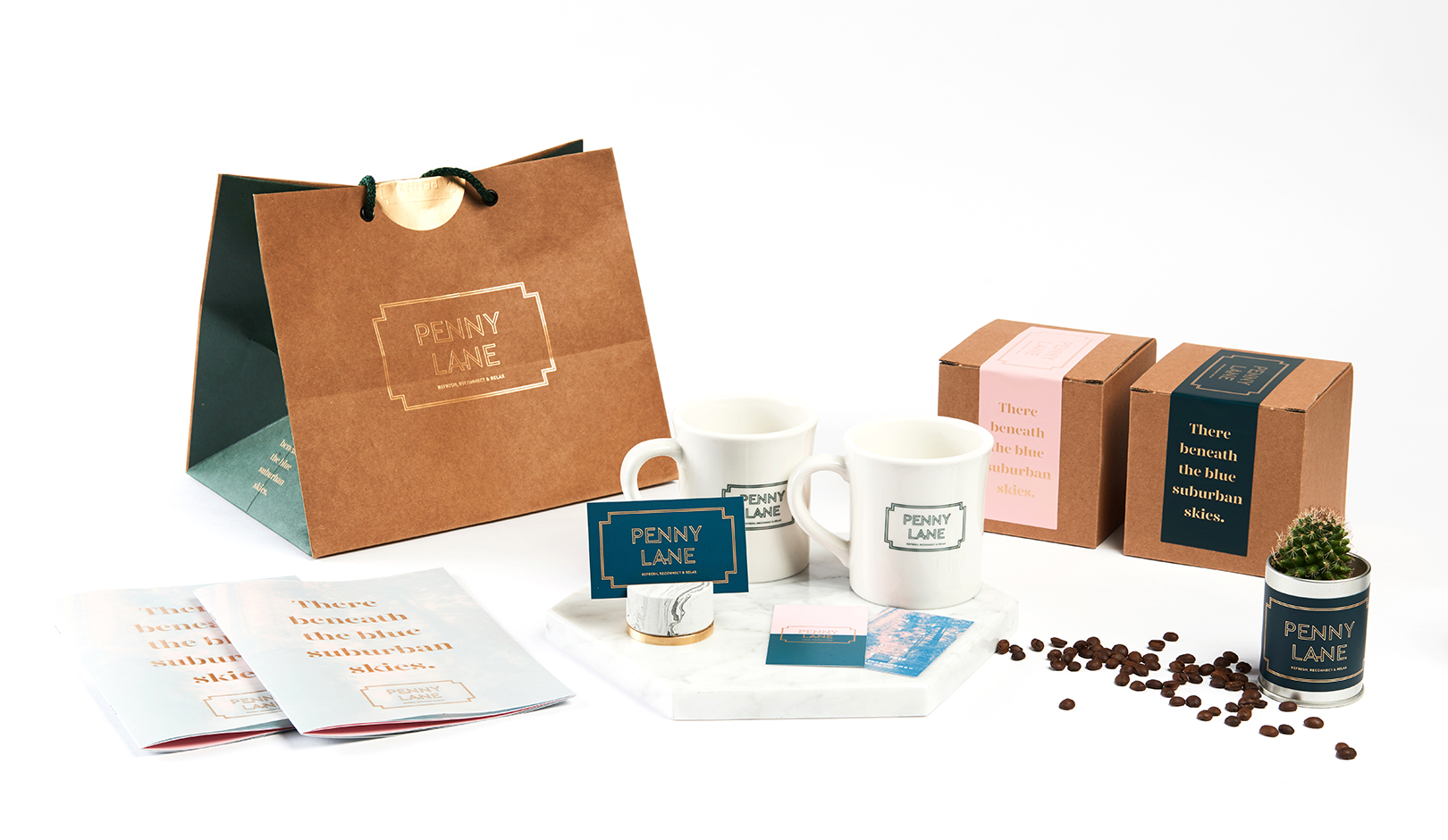
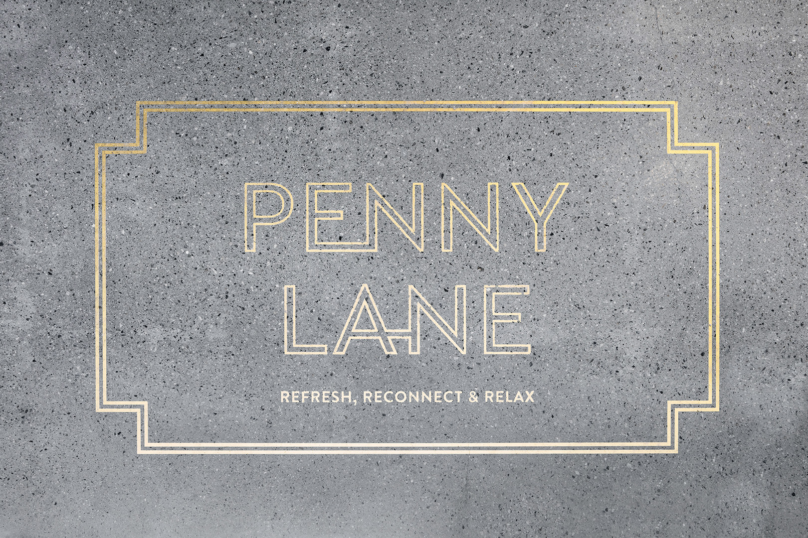
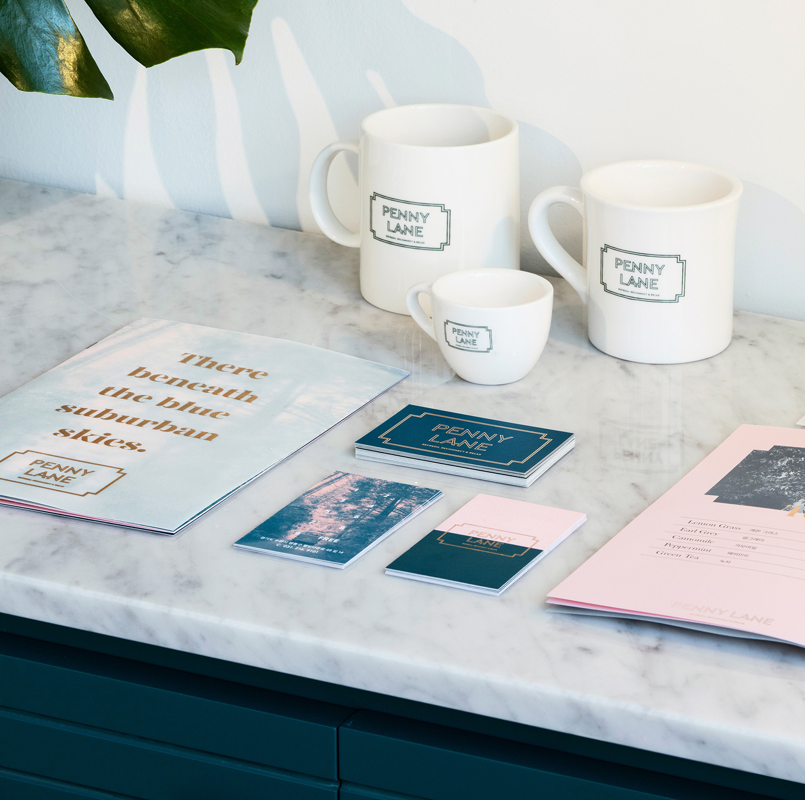
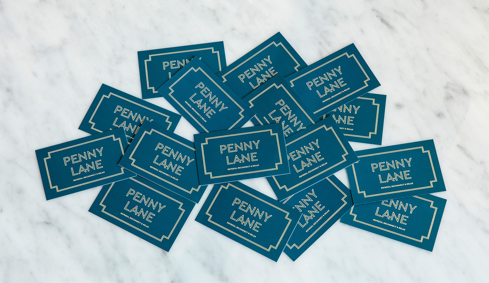
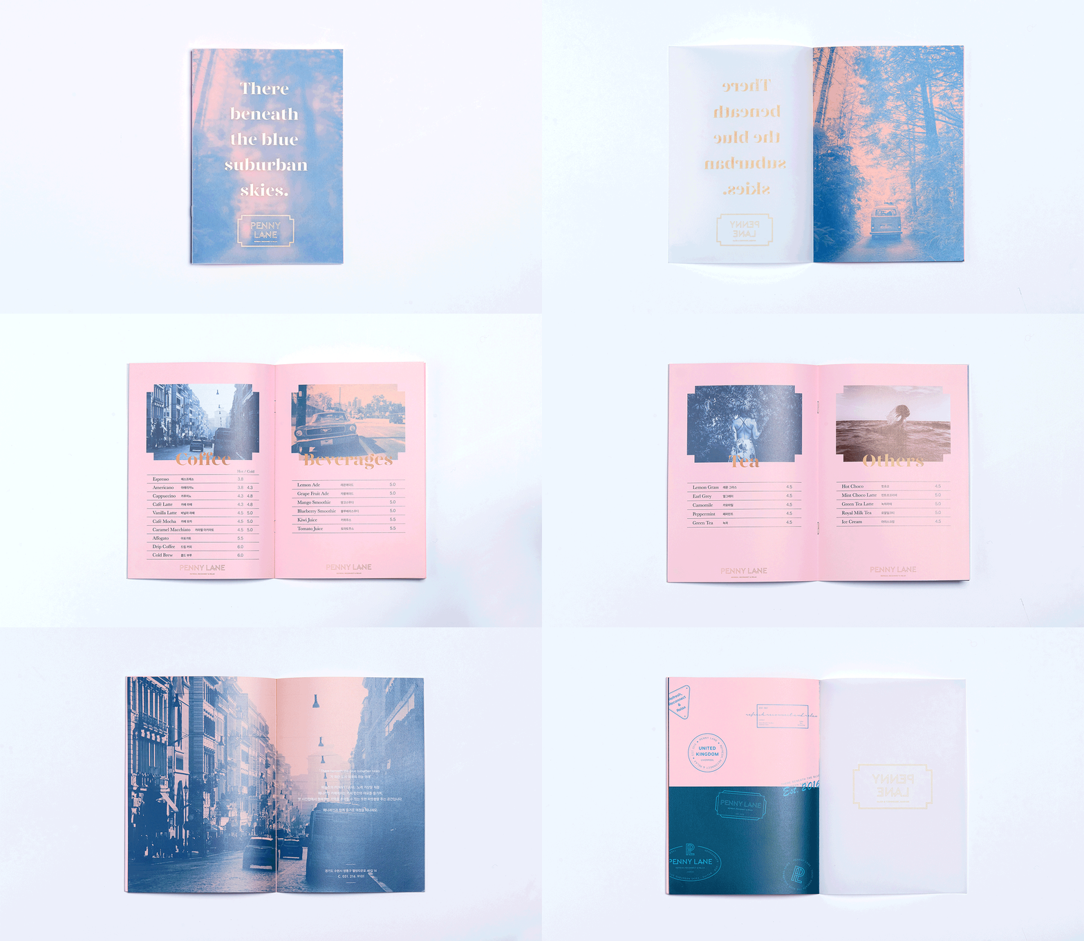
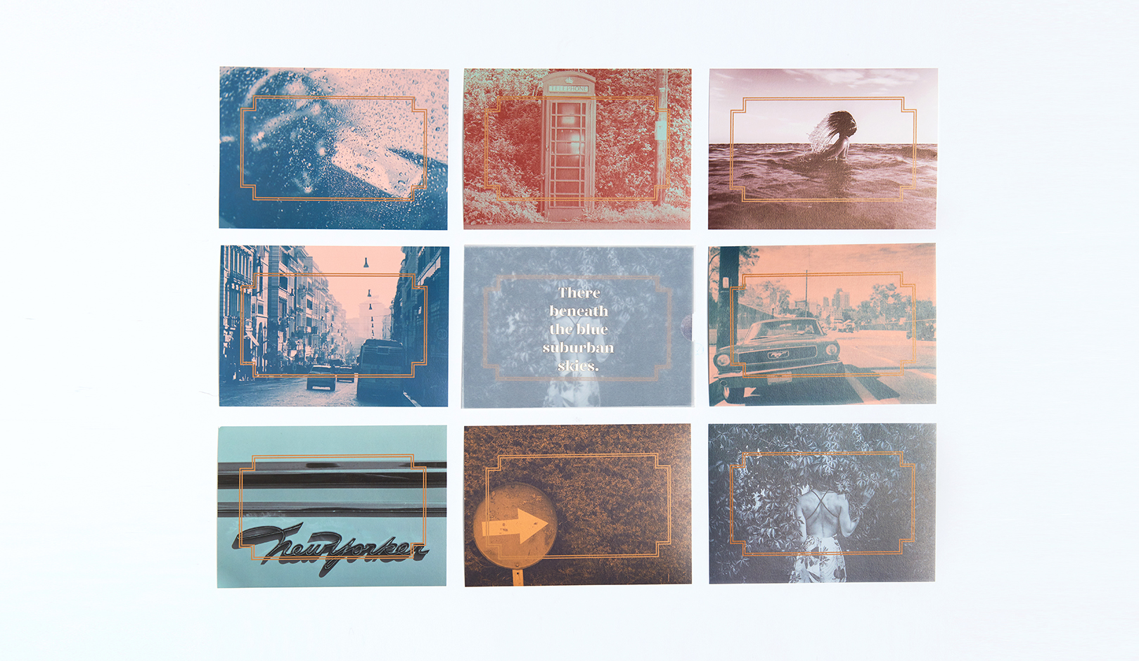
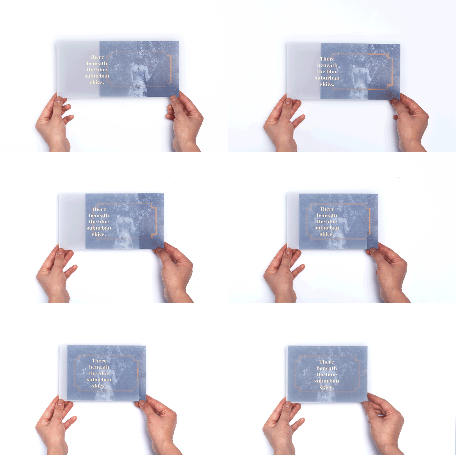
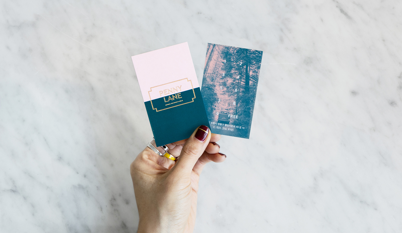
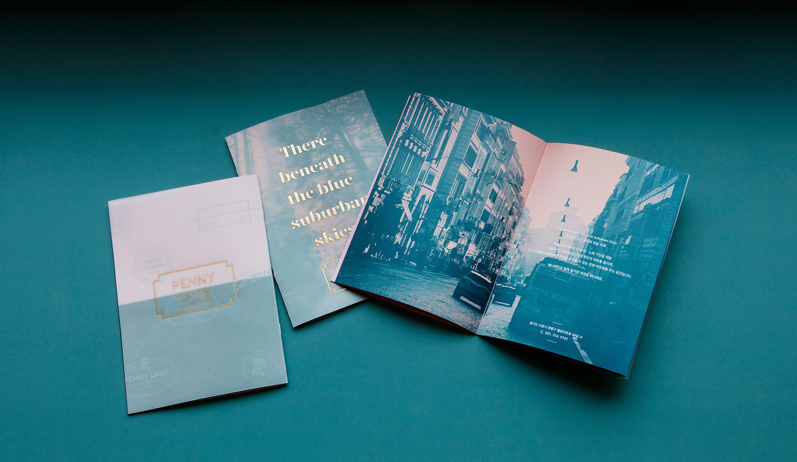
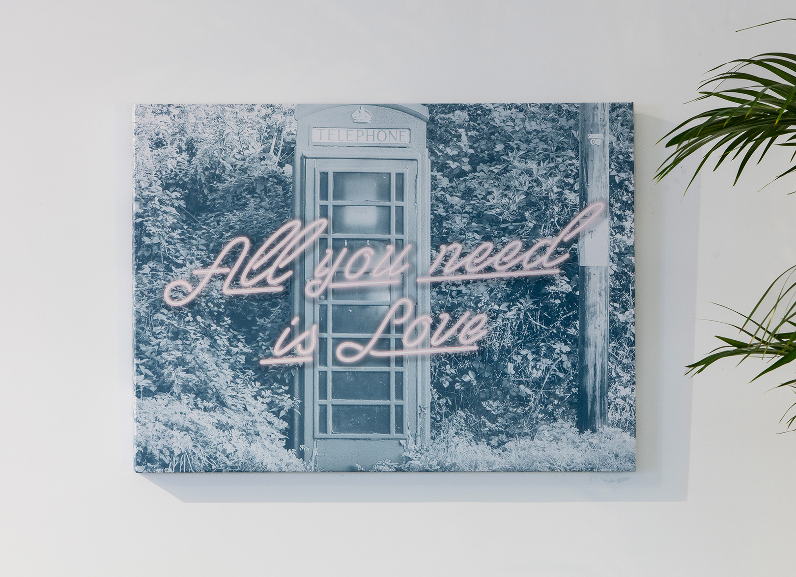
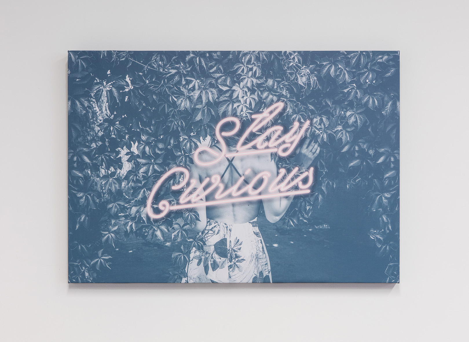
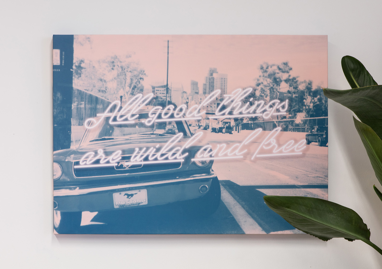
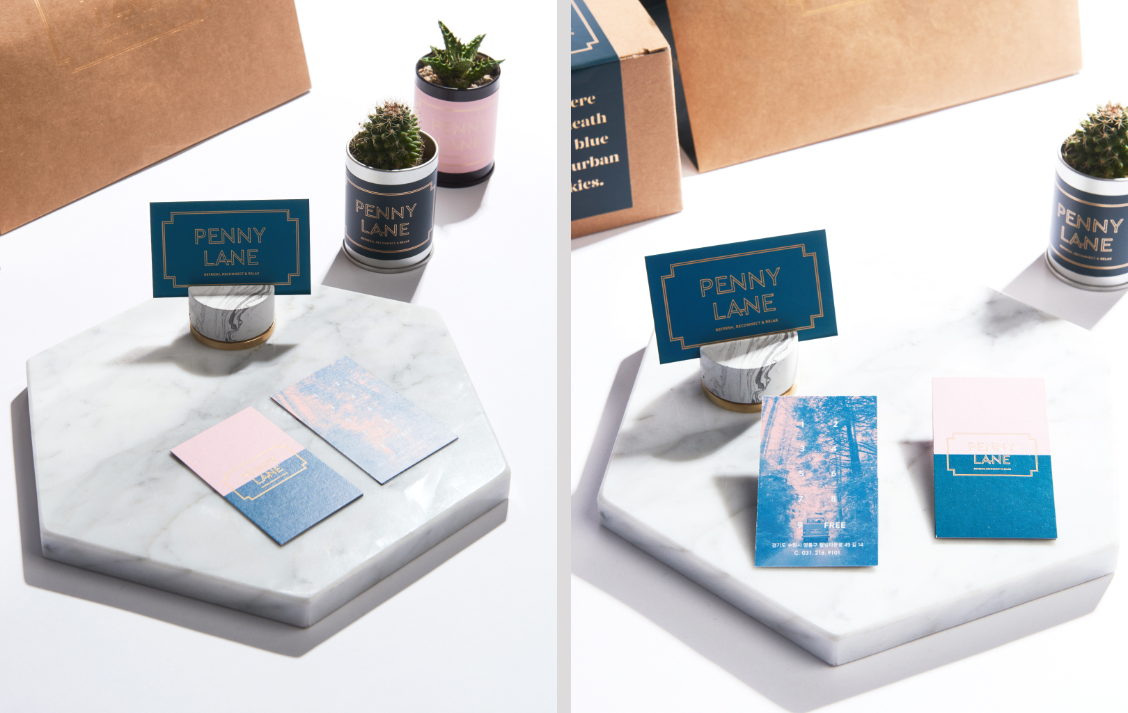
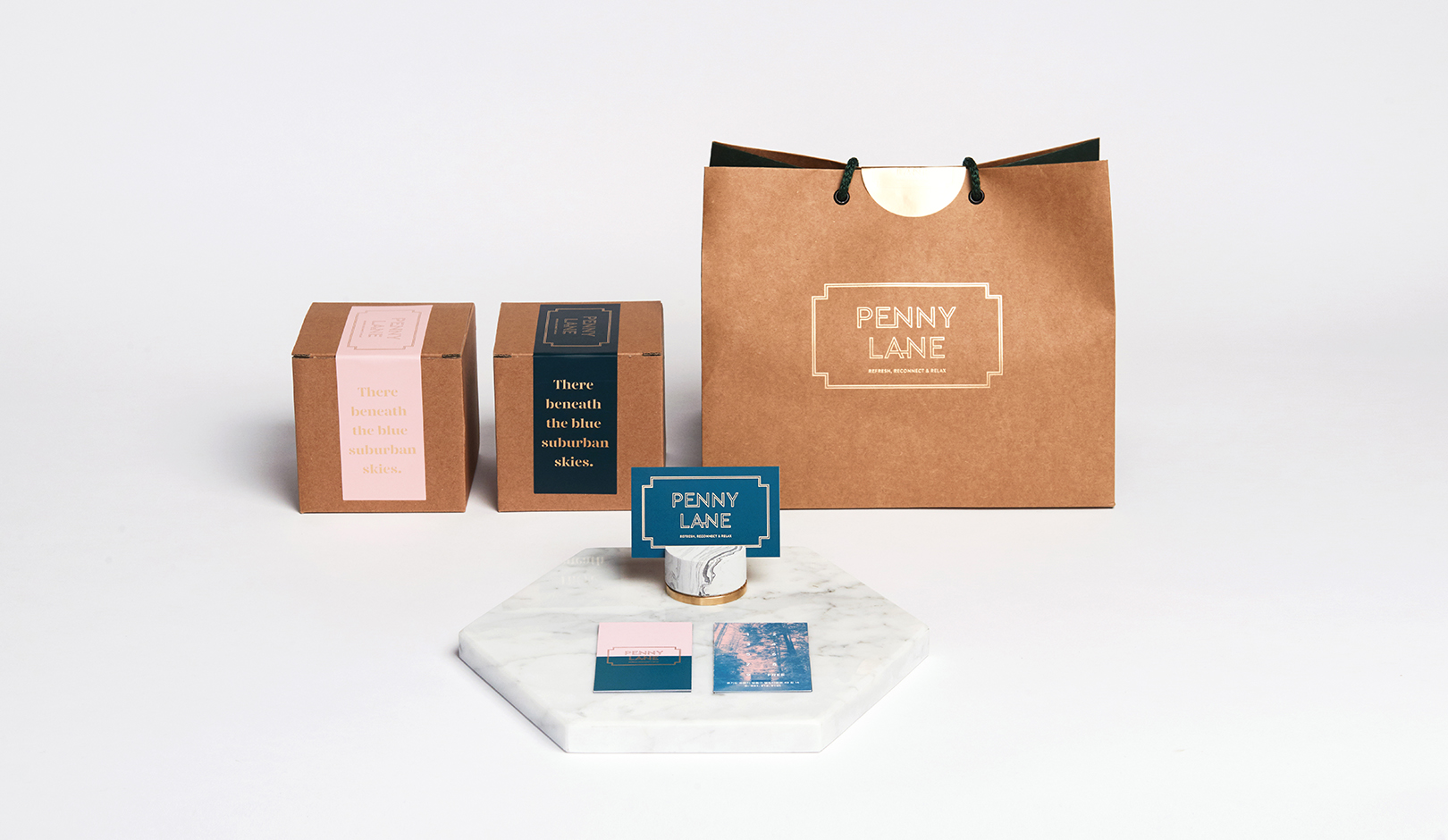
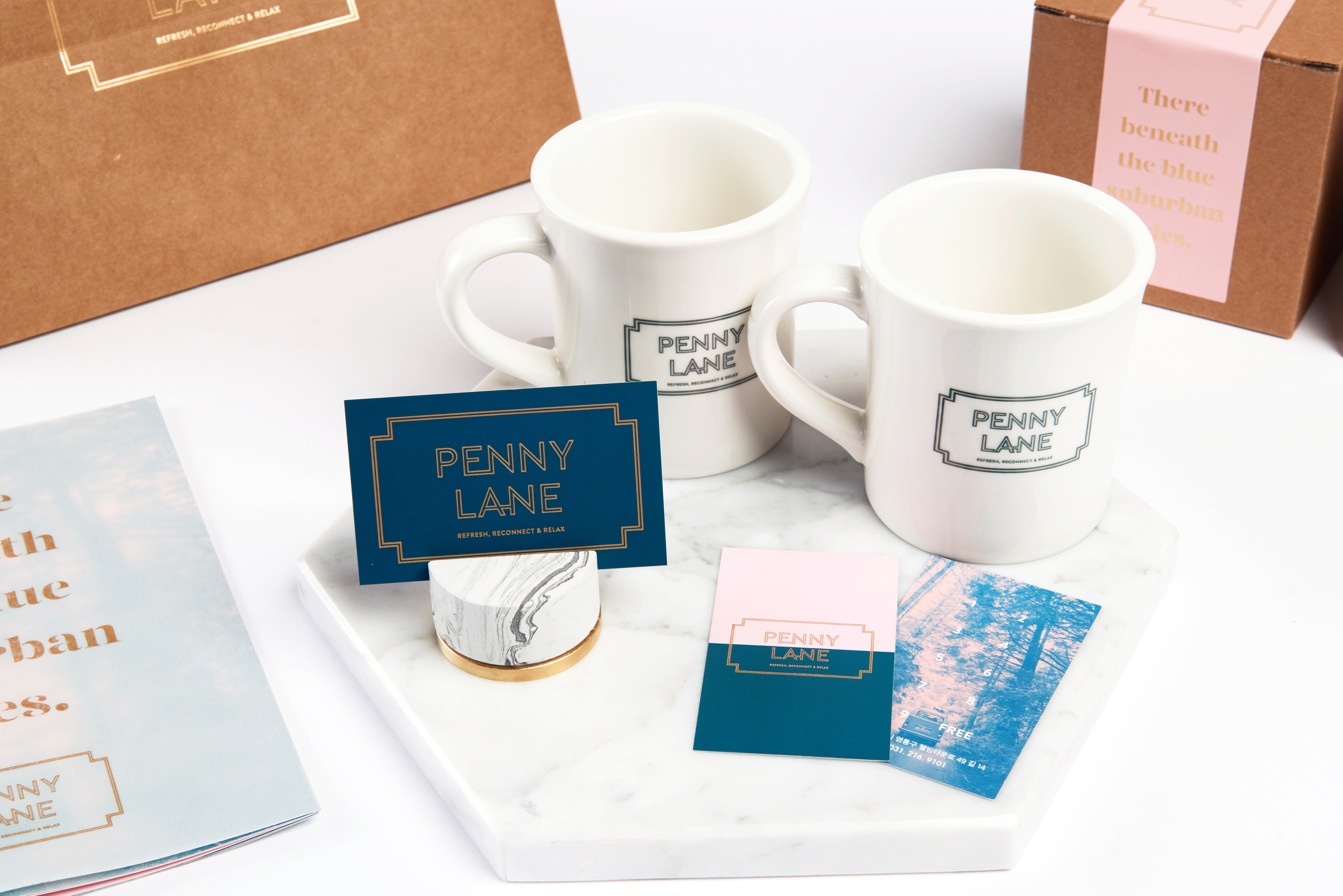
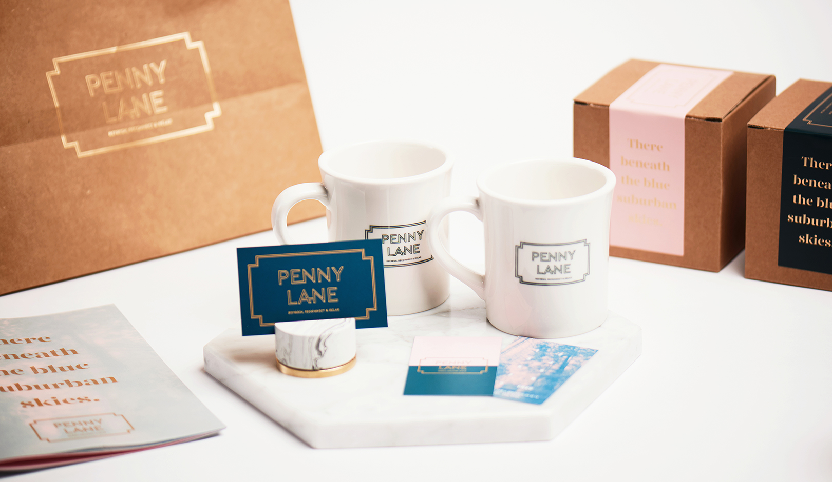
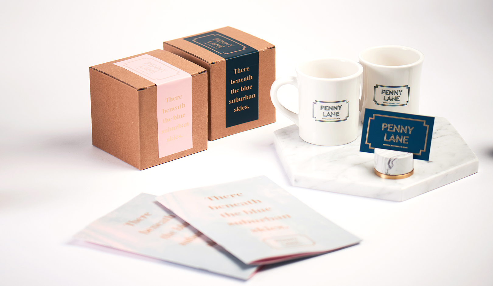
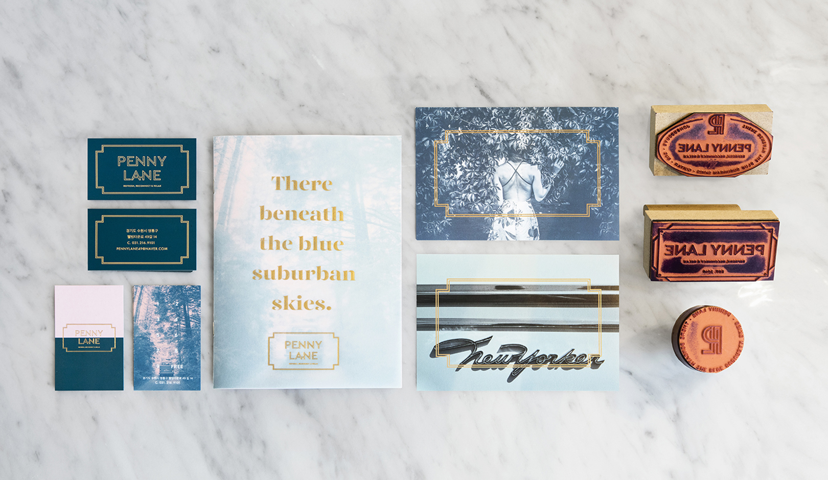
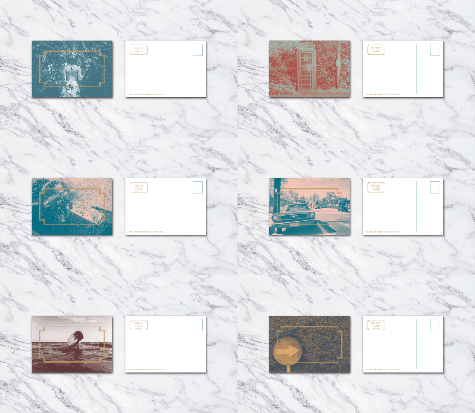
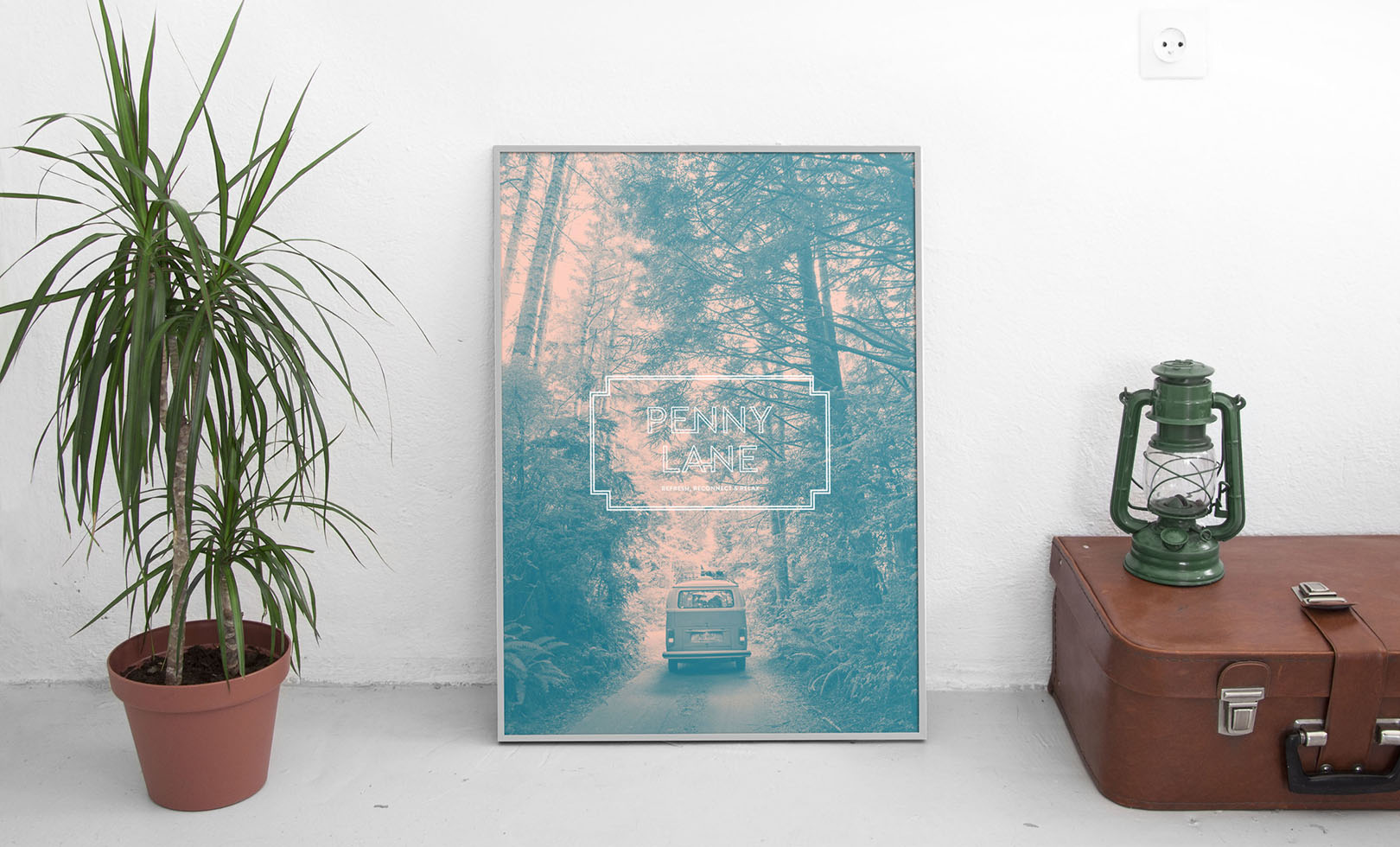
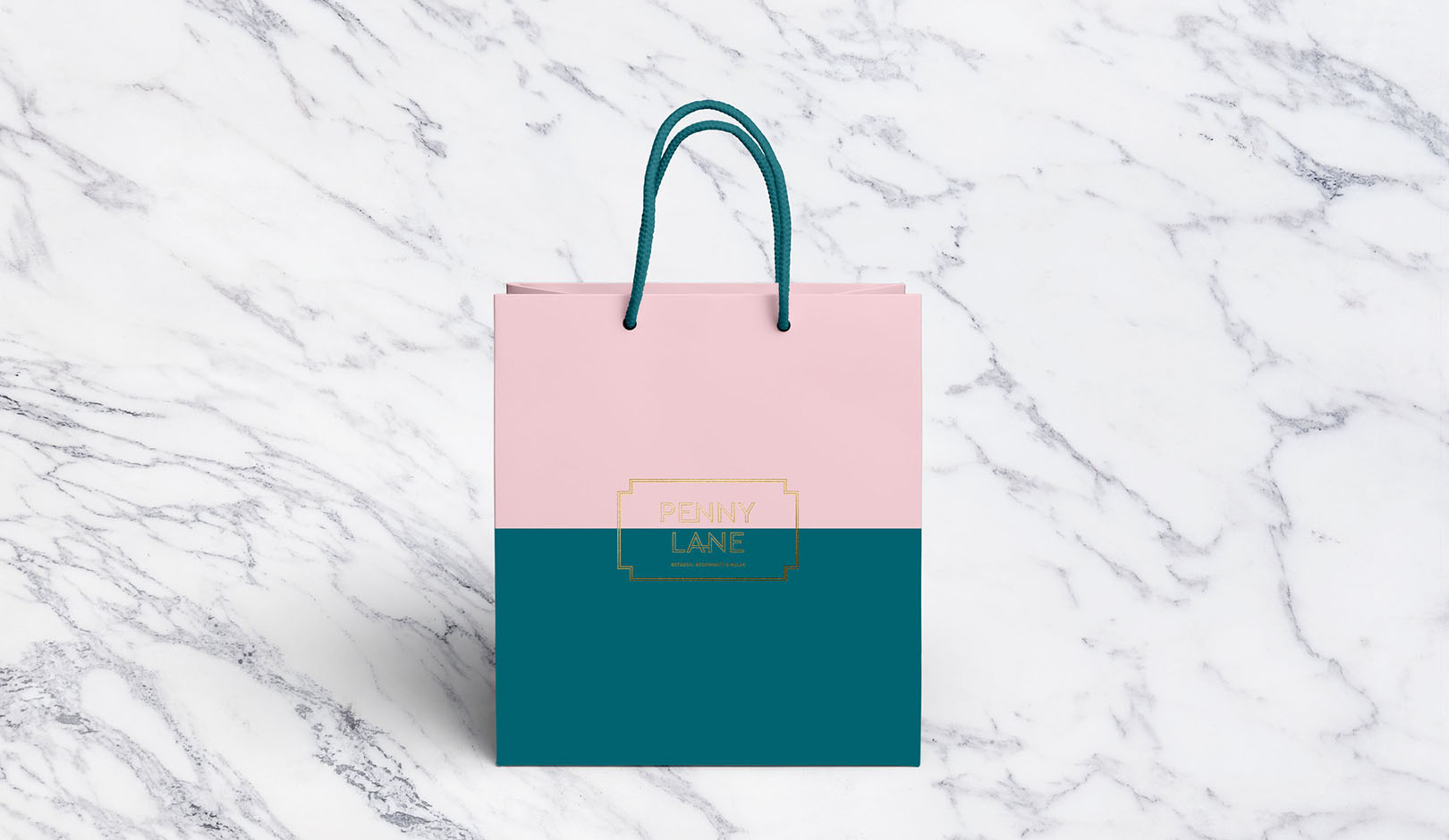
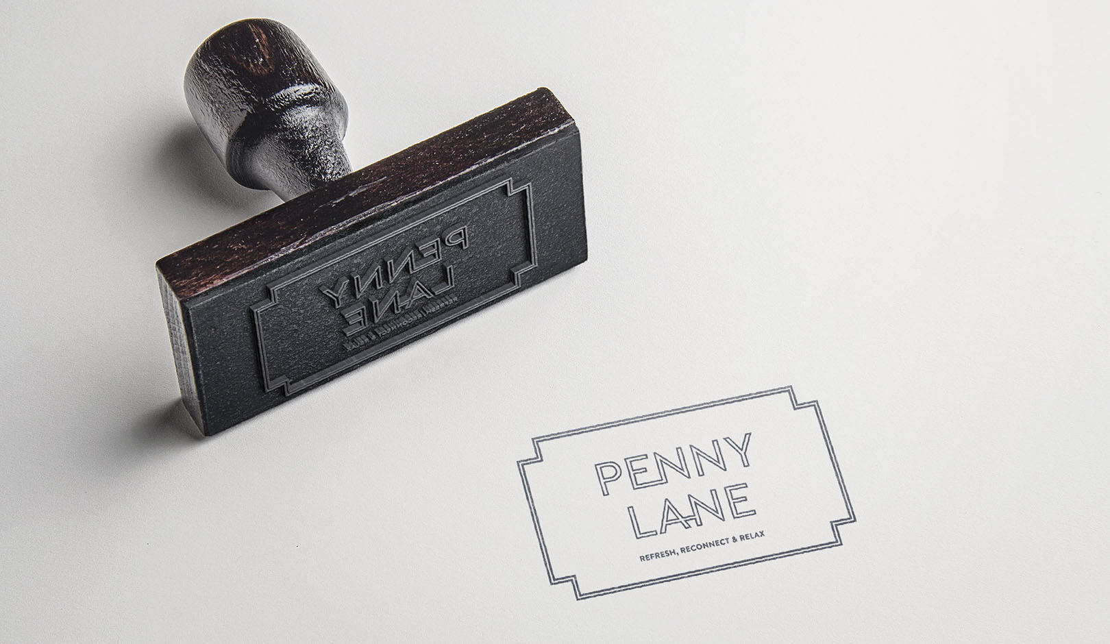
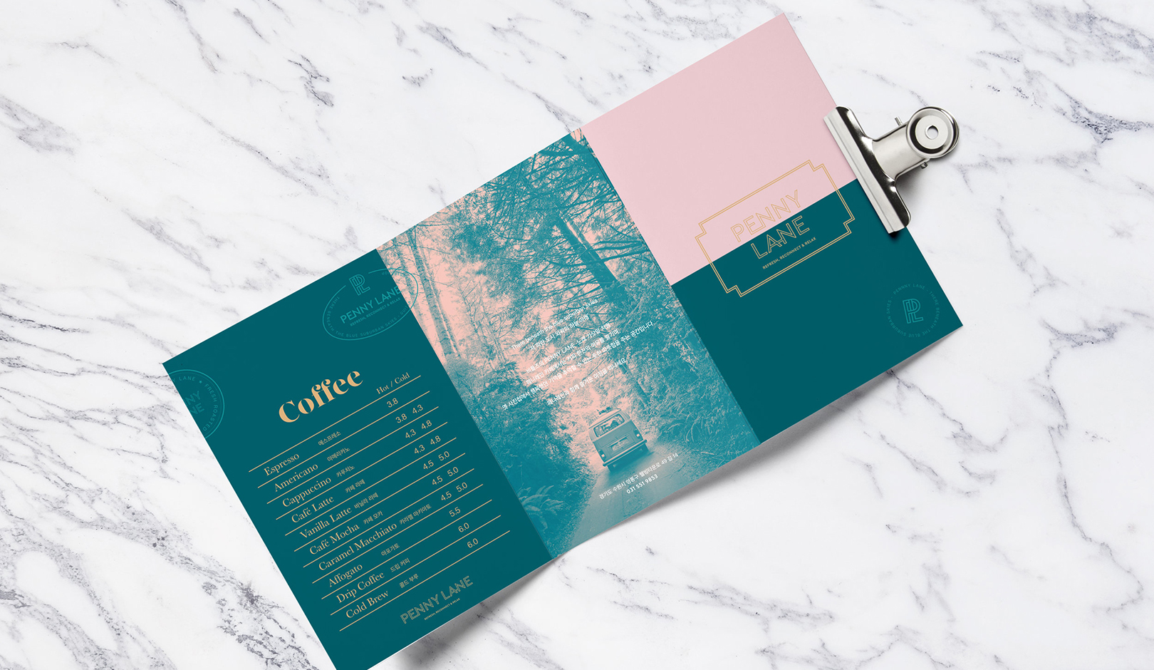
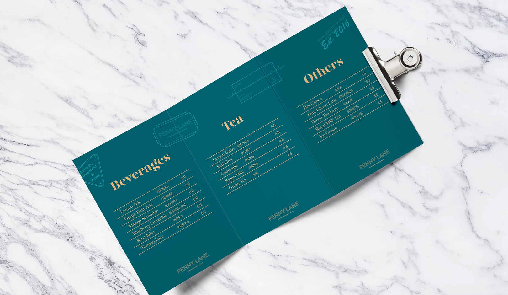
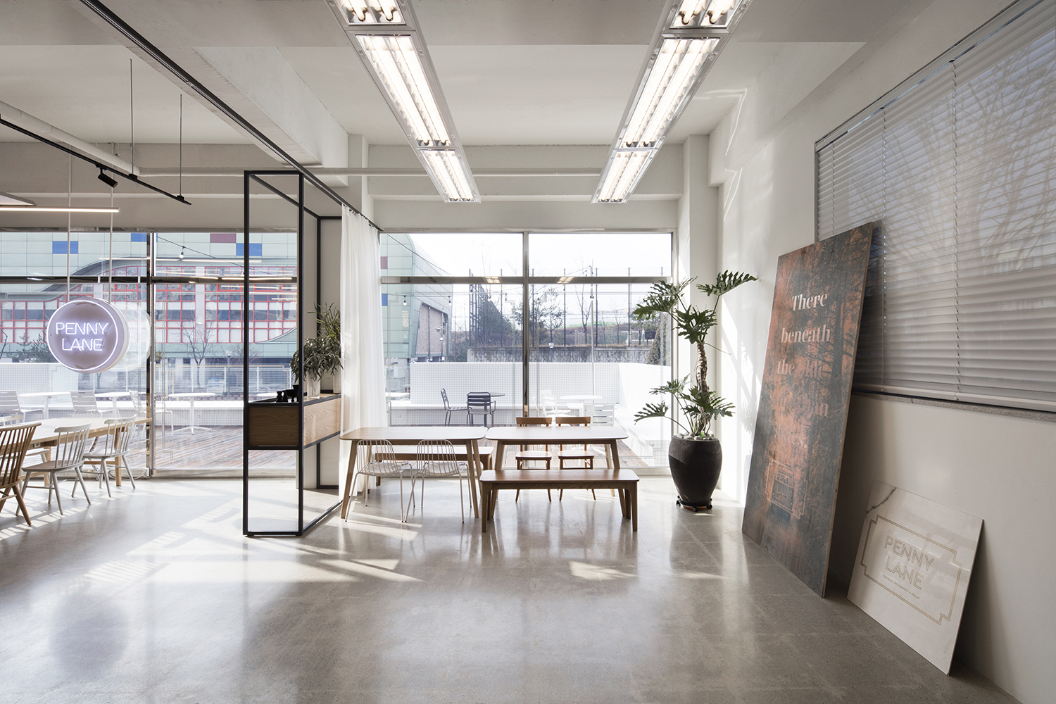
Inspired by the Beatles' song, PENNY LANE's logo was developed on the theme of street signs in the UK, where John Lennon lived during his childhood. It was derived and applied to operational supplies, forms, and packages where it is visually shown to develop a unified design. By metaphorically expressing the lyrics from PENNY LANE, ‘There beneath the blue suburban skies,' on the menu and applying nature-friendly photos, we incorporated the concept of “a healing trip to the outskirts” into the overall visual identity. Wall poster designs and postcards with images differentiated the brand as emotional visual elements that touch the hearts of consumers.
비틀즈 노래에서 영감을 받아 개발된 페니 레인의 로고는 존 레논이 어렸을때 살았던 영국 거리 사인을 모티브 삼아 개발되었습니다. 이를 파생시켜 시각적으로 보여지는 운영 용품, 서식류, 패키지류등에 적용시켜 통일성 있는 디자인으로 개발하였습니다. 페니레인 노래에 나오는 ‘There beneath the blue suburban skies’라는 가사를 은유적으로 메뉴지에 표현하고 자연친화적인 사진을 적용하여 “외곽으로 가는 힐링의 여행”이라는 컨셉을 전반적인 비주얼 아이덴티티에 담았습니다. 벽면 포스터 디자인과 사진 엽서는 소비자의 마음을 건드리는 감성적인 비주얼 요소가 되어 브랜드를 차별화시킵니다.