STATION NEO
A Platform for Growth, Connection and Possibility
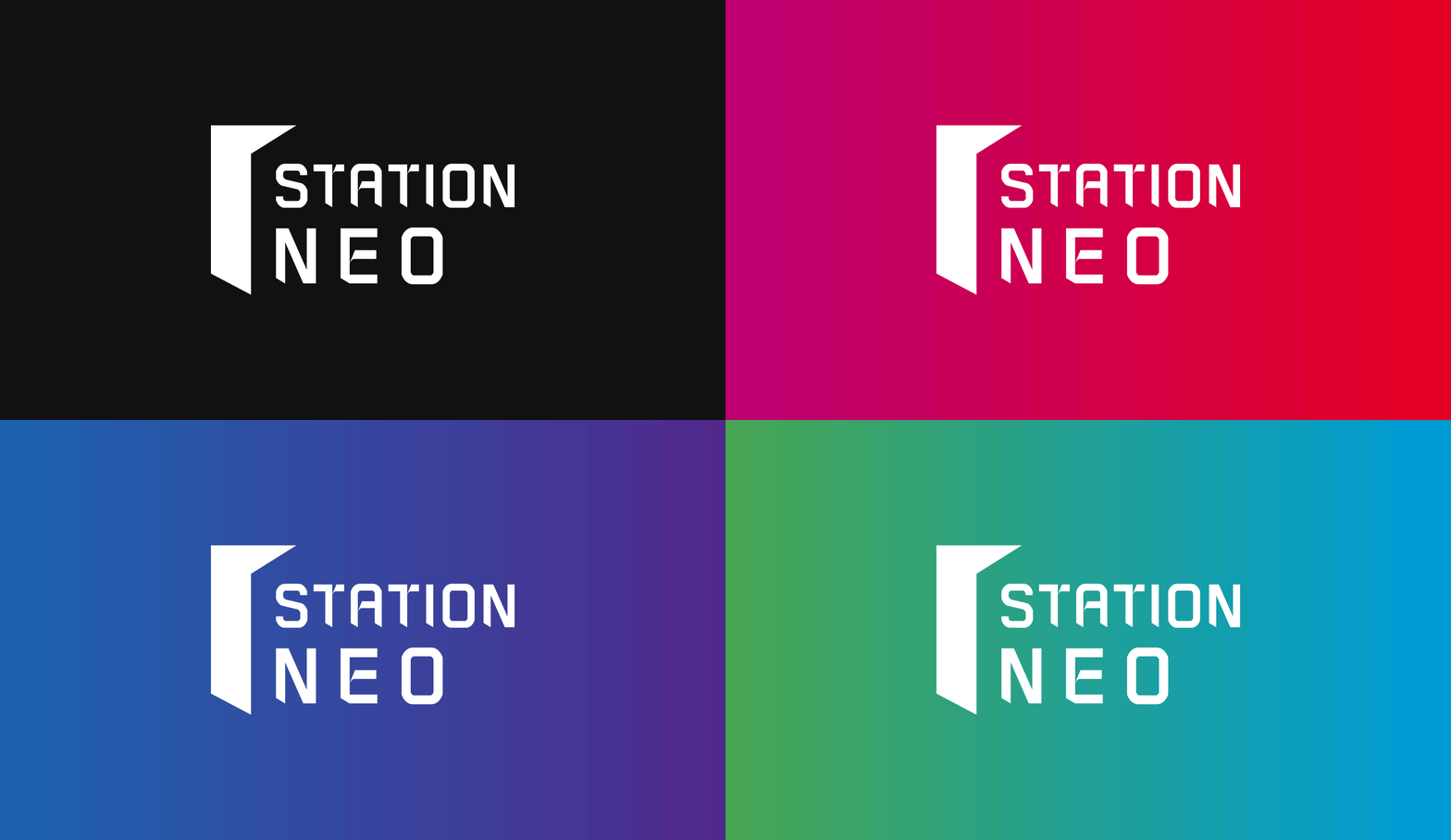
STATION NEO is a space to realize values for entrepreneurs and space for fostering entrepreneurs and collaboration with experts in each startup field to produce innovative entrepreneurs. As a shared office for entrepreneurs, the brand image that STATION NEO pursues is growth, vision, and value realization. STATION NEO aims to provide a platform to ‘Share,’ ‘Fuse,’ and ‘Shift’ by connecting each entrepreneur with experts and partners in each field.
스테이션 니오는 창업가들을 위한 가치실현 공간이며, 혁신형 창업가 육성을 위한 창업 분야별 전문가들과 함께 하는 창업가 육성 및 협업 공간입니다. 스타트업 창업가들을 위한 공유오피스로서 스테이션니오가 추구하는 브랜드 이미지는 성장, 비젼, 가치실현입니다. 스테이션 니오는 각 창업가들에게 분야별 전문가 및 파트너사를 연결하여 ‘공유’ (Share), ‘융합’ (Fuse), ‘도약’(Shift)의 장을 마련한다는 목표를 갖고 있습니다.
YNL Design aims to develop a consistent brand identity to create a tangible brand image out of intangible brand values of STATION NEO: growth, vision, and value realization and expand these to applied design and sign system. Inspired by the brand name of STATION NEO, meaning the first stop for entrepreneurs in realizing their values and a place to set the direction for their goal, we intended to express its identity as a partner and platform to help various companies do business with a future-oriented image.
YNL Design은 스테이션 니오에 성장, 비젼, 가치실현이라는 무형의 브랜드 가치를 유형의 브랜드 이미지로 만들기 위해 일관성 있는 브랜드 아이덴티티를 개발하고 이를 응용 디자인, 사인시스템으로 확장하는 것을 목표로 삼았습니다. 창업가들의 가치실현을 위한 첫 정거장이자 목적지를 향한 방향을 설정하는 곳이라는 스테이션니오의 브랜드 네임에서 착안하여 다양한 기업의 비즈니스를 돕는 파트너이자 플랫폼으로서의 정체성을 미래지향적인 이미지로 표현하고자 했습니다.
YNL Design developed the initial concept and logotype based on STATION NEO's slogan, 'Guide to faster path' ('Guide to a world where entrepreneurs can realize their values.'). By representing the slogan, 'Guide to a world where entrepreneurs can realize their values,' we developed a conceptual symbol where the door opens, and the light shines through it. The meaning of the door shown in the logo is to 'share,' that of the concept of opening is to 'fuse,' and that of the light shining through it is to 'shift.' Also, the shape of the oblique line in the symbol was applied to the entire BI and design system to visualize STATION NEO's unique future-oriented and sophisticated tone and manner.
YNL Design은 ‘Guide to faster path’ (‘창업가의 가치실현이 가능한 세계로 안내합니다.’)라는 스테이션니오의 슬로건을 모티브 삼아 초기 컨셉과 로고타입을 개발하였습니다. 창업가의 가치 실현이 가능한 세계로 안내한다는 의미를 담아 문이 열리고 빛이 보이는 컨셉슈얼한 심볼을 개발하였습니다. 로고에서 보여지는 문의 의미는 즉 ‘공유’ (share)를 뜻하며 열리다는 컨셉은 ‘융합’(Fuse)을, 빛이 나오는 형상은 ‘도약’(Shift)의 의미를 담고 있습니다. 또한 심볼에서 보여지는 사선(oblique)의 라인형태를 전체적인 BI와 응용 디자인 시스템에 적용하여 스테이션니오만의 미래지향적이고 세련된 톤앤매너를 시각화하였습니다.


