PRIOR Tax Corporation
Putting Your Business First

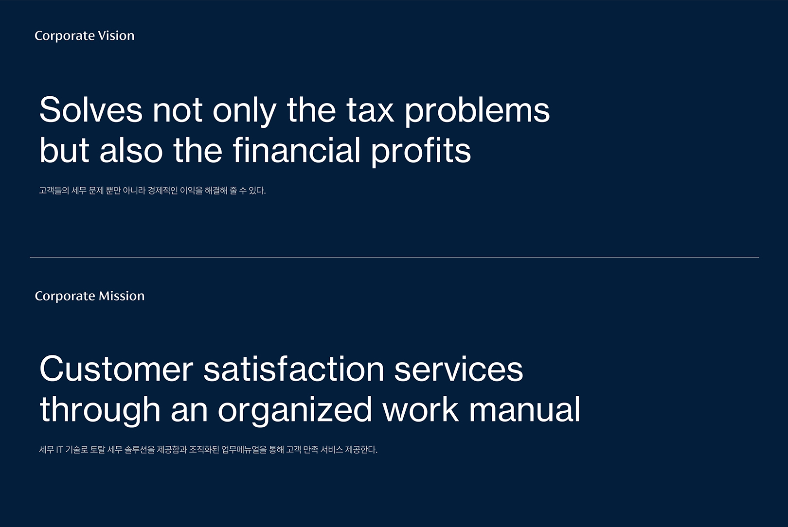
PRIOR is a corporation that provides all-in-one consulting services. It has established affiliates in various fields ranging from tax to law, patent, appraisal, labor, accounting, real estate brokerage, IT, and entertainment. It provides customized consulting services according to the customer's situation to increase profits and form a comprehensive network-based on professionalism, promptness, and reliability to provide a one-stop service that meets customer needs.
PRIOR 프라이어는 All-in-One 컨설팅 서비스를 제공하는 법인 기업으로 세무, 법무, 특허, 감정평가, 노무, 회계, 부동산 중개, IT 그리고 엔터테인먼트까지 다양한 계열사를 구축하고 있습니다. 고객의 상황에 맞게 맞춤 컨설팅 서비스를 제공하여 실질적인 이익을 증가시키고 전문성, 신속성, 신뢰성을 바탕으로 종합 네트워크를 형성하여 원스톱으로 고객이 원하는 니즈를 충족시키는 서비스를 제공합니다.
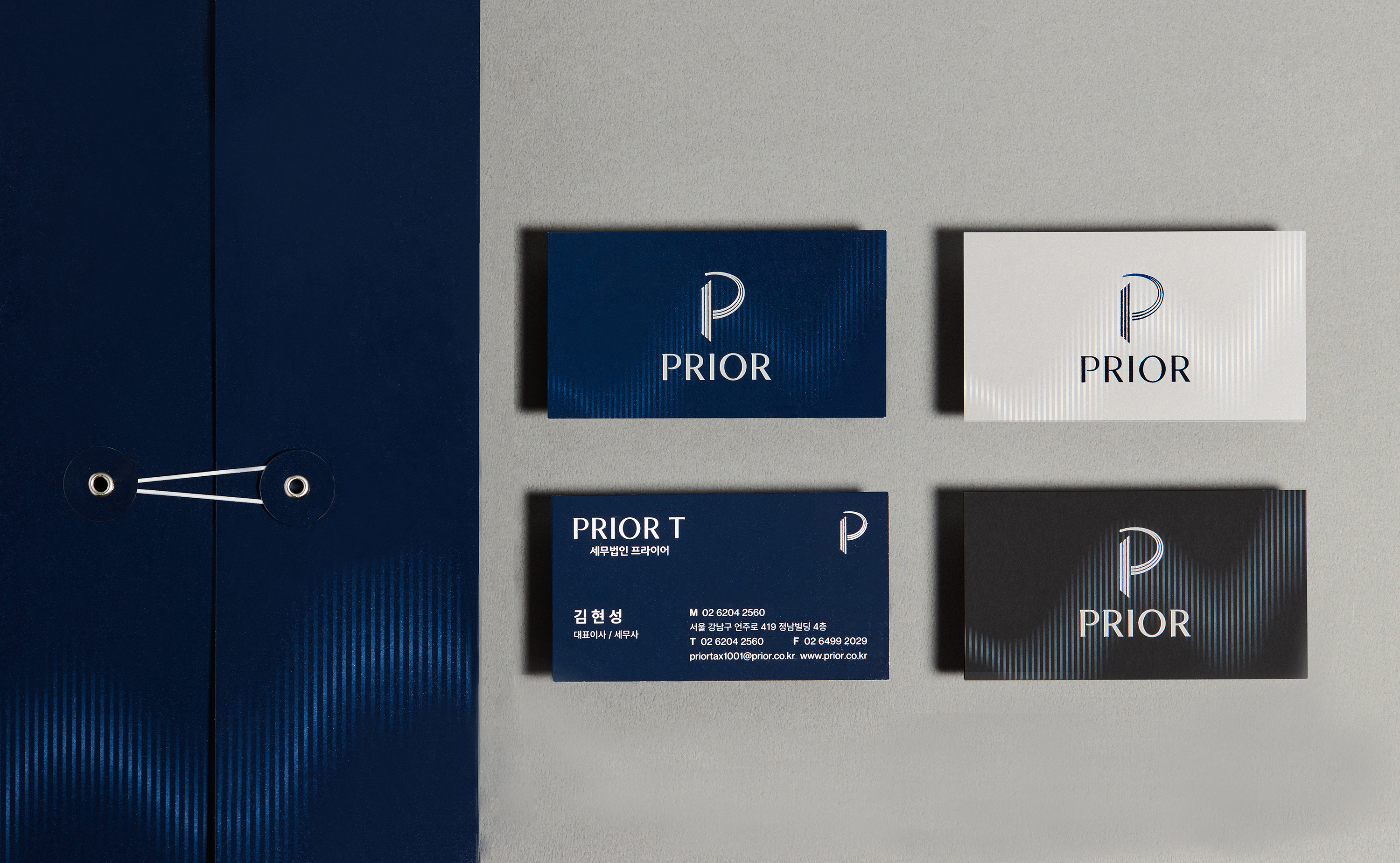
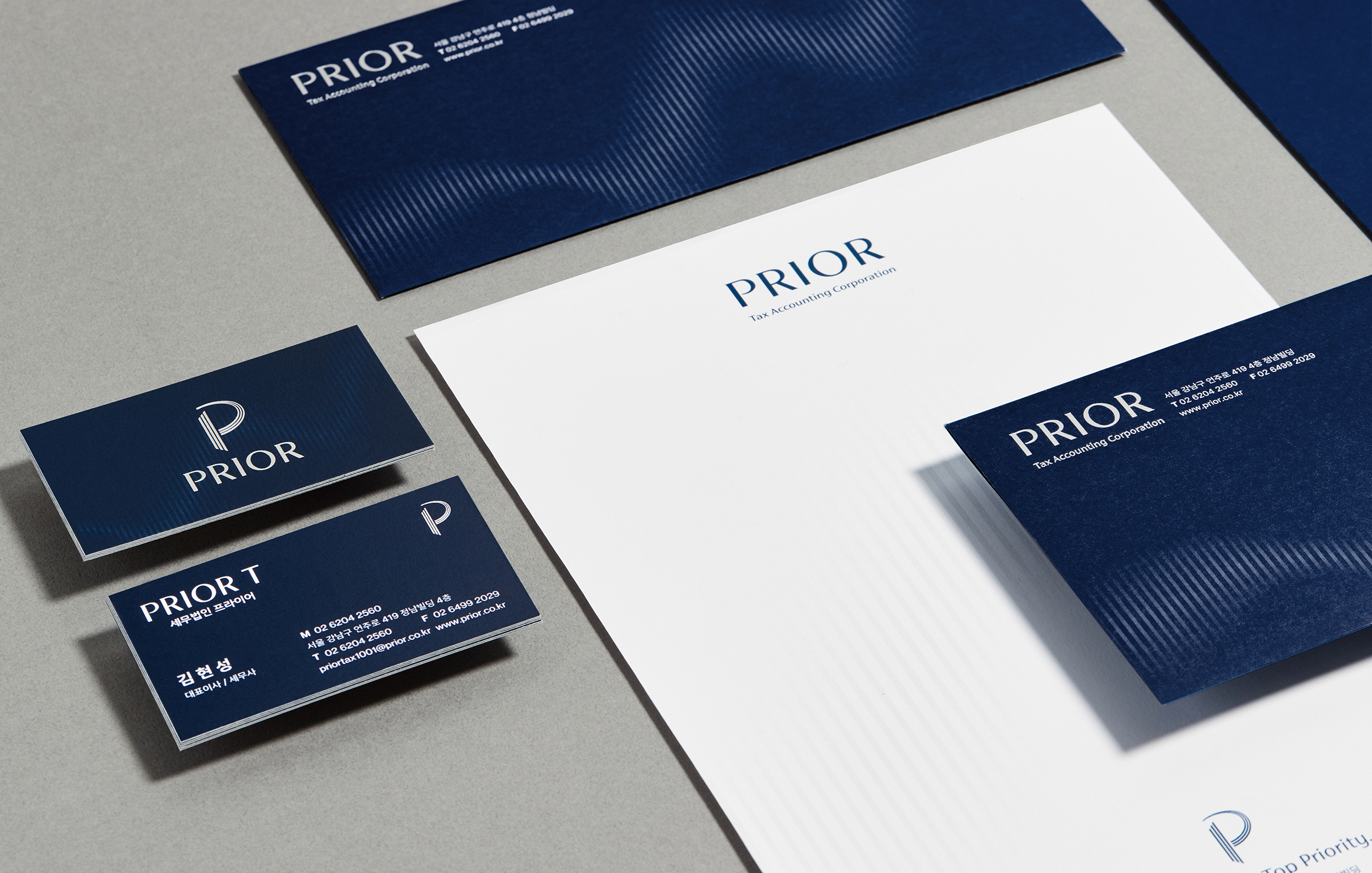
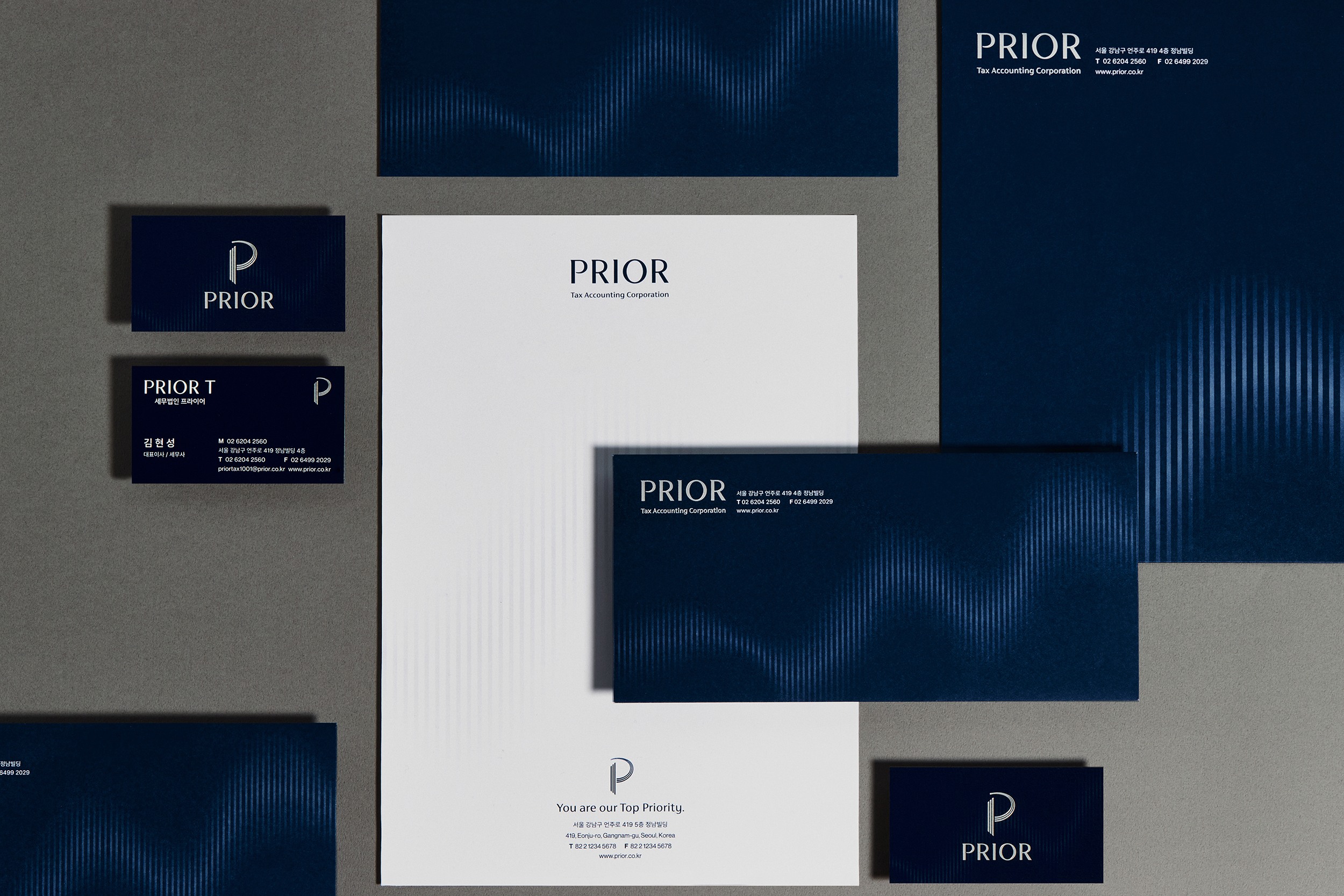
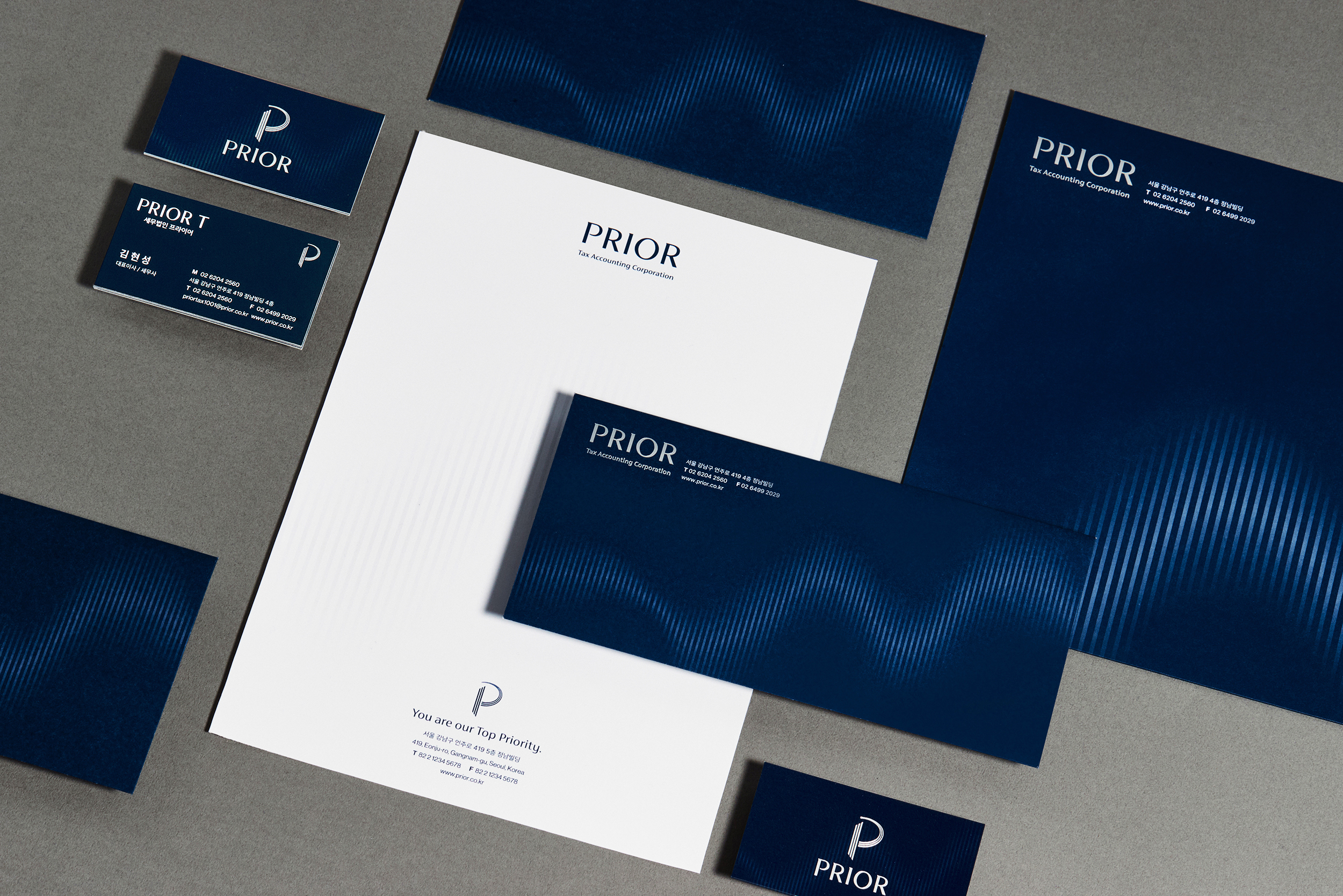
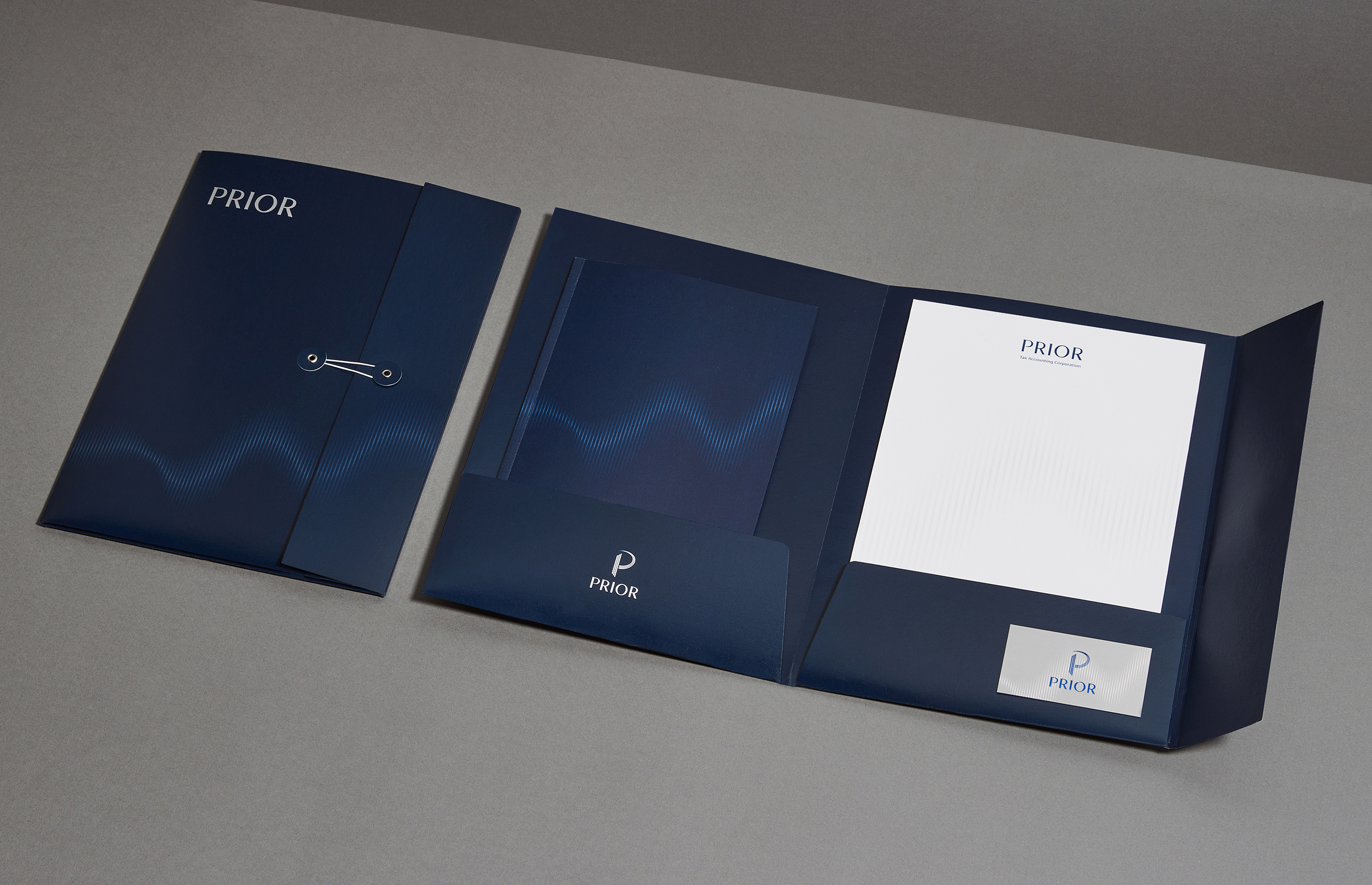
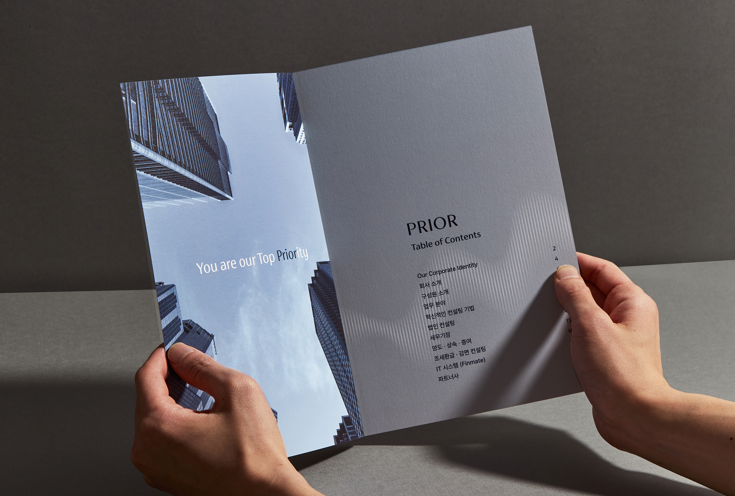
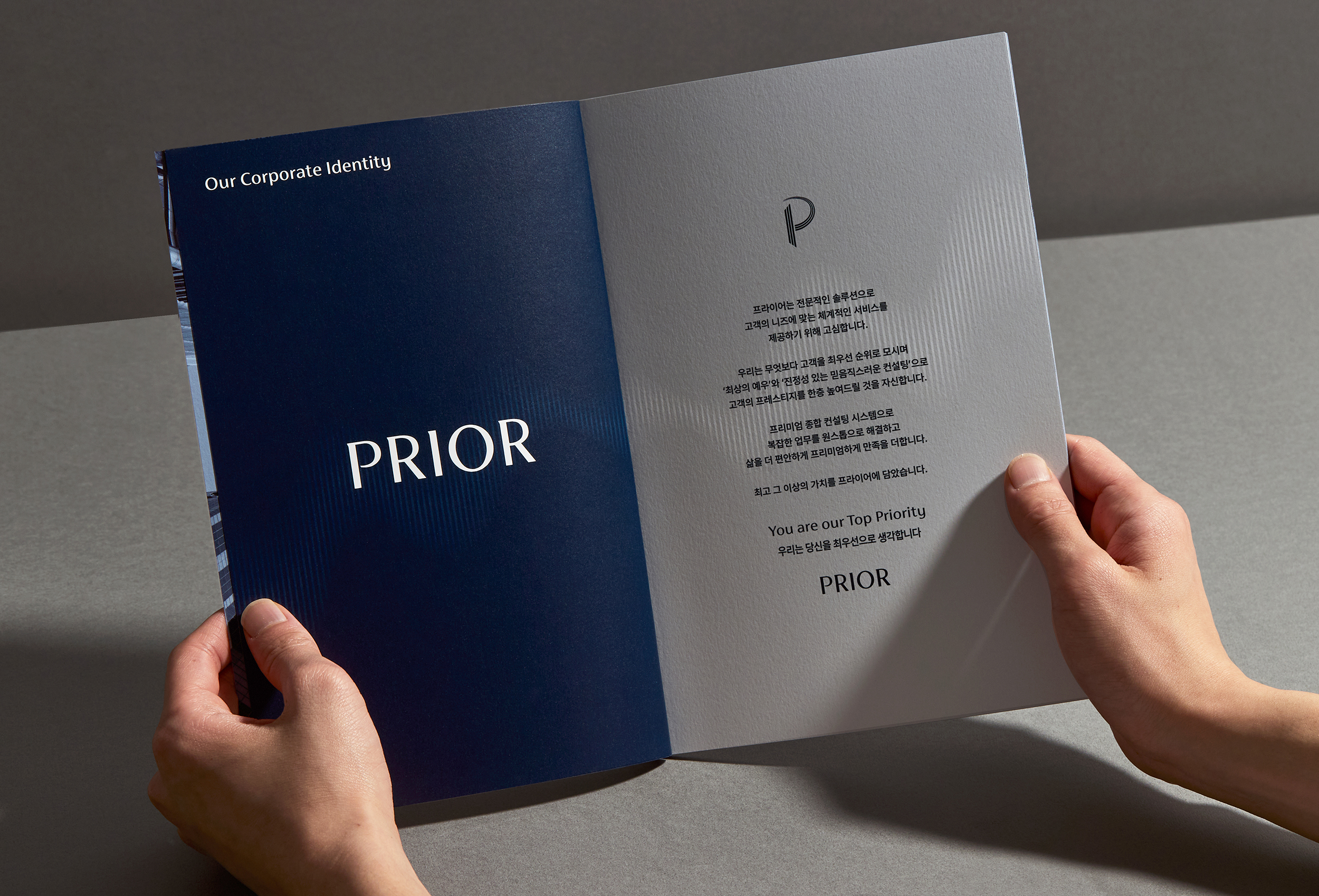
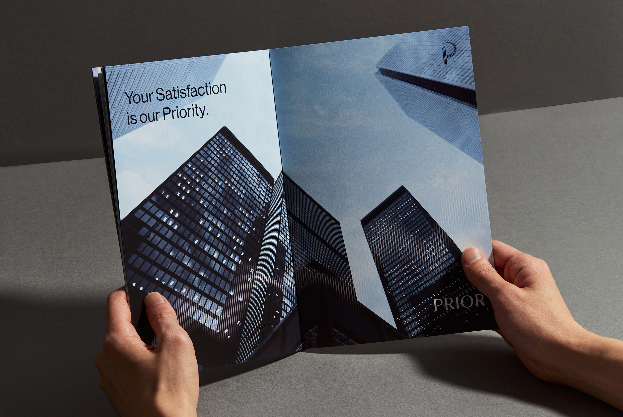
For PRIOR's CI, we wanted to develop a premium corporate name that is intuitive and implies business values and a corporate identity that builds up an integrated visual system. We aimed to break away from the existing petty image of a tax firm and construct a systematic, comprehensive network with a design that represents a sophisticated and premium image considering the idea of a professional company.
PRIOR의 CI는 직관적이며 비즈니스의 가치를 함축적으로 담고 있는 프리미엄한 기업 네이밍과 계열사 기업의 통합된 시각적 체계를 구축한 기업 아이덴티티를 개발하고자 했습니다. 기존 세무법인의 영세한 이미지를 탈피하고 전문적인 기업의 이미지를 고려하여 세련되고 프리미엄한 이미지를 나타내는 디자인으로 체계적인 종합 네트워크를 구성하는 것의 목표를 두었습니다.
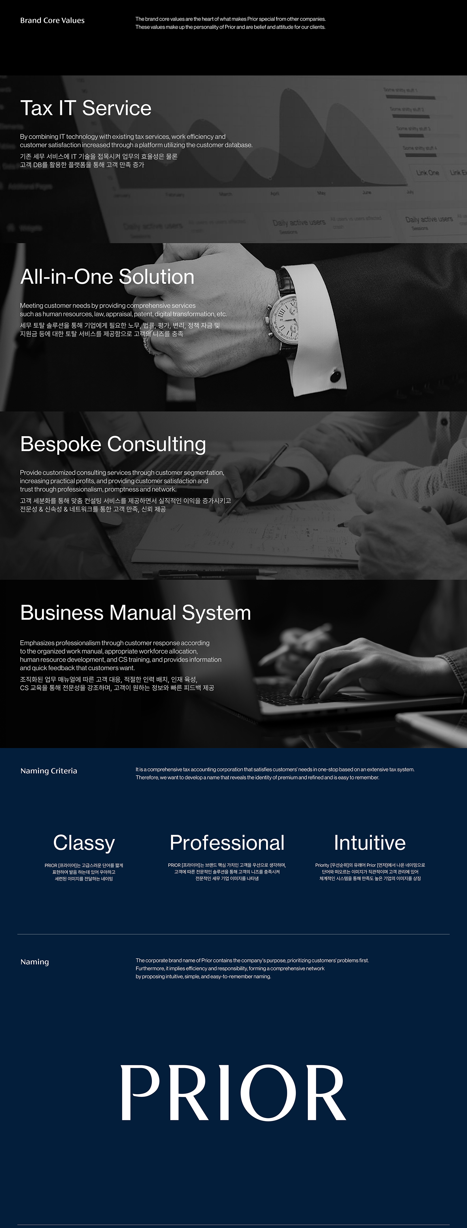
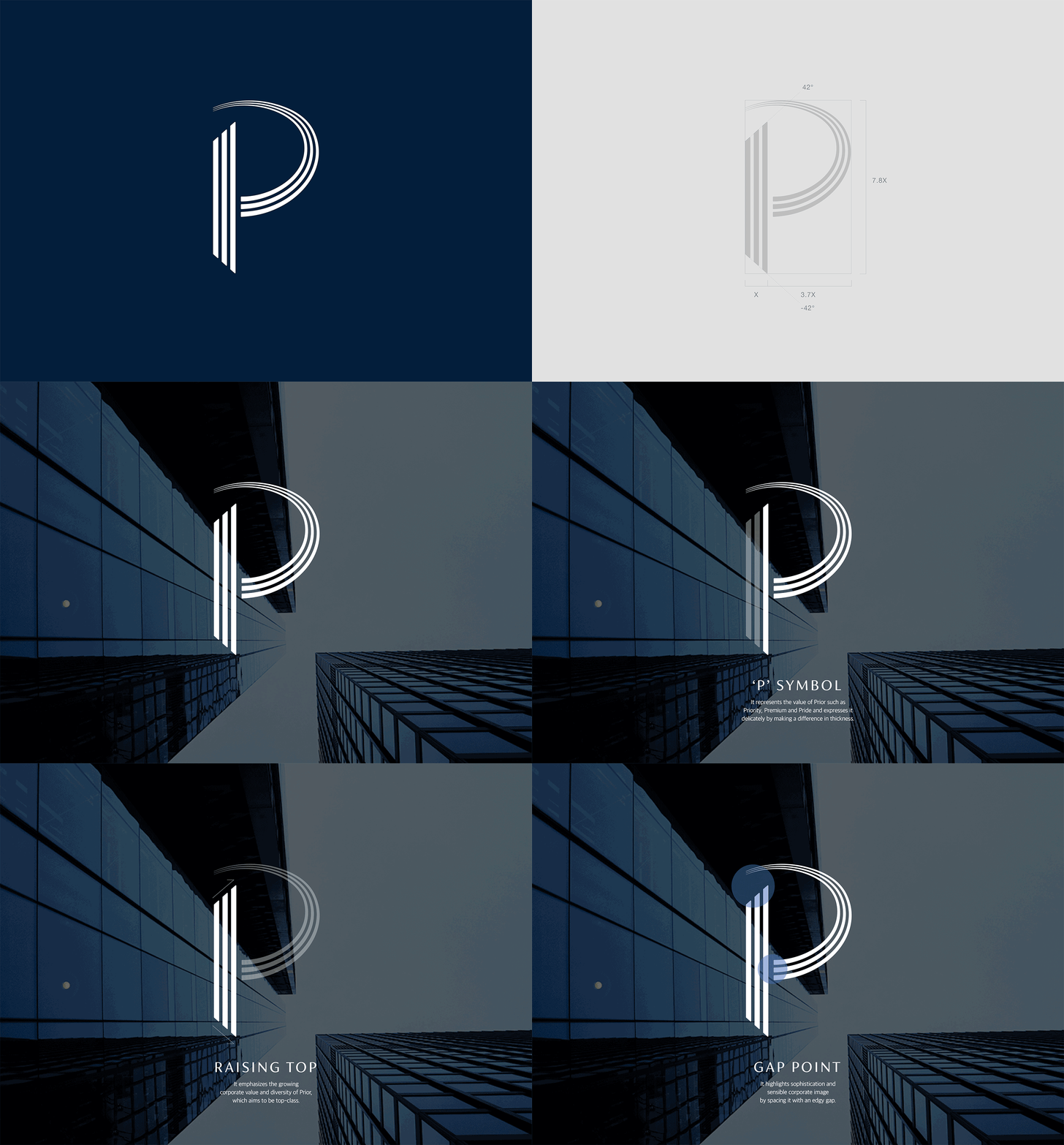
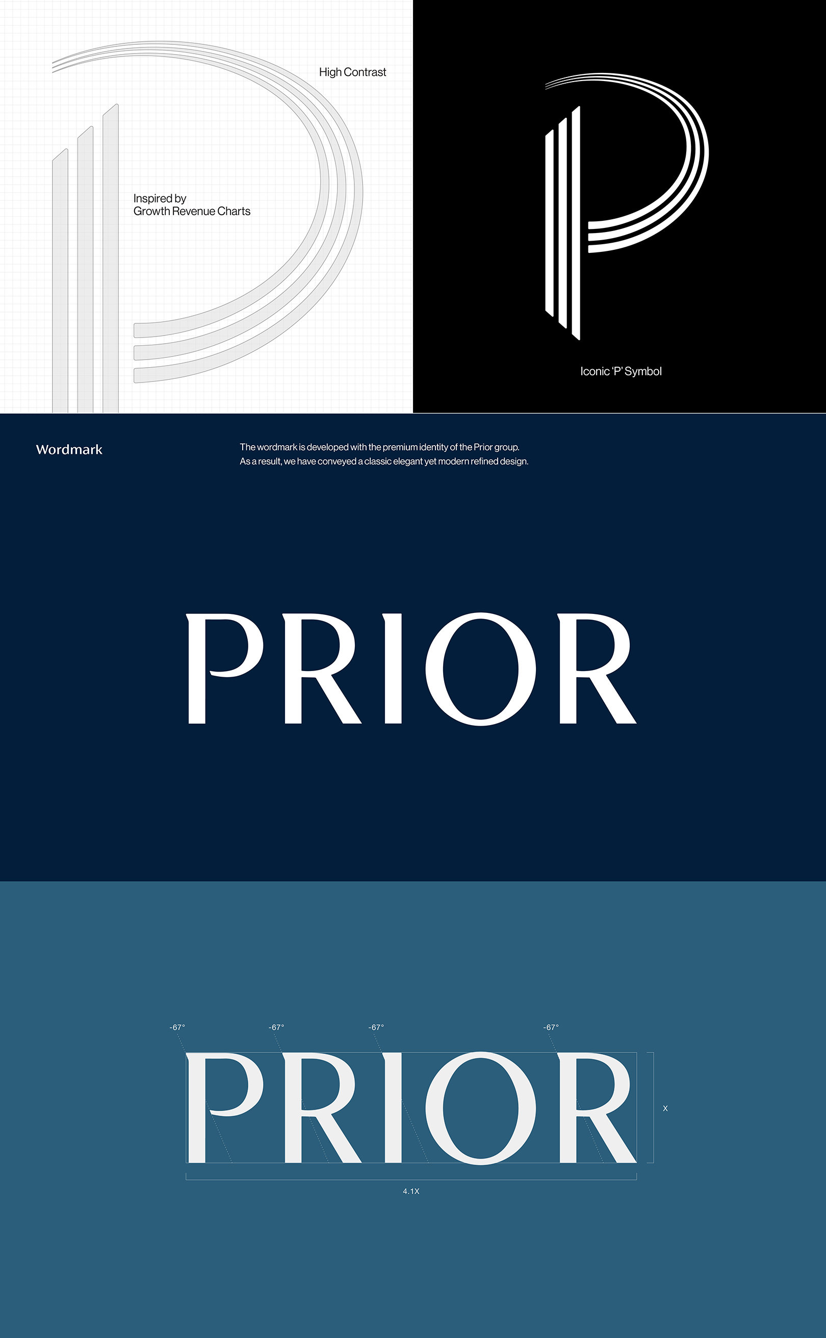
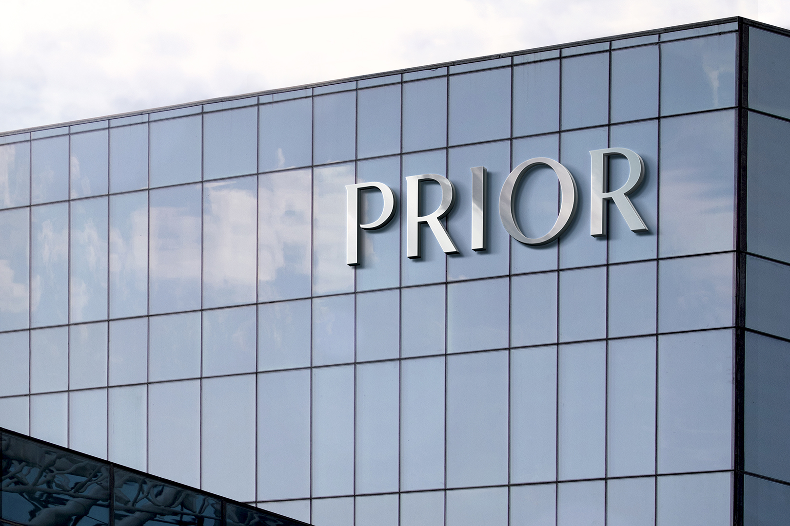
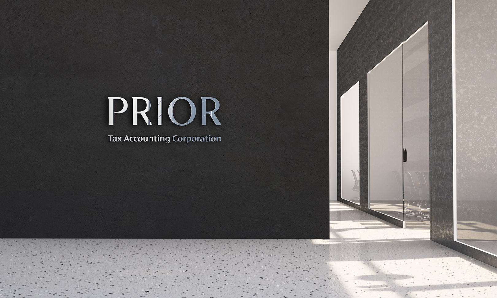
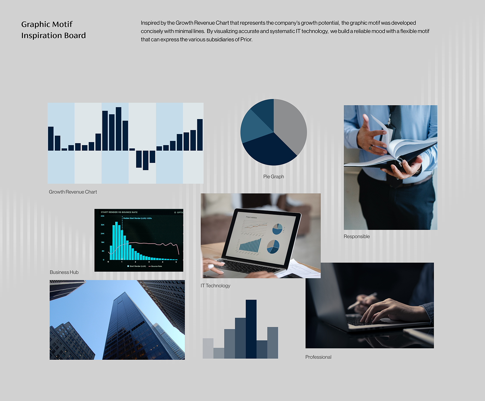
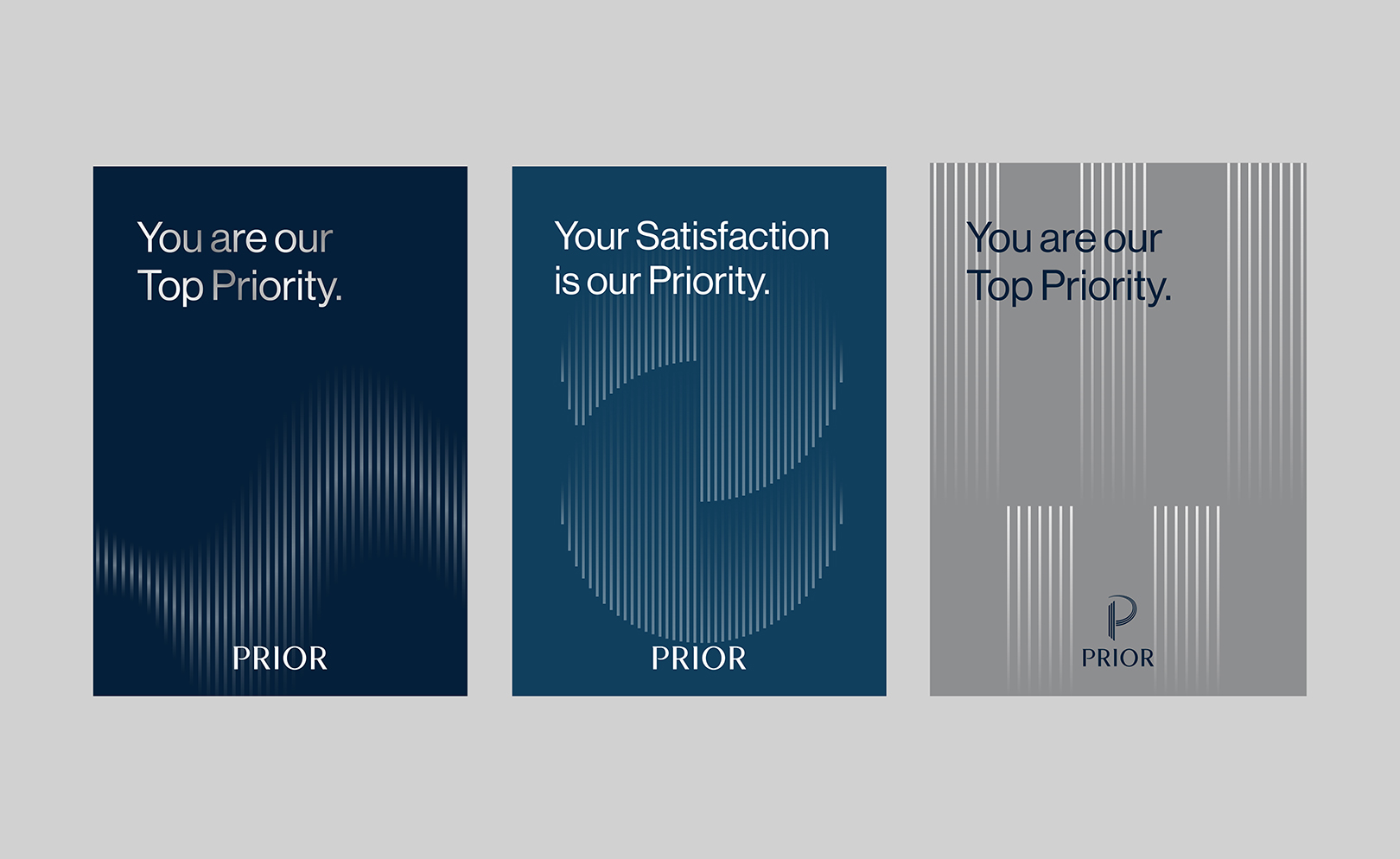
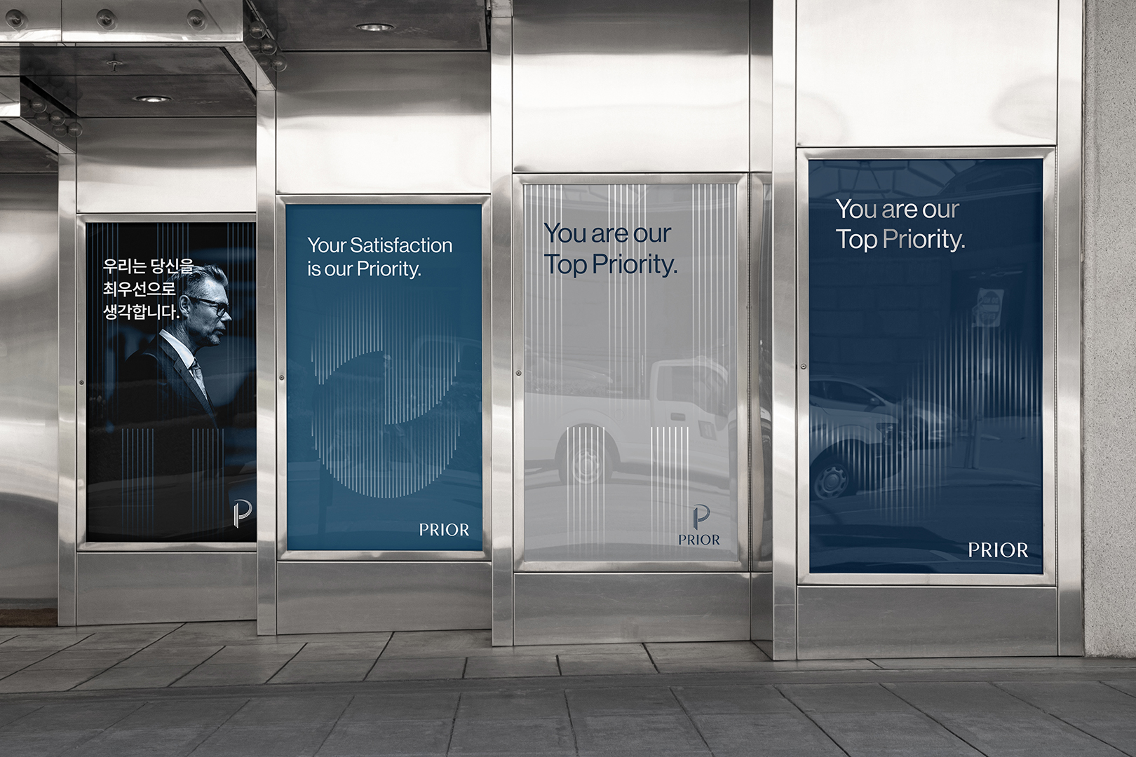
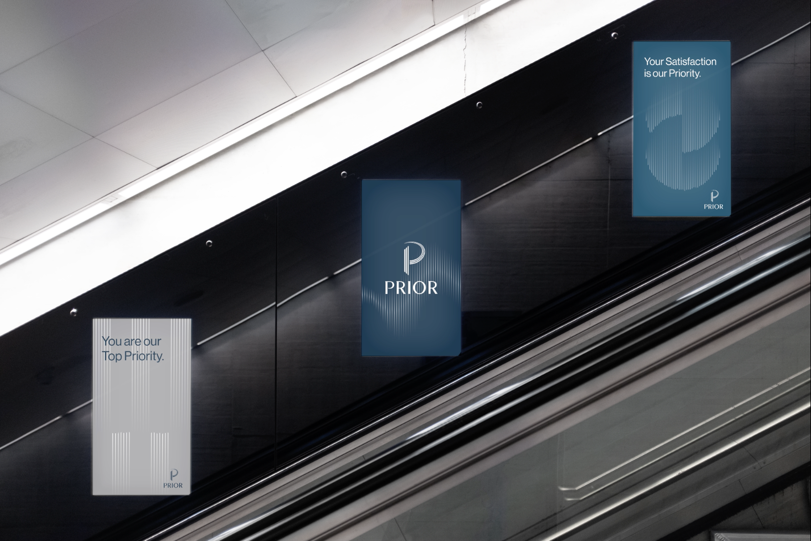
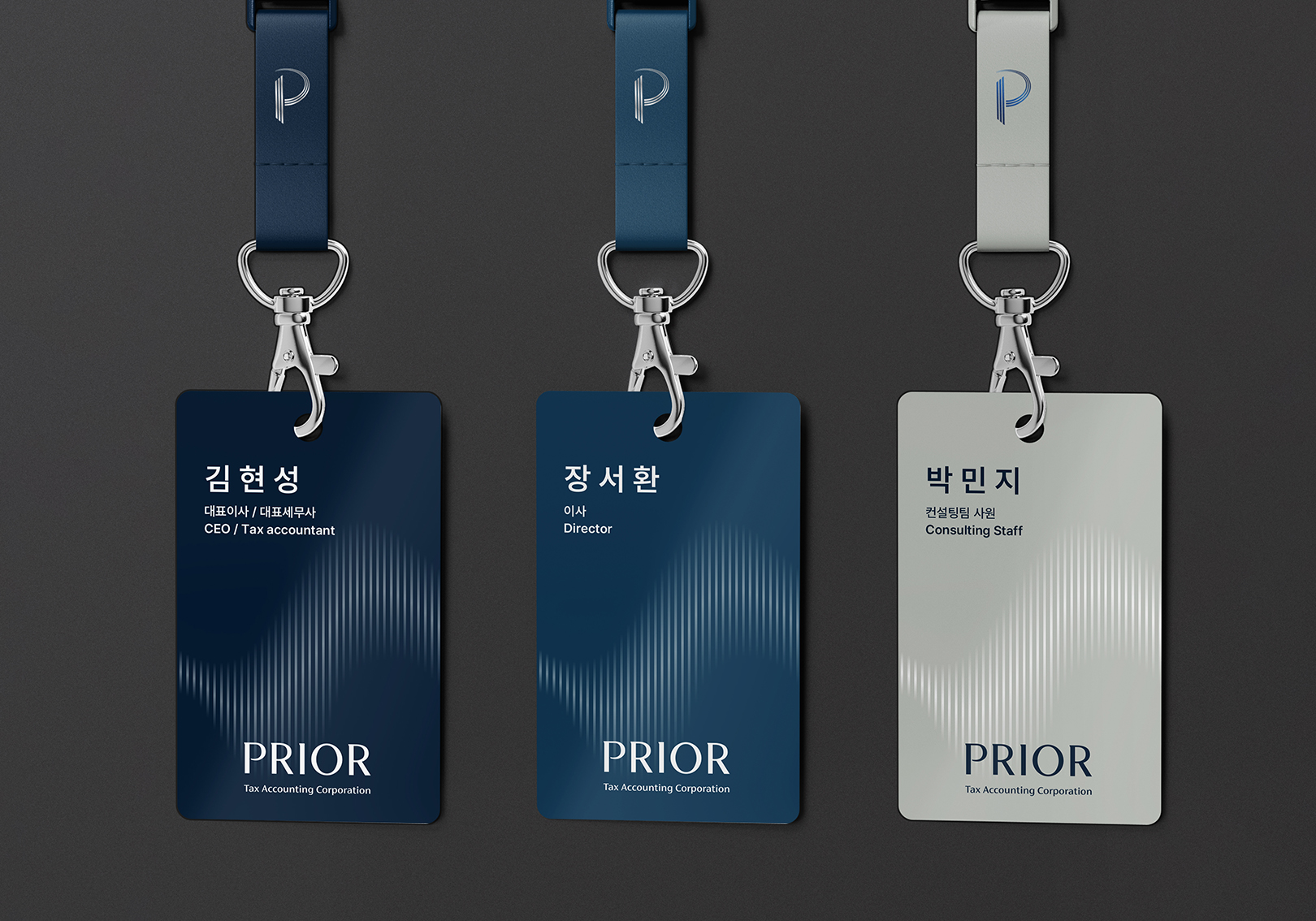
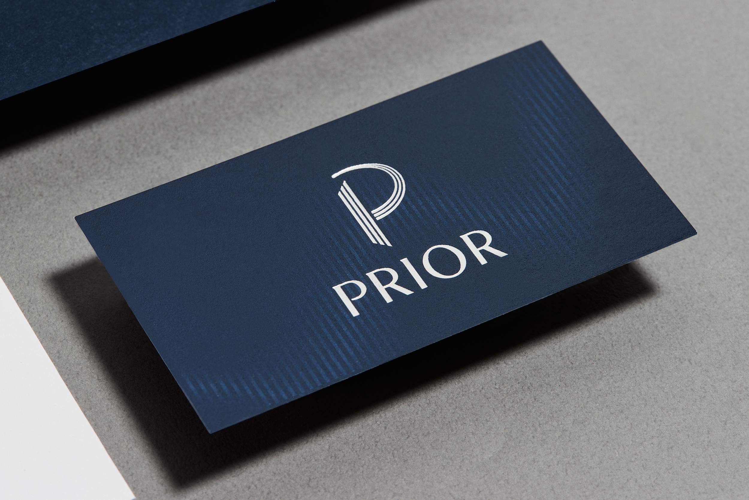
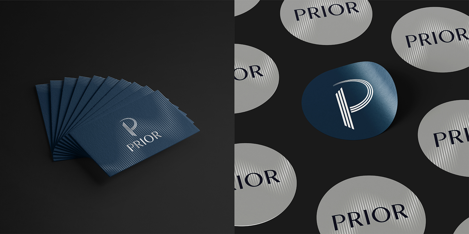
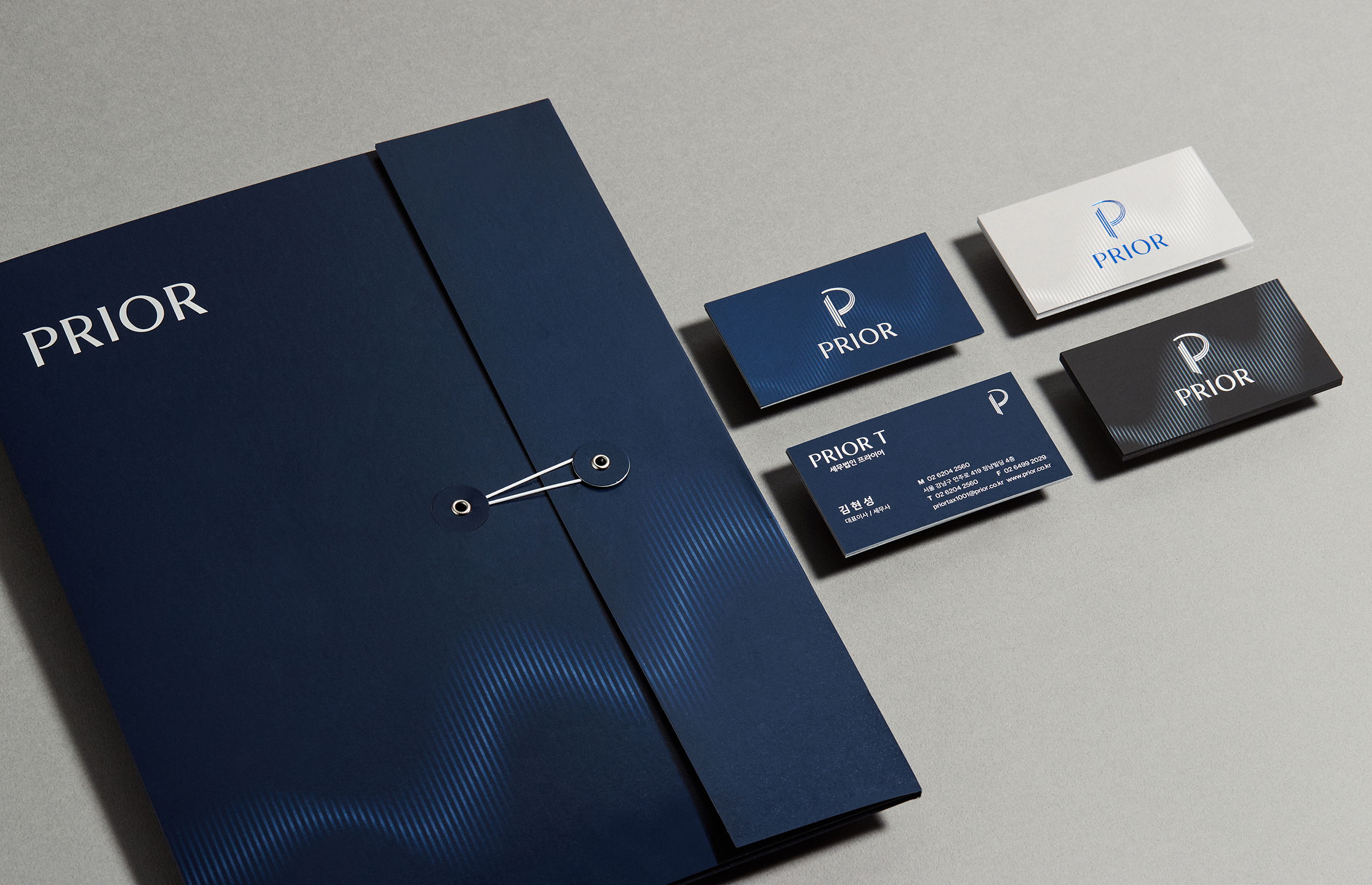
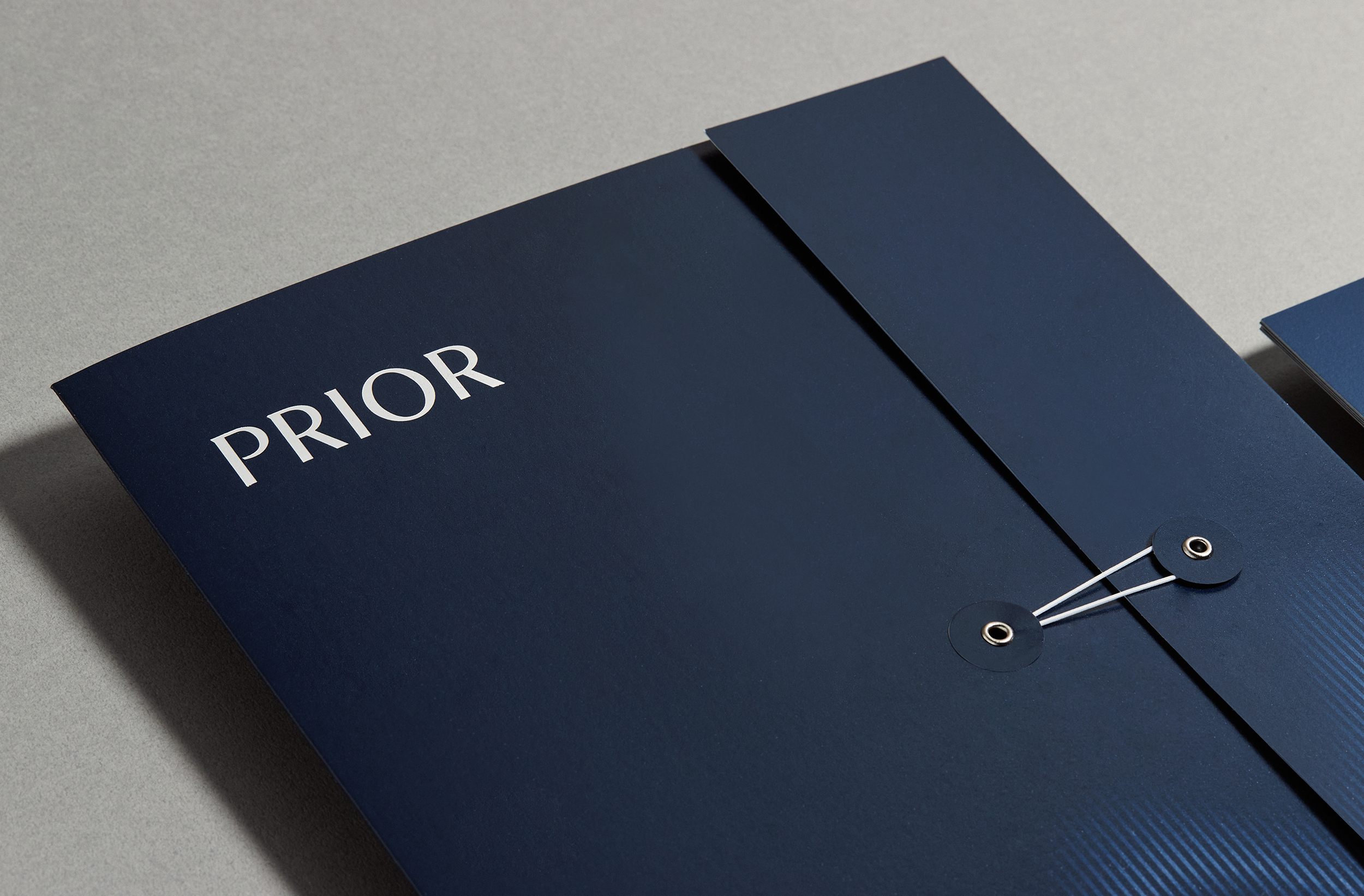
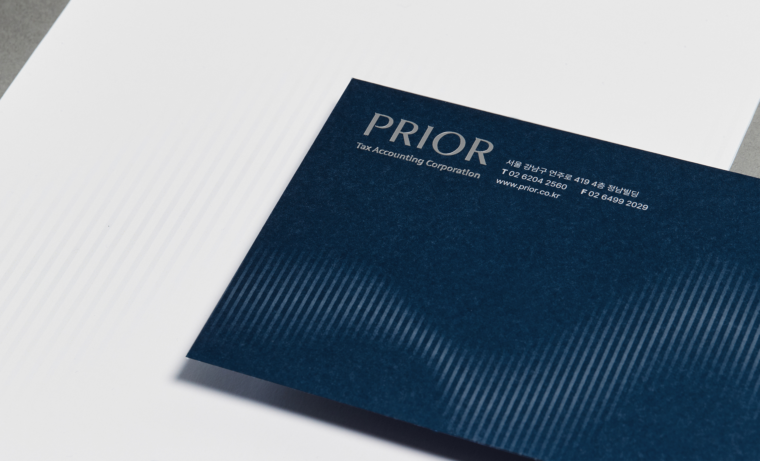
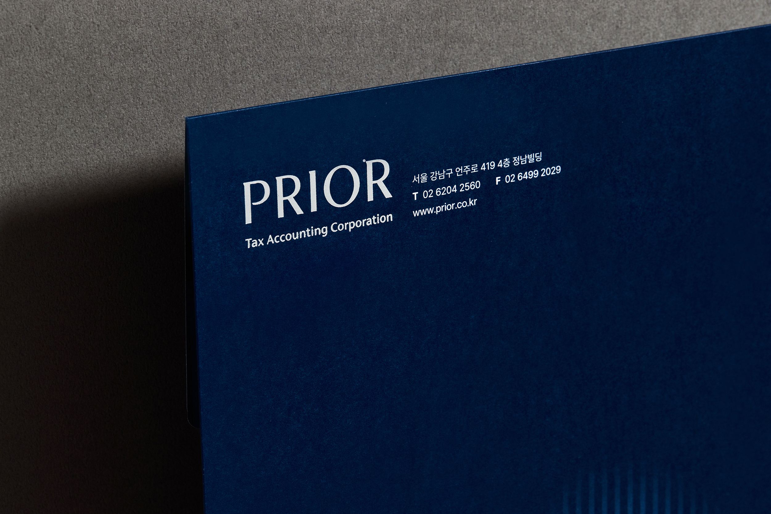
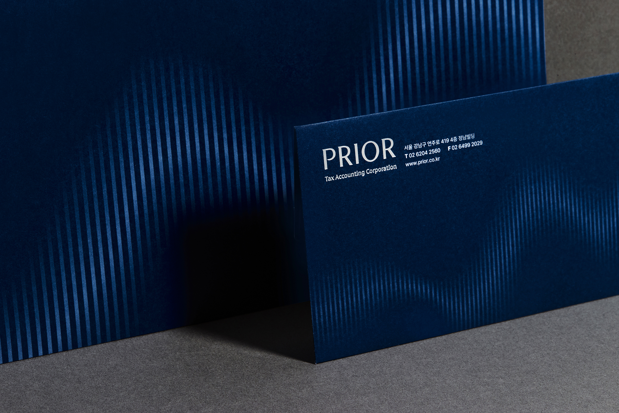
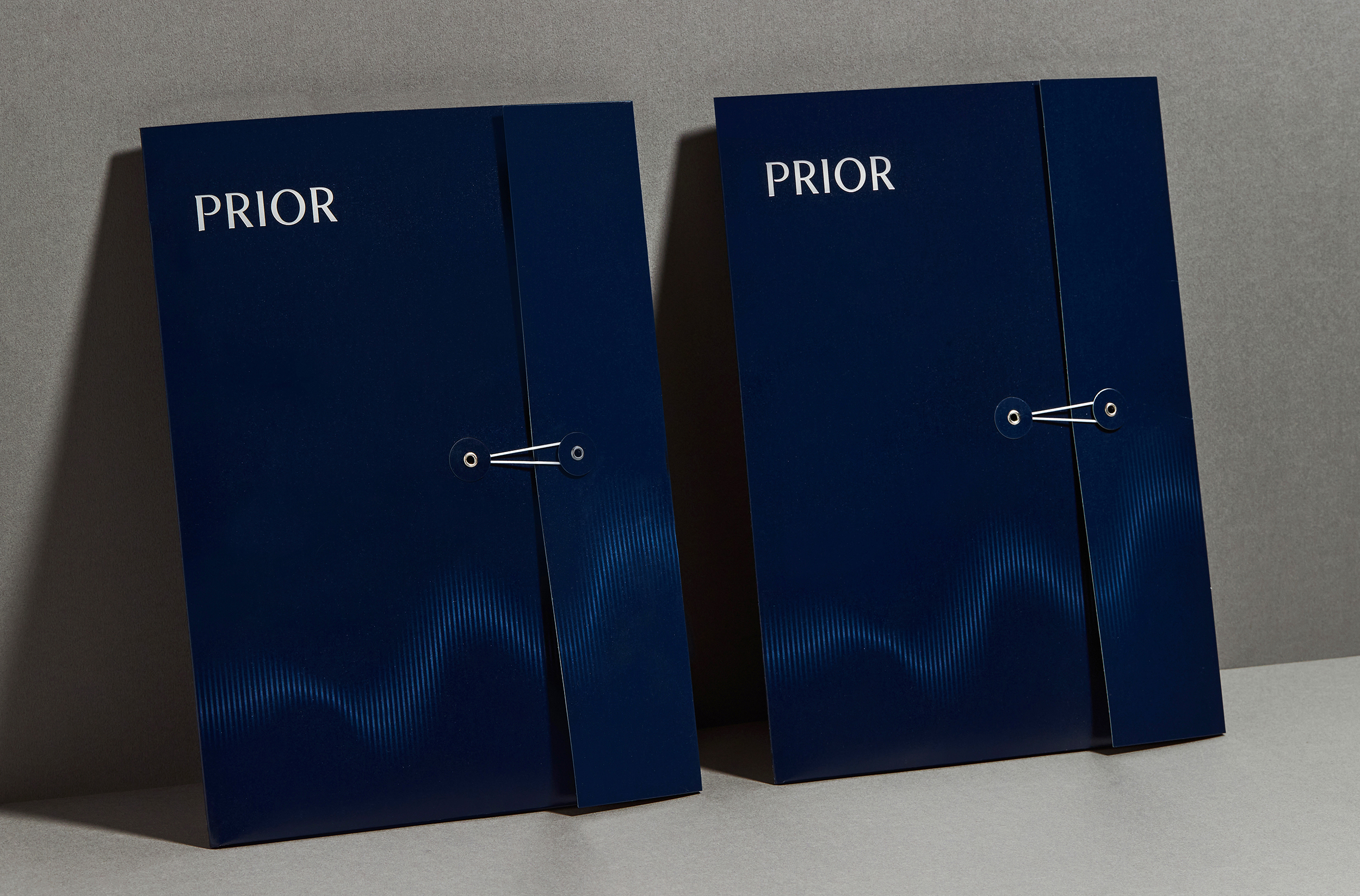
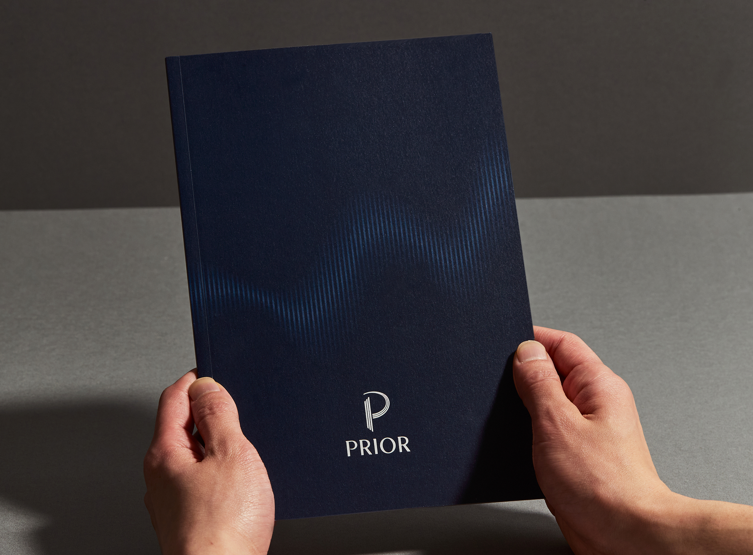
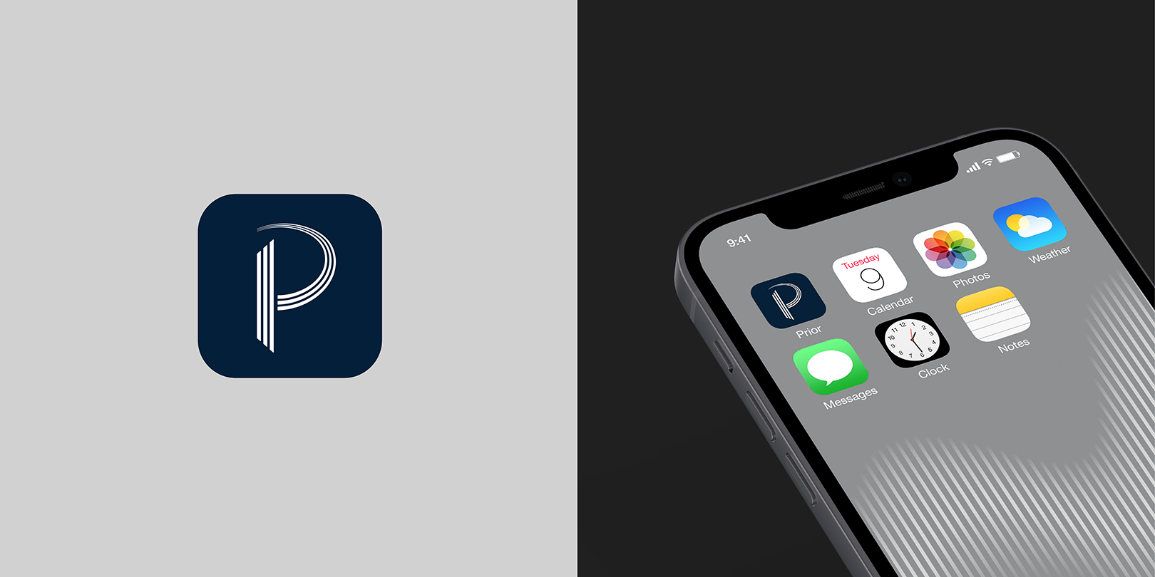
The company's name was developed intuitively and simply with the sense of duty of Prior, which puts customers first, based on the word, prior, derived from priority. We created the logo by incorporating modern sophistication into professional and classic sensibility, delivering the premium tone intuitively. We developed the graphic motif where a simple line rises vertically, based on a dynamic graph that expresses a business growth profit. The motif, visualizing the rising trend of the chart, can be flexibly applied to various digital and print media to create a premium and professional mood. PRIOR's CI provides an experience that enhances the customer's prestige with a consistent tone and manners, and identity system.
기업 네이밍은 Priority[우선순위]의 유래어인 Prior[먼저]에서 착안하여 고객을 먼저 생각하는 프라이어의 사명감을 담아 직관적이면서 심플하게 개발하였습니다. 로고는 전문적이고 클래식한 감성에 현대적인 세련미를 녹여 개발되어 프리미엄한 톤을 직관적으로 전달합니다. 그래픽 모티브는 비즈니스 수익 성장 차트를 표현하는 Dynamic한 그래프에서 영감을 받아 심플한 라인이 수직적으로 상승하는 듯한 모티브를 개발했습니다. 점점 상승하는 그래프의 흐름을 시각화하여 다양한 디지털 매체와 인쇄 매체에서 Flexible하게 적용이 가능한 모티브로 프리미엄하고 전문적인 무드를 구축합니다. PRIOR 프라이어의 CI는 일관된 톤 앤 매너와 아이덴티티 체계로 고객의 프레스티지를 한층 높여드릴 경험을 선사합니다.