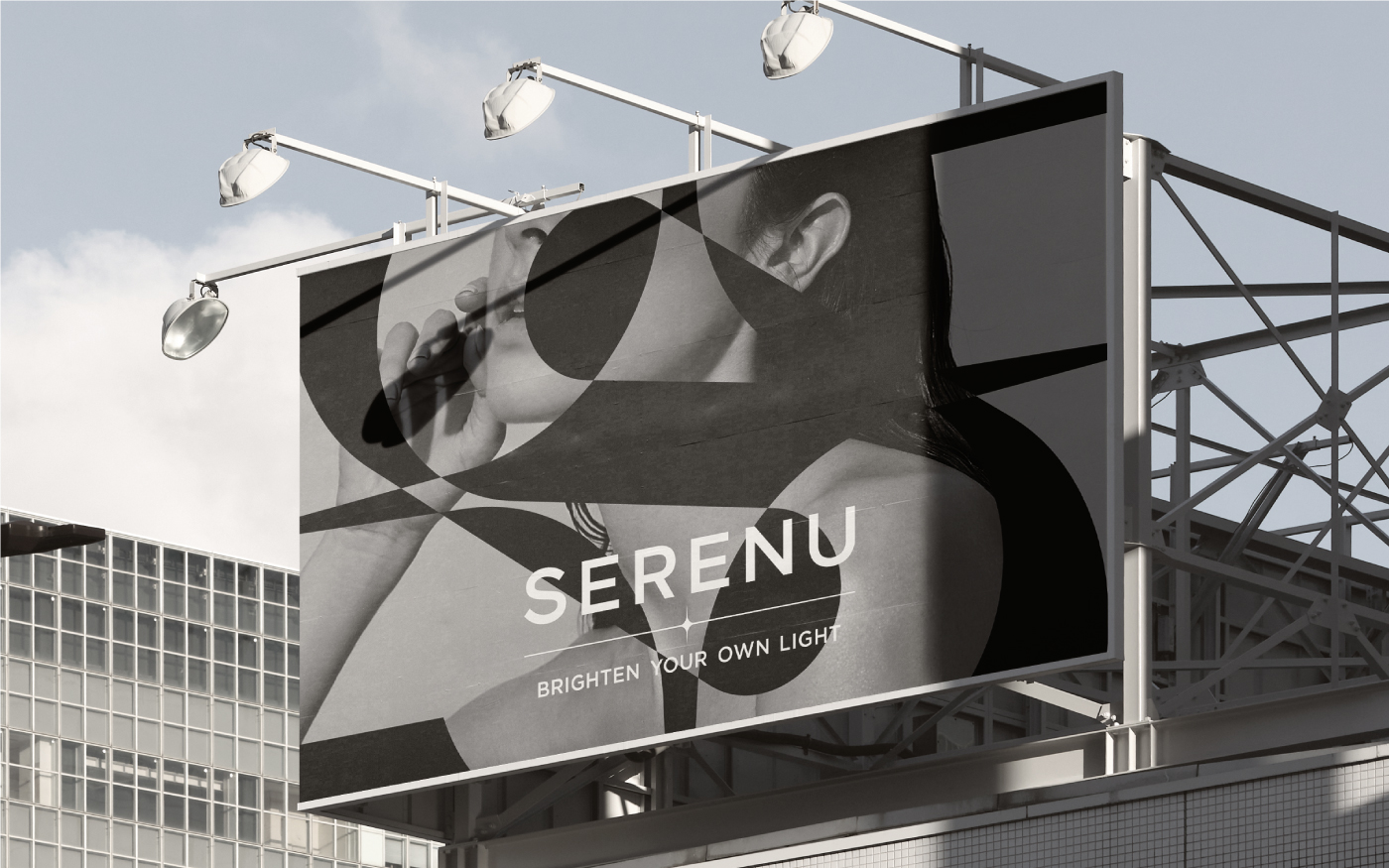
SERENU
Brighten Your Own Light

SERENU is a lifestyle brand that discovers the unique beauty in an individual based on skincare and enhances the individual’s life further. SERENU, which is excellent for general skincare and for treating problematic skin such as acne and scars, is like a haven where you can relax and heal from the stress you have in the city. SERENU believes that all people are as precious as the star with their own orbit. SERENU’s customers are those who pursue their own beauty. They seek the way of life that suits them the most based on an understanding of themselves, not just external beauty. Like countless stars shining in the night sky, SERENU provides a premium skincare experience that perfectly suits their characteristics and an emotional healing experience that increases the satisfaction of life for those who have their own character and unique beauty.
SERENU는 스킨케어를 바탕으로 개인이 지닌 고유한 아름다움을 발견하고 나아가 개인의 삶을 빛나게 하는 라이프스타일 브랜드입니다. 일반적인 스킨케어는 물론 여드름과 흉터와 같은 문제성 피부 치료에 탁월한 강점을 지닌 SERENU는 도심 속의 스트레스에서 벗어나 편안한 휴식과 치유의 시간을 갖을 수 있는 안식처와 같은 공간입니다. SERENU는 모든 사람들은 저마다의 궤도를 지닌 하나의 별처럼 고귀한 존재라고 믿습니다. SERENU의 고객은 자신만의 아름다움을 찾는 이들입니다. 그들은 단순히 외면의 아름다움이 아니라 자기 자신에 대한 이해에 기반한 가장 자신다운 삶의 방식을 추구합니다. 밤하늘에 빛나는 무수한 별처럼 저마다의 개성과 고유한 아름다움을 지닌 이들에게 SERENU는 개인의 특성에 최적화된 고급스러운 스킨 케어 경험과 삶의 만족감을 높이는 정서적 치유의 경험을 선사합니다.
The project's goal was to deliver a consistent brand experience at various customer contact points by establishing the identity as a premium lifestyle brand, which restores the beauty that customers have in them and raises the quality of everyday life through a verbal and visual identity system. It was essential to positively improve customers’ brand awareness by reflecting the core value of enhancing the satisfaction and quality of life by enhancing an individual's inner and outer beauty in developing brand assets. The main goal of this project was to share a delicate and elegant brand experience with customers within a consistent context by creating a verbal brand identity through naming, slogan, and brand story based on the brand’s core values and developing a visual identity of minimal, classy tone and manner.
프로젝트의 목표는 고객 본연의 아름다움을 되찾고 일상의 퀄리티 높이는 프리미엄 라이프스타일 브랜드로서의 정체성을 버벌, 비주얼 아이덴티티 시스템으로 구축하여 다양한 고객 접점에서 일관된 브랜드 경험을 전달하는 것이었습니다. 무엇보다 개인이 지닌 내면과 외면의 아름다움을 개선하여 삶의 만족감과 퀄리티를 높인다는 핵심 가치를 브랜드 자산 개발에 반영하여 고객의 브랜드 인식을 긍정적으로 개선하는 것이 중요했습니다. 브랜드 핵심 가치를 반영하여 네이밍, 슬로건, 브랜드 스토리 등 버벌 브랜드 아이덴티티를 개발하고, 미니멀하고 고급스러운 톤앤매너의 비주얼 아이덴티티를 개발하여 세심하고 품격있는 브랜드 경험을 일관된 맥락 속에서 고객과 공유하는 것이 프로젝트의 주된 과제였습니다.
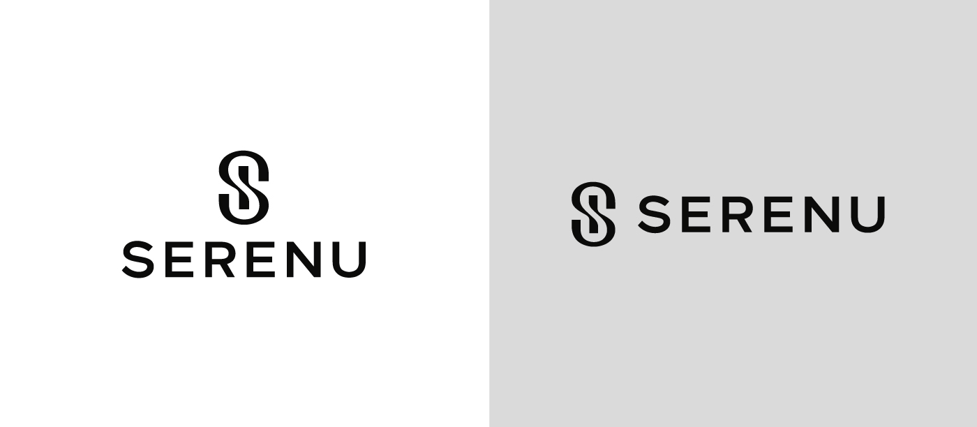
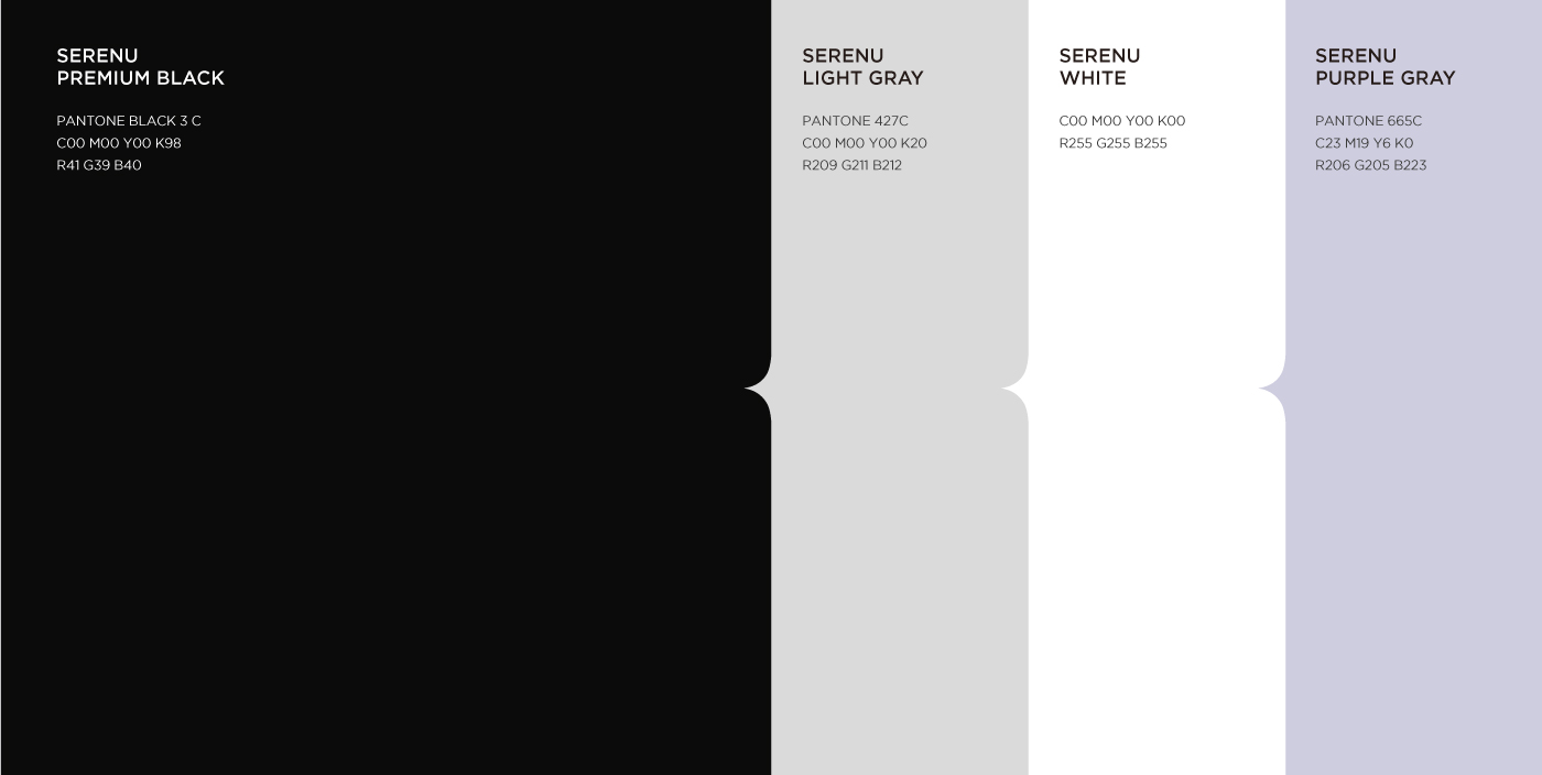
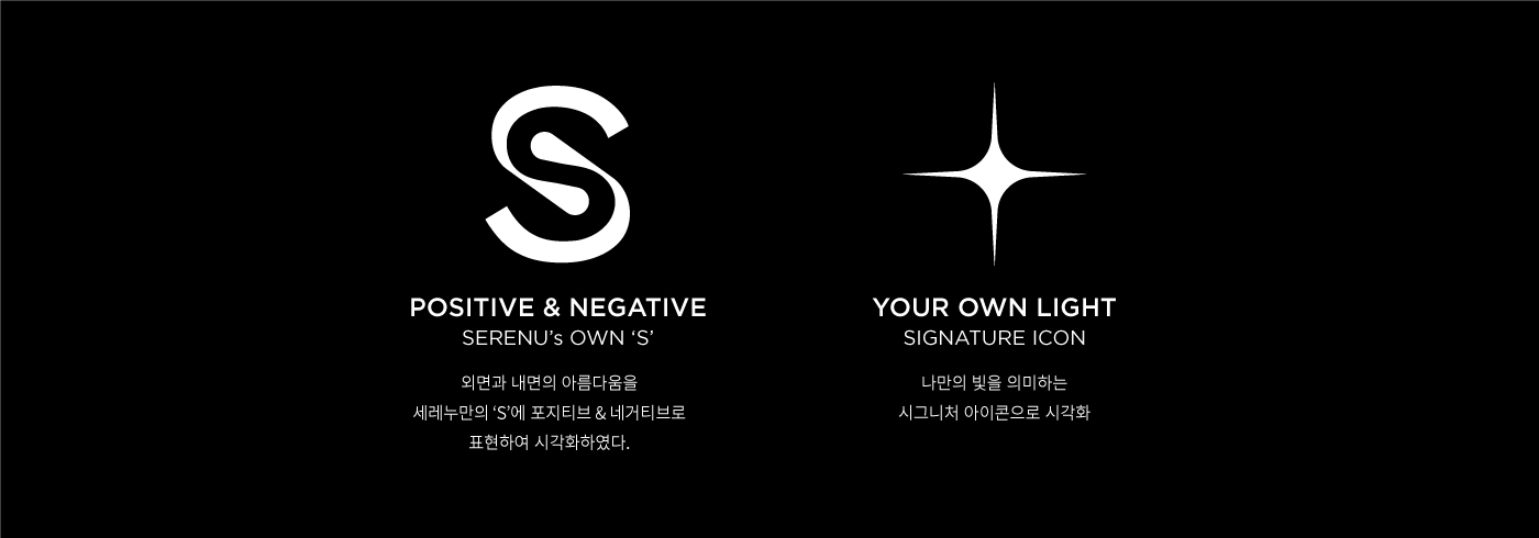
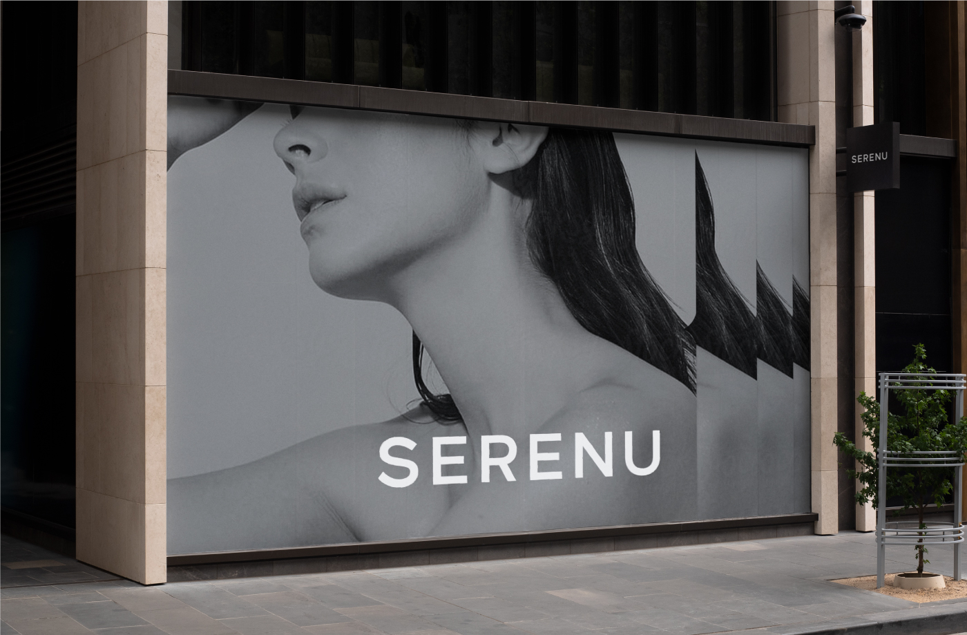
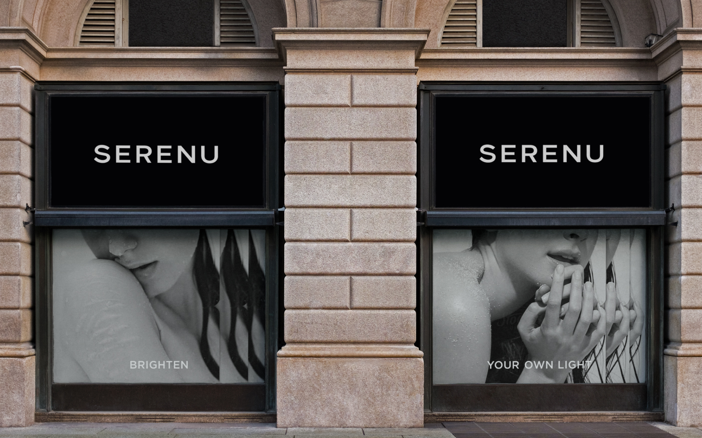
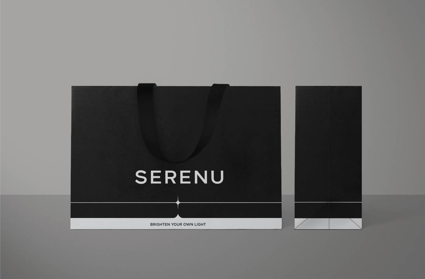
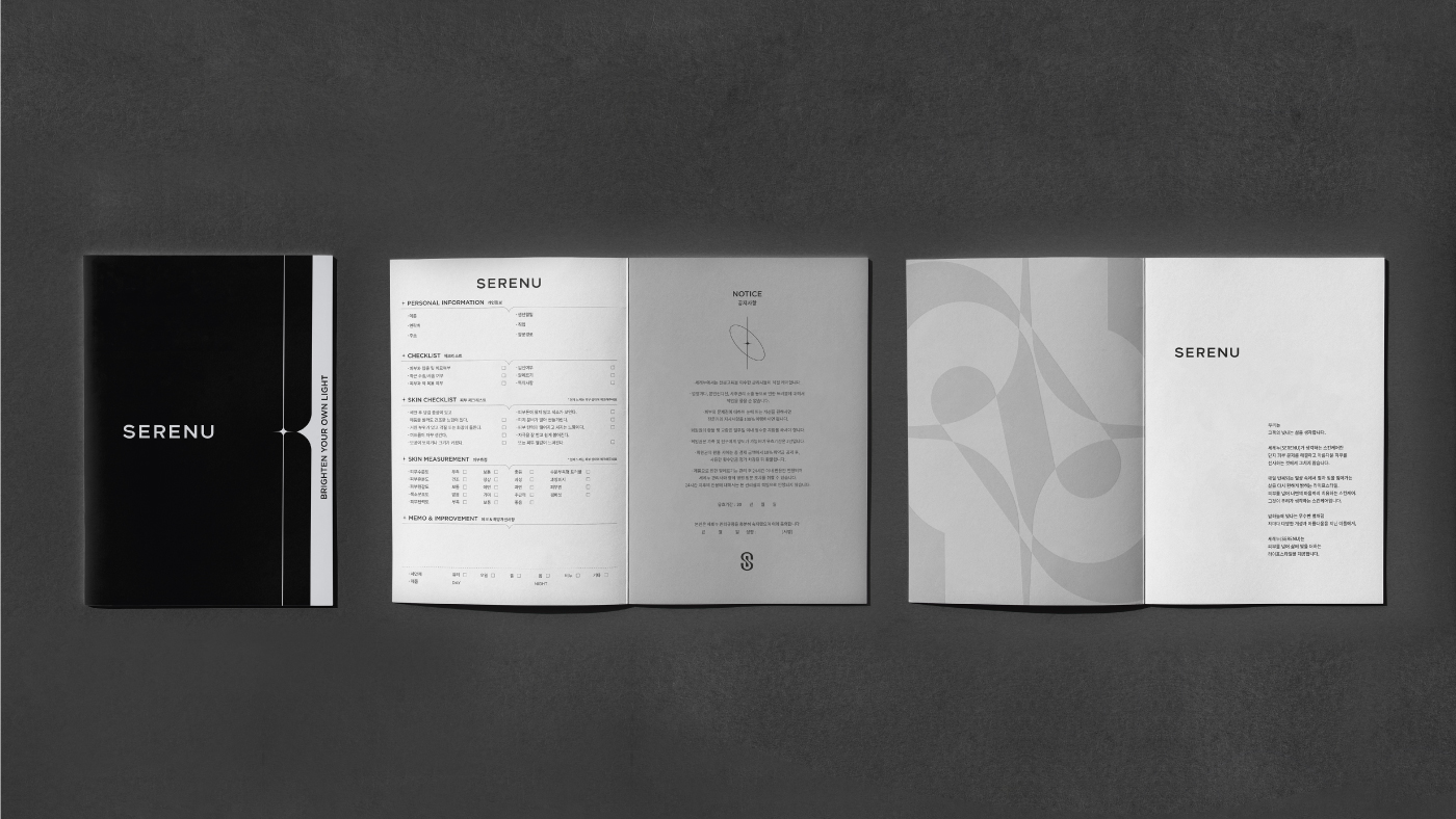
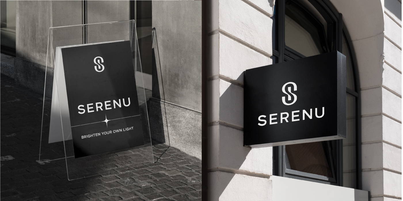
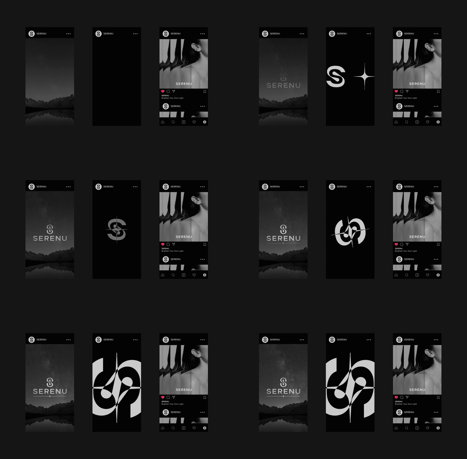
YNL Design straightened up the message the brand wanted to convey through verbal brandings, such as brand name, slogan, and brand story and developed a brand design concept based on the message. SERENU’s brand name is an abbreviation of the Latin word ‘Serenus,’ which means ‘to shine brightly,’ and it captures the value of a skincare brand that carefully examines the beauty and character of customers and helps customers have beautiful skin and life. The brand slogan and design concept, BRIGHTEN YOUR OWN LIGHT, intuitively conveys the brand philosophy, which is to provide a light that illuminates customers' lives, emphasizing a balanced lifestyle that makes life beautiful and improves the quality of life beyond simple skincare. We designed the BI based on the brand definition, a luxurious lifestyle that realizes the unique beauty both outside and inside and enhances the quality of life. The symbol of SERENU means enabling a healthy and balanced life by combining two core services: skincare and mind care. The “S” expressed in the negative space represents the inner satisfaction provided by the brand, and the “S” expressed in the positive space represents the external beauty. The refined logotype with ornamental elements eliminated maximizes a modern sensibility. In addition, white, which means clear skin, and classy and elegant black are used with minimal gray to deliver a neutral and sophisticated brand image.
YNL Design은 브랜드 네임, 슬로건, 브랜드 스토리 등 버벌 브랜딩을 통해 브랜드가 전달하고자하는 메시지를 정돈하고, 이를 바탕으로 브랜드 디자인 컨셉을 개발하였습니다. SERENU의 브랜드 네임은 ‘밝게 빛나는’ 이라는 뜻의 라틴어 ‘Serenus’의 축약어로서, 고객이 지닌 아름다움과 개성을 세심하게 살피고 피부와 삶을 아름답게 가꾸는 스킨케어 브랜드의 가치를 담고있습니다. 브랜드 슬로건이자 디자인 컨셉인, BRIGHTEN YOUR OWN LIGHT은 고객의 삶을 밝히는 빛을 선사한다는 브랜드 철학을 직관적으로 전달하여, 단순한 스킨케어를 넘어 삶을 아름답게 만들고 삶의 퀄리티를 높이는 균형잡힌 라이프스타일을 강조합니다. BI 디자인은 외면과 내면 모두에 고유한 아름다움을 일깨우고 삶의 퀄리티를 높이는 고급스러운 라이프스타일이라는 브랜드 정의를 바탕으로 진행되었습니다. 세레누의 심볼은 스킨 케어와 마인드 케어라는 두 개의 핵심 서비스가 결합되어 건강하고 균형잡힌 삶을 가능하게 한다는 의미를 지니고 있으며, 네거티브 스페이스에 표현된 S는 브랜드가 선사하는 내면의 만족감을, 포지티브 스페이스에 표현된 S는 외면의 아름다움을 의미합니다. 장식적인 요소를 덜어낸 정제된 형태의 로고타입으로 현대적인 감각을 극대화하였습니다. 또한 맑은 피부를 의미하는 화이트, 고급스럽고 우아한 블랙 컬러를 미니멀한 그레이 컬러와 함께 활용하는 방식으로 중성적이고 세련된 브랜드 이미지를 전달합니다.