SCOTT
A Fresh Approach to Everyday Clean

Yuhan-Kimberly Co., Ltd., specializing in household goods, has the image of a ‘good company’ that actively fulfills corporate social responsibility. Yuhan-Kimberly Co., Ltd.'s smart house care brand, Scott, launched a new product line, 'mild and clean fabric deodorizers.' It improves the average standard of living with products that satisfy customers with various fragrances and powerful deodorizing effects and reflect customers needs for fabric deodorizers that are reliable for health and safe ingredients that relieve concerns.
생활용품 전문 업체인 유한킴벌리(주)는 기업의 사회적 책임을 적극적으로 실천하는 ‘착한 기업’ 이미지를 가지고 있습니다. 유한킴벌리(주)의 스마트한 집안관리용품 브랜드 스카트에서 ‘순하고 깨끗한 섬유탈취제’ 신제품을 출시했습니다. 향과 탈취력에 대한 만족도 뿐만 아니라, 믿을 만한 성분과 건강에 대한 믿음을 주는 섬유탈취제에 대한 고객의 니즈를 반영한 제품으로 평균적인 생활수준을 향상시키는데 기여합니다.
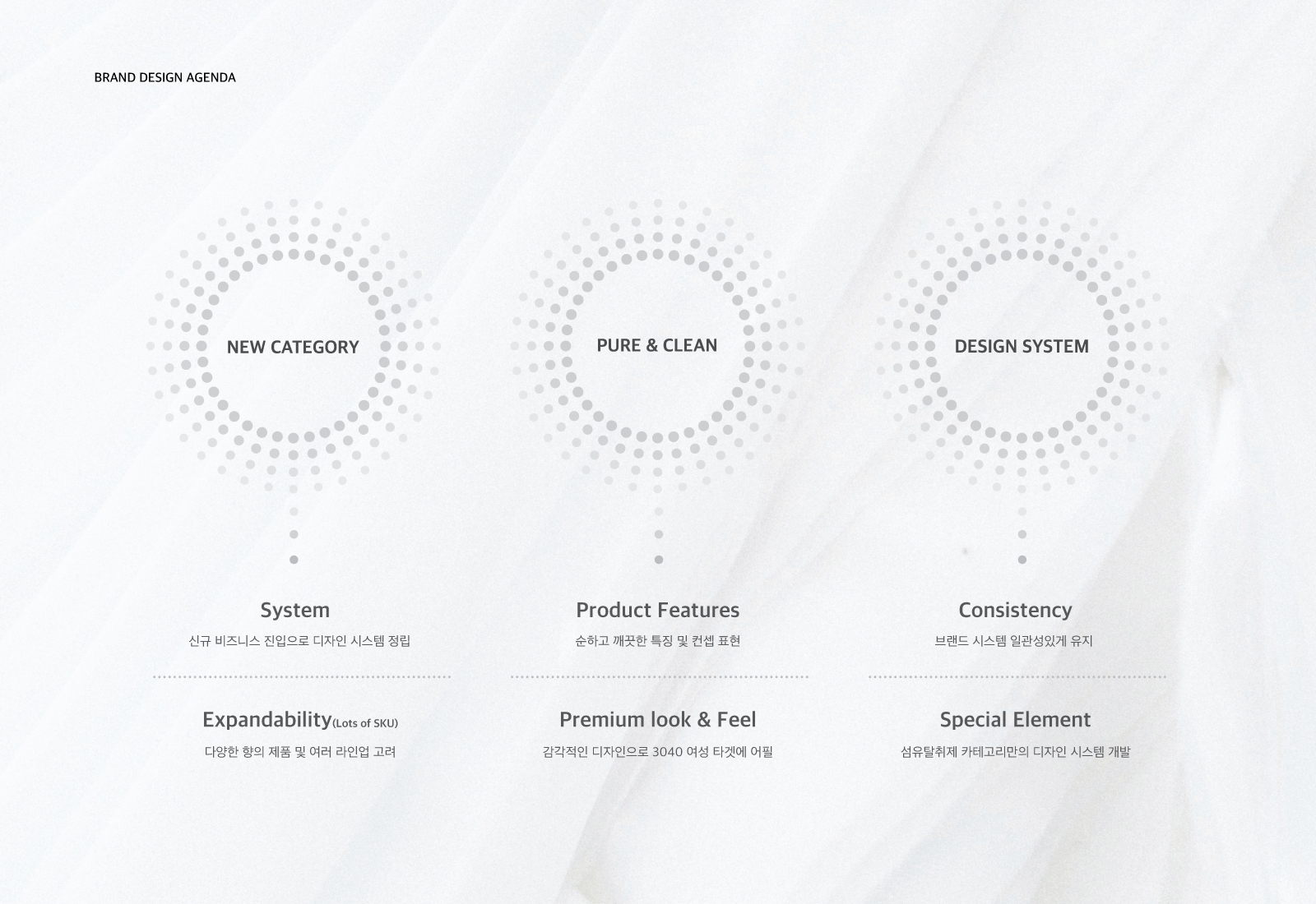
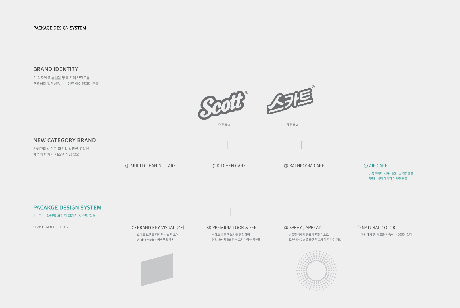
To establish a new design system unique to Scott’s fabric deodorizers while maintaining a consistent tone and manner throughout the brand, considering the expansion of Scott’s new lineup, we wanted to deliver a differentiated product concept that fits the 'mild and clean' product image and a premium look and feel for the concept simply and intuitively. It was also essential to ensure that consumers were clearly aware of the product's intended use and to increase positive brand awareness. Furthermore, the biggest goal of the project was to increase the demand for Scott fabric deodorizers as the product for a lifestyle that increases trust in the brand and the satisfaction and quality of life through design.
스카트의 신규 라인업 확장을 고려한 브랜드 디자인 시스템을 구축하여 브랜드 전체의 일관된 톤앤매너를 표현하려고 했으며, ‘순하고 깨끗하다’라는 차별화된 제품 컨셉과 어울리는 프리미엄한 룩앤필로 스카트 섬유탈취제만의 새로운 디자인을 시스템을 정립하고자 했습니다.
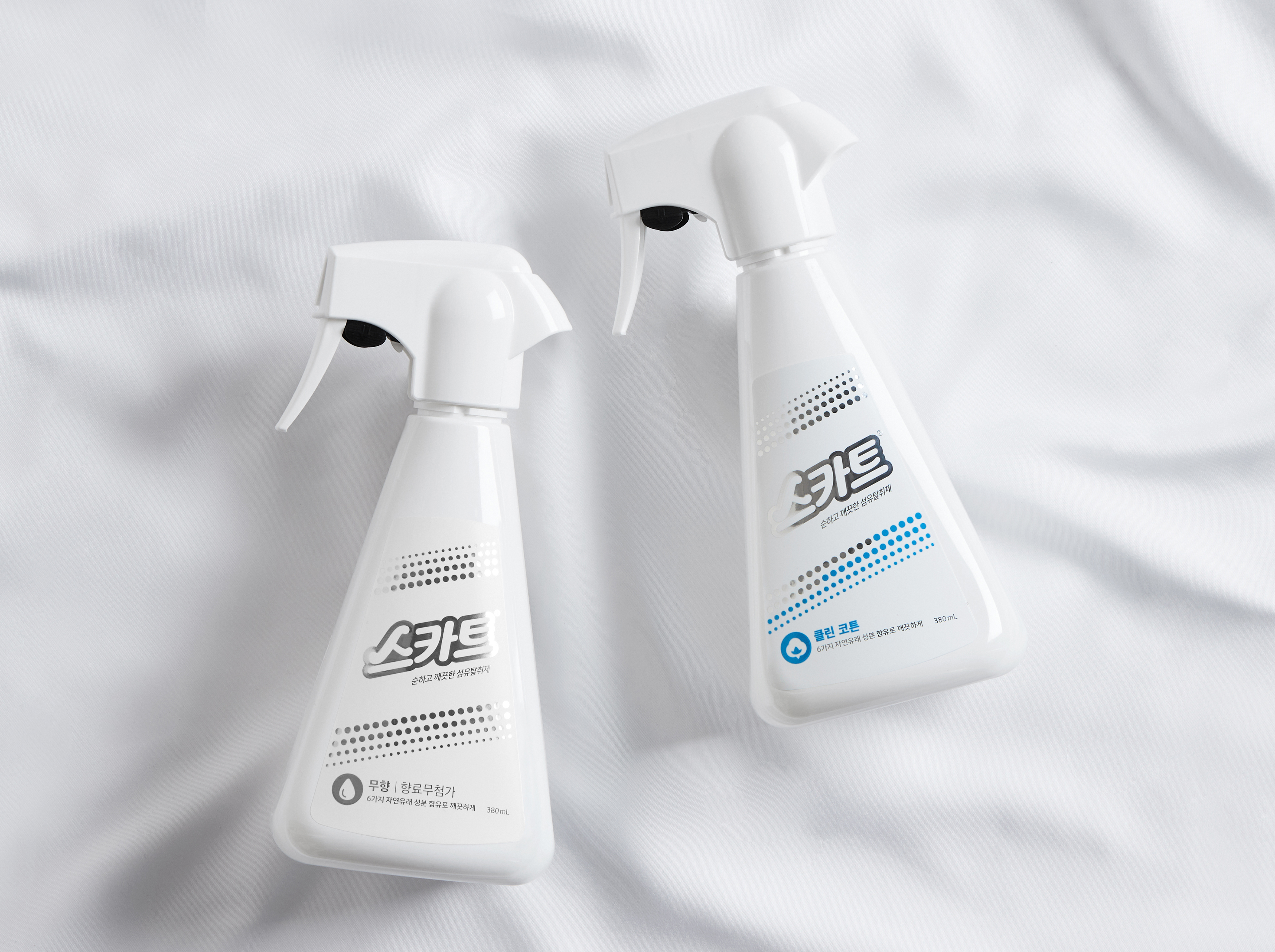
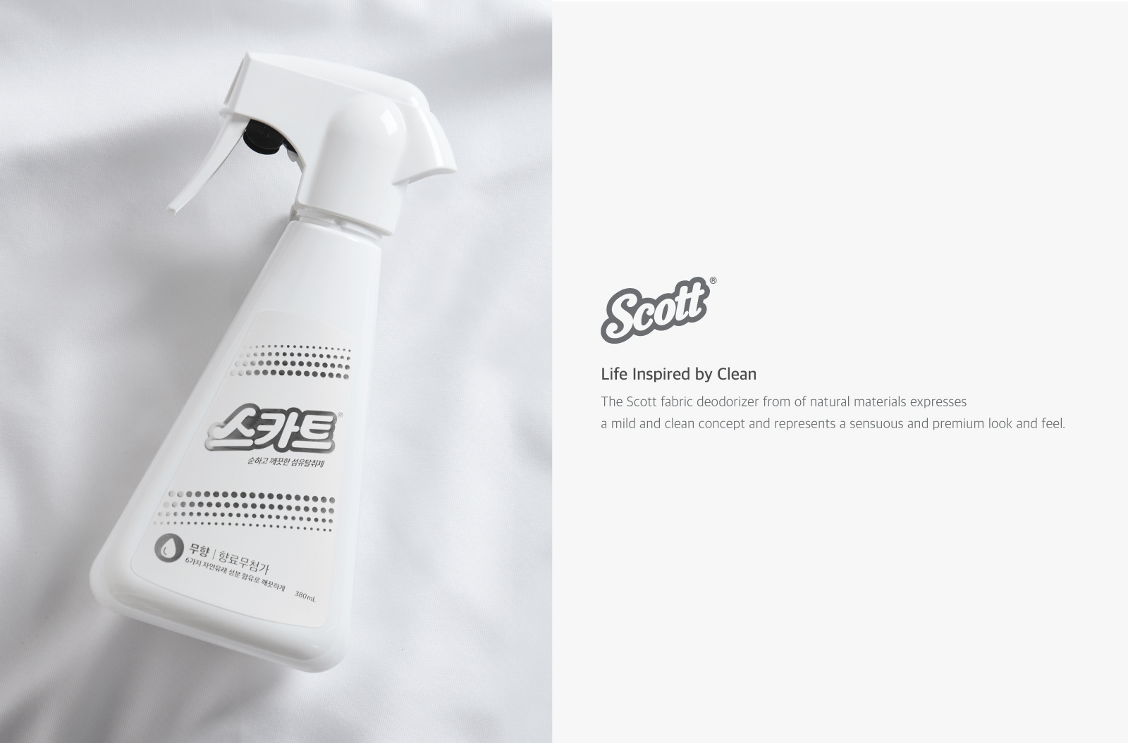
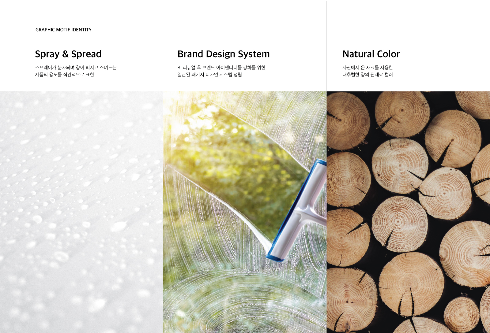
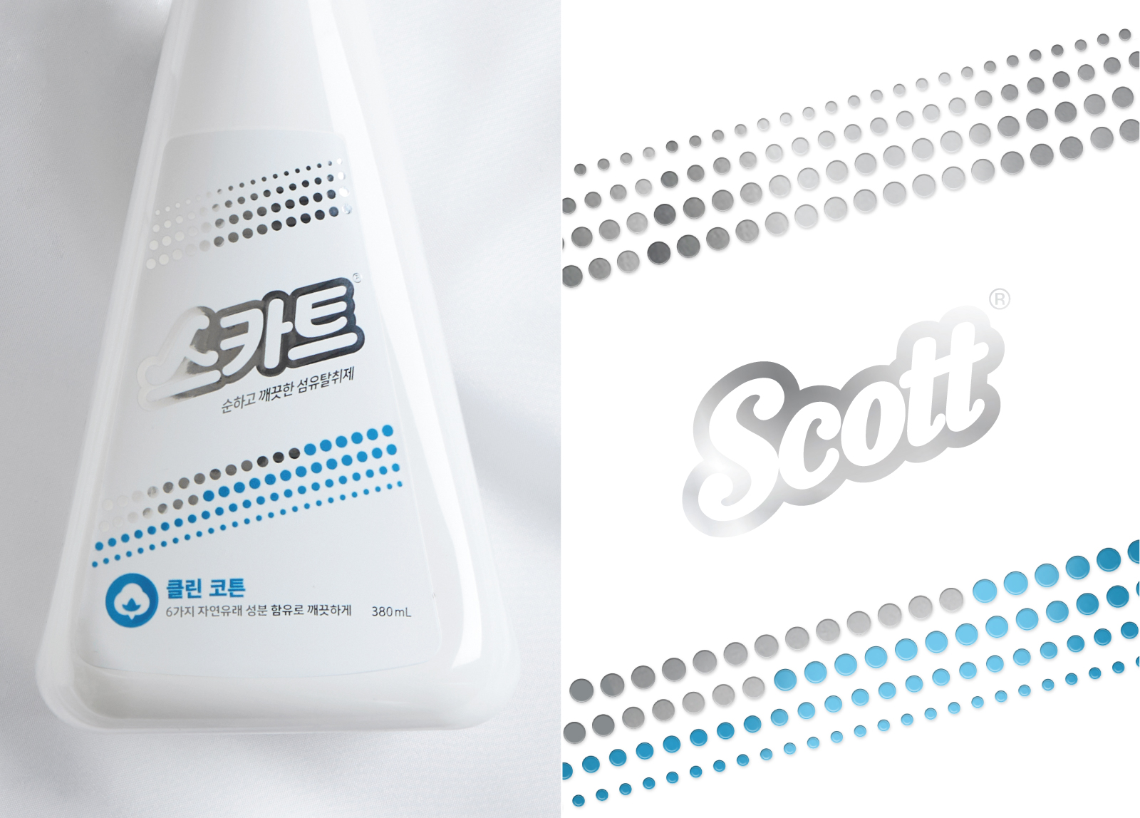
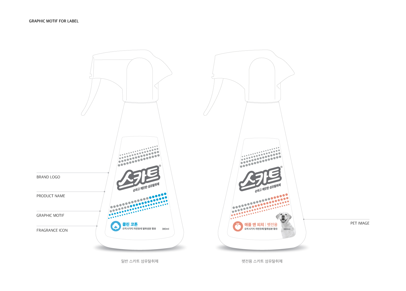
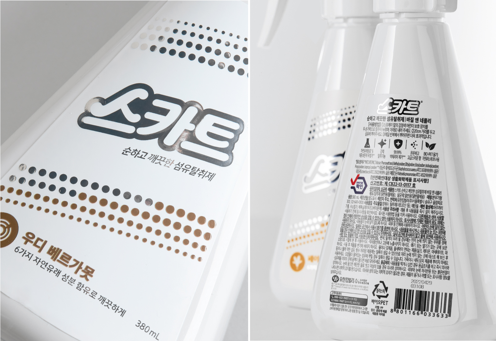
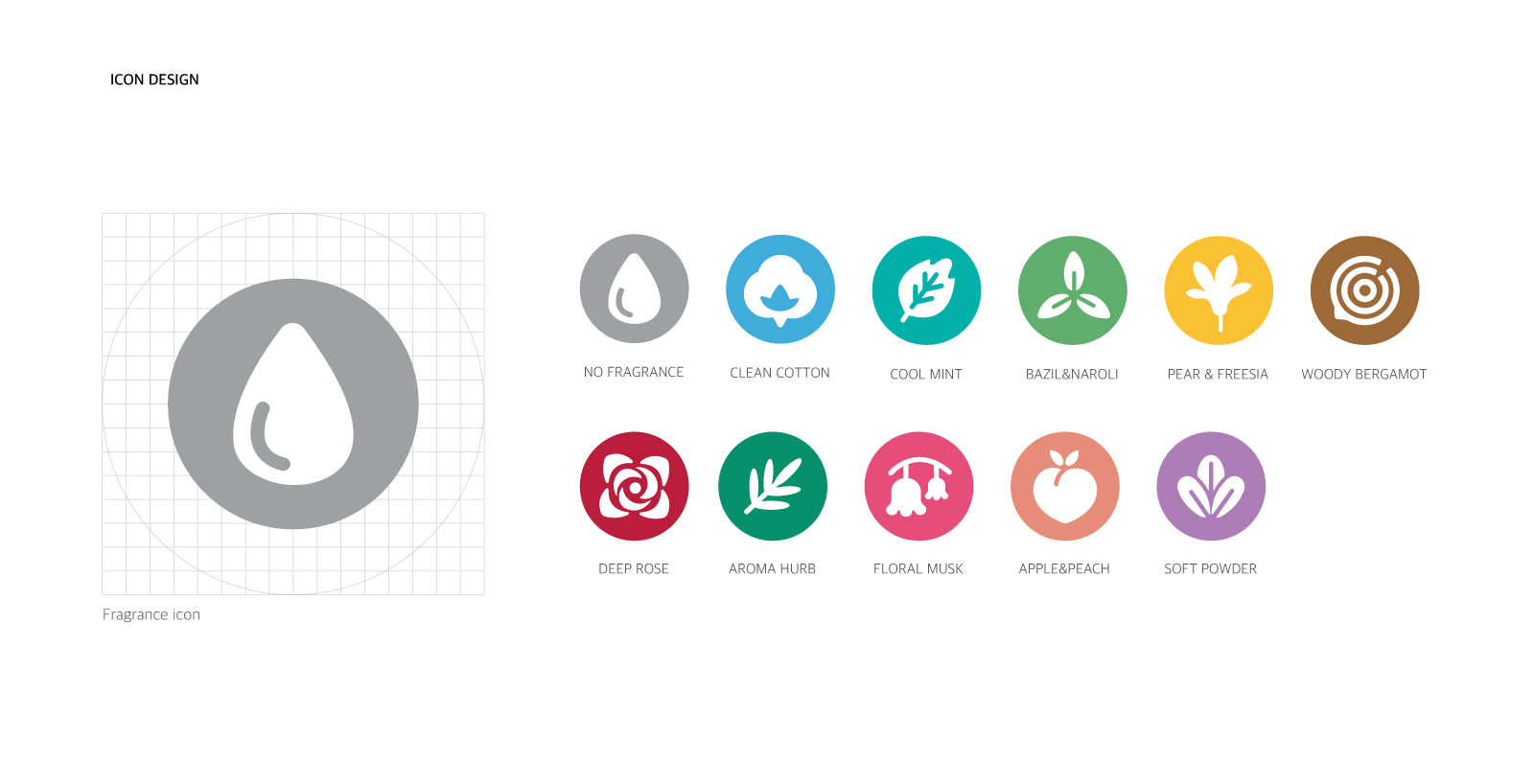
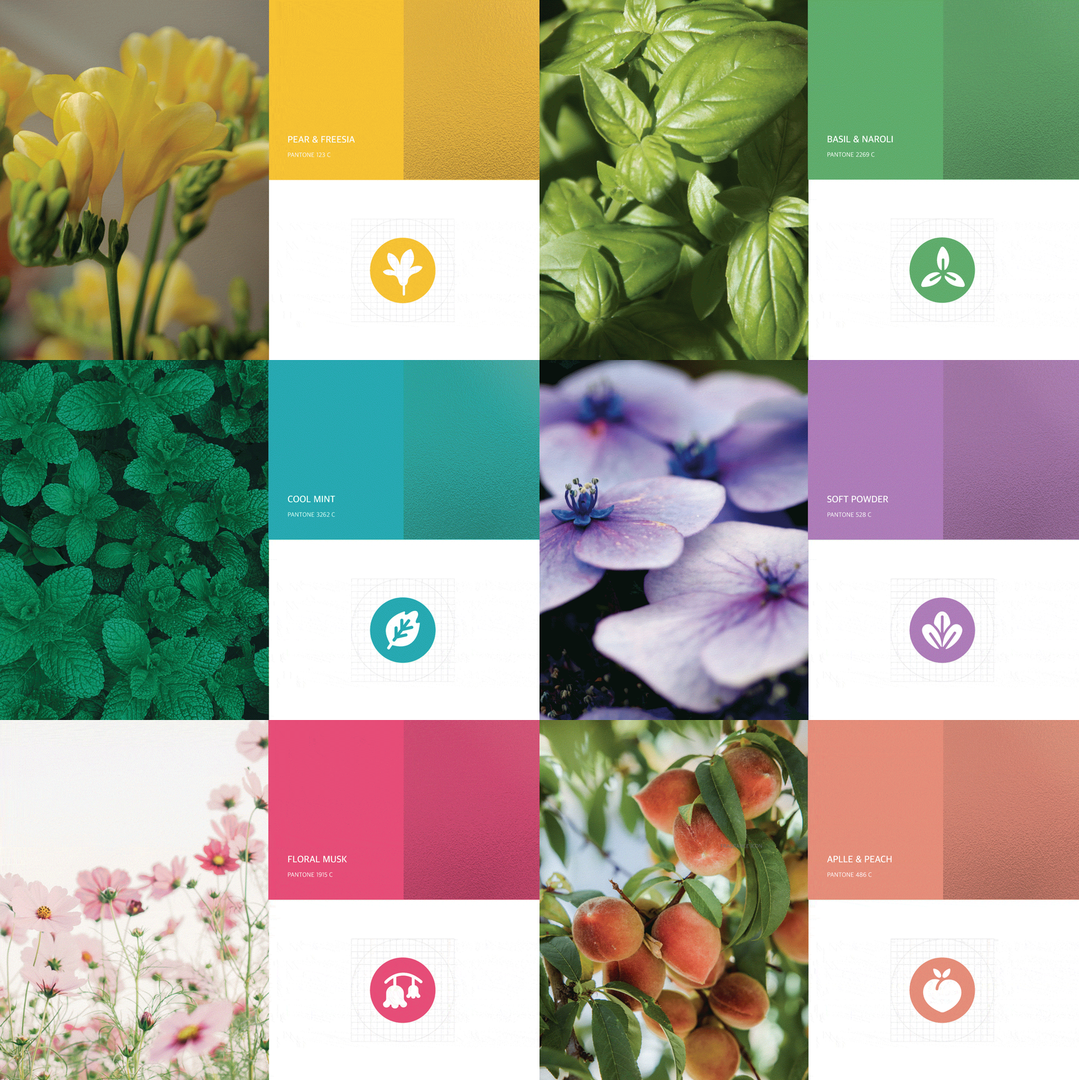
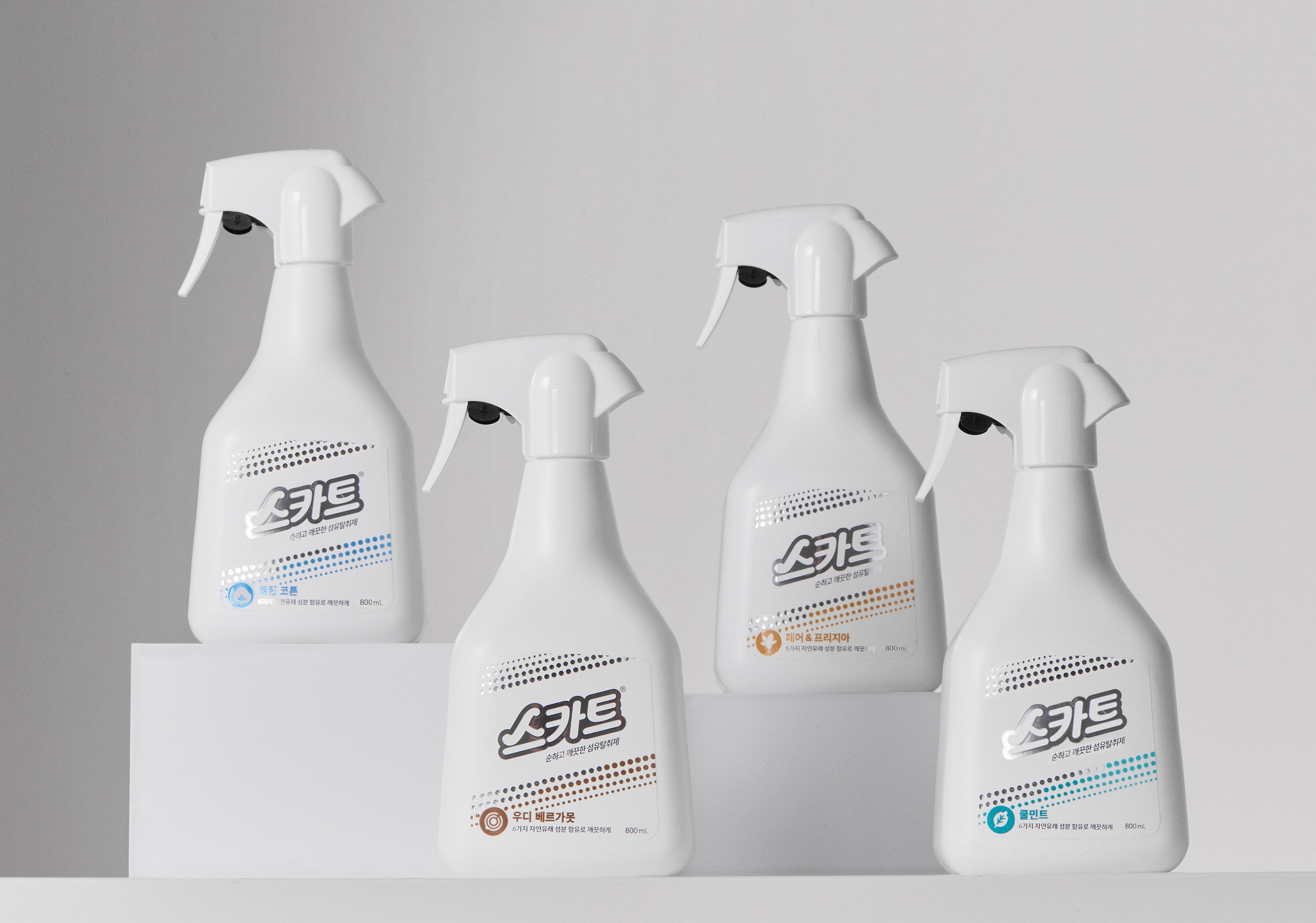
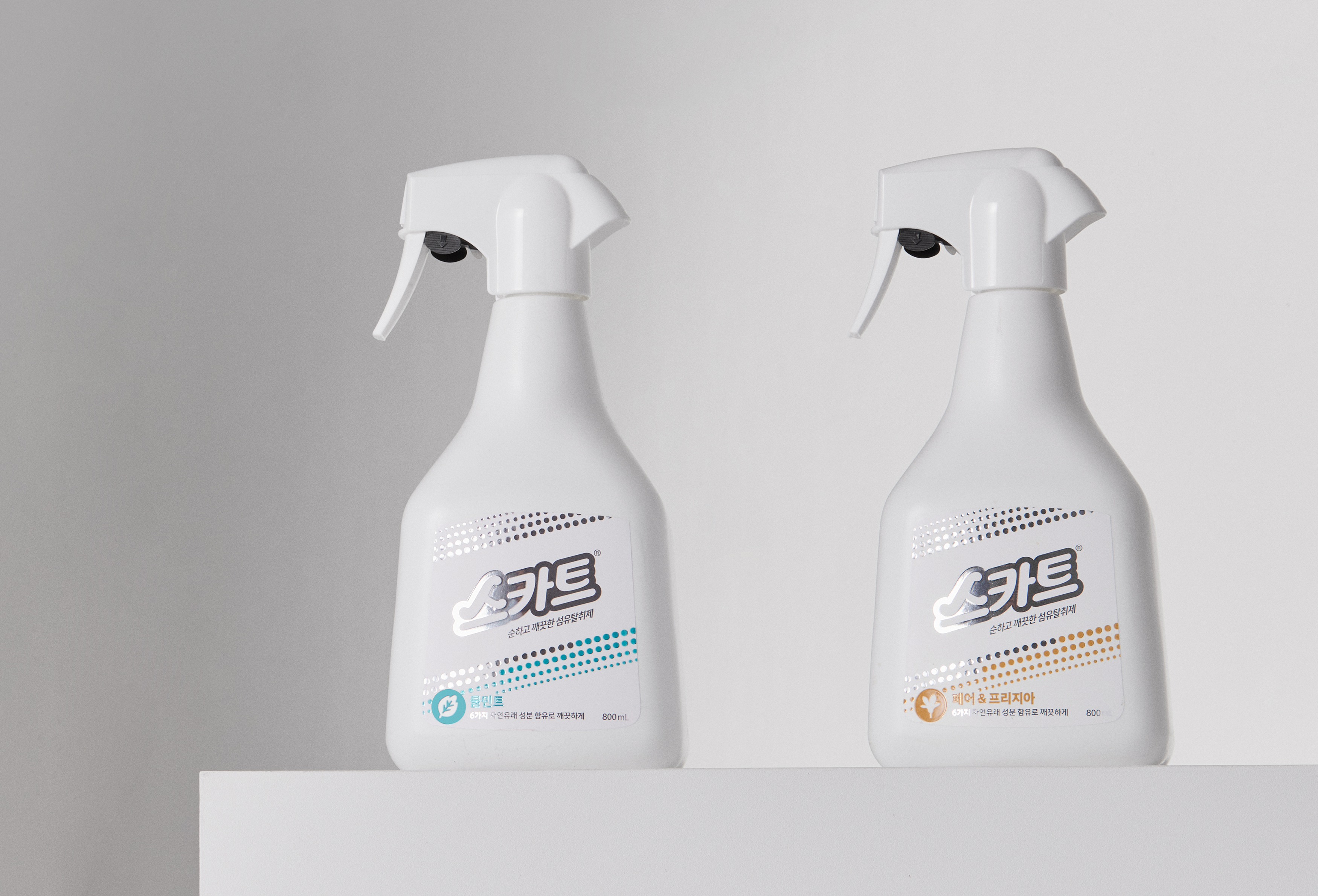
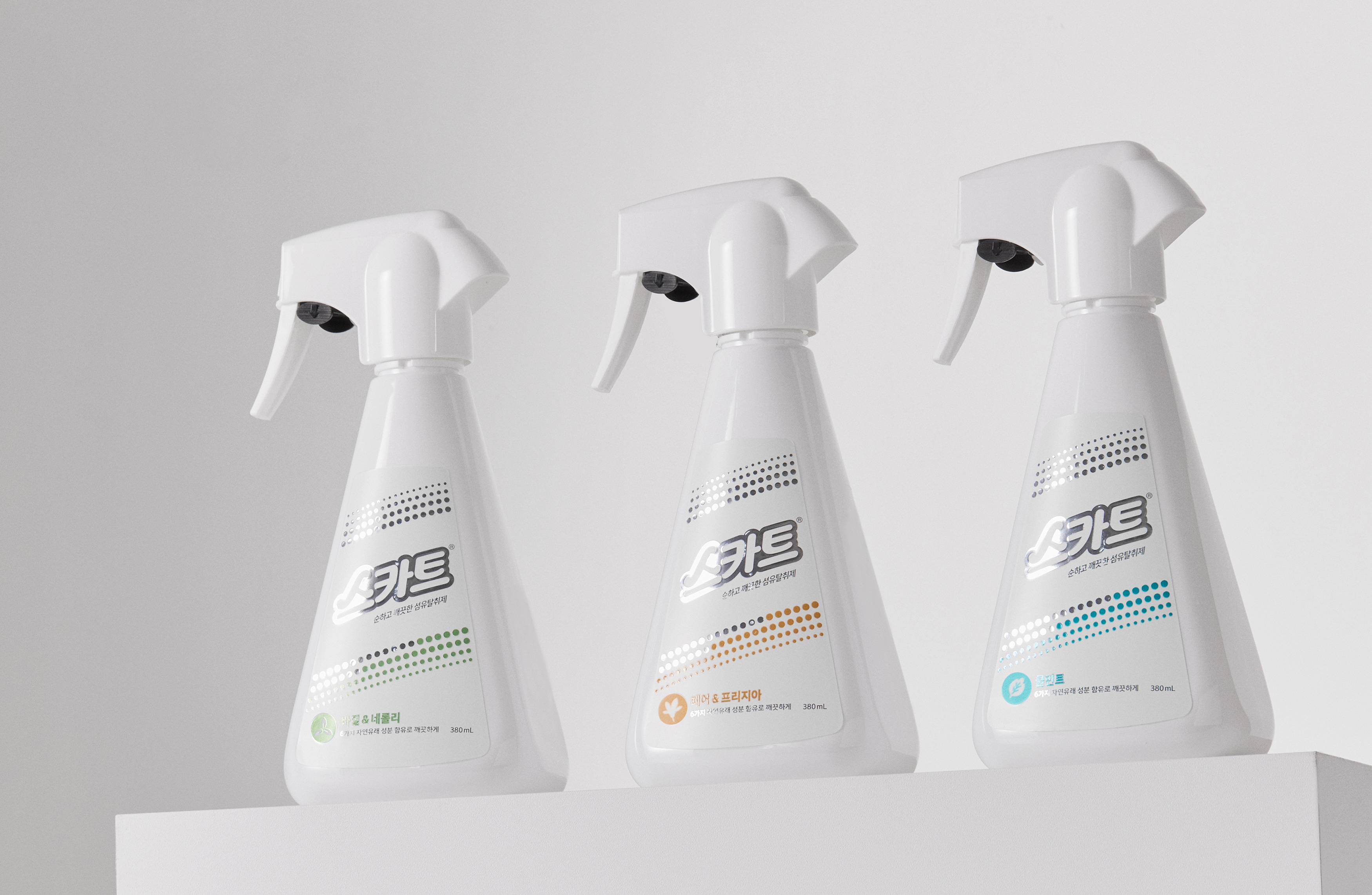
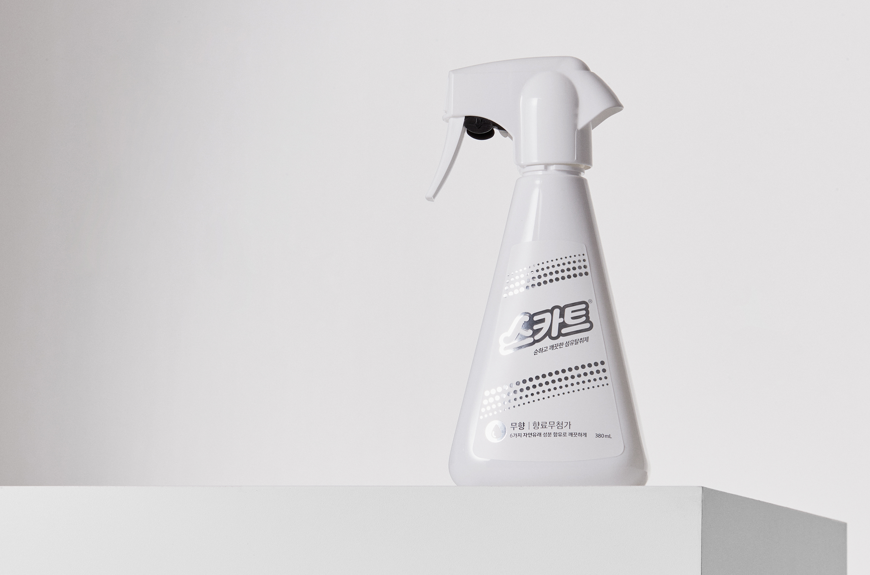
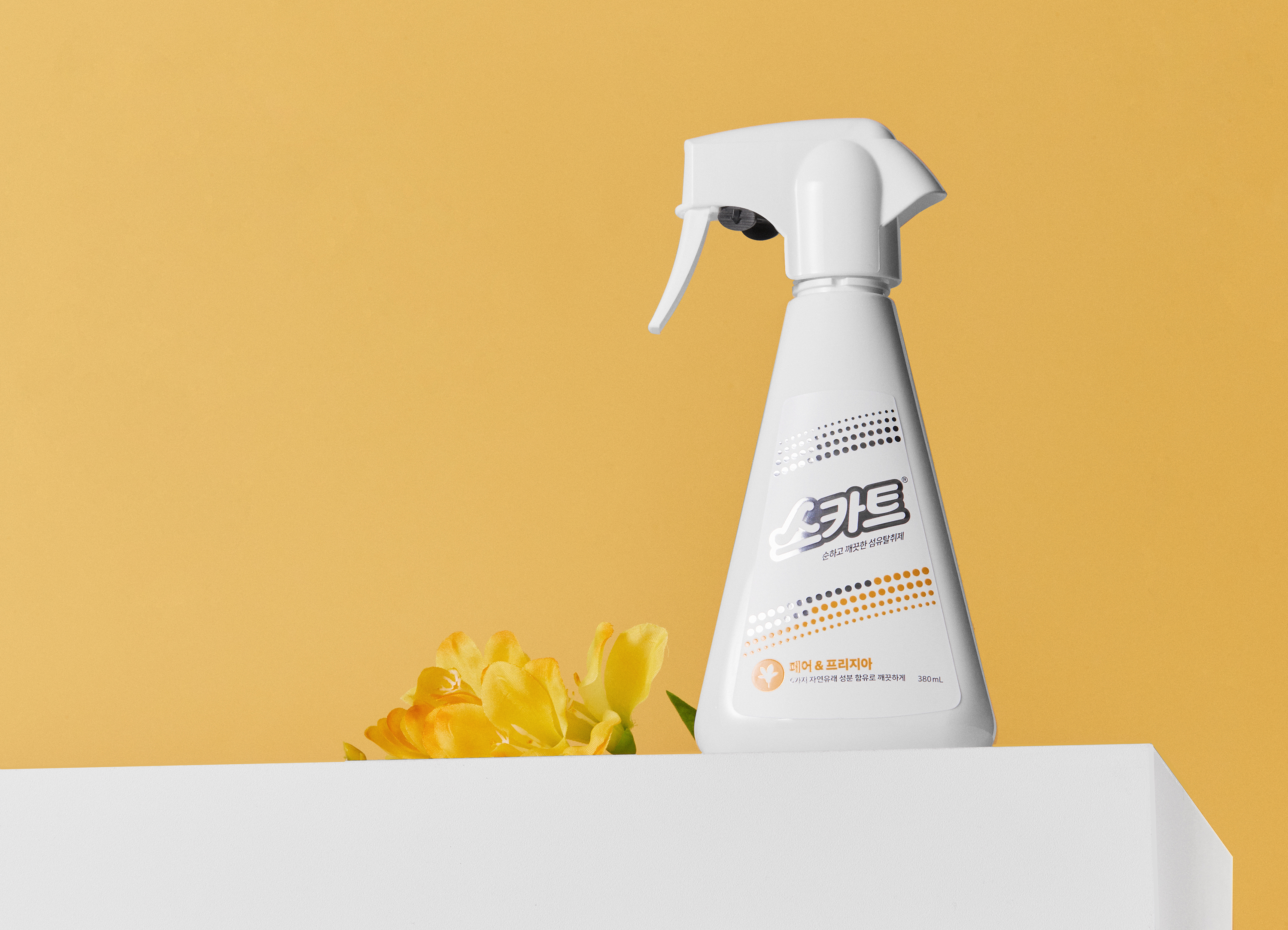
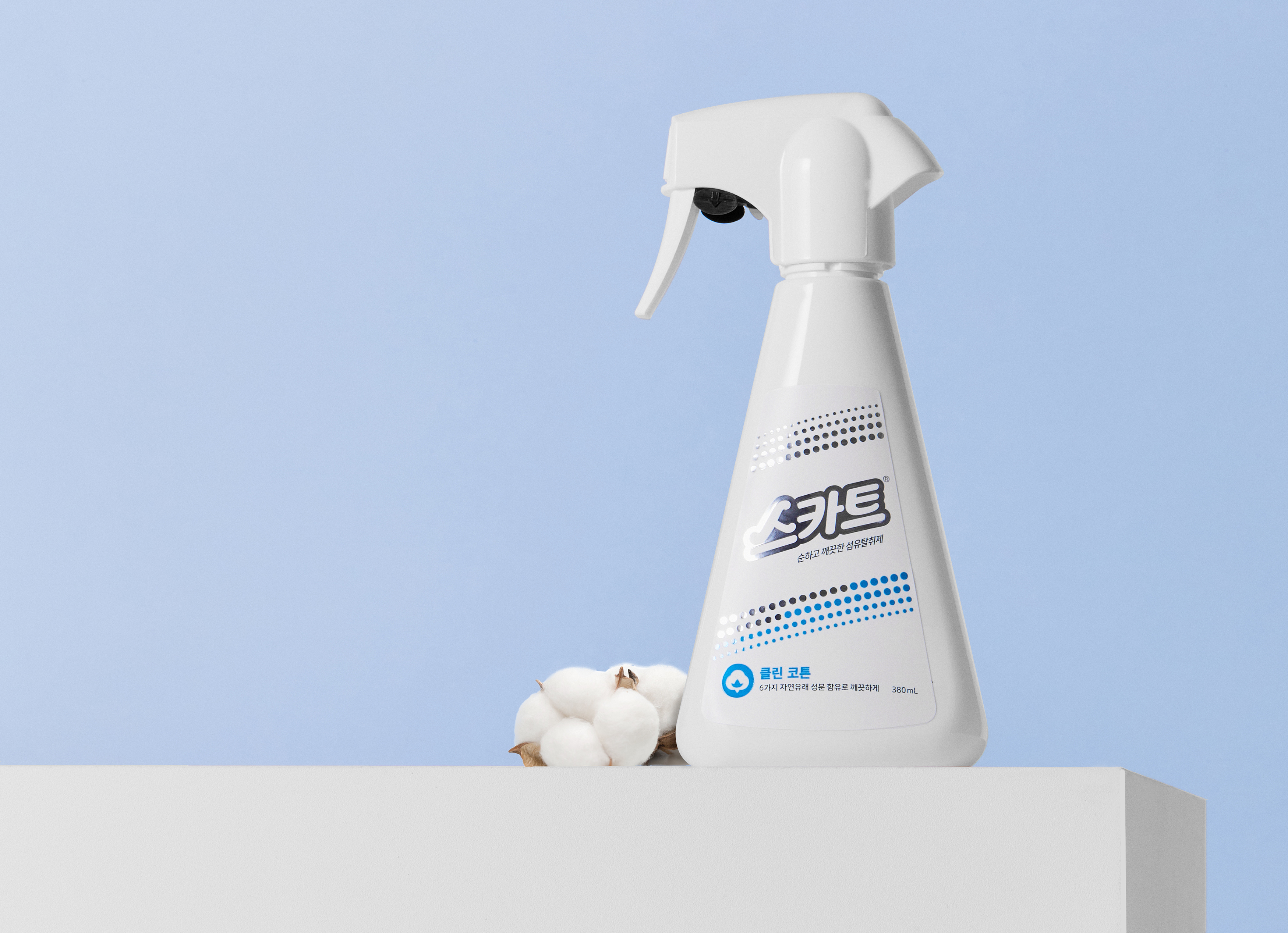
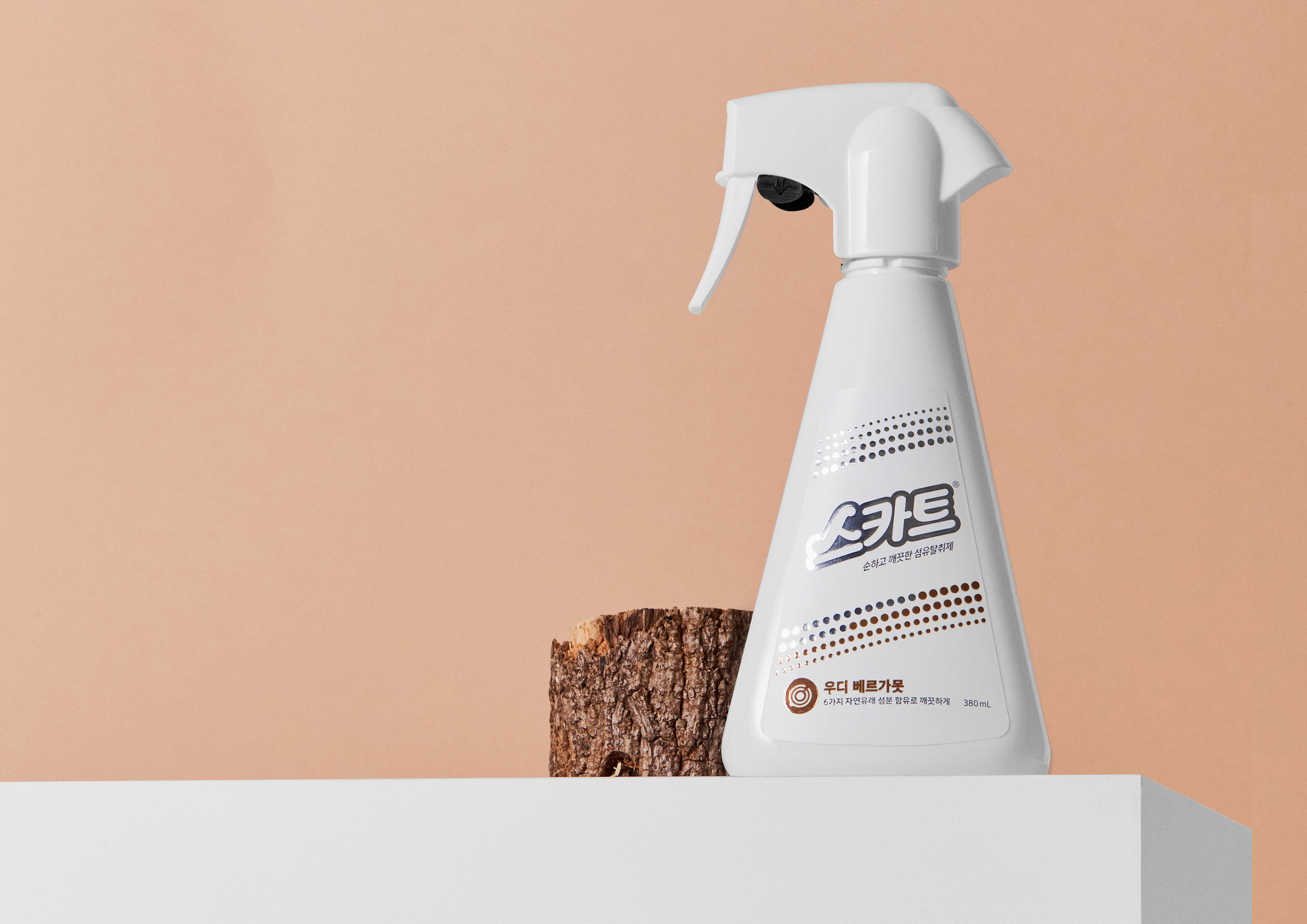
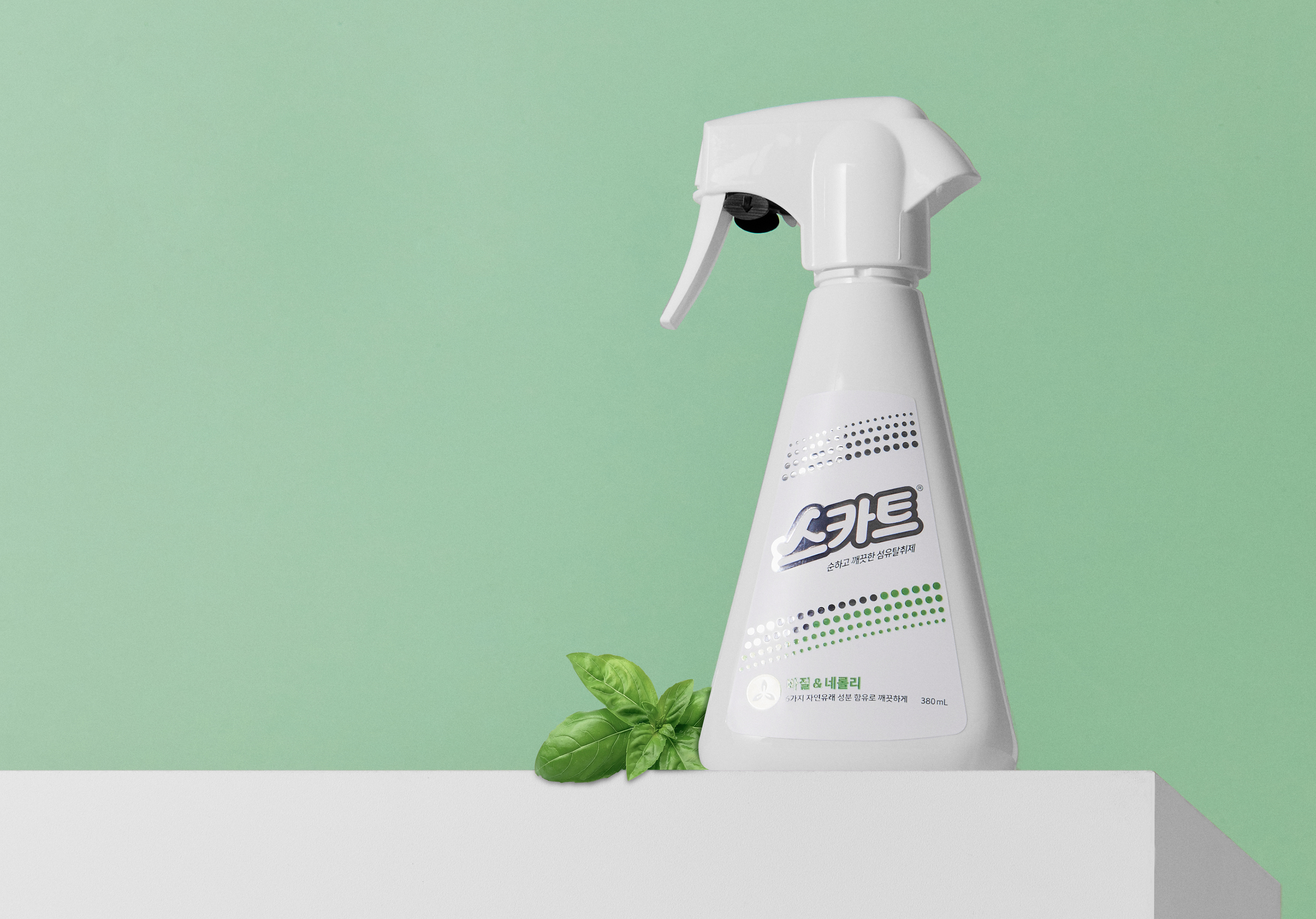
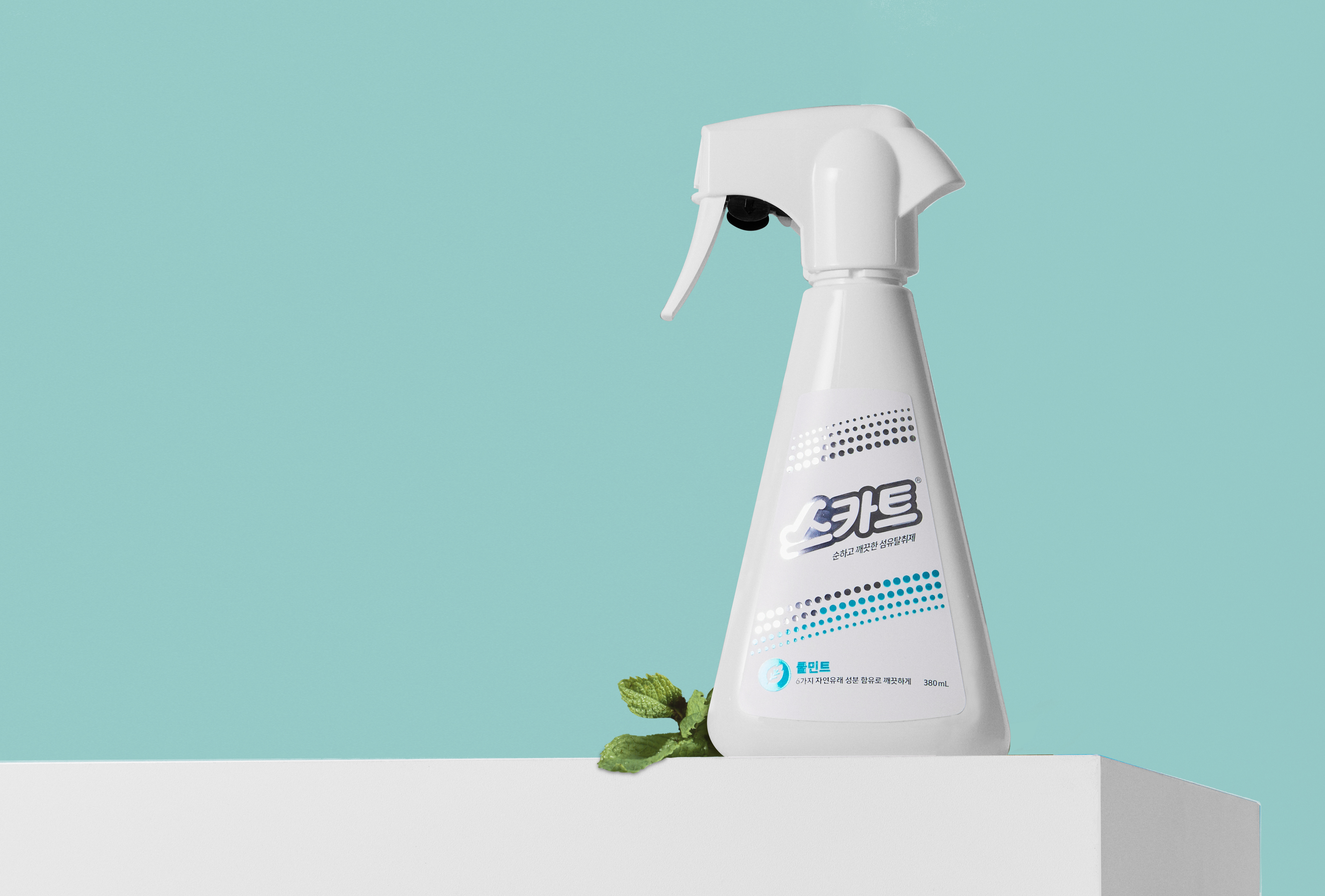
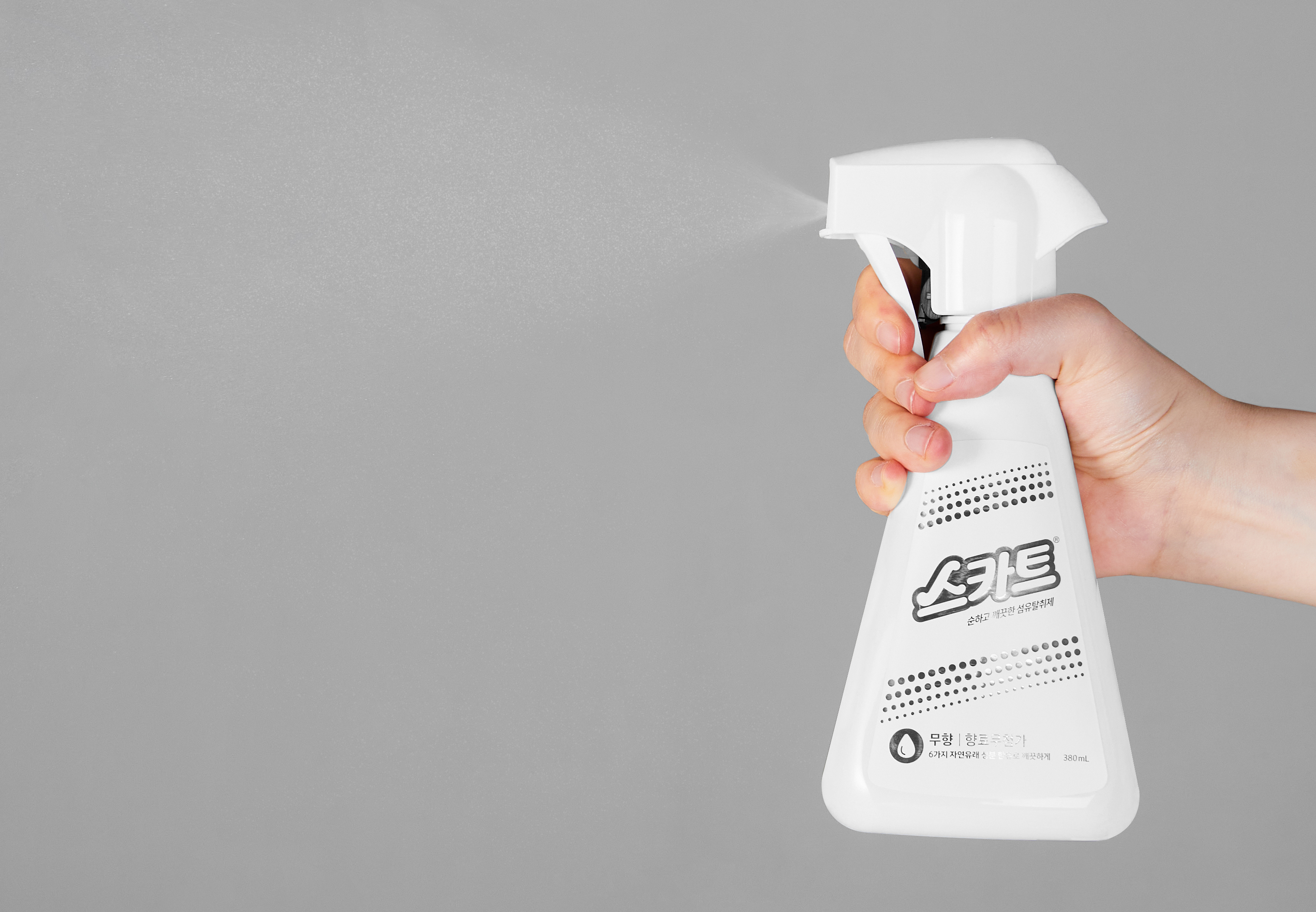
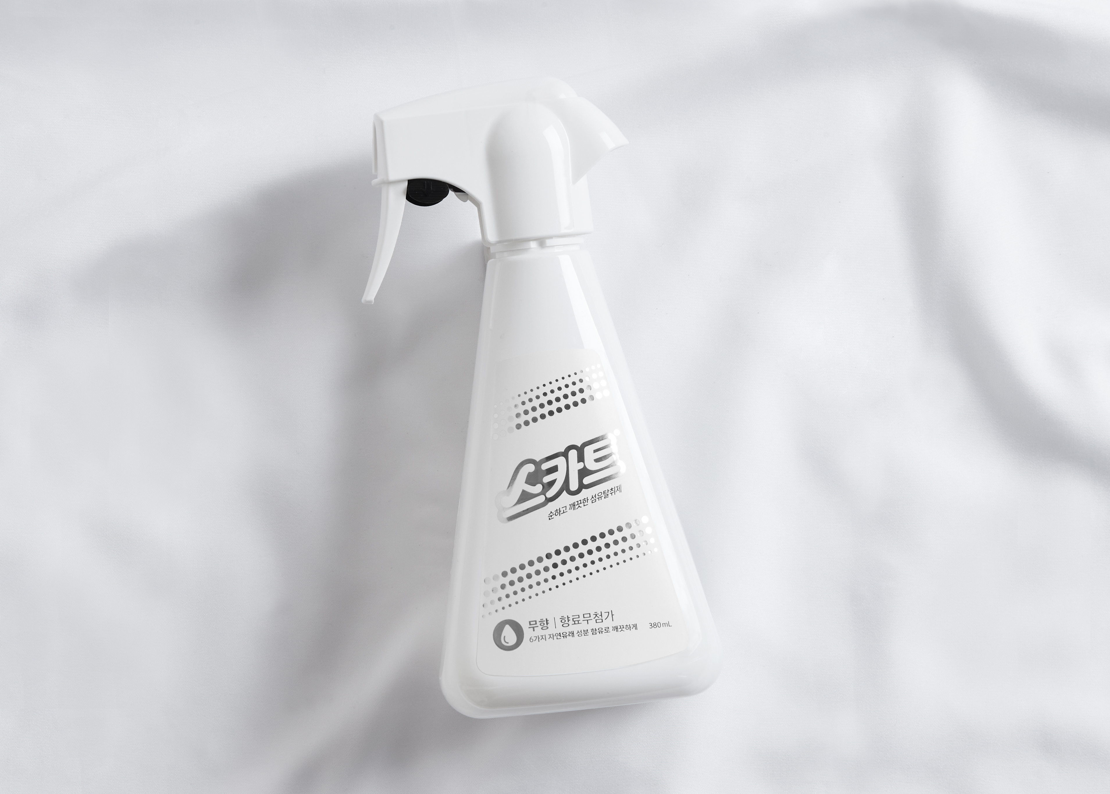
We focused on designs that maintain Scott’s brand system consistently and highlight its distinct strengths of Scott. Inspired by how the fabric deodorizer is sprayed, we visualized the product’s use so that consumers can easily recognize it online and offline by using simple and obvious graphic motifs and icons that can intuitively show the product’s use. Using a white background color matching a minimal and modern package that coincides with the product concept, we intended to further emphasize the pure and clean feeling. We used various color schemes to emphasize that the product contains the fragrance of natural raw natural materials. Through a refined package design without unnecessary elements, we have developed an organized packaging system that provides customers with a differentiated new brand experience for good consumption, such as mild and clean products, safe ingredients, and pleasant scents.
우리는 스카트 브랜드 시스템을 일관되게 유지하며 스카트만의 차별화된 장점이 부각되는 디자인에 중점을 두었습니다. 섬유탈취제가 분사되는 모습에서 영감을 받아 제품의 용도가 직관적으로 보여질 수 있는 그래픽 모티브와 아이콘을 사용하여 온라인과 오프라인에서 소비자들이 쉽게 인식이 가능하도록 시각화했습니다. 제품의 컨셉과 부합하는 미니멀하고 모던한 감각의 패키지에 어울리도록 백그라운드 컬러는 화이트로 통일시키고, 자연에서 온 순한 원료의 향이 담긴 제품임을 강조하기 위해 향을 표현하는 다양한 컬러스킴을 포인트로 사용했습니다. 군더더기 없는 심플한 패키지 디자인을 통해 순하고 깨끗한 제품, 안심할 수 있는 성분, 기분 좋은 향 등 고객들에게 착한 소비에 대한 차별화된 새로운 브랜드 경험을 선사하는 체계화된 패키지 시스템을 개발했습니다.