pigeon
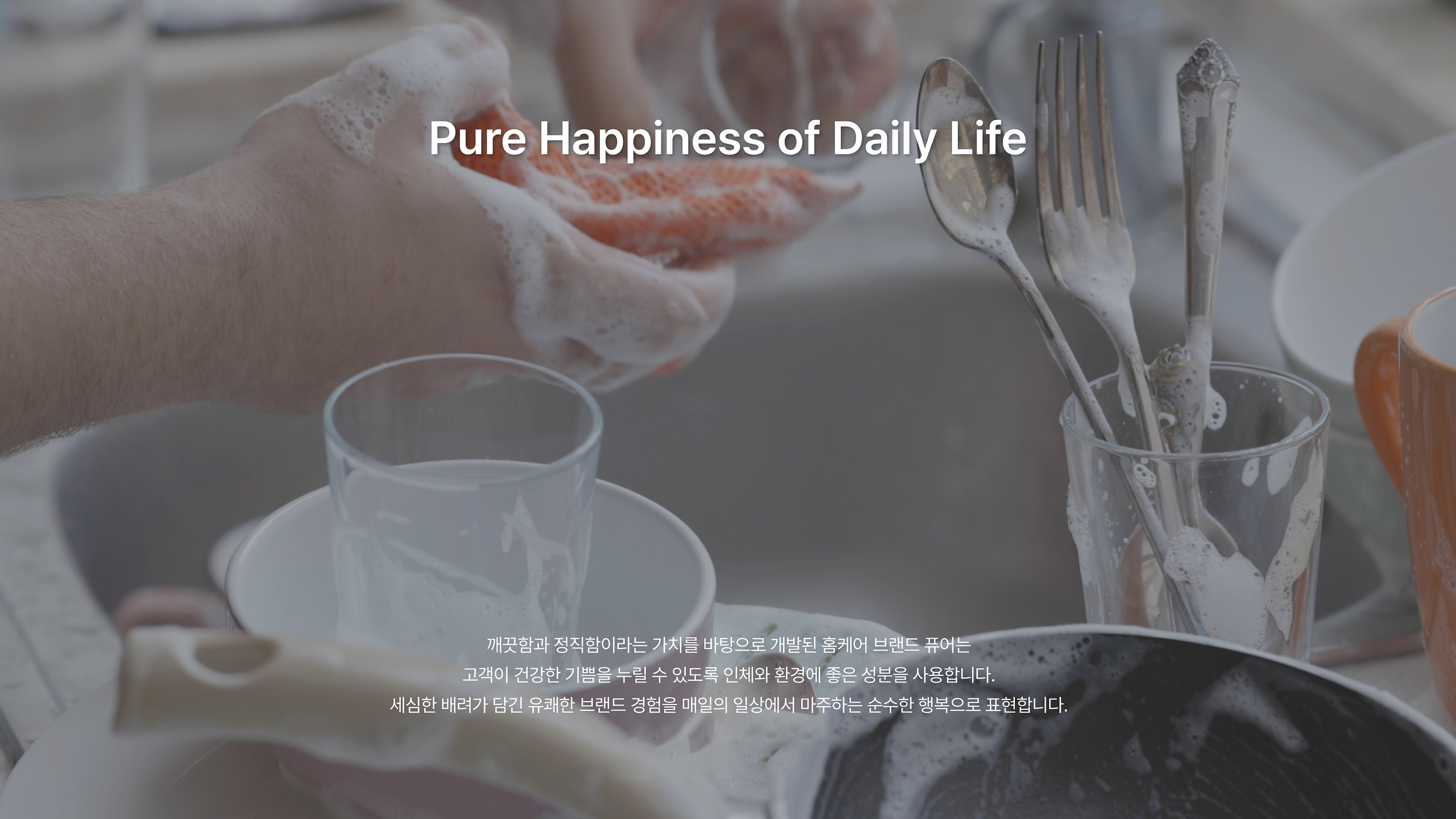
Pure Happiness in Everyday Life

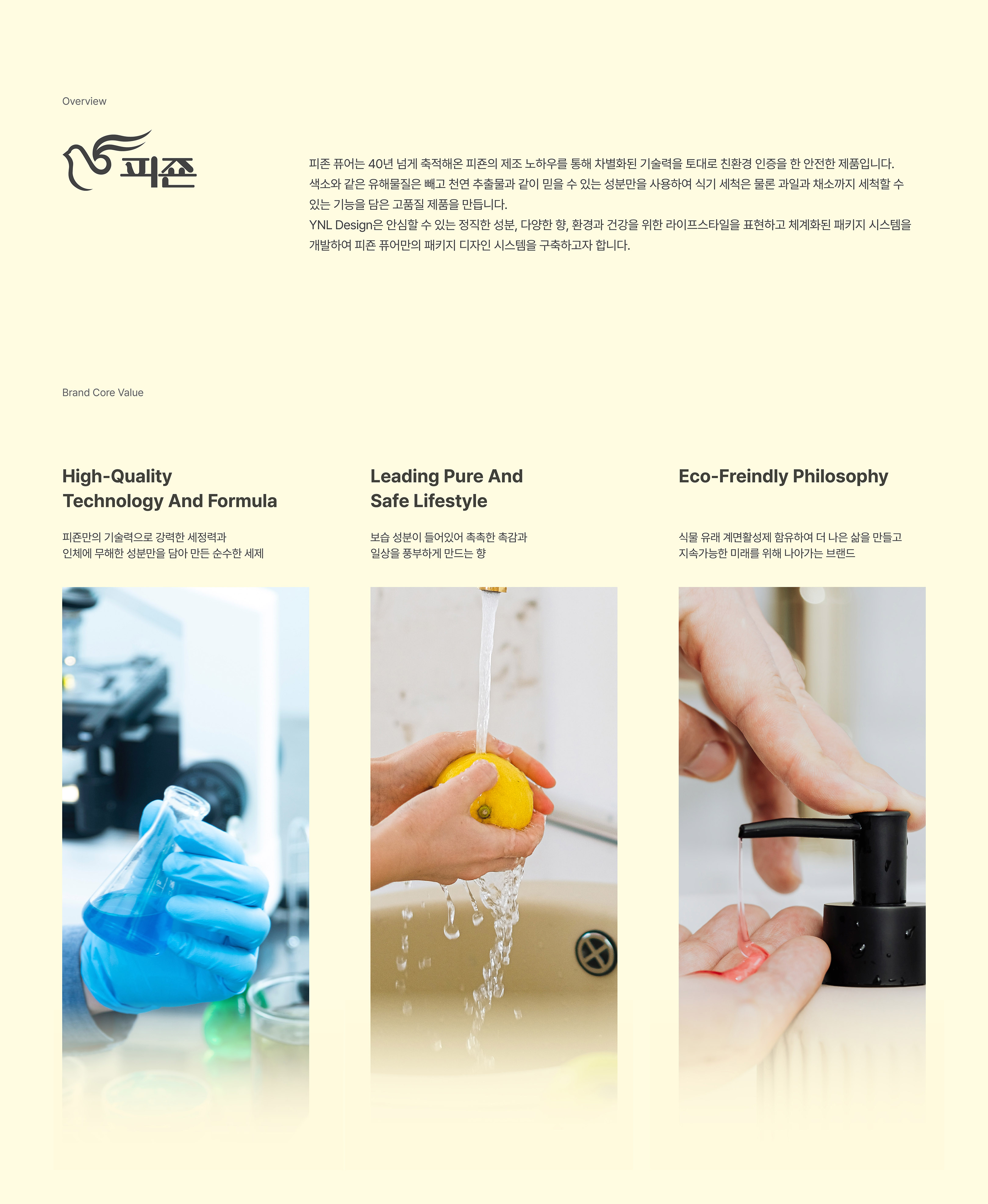
Pure by Pigeon harnesses Pigeon’s accumulated manufacturing expertise spanning over 40 years to deliver a differentiated technological prowess certified for eco-friendliness. Our products are certified safe, incorporating natural extracts and trusted ingredients while excluding harmful substances such as dyes. With functionality to wash not only dishes but also fruits and vegetables, we strive to create high-quality products for a convenient and pleasant lifestyle. Additionally, we have eliminated allergens that could trigger skin allergies, obtaining skin stability in human application tests to further enhance comfort and well-being.
피존 퓨어는 40년 넘게 축적해온 피죤의 제조 노하우를 통해 차별화된 기술력을 토대로 친환경 인증을 한 안전한 제품입니다. 색소와 같은 유해물질은 빼고 천연 추출물과 같이 믿을 수 있는 성분만을 사용하여 식기 세척은 물론 과일과 채소까지 세척할 수 있는 기능을 담은 고품질 제품을 만듭니다. 피부 알레르기를 유발하는 유해성분을 빼고 인체적용시험에서 피부 안정성도 안정을 받아 편리하고 쾌적한 라이프 스타일을 위해 나아가고자 합니다.
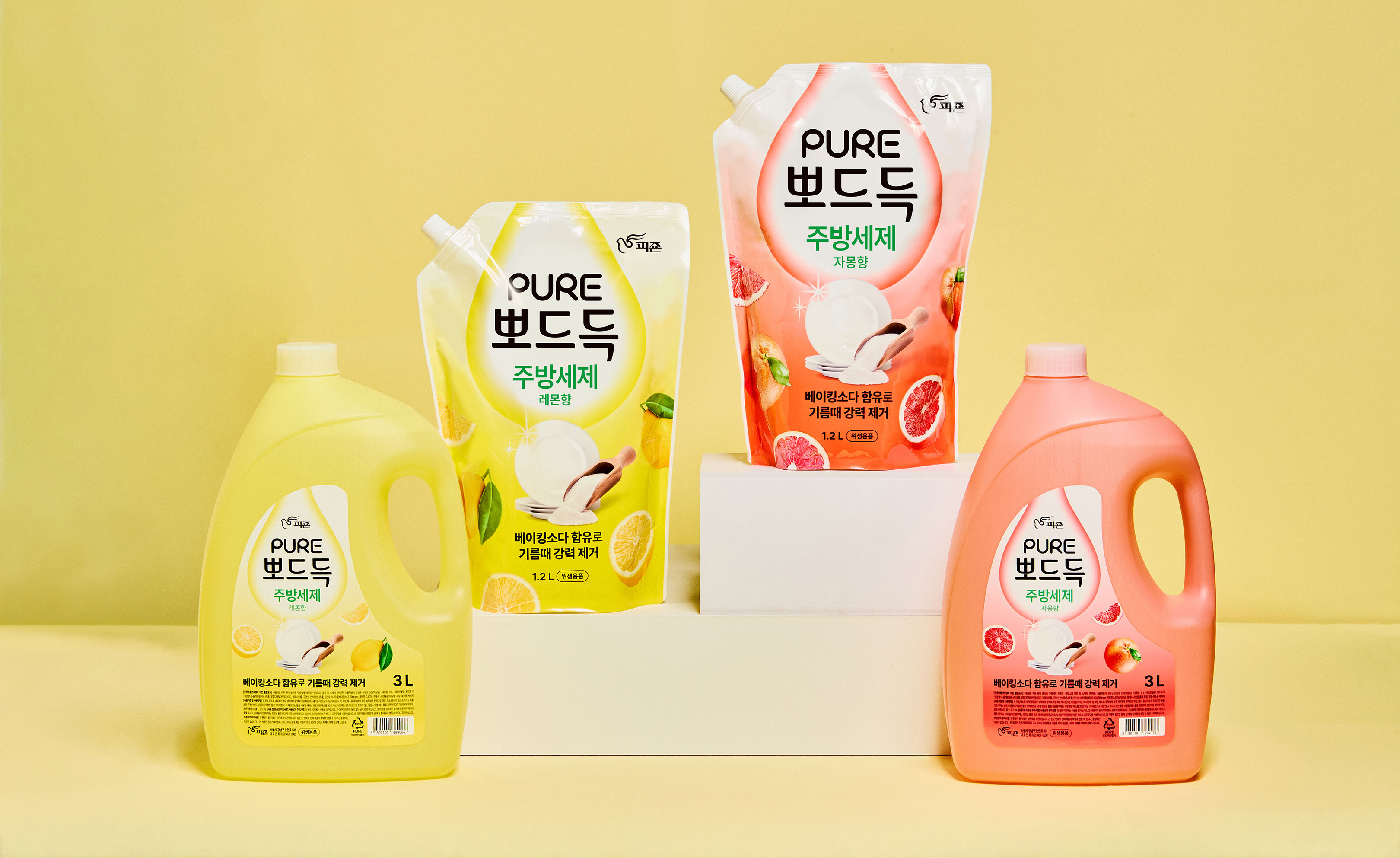
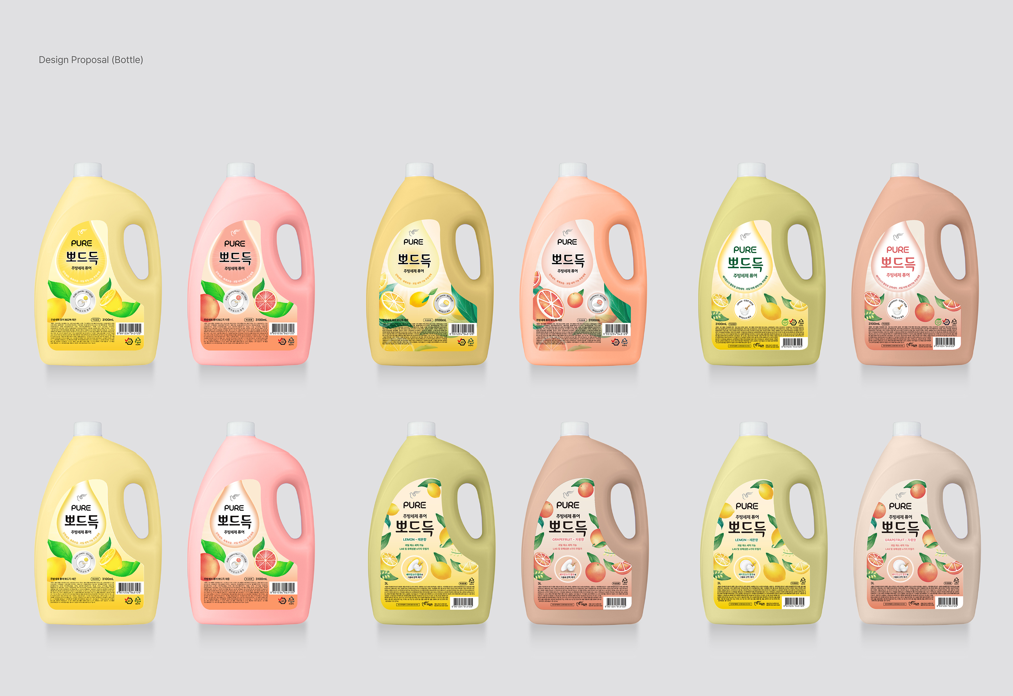
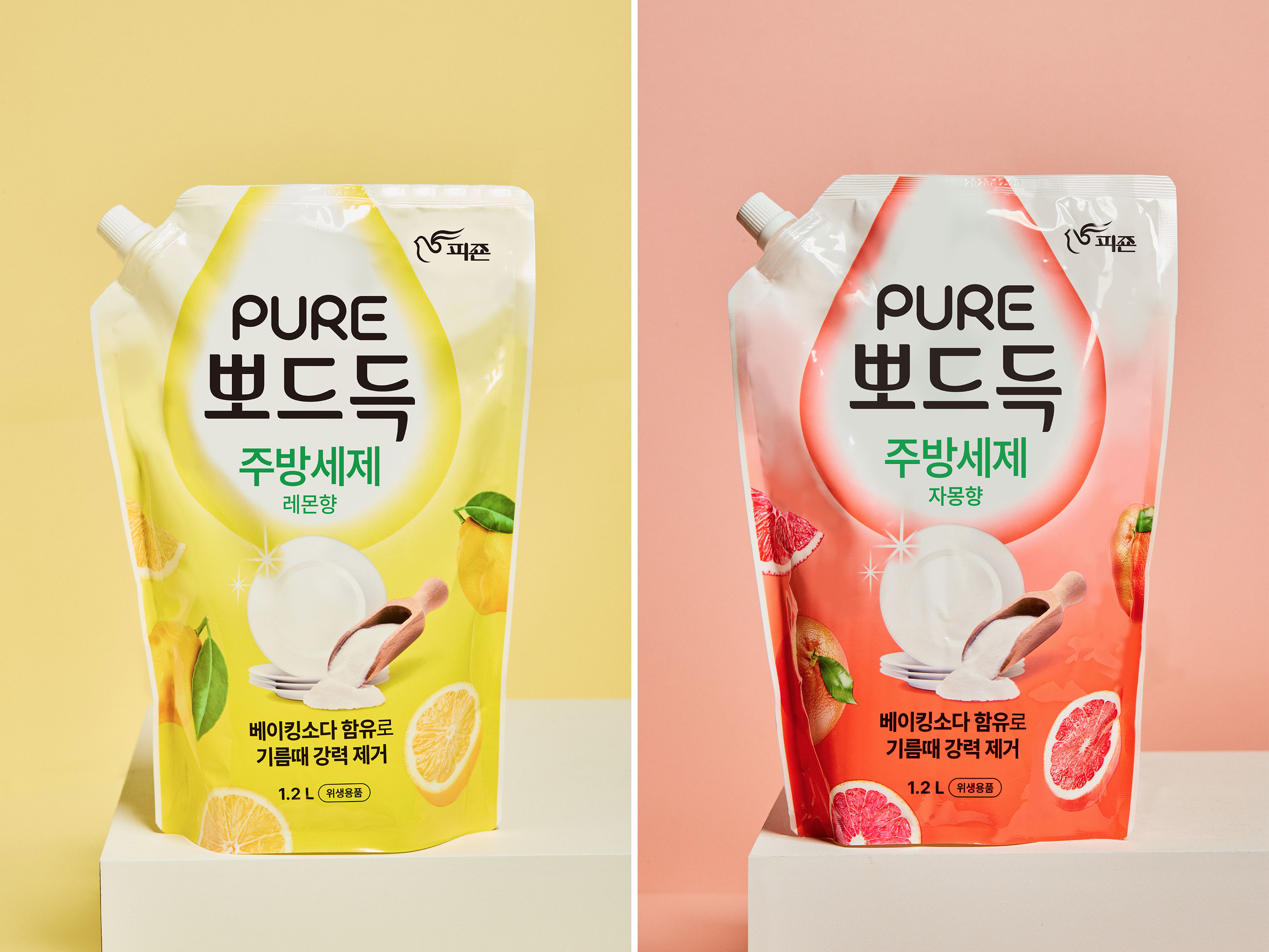
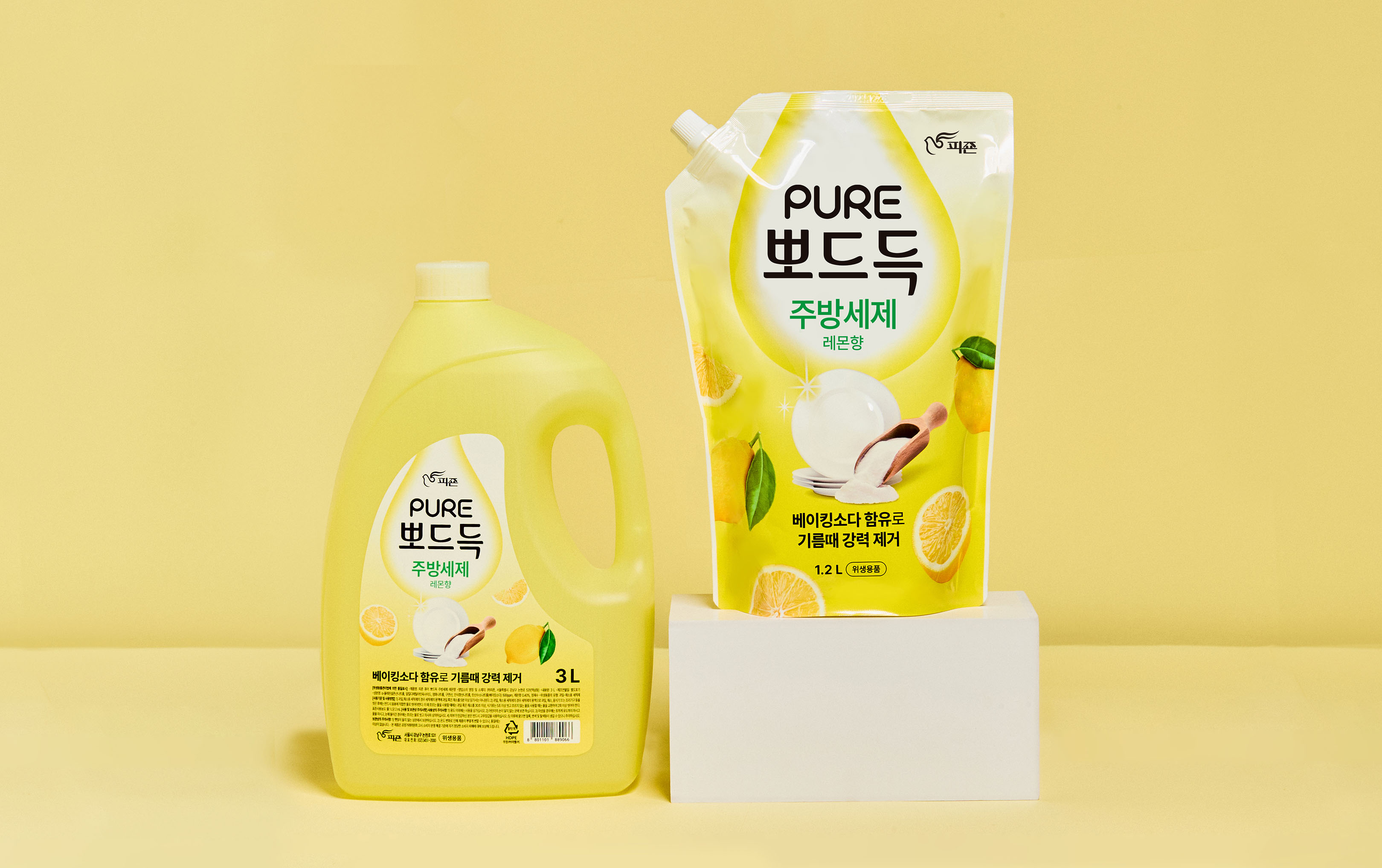
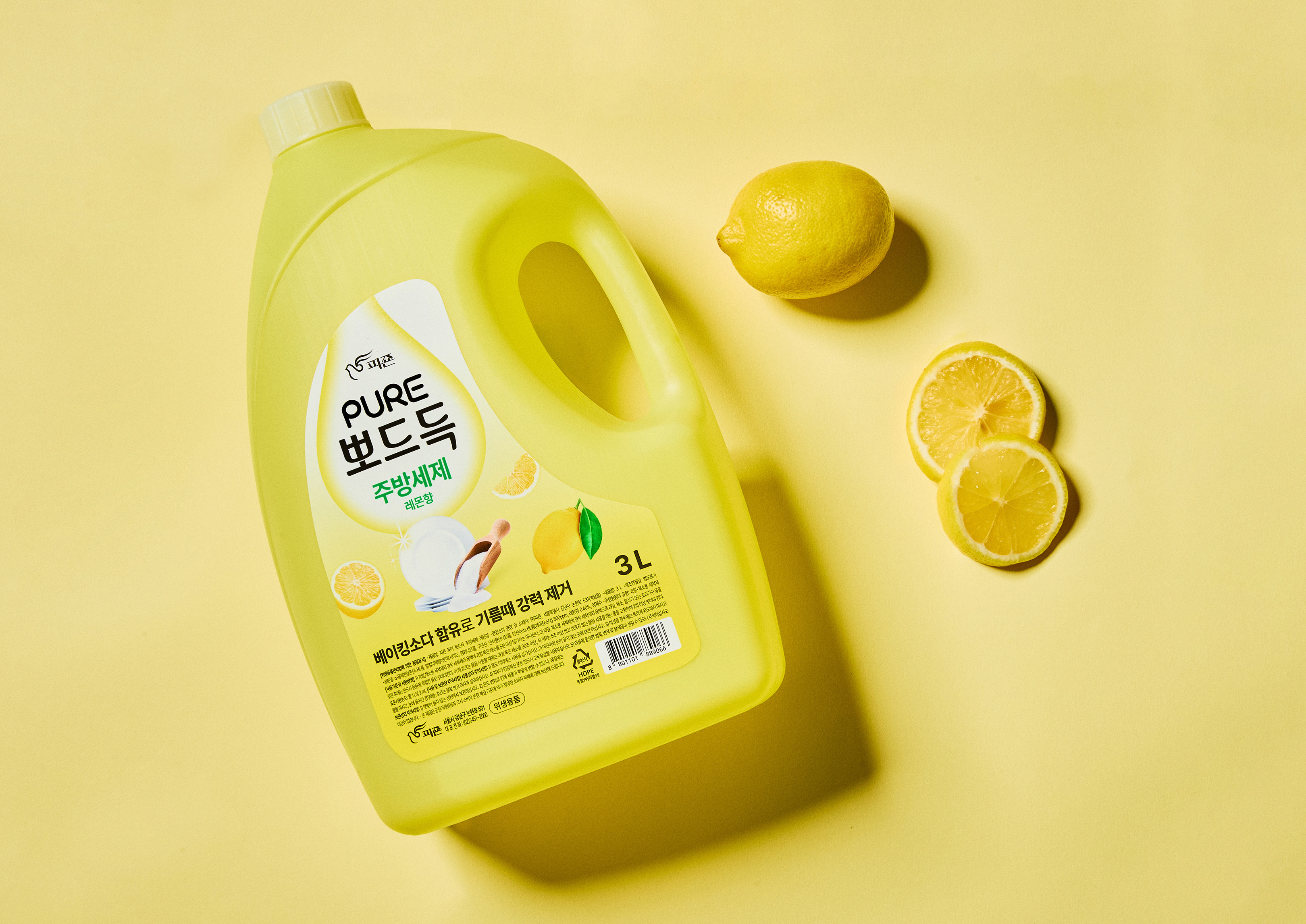
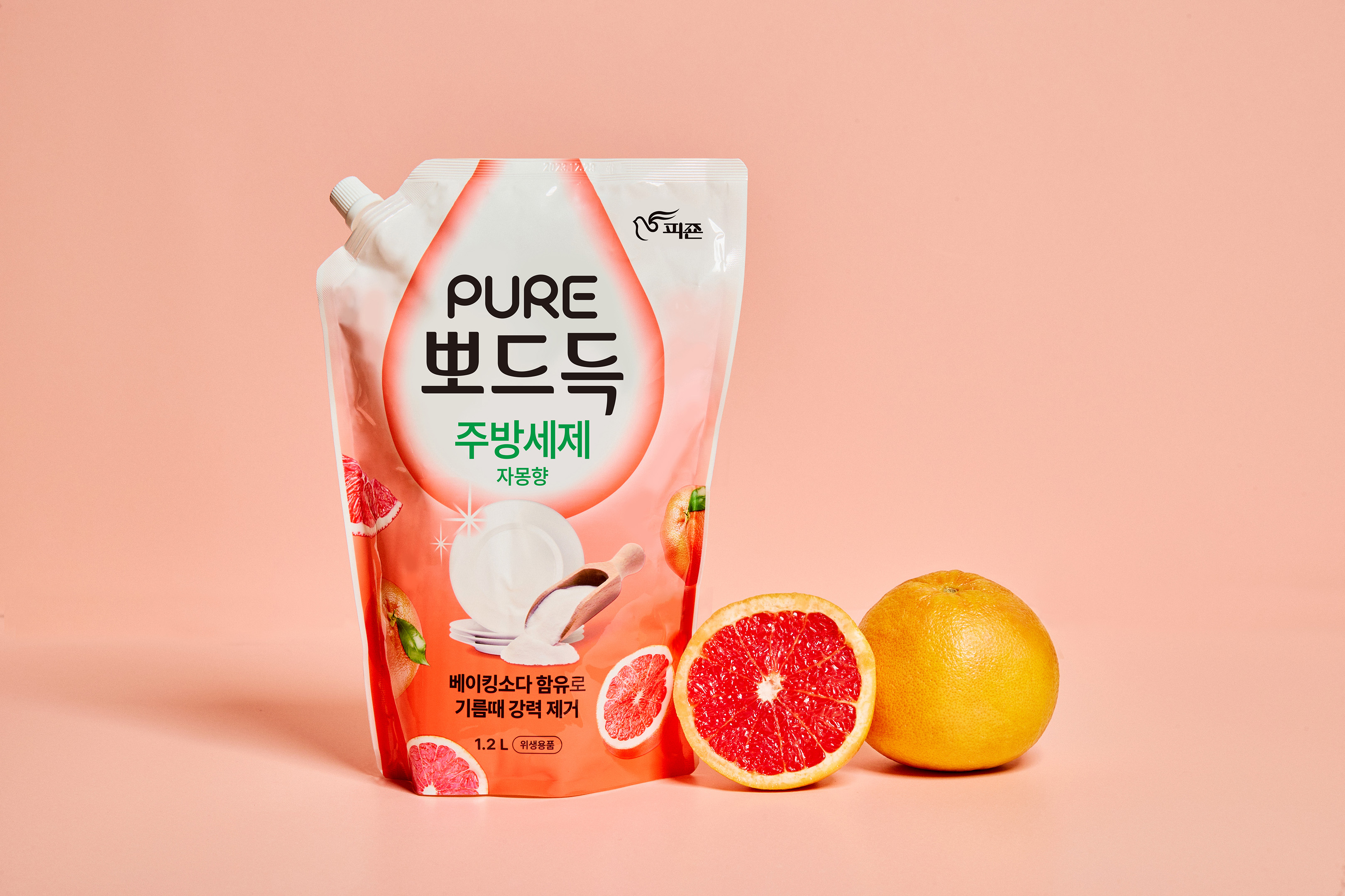
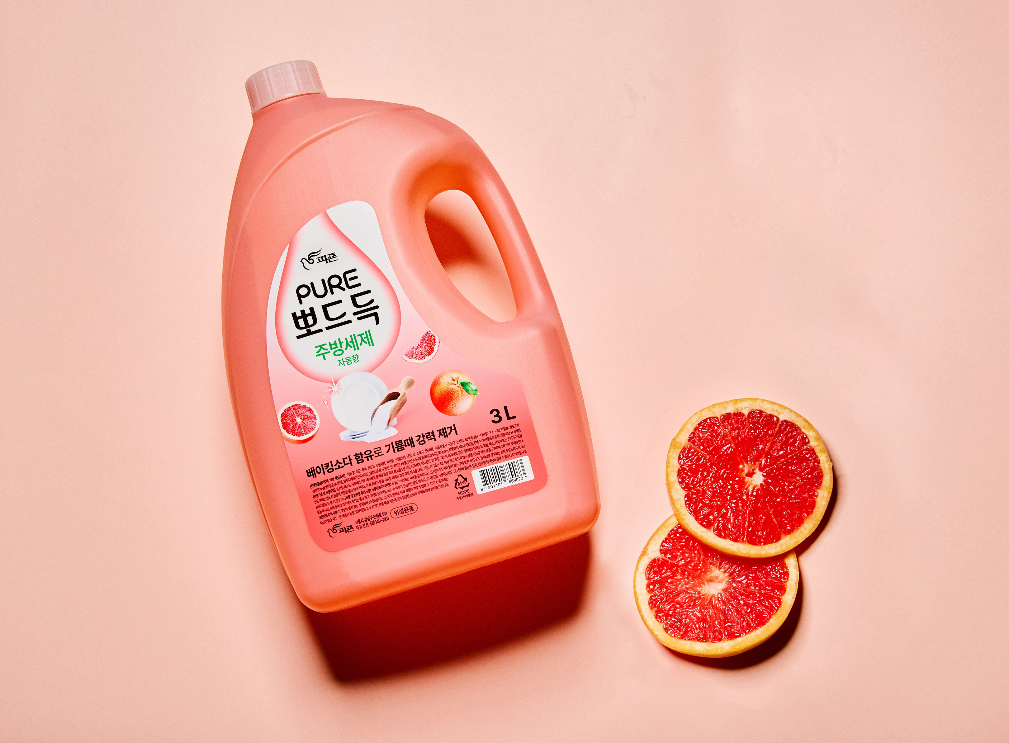
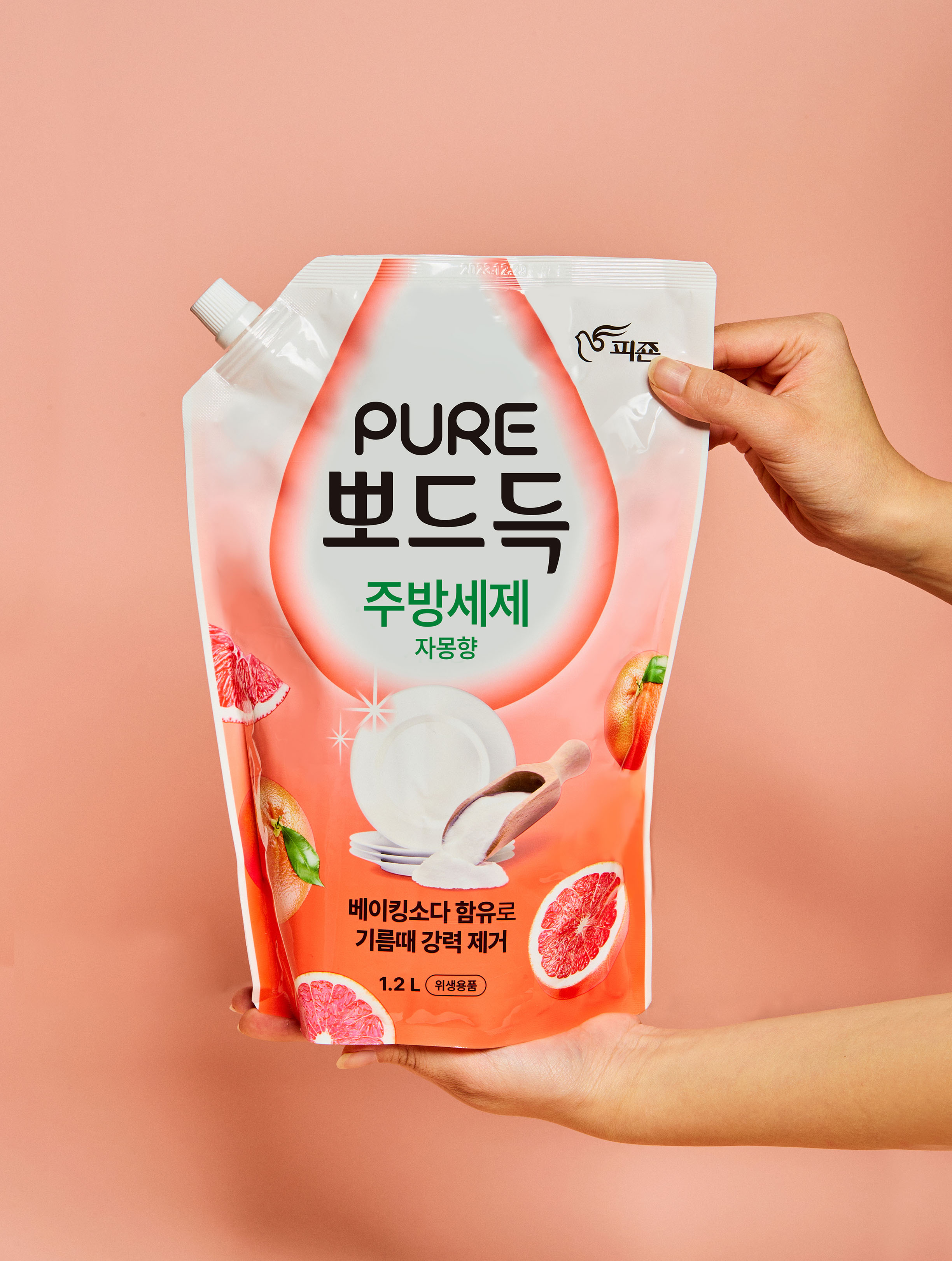
Pure by Pigeon’s Pure Pods are a product introduced to the market as a more affordable option compared to the existing Pure by Pigeon line. To accommodate various sizes and expand the lineup, we have developed an iconic brand identity. Additionally, considering the need to appeal strongly to customers in a short period, we have established a clear color system based on fragrances. Our main objective for this project is to enhance visibility by elevating the prominence of kitchen detergents that offer both a friendly demeanor and powerful cleaning capabilities, ensuring quick recognition among customers.
피죤의 퓨어 뽀드득은 기존에 출시된 피죤 퓨어에서 합리적인 가격을 위한 제품으로 다양한 사이즈가 나오는 것을 고려하여 라인업 확장을 위해 아이코닉한 브랜드 아이덴티티를 구축하였습니다. 또한 고객들에게 짧은 시간안에 강력하게 어필할 수 있는 점을 고려하여 향에 따른 명확한 컬러 시스템을 구축하였습니다. 친근하면서 강력한 세정력을 명확하게 보여줄 수 있는 주방세제로 주목성을 높여 고객들에게 빠르게 인식되는 것을 이번 프로젝트의 가장 큰 목표로 하였습니다.
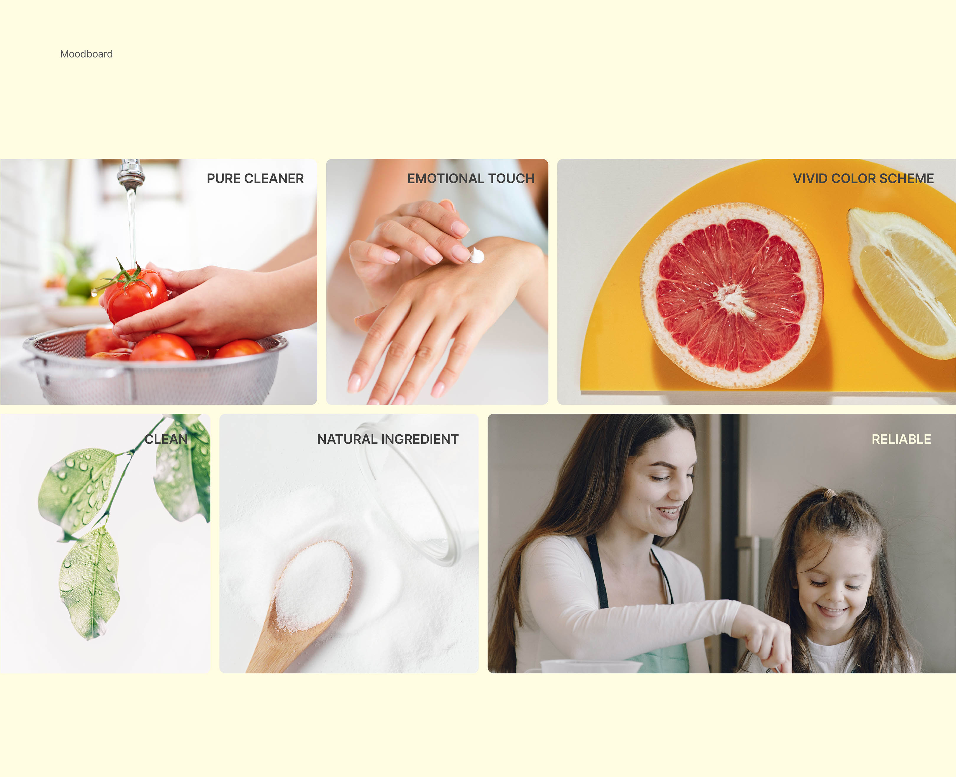
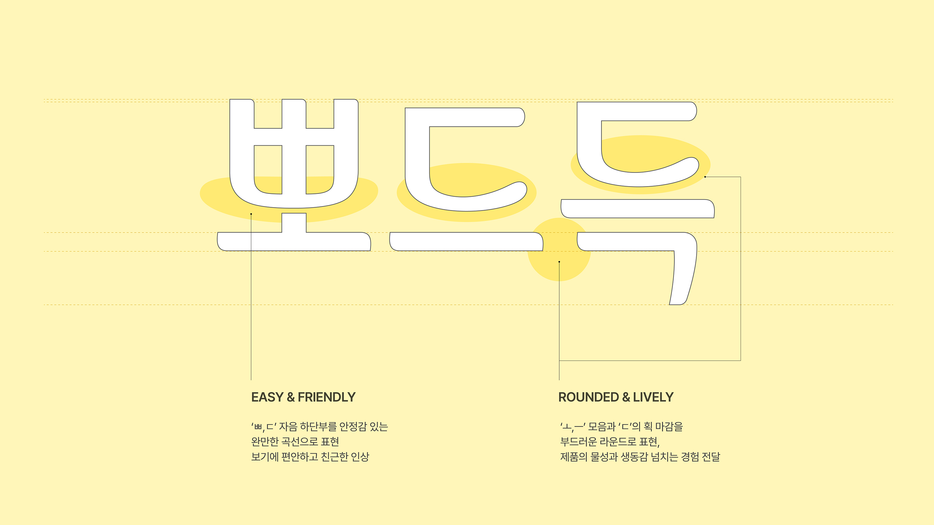
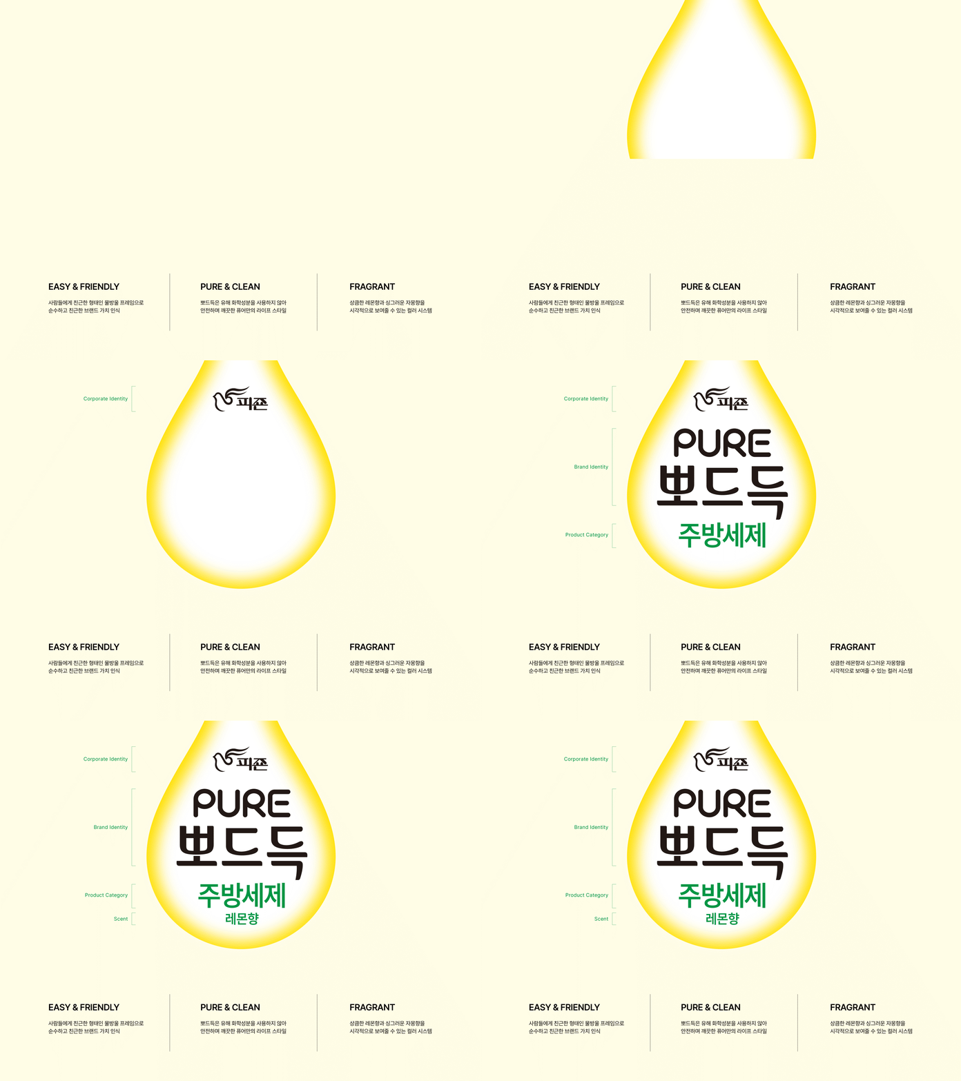
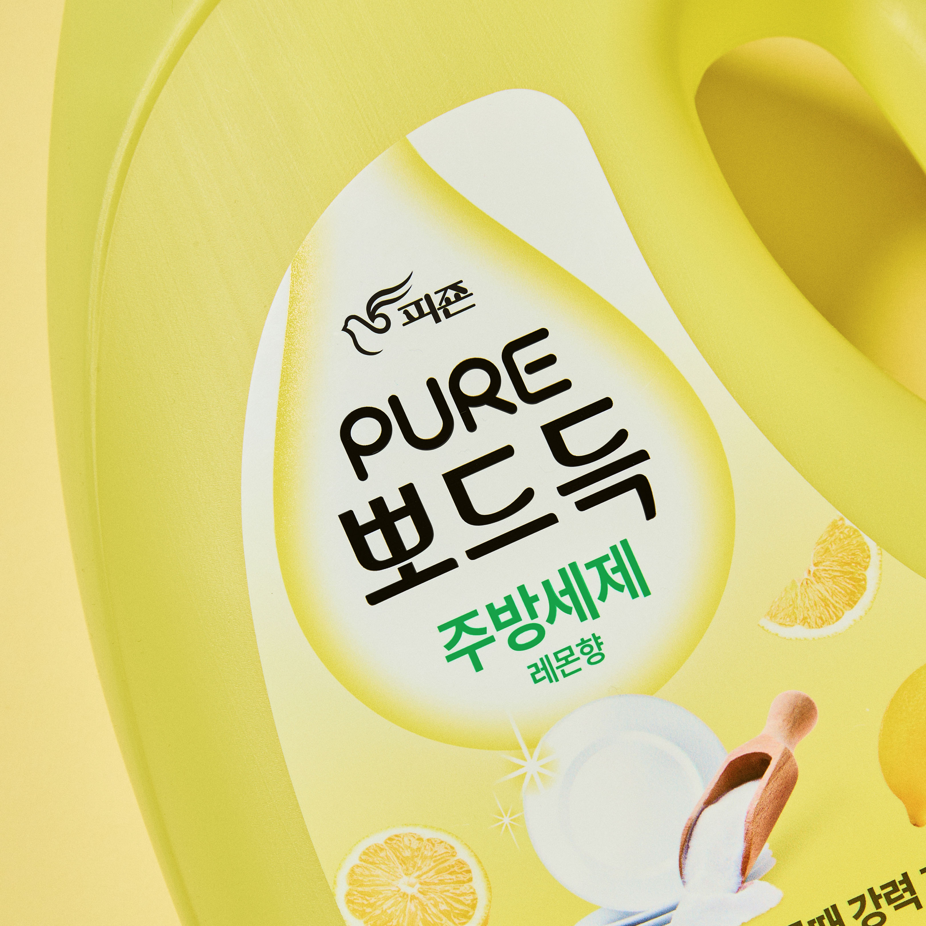
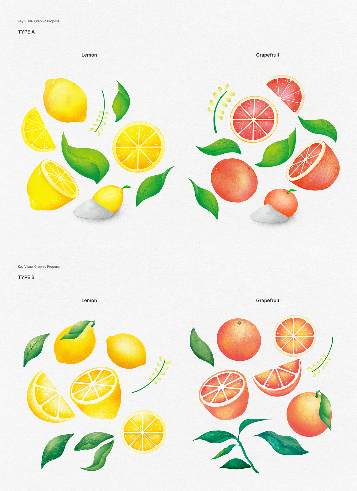
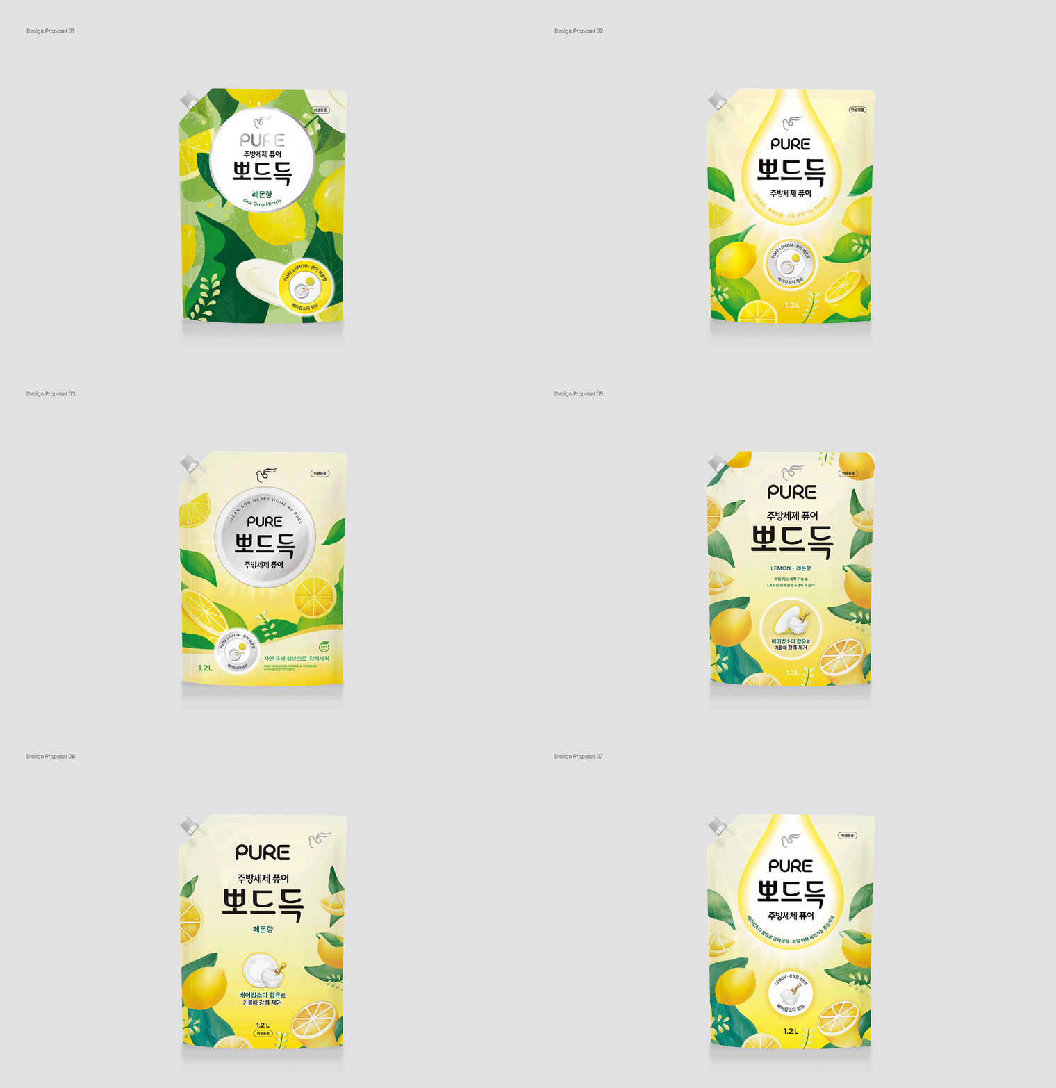
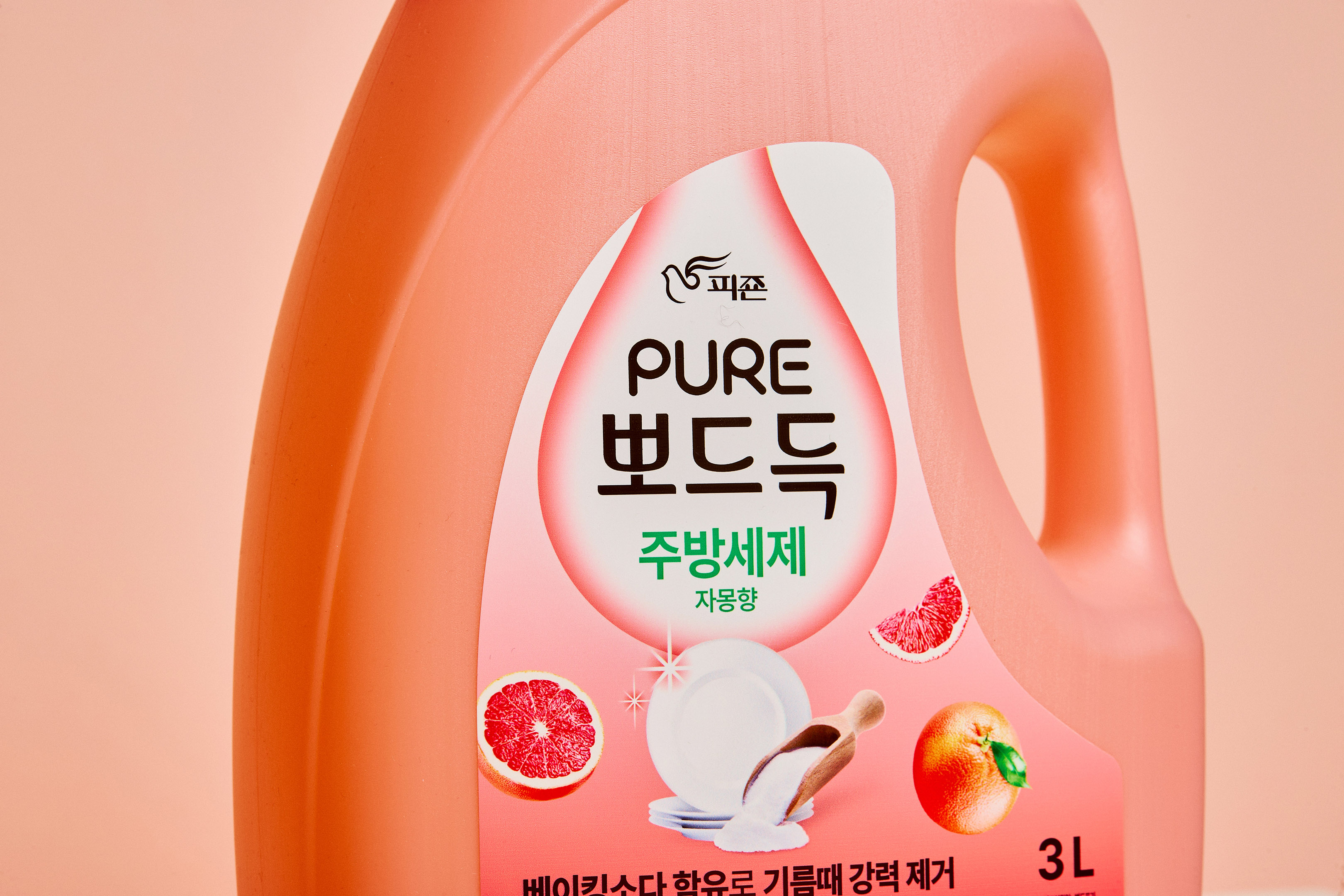
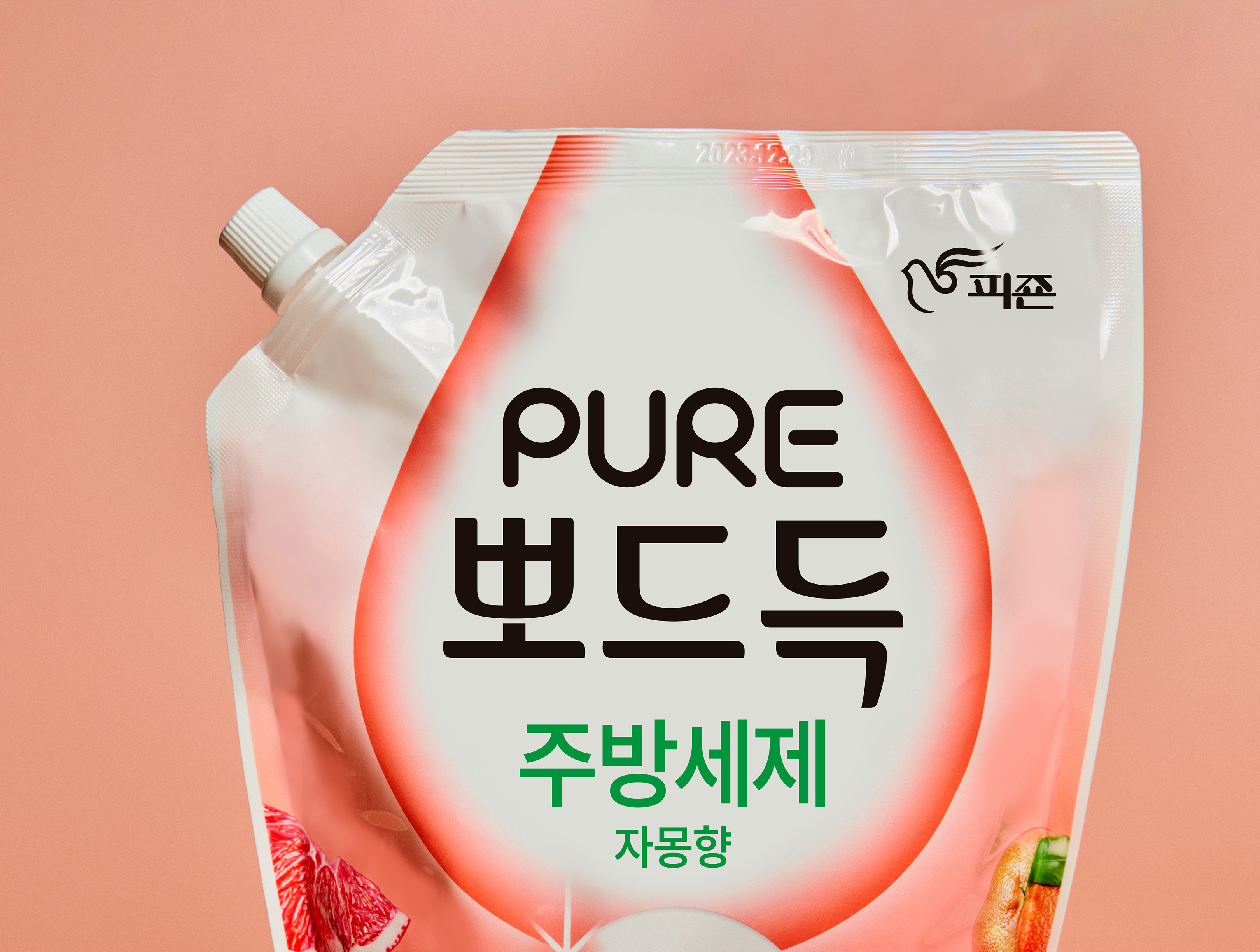
YNL Design developed the brand identity with the concept of ‘Pure happiness of daily life’, aiming to convey a clean and friendly impression. In the Pure Pods BI, a gentle curve is utilized at the bottom of the consonant to evoke a comfortable and mild impression. The rounded vowel endings visualize the product’s fluidity and vitality. The unique frame of Pure Pods is shaped like a water droplet, symbolizing safe ingredients without harmful substances, conveying the value of a clean, pure lifestyle. Graphic motifs feature various cross-sections of fruits, evoking a sizzling sensation, arranged freely in layouts that offer an intuitive yet playful brand experience. Vibrant and lively colors expressed in gradients emphasize the pleasant aroma permeating the surroundings, establishing visually striking communications.
YNL Design은 'Pure happiness of daily life’를 컨셉으로 하여 깨끗하고 친근한 인상을 주는 BI 개발을 하였습니다. ‘뽀드득’ BI에서 자음 하단부에서 완만한 곡선을 사용하여 편안하고 순한 인상을 전달합니다. 라운드진 모음 마감으로 인해 제품이 물성과 생동감을 시각화하였습니다. 뽀드득만의 프레임을 ‘물방울’로 형상화하여 유해성분이 없이 안전한 성분을 담아 깨끗한 퓨어만의 라이프 스타일의 가치를 전달합니다. 그래픽 모티브는 씨즐이 느껴지는 과일의 다양한 단면을 사용하였고, 이를 자유롭게 배치한 레이아웃을 통해 직관적이지만 리드미컬하면서 유쾌한 브랜드 경험을 선사합니다. 생기있는 비비드한 컬러를 그라디언트로 표현하여 기분 좋은 향이 스며드는 모습을 강조하며, 주목성 높은 비주얼 커뮤니케이션을 구축하였습니다.