STUDIO EON
Where unreal becomes real

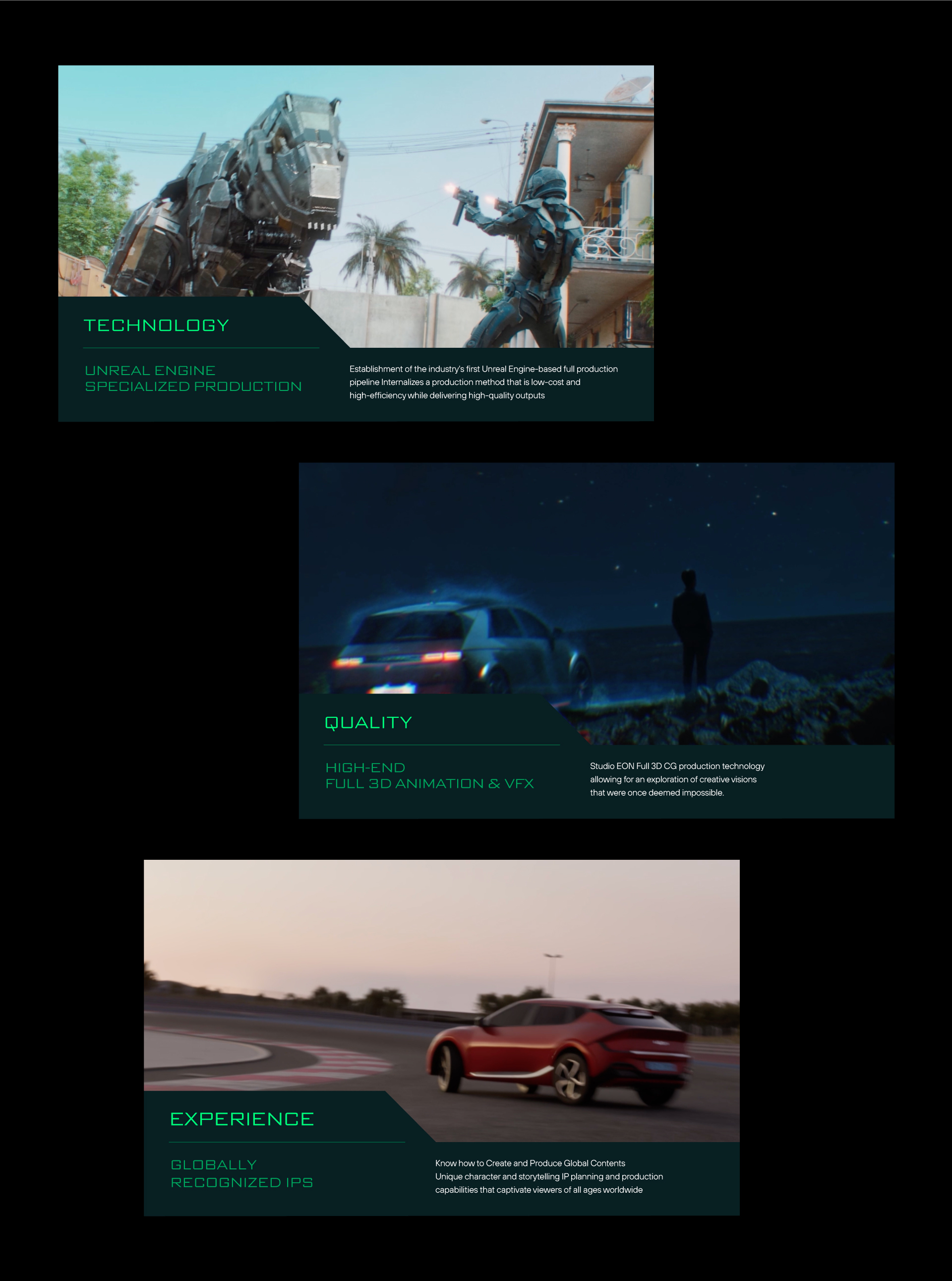
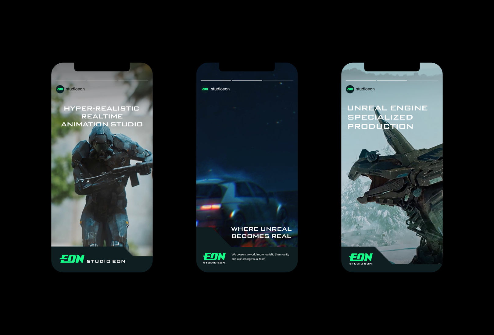
STUDIO EON, a leading 3D animation company in Korea, has demonstrated its outstanding capabilities in developing 3D animation content IPs by overseeing the production of various works such as "Iron Kid," "Kongsuni," and "Armored Saurus" as the original author, director, and executive producer. Additionally, based on its excellent technical skills in Unreal Engine, which enables real-time design and visualization, the studio has produced high-quality work in 3D animation, VFX, and CG in a time-efficient manner. STUDIO EON leads the market in various areas, surpassing the limitations and boundaries of traditional methods, thanks to its superior creativity and unique technical prowess compared to its competitors.
국내 대표 3D 애니메이션 기업인 스튜디오 이온은 ‘아이언 키드’, ‘콩순이’, ‘아머드 사우루스’ 등 다양한 작품의 원작자이자 감독, 총괄 프로듀서(EP)로서 제작 전반을 이끌며 3D 애니메이션 콘텐츠 IP 개발에서 탁월한 역량을 증명해왔습니다. 또한, 실시간 디자인과 시각화가 가능한 언리얼 엔진에서의 뛰어난 기술력을 바탕으로 3D 애니메이션, VFX, CG 등 다양한 분야에서 시간 대비 높은 퀄리티의 작업물을 선보이고 있습니다. 스튜디오 이온은 경쟁사 대비 뛰어난 창의성과 독보적인 기술력을 통해 기존 방식의 한계를 넘어 다양한 영역에서 시장을 선도하고 있습니다.
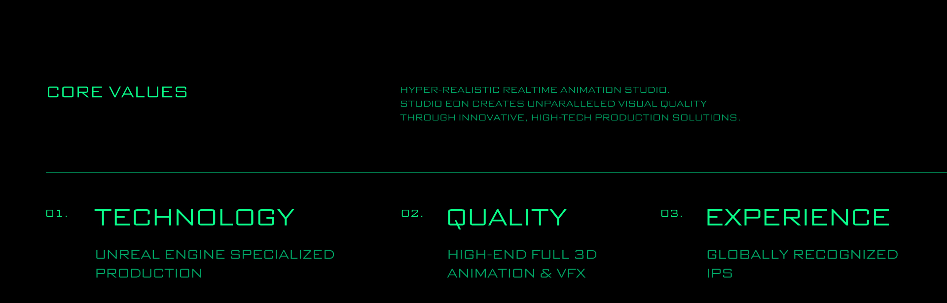
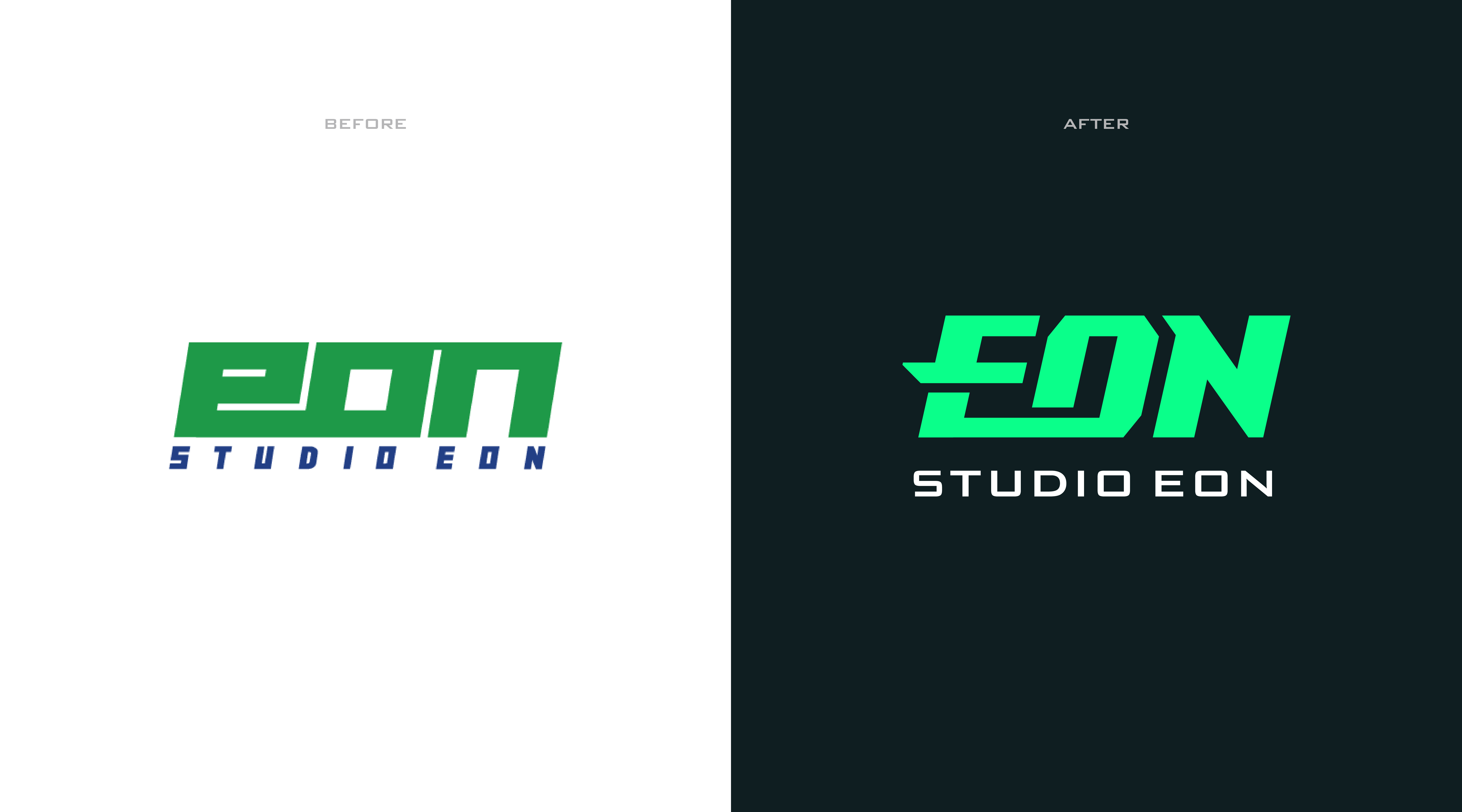
The goal of renewing STUDIO EON's corporate identity is to develop the identity of a first-generation authentic 3D animation studio in Korea and a next-generation high-tech studio leading the global market. YNL Design aimed to define the core values of STUDIO EON, which include its heritage in the animation industry, its proven excellence through global IPs, and its strength in various content businesses with Unreal Engine technology. The vision of the company, which realizes the infinite possibilities of content, is clearly encapsulated in the verbal brand assets and visual identity system.
스튜디오 이온의 기업 아이덴티티 리뉴얼은 국내 1세대 정통 3D 애니메이션 스튜디오이자 글로벌 시장을 선도할 차세대 하이테크 스튜디오로서의 정체성을 개발하는 것을 목표로 합니다. YNL Design은 애니메이션 업계에서의 기업 헤리티지와 글로벌 IP로 입증된 탁월한 역량, 그리고 다양한 콘텐츠 비즈니스에서 강점을 지닌 언리얼 엔진 기술력을 스튜디오 이온의 핵심 가치로 정의하고, 콘텐츠의 무한한 가능성을 실현하는 기업의 비전을 명확히 담은 버벌 브랜드 자산 및 비주얼 아이덴티티 시스템을 구축하고자 했습니다.
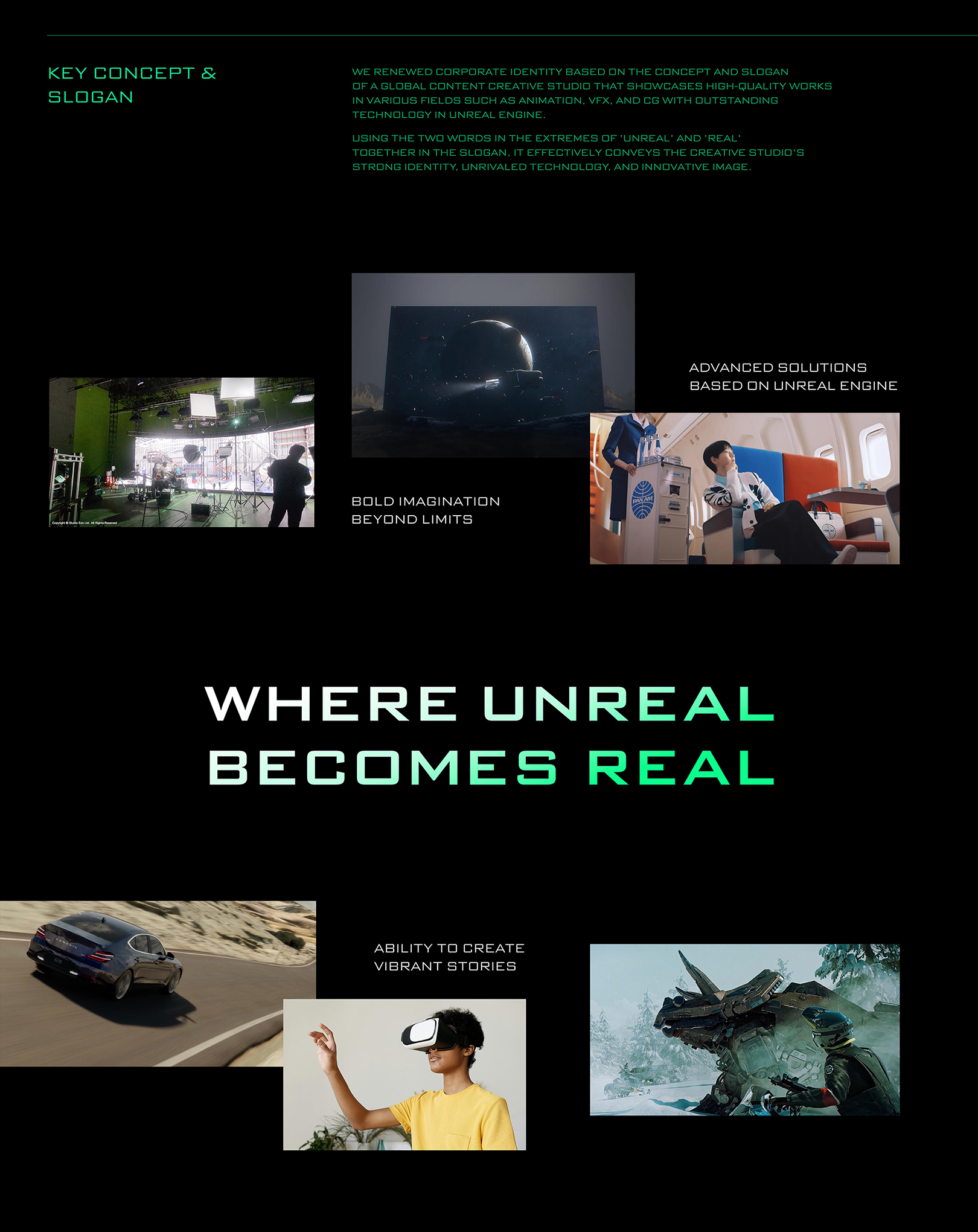
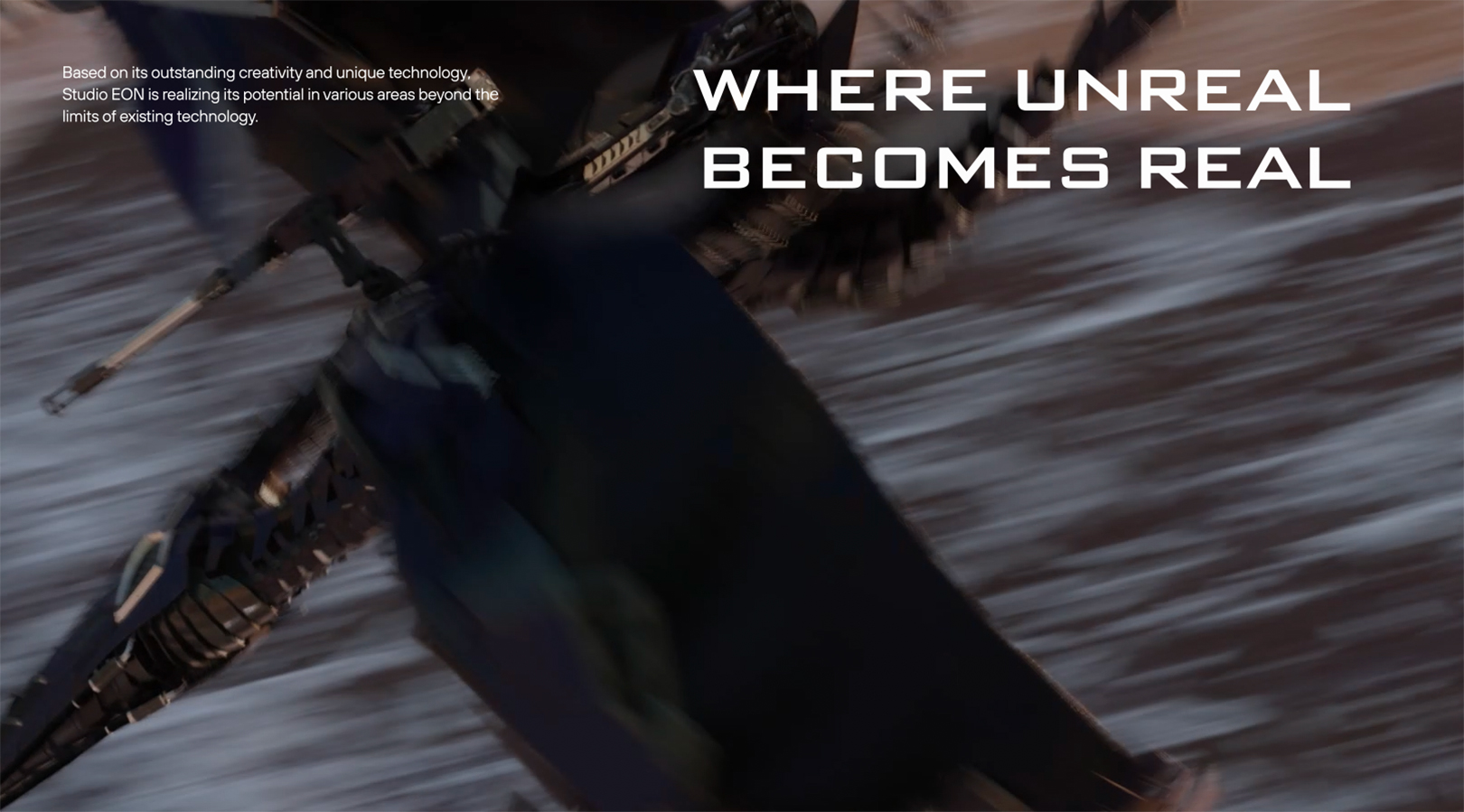
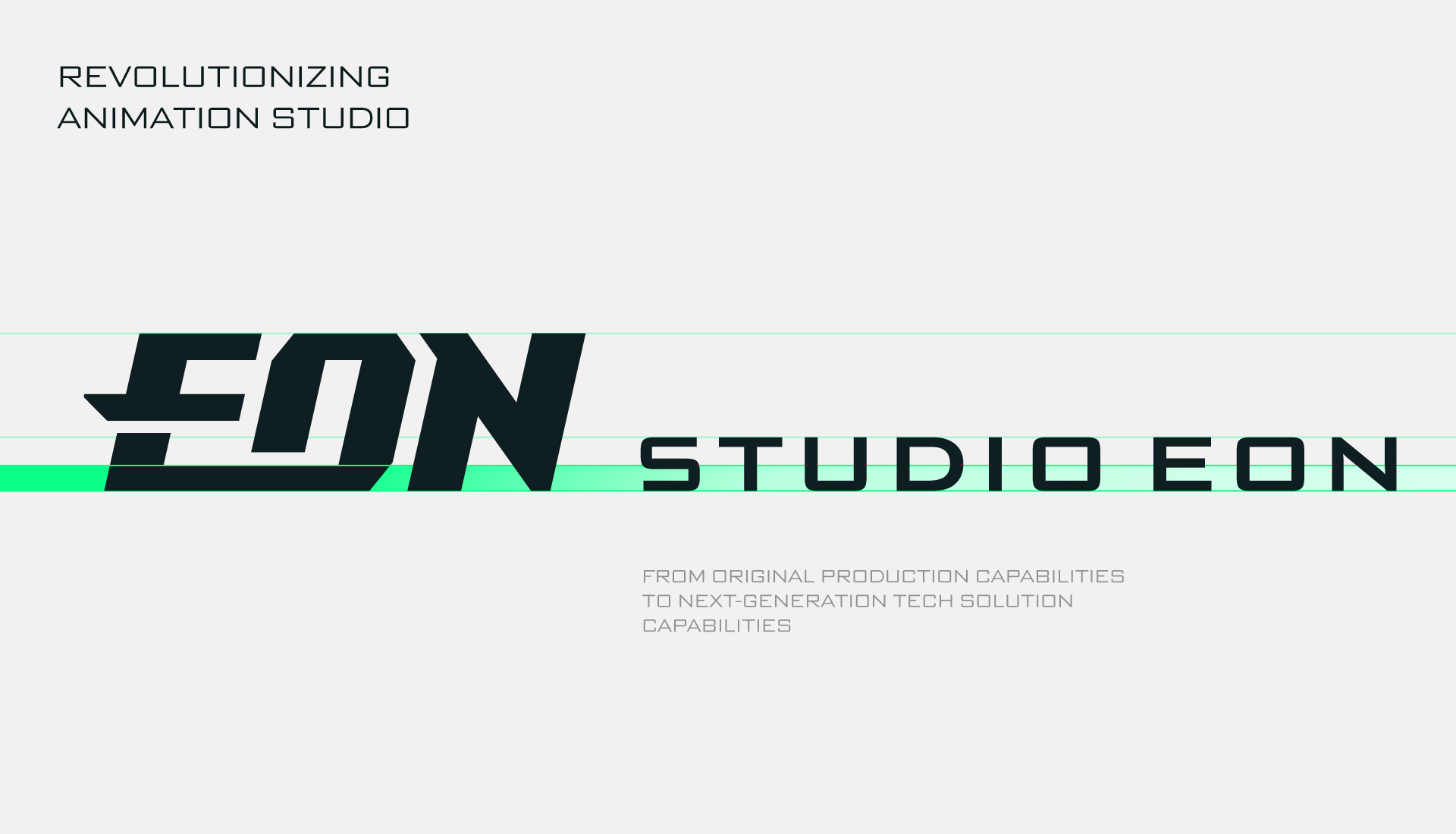
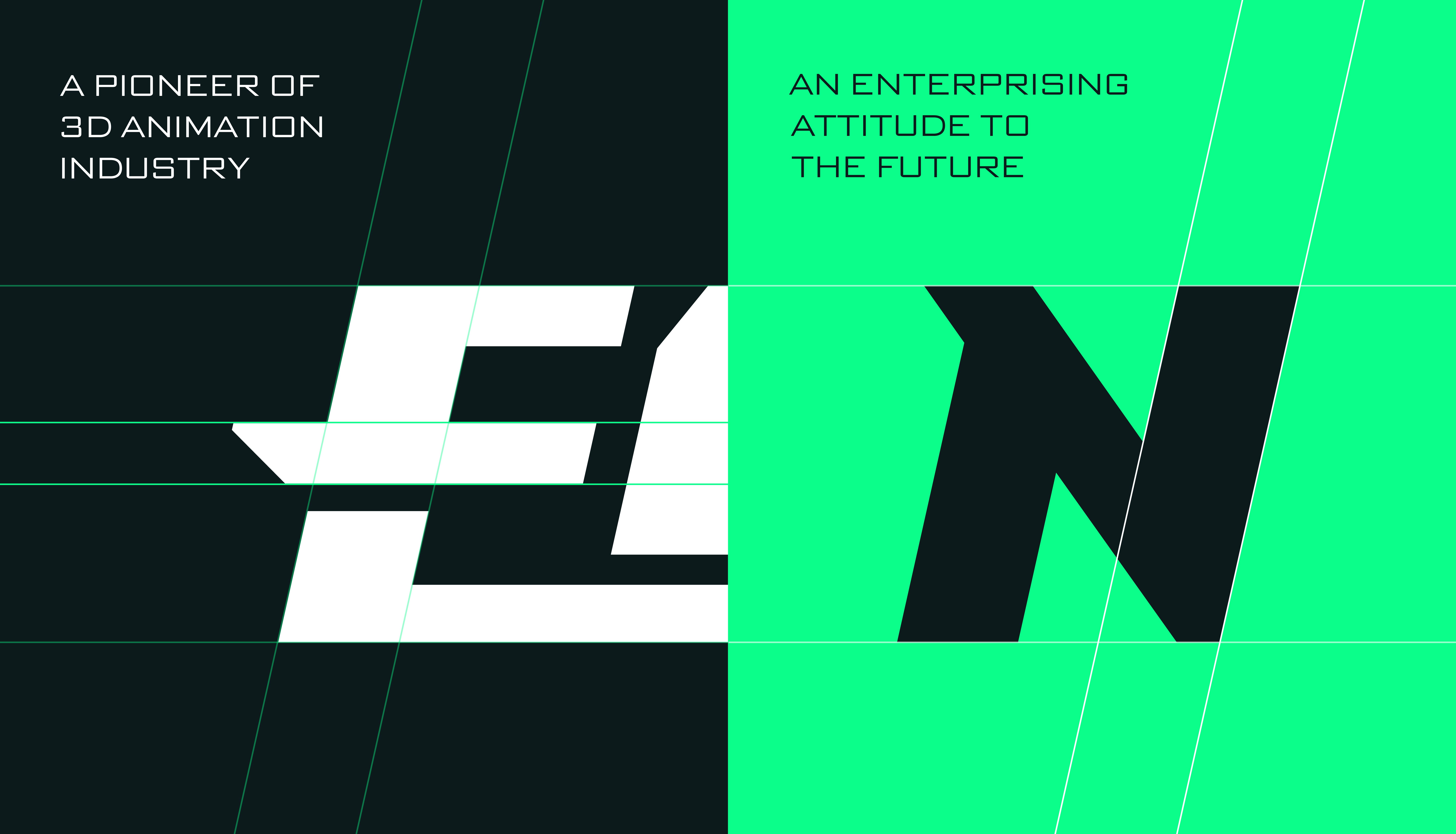
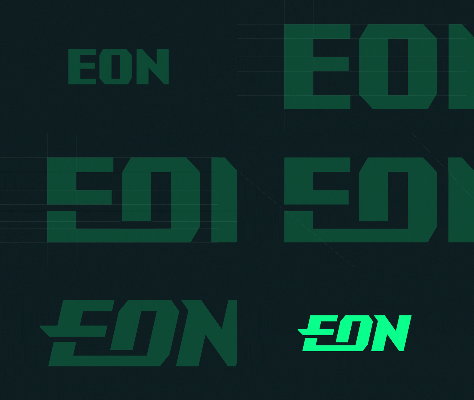
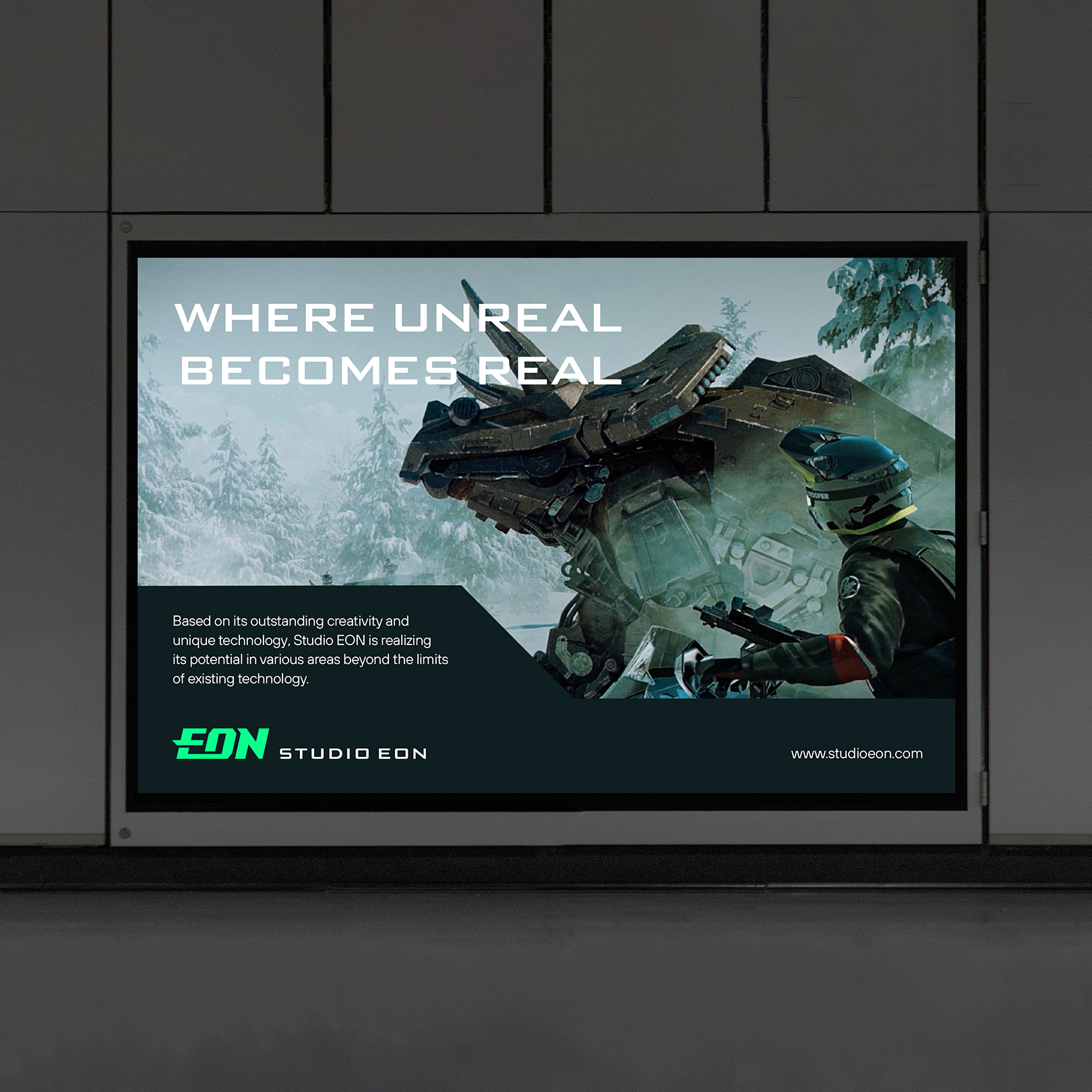
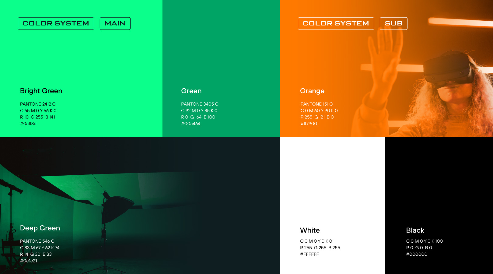
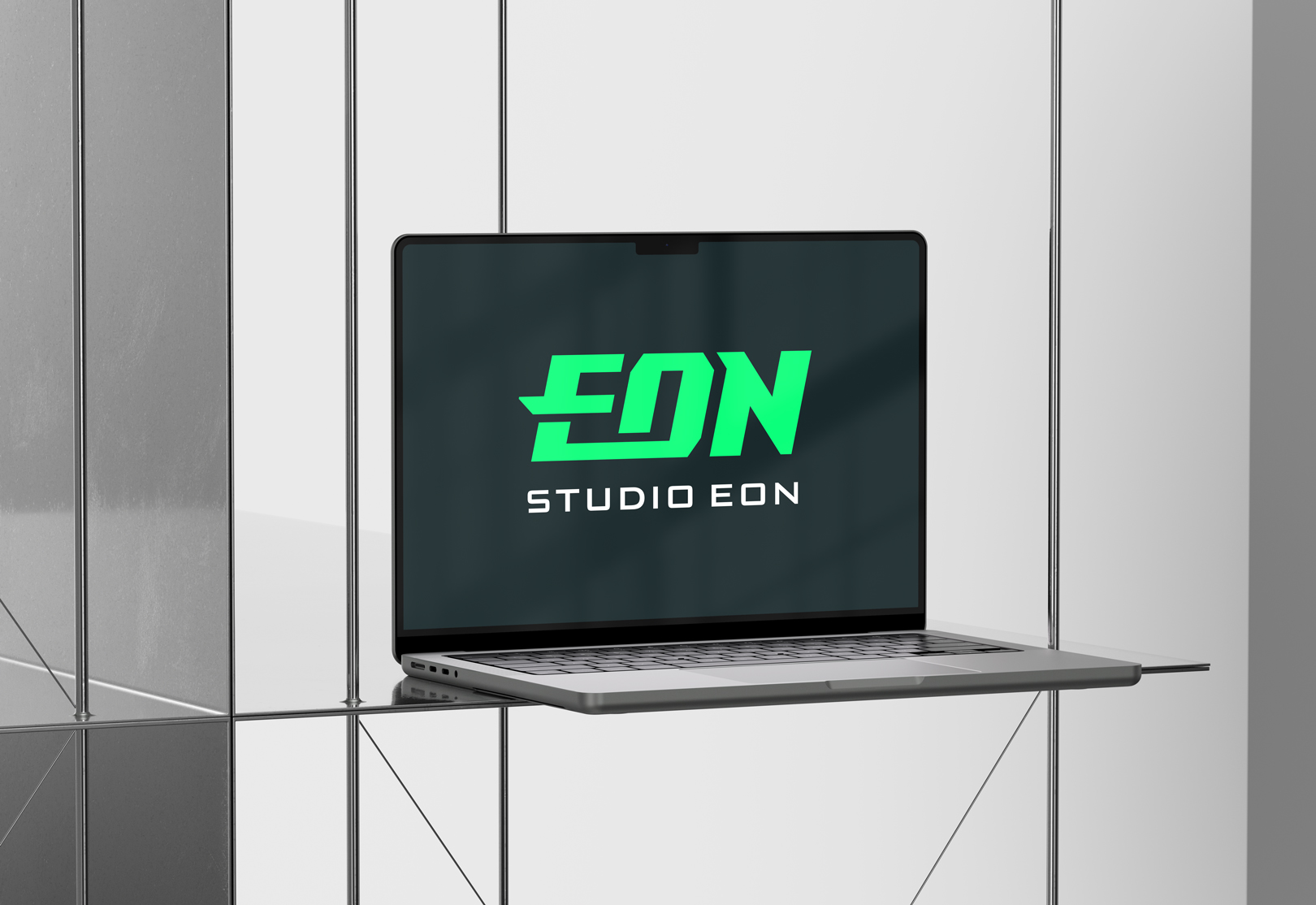
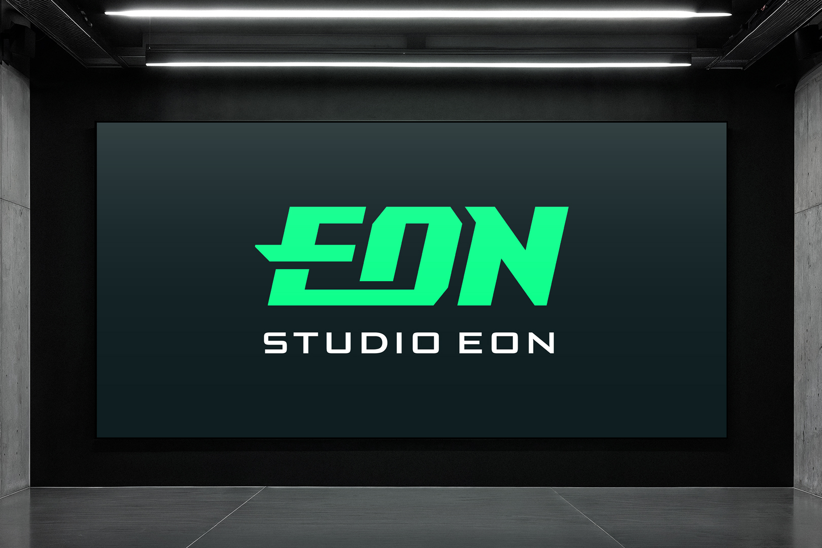
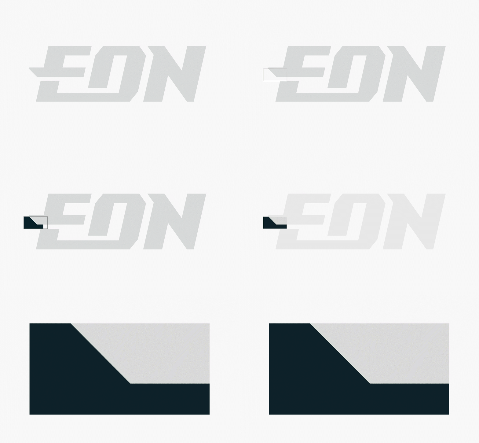
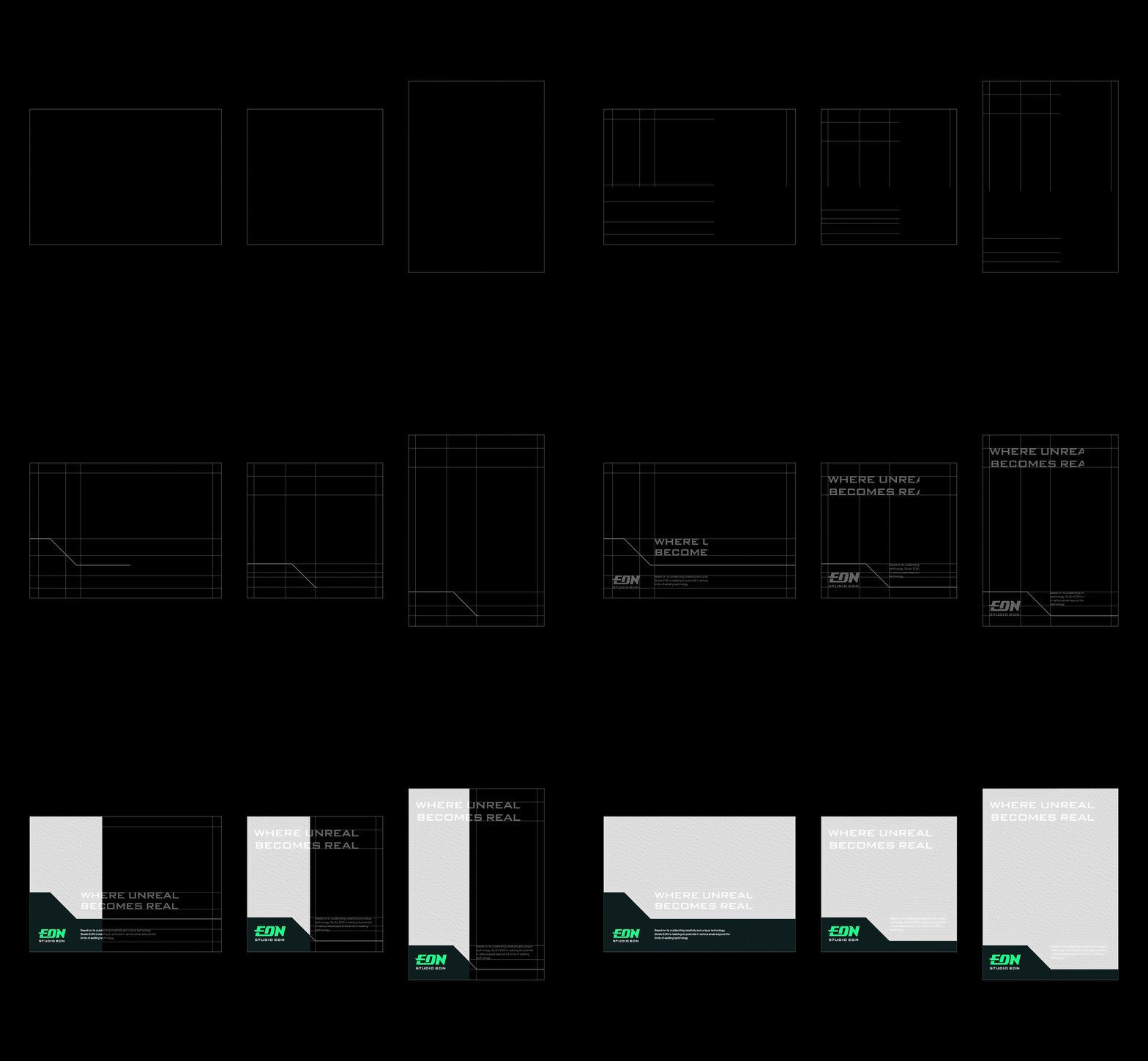
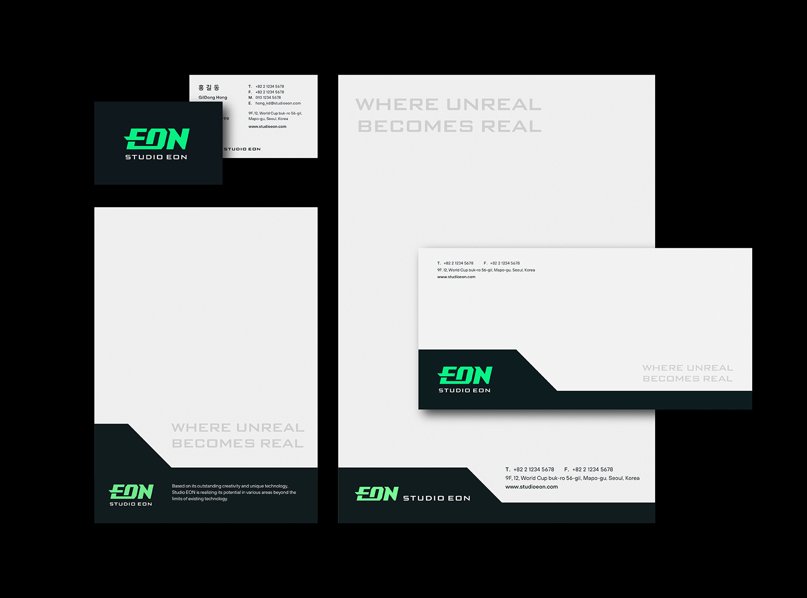
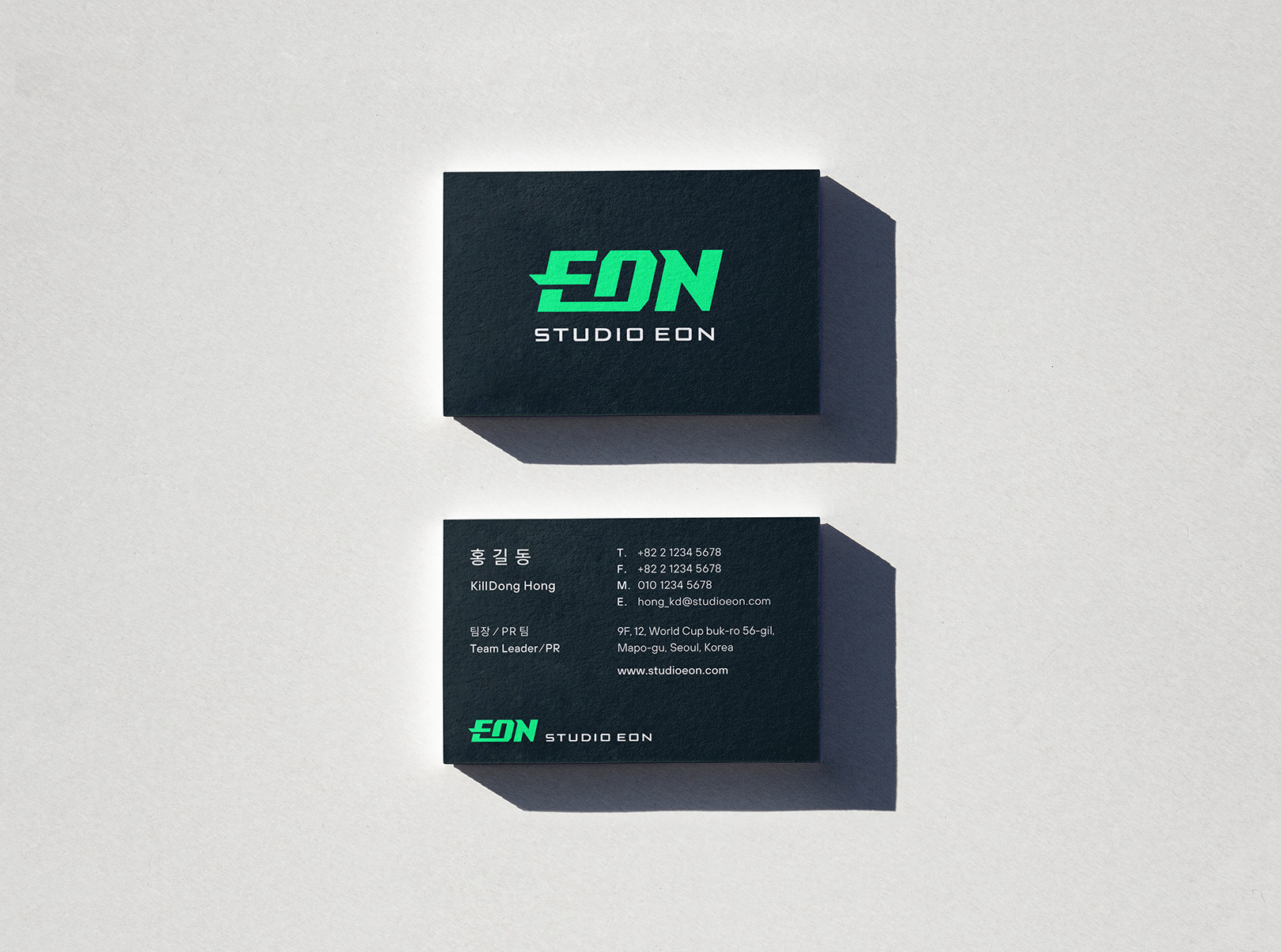
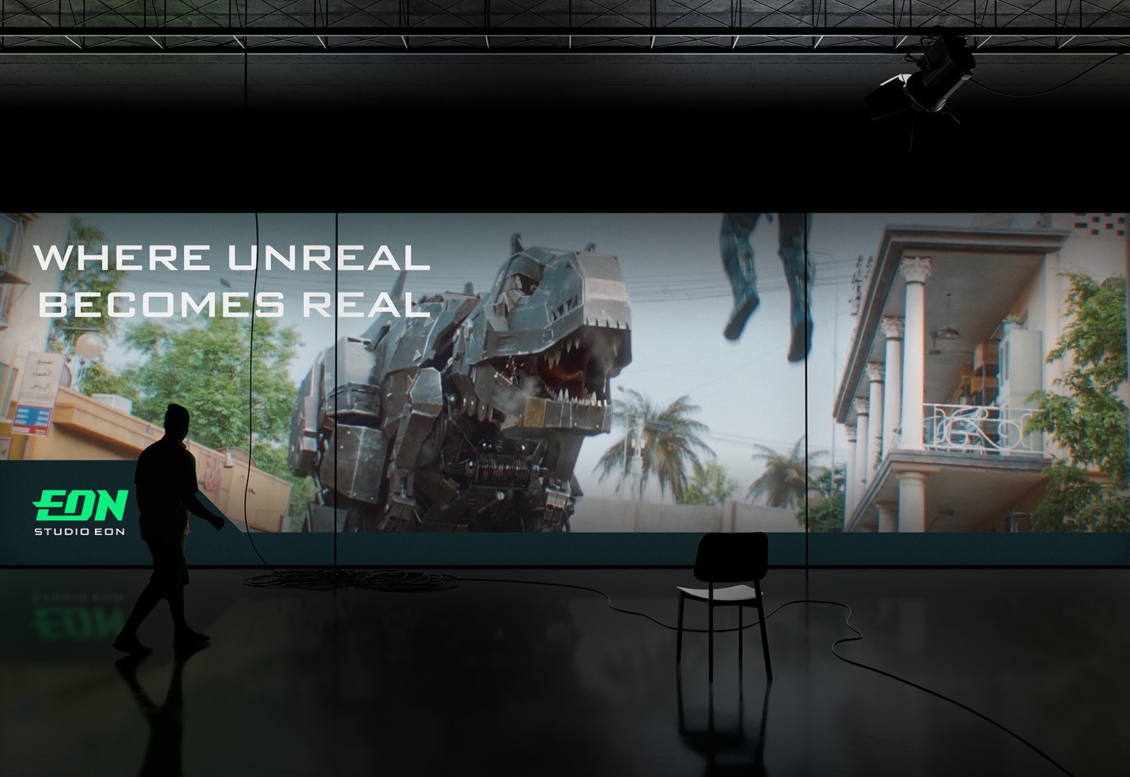
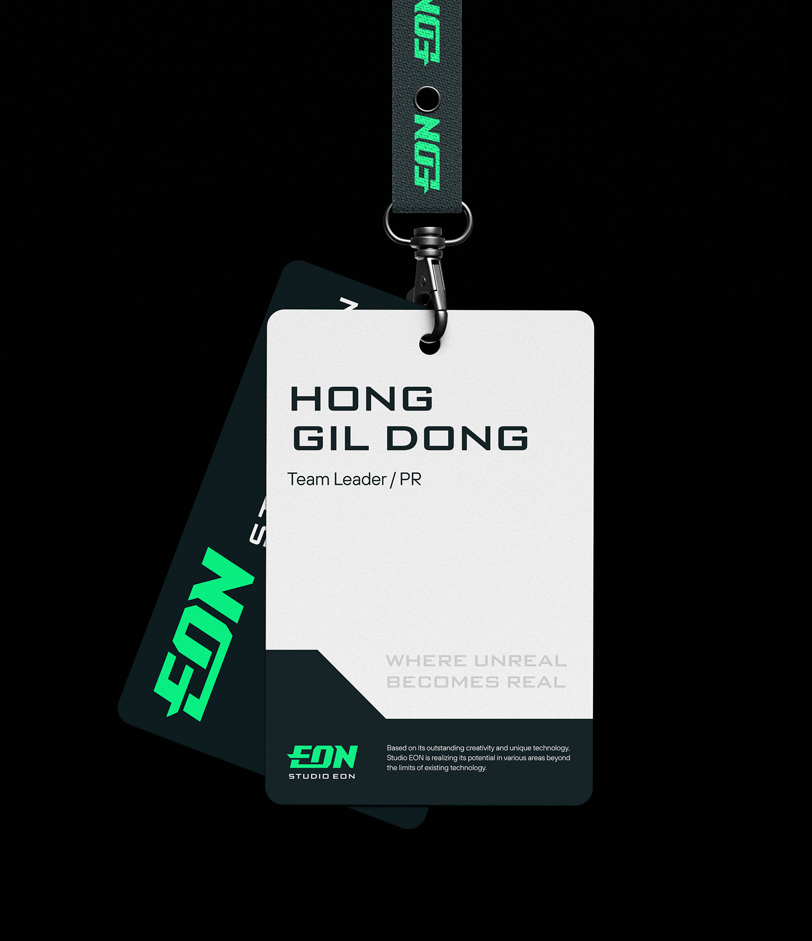
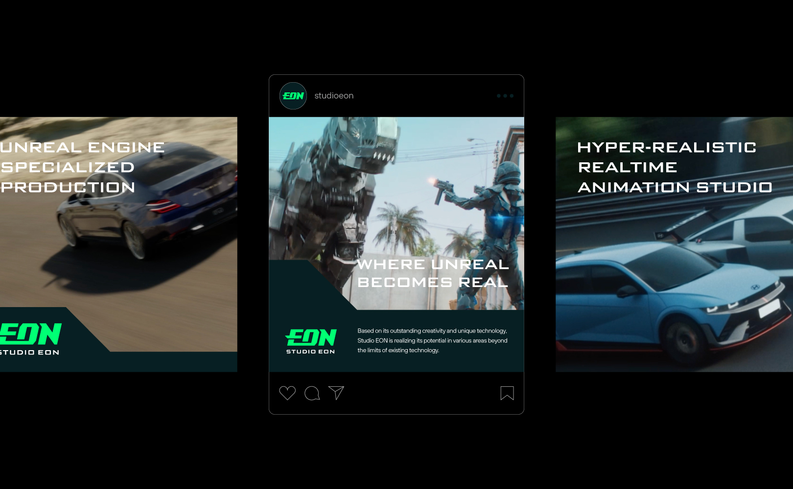
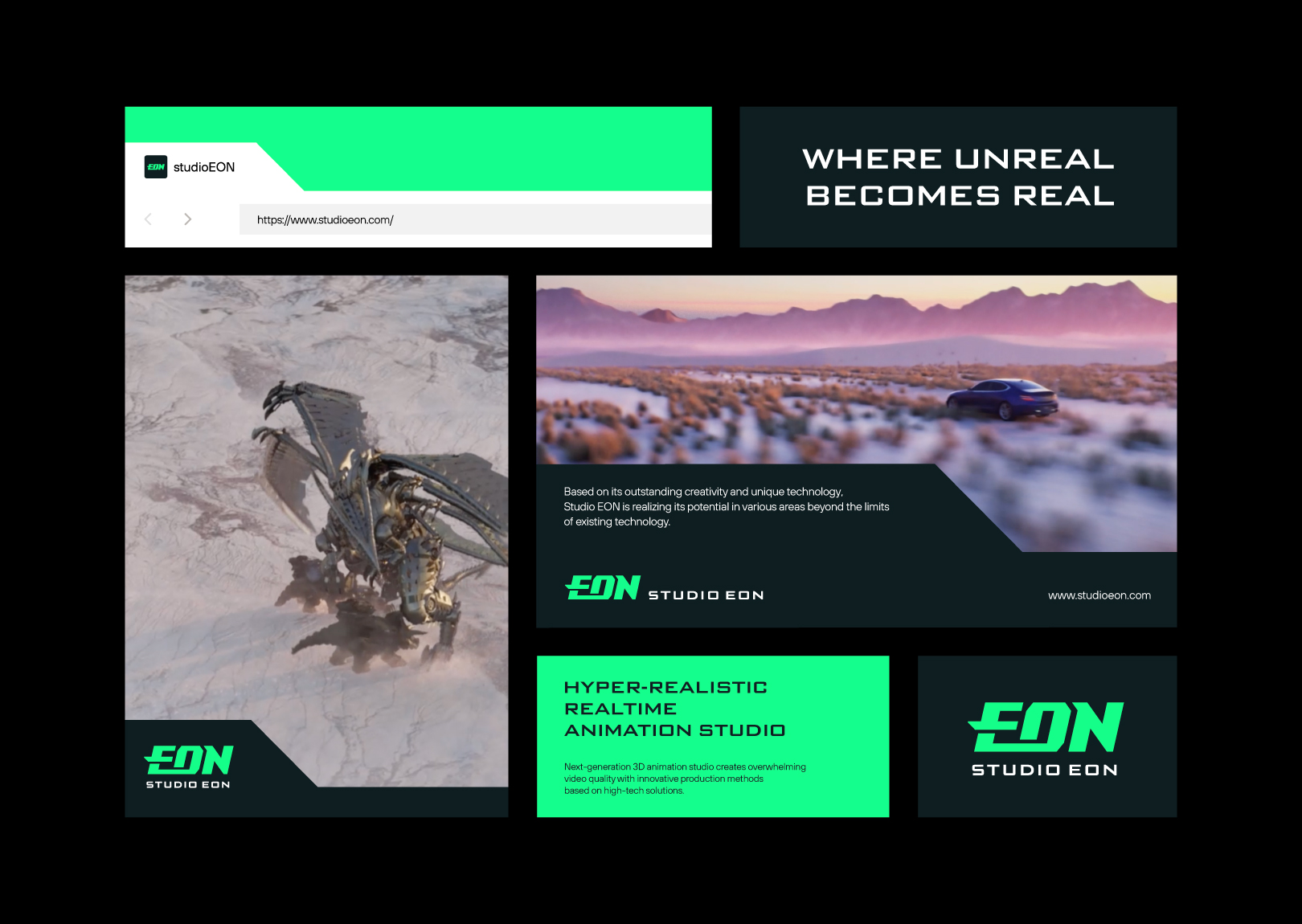
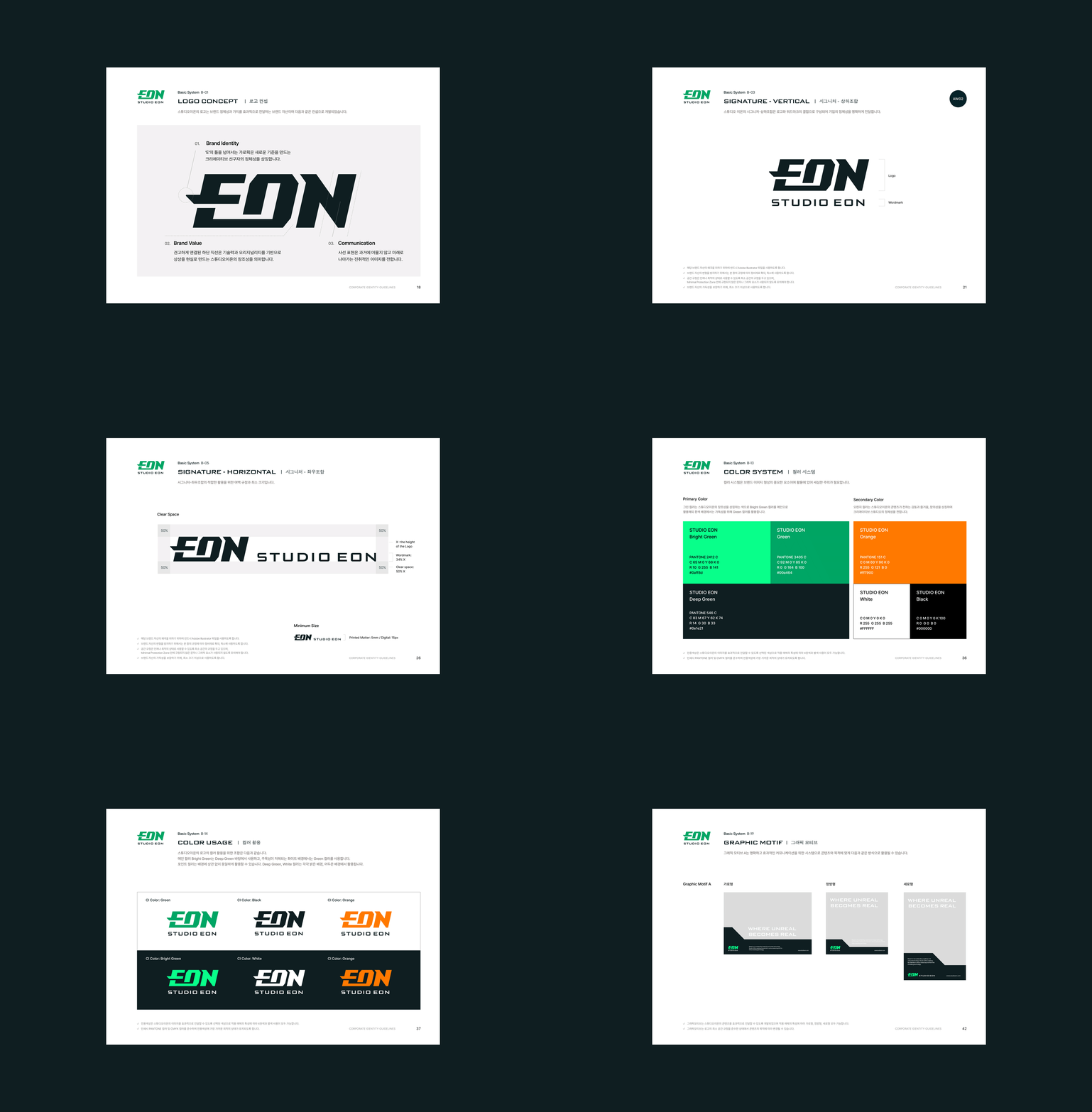
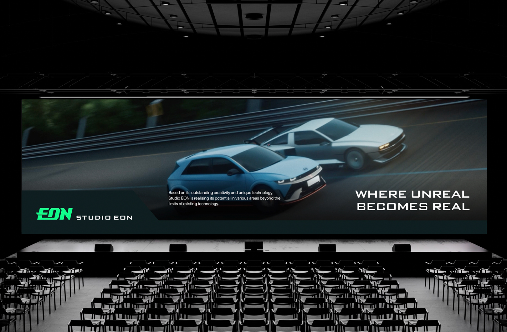
YNL Design renewed STUDIO EON's Corporate Identity with the branding concept of the slogan "WHERE UNREAL BECOMES REAL." By using the two words "UNREAL" and "REAL" together, which are at extreme ends, it effectively conveys the bold imagination, unique technical prowess, and innovative image of a global content creative studio that realizes the potential of content. The logo of STUDIO EON symbolizes the company's solid capabilities and technology that connect its heritage in the 3D animation industry to the next-generation virtual production. The stroke breaking out of the framework of the letter 'E' expresses the identity of a creative pioneer that transcends existing limitations to realize new possibilities. The entire logo is tilted diagonally to represent the progressive attitude of constantly moving forward. The robust technical strength and progressive image reflected in the visual identity are utilized as graphic motifs, effectively conveying video content and messages. The main color, green, symbolizes the creativity of a creative studio with bold imagination.
YNL Design은 ‘WHERE UNREAL BECOMES REAL’이라는 슬로건을 브랜딩 컨셉으로 삼아 스튜디오 이온의 기업 아이덴티티를 리뉴얼했습니다. ‘UNREAL’과 ‘REAL’이라는 극단적인 두 단어를 함께 사용하여 콘텐츠의 가능성을 실현하는 글로벌 콘텐츠 크리에이티브 스튜디오의 대담한 상상력과 독보적인 기술력, 혁신적 이미지를 효과적으로 전달합니다. 스튜디오 이온의 로고는 3D 애니메이션 업계에서의 헤리티지와 차세대 버추얼 프로덕션을 연결하는 기업의 견고한 역량과 기술력을 상징합니다. 알파벳 'E'의 틀을 벗어난 가운데 획은 기존의 한계를 넘어 새로운 가능성을 실현하는 크리에이티브 선구자의 정체성을 표현합니다. 로고 전체를 사선으로 기울여 끊임없이 앞을 향해 나아가는 진취적인 태도를 나타냅니다. 비주얼 아이덴티티에 반영된 견고한 기술력과 진취적인 이미지는 그래픽 모티브로 활용되어 영상 콘텐츠와 메시지를 효과적으로 전달합니다. 메인 컬러인 그린 컬러는 대담한 상상력을 지닌 크리에이티브 스튜디오의 창의성을 상징합니다.