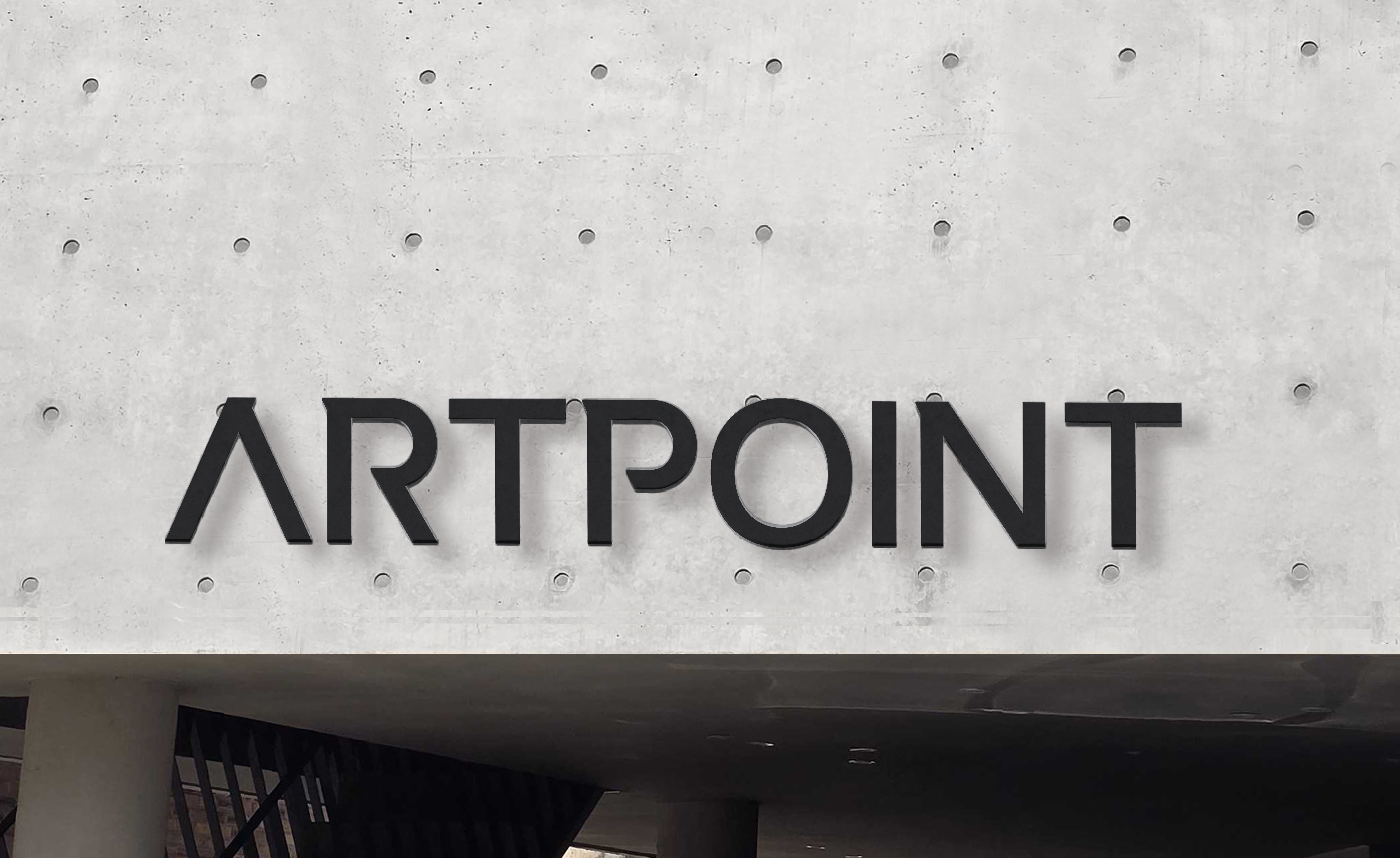
ARTPOINT
Connecting people and space

Since its establishment in 1988, ARTPOINT has grown into a company with outstanding achievements and rich expertise by carrying out various brand exhibition projects domestically and internationally. Leveraging this experience, we proudly showcase leading industry expertise, providing a high degree of completion in exhibition experiences across all processes, from exhibition design to construction. Additionally, we are recognized as a high-caliber exhibition design specialist trusted by a wide range of partners both domestically and abroad.Having recreated customer value and imagination with top-notch design, ARTPOINT is now set to embark on new challenges to realize customer value in various spaces based on our accumulated know-how and exceptional expertise in the exhibition industry.
아트포인트는 1988년 창립 이래 국내외 다양한 브랜드 전시 프로젝트를 진행하며, 우수한 실적과 풍부한 노하우를 쌓아온 기업입니다. 이러한 경험을 바탕으로 업계를 선도하는 전문성을 자랑하고 있으며, 전시 디자인에서 시공까지 모든 과정에서 완성도 높은 전시 경험을 제공합니다. 또한, 국내외 다양한 파트너들로부터 신뢰받는 전시 디자인 전문 기업으로 인정받고 있습니다. 최상의 디자인으로 고객 가치와 상상을 재창조해온 아트포인트는 이제 기존 전시업에서의 노하우와 전문성을 바탕으로 다양한 공간에서 고객 가치를 실현하기 위한 도전을 앞두고 있습니다.
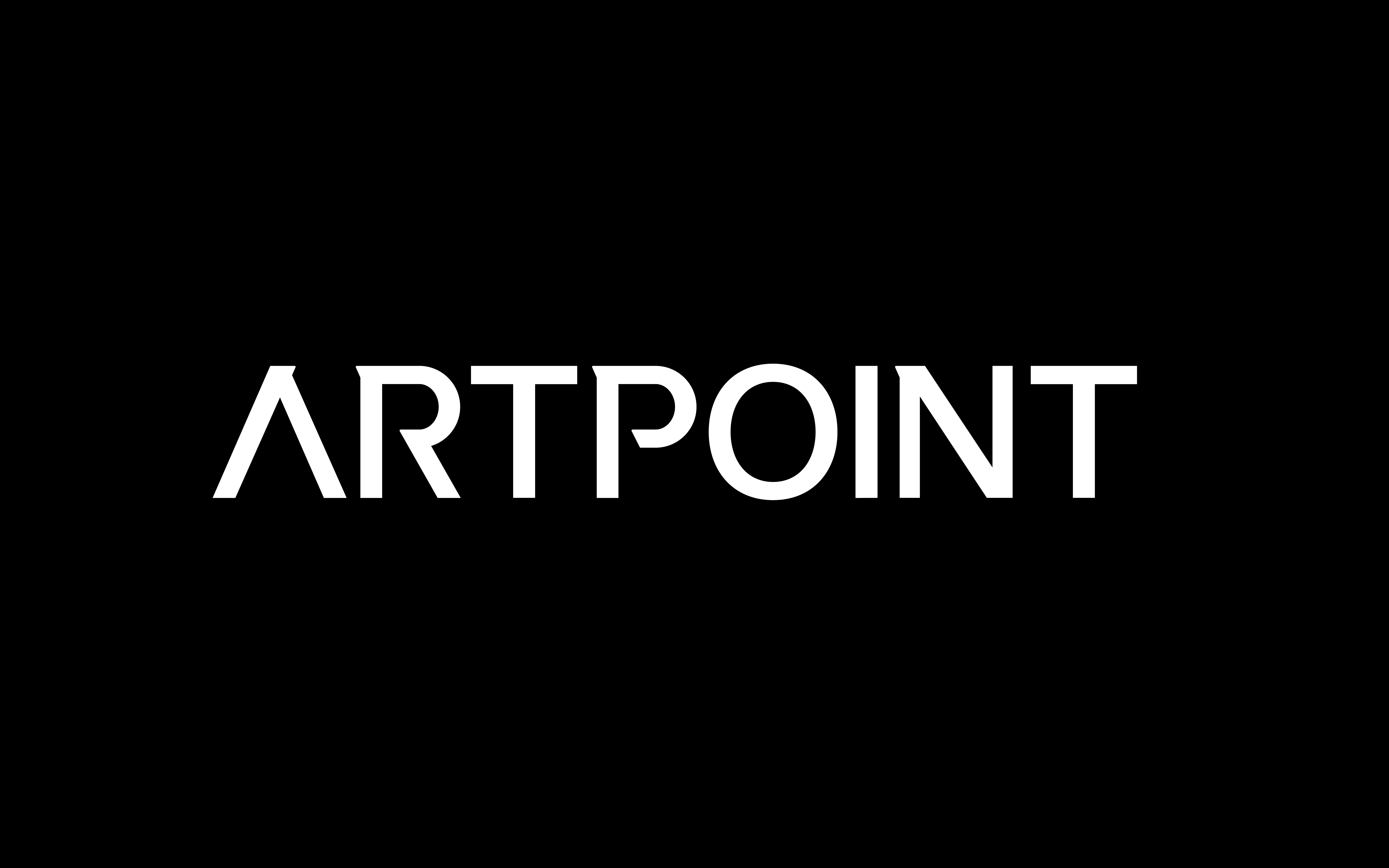
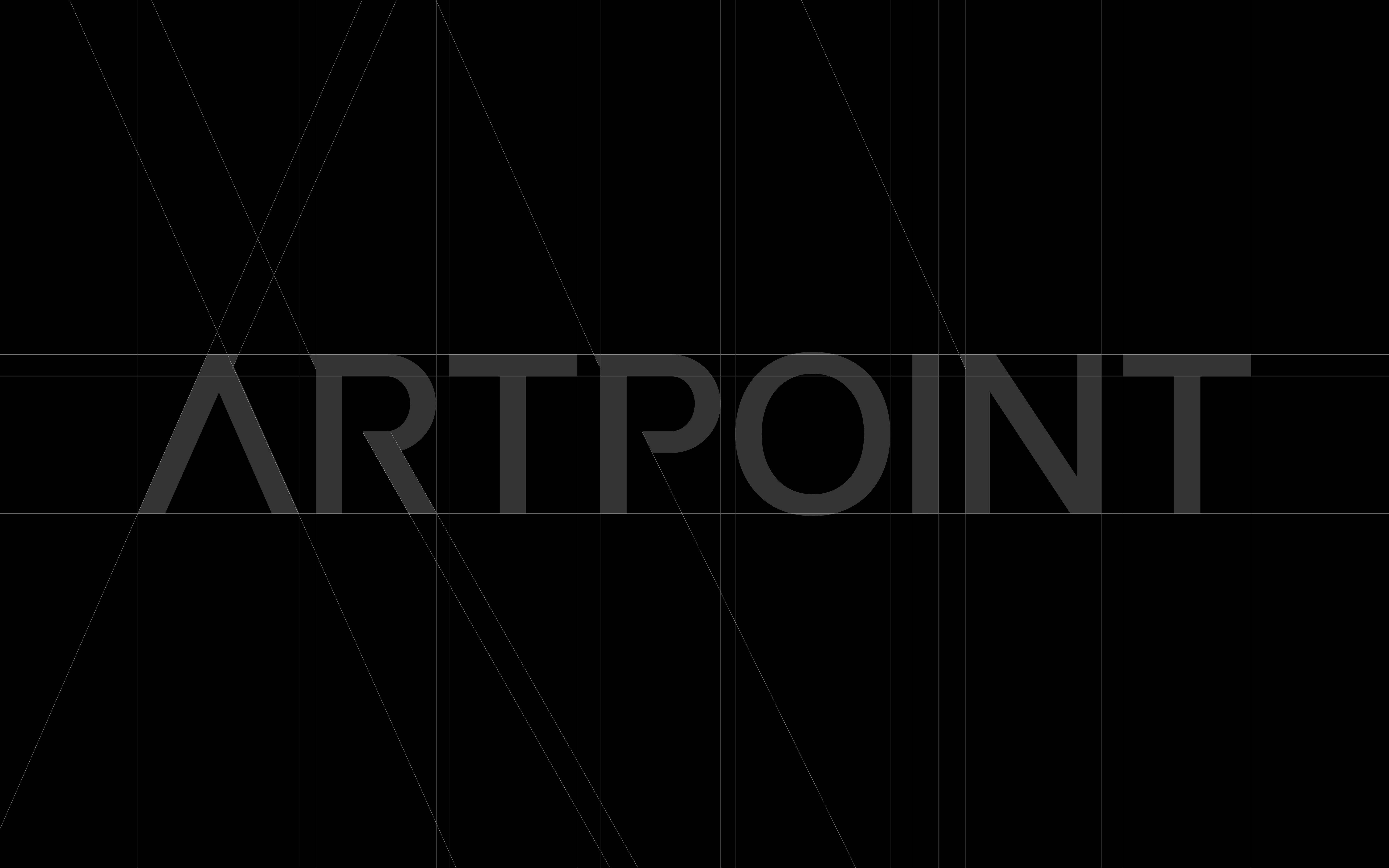
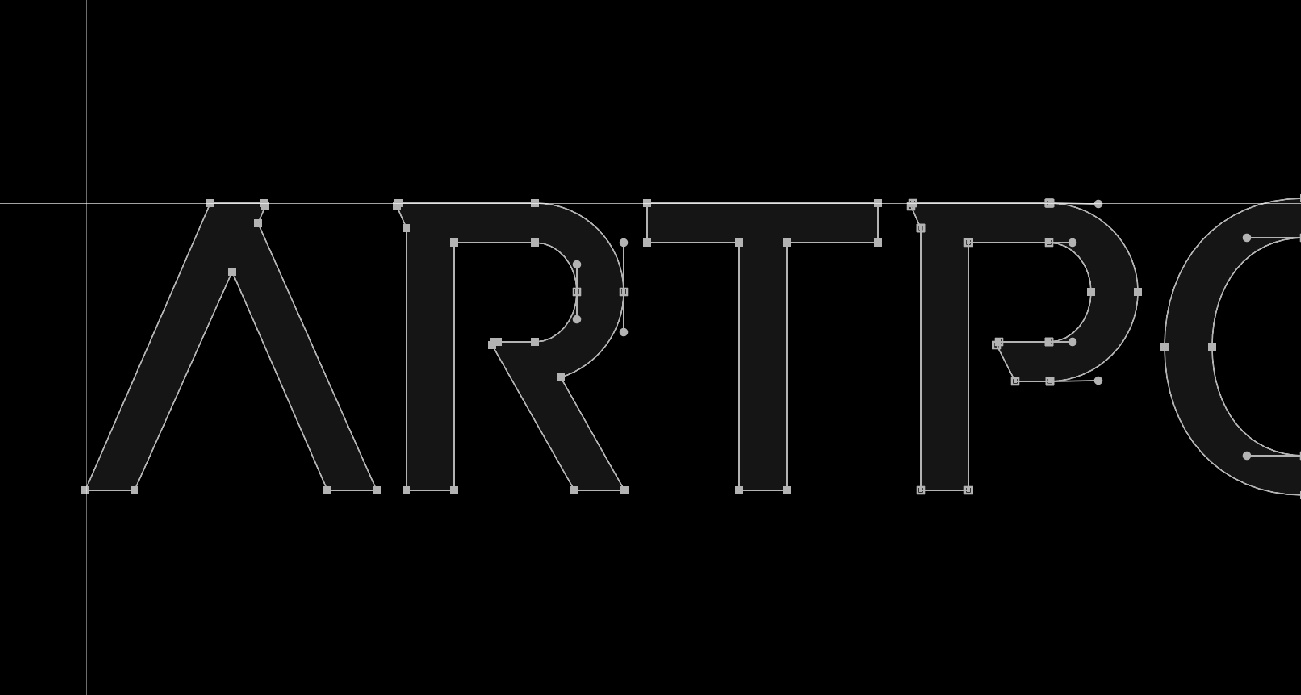
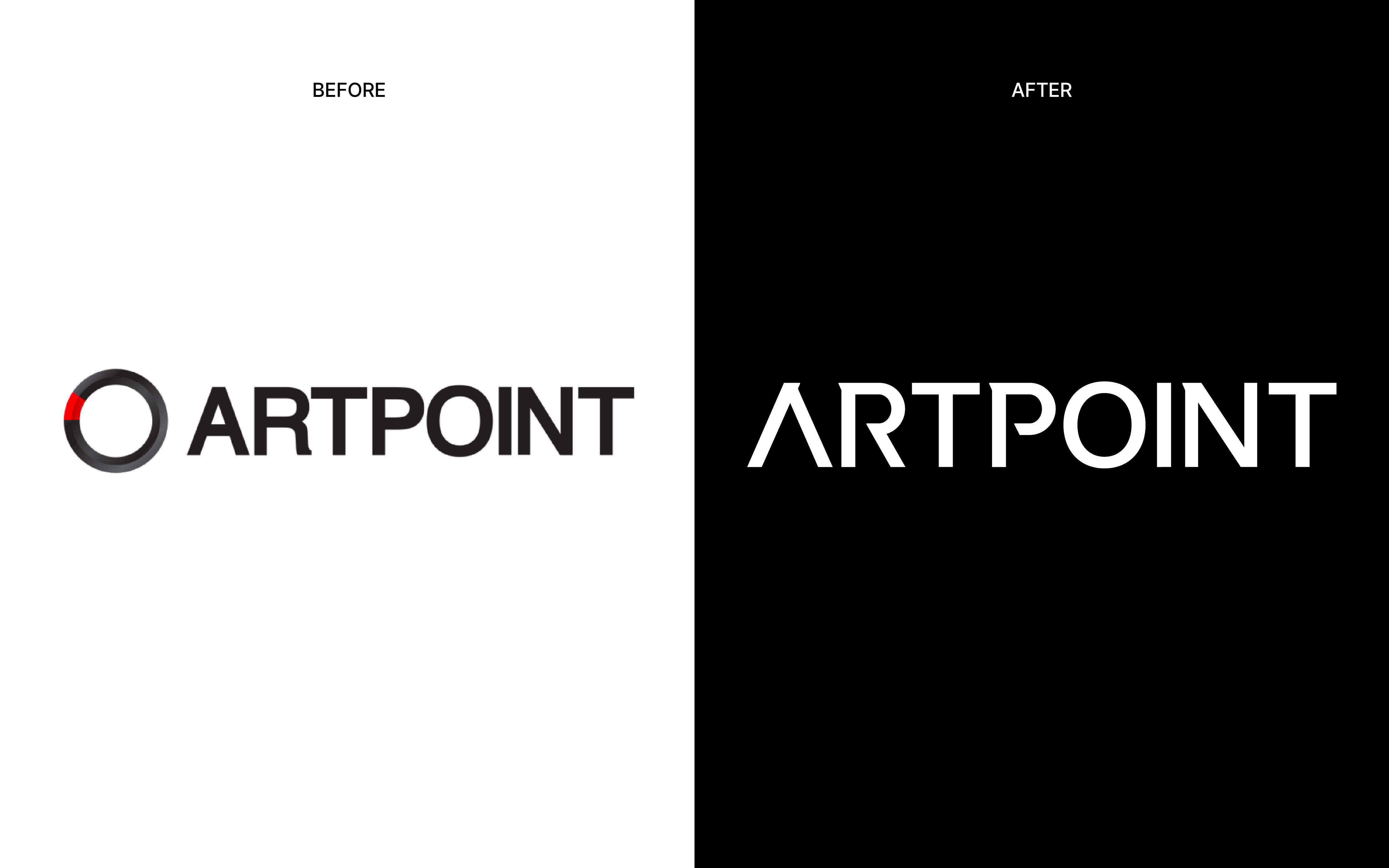
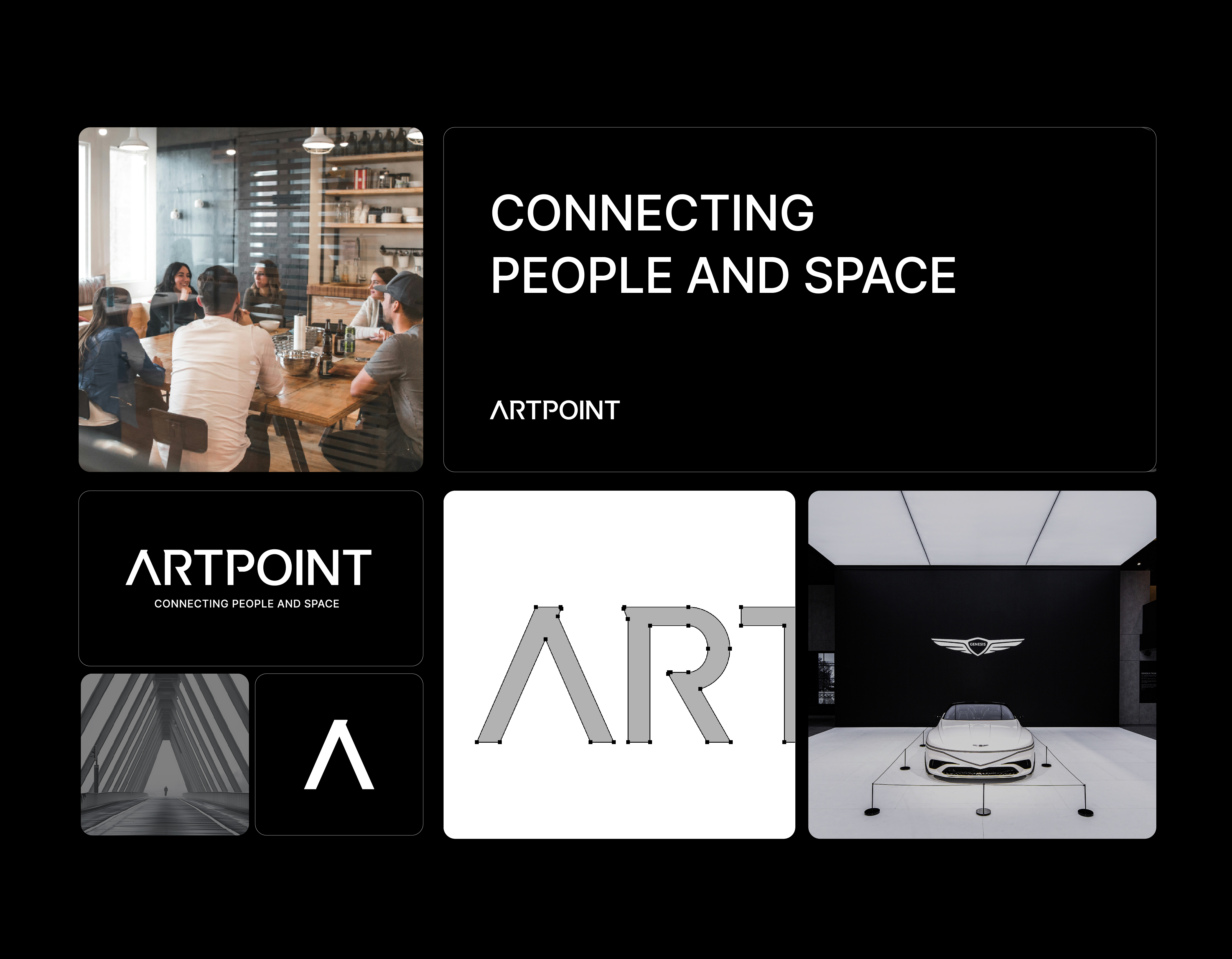
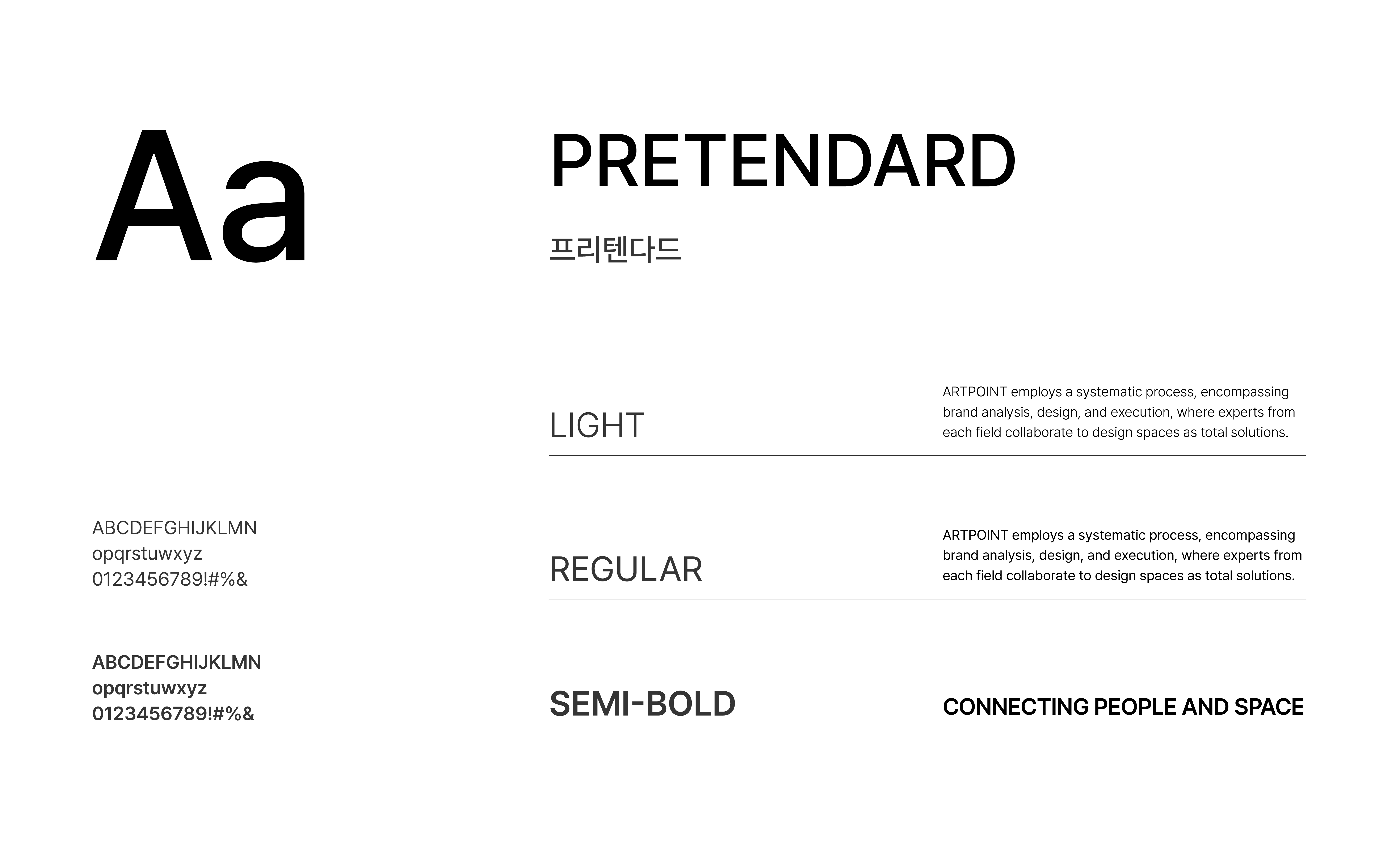
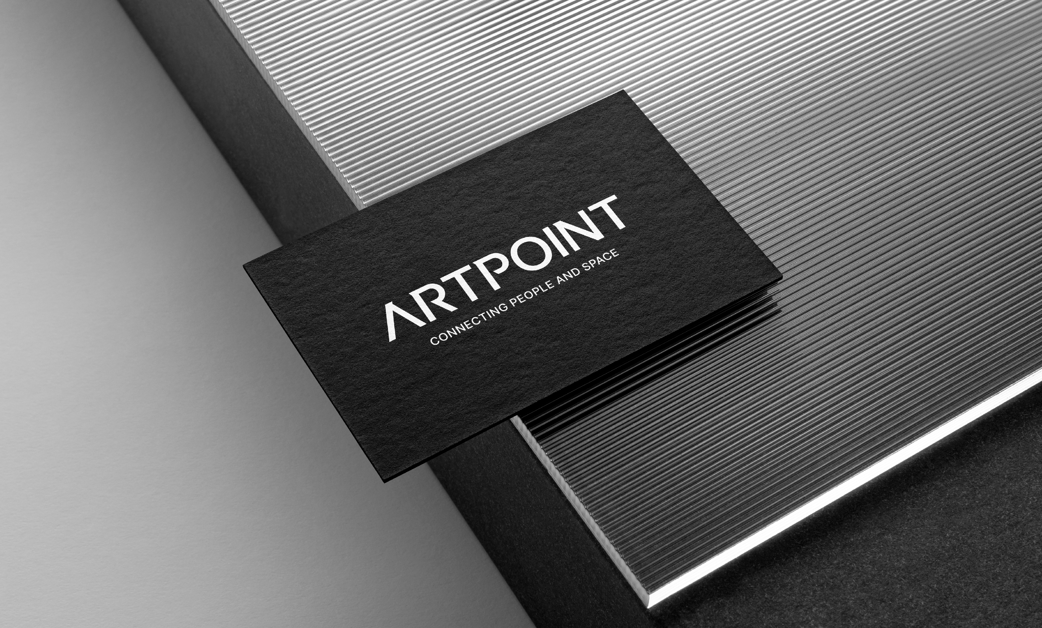
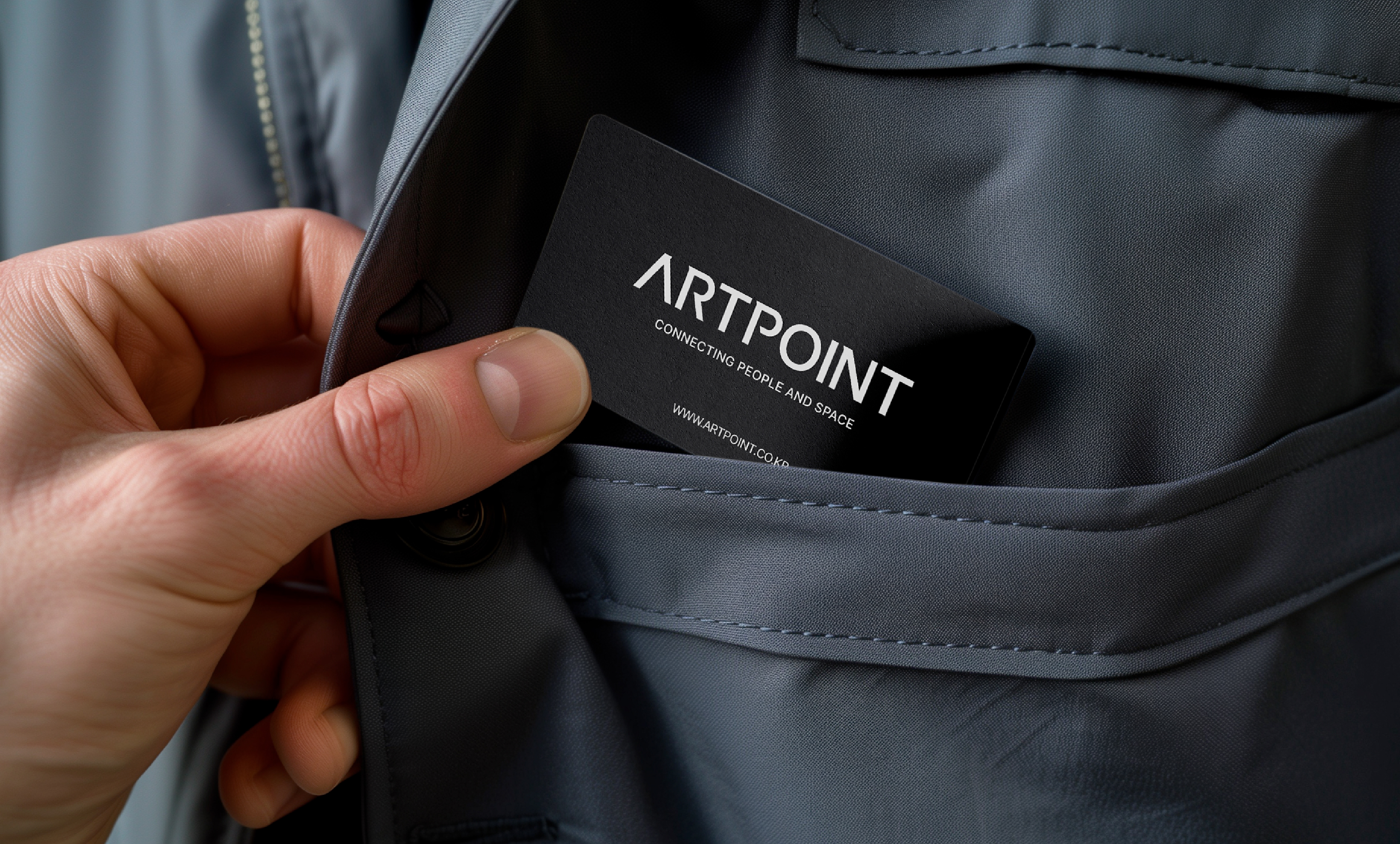
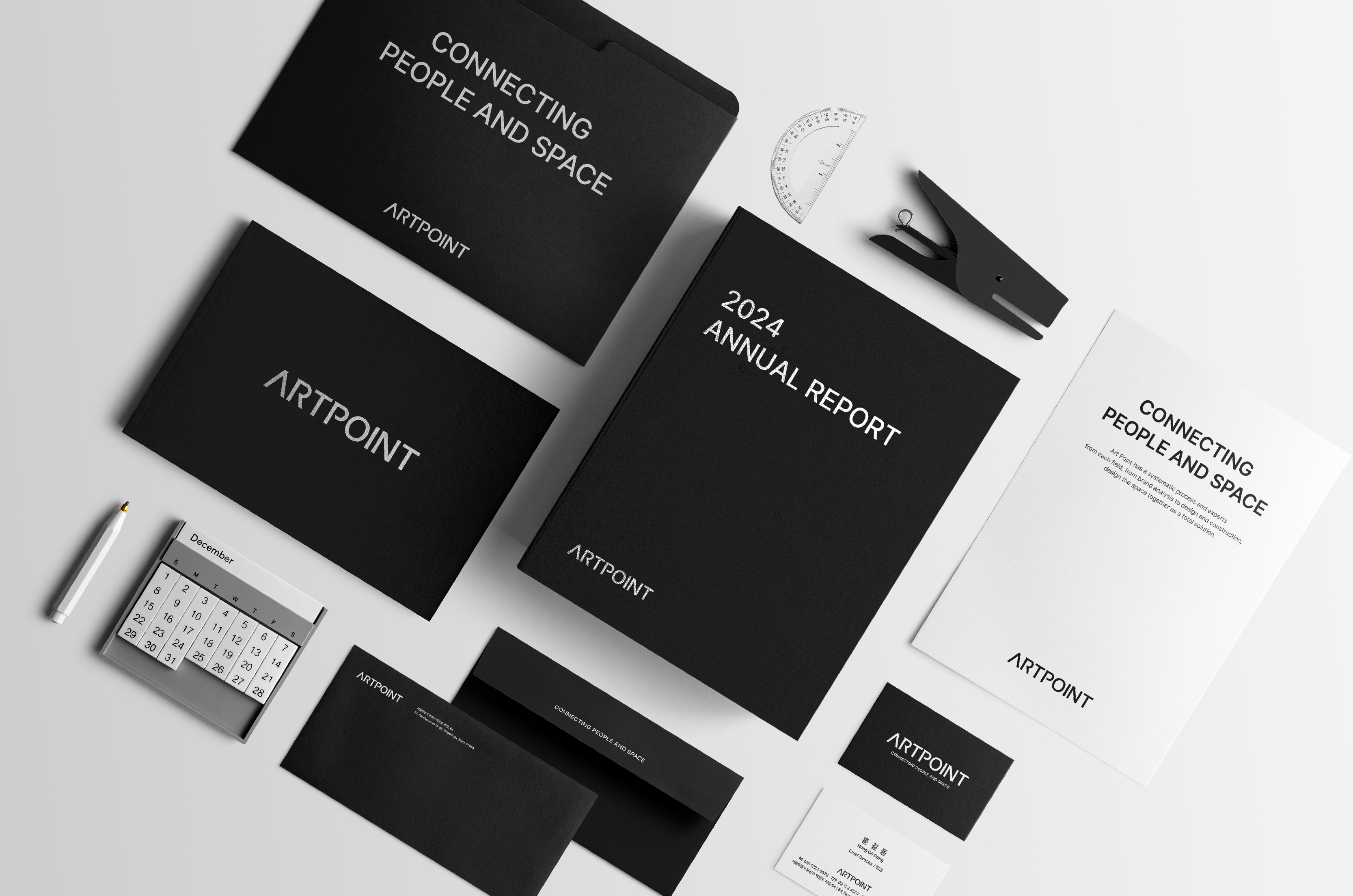
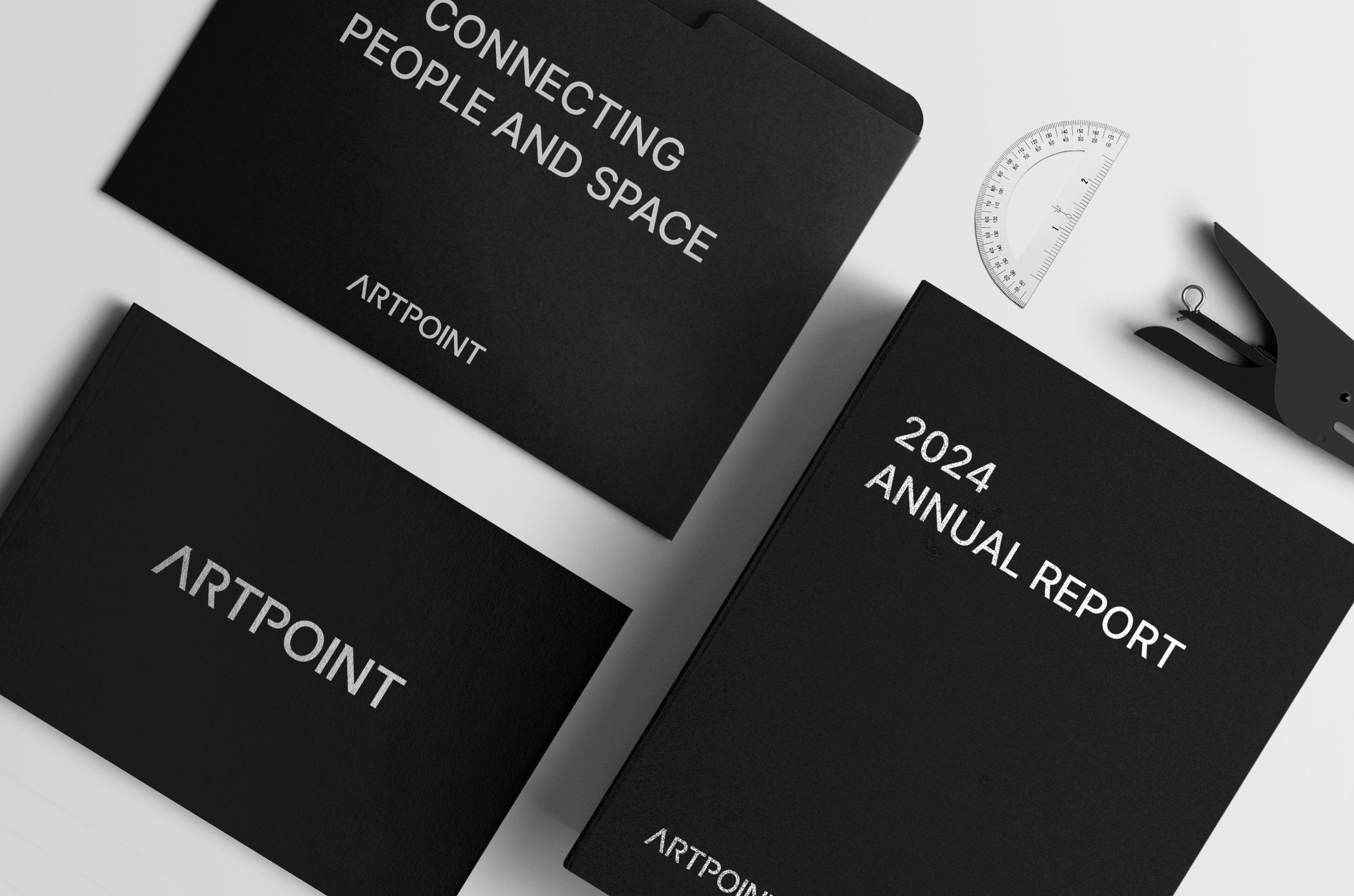
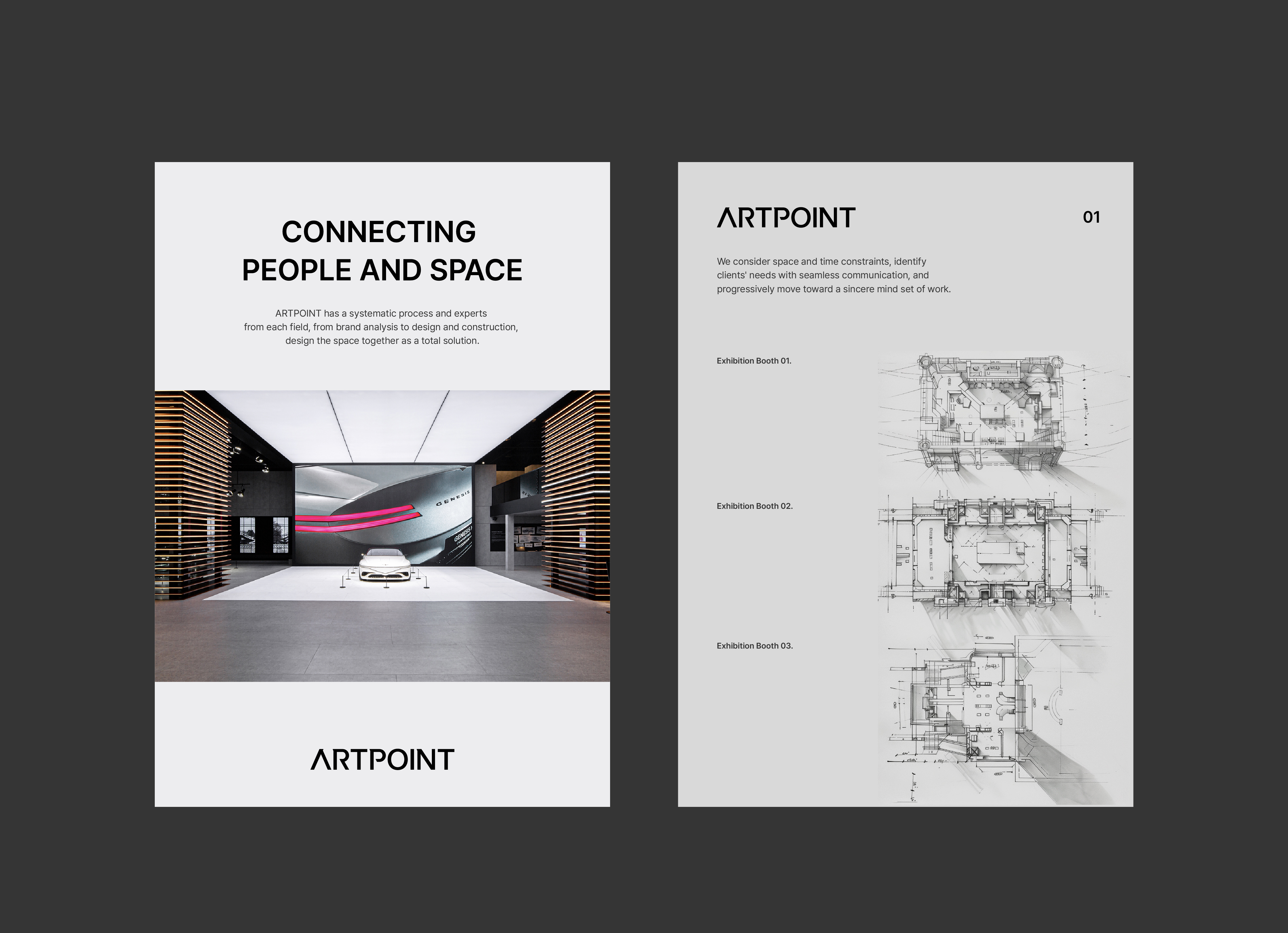
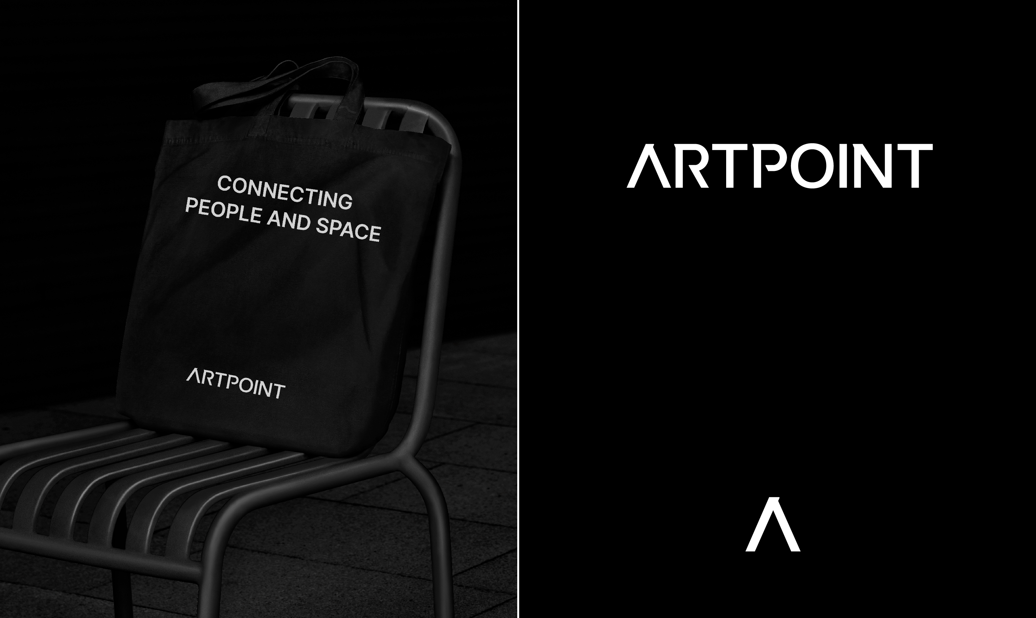
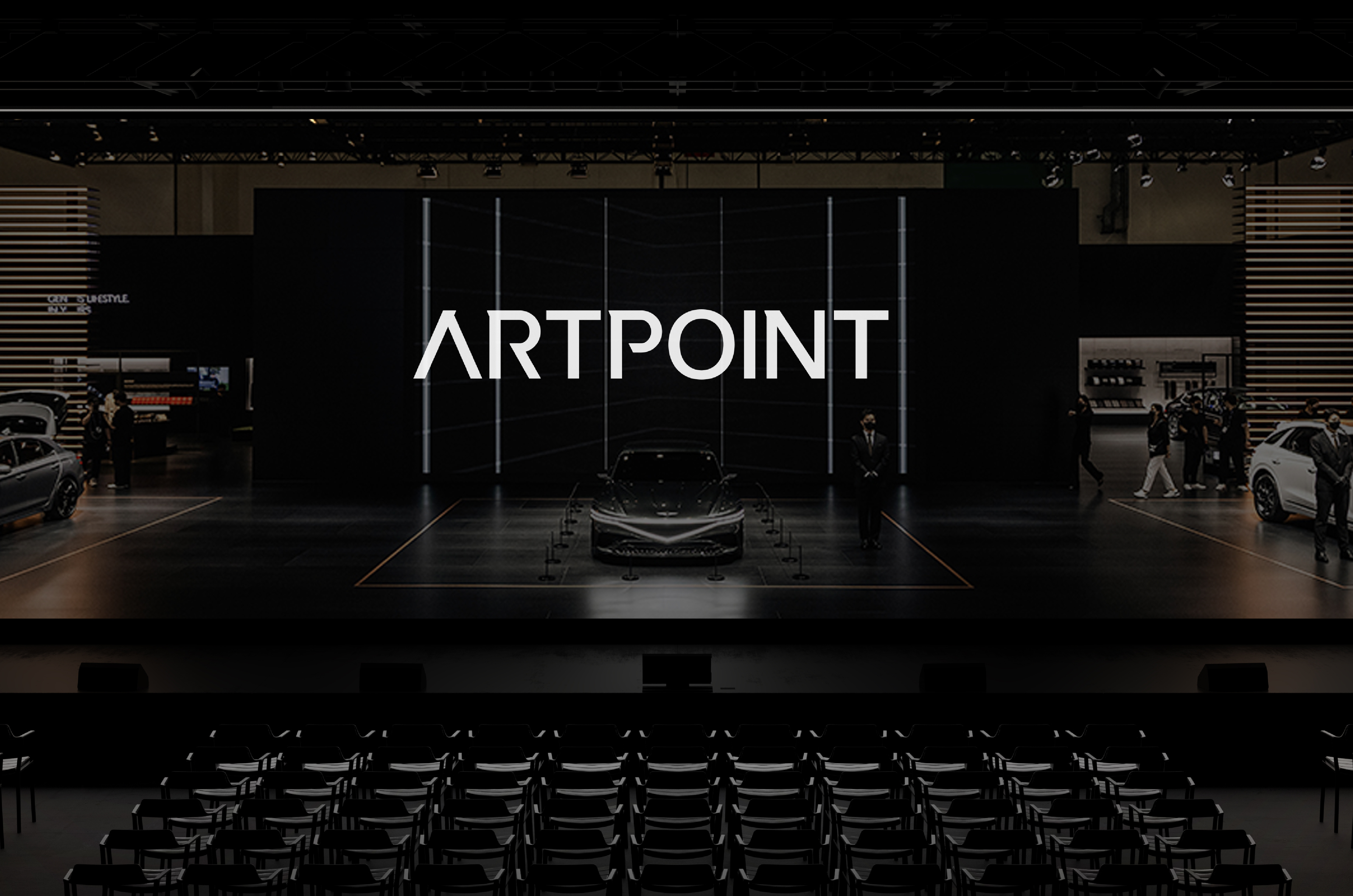
There was a need to develop a differentiated identity and image unique to ARTPOINT, leading the industry through accumulated know-how and continuous innovation, and to establish a corporate identity that could secure market competitiveness. We built a progressive corporate image with a clean and bold sans-serif typeface logotype that powerfully and reliably conveys ARTPOINT's unique values. Additionally, by developing a friendly mood slogan that signifies customer-centric service, we aimed to establish an influential corporate image that offers more valuable spatial experiences to customers with a modern look and feel differentiated from the existing industry.
축적된 노하우와 지속적인 혁신으로 업계를 리드하는 아트포인트만의 차별화된 정체성과 이미지를 개발하고, 시장에서의 경쟁력을 확보할 수 있는 기업 아이덴티티가 필요했습니다. 아트포인트가 추구하는 고유의 가치를 힘 있고 신뢰감 있게 전달할 수 있는 간결하고 볼드한 산세리프 서체 기반의 로고타입으로 진취적인 기업 이미지를 구축했습니다. 또한, 고객 중심의 서비스를 의미하는 친근한 무드의 슬로건을 개발하여 기존 업계와는 차별화된 모던한 룩앤필의 CI 디자인으로 고객들에게 보다 가치 있는 공간 경험을 제시하는 영향력 있는 기업 이미지로 각인시키고자 했습니다.
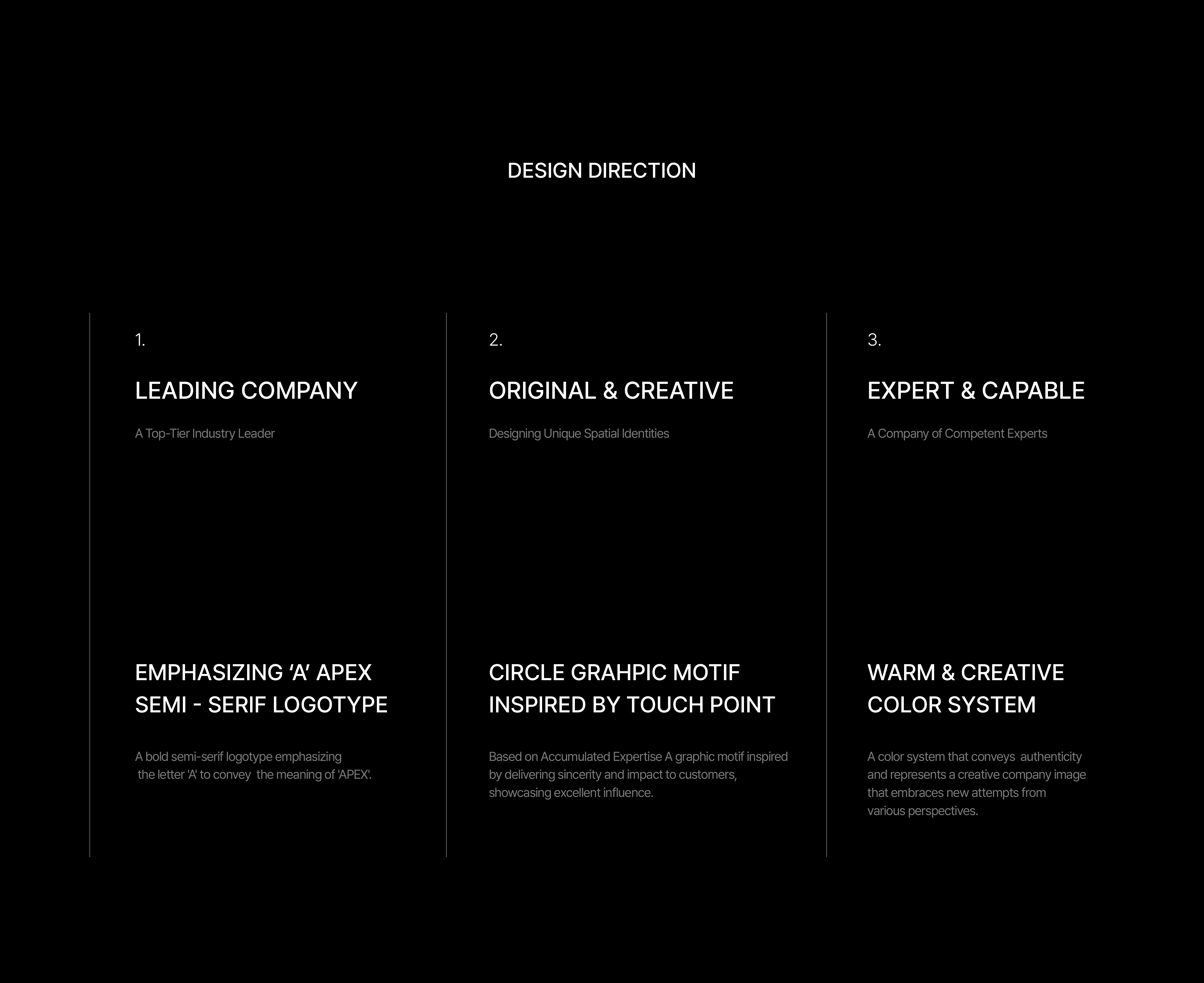
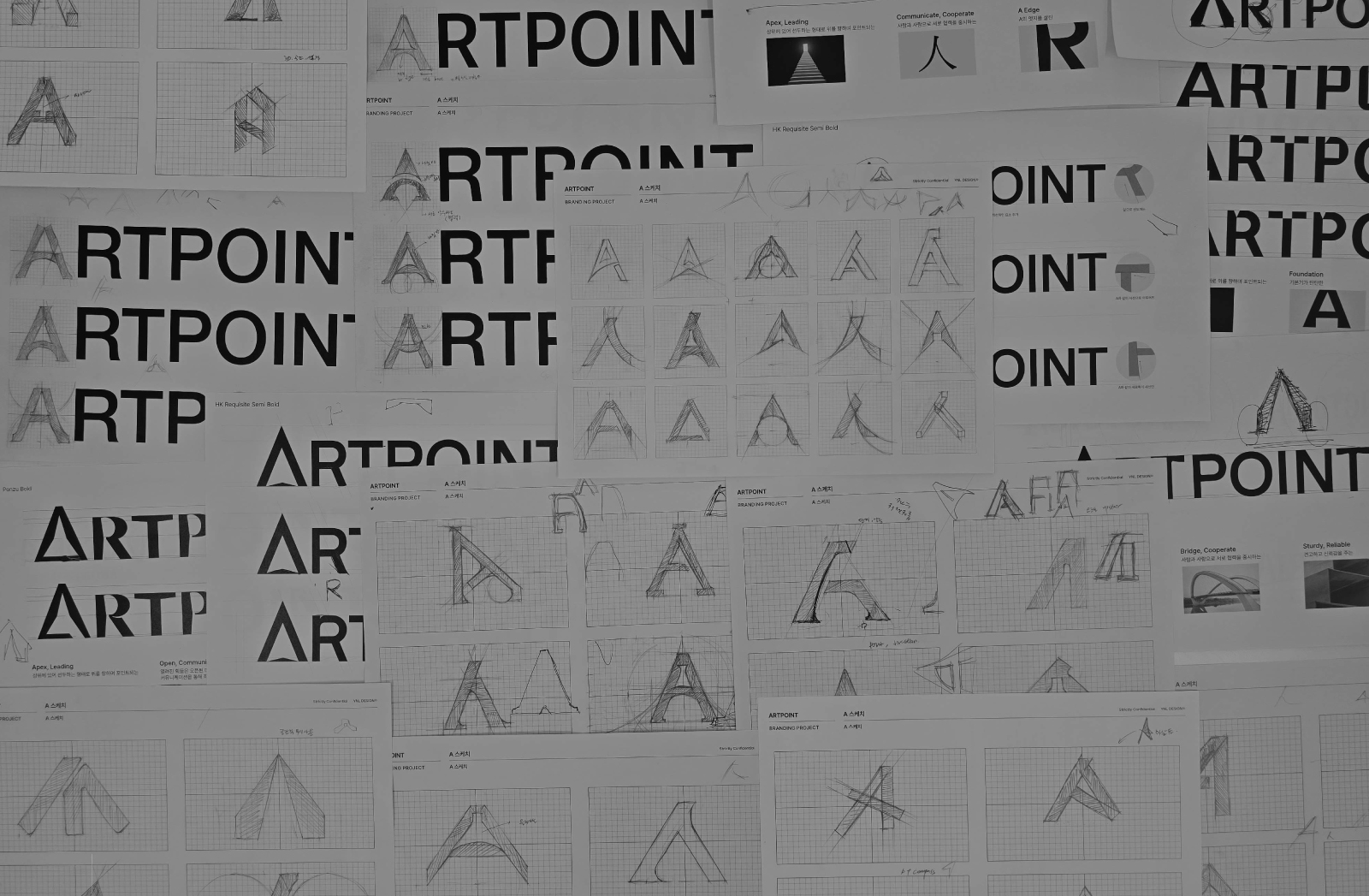
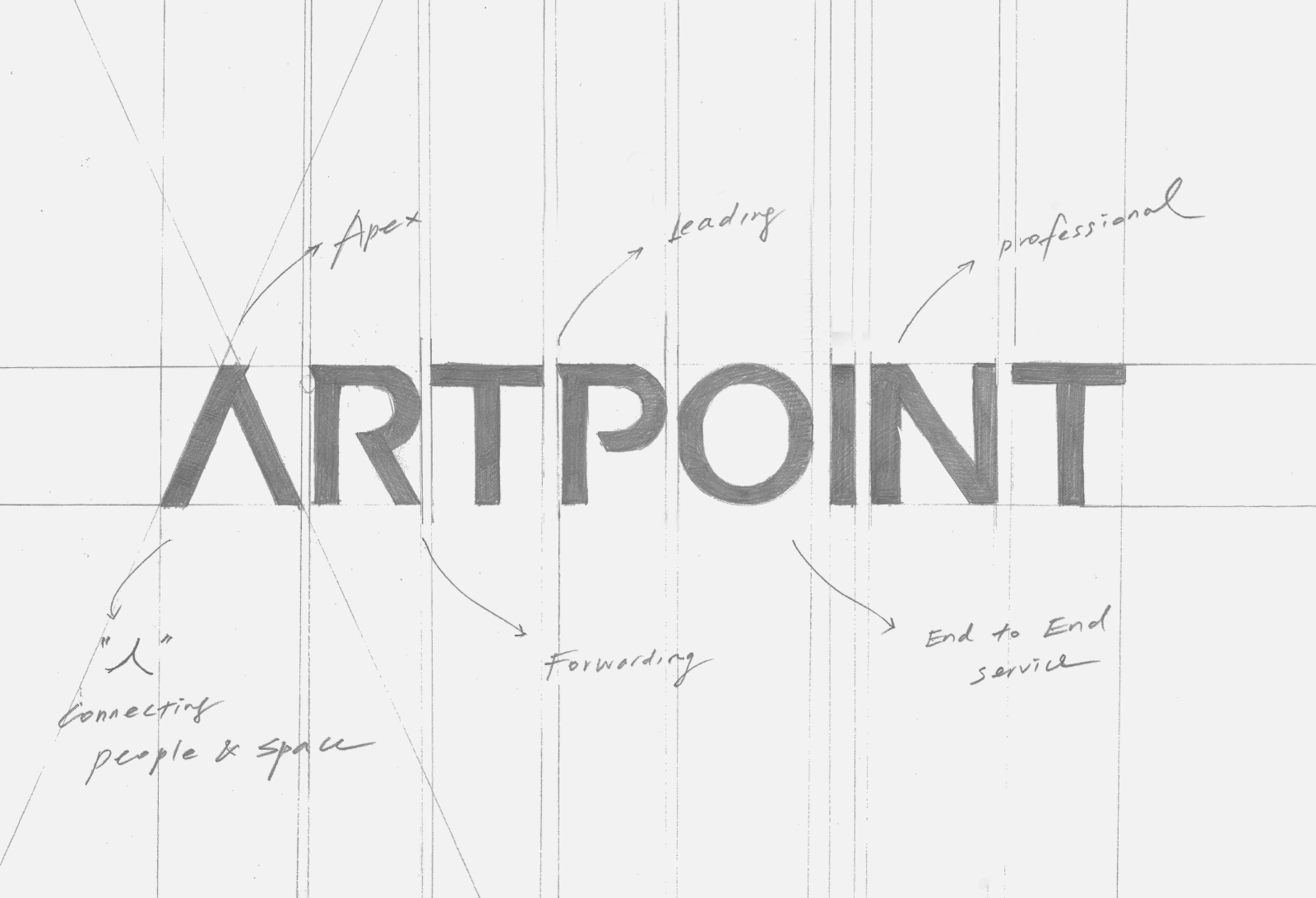
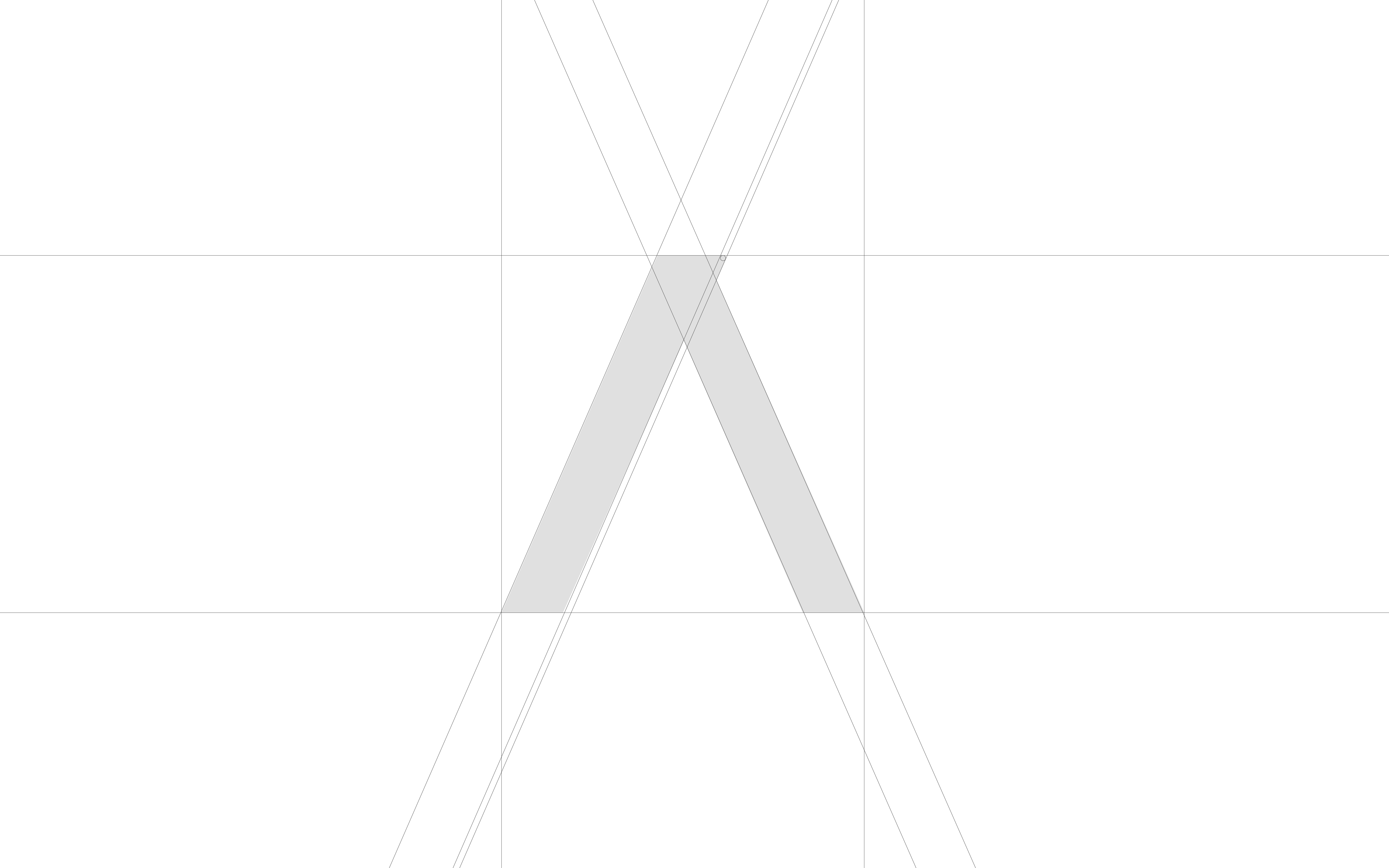
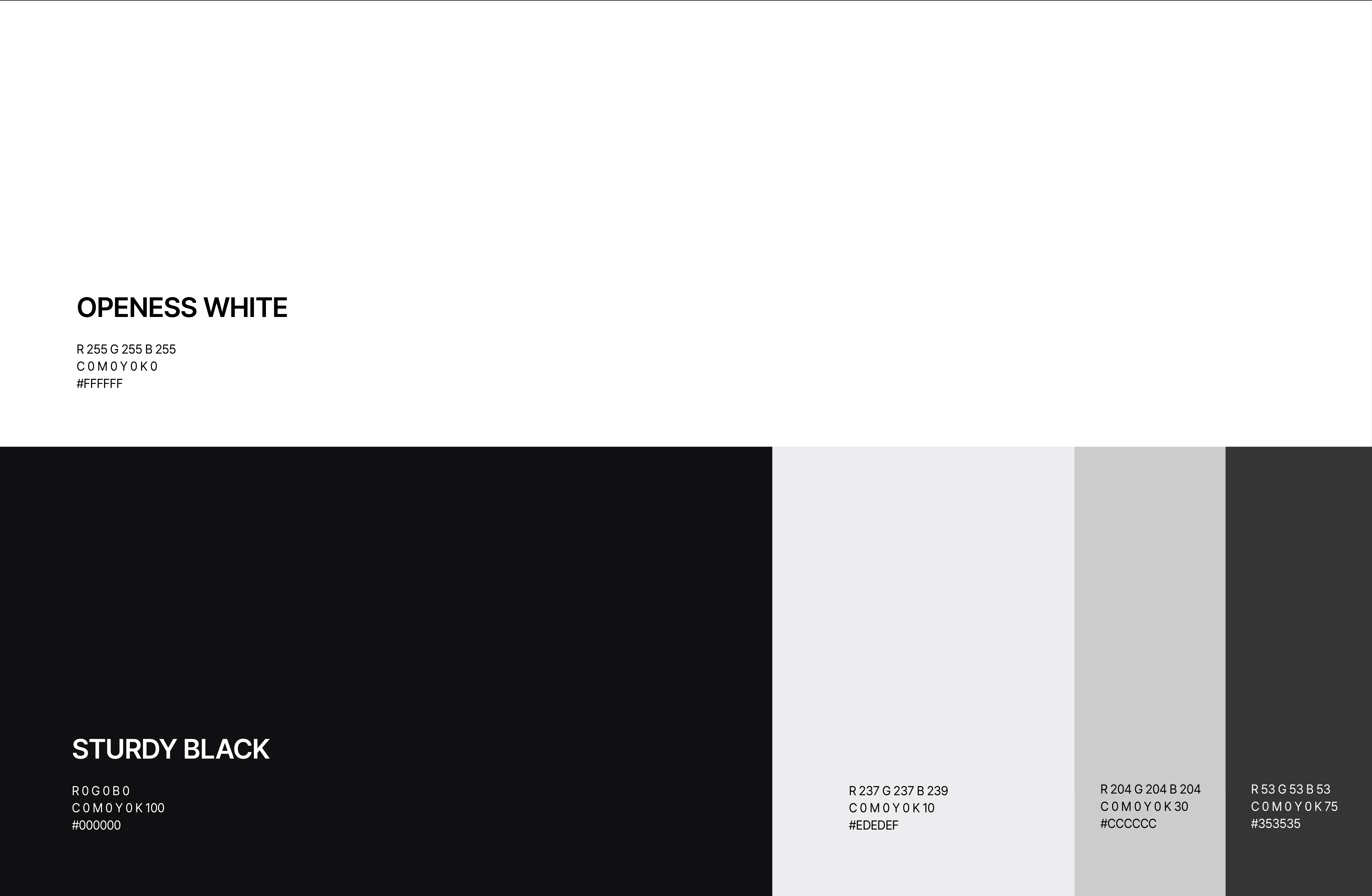
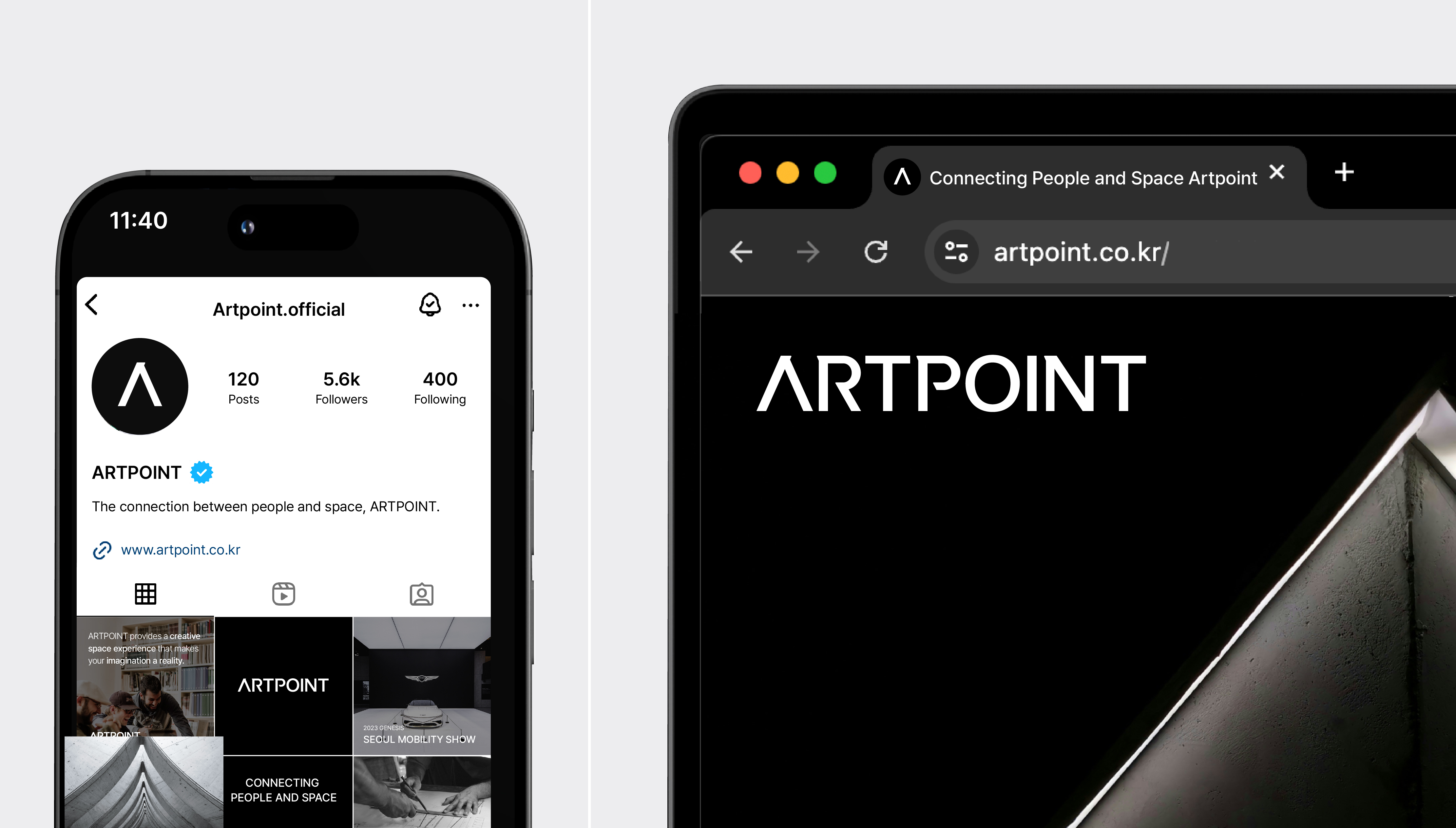
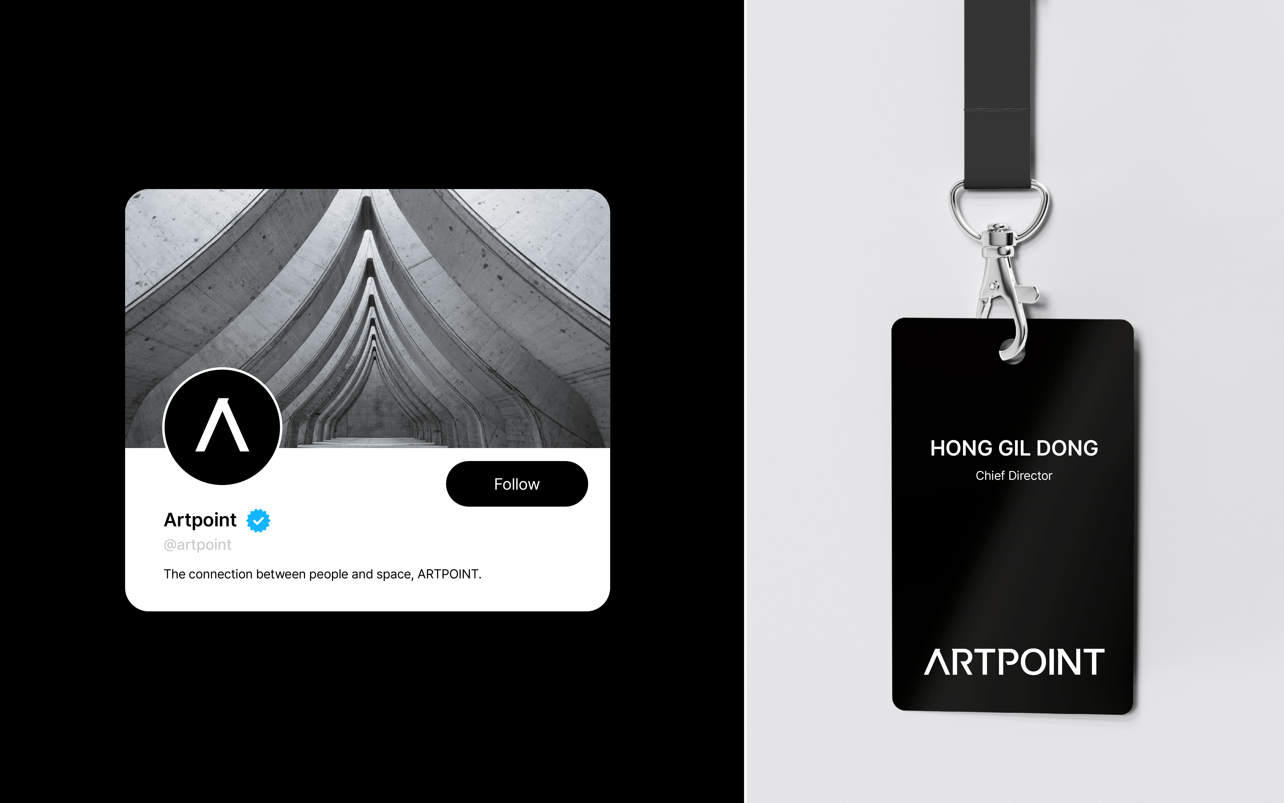
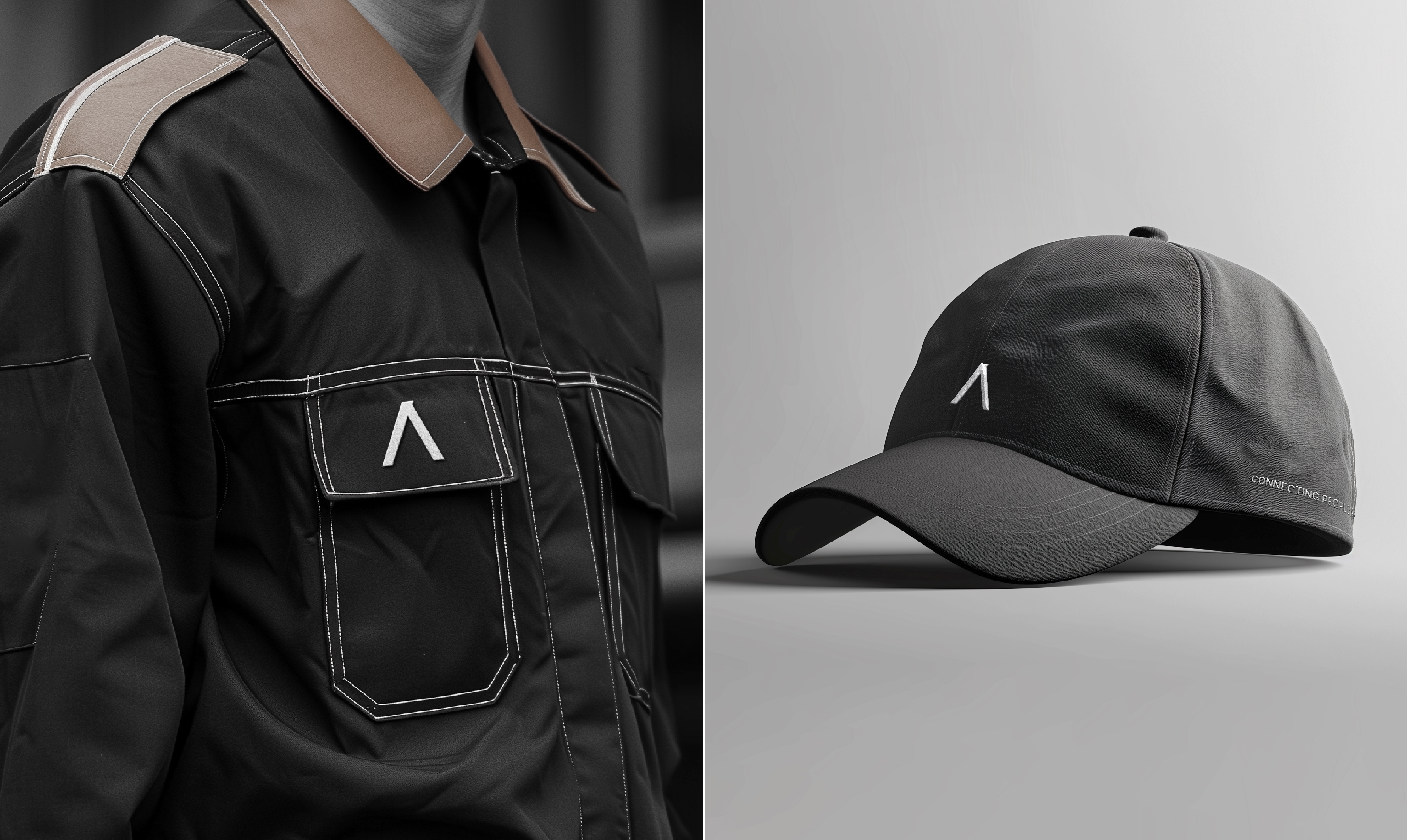
YNL Design defined ARTPOINT as a company that leads the industry with superior expertise and a high degree of completion in total solutions, from brand analysis to design and construction. Based on the slogan "Connecting People and Space," we sought to convey ARTPOINT's unique identity more clearly and succinctly by emphasizing the company's philosophy of valuing relationships between people. This was visually represented by depicting the 'A' in the logotype as a human figure, consistently expressing the positive image of a company advancing through smooth communication with customers. The graphic motif emphasized the 'O,' extending ARTPOINT's inherent value (Originality), symbolizing a unique perspective in meeting customer needs, and delivering new resonances through its expanding influence. To enhance visibility, we used the 'Redish Orange' color to signify a professional and passionate attitude towards space. We established a creative image that realizes customer value based on ARTPOINT's philosophy of creating spaces that move people's hearts, going beyond merely conveying brand value in exhibitions.
YNL Design은 아트포인트를 탁월한 전문성과 브랜드 분석부터 디자인, 시공까지 완성도 높은 토탈 솔루션으로 업계를 리딩하는 기업으로 정의했습니다. ‘Connecting People and Space’라는 슬로건을 기반으로 사람과 사람 간의 관계를 중요시하는 기업의 철학을 담아 아트포인트만의 정체성을 보다 쉽고 명확하게 전달하고자 했습니다. 이는 로고타입의 ‘A’를 사람 인(人) 모습으로 시각화하여 고객과의 원활한 커뮤니케이션을 통해 진취적으로 나아가는 기업의 긍정적인 이미지를 일관성 있게 표현했습니다. 그래픽 모티브는 아트포인트 본연의 가치(Originality)를 확장시킨 ‘O’에 포인트를 주어 고객의 니즈를 새로운 관점으로 바라보는 독창적인 자세와 이를 통해 영향력이 확대되고 퍼져나가 새로운 울림을 선사한다는 의미를 담았습니다. 공간을 대하는 프로페셔널하고 열정적인 태도를 의미하는 ‘Redish Orange’ 컬러를 포인트로 사용하여 주목도를 높였습니다. 우리는 단순히 브랜드의 가치를 전하는 전시를 넘어 사람의 마음을 움직이는 공간을 만드는 아트포인트만의 철학을 바탕으로 고객 가치를 실현하는 창조적 이미지를 구축했습니다.