ENFORD HOTEL
Turning a hotel into an urban oasis

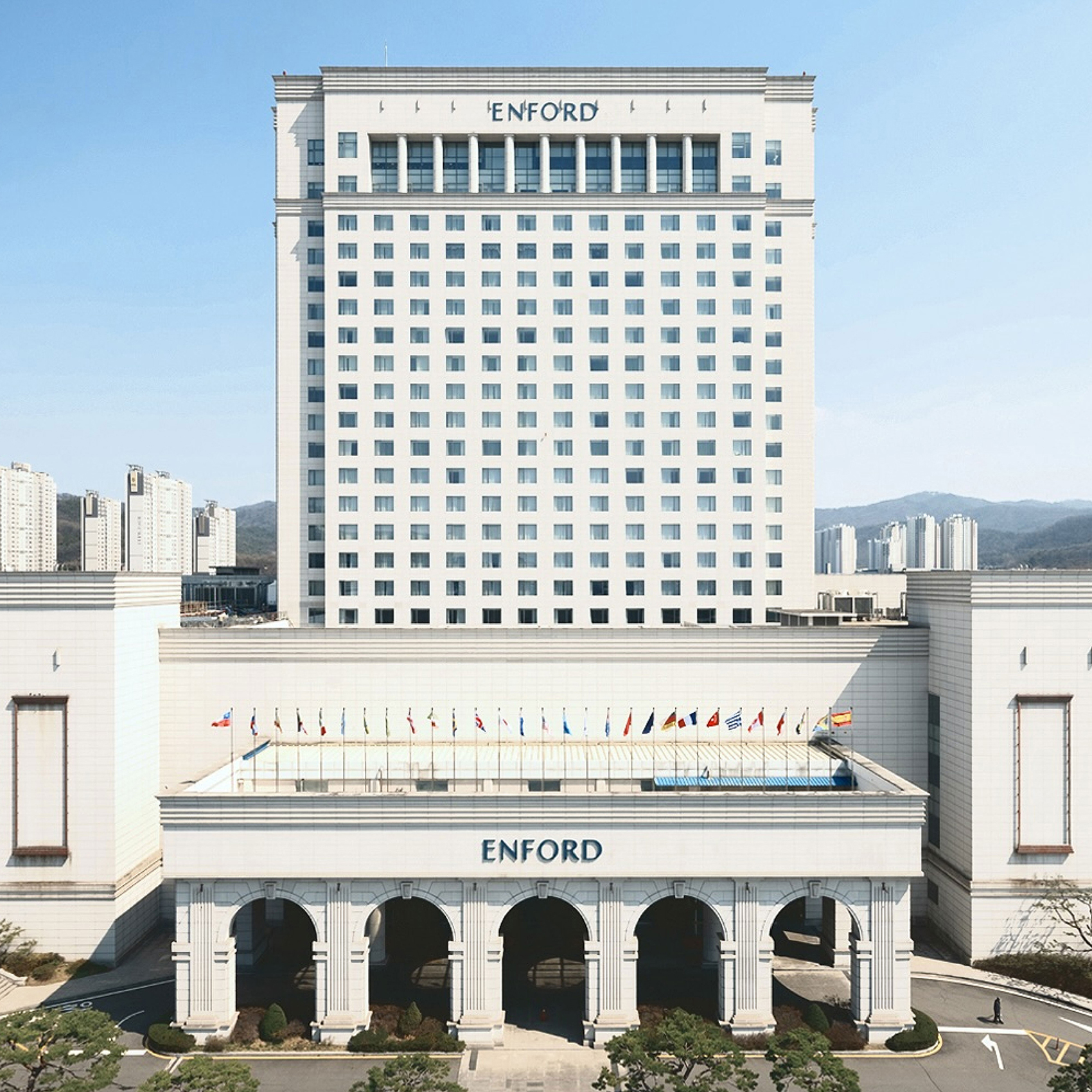
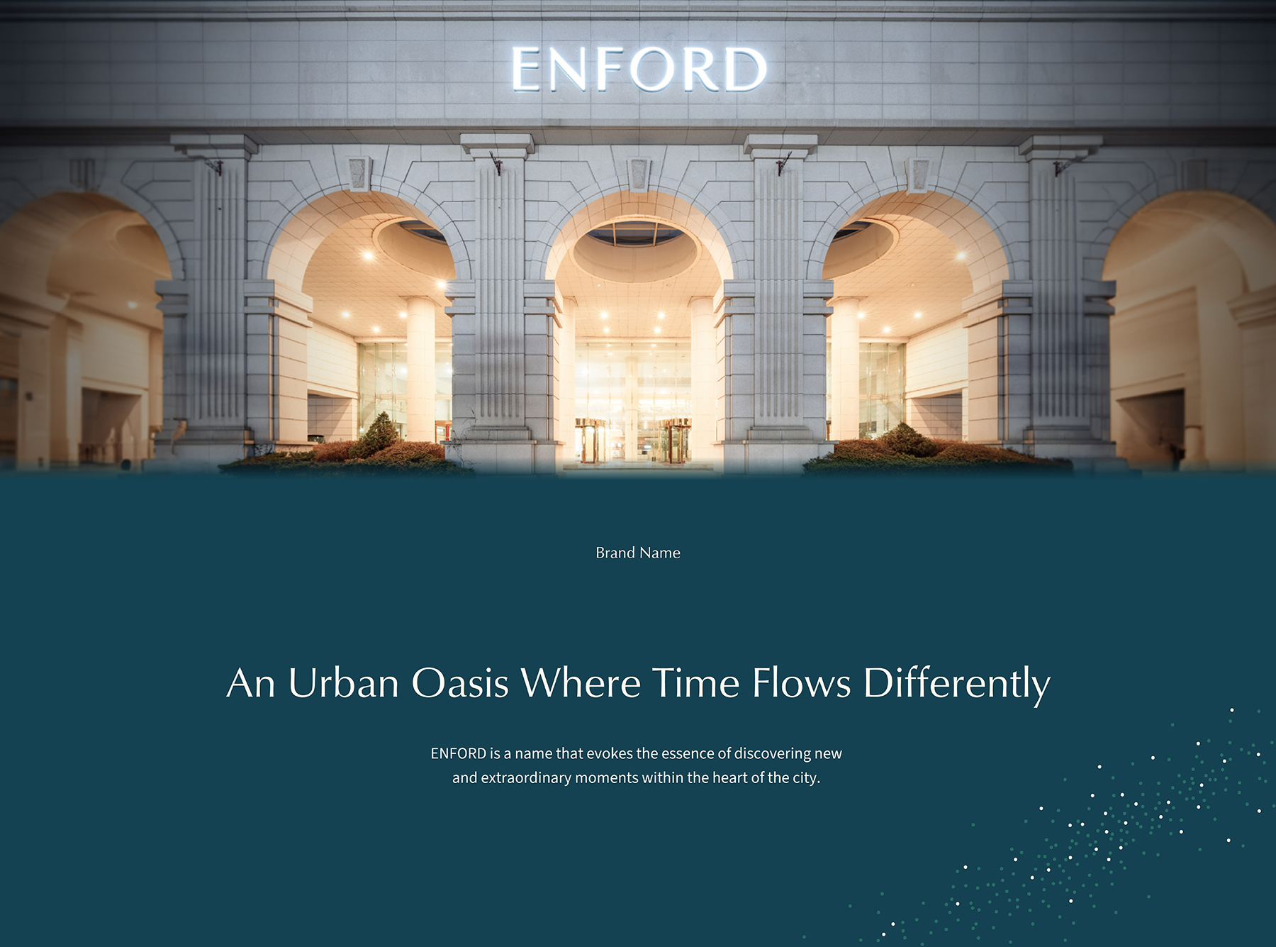
Opened in 2003 as the first and only five-star hotel in Korea’s central region, Grand Plaza Cheongju Hotel quickly established itself as a landmark with convenient access to Cheongju International Airport and amenities such as large-scale retail and cinemas. The 21-story, 328-room hotel featured spacious banquet halls, six restaurants and bars, a fitness center, and premium service. However, over time, the outdated interiors and traditional hotel image led to a declining brand perception. In 2023, in response to the elevated expectations and diverse needs of post-pandemic travelers, the hotel embarked on a comprehensive rebranding initiative. This included a complete renewal of its name, brand identity, interior design, merchandise development, and overall guest experience.
그랜드 플라자 청주 호텔은 지역 문화 시설이 전무하던 2003년 출범한 중부권 유일의 5성급 호텔로서 청주국제공항과 인접하여 편리한 접근성과 대형마트 및 영화관 등 부대시설을 갖춘 지역의 랜드마크 역할을 해왔습니다. 그랜드 플라자 청주는 지상 21층, 지하 3층 규모의 호텔로 객실 328실의 객실과 대규모 연회장, 6개의 레스토랑과 바, 휘트니스 센터를 보유하고 있는 특급호텔이지만 오래된 시설과 전형적인 호텔 공간으로 인해 올드한 브랜드 이미지를 갖고 있었습니다. 2023년 그랜드 플라자 청주는 해외여행이 어려웠던 팬데믹 동안 고도화된 호텔 경험에 대한 고객의 기대치와 다원화된 니즈를 만족시키고 더욱 가치 있는 경험을 선사하기 위해 호텔 네임, BI 리뉴얼, 객실과 내부 인테리어, MD 구성을 포함하여 전면적인 호텔 리브랜딩을 진행했습니다.
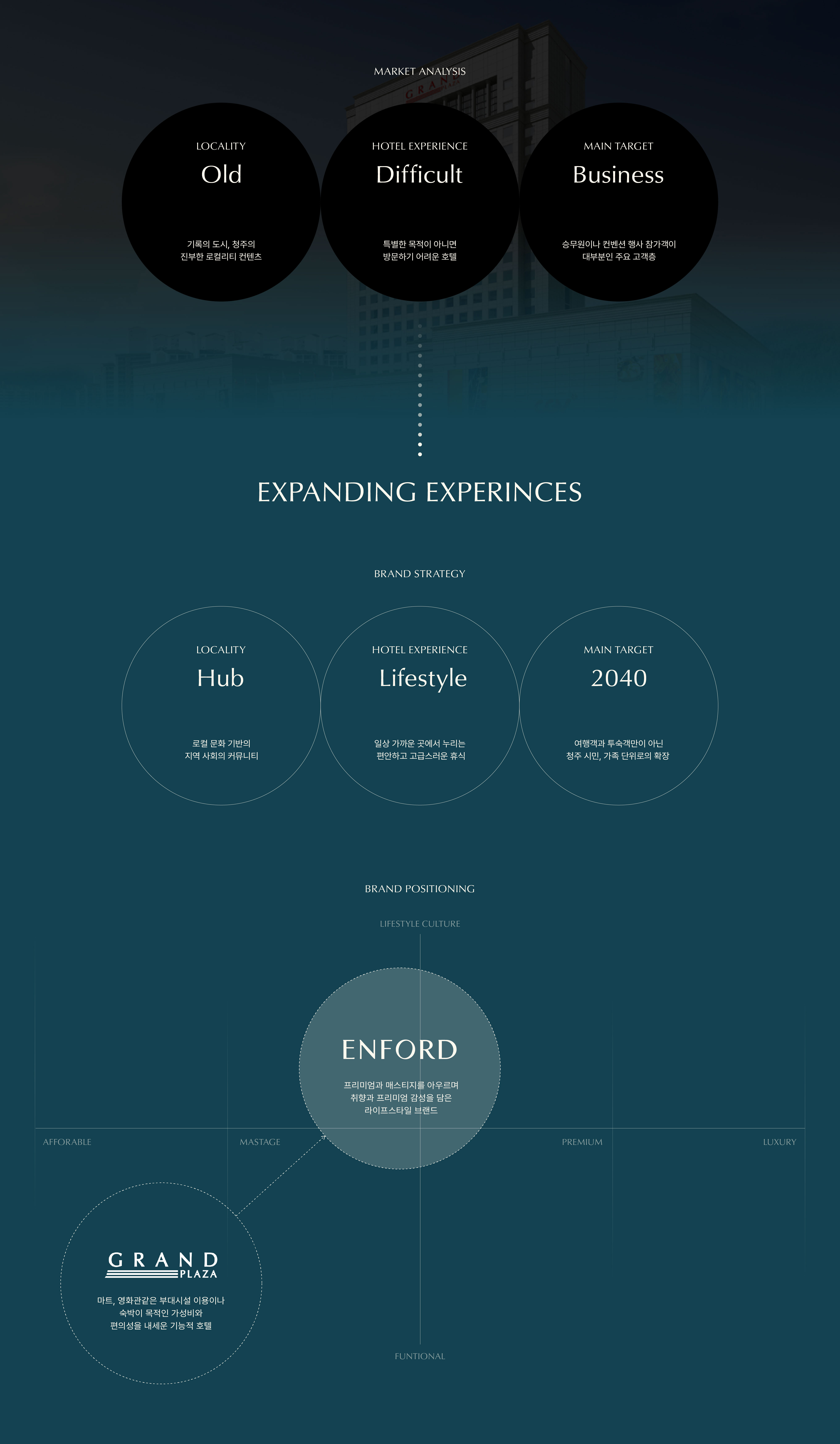
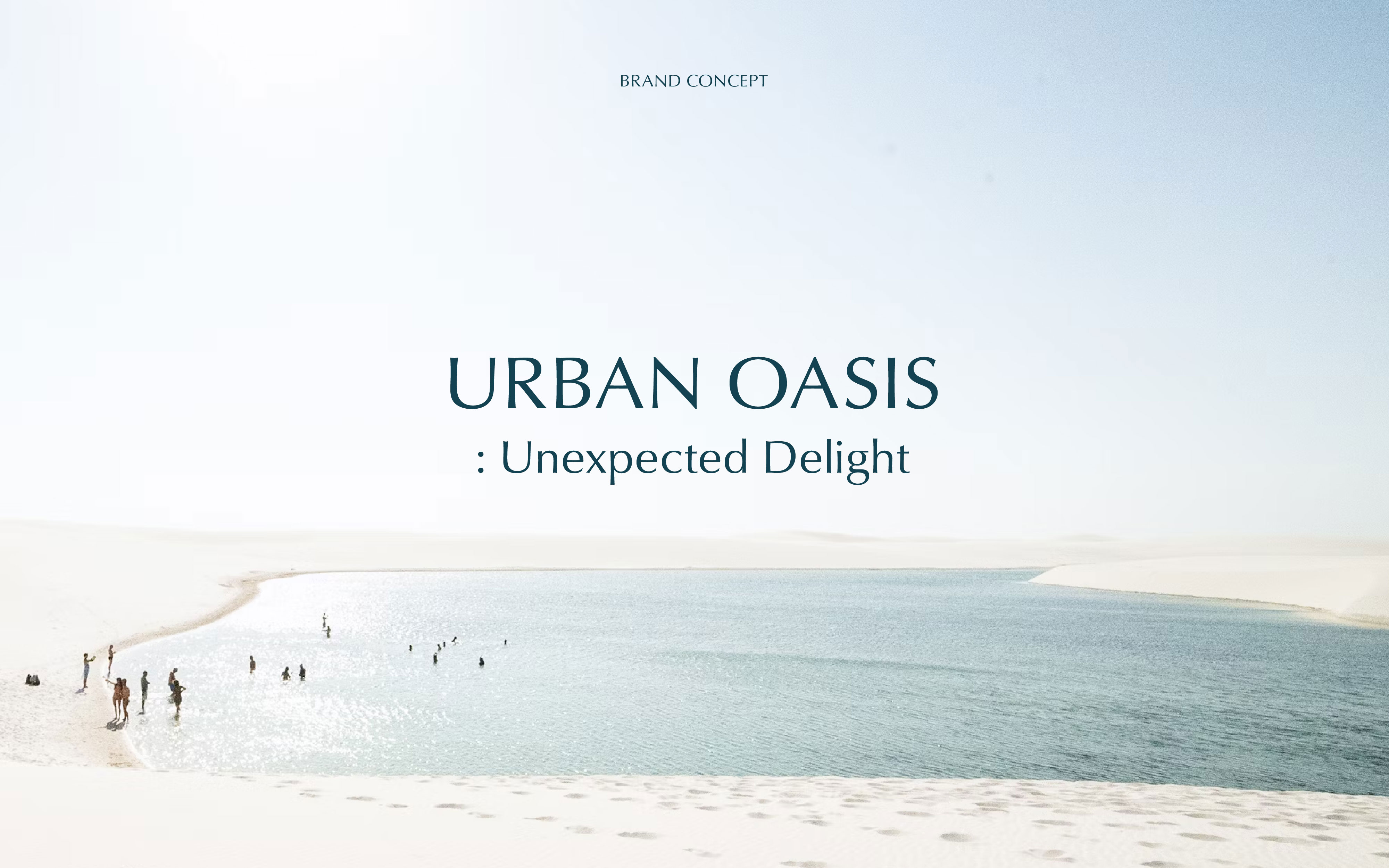
YNL aimed to redefine the notion of “rest” as envisioned by the hotel and craft a unique brand identity that offers a differentiated and inspiring customer experience. Through a series of in-depth interviews with hotel executives and staff, we reinterpreted the role of the hotel—not as a conventional lodging space, but as a dynamic lifestyle platform that delivers moments of inspiration and joy through rest and entertainment. The renewed identity positioned the hotel as an Urban Oasis—a cultural and emotional refuge in the city, open to all, whether for an overnight stay or a brief moment of refreshment.
YNL Design은 그랜드 플라자 청주 호텔이 지향하는 온전한 ‘쉼’에 대한 새로운 정의를 바탕으로 차별화된 브랜드 가치를 담은 브랜드 네이밍, 브랜드 아이덴티티 시스템을 개발하고, 고객에게 색다른 브랜드 경험을 선사할 수 있는 브랜드 어플리케이션 시스템을 개발하고자 했습니다. 우리는 호텔 임직원과의 인터뷰를 통해 새로운 호텔을 단순 숙박이나 전형적인 고급스러움이 아니라 생동감 넘치는 휴식과 엔터의 경험을 통해 고객의 일상에 새로운 영감을 선사하는 라이프스타일 플랫폼으로 정의했습니다. 새롭게 정의된 호텔의 정체성은 격식을 강조하는 기성 호텔, 소비를 요구하는 노골적인 상업 공간이 아니라, 숙박이 아니어도 언제든 방문해 리프레시를 누릴 수 있는 도심 속 오아시스(Urban Oasis)입니다.
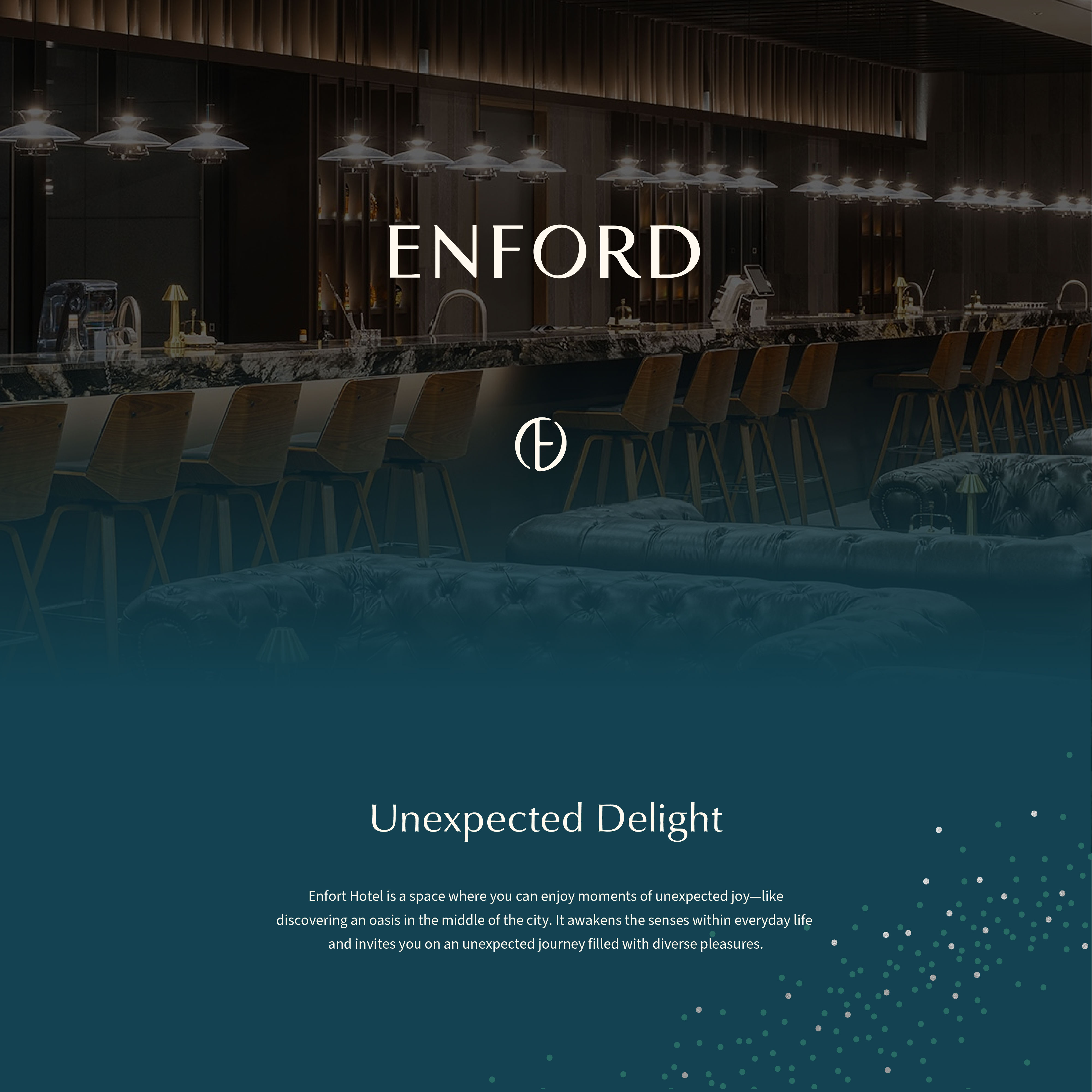
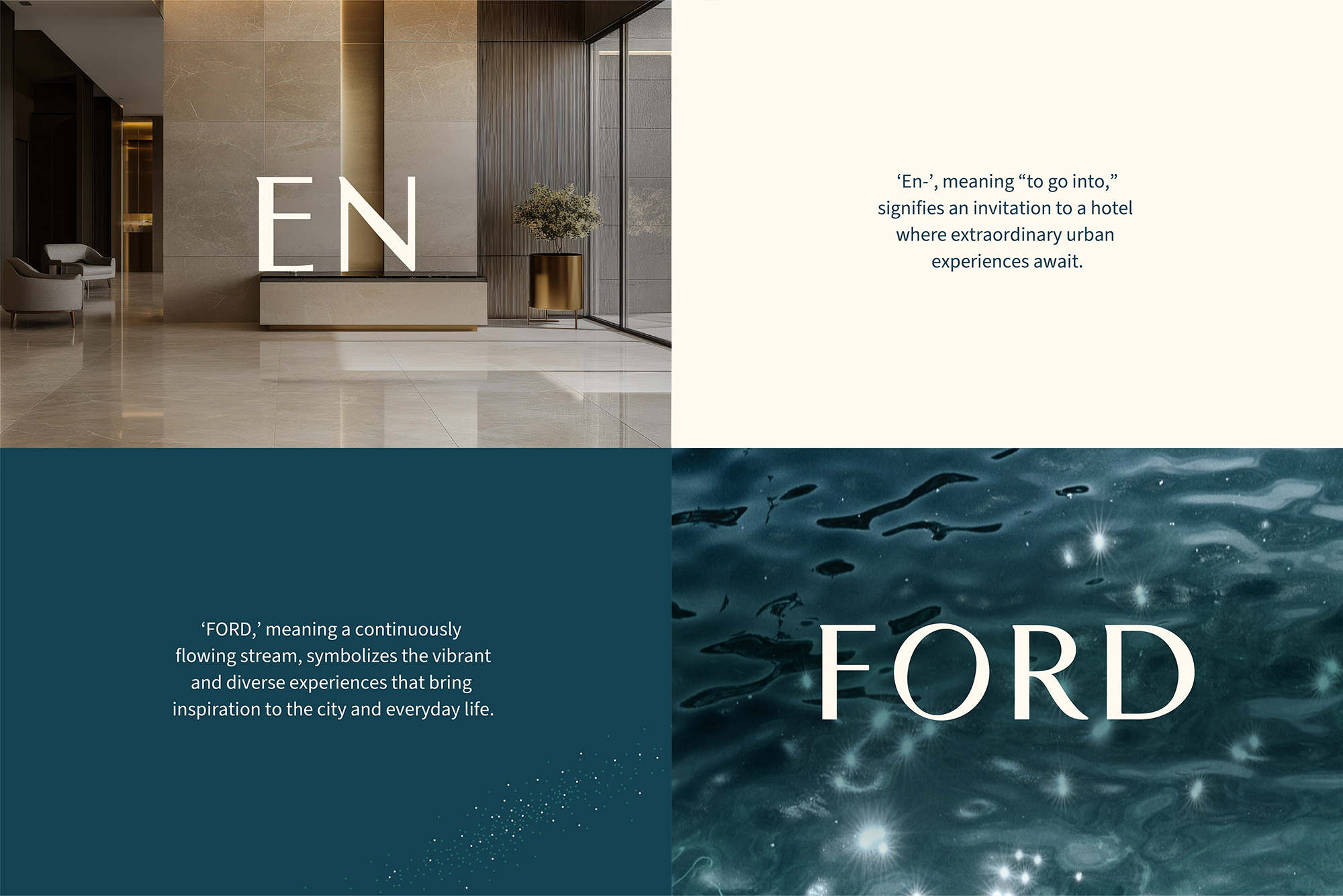
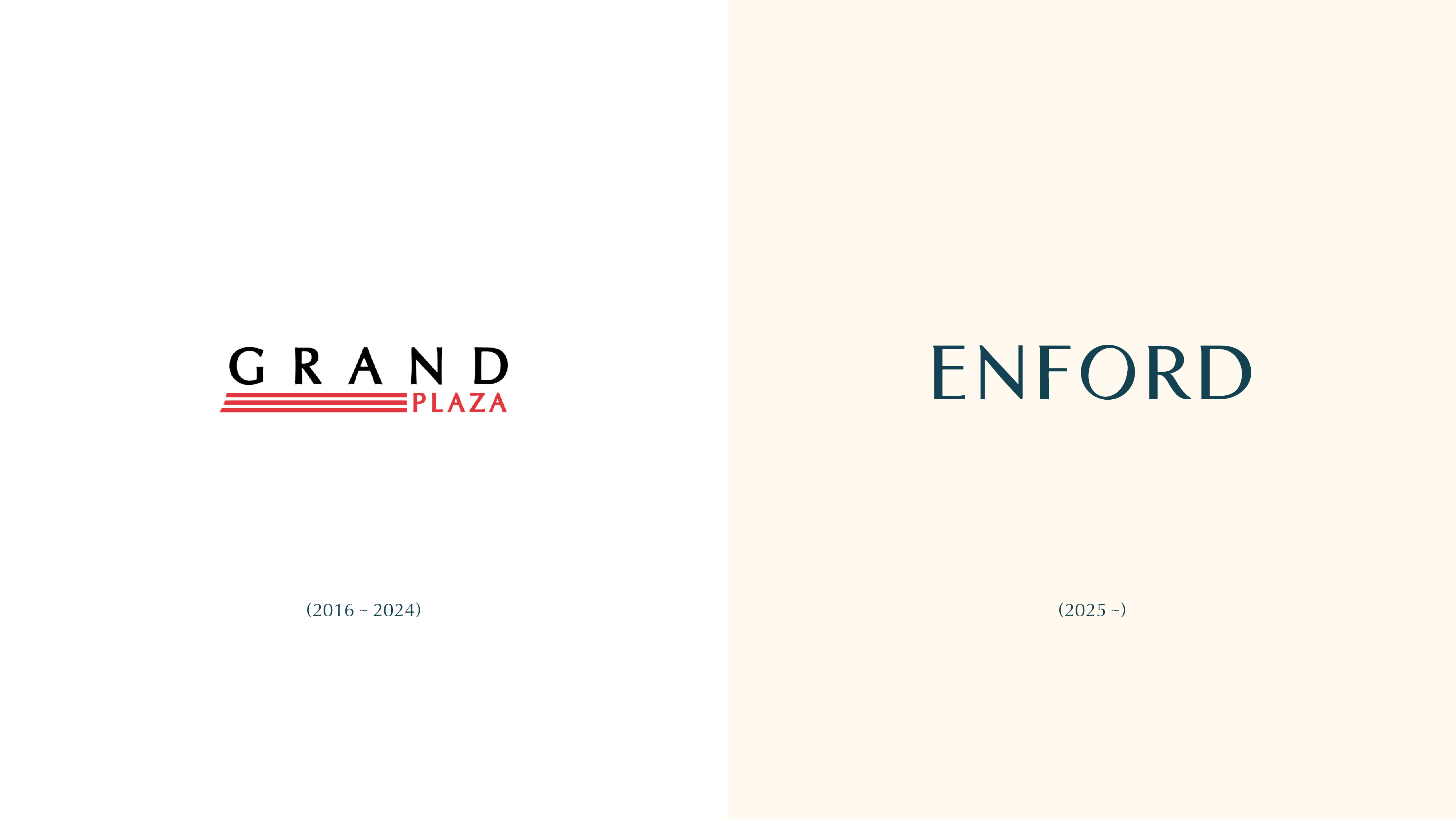
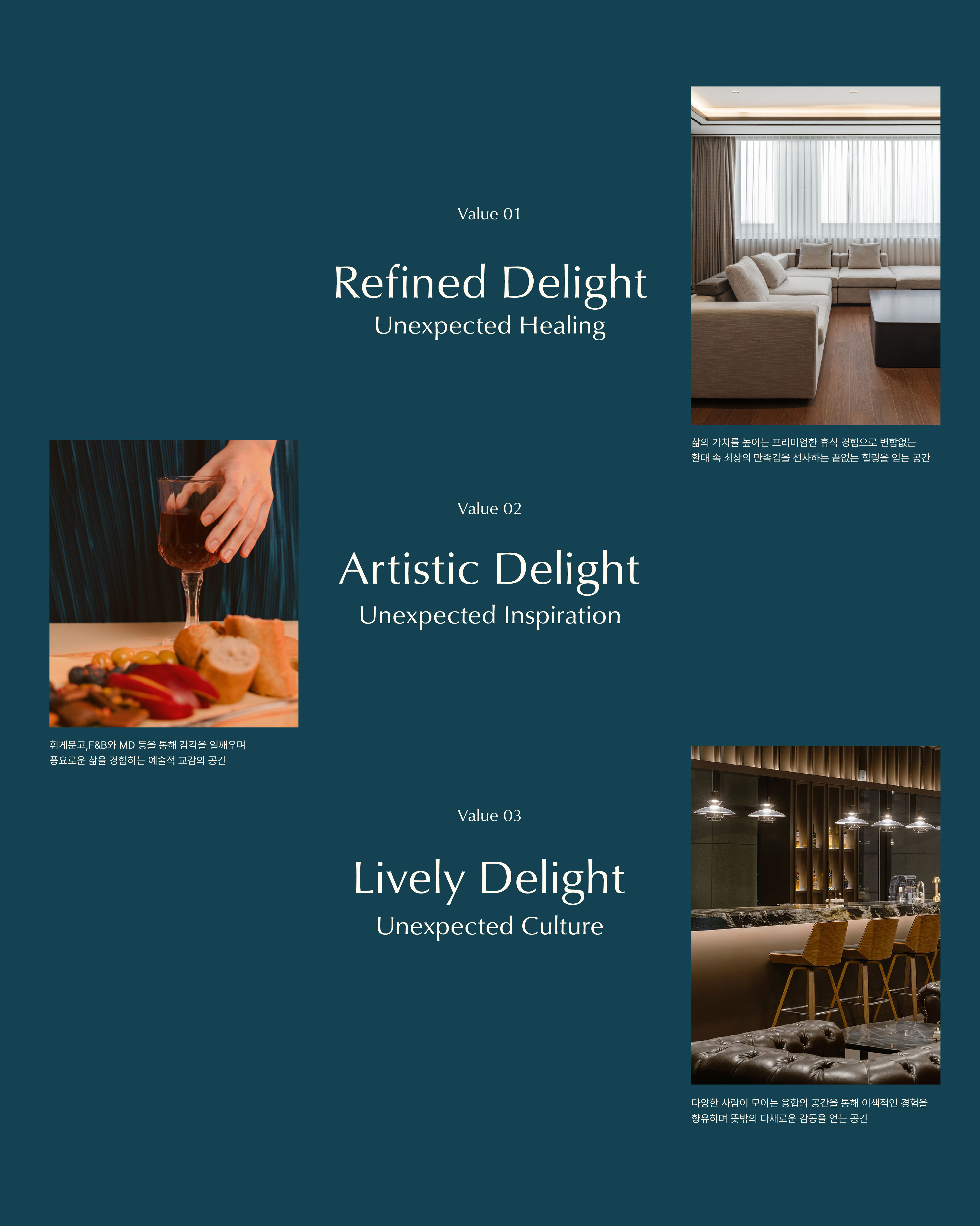
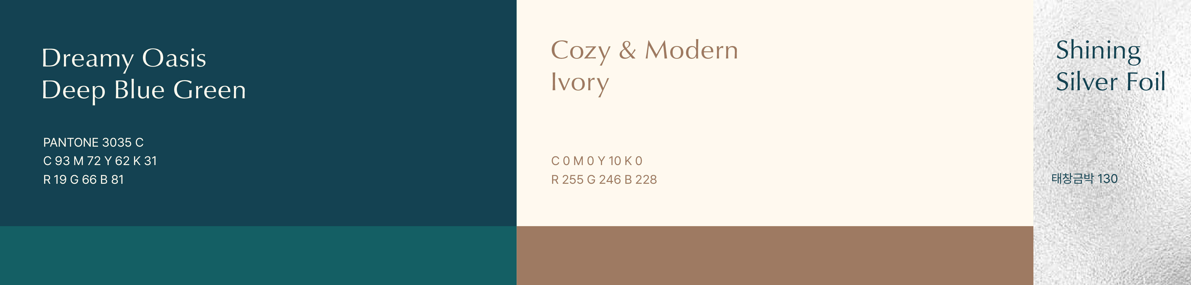
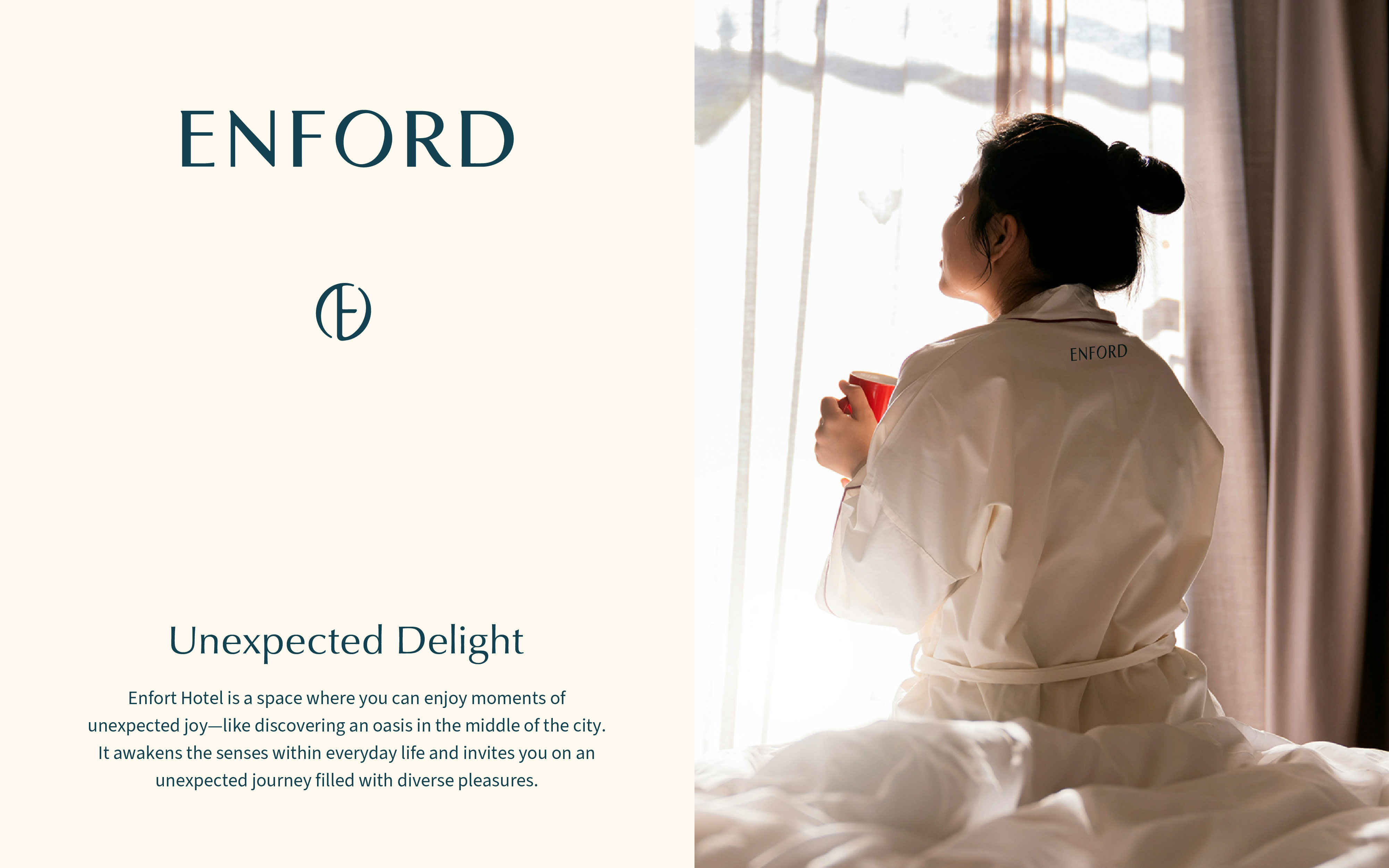
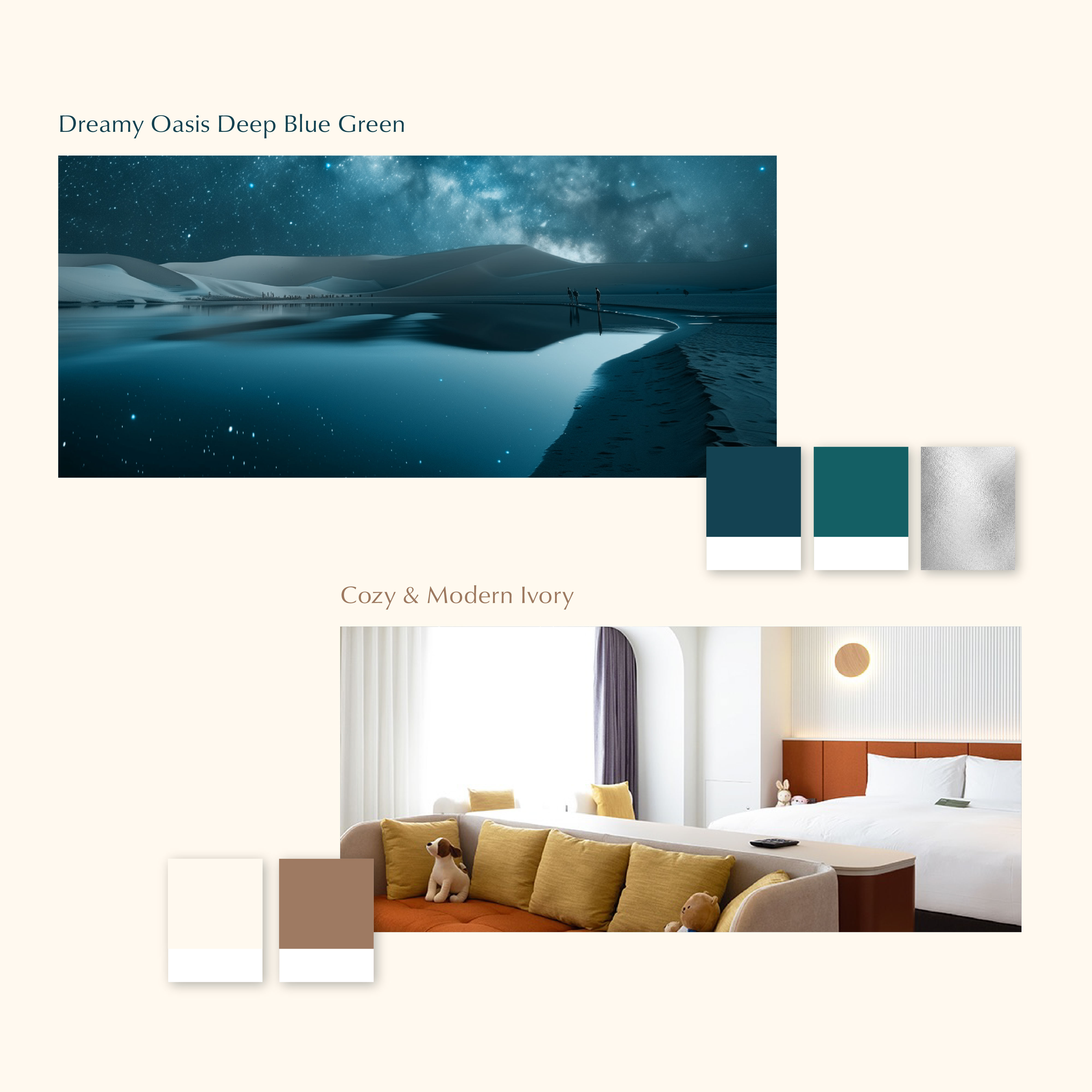
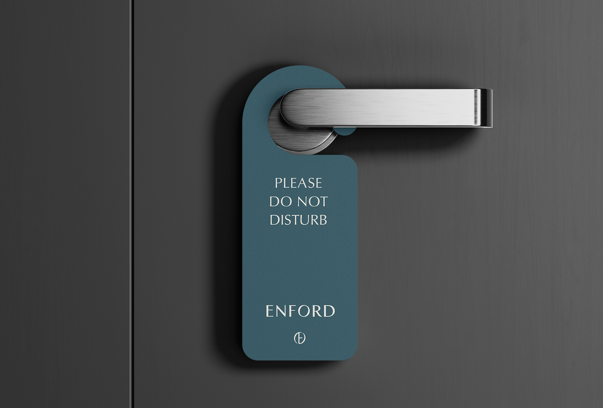
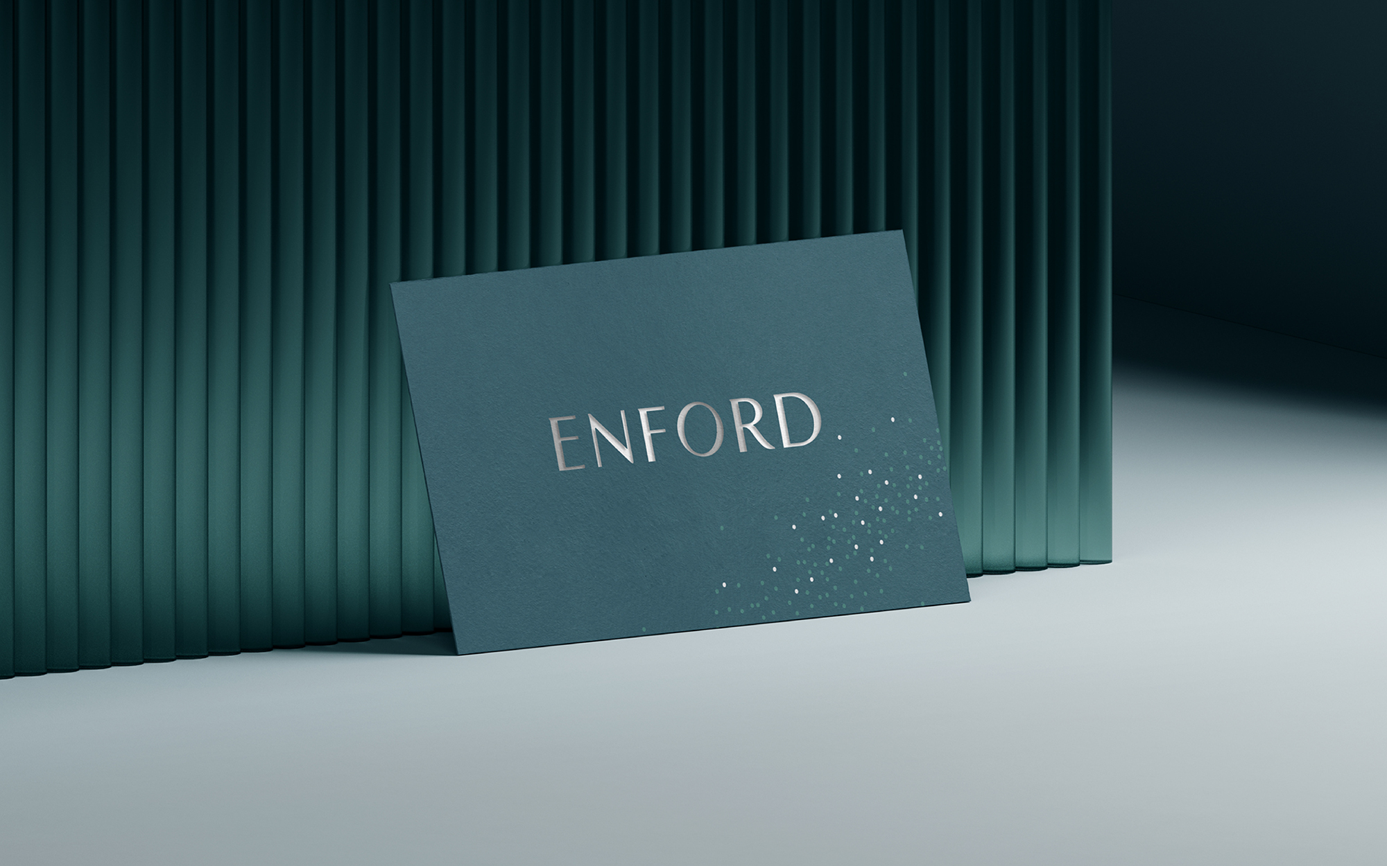
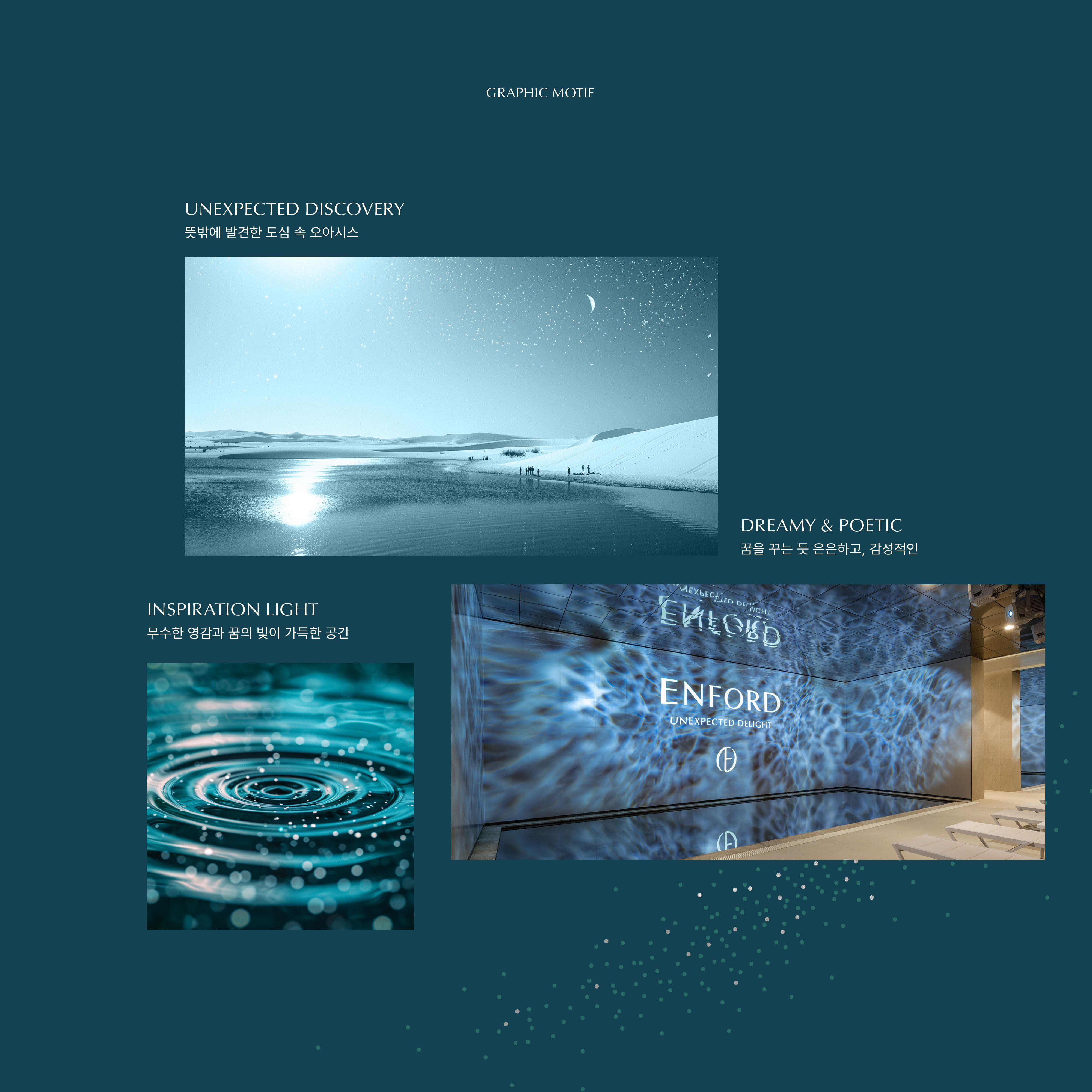
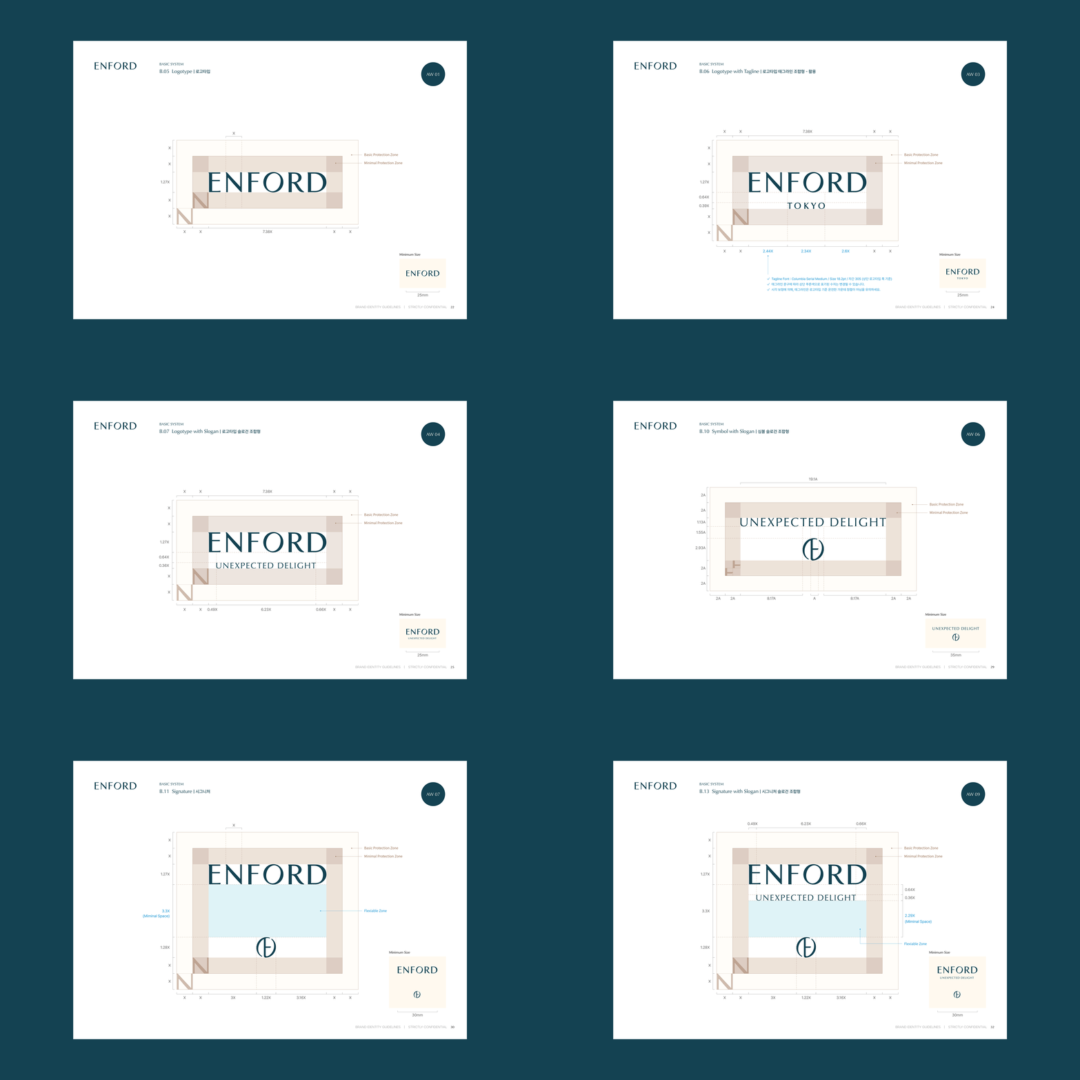
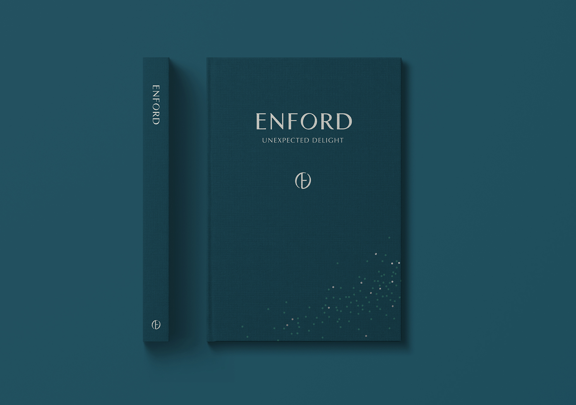
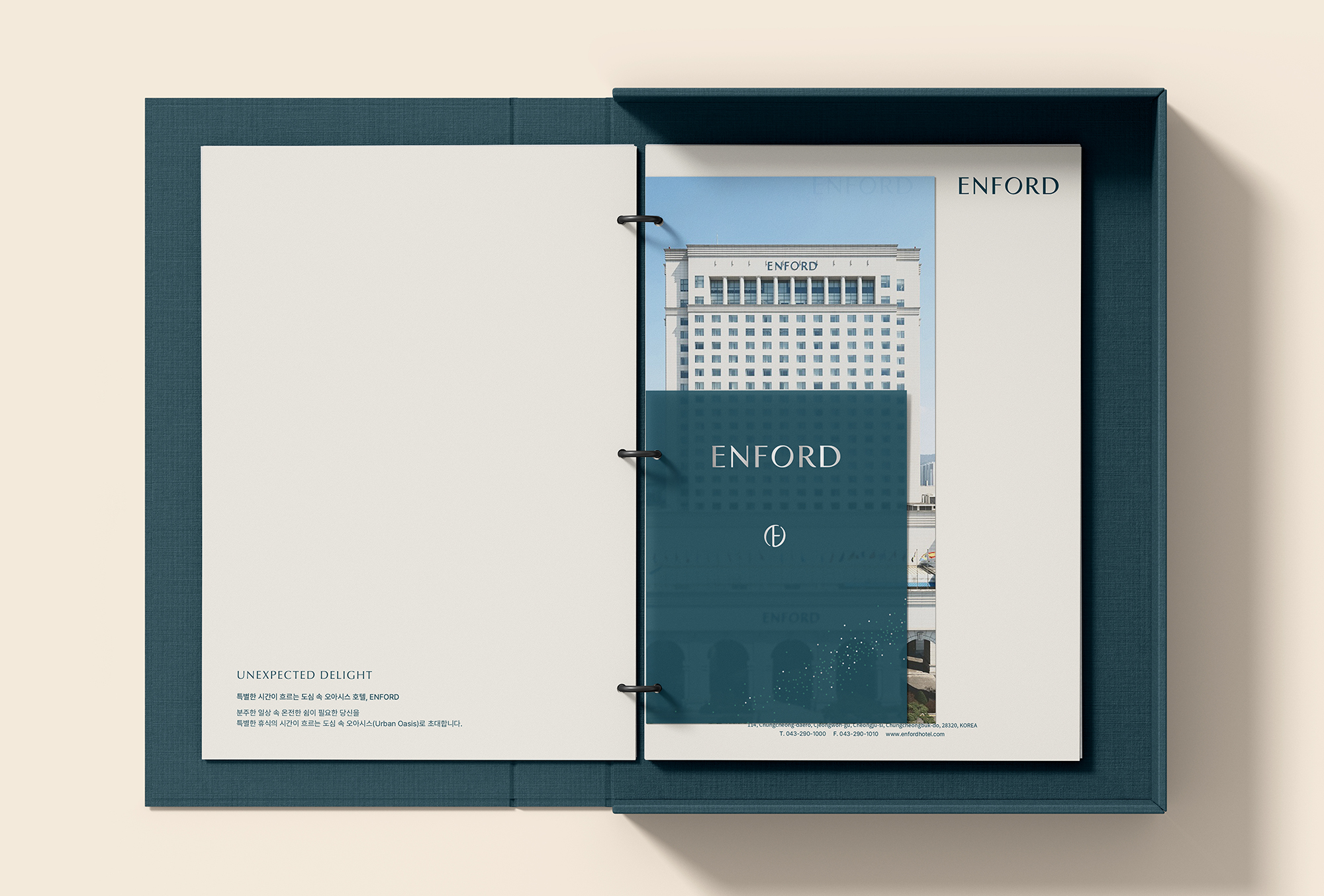
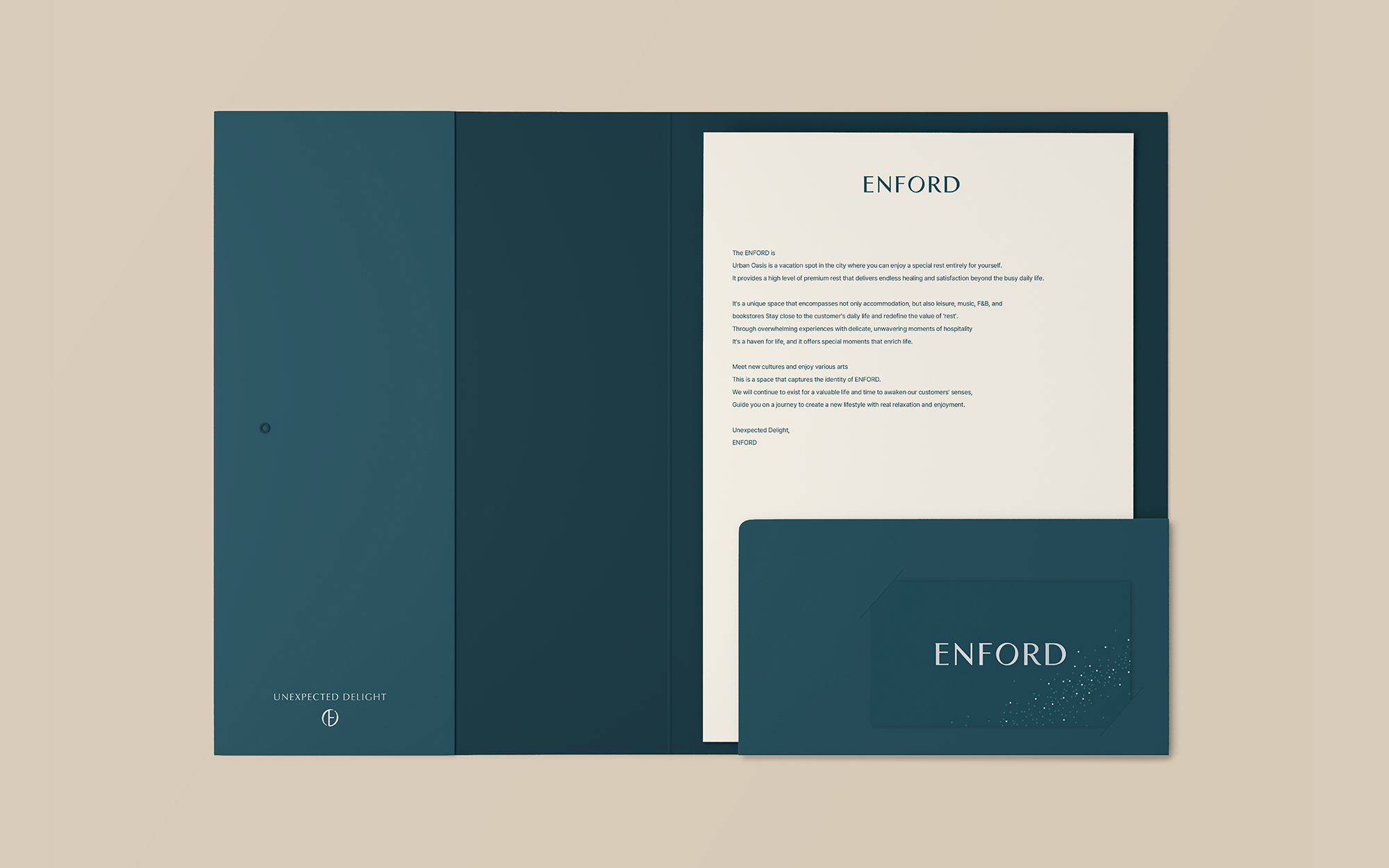
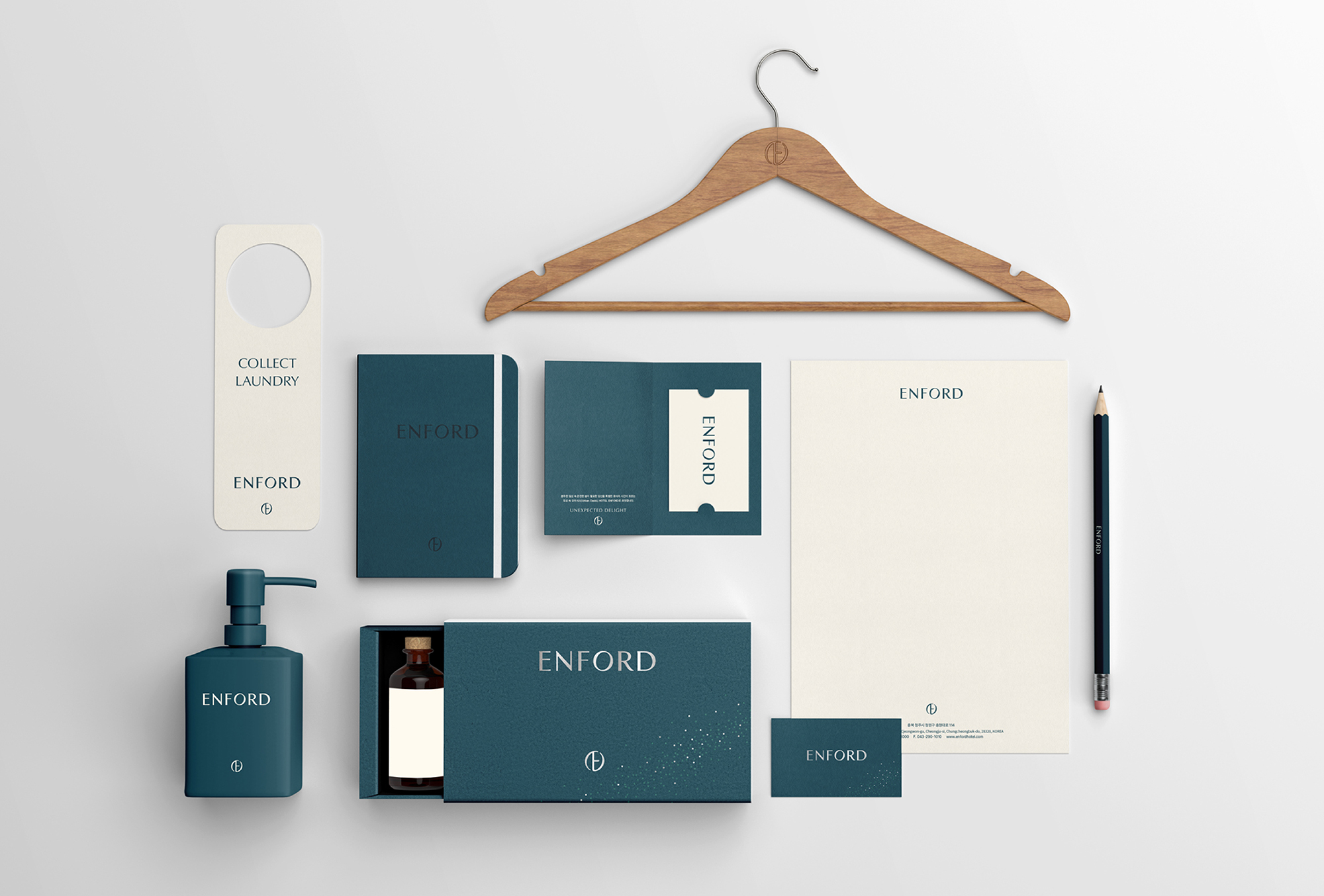
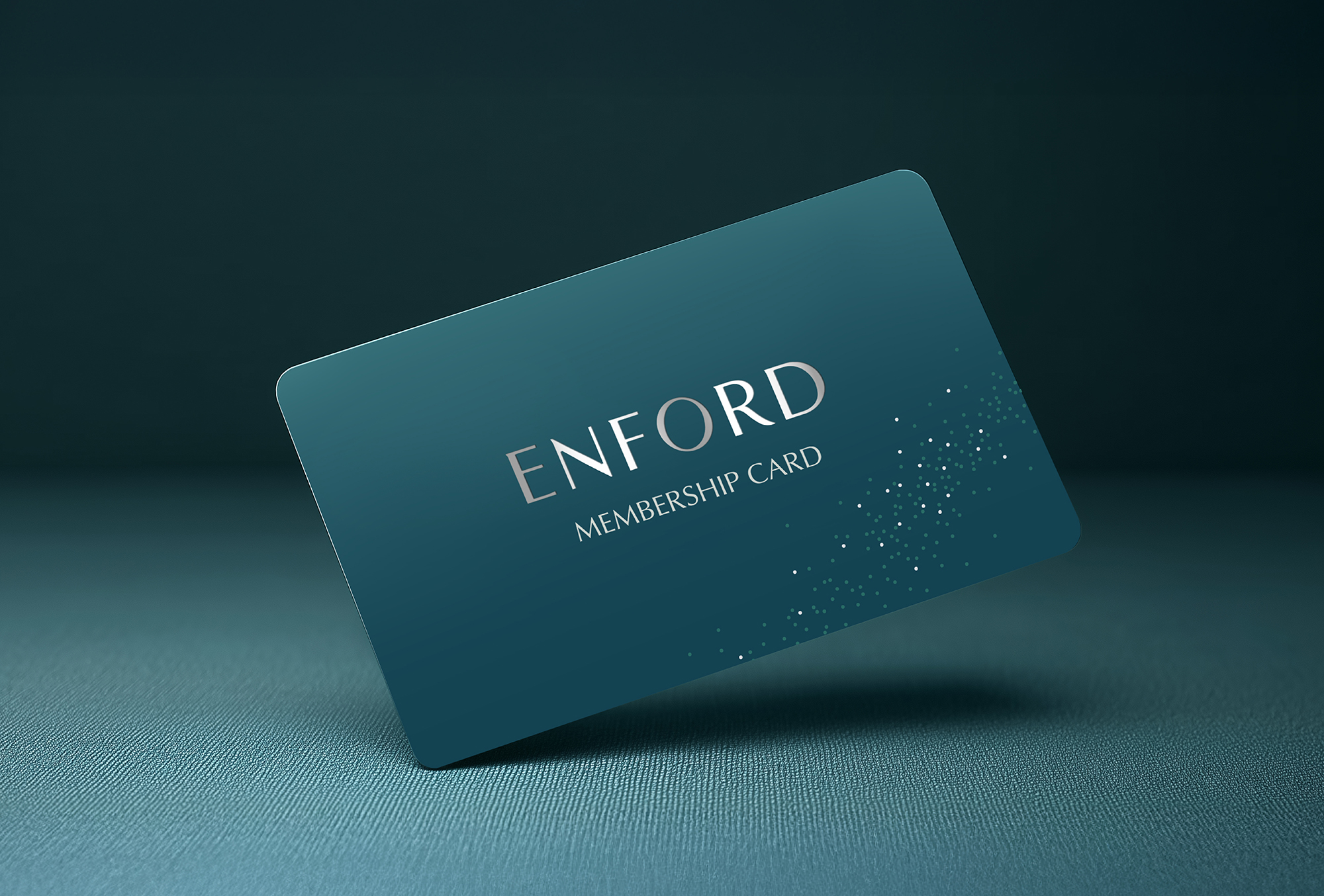
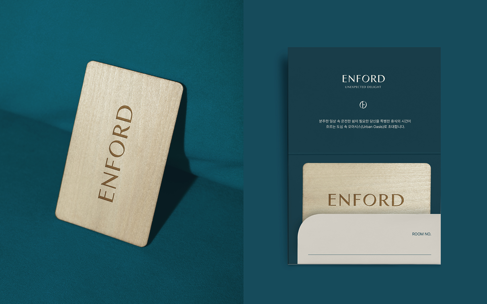
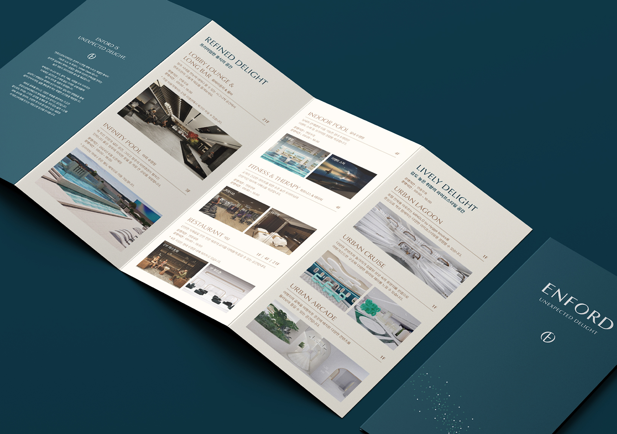
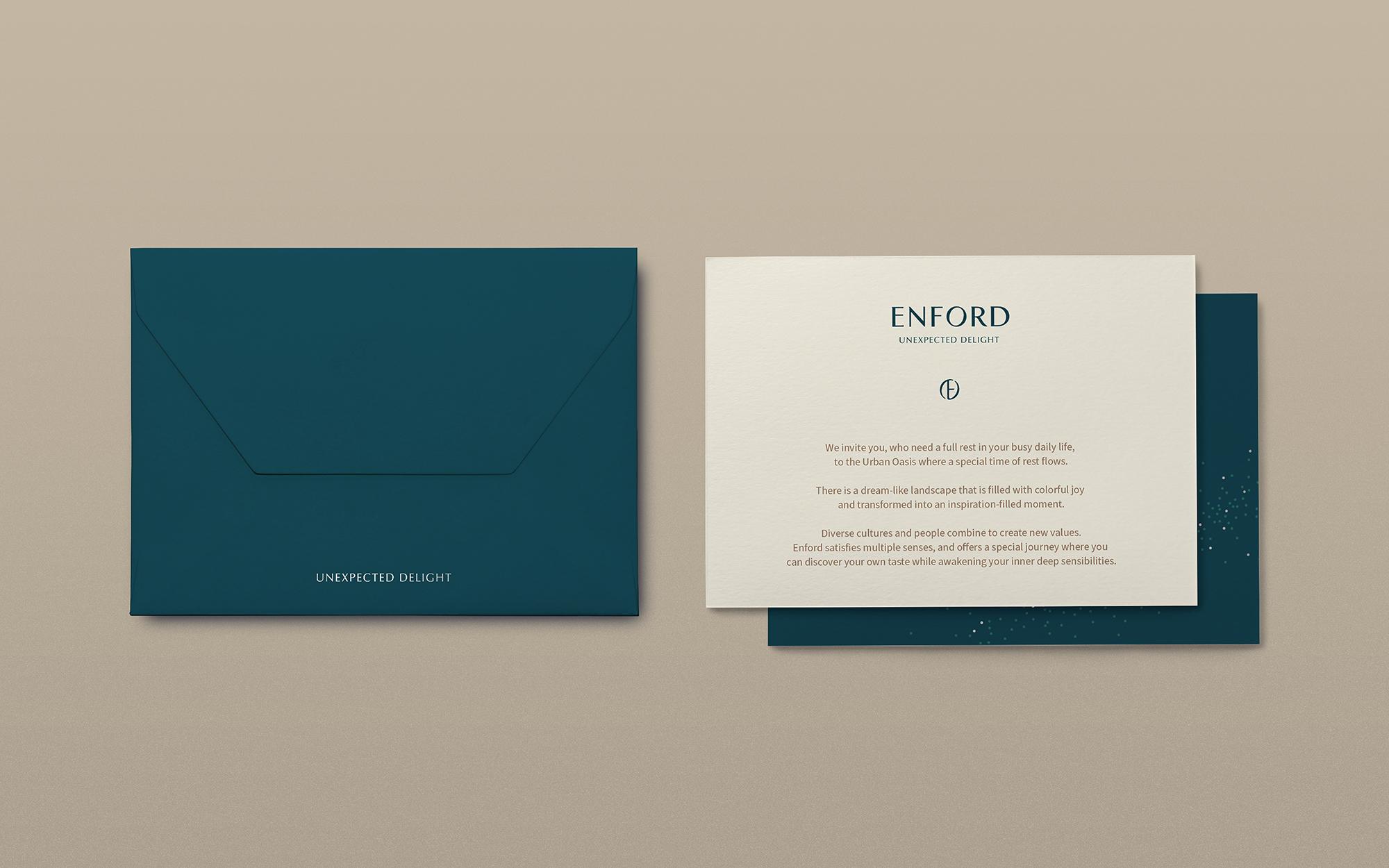
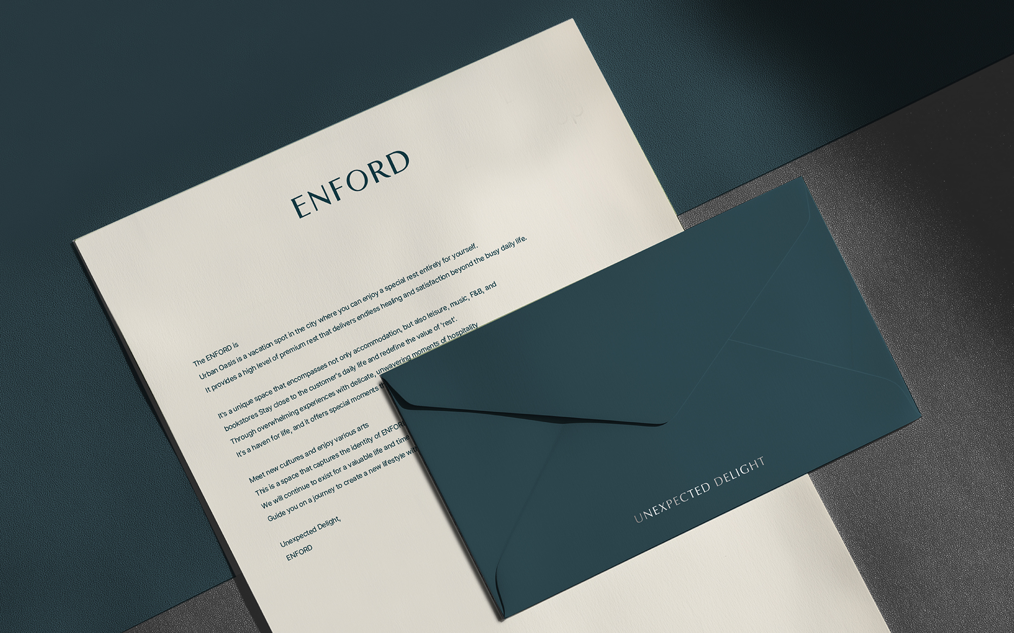
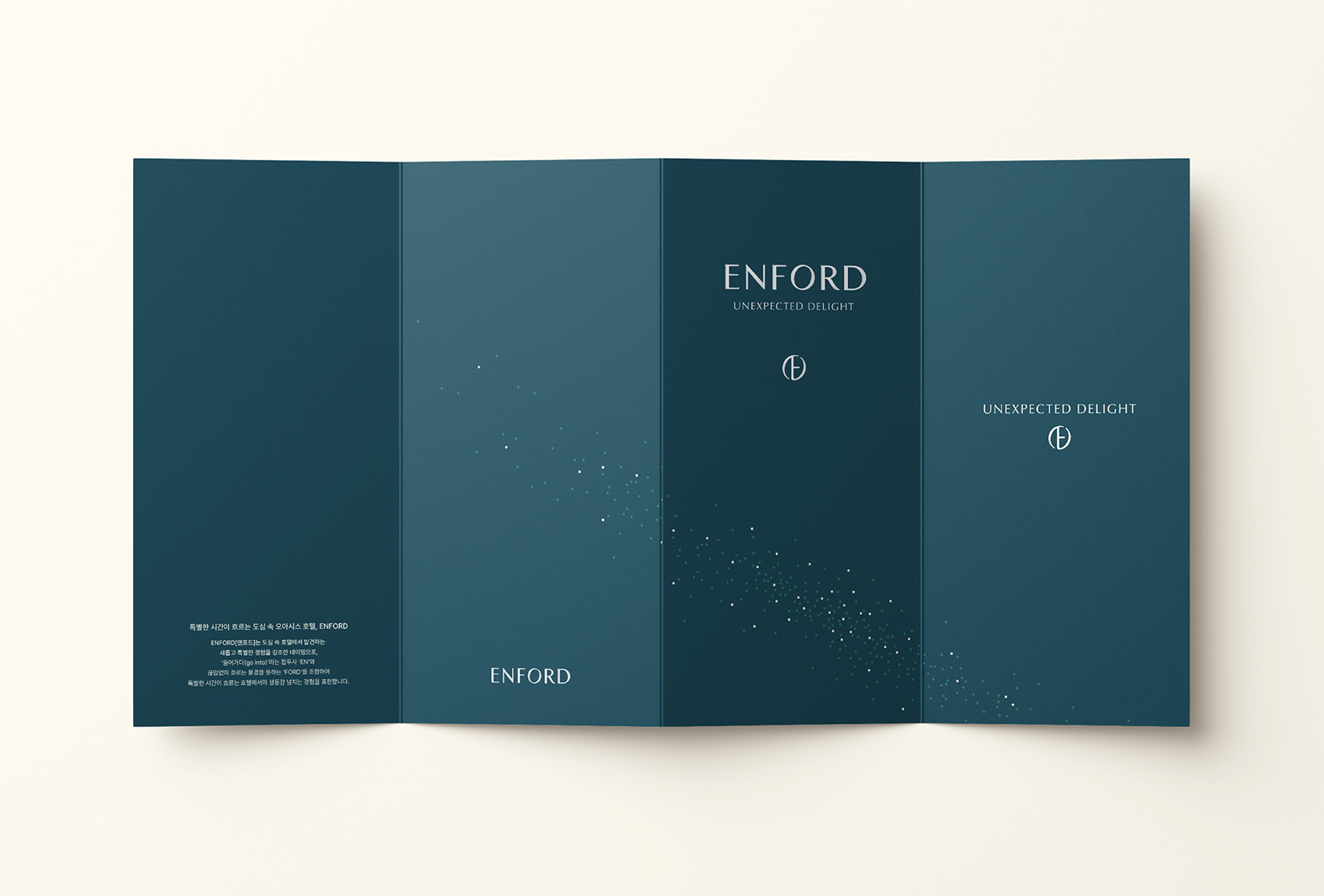
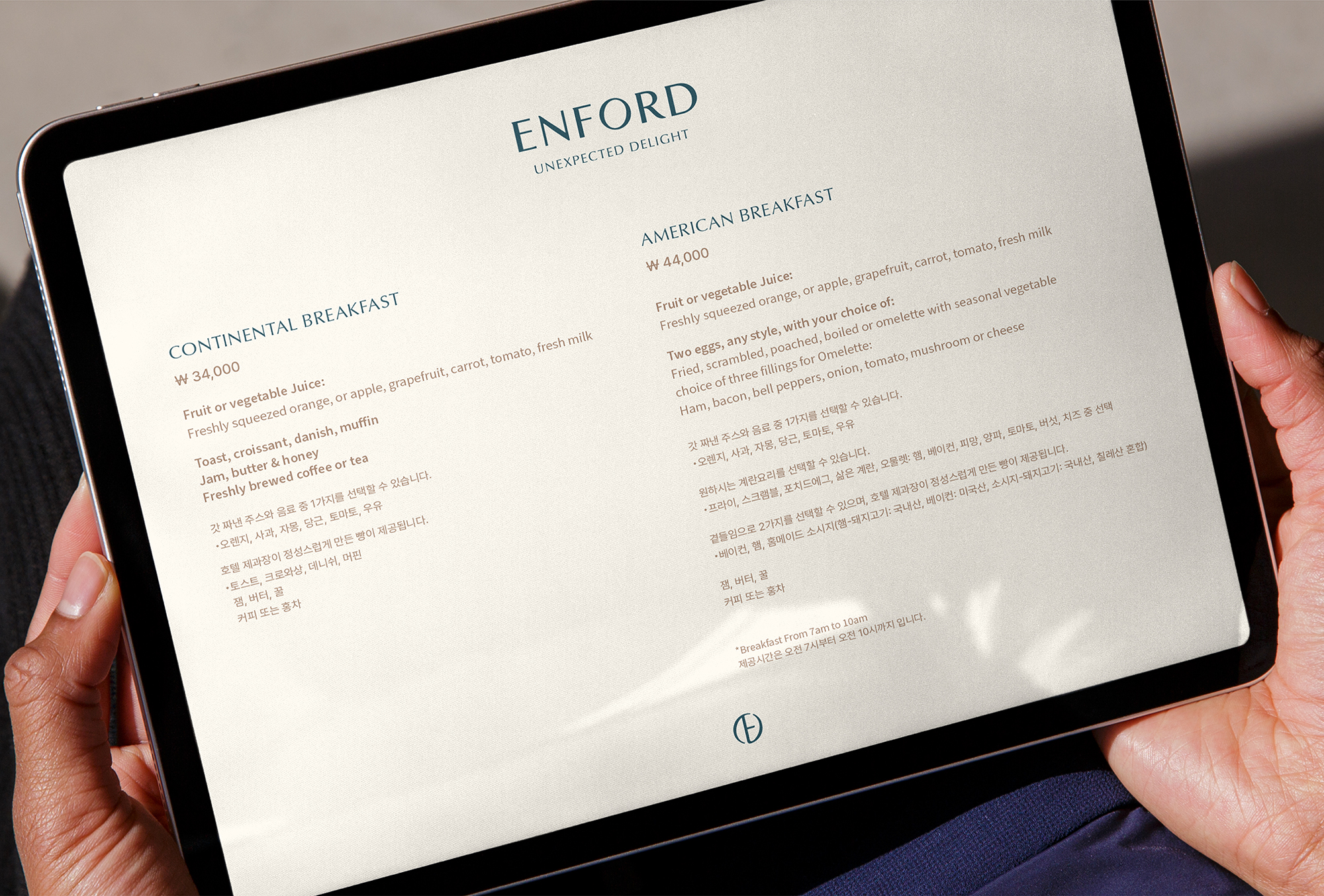
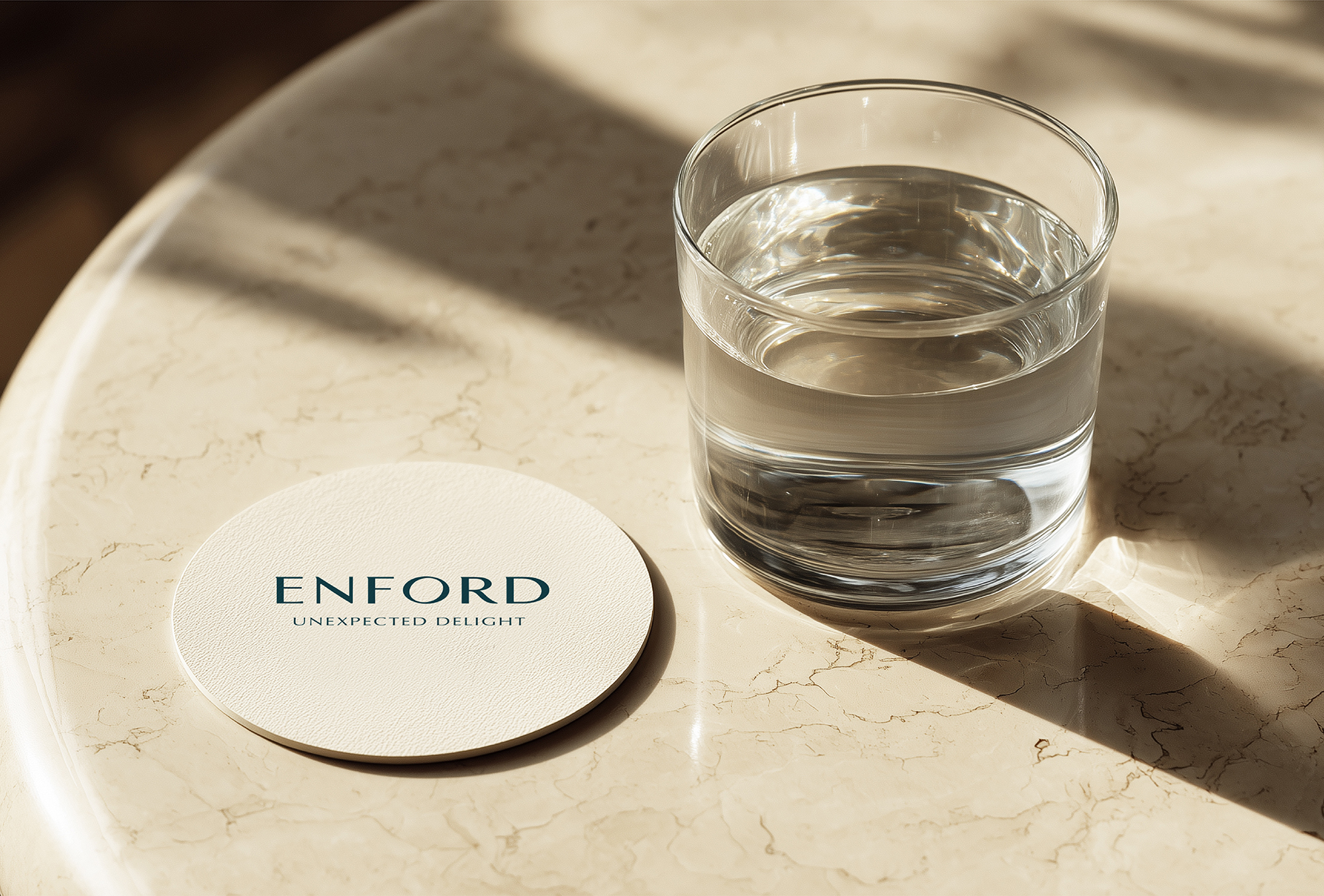
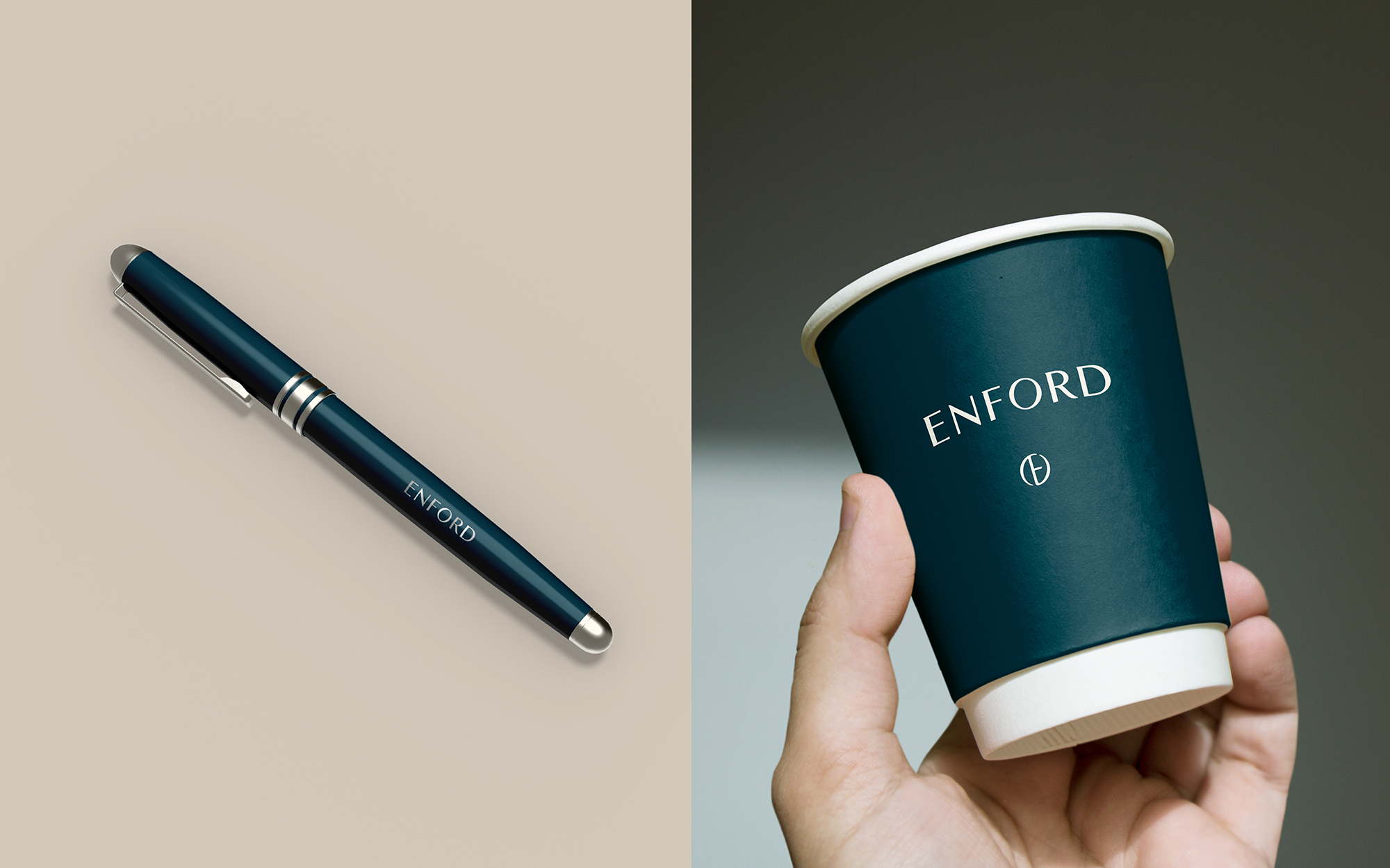
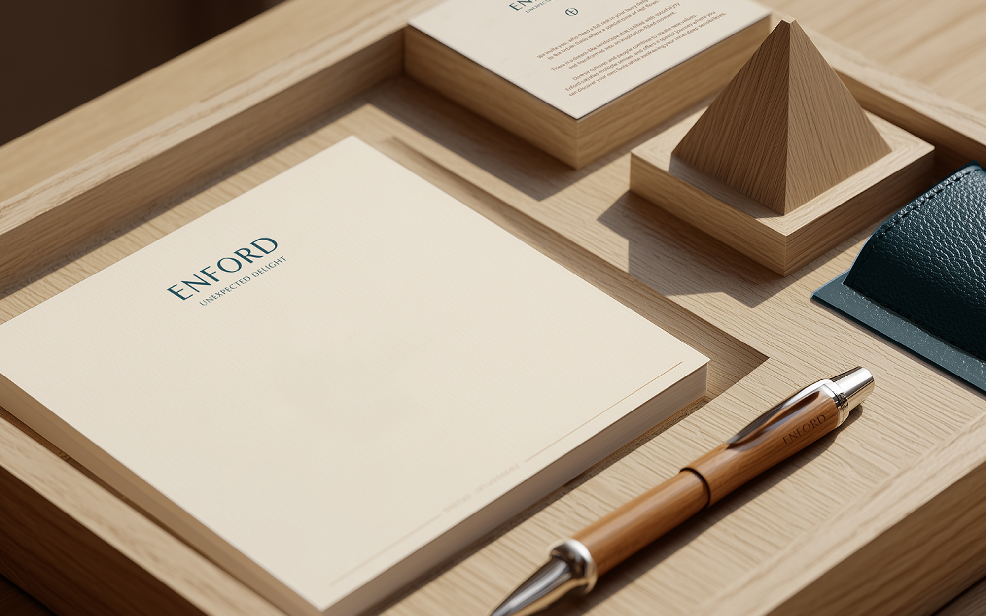
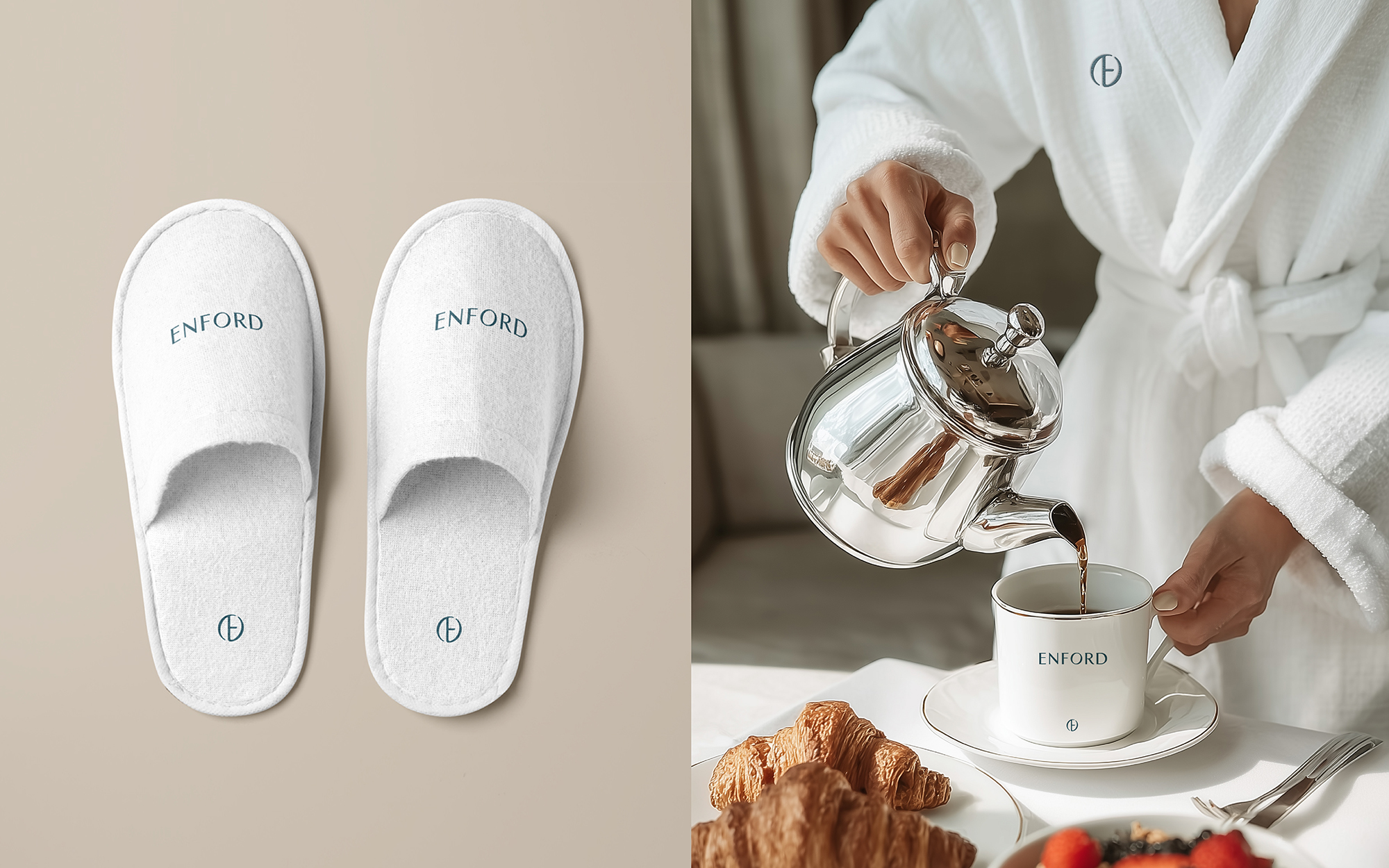
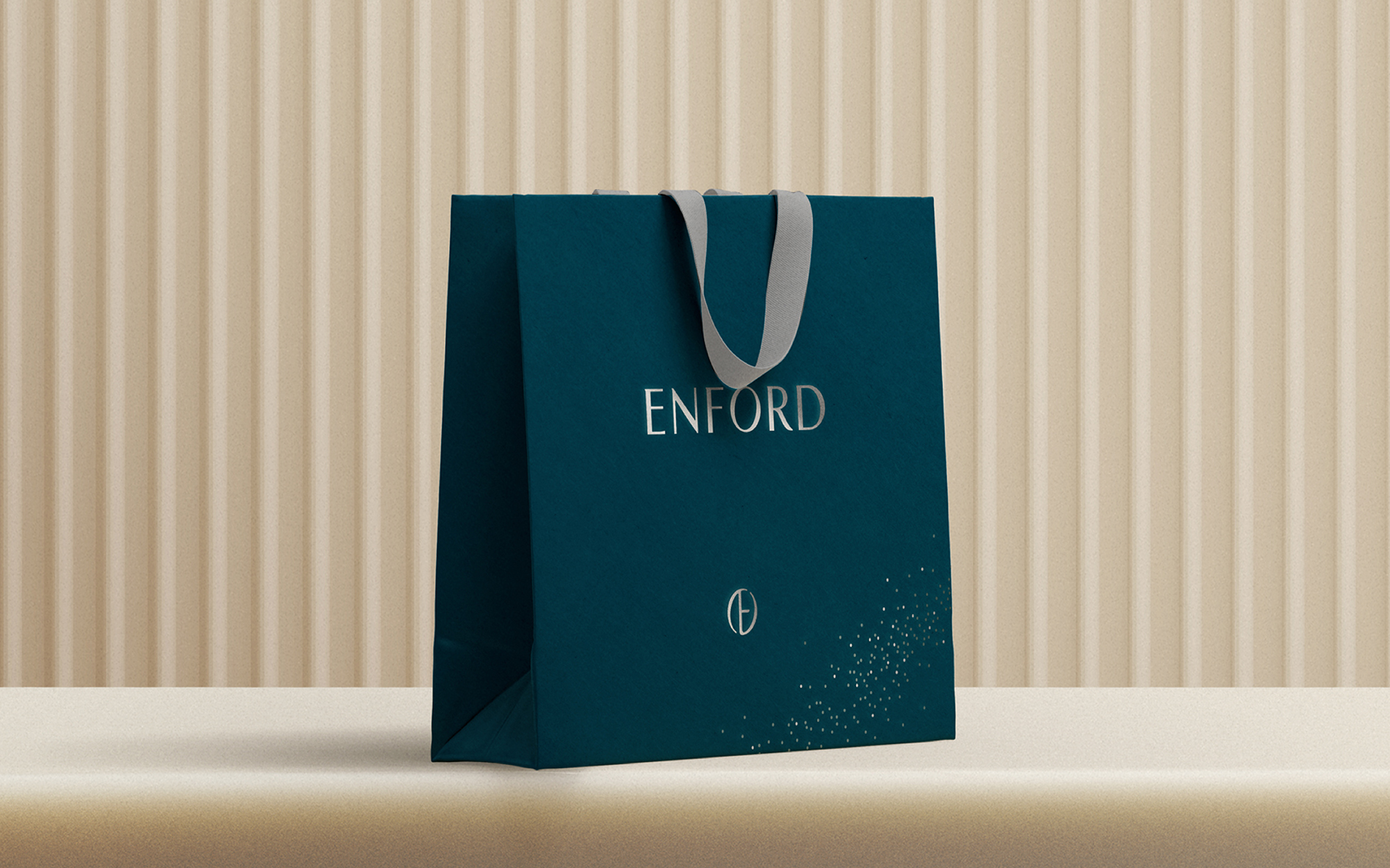
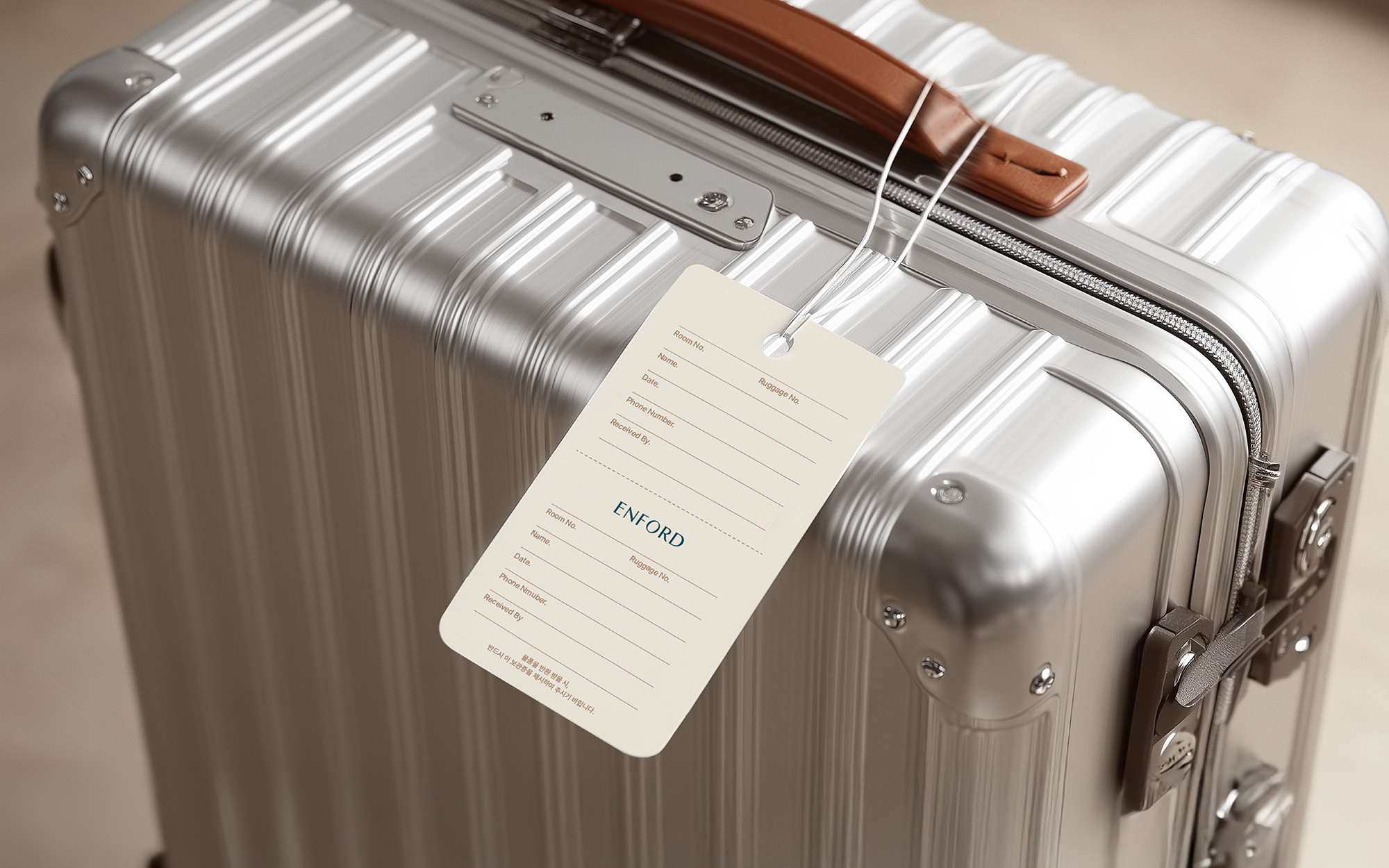
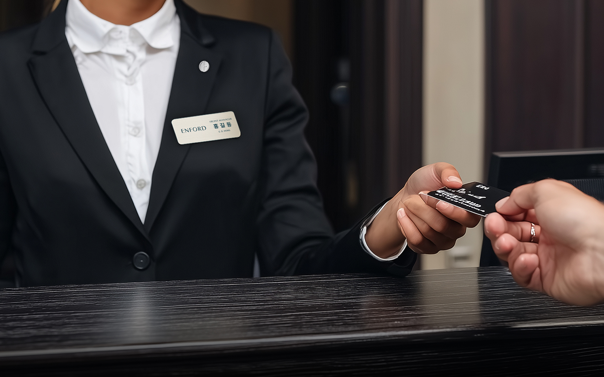
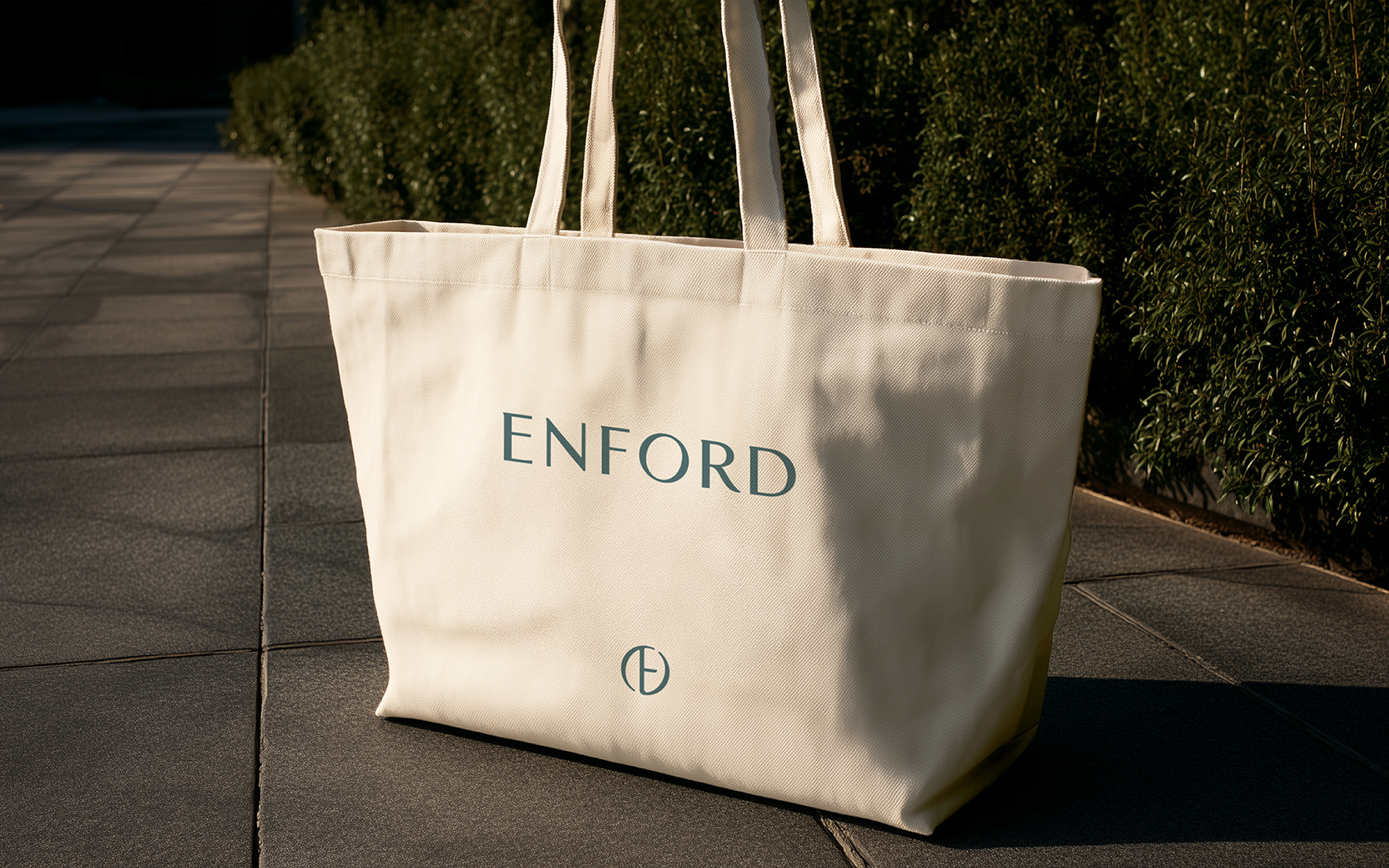
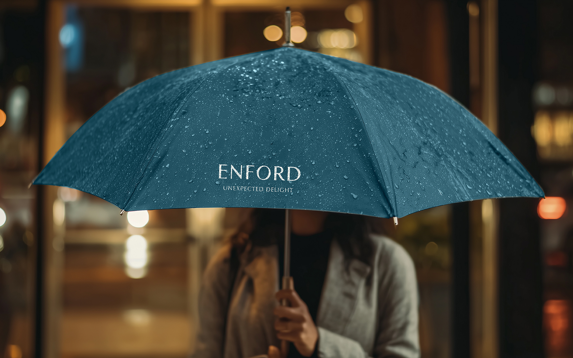
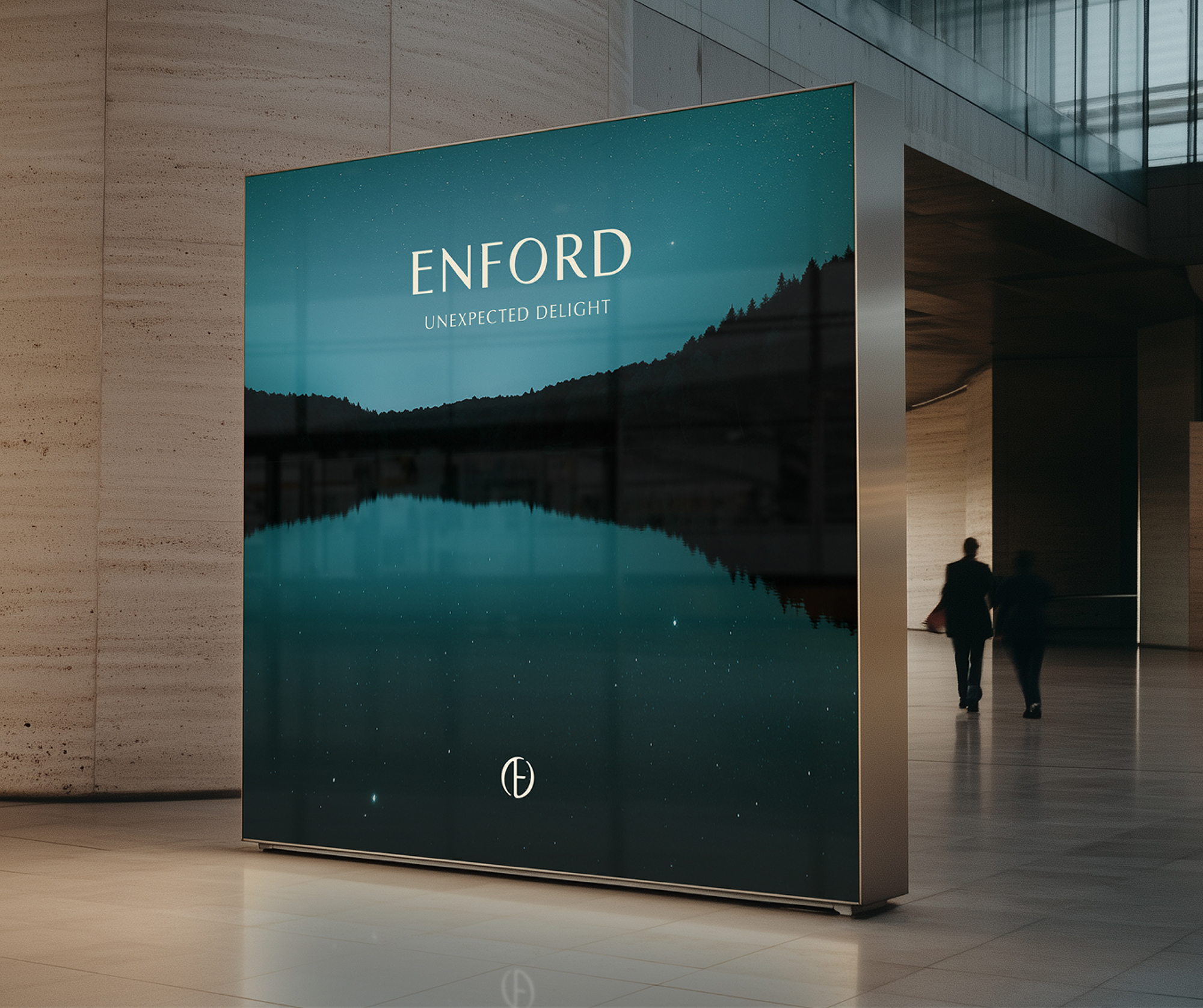
The brand slogan “UNEXPECTED DELIGHT” encapsulates the hotel’s vision: discovering extraordinary joy in the midst of everyday life—just like stumbling upon an oasis in the desert. This concept expands beyond guestrooms to embrace experiences in art, music, conventions, weddings, bookstores, F&B, infinity pools, fitness centers, and spa facilities—each curated to provide cultural richness and inspiration. The hotel’s new name, ENFORD, is a compound of “En-” (to enter) and “Ford” (a flowing stream), symbolizing a destination where relaxation and inspiration flow in harmony. As an Urban Oasis, ENFORD embodies the idea of a city sanctuary that serves as both a travel destination and a lifestyle platform. The ENFORD logo, designed with a refined semi-serif typeface, features graceful curves and delicate detailing that reflect the serene and timeless quality of the hotel. The monogram symbol, formed by the “E” encased in an “O,” represents a place of open inspiration and a gateway to cultural and emotional rejuvenation. The visual motif—starlight reflected on flowing waves—evokes poetic imagery of tranquil nights in the oasis and symbolizes the diverse moments of inspiration guests can experience. The primary brand colors—a deep blue-green representing the oasis, and a warm ivory conveying comfort and softness—bring vitality and emotion to the overall experience. Over 50 applications were developed to bring the brand to life at every touchpoint, including hotel signage, stationery, robes, slippers, towels, mugs, and amenity kits—each carefully crafted to communicate the refined and welcoming essence of ENFORD.
호텔이 지향하는 새로운 가치를 함축한 브랜드 슬로건, UNEXPECTED DELIGHT는 사막에서 발견한 오아시스처럼 평범한 일상에서 발견하는 색다른 즐거움과 풍요로운 경험을 의미합니다. 이는 객실 뿐 아니라 예술과 음악, 컨벤션과 웨딩, 서점과 F&B, 인피니티풀, 피트니스와 스파를 비롯해 호텔이 제공하는 다채롭고 풍요로운 문화적 경험은 그 자체만으로도 영감을 선사하는 특별한 여행이 됩니다. 호텔의 새로운 네임은 들어가다라는 접두사 ‘En-’과 흐르는 물결을 의미하는 ‘Ford’의 조합인 ‘ENFORD’로 선정되었습니다. 이는 그 자체만으로도 여행의 목적지가 되는 도심 속 휴양지이자 특별한 영감을 선사하는 라이프스타일 플랫폼을 지향하는 Urban Oasis로서의 정체성을 효과적으로 전달합니다. 세미 세리프 서체 기반으로 제작된 엔포드의 로고는 부드럽게 흐르는 물결과 편안하고 즐거운 호텔 경험을 유려한 곡선과 정교한 디테일로 표현하여 시간이 지나도 변치않는 호텔의 프리미엄한 무드를 표현합니다. ‘E’를 감싸는 ‘O’ 형태의 모노그램 심볼은 누구에게나 열려 있는 영감의 장소이자 도심 속 오아시스를 상징하며, 호텔이 전하는 활기 넘치는 문화와 편안한 휴식의 가치를 고급스러운 무드로 표현합니다. 엔포드 호텔의 그래픽모티브는 도심 속 오아시스에서 누리는 다채로운 문화적 경험과 특별한 영감의 순간들을 물결 위에 비친 별빛으로 묘사하여 시적인 무드를 연출합니다. 오아시스를 상징하는 딥 블루 그린 컬러와 편안하고 따뜻한 감성이 녹아있는 아이보리 컬러는 브랜드 메인 컬러로 활용되어 일상에 영감을 주는 호텔 경험에 생동감을 부여합니다. 개발된 브랜드 자산은 호텔 사이니지와 스테이셔너리를 비롯해 가운과 슬리퍼, 타월, 머그컵, 어메니티 등 50여 종이 넘는 어플리케이션으로 개발되어 다양한 고객 접점에서 엔포드 호텔의 고유한 인상을 형성합니다.