PILOTO MAISON
Designed for Better Living

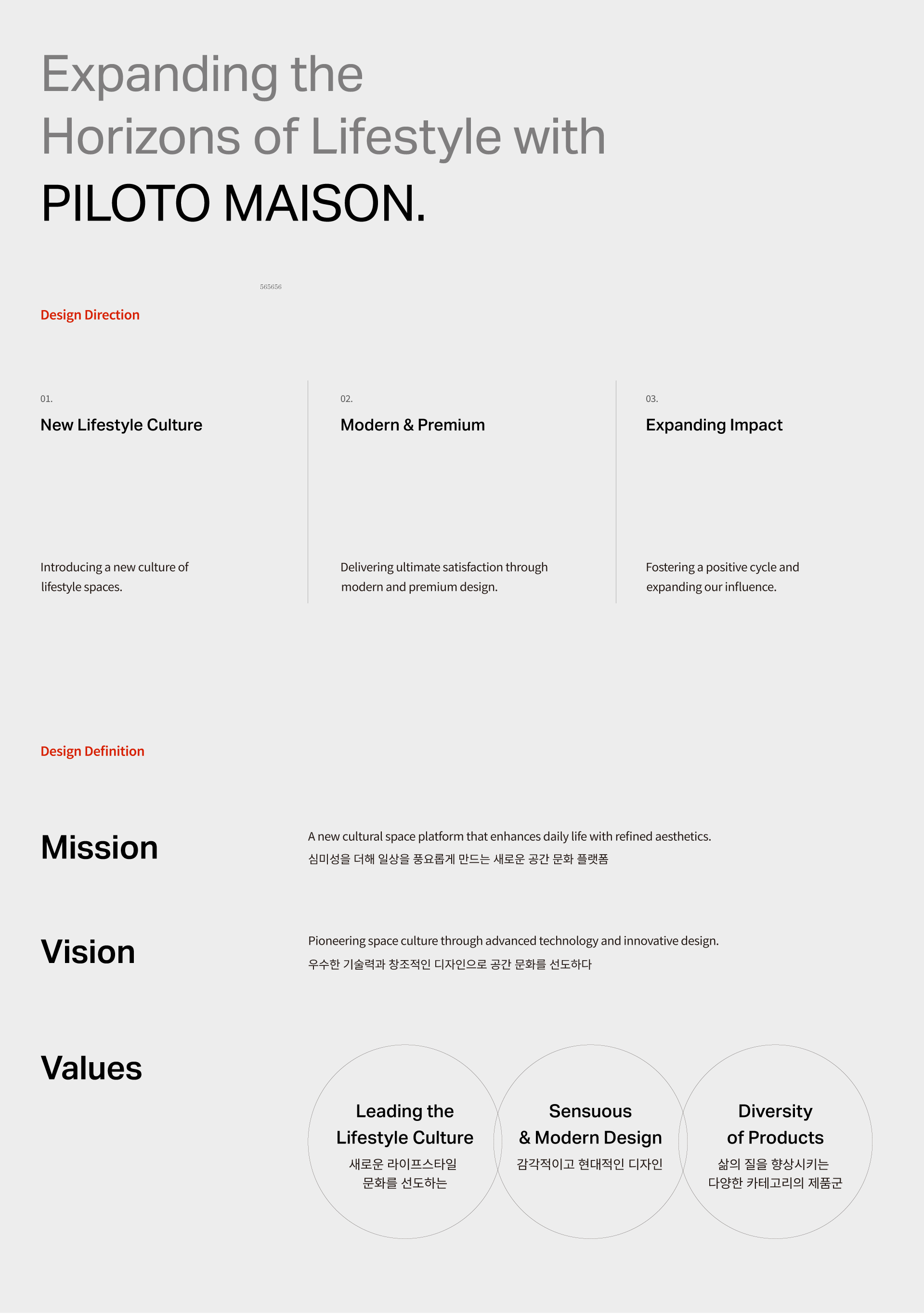
PILOTO MAISON is a sub-brand of PILOTO, a company leading kitchen and bathroom culture with modern and sensuous water fixture designs. More than simply providing kitchen and bathroom products, PILOTO MAISON aims to become a lifestyle brand that offers a better quality of life in customers’ everyday routines. By reflecting individual tastes and living patterns, the brand aspires to lead a more enriched lifestyle culture. A visual identity was developed to embody its core values and to define a clear vision for PILOTO MAISON’s growth as a global brand.
필로토 메종은 현대적이며 감도 높은 수전류를 전개하며 주방과 욕실의 문화를 선도하는 기업인 필로토의 서브 브랜드로 단순히 주방과 욕실 제품을 제공하는 것을 넘어 고객의 일상 속에서 더 나은 삶을 제안하는 라이프스타일 브랜드로 확장하며, 이를 통해 고객의 취향과 생활 패턴을 반영한 풍요로운 라이프스타일을 선도하는 브랜드로 자리매김 하고자 합니다. 핵심 가치를 반영한 비주얼 아이덴티티를 개발하여 필로토 메종이 지향하는 글로벌 브랜드로 성장하기 위한 미래 비전을 구체화 했습니다.
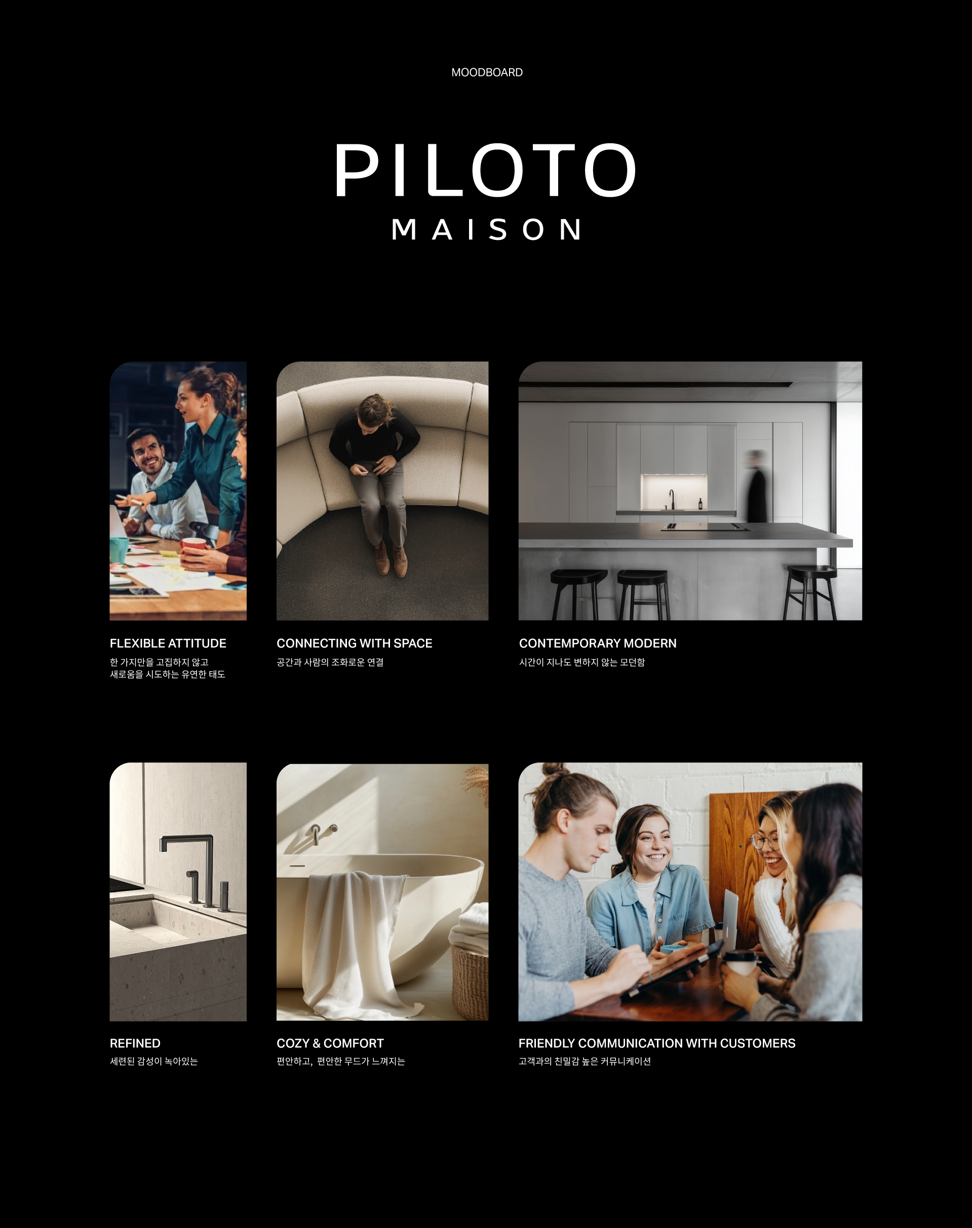
PILOTO MAISON is a lifestyle brand that offers a rich and refined daily experience through creative design and outstanding technology. Evolving beyond the faucet industry, the brand aims to establish itself as a “new spatial culture platform,” conveying both confidence within the industry and approachability to consumers. By inspiring small yet meaningful changes in daily life, PILOTO MAISON seeks to provide customers with new experiences and inspiration. The goal is to become a cultural icon that leads modern living, with a brand image that is both contemporary and sophisticated.
창조적인 디자인과 우수한 기술력으로 양질의 풍요로운 일상을 선사하는 라이프스타일 브랜드인 필로토 메종은 수전업을 넘어서 라이프스타일 브랜드로서의 확장을 알리고 ‘새로운 공간 문화 플랫폼’으로서 업계에 대한 자신감과 소비자를 향한 친근함을 전하고자 했습니다. 일상 속 작은 변화를 통해 삶을 환기시켜주며, 고객에게 새로운 경험과 영감을 제공하는 것을 목표로 현대적인 생활 방식을 선도하는 문화적 아이콘으로 자리매김할 수 있도록 모던하면서도 현대적인 브랜드 이미지를 구축하고자 했습니다.
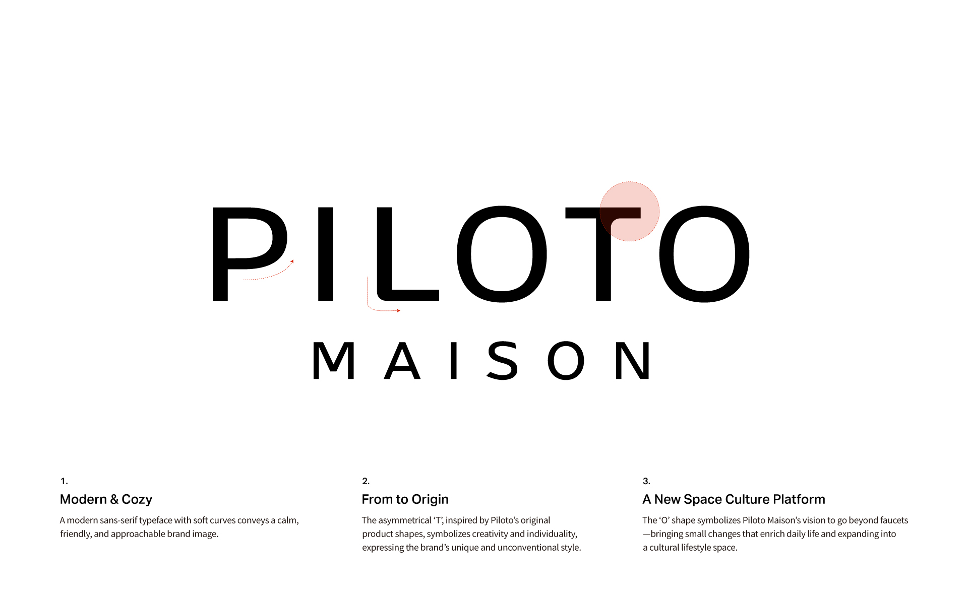
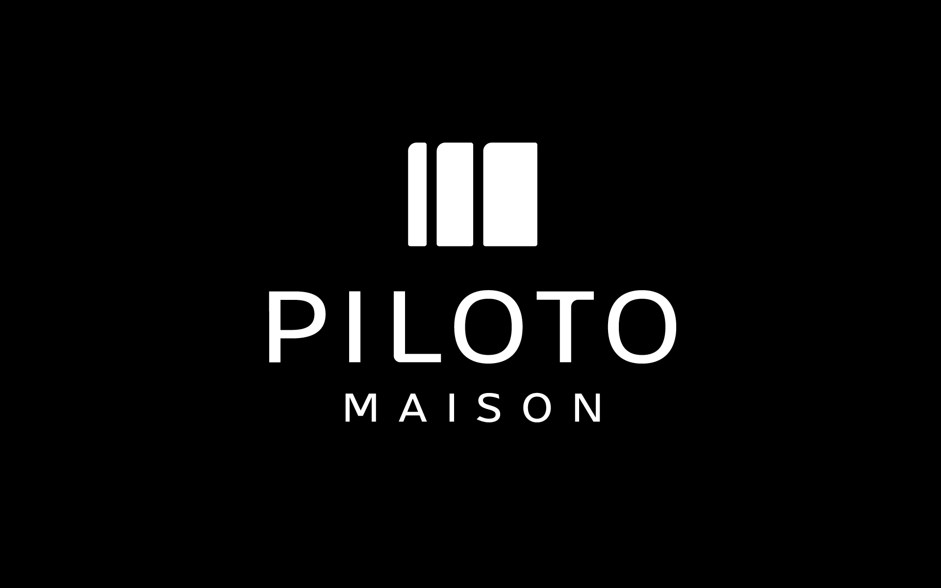
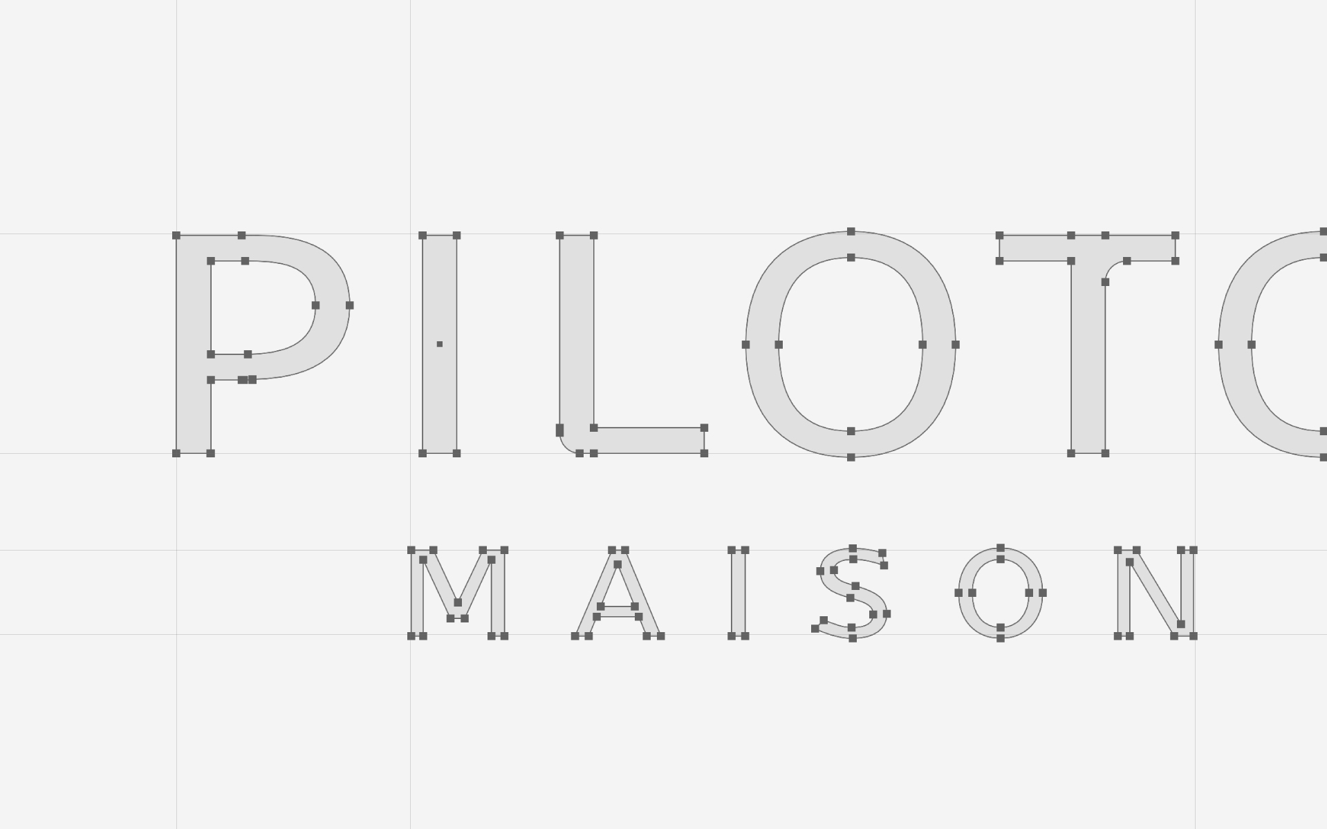
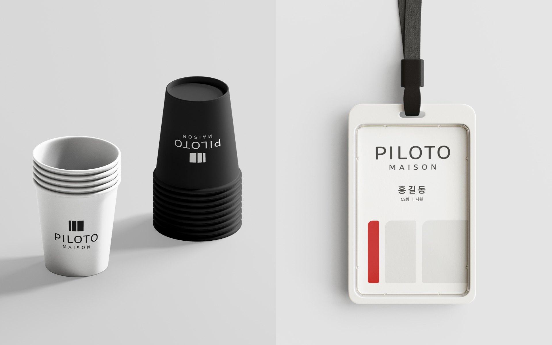
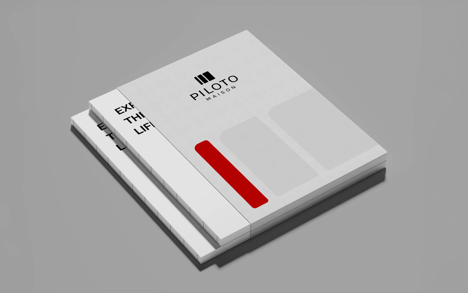
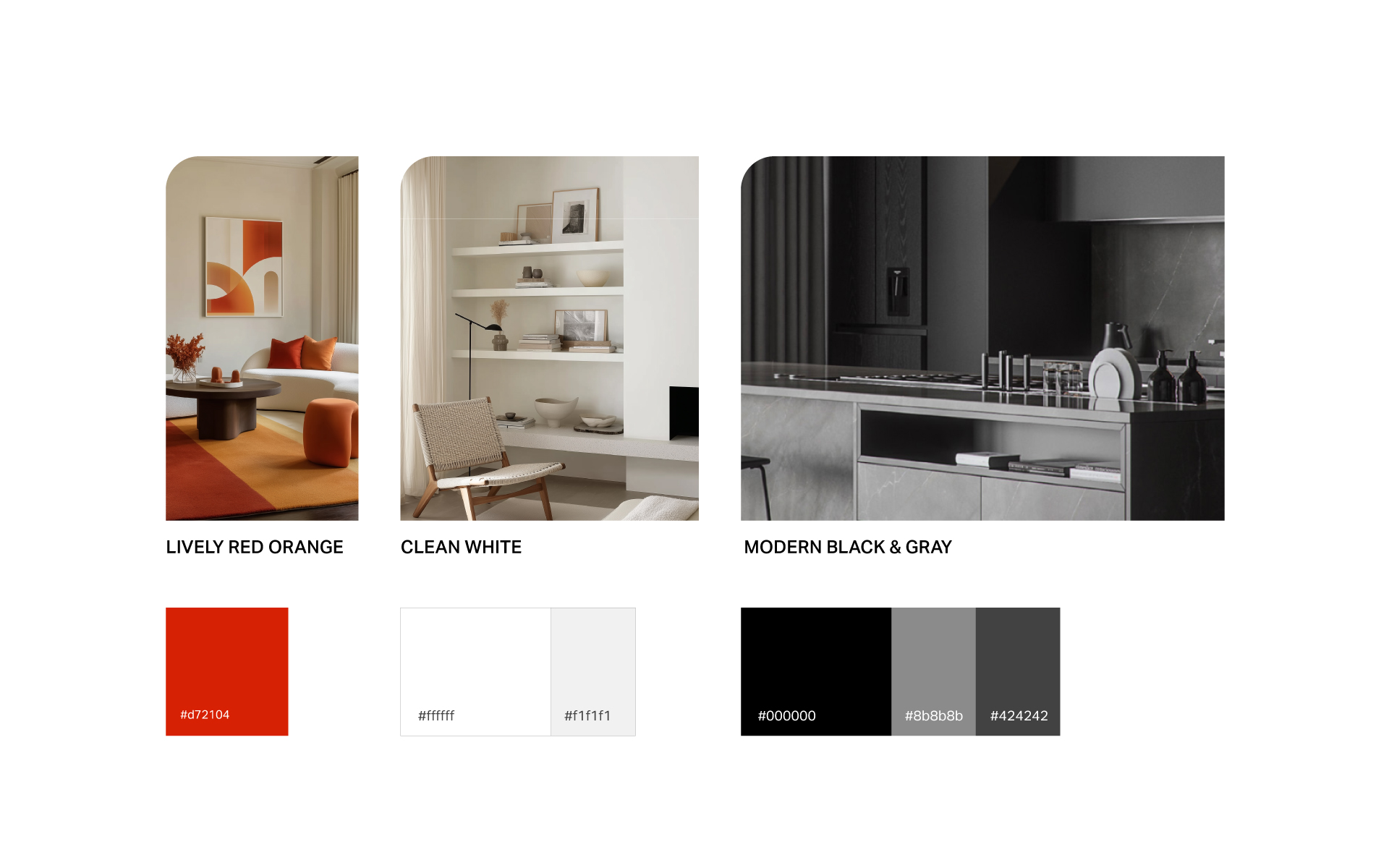
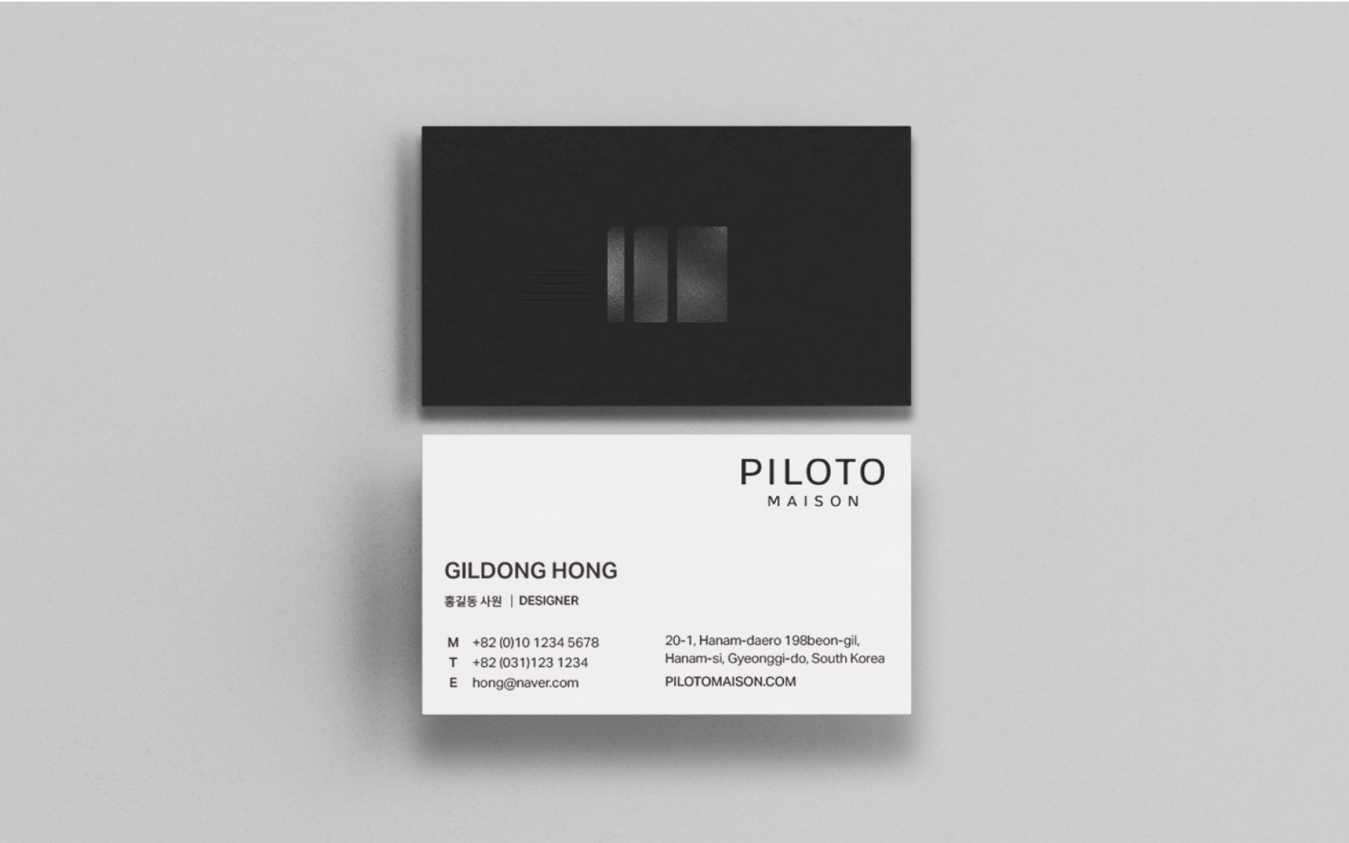
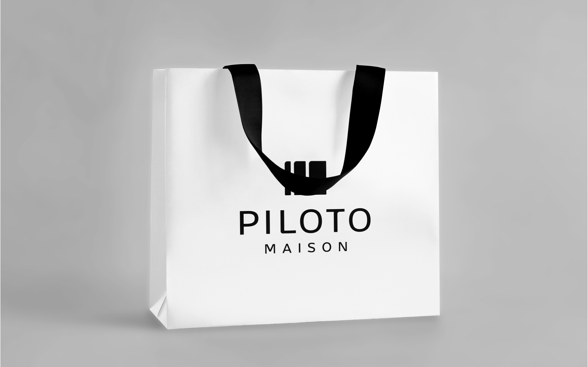
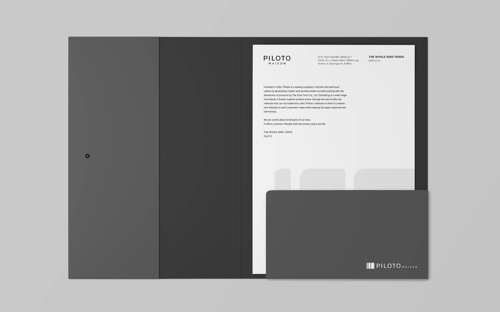
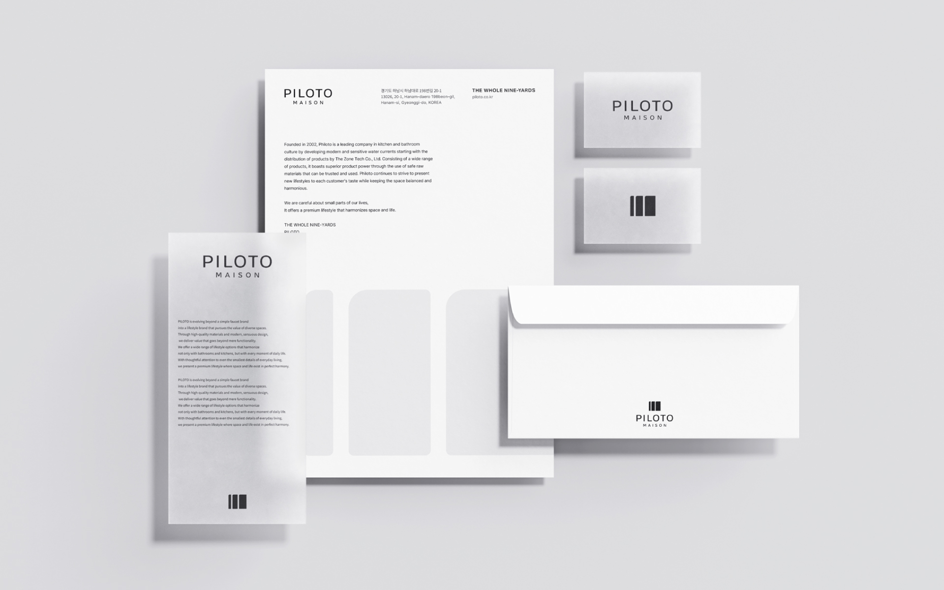
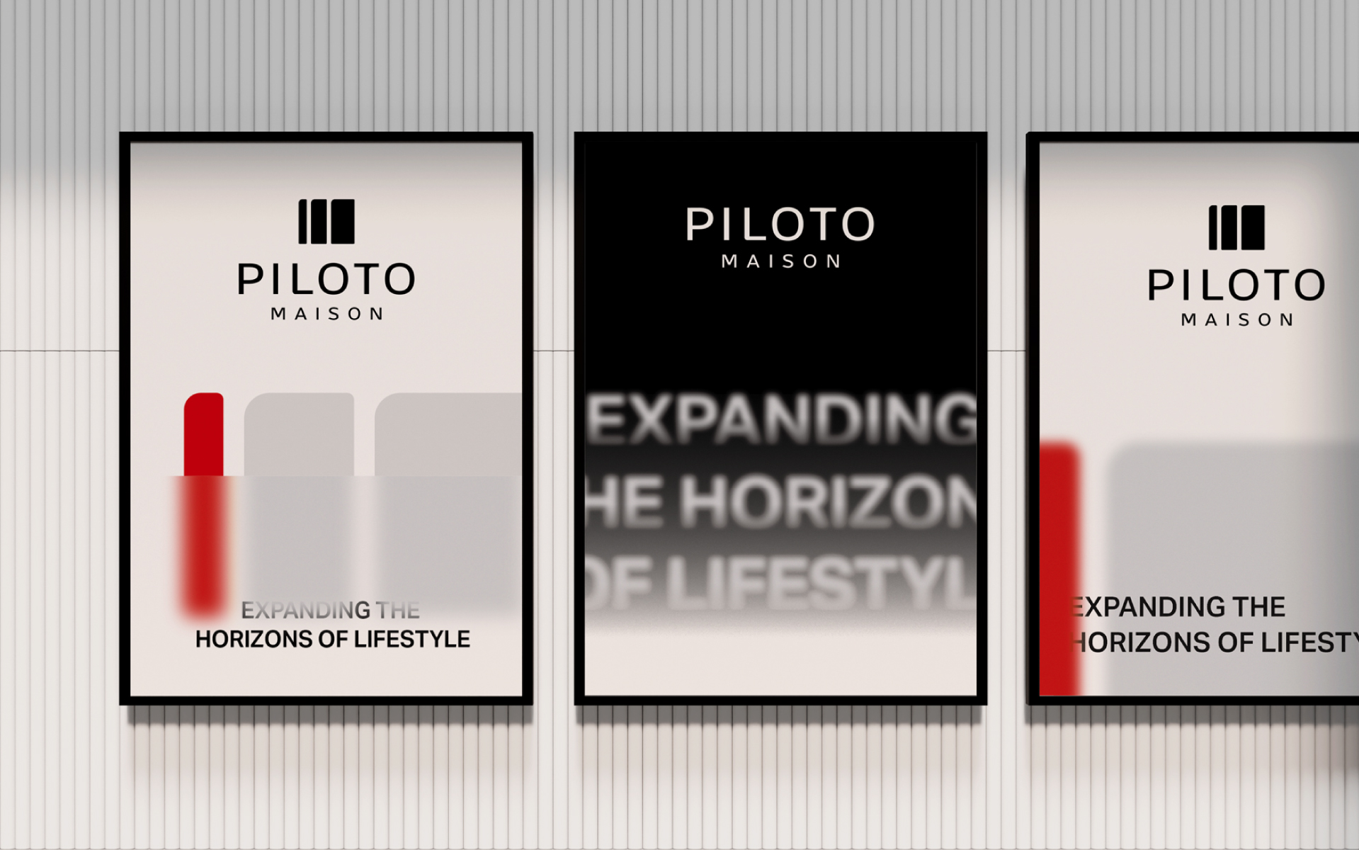
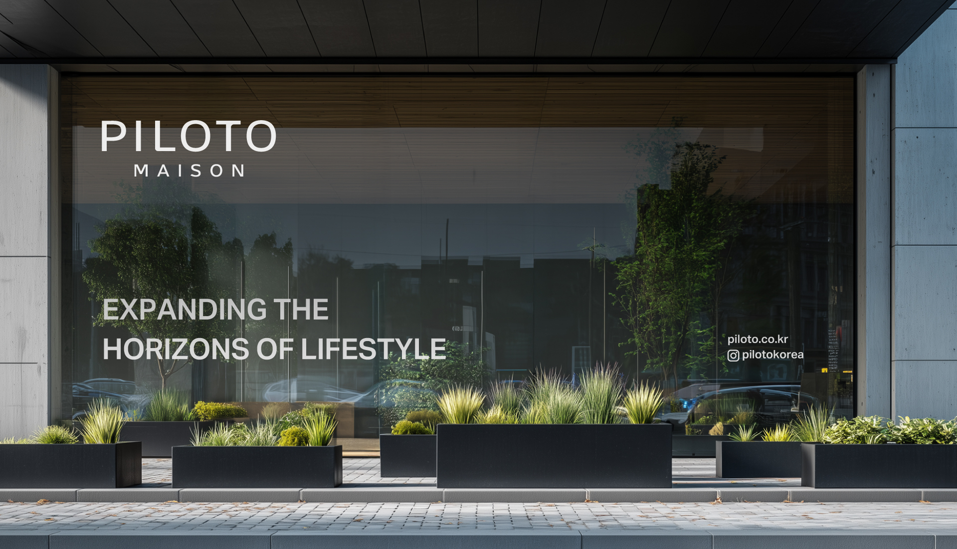
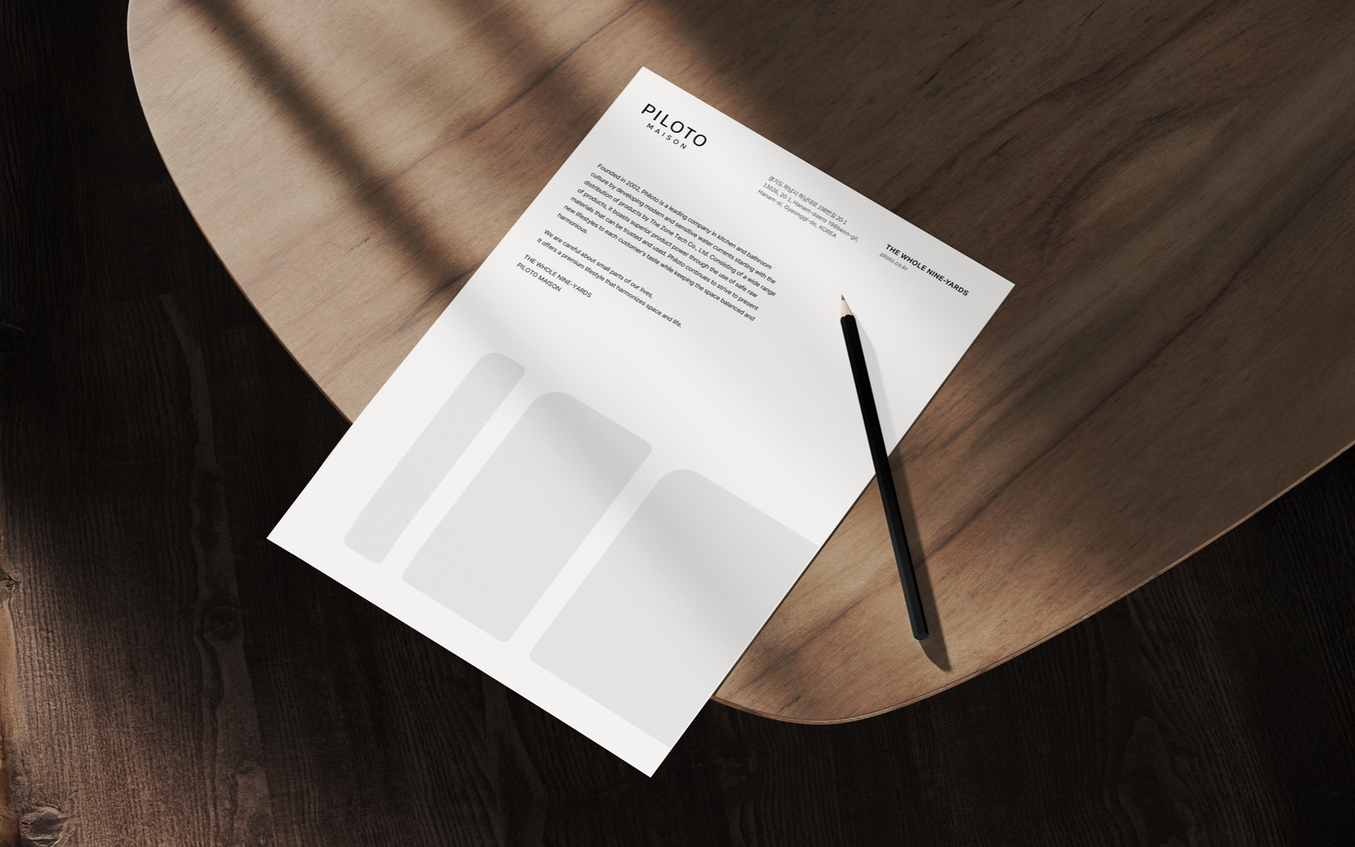
YNL Design aimed to establish a friendly brand image for PILOTO MAISON that reflects its origins while offering a harmonious spatial experience and a richer lifestyle. To move beyond the boundaries of the faucet industry, an intuitive and iconic symbol was developed—one that represents PILOTO MAISON’s transition into a new lifestyle brand and positions it as a cultural icon leading modern living. The logotype draws inspiration from the distinctive shape of the original PILOTO product, particularly the form of the letter ‘T’, which symbolizes the brand’s roots. Its unconventional and sculptural quality breaks away from traditional forms, highlighting PILOTO MAISON’s unique design identity. To convey the brand’s vibrant presence in everyday life, a highly saturated orange-red was used as a point color, enhancing visual impact and delivering the brand’s personality with bold clarity. More than a visual refresh, this identity system captures the authenticity and expansiveness that PILOTO MAISON aspires to, building a brand image aligned with its vision for the future.
YNL Design은 필로토의 기원을 이어가면서도 조화로운 공간 경험을 담아 풍성한 라이프스타일을 선사하는 친근한 브랜드 이미지를 구축하고자 했으며, 수전업의 한계를 넘어 새로운 라이프스타일 브랜드로 영역을 확장하는 직관적이고 아이코닉한 형태의 심볼을 개발하여 현대적인 생활 방식을 선도하는 문화적 아이콘으로 자리매김 할 수 있도록 했습니다. 로고타입은 브랜드의 근원이 되는 필로토 제품의 독창적인 쉐입에서 영감을 받은 ’T’의 형태는 기존의 틀을 벗어난 독특한 조형미를 통해 필로토 메종만의 고유한 스타일을 강조했습니다. 또한, 고객의 일상 속 활력을 불어넣는 브랜드의 이미지를 전달하기 위한 생동감이 느껴지는 채도 높은 오렌지 레드 컬러를 포인트로 사용하여 시각적 주목도를 높이고 브랜드의 개성을 강렬하게 전달하고자 했습니다. 우리는 단순히 시각적 리뉴얼을 넘어 필로토 메종이 지향하는 진정성, 확장성을 담은 브랜드 이미지를 구축했습니다.