Wink Plastic Surgery Clinic
Revealing Individual Beauty Beyond the Boundaries

Located in Garosu-gil, Wink plastic surgery clinic provides the best beauty solution customized for customers based on accurate diagnosis and treatment through the representative doctor Choi Seung-hyeop who has many surgery experiences. With customized design for each customer, it gives a direction to show their own beauty. Wink plastic surgery clinic plans and performs intensely considering the customer's situation through various surgical methods, for instance, minimizing surgical scars with natural agglutination methods to find their own beauty naturally.
가로수길에 위치한 윙크성형외과는 다년간 수술 경험이 있는 최승협 대표 원장님의 심미안을 통해 정확한 판단과 치료를 기반으로 고객에게 맞는 최고의 아름다움을 선사합니다. 고객 개개인에게 맞는 디자인을 하여 자신만의 개성과 아름다움을 더 잘 드러낼 수 있는 방향성을 제시합니다. 자연스럽게 나만의 아름다움을 찾을 수 있는 자연유착법으로 흉터를 최소화하는 등 다양한 수술 방법으로 고객의 상황을 고려하여 심도 있게 계획하고 진행합니다.
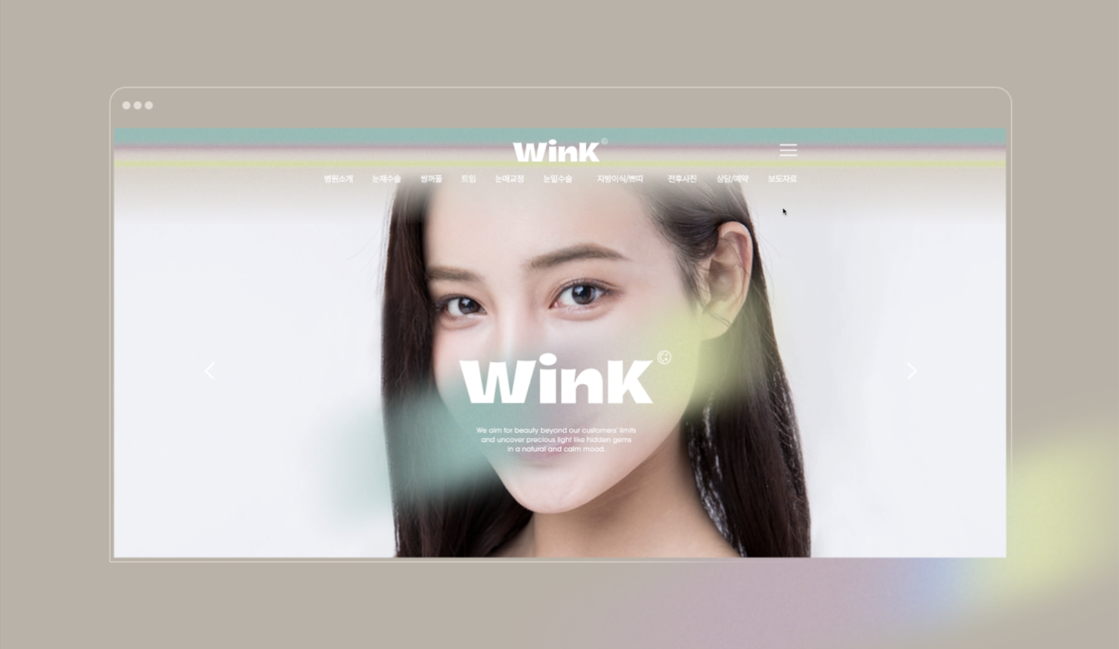
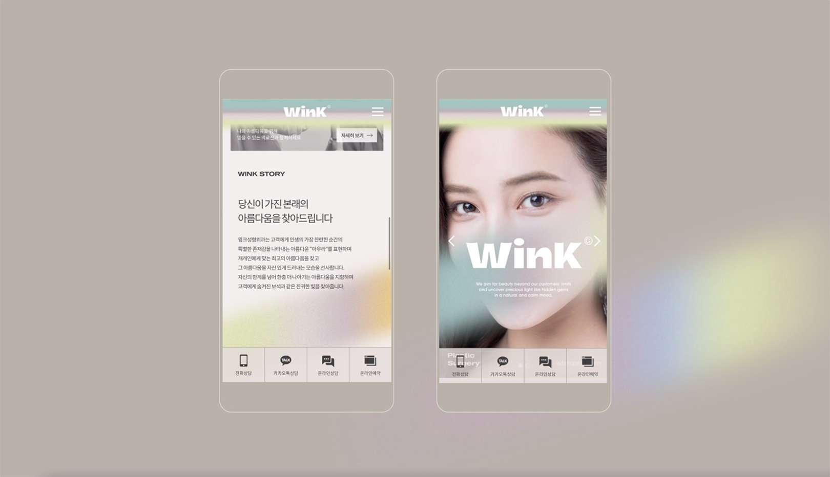
YNL Design developed the brand identity and website design for Wink plastic surgery clinic which is specialized in eye plastic surgery. The Objective was to set a brand direction unique to Wink plastic surgery clinic and to build professional and differentiated images, and the website was designed with a focus on visualizing brand identity and increasing convenience and accessibility through simple UI and UX.
YNL Design은 눈 성형전문 윙크성형외과의 브랜드 아이덴티티와 웹사이트 개발 디자인을 맡아서 작업하였습니다. 윙크성형외과만의 브랜드 방향성을 정립하고 전문적이고 차별화된 이미지를 구축하는 것과 웹디자인에서는 브랜드 아이덴티티를 시각화 하고 간편한 ui/ux로 고객들의 편의성과 접근성을 높이는 것을 목표로 작업하였습니다.
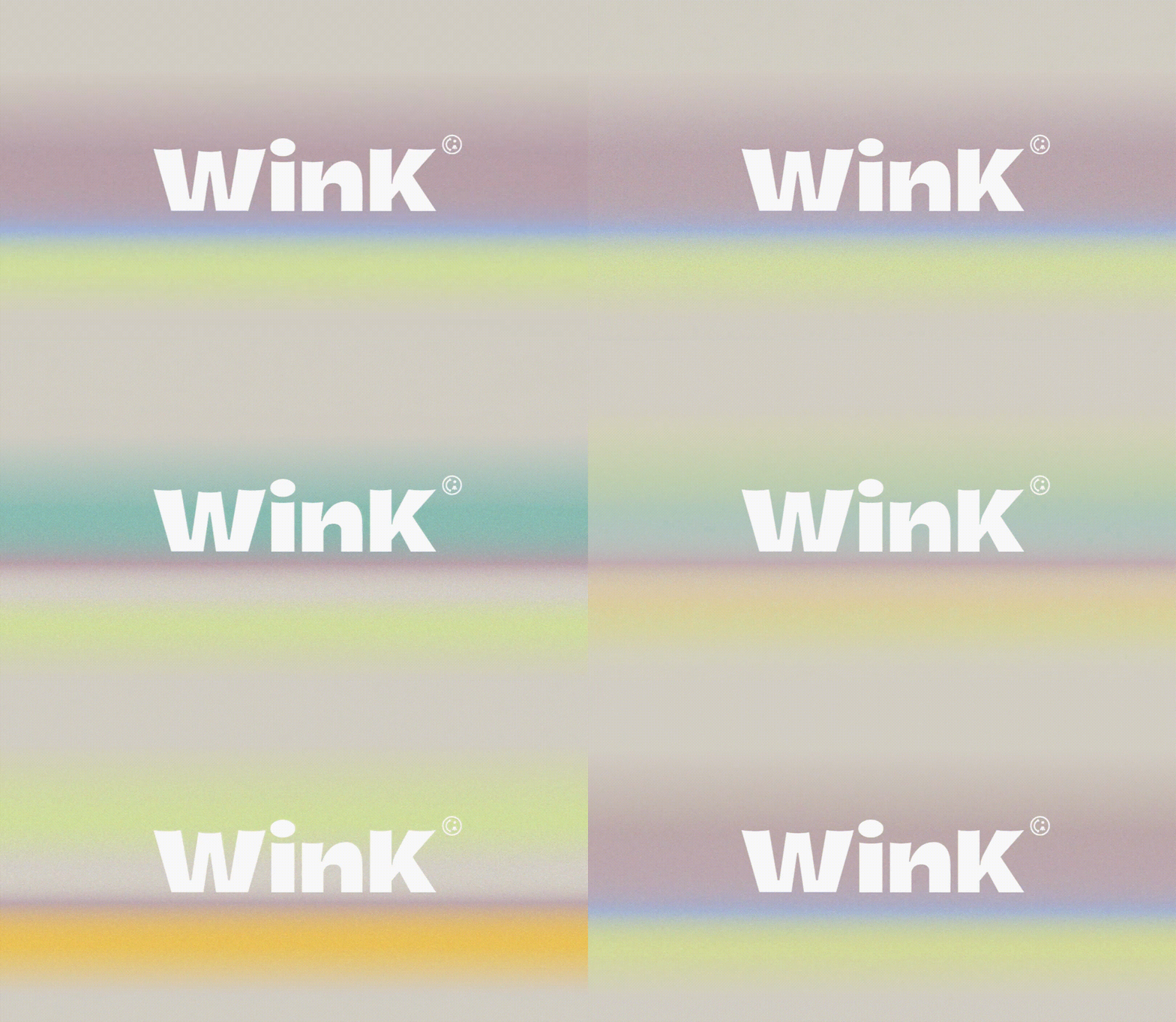
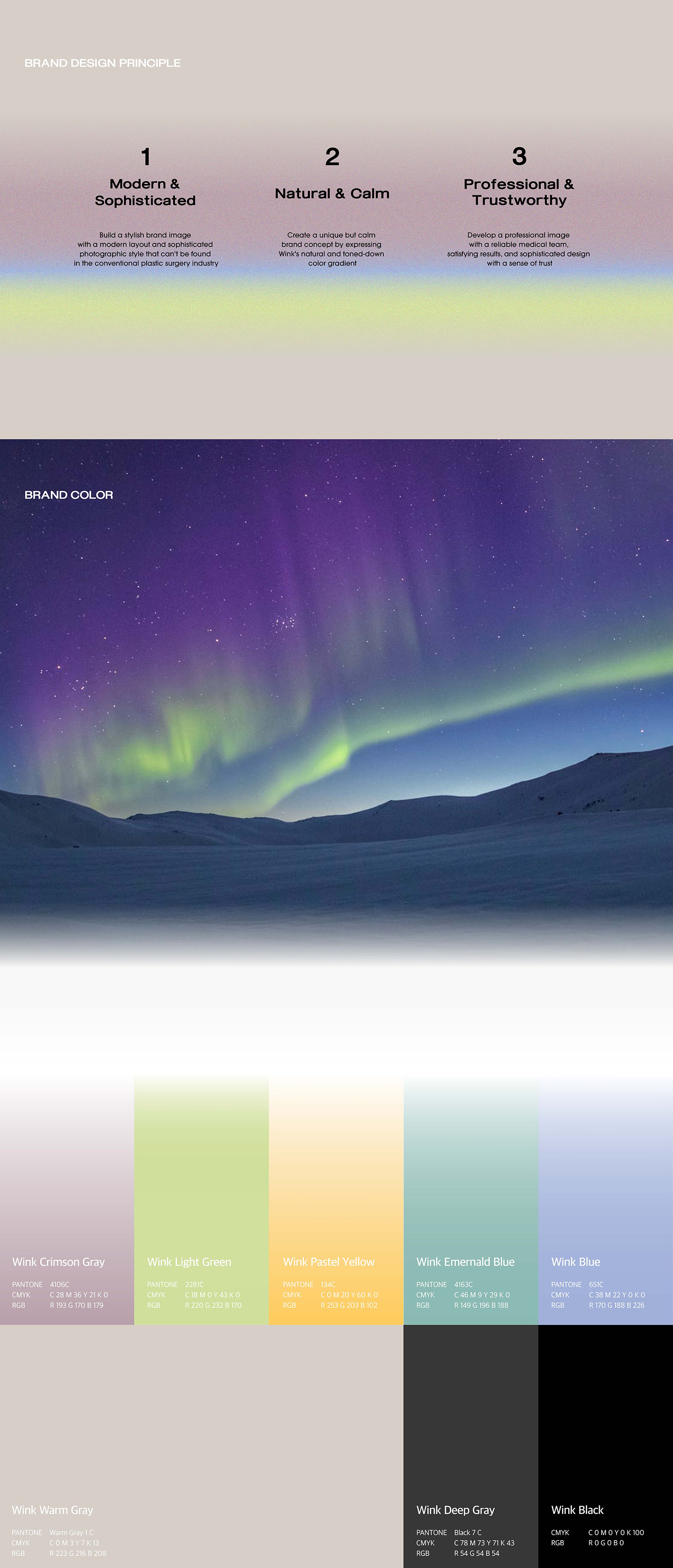
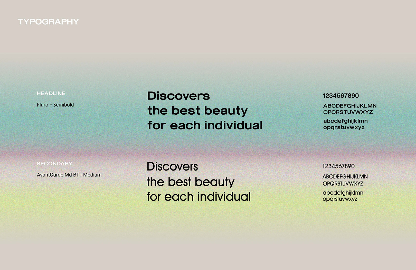
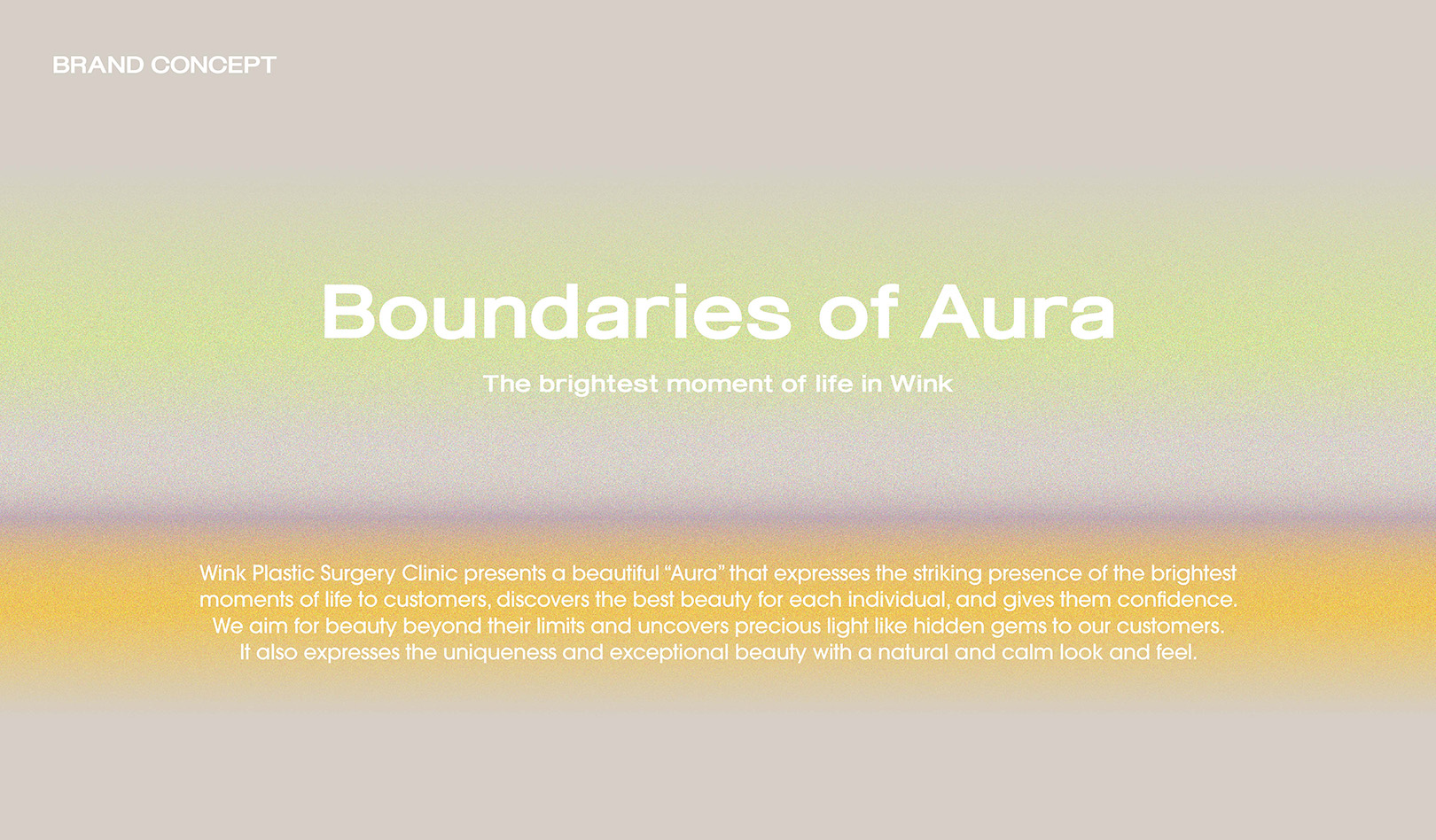
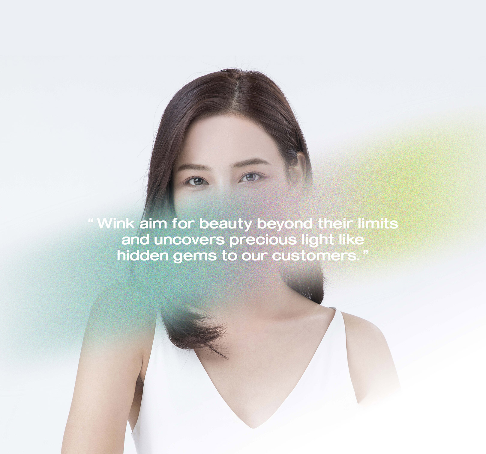
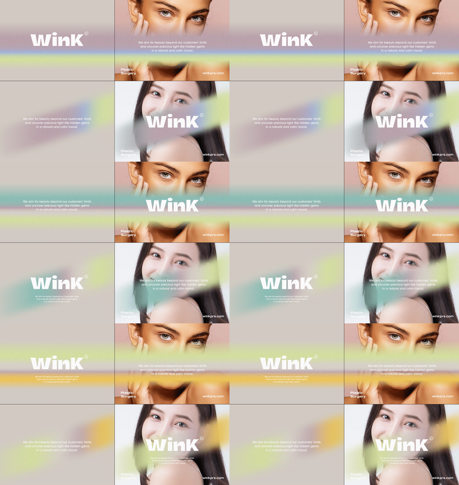
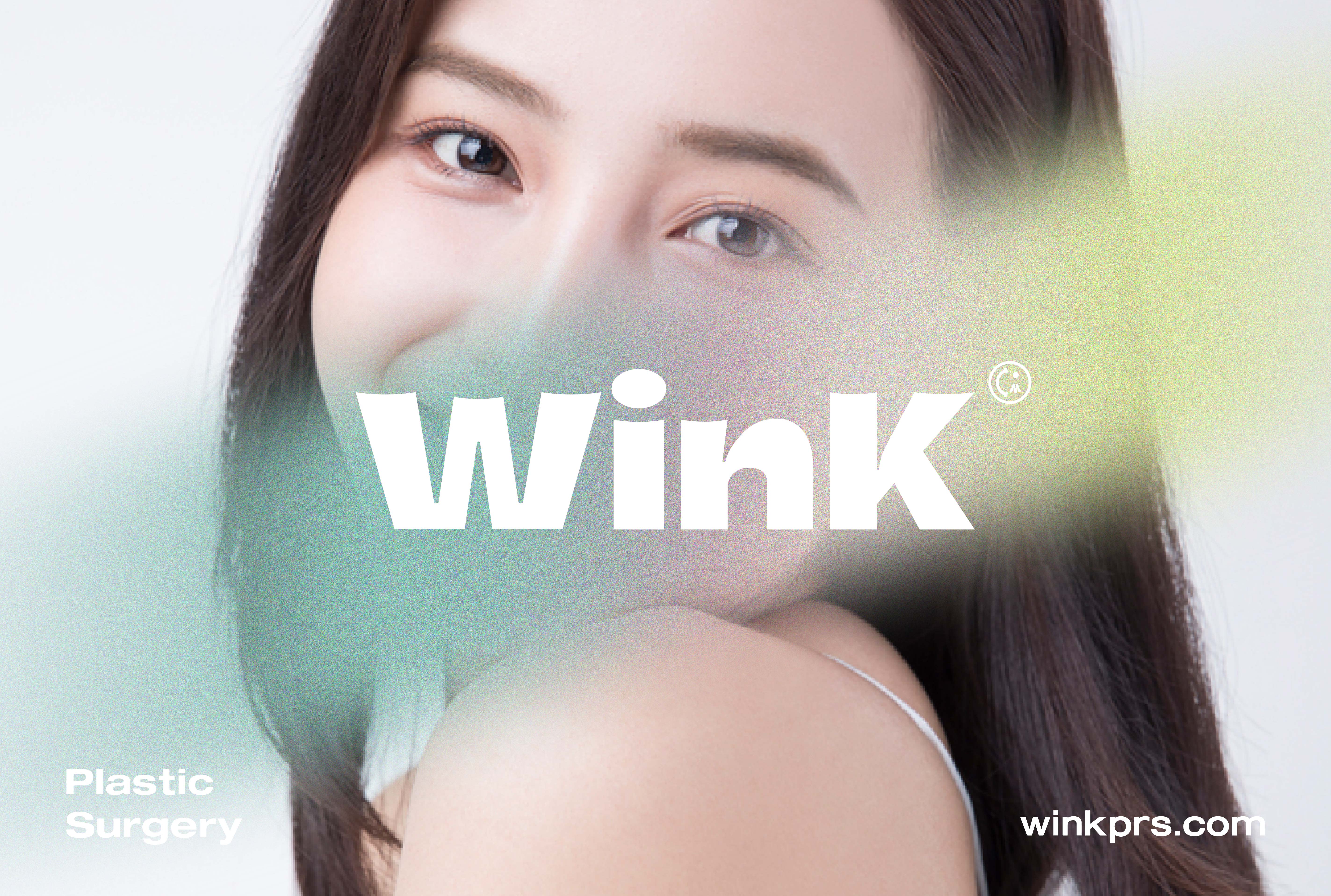
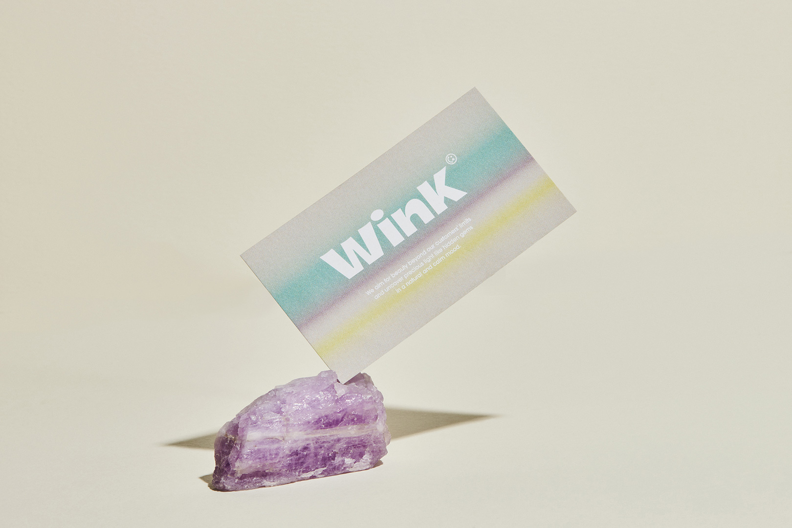
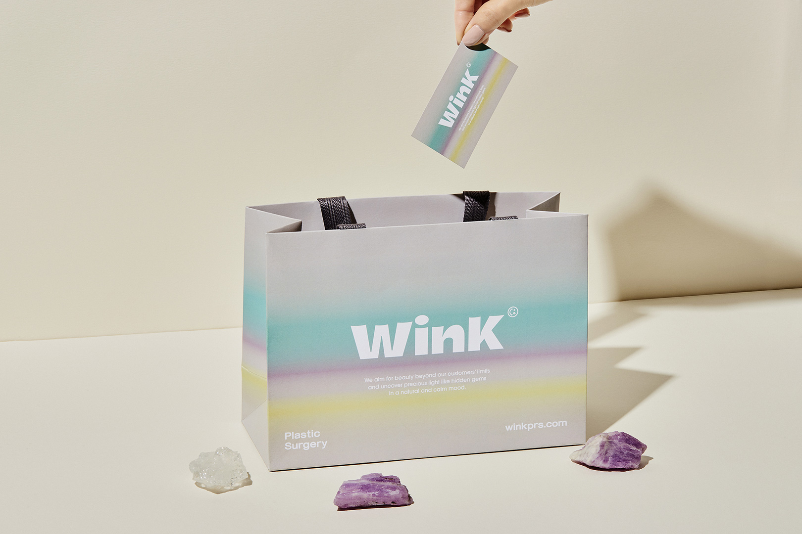
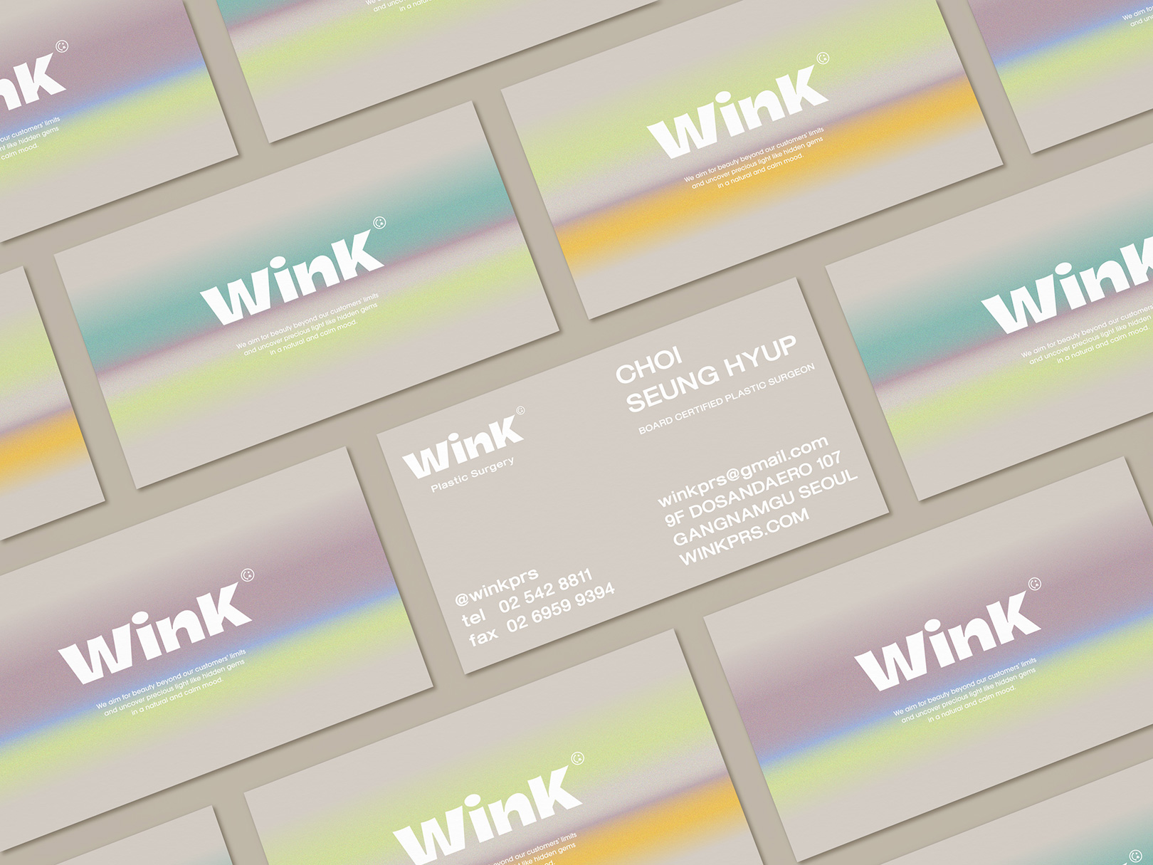
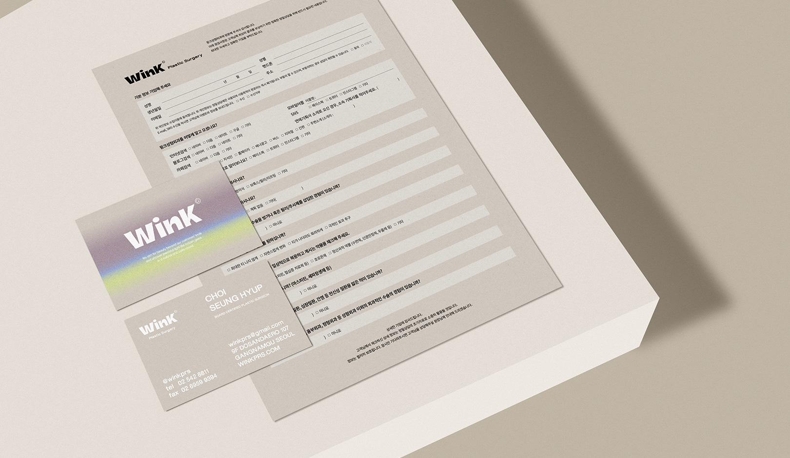
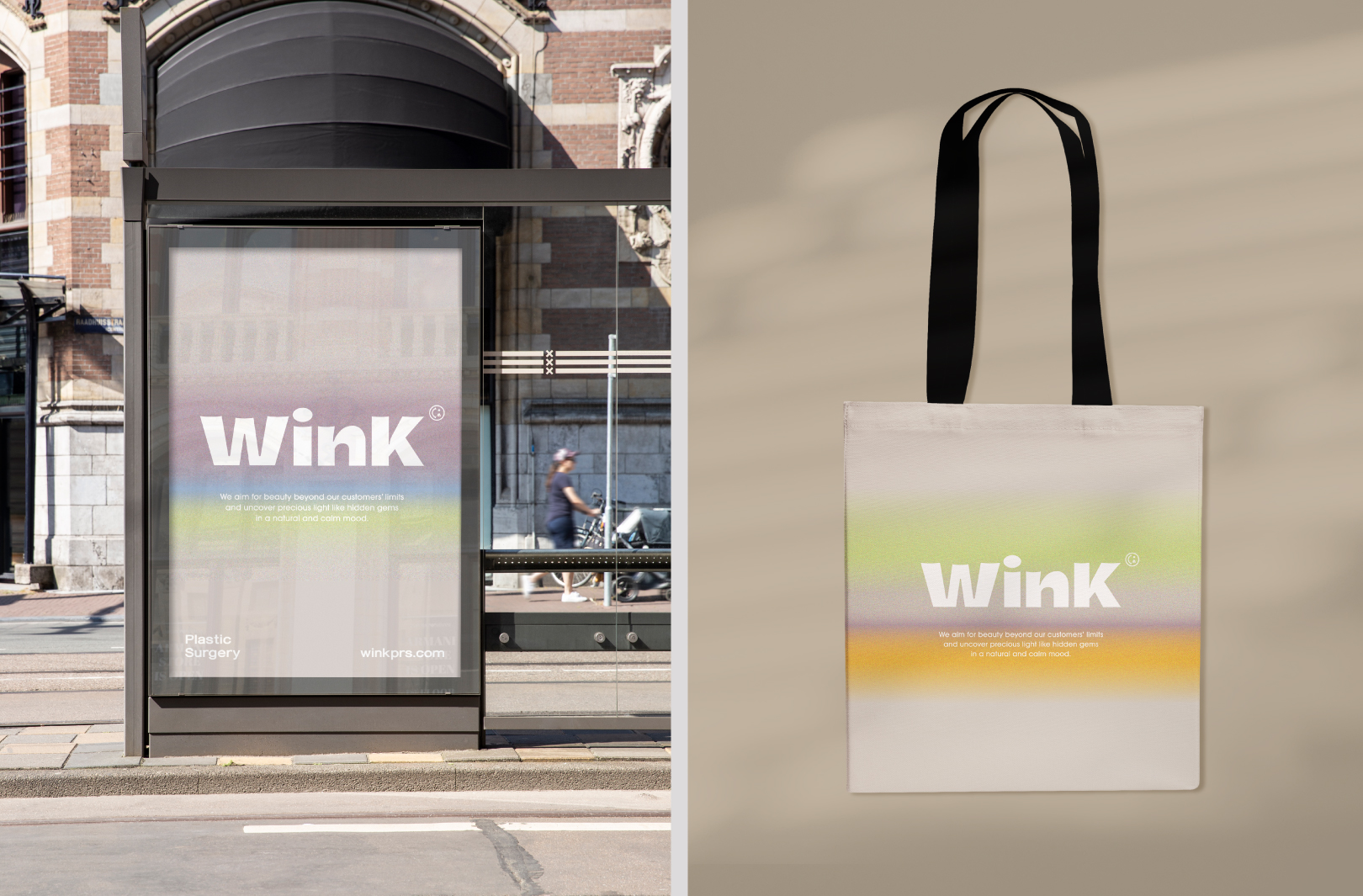
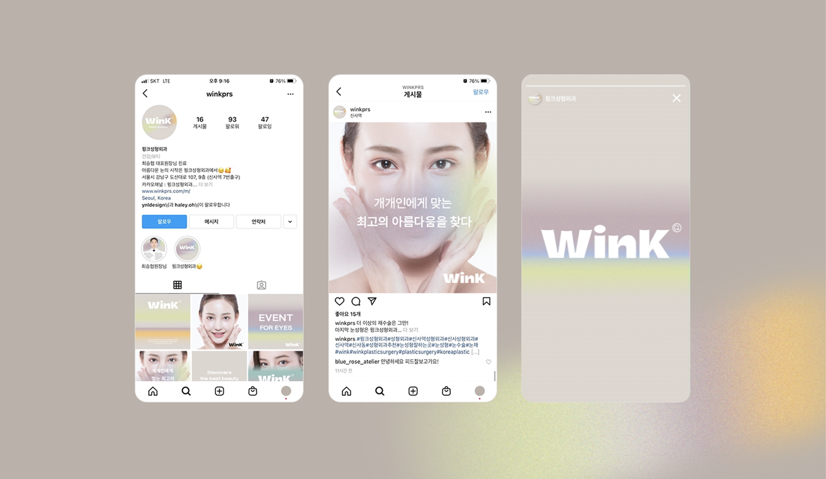
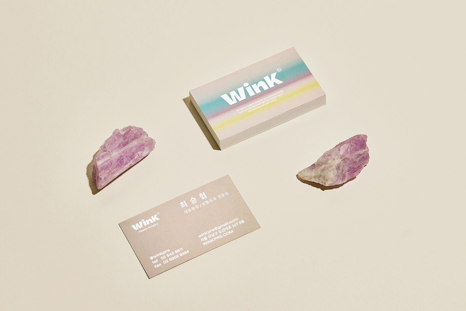
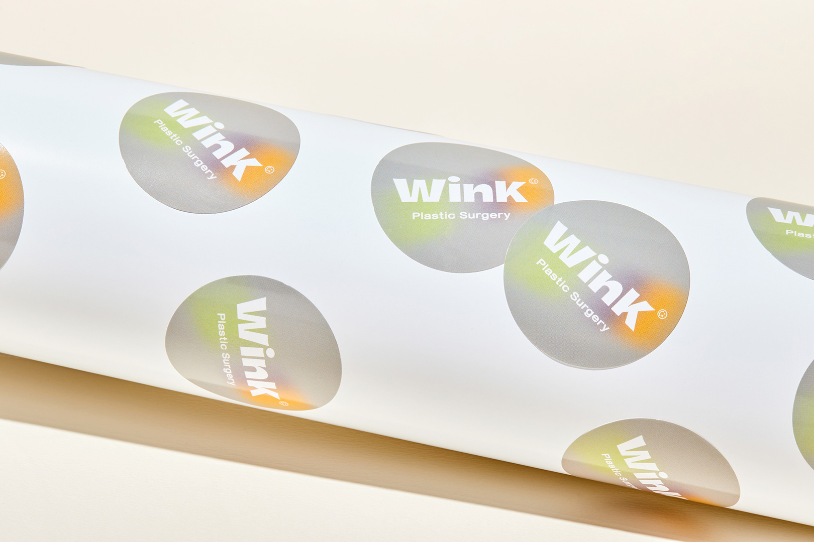
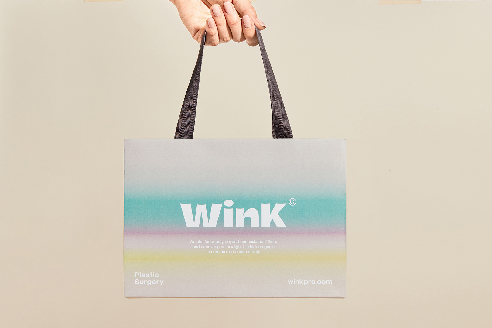
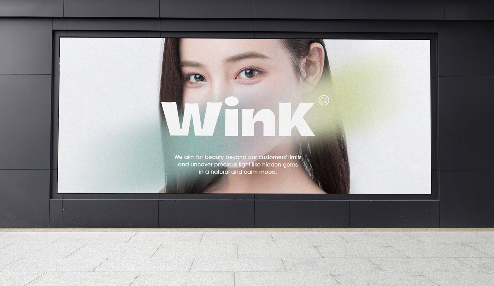
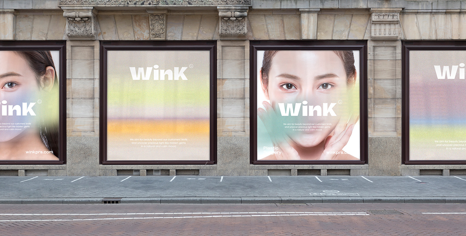
The brand concept was defined as ‘boundaries of aura’ by embodying the attitude of modern women who confidently express individuality of their own beauty, and it delivers the brand value of ‘Find jewelry-like hidden aura in customers and help them go beyond the bounds.’ Designed with sans serif wordmarks, the logo of Wink plastic surgery clinic, which is specialized in eye re-operation, represents bold and modern personality and visualizes the shape of eyes by concavely designing the upper line of each typography. Inspired by beautiful aurora, the brand color was expressed as gradated various color tones in the motif. The brand motif, which was designed with an art of colorful lights and movement, is applied to various applications, creating a noble and beautiful sensibility. Various colored motifs and concise layouts are also applied to the website, naturally reflecting the brand identity of Wink.
나만의 개성이 아름다움임을 자신 있게 드러내는 현대 여성의 애티튜드를 형상화하여 ‘boundaries of aura’로 브랜드 컨셉을 정립하고 보석과 같은 고객에게 숨겨진 빛[aura]을 찾아주어 한계를 넘게 해준다는 브랜드의 가치와 의미를 담았습니다. 눈 재수술이 전문인 윙크 성형외과의 로고는 산세리프체 워드마크로서 볼드하고 현대적 개성을 나타내며 각 타이포그래피의 윗부분을 오목하게 표현하여 눈의 형태를 시각화합니다. 브랜드 컬러는 아름다운 빛깔의 오로라에서 영감을 얻어 다양한 색상이 결을 이루어 모티브에 표현되었습니다. 움직이는 듯한 형형색색의 빛을 표현한 브랜드 모티브는 다양한 어플리케이션에 적용되어 고귀하고 아름다운 감성을 자아냅니다. 다양한 빛깔의 모티브와 간결한 레이아웃은 홈페이지에도 적용이 되어 윙크의 브랜드 아이덴티티가 자연스럽게 녹아 있습니다.