OTTOGI OMU
Sharing Delicious Moments through a New Community

Introduced 3-minute curry for the first time in Korea, Ottogi is a company with a long experience in the HMR market, which occupies a high share with various items and is consistently loved by consumers. To increase online sales, Ottogi launched a new brand OMU to offer new products that cannot be easily found in other brands, by identifying the needs of millennial consumers and using a diversified portfolio. Ottogi OMU is an online shopping mall with a variety of products to satisfy the lifestyle of the MZ generation. The brand name OMU, referring Ottogi community, means sharing mysterious tasting experience through attractive products with customers in their 10s to 30s who are the main users of online channels.
국내 최초로 3분 카레를 선보인 오뚜기는 간편식 시장에서 오랜 경험을 지닌 기업으로 다양한 품목에서 높은 점유율을 차지하며 소비자에게 꾸준히 사랑받는 기업입니다. 오뚜기는 온라인 매출을 강화하기 위해 오뮤라는 신규 브랜드를 통해 밀레니얼 소비자의 니즈를 파악하고 다각화된 포트폴리오를 활용해 타 브랜드가 쉽게 따라 할 수 없는 신규 제품을 빠르게 선보이고자 했습니다. 오뚜기 오뮤는 ‘MZ세대’의 라이프스타일을 만족시킬 수 있는 다양한 제품을 제공하는 온라인 쇼핑몰입니다. 오뮤의 브랜드 네임은 오뚜기 커뮤니티를 의미하며 온라인 채널을 주력으로 하는 만큼 10 - 30대 고객들에게 매력적인 제품을 통해 오묘한 맛의 경험을 공유한다는 의미를 지니고 있습니다.
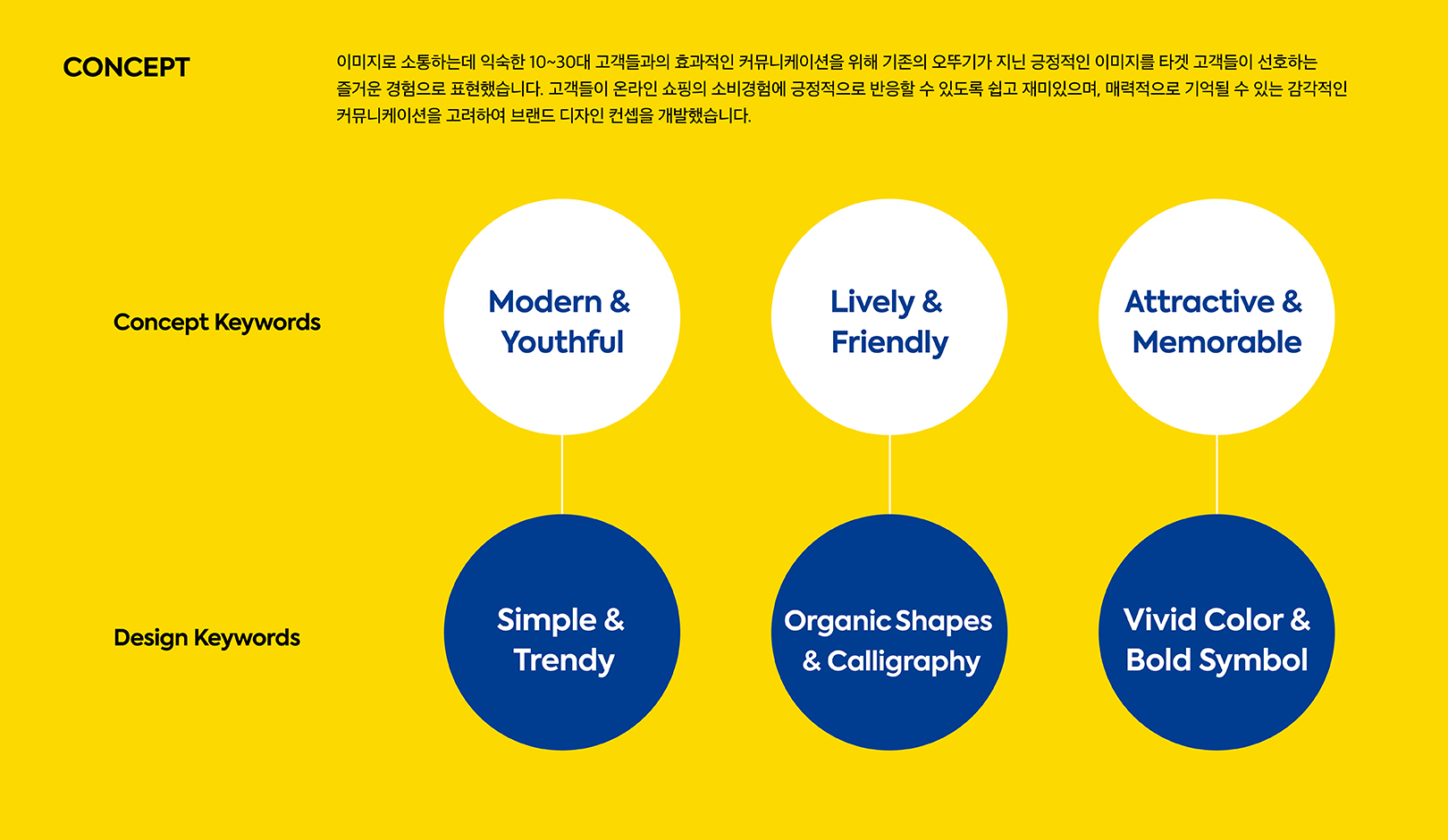
YNL Design understood the brand environment through Ottogi corporate analysis and market status analysis, and elaborately designed the brand image for Ottogi OMU based on the insights derived from trend research and case studies. The key task was to develop an attractive brand image to satisfy the OMU's target customers in their 10s and 30s while maintaining Ottogi's existing tone and manners. For effective communication with the MZ generation in their 10s and 30s who are familiar with communicating with images, we established more attractive and sensuous brand assets based on the friendly image of the existing Ottogi.
오뚜기에 대한 기업 분석 및 시장 현황 분석으로 브랜드 환경에 대해 파악하고, 트렌드 리서치와 브랜드 사례조사로 도출된 인사이트를 바탕으로 오뚜기 오뮤가 지향해야 할 브랜드 이미지를 보다 정교하게 설계합니다. 특히 오뚜기가 지닌 기존의 톤앤매너를 유지하면서도 오뮤의 타겟 고객인 10 - 30대 고객의 취향을 만족시킬 수 있는 매력적인 브랜드 이미지를 개발하는 것이 핵심적인 과제였습니다. 이미지로 소통하는데 익숙한 10 - 30대 MZ 세대와의 효과적인 커뮤니케이션을 위해 기존의 오뚜기가 지닌 친근한 이미지를 바탕으로 더욱더 매력적이고 감각적인 브랜드 자산을 구축해야 했습니다.
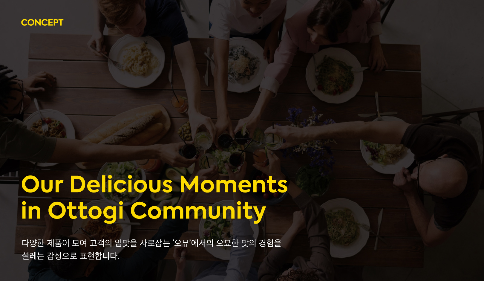
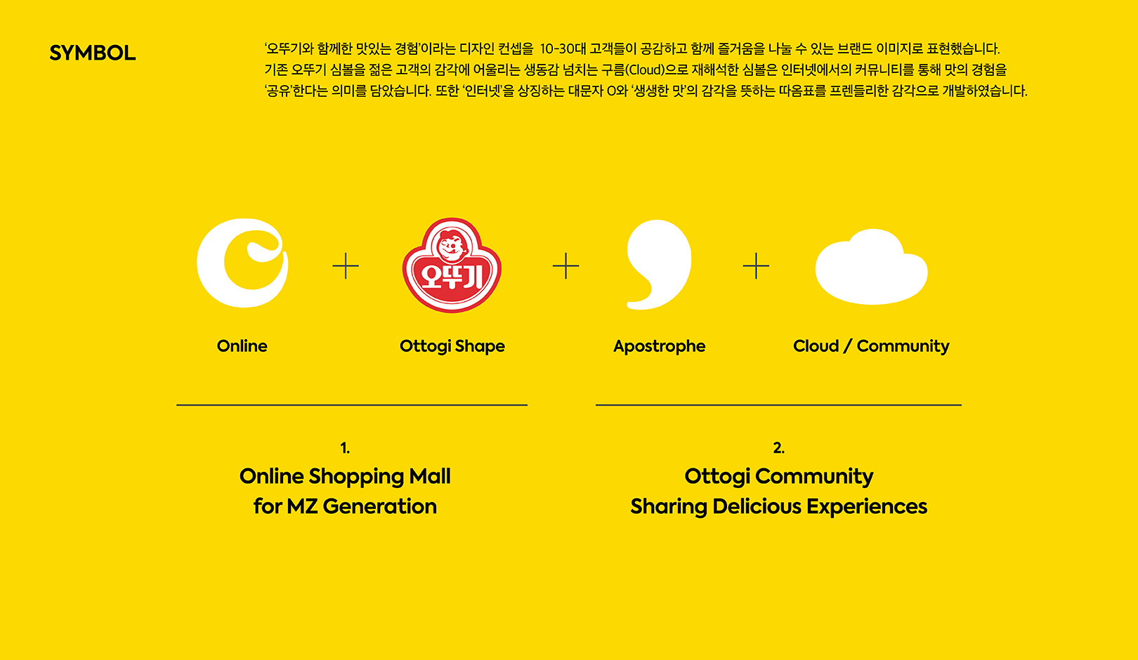
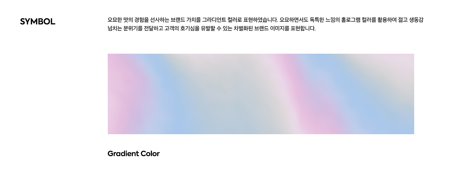
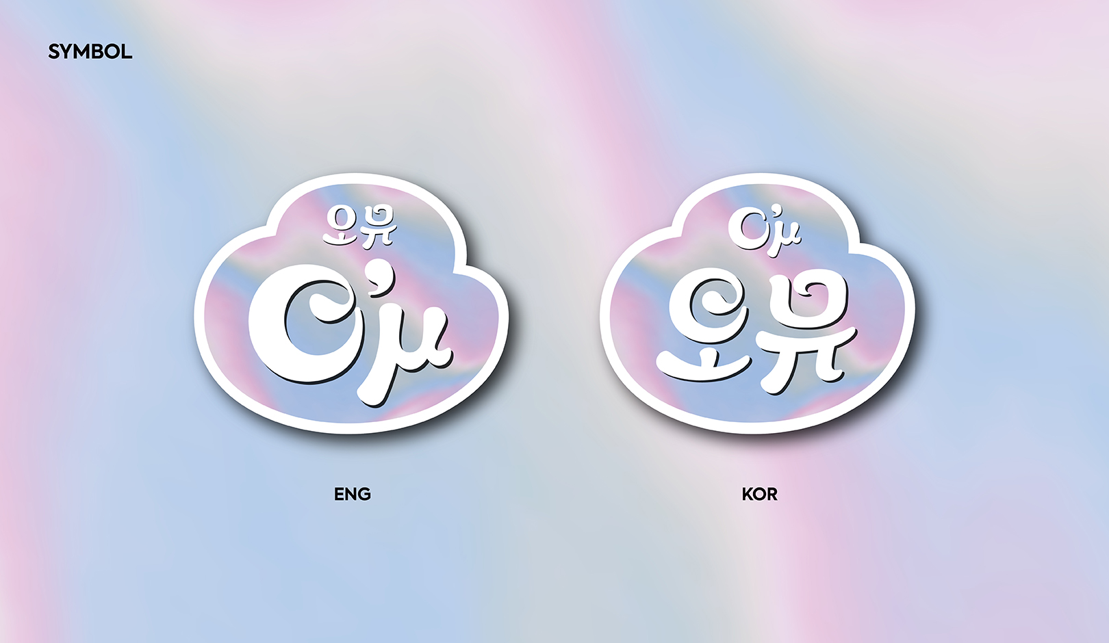
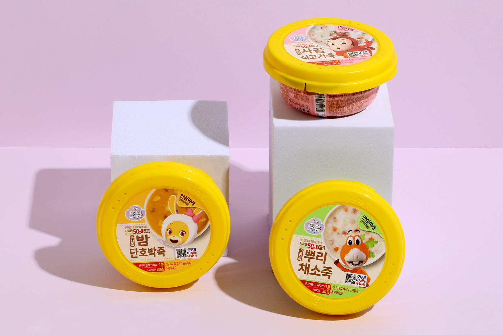
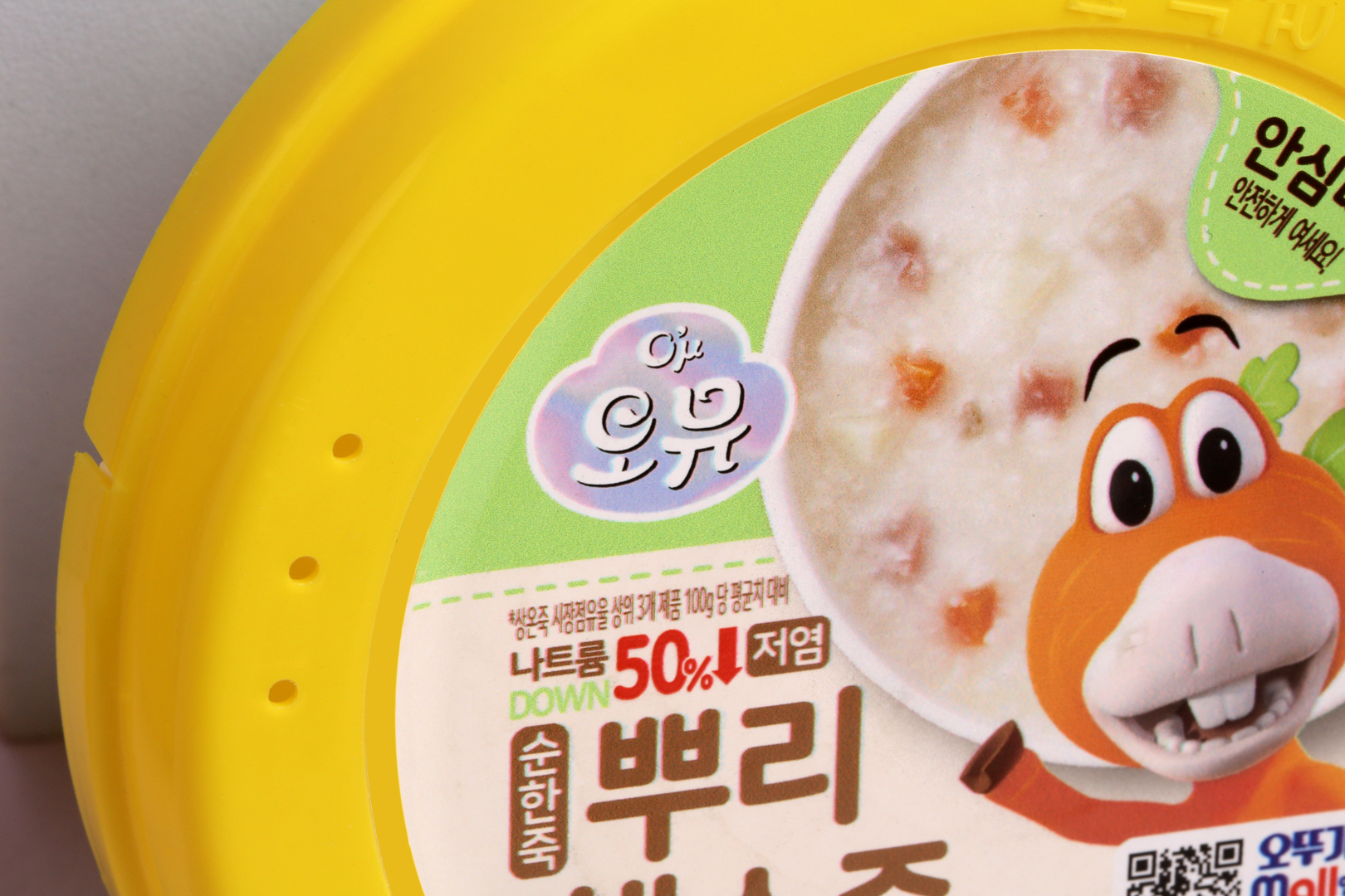
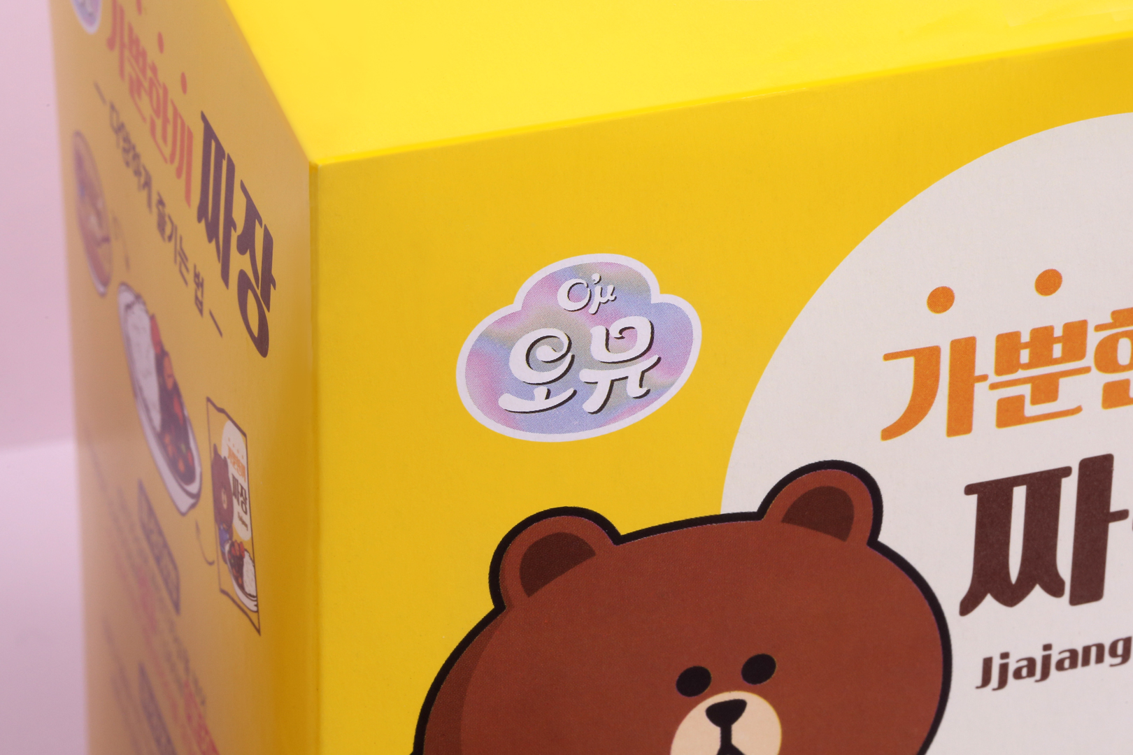
The brand identity of Ottogi OMU was developed to be recognized as an attractive brand through customer's consumption experience. Based on the brand concept of ‘Our Delicious Moments in Ottogi Community,’ we intended to express the identity of the online community that shares mysterious tasting experience. The symbol of OMU was designed to be younger and fresher while keeping Ottogi's tone and manners because it should be used on the package instead of the Ottogi symbol. To maintain the brand image of Ottogi, the existing Ottogi symbol with a symmetrical structure was changed to a free and lively asymmetrical cloud-shape symbol, and mysterious aura-like hologram colors were used to represent the brand value of offering mysterious tasting experiences while arousing curiosity.
오뚜기 오뮤의 브랜드 아이덴티티는 고객의 소비 경험에서 매력적인 브랜드로 인식될 수 있도록 개발되었습니다. ‘Our Delicious Moments in Ottogi Community’라는 브랜드 컨셉을 기반으로 오묘한 맛의 경험을 공유하는 온라인 커뮤니티의 정체성을 표현하고자 했습니다. 오뮤의 심볼은 오뚜기 심볼을 대체하여 패키지 전면에 사용되는 만큼 오뚜기의 톤앤매너를 계승하면서도 더 젊고 매력적인 이미지를 고민했습니다. 오뚜기의 브랜드 이미지를 유지하기 위해 대칭 구조를 지닌 기존 오뚜기 심볼의 형태를 비대칭의 자유롭고 생동감 넘치는 구름 형태의 심볼로 개발하였고, 오로라의 신비함을 담은 홀로그램 컬러를 활용하여 오묘한 맛의 경험을 선사한다는 브랜드 가치를 표현하는 동시에 고객의 호기심을 유발할 수 있는 차별화 된 브랜드 이미지를 구축했습니다.