OTTOGI GIFT SET
Bringing Authentic Korean Warmth to Gifting

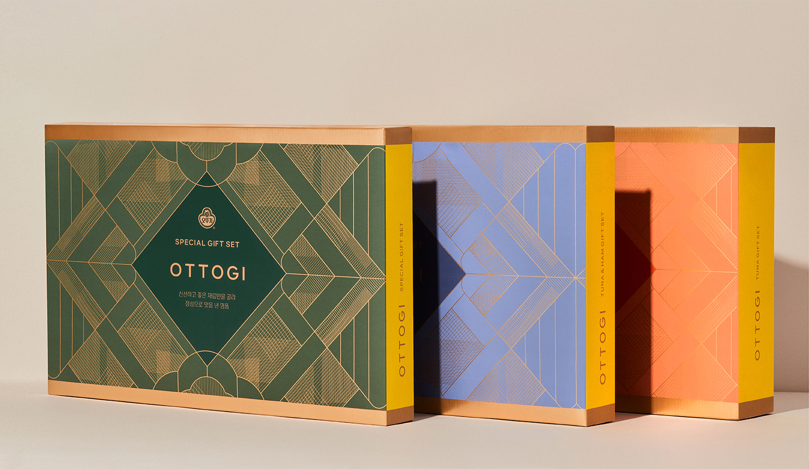
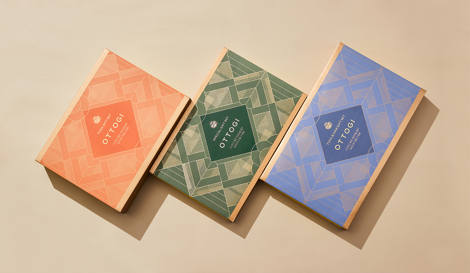
Ottogi is a company that has built trust with customers with its high-quality products for a long time and is recognized for its friendly image to customers with the signature color, yellow, and the symbolic character. We wanted to build the PREMIUM GIFTING EXPERIENCE unique to Ottogi that matches the company's positive image and contains the specialness of Korea's unique holiday gift sets.
오뚜기는 오랜 기간 좋은 품질의 제품으로 고객들과 신뢰감을 쌓아왔으며 오뚜기의 시그니처 컬러인 옐로우와 오뚜기 심볼 캐릭터로 고객들에게 친근한 이미지로 인식되고 있는 기업입니다. 이런 기업의 긍정적인 이미지와 어울리며 한국 고유의 명절 선물세트의 특수성을 담은 오뚜기만의 PREMIUM GIFTING EXPERIENCE를 구축하고자 합니다.
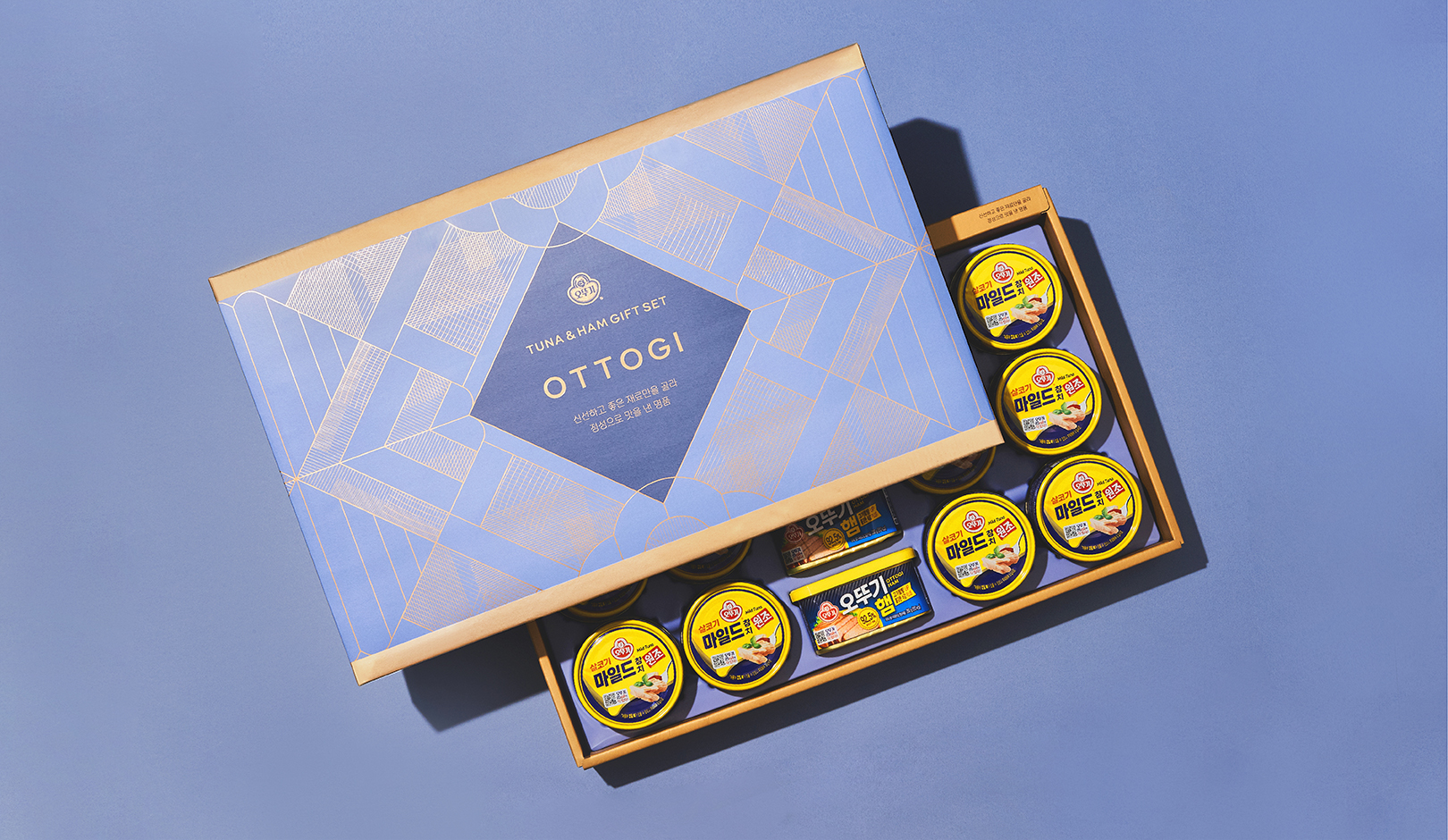
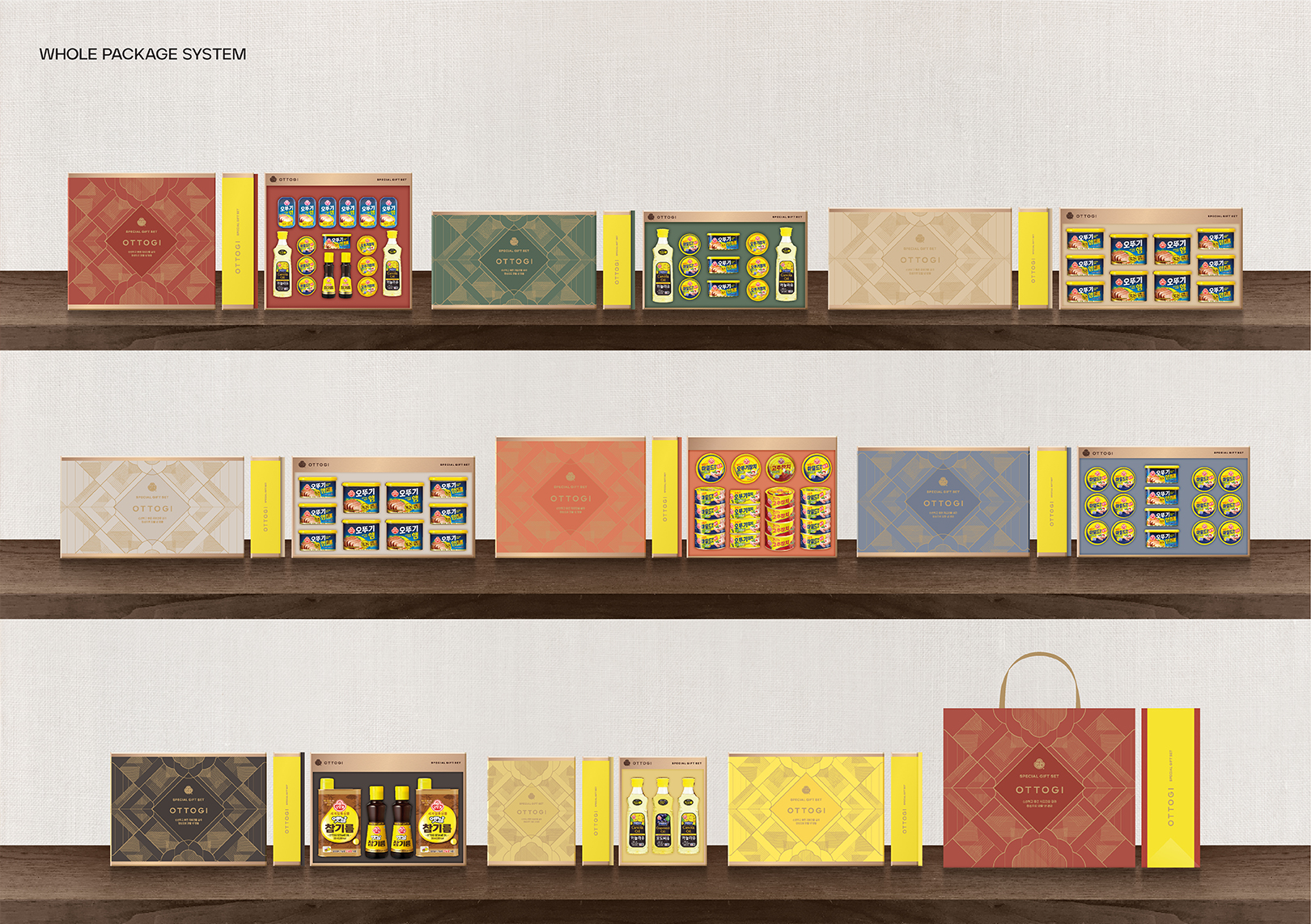
We wanted to express the needs of consumers who wish to meet up with those who are precious to them and express their feelings with a gift in a premium holiday gift set that captures Korea's unique traditional beauty. We wanted to build a layout system that matches the existing identity of Ottogi and enables smooth visual communication with customers. Also, we intended to deliver Ottogi's unique PREMIUM GIFTING EXPERIENCE to consumers by developing a modern graphic theme and a calm color system.
소중한 사람들과 모여 서로의 마음을 선물로 표현하고자 하는 소비자들의 니즈를 한국 고유의 전통미가 담긴 프리미엄한 명절 선물세트로 표현하고자 하였습니다. 기존의 오뚜기 아이덴티티와 어울리며 고객들과 시각적 커뮤니케이션이 원활하게 가능한 레이아웃 시스템을 구축하고자 하였습니다. 또한 모던한 그래픽 모티브와 차분한 컬러 시스템을 구축하여 소비자들에게 오뚜기 고유의 프리미엄한 GIFTING EXPERIENCE를 전달하는 것을 목표로 작업을 진행하였습니다.
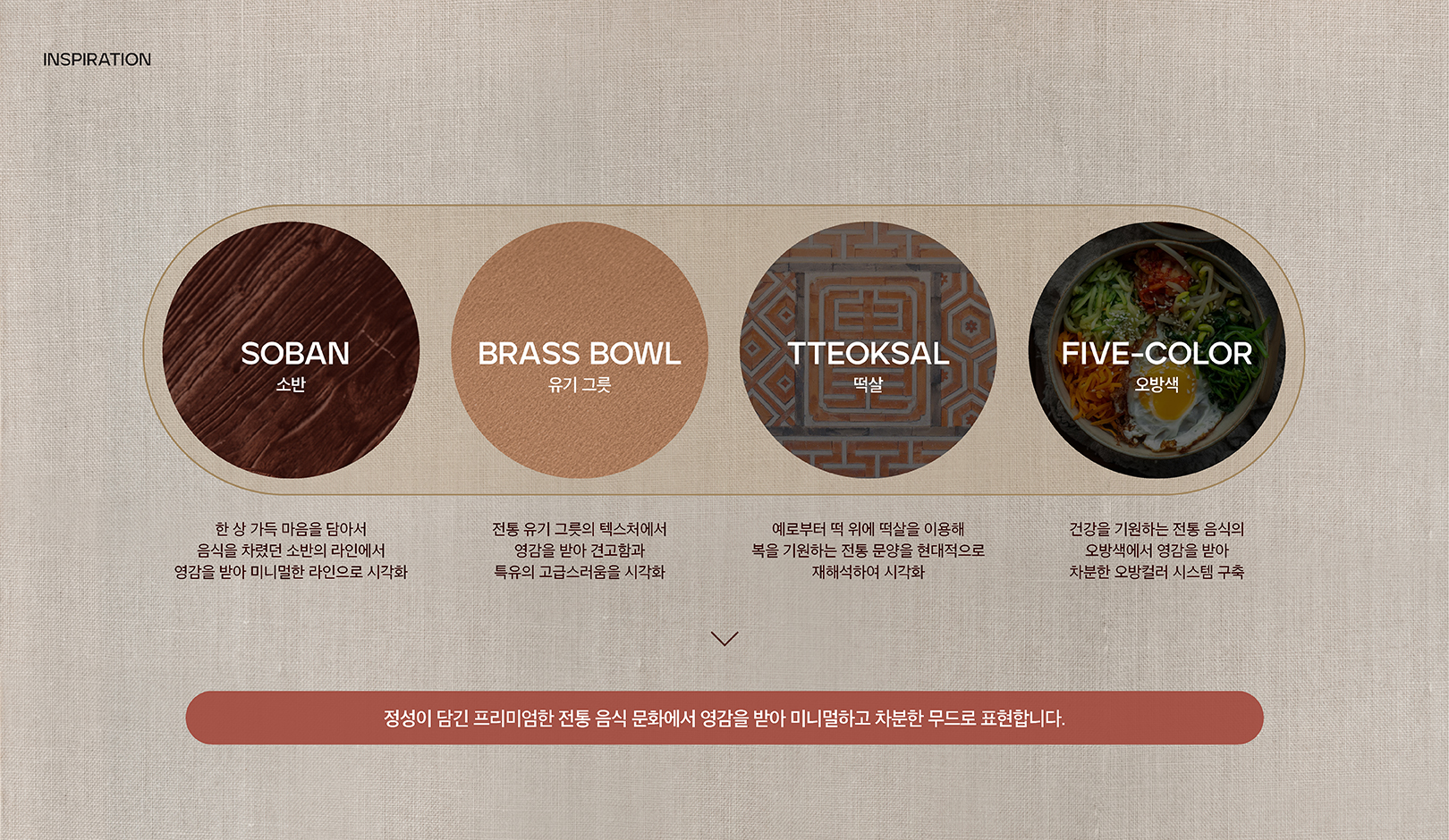
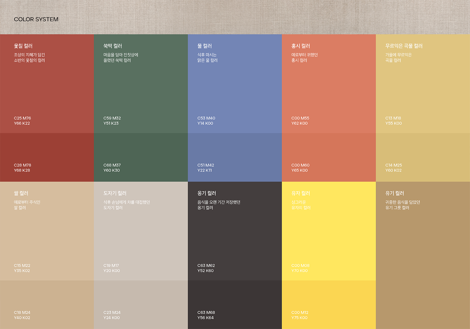
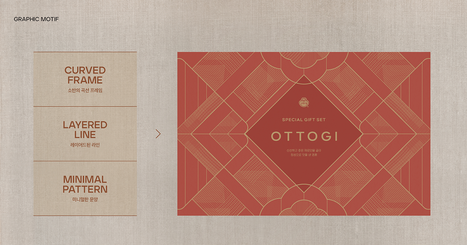
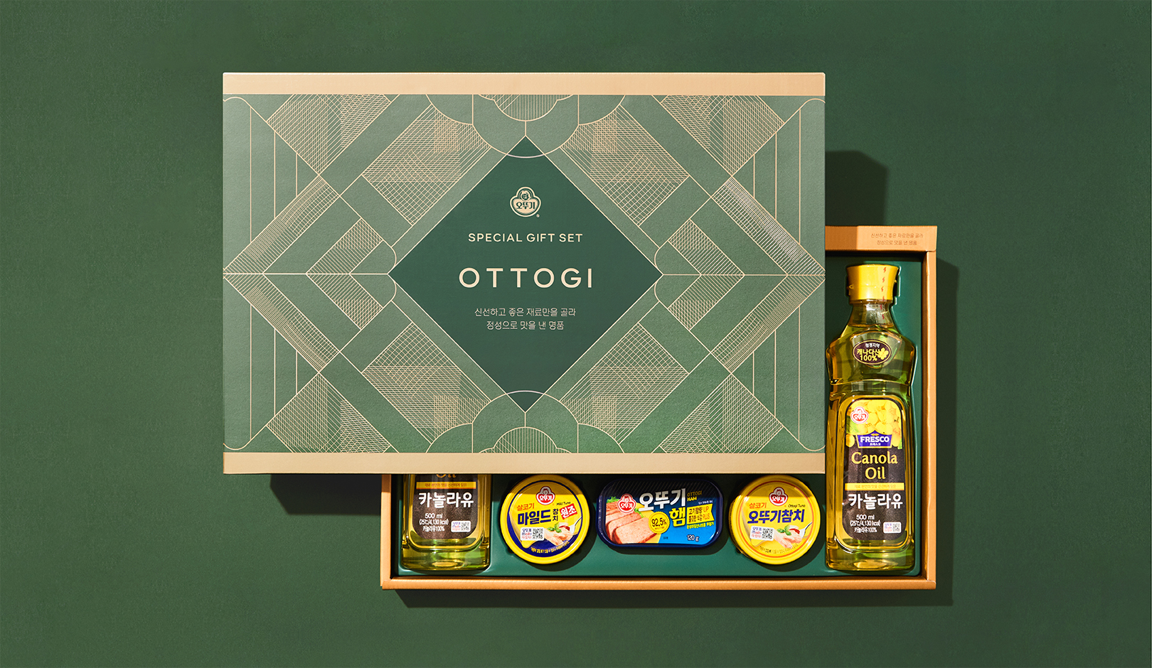
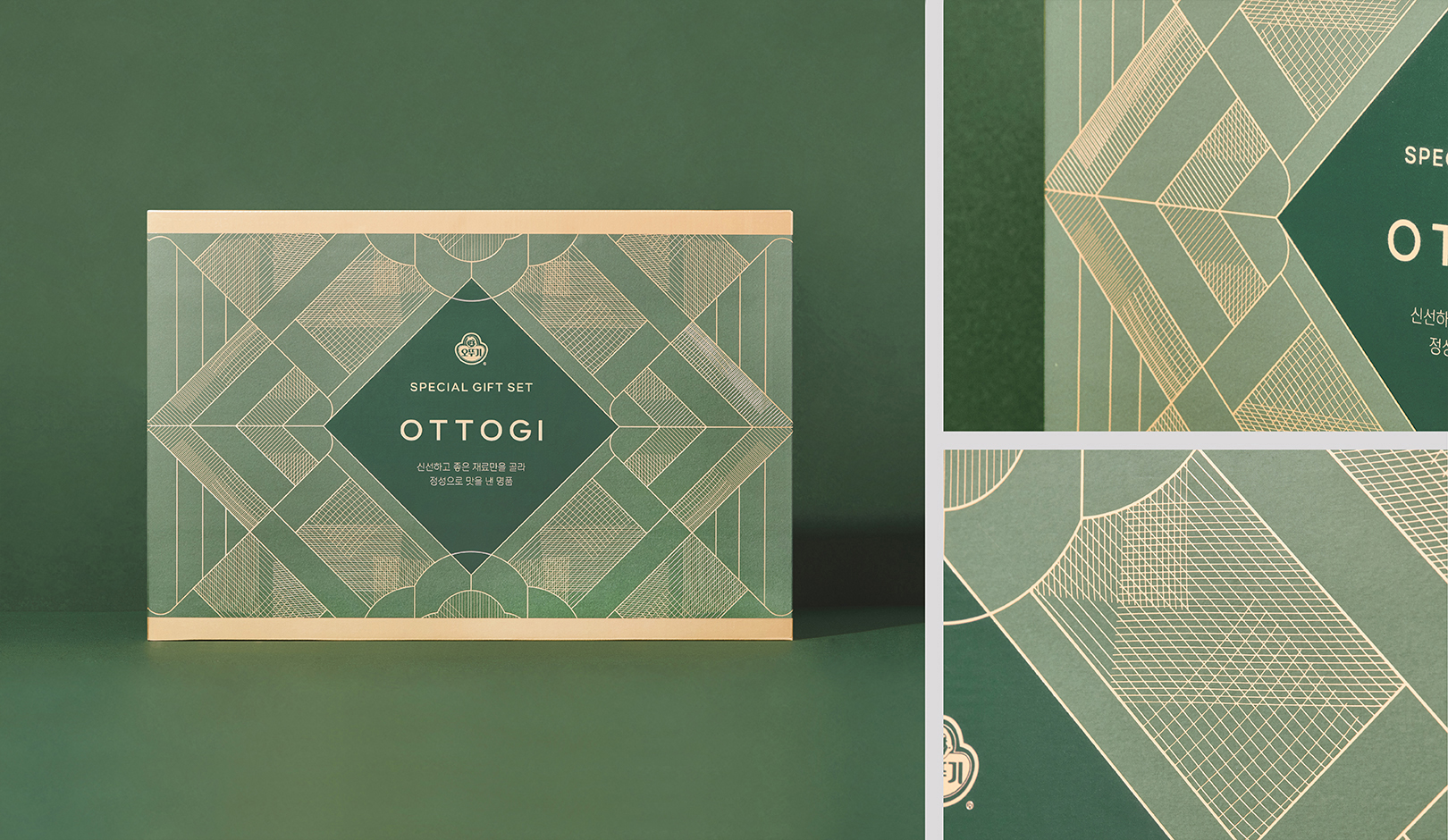
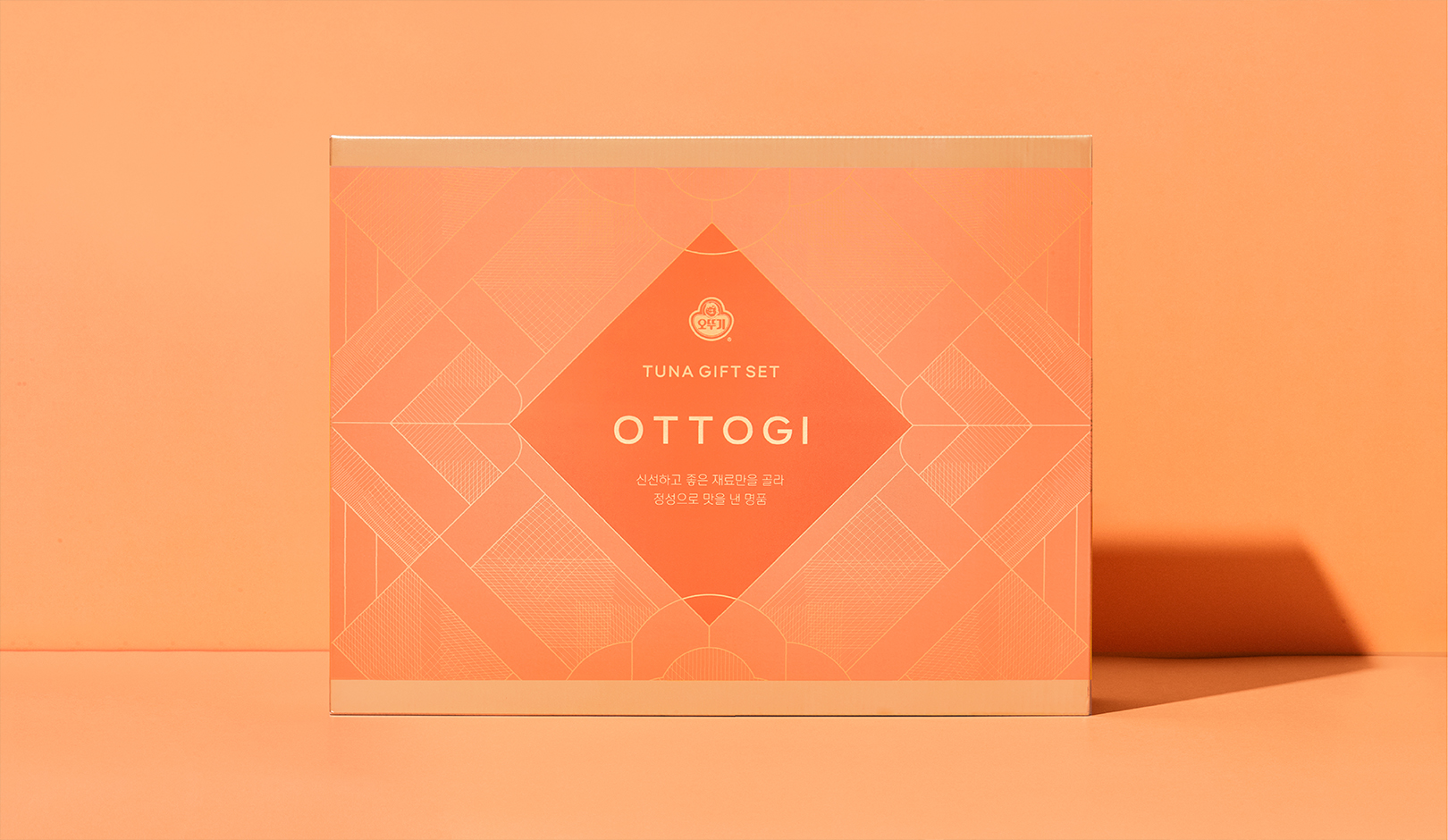
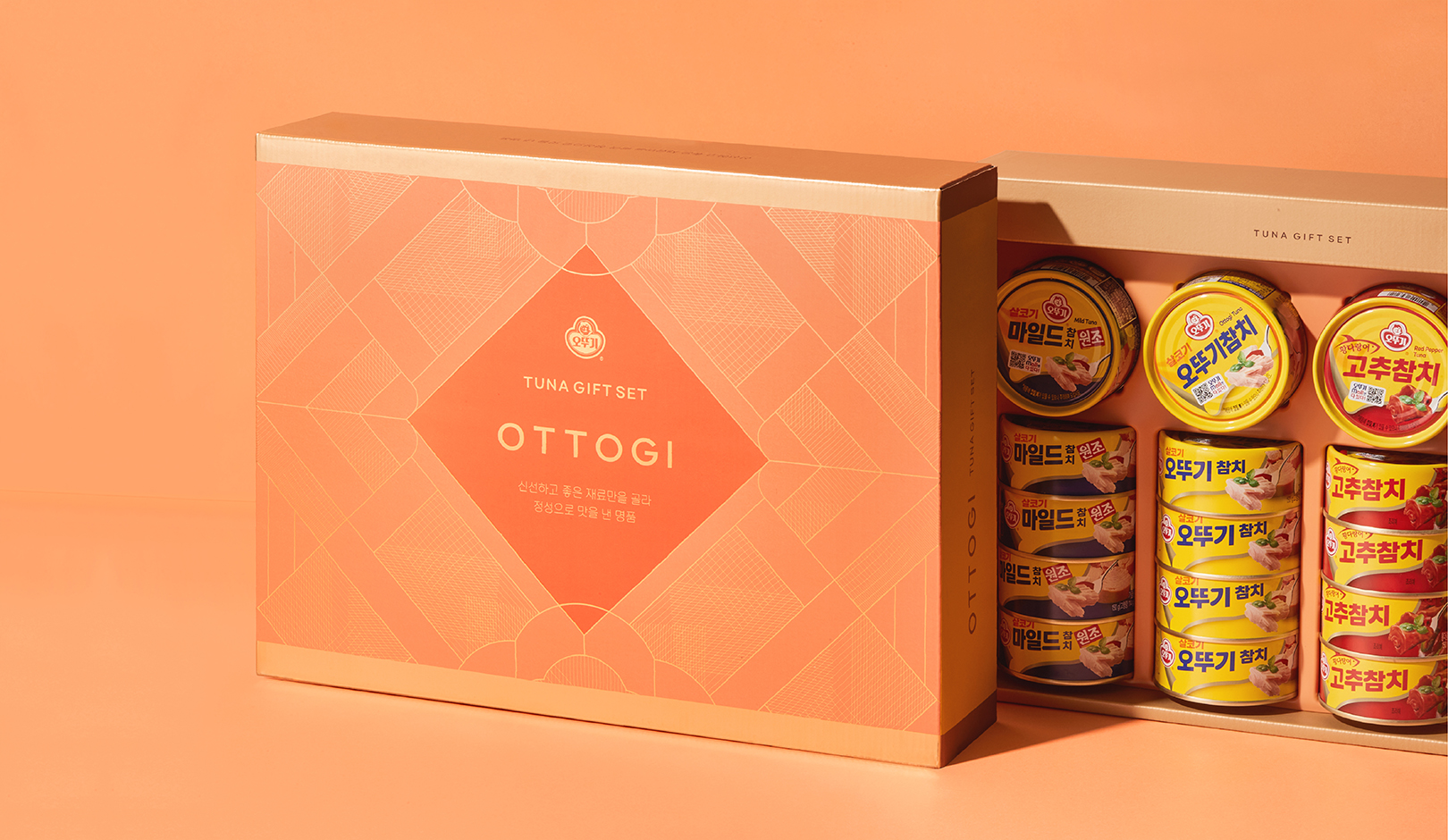
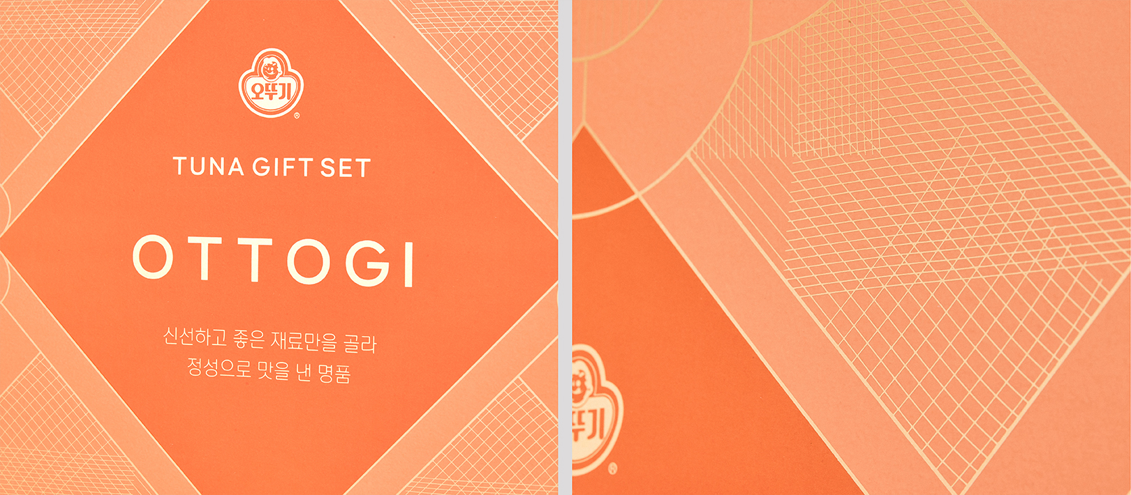
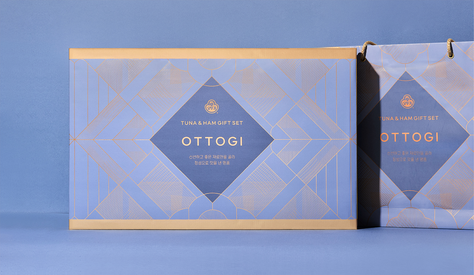
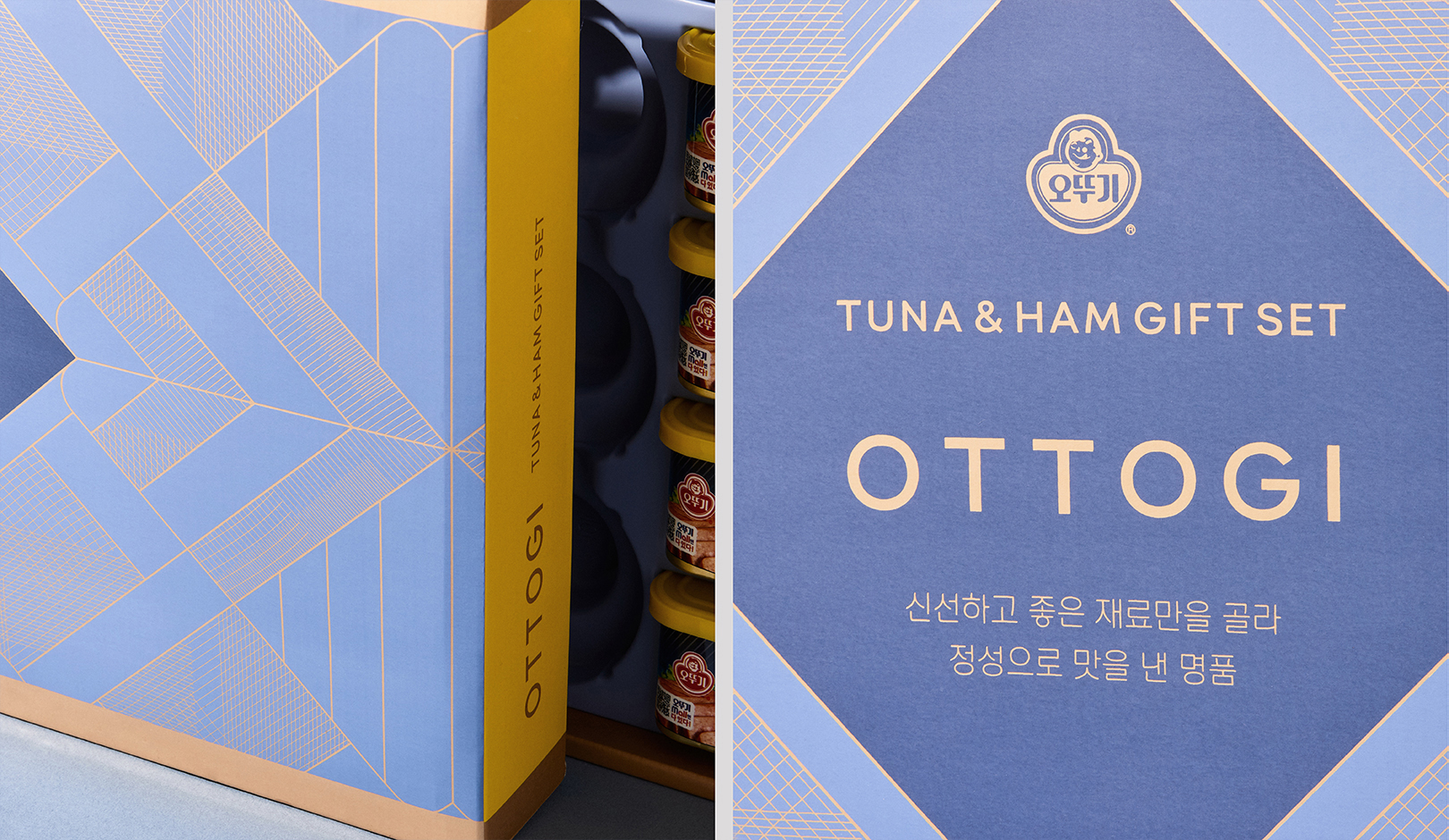
We set the direction based on the positioning of the existing Ottogi gift sets and the analysis of competitors. We composed a soft color scheme that balances with and redounds to Ottogi's main color system and developed a package layout system that enables effective visual communication. Also, we visualized the uniqueness of the holiday through the graphic motifs that are reinterpreted in a modern sense based on the inspiration from Korean materials. We developed the design by deriving the concept, ‘ADD OUR AUTHENTIC MIND’ and ‘A Bountiful Holiday, Adding a Table Full of Heart,’ and the keywords, 'MODERN / PREMIUM / AUTHENTIC.' We reinterpreted the curved line of soban (small table), carefully prepared and served to loved ones, in a minimal and modern sense and developed a unique pattern based on the inspiration from the elegant texture of yugi (bronzeware), which contained food abundantly, to visualize a premium mood. Also, we reinterpreted the five colors used in traditional dishes with calm and modern colors to establish a visual system for Ottogi's unique premium gift set package for customers as a genuine Korean classic holiday gift set.
기존의 오뚜기 선물세트의 상황 및 경쟁사 분석과 포지셔닝으로 나아가고자 하는 방향성을 설정하였습니다. 오뚜기의 메인 컬러 시스템과 조화를 이루며 더욱 돋보이게 해주는 부드러운 컬러스킴 구성과 효과적인 시각적 커뮤니케이션이 가능한 패키지 레이아웃 시스템을 구축하고 한국적인 소재에서 영감을 받아 모던하게 재해석한 그래픽 모티브를 통해 고유 명절의 특수성을 시각화하였습니다. ‘ADD OUR AUTHENTIC MIND’ ‘풍성한 명절, 한 상 가득 마음을 더하다’라는 콘셉트와 MODERN / PREMIUM / AUTHENTIC이라는 키워드를 도출하여 디자인을 진행하였습니다. 정성스럽게 음식을 차려 소중한 사람에게 대접했던 소반의 곡선 라인을 미니멀하고 모던하게 재해석하고 풍성하게 음식을 담았던 고급스러운 유기의 텍스처에서 영감을 받아 고유의 패턴을 개발하여 프리미엄한 무드를 시각화하였습니다. 또한 전통 음식에서 사용되었던 오방색을 차분하고 현대적인 컬러로 재해석하여 진정성 있는 한국 고유 대명절 선물세트로 고객들에게 오뚜기만의 차별화된 프리미엄 선물세트 패키지 비주얼 시스템을 구축하였습니다.