YNL Design Website Renewal
We Build Brands That Truly Connect

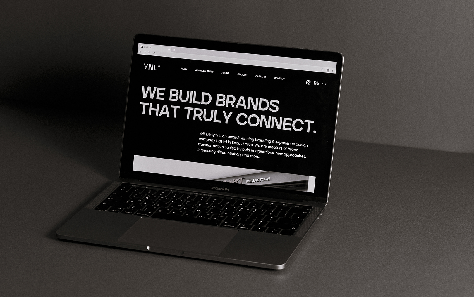
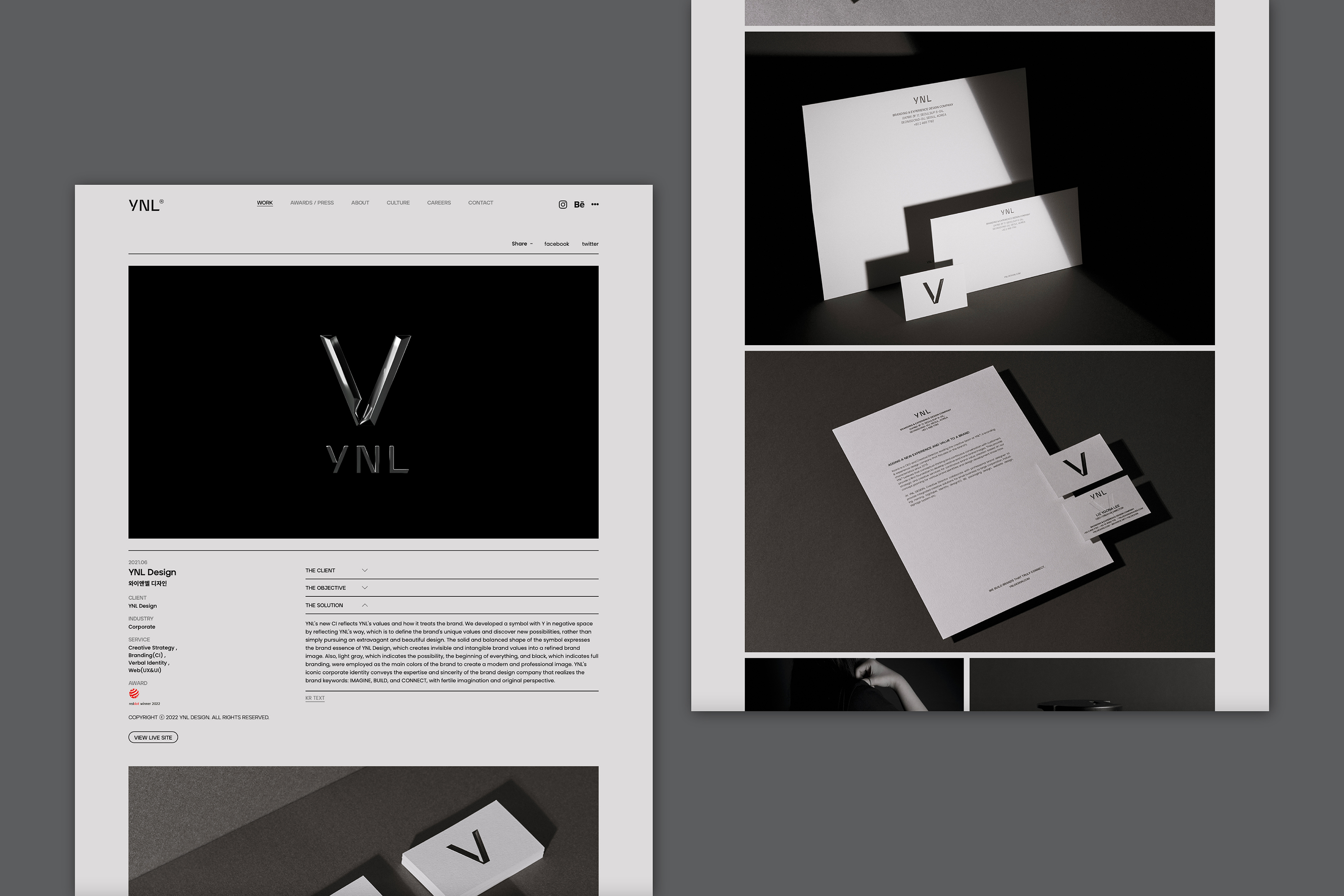
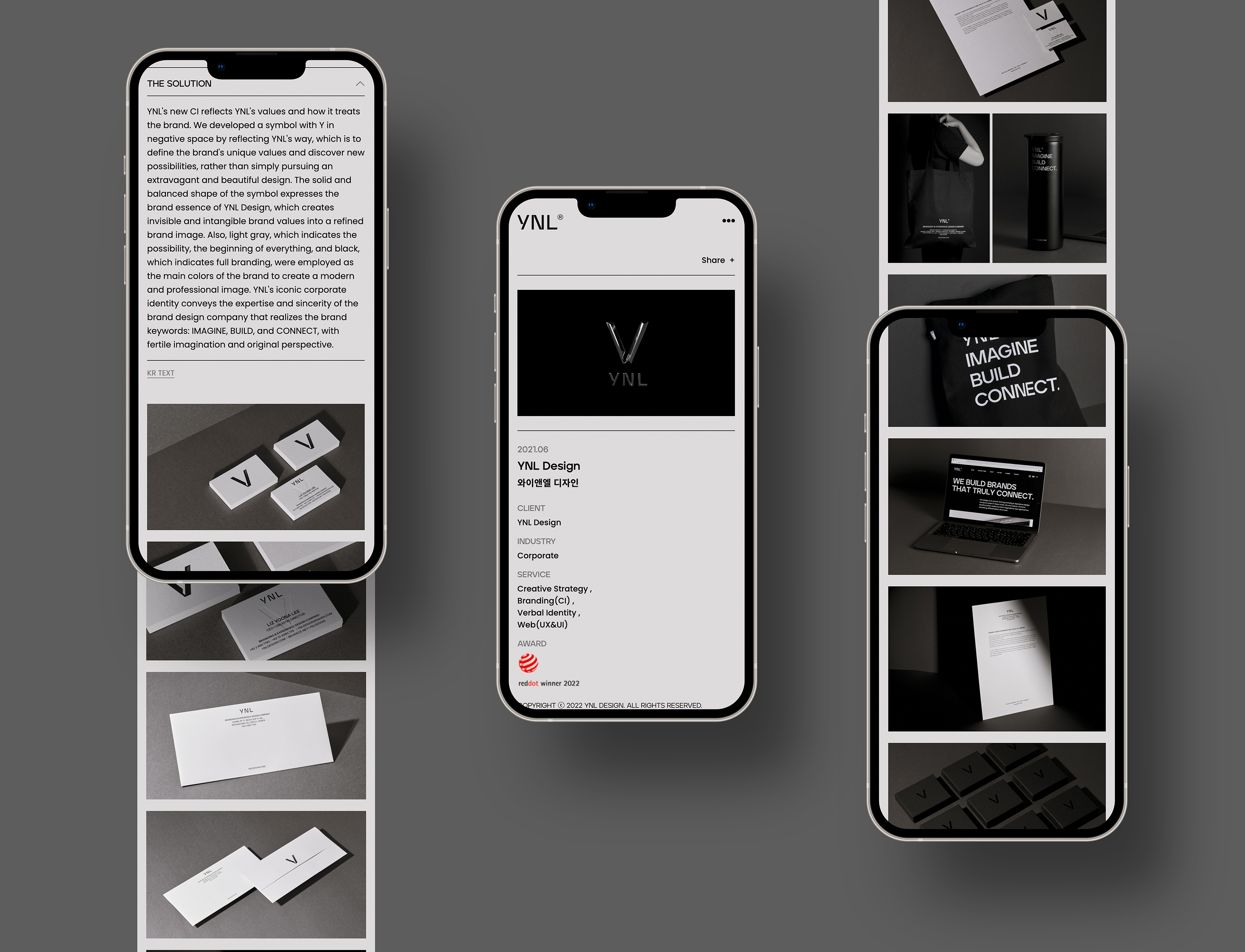
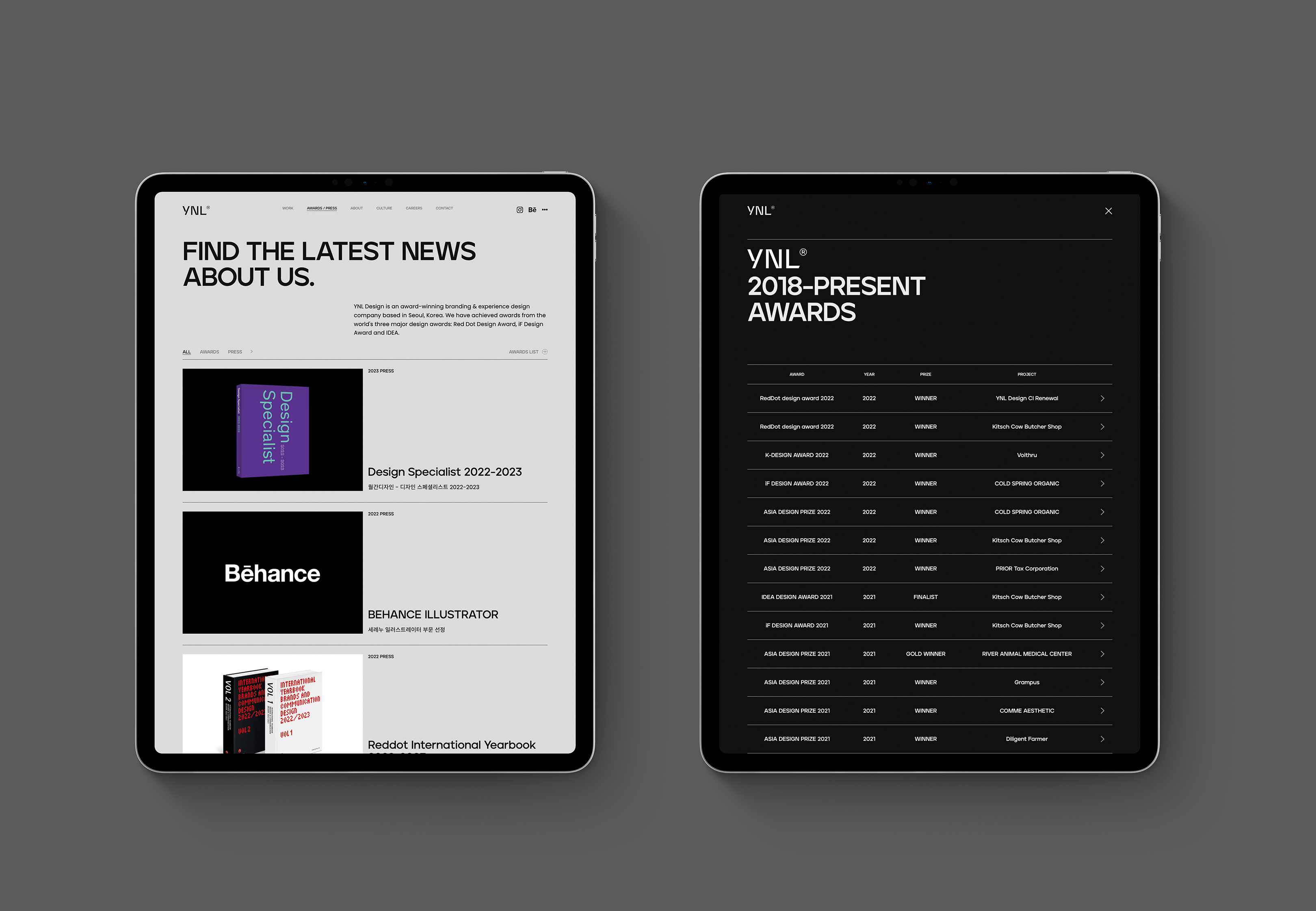
YNL Design developed a new UI/UX of the existing website and mobile site, which had been used for a decade. YNL Design motto is that 'WE BUILD BRANDS THAT TRULY CONNECT.' We provide a special and differentiated brand experience by understanding the essence of the client. We carried out the WEB & MOBILE Web Renewal Design Project to develop a client-centered system and convey YNL Design's professionalism and sincerity. We renewed our sites as a client-oriented platform that can enhance clients' convenience and satisfy users' needs through the formation of subdivided categories by improving the existing project-oriented platform.
YNL Design은 10년 동안 사용되었던 기존의 웹사이트와 모바일 사이트의 새로운 UI/UX를 개발하였습니다. YNL Design의 모토는 '우리는 진정으로 연결되는 브랜드를 구축한다'입니다. 우리는 고객의 본질을 파악하여 특별하고 차별화된 브랜드 경험을 제공합니다. 고객 중심의 시스템을 개발하고 YNL Design의 전문성과 진정성을 전달하기 위해 WEB & MOBILE Web Renewal Design 프로젝트를 수행하였습니다. 기존 프로젝트 중심의 플랫폼을 개선하여 세분화된 카테고리 구성을 통해 고객의 편의성을 높이고 사용자의 요구를 충족할 수 있는 고객 중심의 플랫폼으로 사이트를 리뉴얼하였습니다.
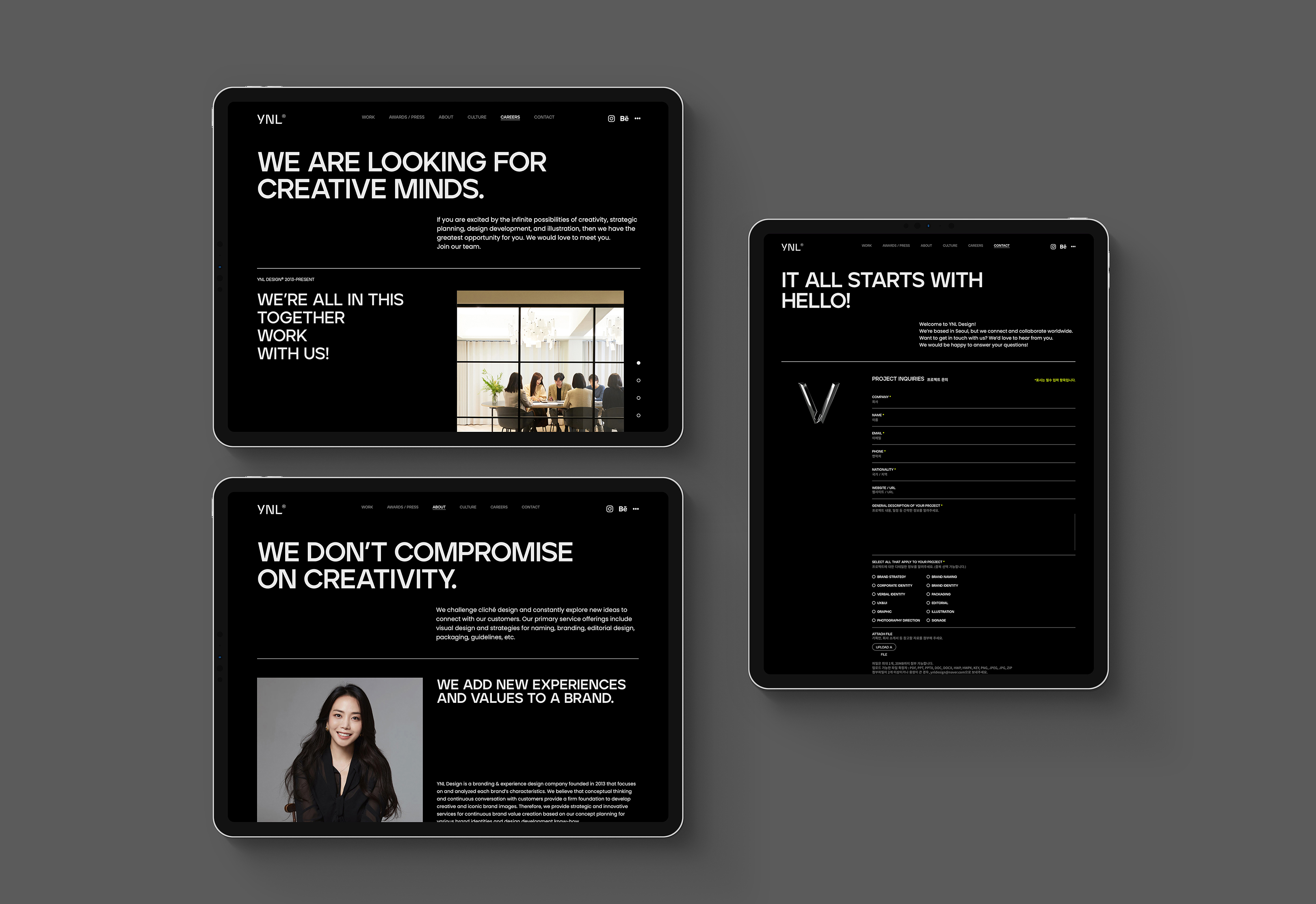
With a clear corporate vision and values, we decided to develop a website that considers the accessibility and convenience of users. Using typography adopted from YNL Design's new CI mainly, we represented a consistent brand identity. We introduced ourselves as a branding agency that provides a diverse and flexible brand experience by producing and showing videos containing YNL Design's content to express the brand's values and vision earnestly. We drew attention by accentuating the monotone main color with neon color and expressed the image of a branding company with a character and imagination.
뚜렷한 기업의 비전과 가치를 지니고, 사용자들의 접근성과 편의성을 고려한 홈페이지 개발을 목표로 하였습니다. YNL Design의 새로운 CI에서 차용한 타이포그래피를 메인으로 활용하여 일관된 브랜드 정체성을 나타냅니다. 브랜드의 가치와 비전을 적극적으로 표현하기 위해 YNL Design의 컨텐츠를 담은 영상을 제작하고 보여줌으로써 다양하고 유연한 브랜드 경험을 제공하는 브랜딩 에이전시로 소개합니다. 모노톤의 메인 컬러에 네온 컬러를 포인트 컬러로 활용하여 이목을 집중시키며 개성과 상상력을 갖춘 브랜딩 전문 회사의 이미지를 표현합니다.
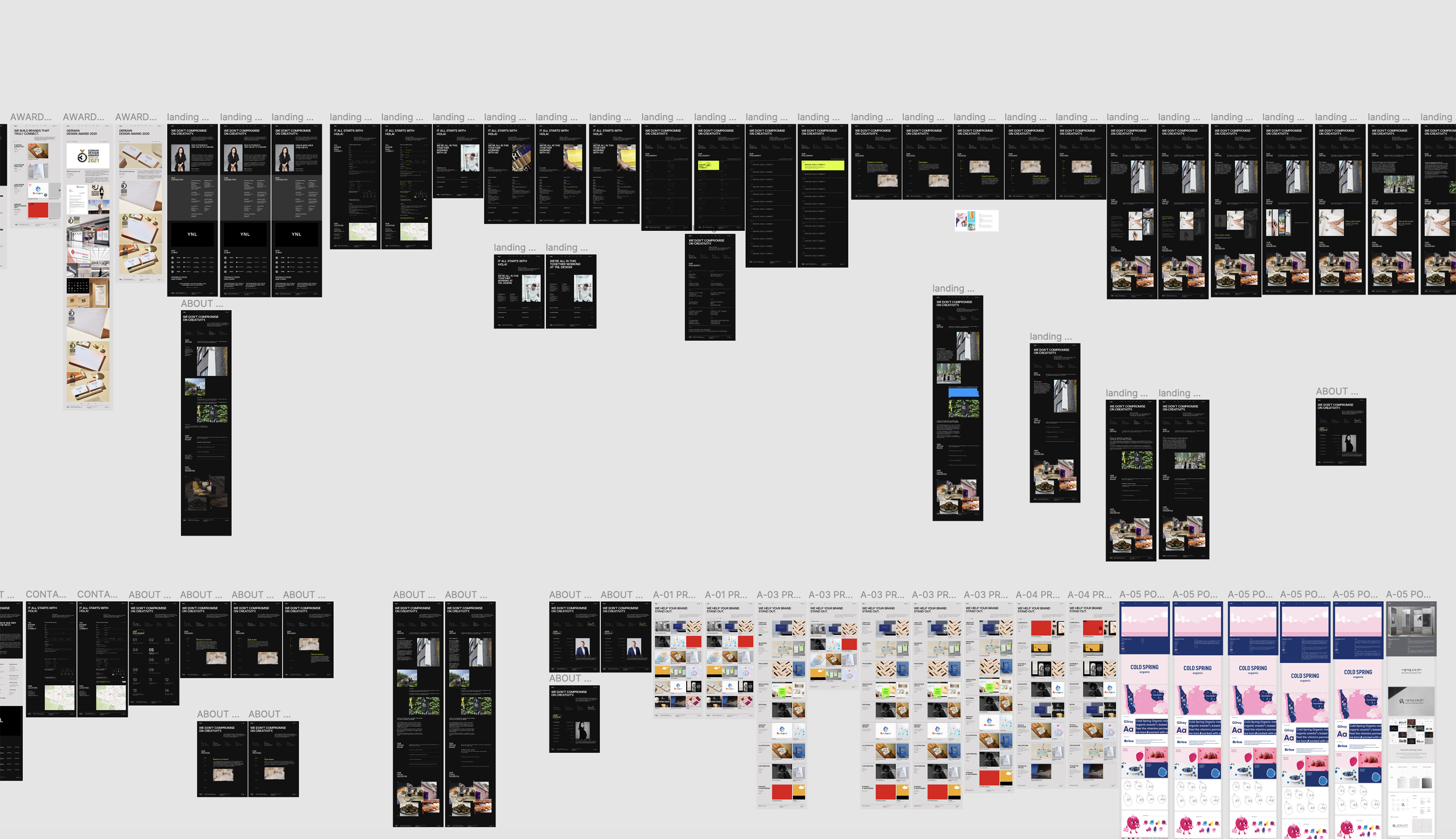
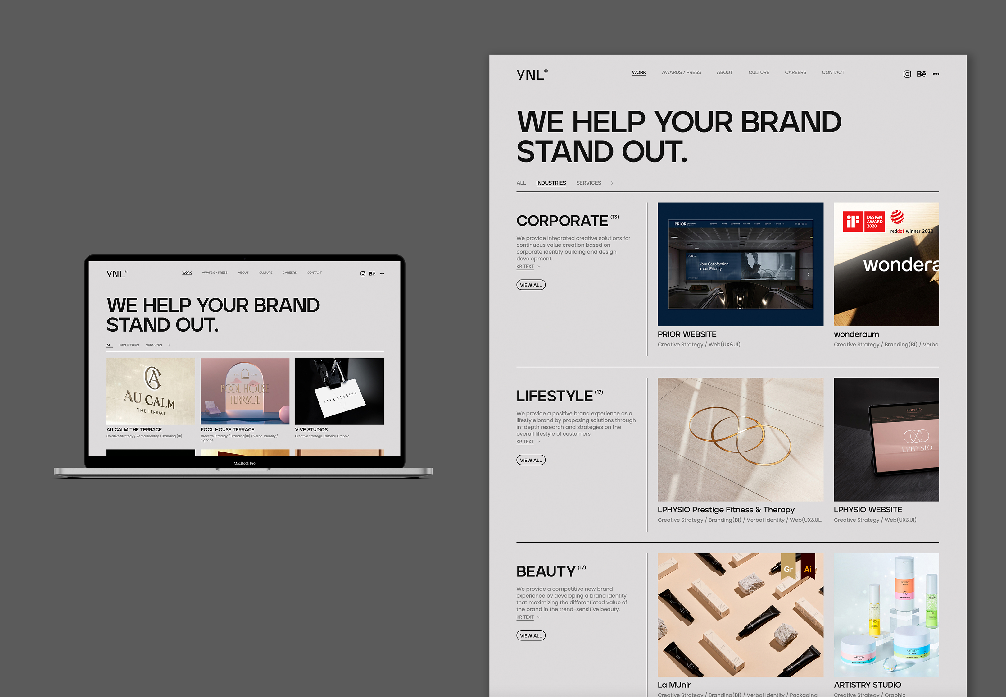
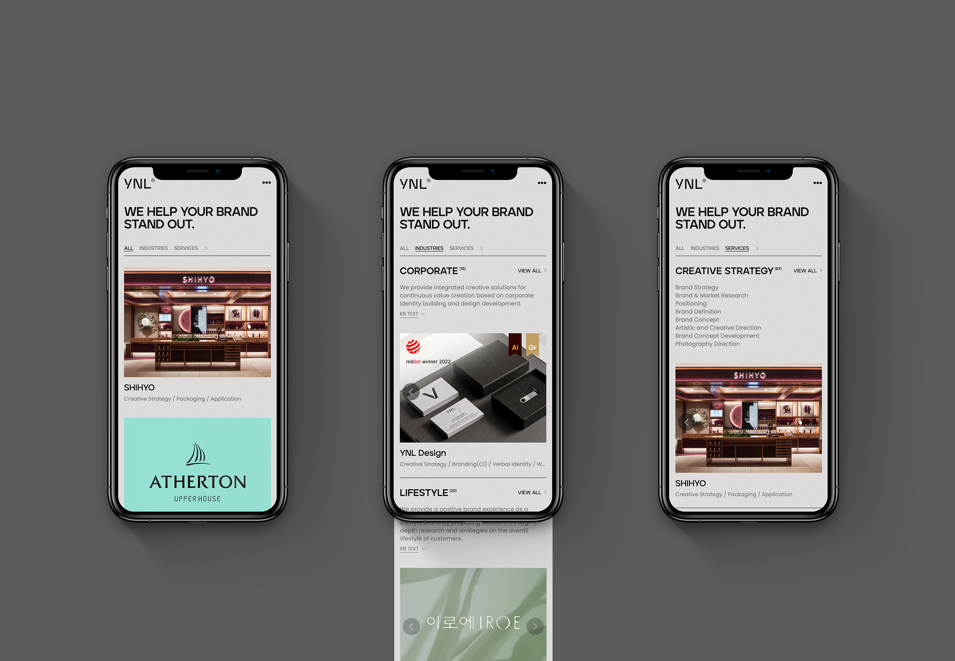
The website is simplified and organized based on a well-thought-out GRID SYSTEM to express the attitudes and values of YNL Design in a minimal and modern way, building YNL Design's own brand identity. It allows users to feel the image of a design company that changes flexibly through interaction with the changing background. By adopting a simple and intuitive menu, we improved users' accessibility. Also, we arranged the information that the client considers essential so that they can be found at a glance to convey the information concisely and clearly. We have created a system environment that eliminates unnecessary information exposure and allows users to obtain information quickly. We allowed users to move naturally through intuitive category configuration and improved convenience in user experience. On the all projects page, we presented various projects at a glance and showed the scope and scalability of YNL Design by separating industry and service sections. We made it easy for users to find information and increased user access to create an environment to learn information swiftly. The grid system used in the PC is also applied to the mobile device to provide an integrated visual experience for each device.
웹사이트는 체계적인 그리드 시스템을 기반으로 절제되고 정돈되어 YNL Design의 태도와 가치관을 미니멀하고 모던하게 표현하여 브랜드 정체성을 구축합니다. 백그라운드가 변화되는 interaction을 통해 유연하게 변화하는 디자인 회사의 이미지를 나타냅니다. 단순하고 직관적인 메뉴 구성은 사용자의 접근성을 높이고, 클라이언트가 중요하게 생각하는 정보를 한눈에 보기 쉽게 배치하여 간결하고, 명확하게 전달합니다. 불필요한 정보 노출을 없애고 사용자가 신속하게 정보를 얻을 수 있는 시스템 환경을 조성하였습니다. 직관적인 카테고리 구성을 통해 사용자들의 자연스러운 이동을 유도하며 사용자 경험에 있어 편리함을 향상시킵니다. 전체 프로젝트 페이지에서는 다양한 프로젝트가 한눈에 들어올 수 있도록 하며 산업과 서비스 섹션을 구분하여 YNL Design의 업무 범위와 확장성을 보여줍니다. 사용자들이 정보를 손쉽게 찾을 수 있도록 하며 사용자의 접근성을 높여 원활한 정보 습득 환경을 조성합니다. PC에서 활용된 그리드 시스템을 모바일에도 적용하여 디바이스별로 통합된 시각 경험을 제공합니다.