LEONE CONSULTING GROUP
Growing Together through Integrated Solutions

LEONE Consulting Group is a professional group rooted in tax expertise, aiming to integrate IT technology into existing tax services to not only enhance business efficiency but also elevate customer satisfaction through an all-in-one service solution. By expanding to include tax firms, IT firms, and HR consulting around the consulting group, we strive to grasp the diverse needs of customers comprehensively and propose high-satisfaction solutions tailored to their current situations.
리원 컨설팅 그룹은 세무 실력이 근본이 되는 전문가 그룹으로서, 기존 세무 서비스에 IT 기술을 접목시켜 업무의 효율성뿐만 아니라 고객의 만족도를 높일 수 있는 통합 솔루션(All-in-one service) 기업을 지향합니다. 컨설팅 그룹을 중심으로 세무법인, IT법인, 인사노무로 확장하여 고객의 다양한 니즈를 입체적으로 파악하고 고객 현황에 맞는 만족도 높은 솔루션을 제안하는 기업으로 나아가고자 합니다.
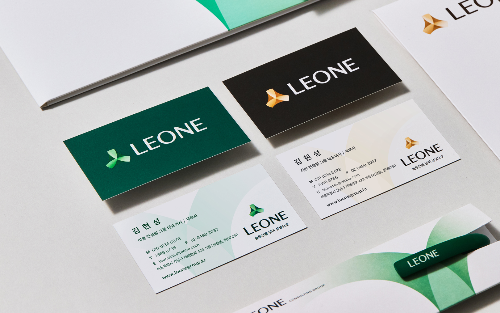
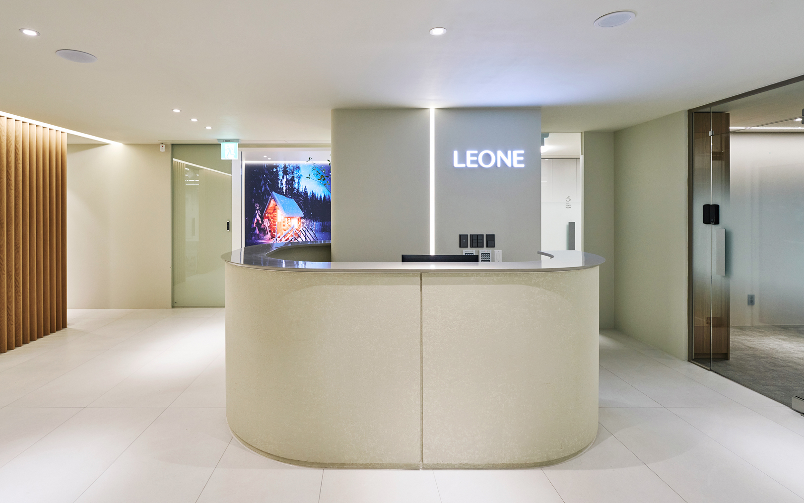
Leone Consulting Group needed a distinctive identity and image to develop and secure its competitiveness in the market. To appeal to customers with the brand's unique value proposition, a clear concept considering both functionality and emotion was developed. Trustworthy naming, appealing to professionalism and service strengths intuitively, along with a differentiated look and feel from traditional tax firms, through friendly and trendy BI design, aims to engrave the brand as authentic to customers.
리원 컨설팅 그룹의 차별화된 정체성과 이미지를 개발하고 시장에서의 경쟁력을 확보할 수 있는 브랜드 아이덴티티가 필요했습니다. 브랜드 고유의 가치를 고객에게 매력적으로 어필하기 위해, 기능과 감성을 모두 고려한 명확한 컨셉을 개발하고, 전문성과 서비스의 강점을 직관적으로 어필할 수 있는 신뢰감 있는 네이밍과 기존의 세무법인과는 차별화 된 룩앤필의 친근하고 트렌디한 BI 디자인으로 고객들에게 진정성 있는 브랜드로 각인시키고자 합니다.
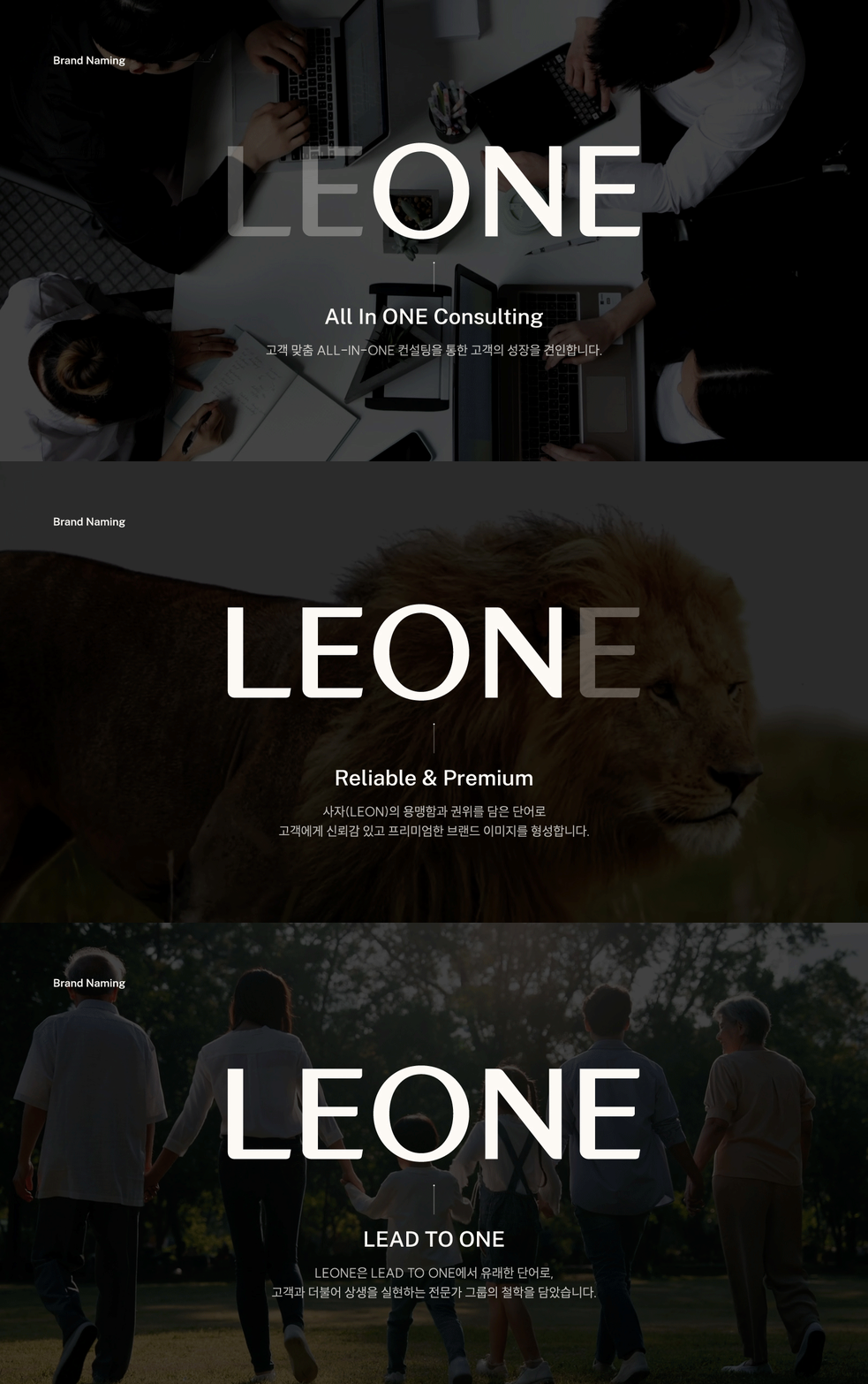
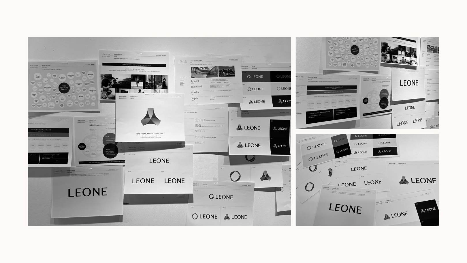
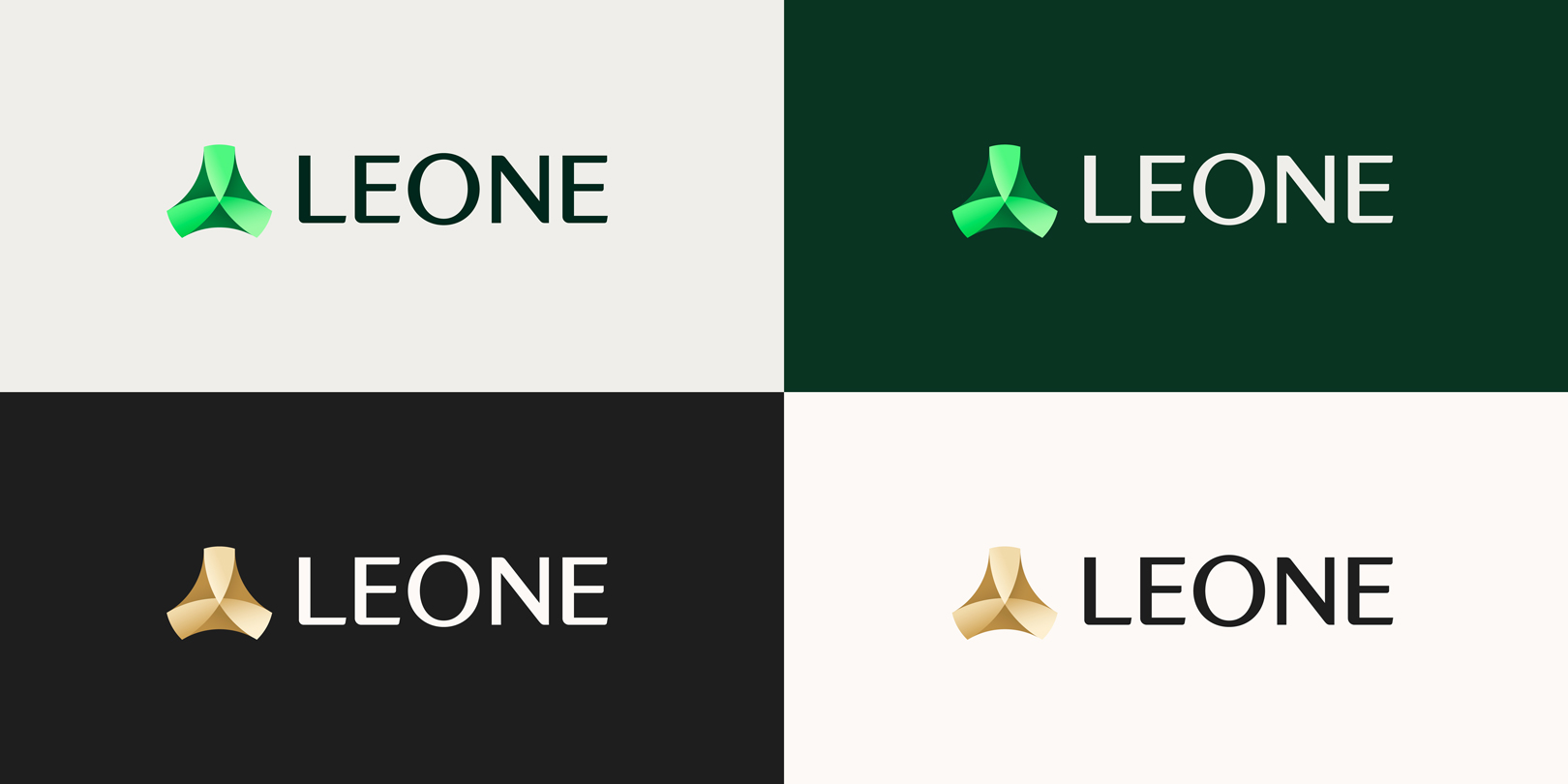
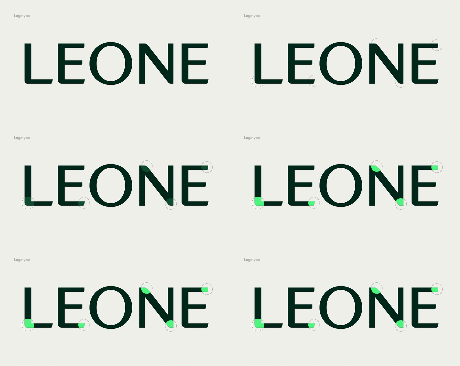
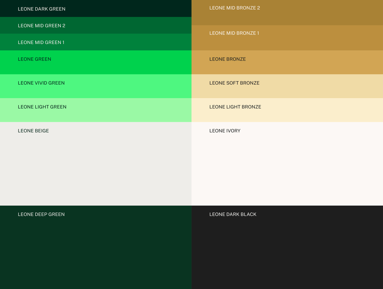
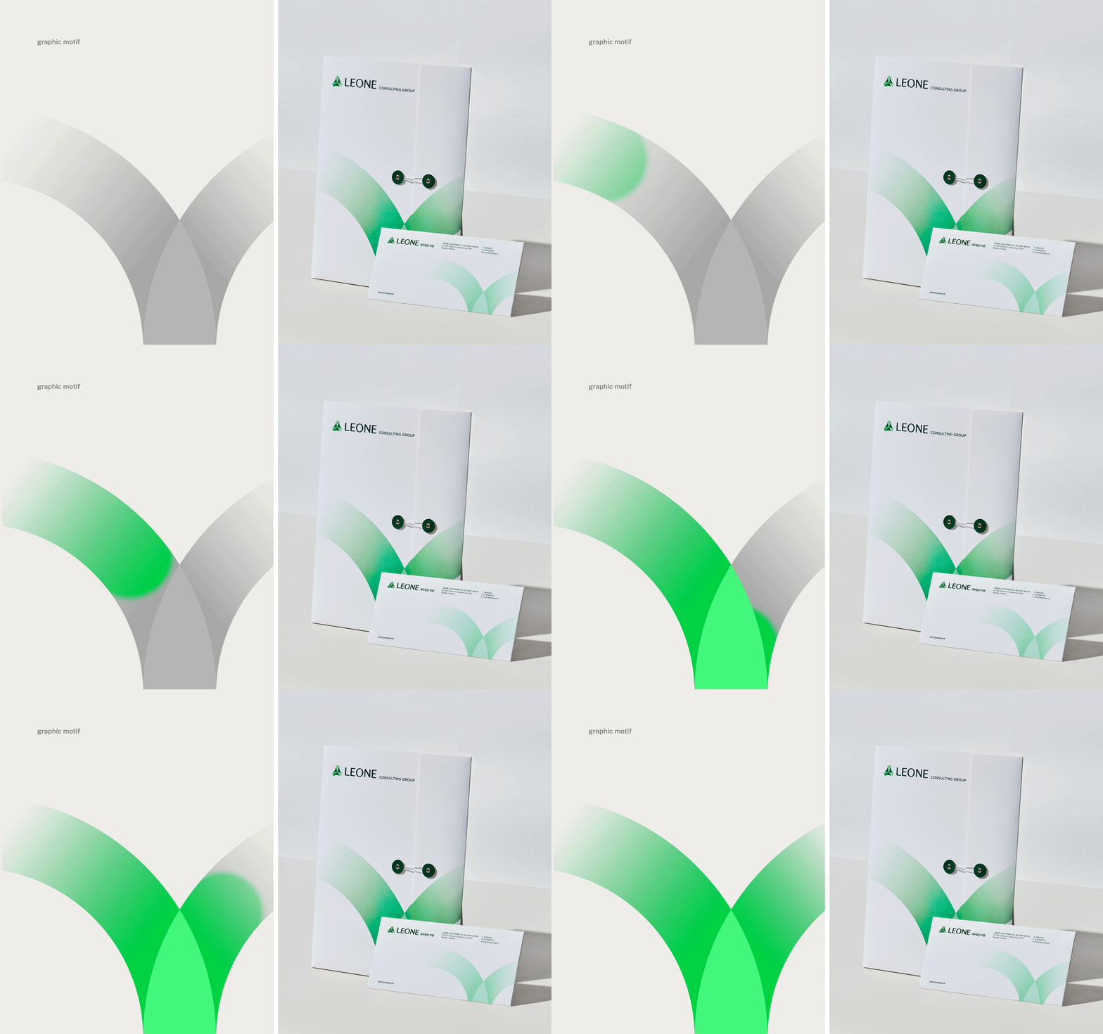
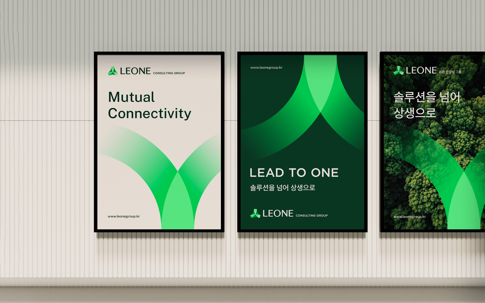
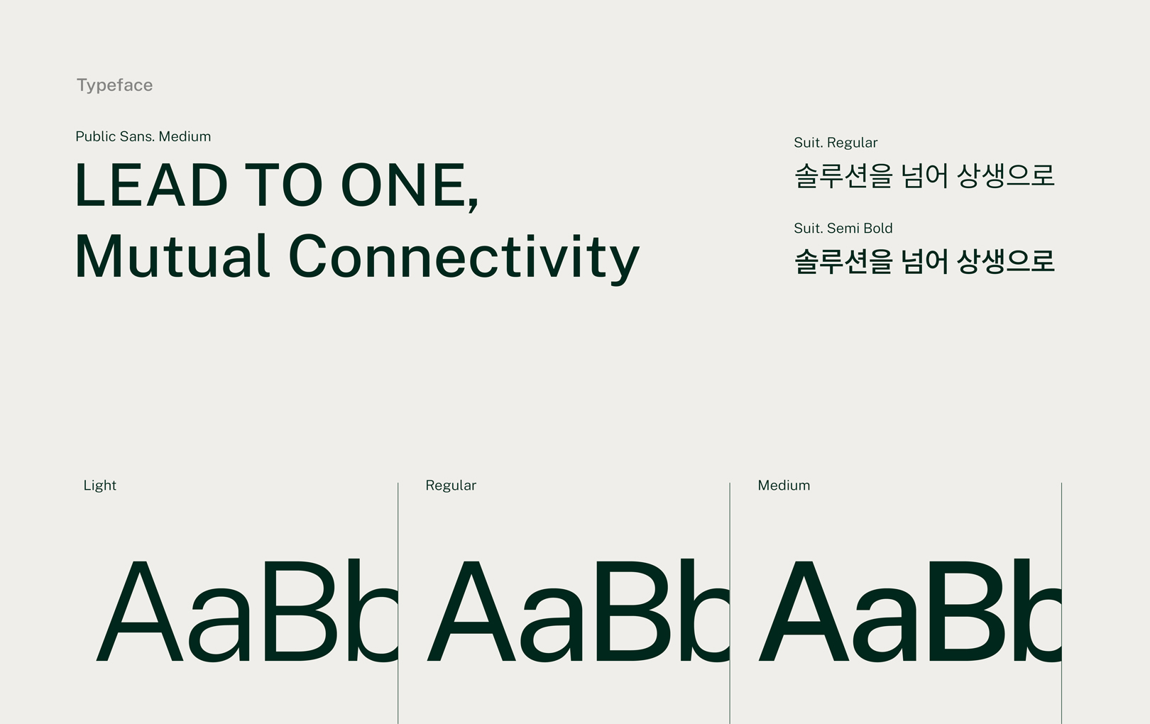
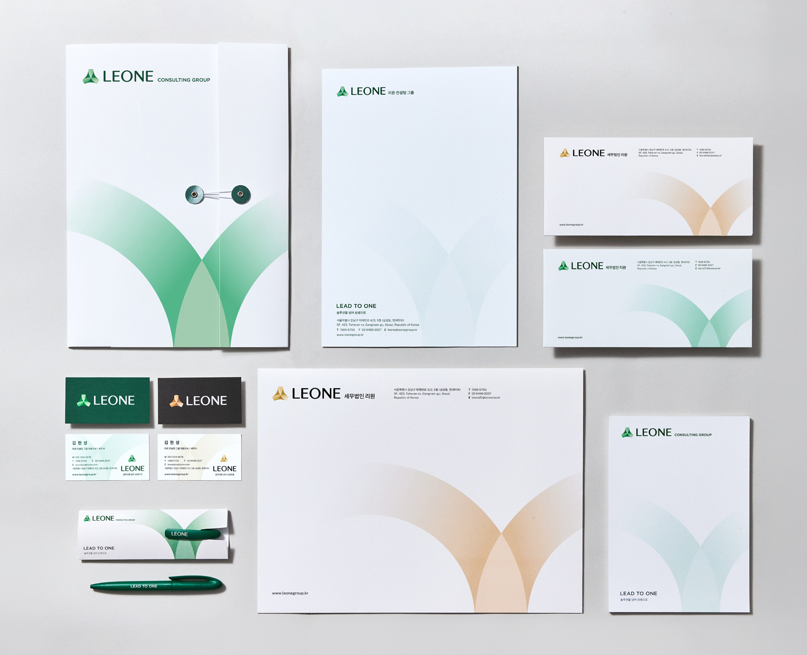
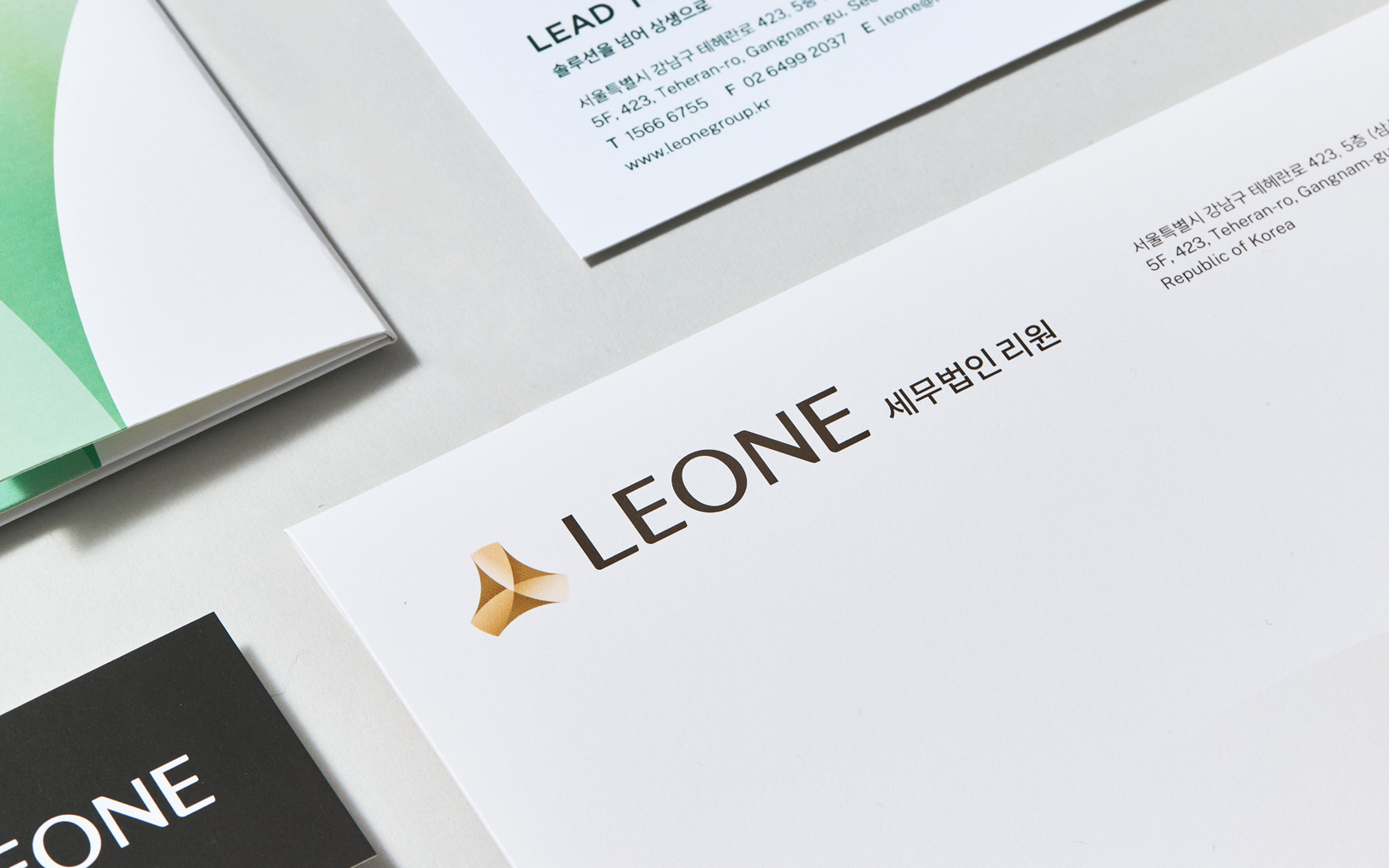
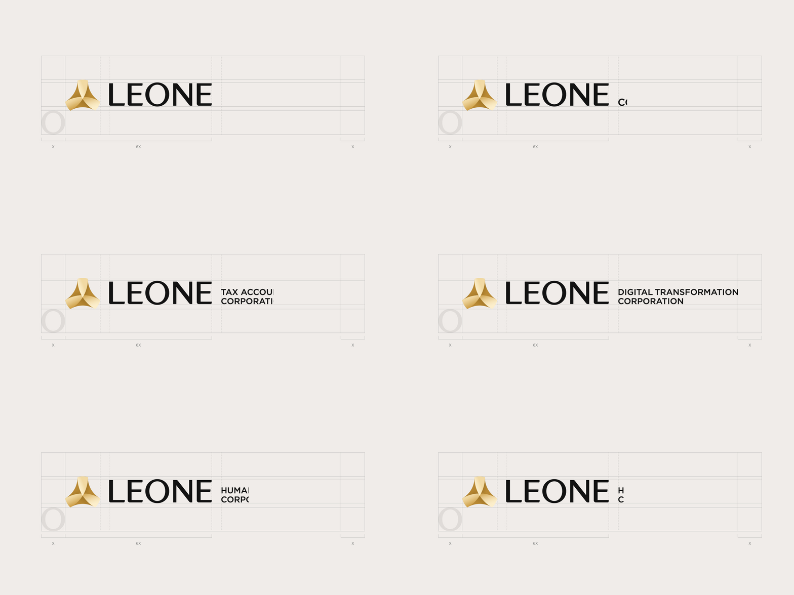
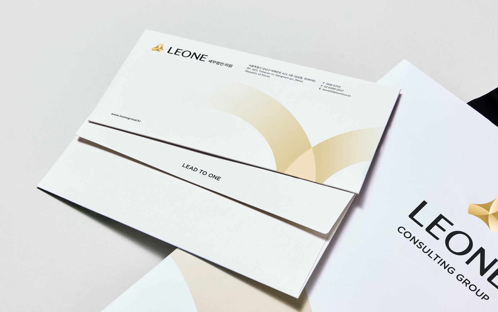
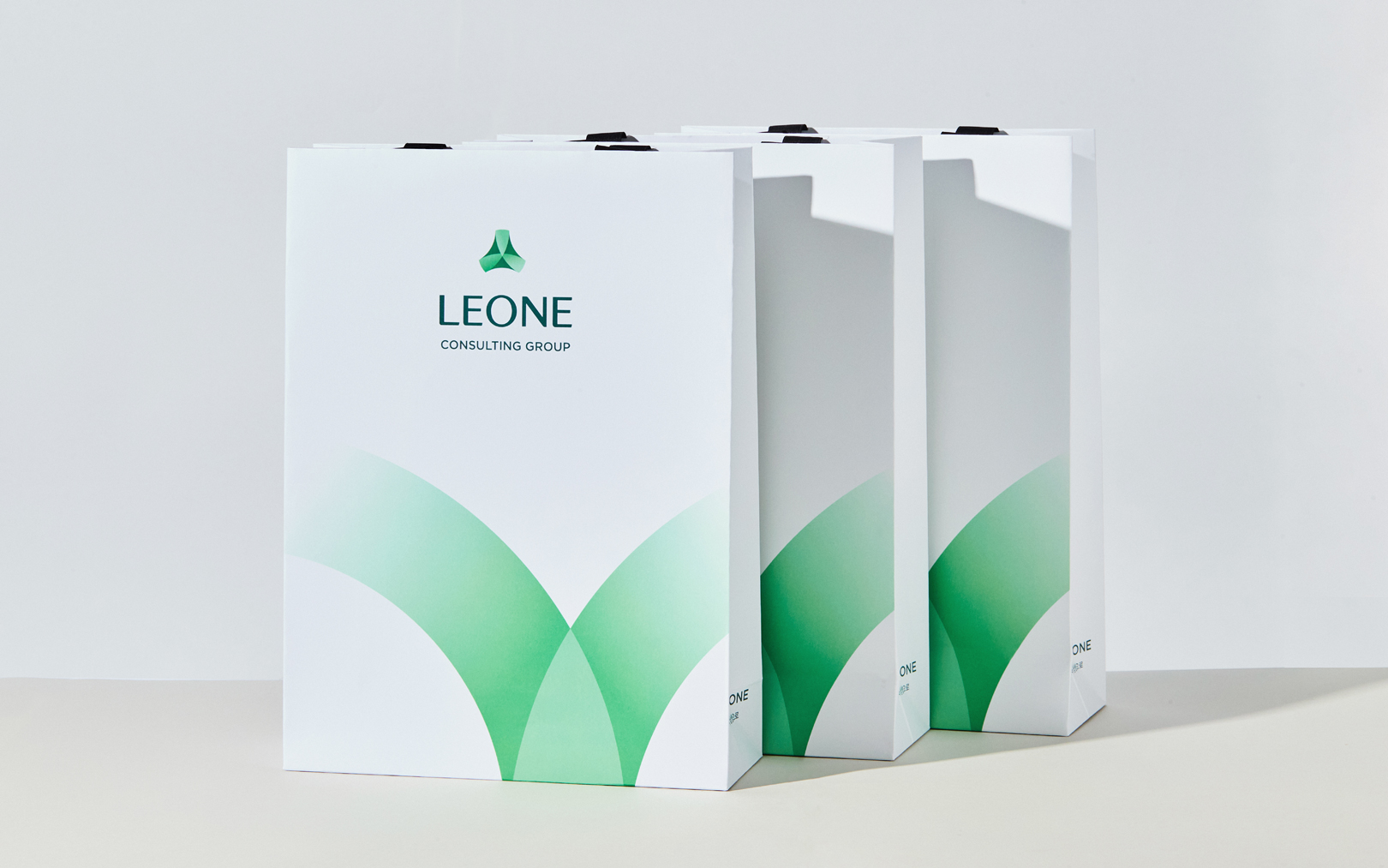
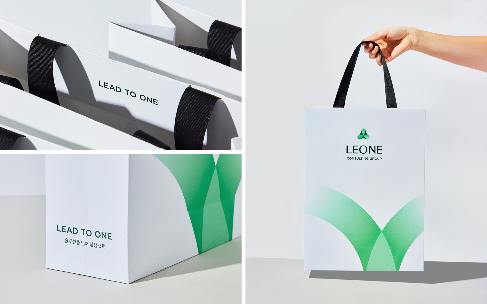
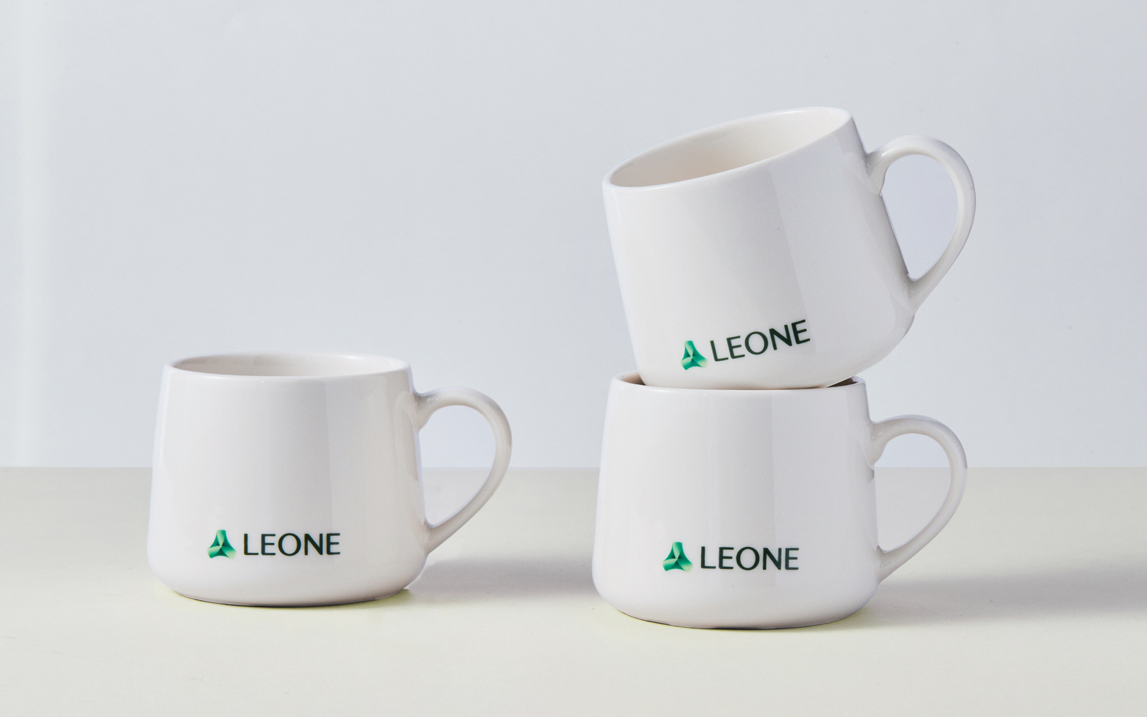
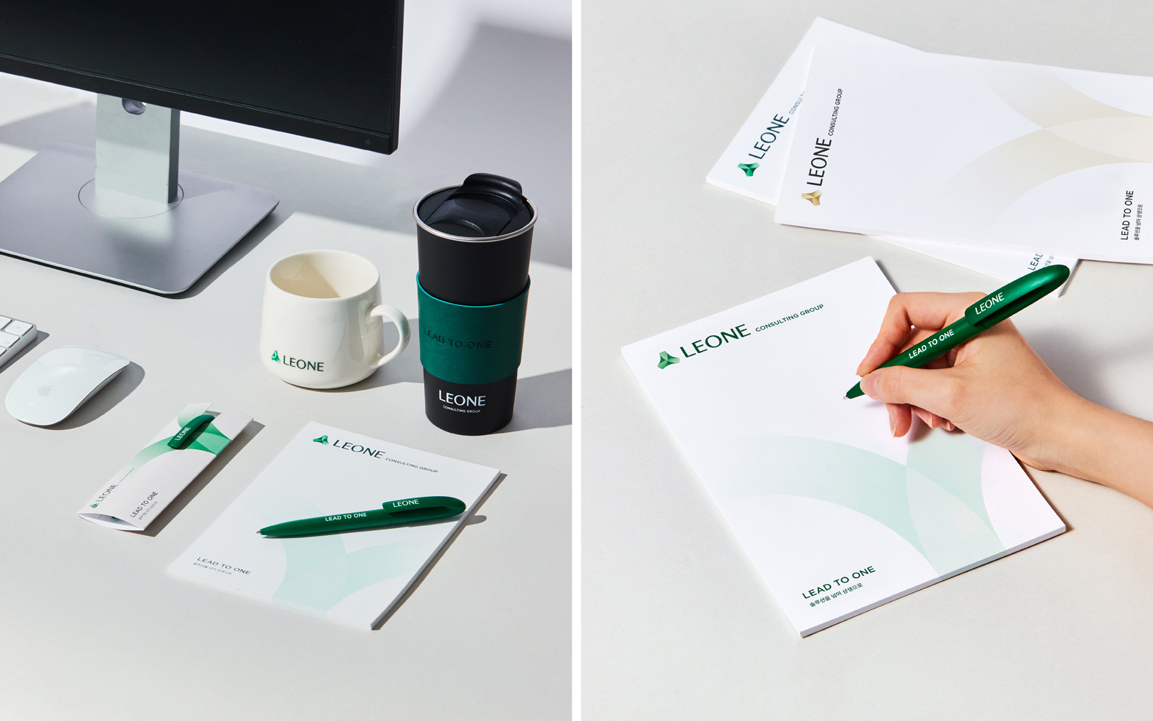
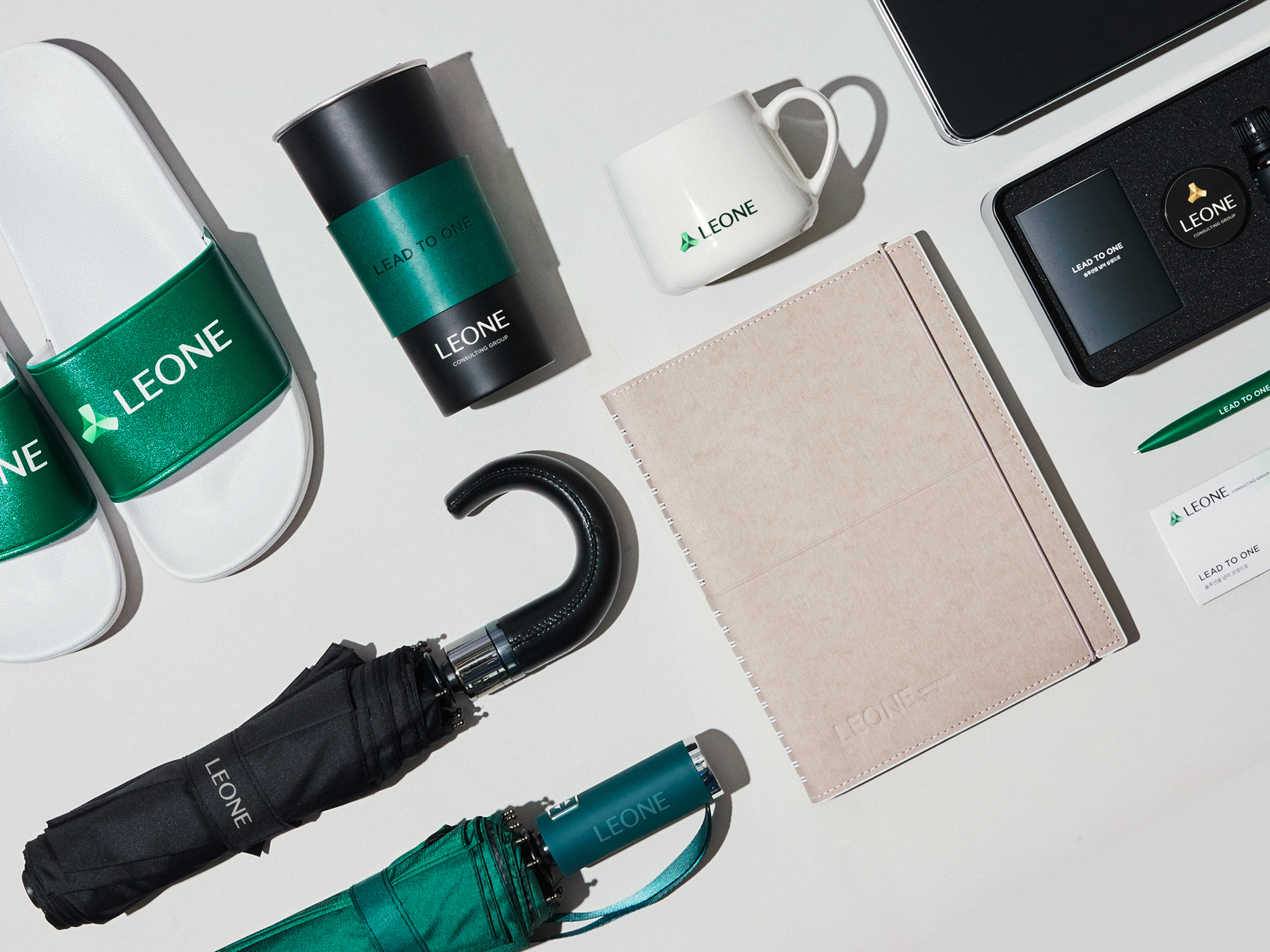
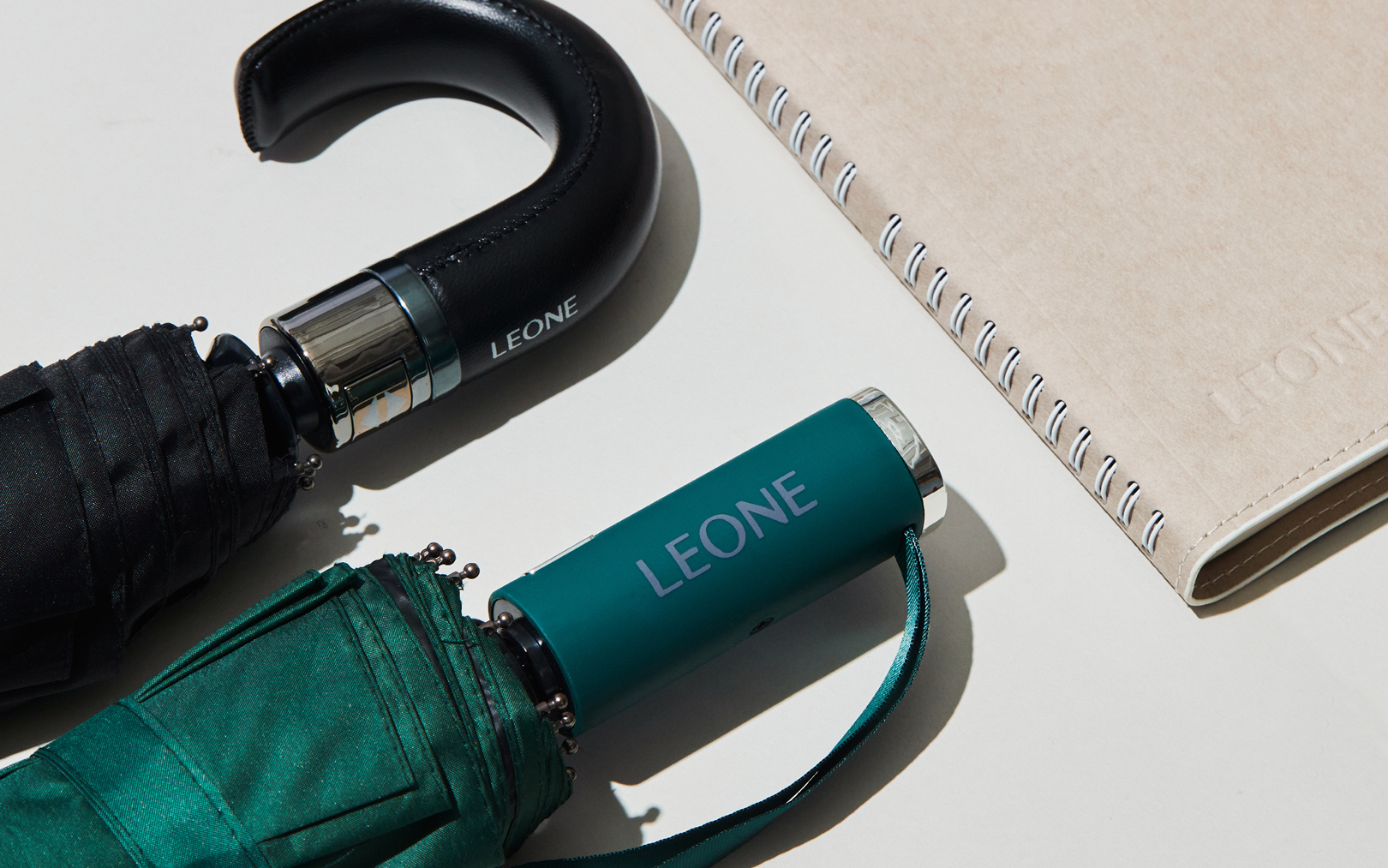
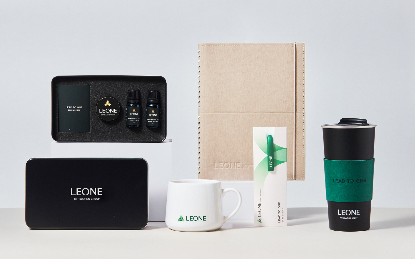
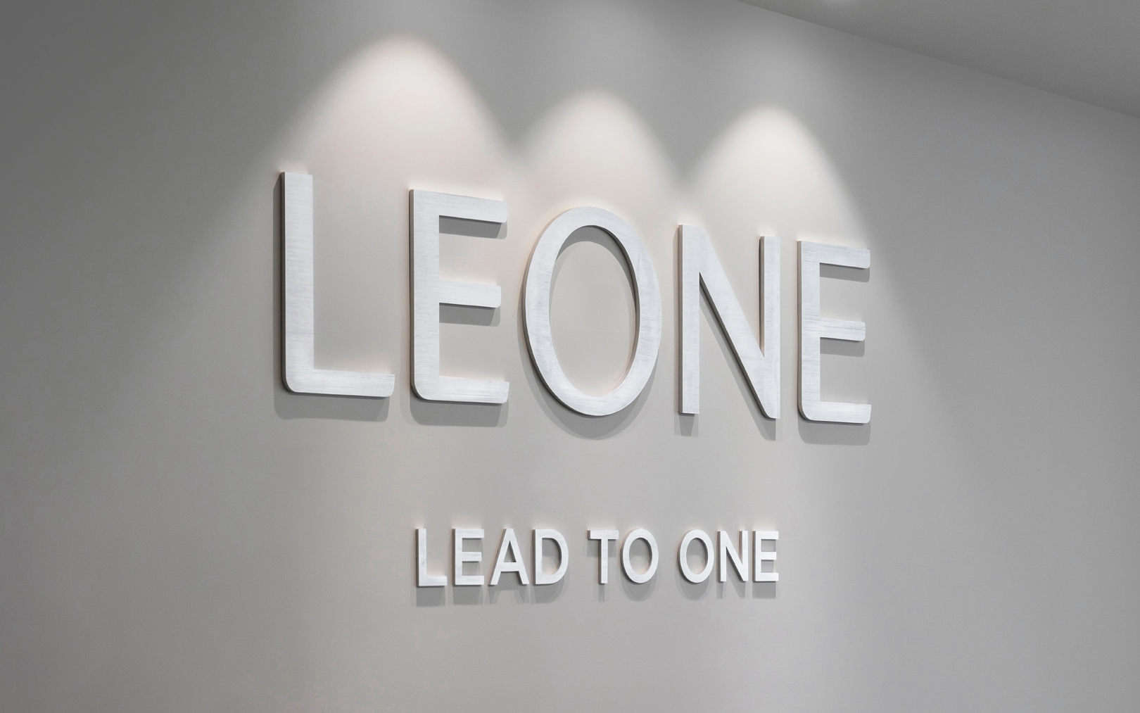
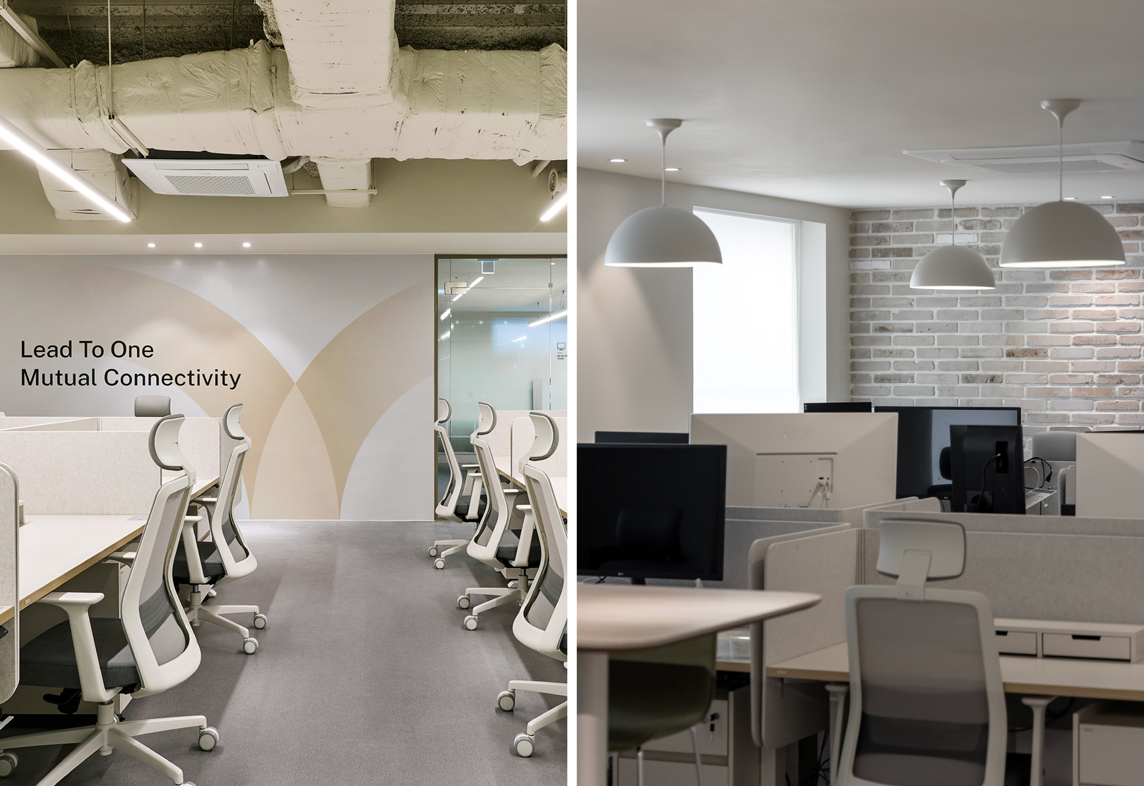
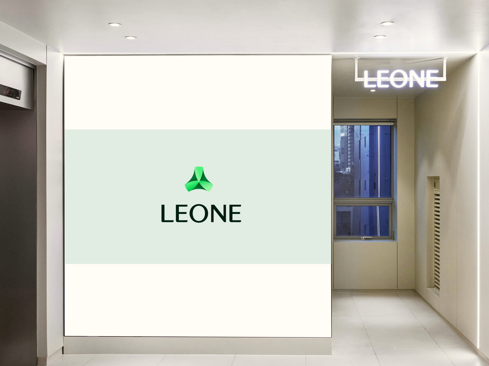
YNL Design defined LEONE Consulting Group as a sincere comprehensive consulting group embodying the value of mutual prosperity, and developed a brand identity that realizes values of co-prosperity along with customer growth through the slogan 'LEAD TO ONE'. The name 'LEONE', derived from Lead to One, expresses the group's authenticity in aiding customer growth with outstanding solutions. The logo type, based on the modern sans-serif font of LEONE Consulting Group, expresses a contemporary representation of the consulting group's image, combining approachability with professionalism and trust. The symbol embodies three interconnected circles representing customer-centric service, IT-based systems, and the synergy among customers, members, and partner companies, creating LEONE's unique value. The motif extends from the symbol to convey the value of co-prosperity, symbolizing growth and elevation alongside LEONE. LEONE Consulting Group's color system consists of bronze and green. The dignified and trustworthy bronze color system conveys the image of a premium group delivering the best services, while the vibrant green color system communicates a warm image of being future-oriented and pursuing values of co-prosperity.
YNL Design은 리원 컨설팅 그룹을 상생의 가치를 실현하는 진정성 있는 종합 컨설팅 그룹으로 정의했으며 ‘LEAD TO ONE’ 이라는 슬로건을 기반으로 프로페셔널하고 리더십있는, 올인원 솔루션을 통해 고객의 성장과 더불어 상생의 가치를 실현하는 브랜드 아이덴티티를을 개발했습니다. 이로울 ‘리(利)‘와 도울 ‘원(援)’의 한자를 기반으로 만들어진 리원의 네임은 탁월한 솔루션으로 고객의 성장을 돕는 그룹의 진정성을 표현하고 있습니다. 영문 네임 Leone은 Lead to One에서 유래한 단어로, 고객과 더불어 상생을 실현하는 전문가 그룹의 철학을 담았습니다. 로고타입은 리원 컨설팅 그룹의 모던한 산세리프 서체를 기반으로 친근하면서도 전문성과 신뢰감이 느껴지는 컨설팅 그룹의 이미지를 현대적으로 표현하였으며, 심볼은 고객중심의 서비스과 IT 기반 시스템 그리고 고객, 구성원, 파트너사의 상생의 장을 뜻하는 3가지의 원이 연결되고 융합하여 LEONE만의 가치를 만들어내는 모습을 담고 있습니다. 모티브는 심볼에서 확장하여, LEONE과 함께 성장하고 상승하는 형태로 상생의 가치를 전달합니다. 리원 컨설팅 그룹의 컬러 시스템은 브론즈 컬러와 그린 컬러 두가지로 구성하였습니다. 진중하고 신뢰감있는 브론즈 컬러 시스템을 통해 최상의 서비스를 전달하는 프리미엄한 그룹의 이미지를 전달하고, 생동감 넘치는 그린 컬러 시스템을 통해 미래지향적이고 상생의 가치를 추구하는 따스한 그룹의 이미지를 전달합니다.