MINGLO
Where People, Culture and Space Mingle

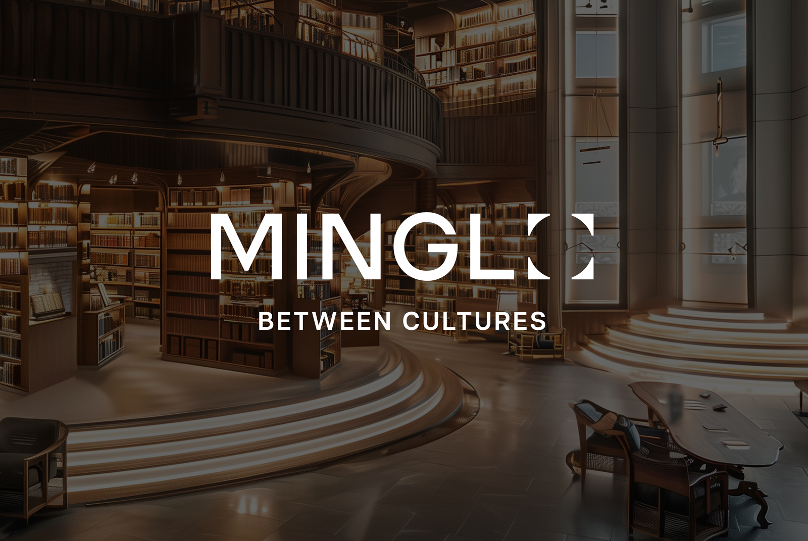
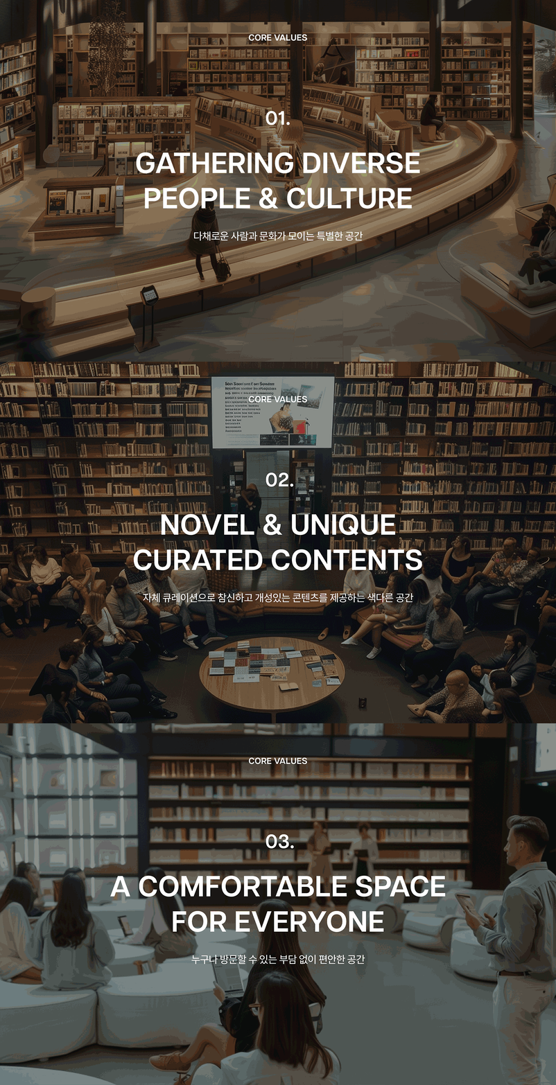
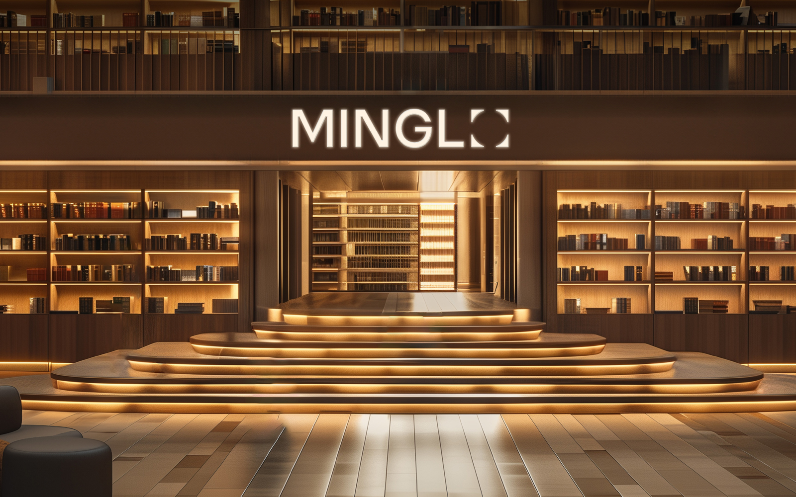
MINGLO transcends the traditional bookstore, embodying a composite cultural trend. As a premium lifestyle brand, it offers genuine relaxation and rejuvenation through a diverse range of content, not just books. MINGLO is a space where people and cultures harmoniously coexist, seamlessly infusing sophisticated sensibilities and vibrant inspirations into customers' daily lives. Moreover, it serves as an inclusive platform that anyone can access, becoming a hub for experiencing unprecedented, high-dimensional culture.
MINGLO는 단순한 서점을 넘어선 복합문화 트렌드를 지향하는 공간으로, 도서뿐만 아니라 다양한 콘텐츠와 함께 누리는 진정한 휴식과 새로운 활력을 선사하는 프리미엄 라이프스타일 브랜드입니다. 이 곳은 사람과 사람, 문화가 조화롭게 어우러진 풍부한 경험이 공존하는 공간으로, 세련된 감성과 다채로운 영감을 고객의 일상에 자연스럽게 스며들게 합니다. 더불어, 누구에게나 열려 있고 언제나 방문하고 싶은 플랫폼으로서 이제껏 보지 못한 새로운 고차원적 문화를 경험할 수 있는 문화의 구심점입니다.
As a brand pioneering the relatively unfamiliar concept of a 'bookstore-based composite cultural space' domestically, there was a need for a unique and comprehensive identity capable of encompassing various contents. From naming to verbal and visual identities, the focus was to consistently convey the brand message of a 'colorful space where people, culture, and place converge'.
국내에서는 아직 생소한 ‘서점 기반 복합문화공간’이라는 문화 트렌드를 선도하는 브랜드로서, 유니크하며 다양한 콘텐츠를 포괄할 수 있는 아이덴티티 설계가 필요했습니다. 네이밍을 비롯한 버벌 아이덴티티부터 비주얼 아이덴티티까지 모두 ‘사람, 문화, 공간이 모이는 다채로운 공간’이라는 브랜드 메세지에 집중해 일관적으로 표현하고자 했습니다.
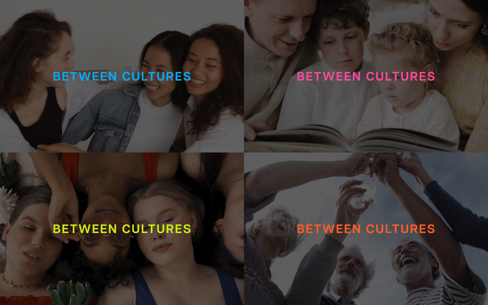
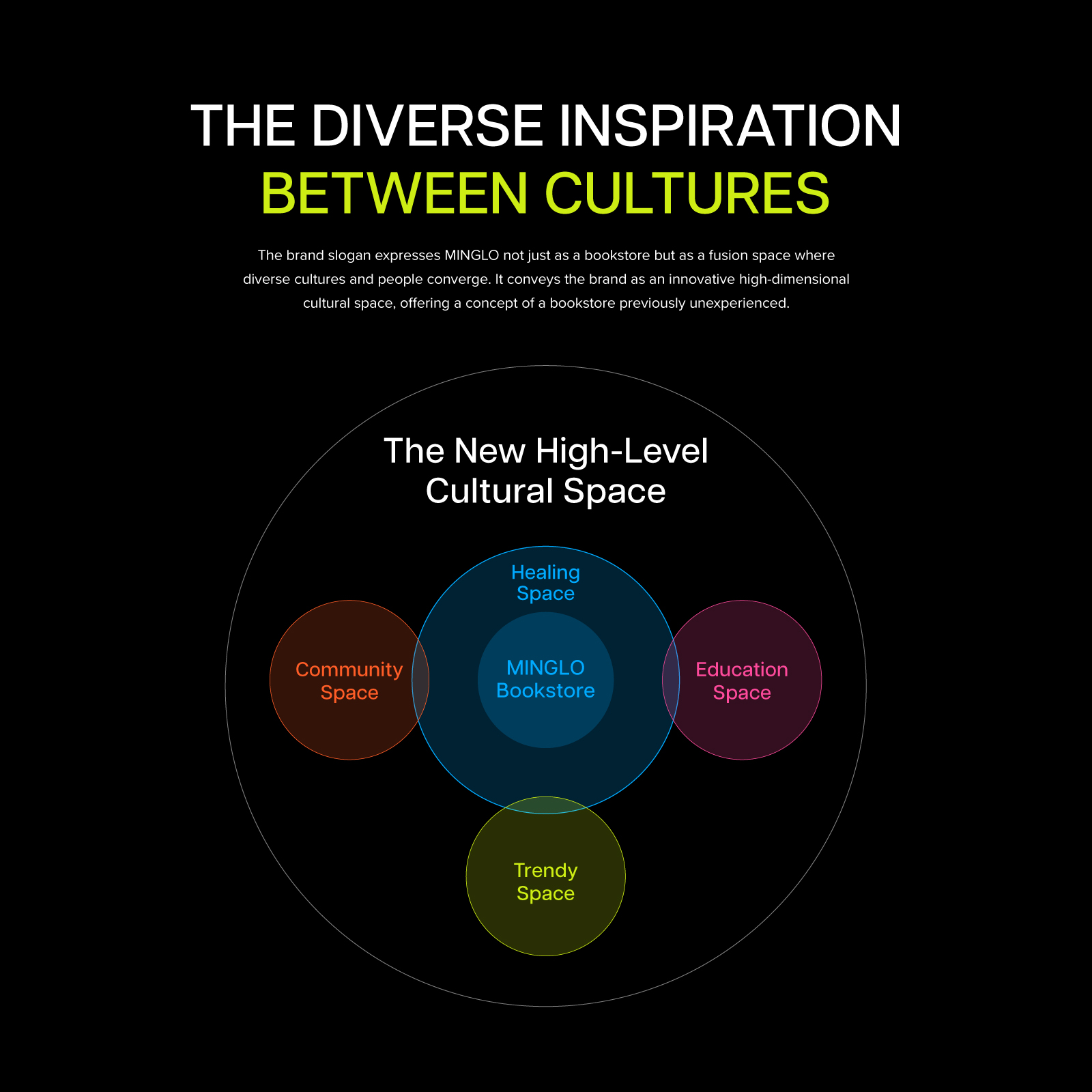
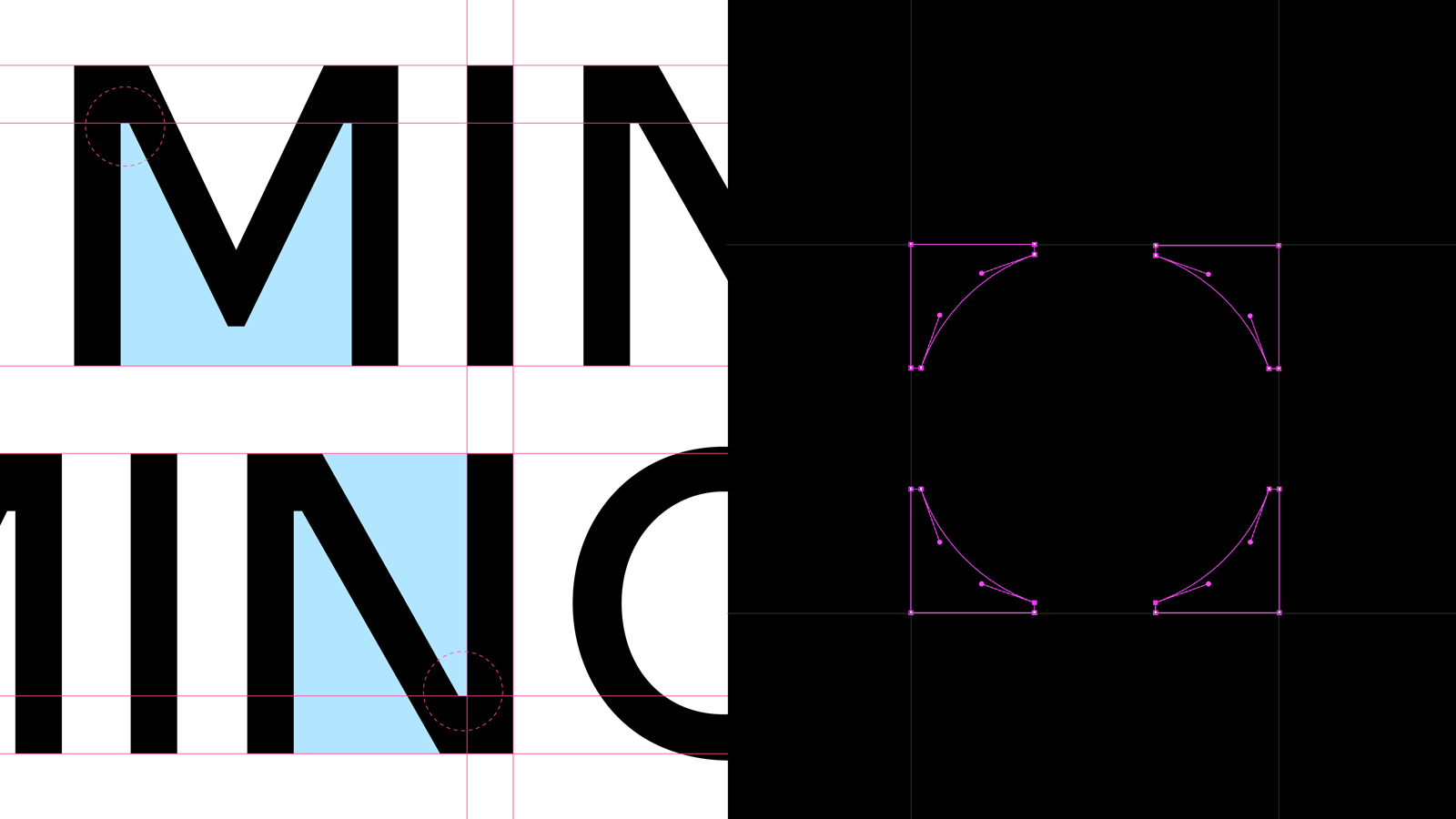
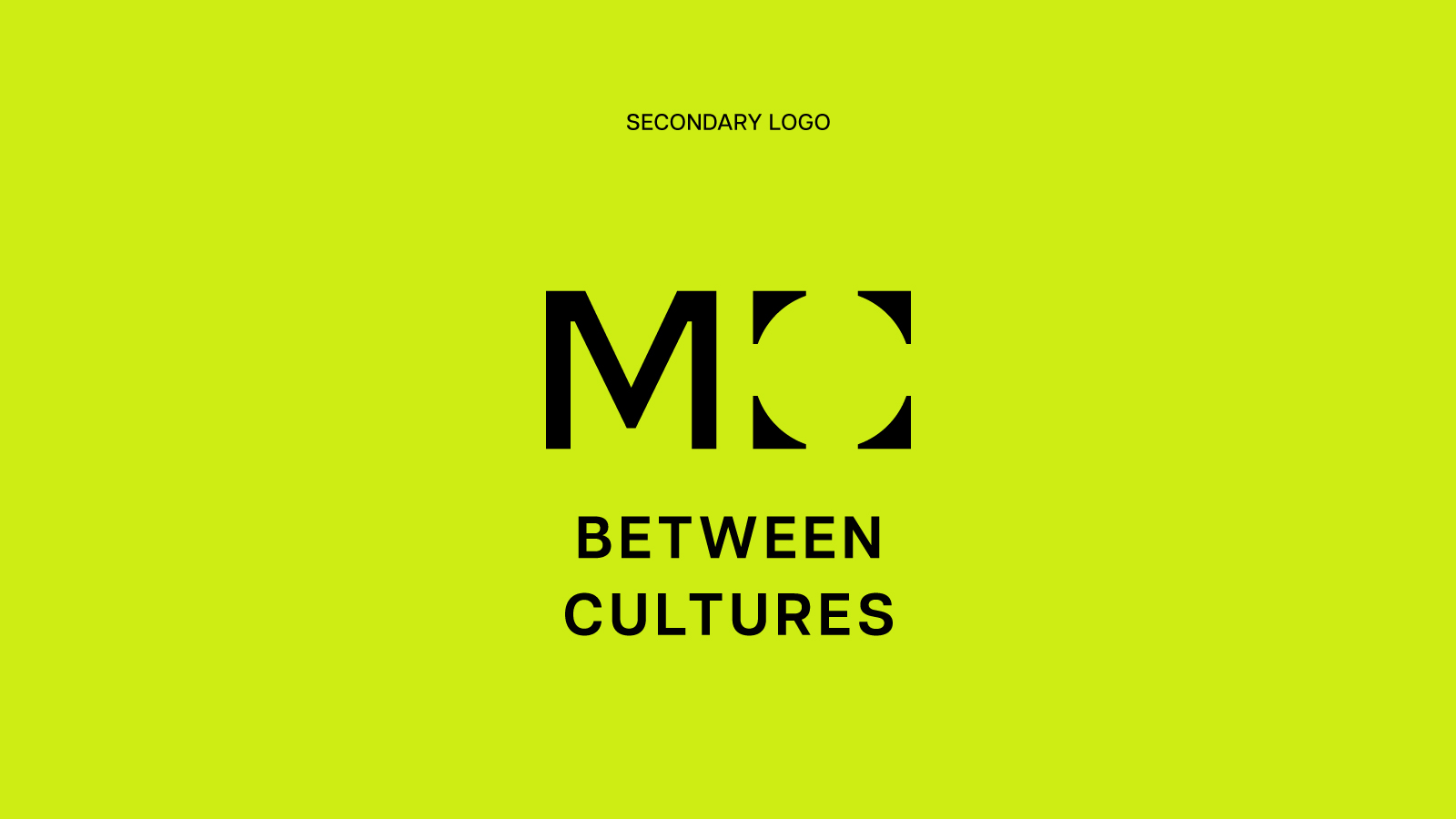
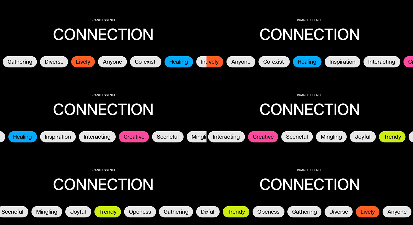
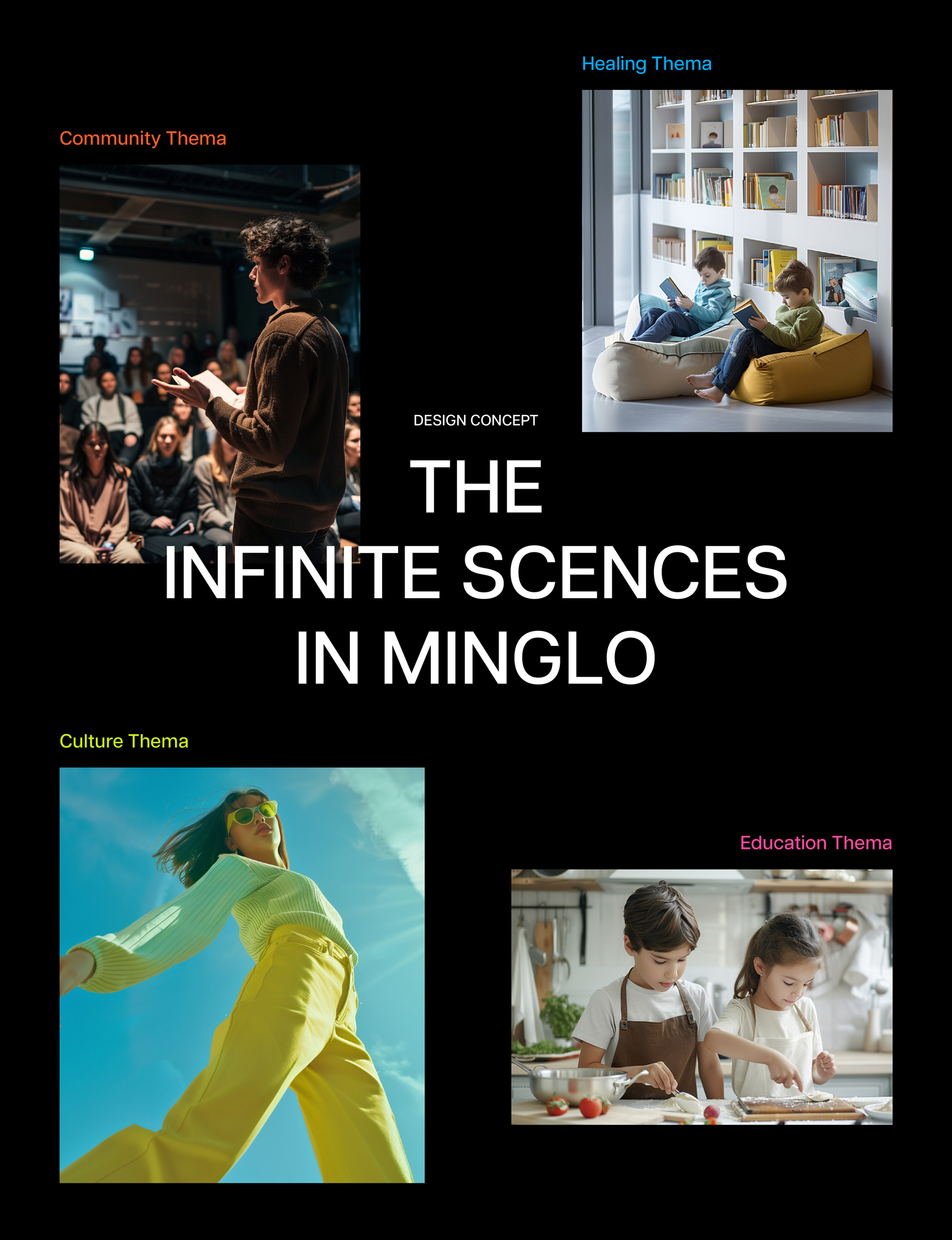
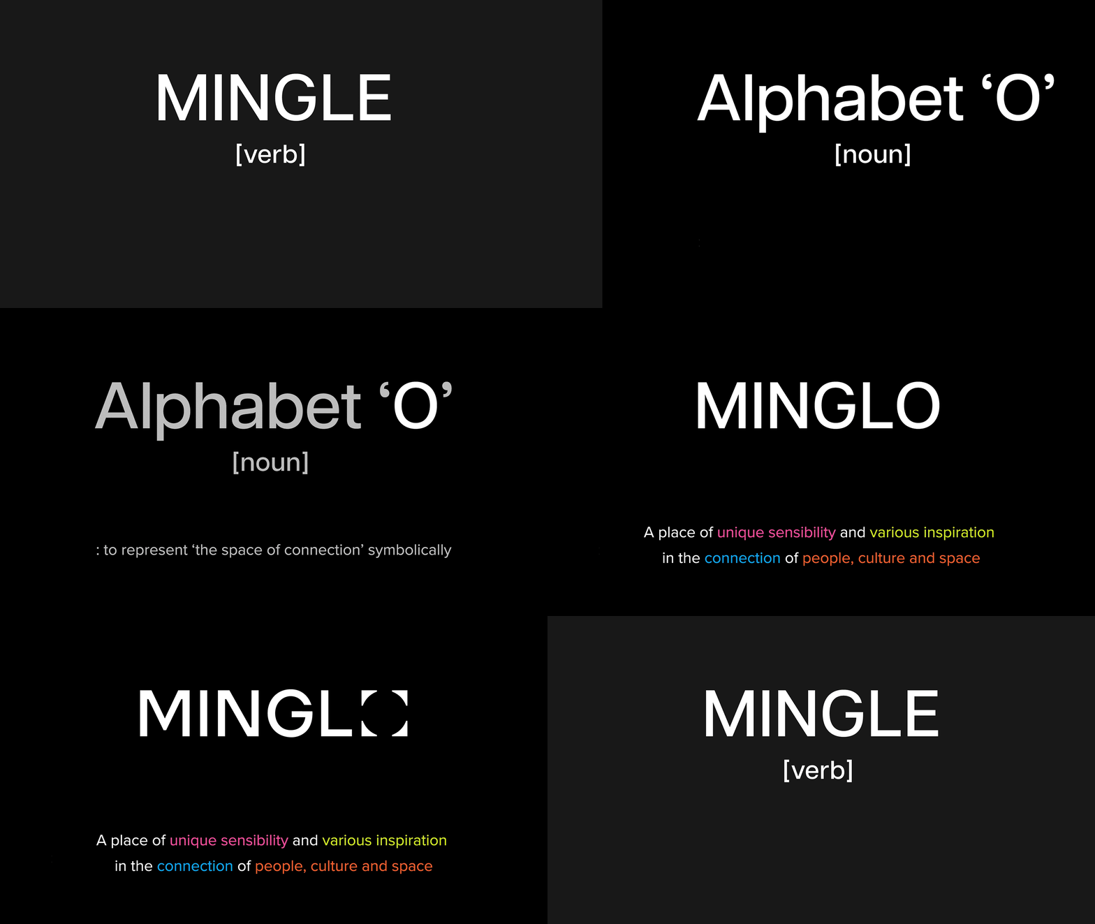
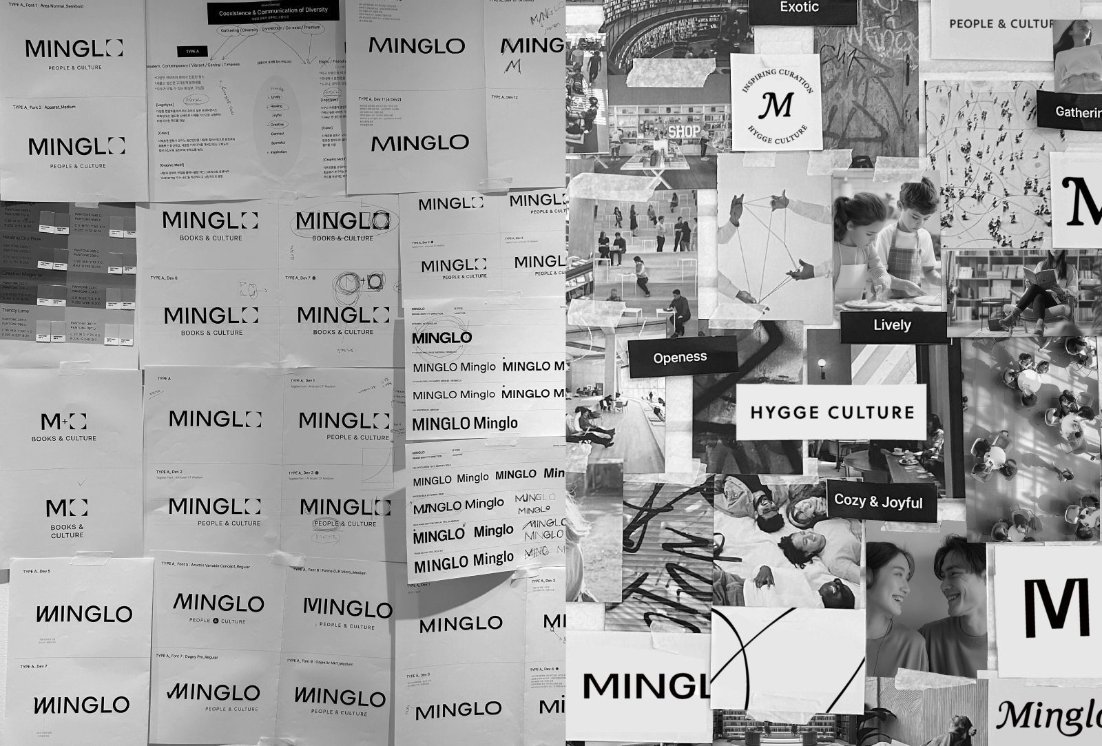
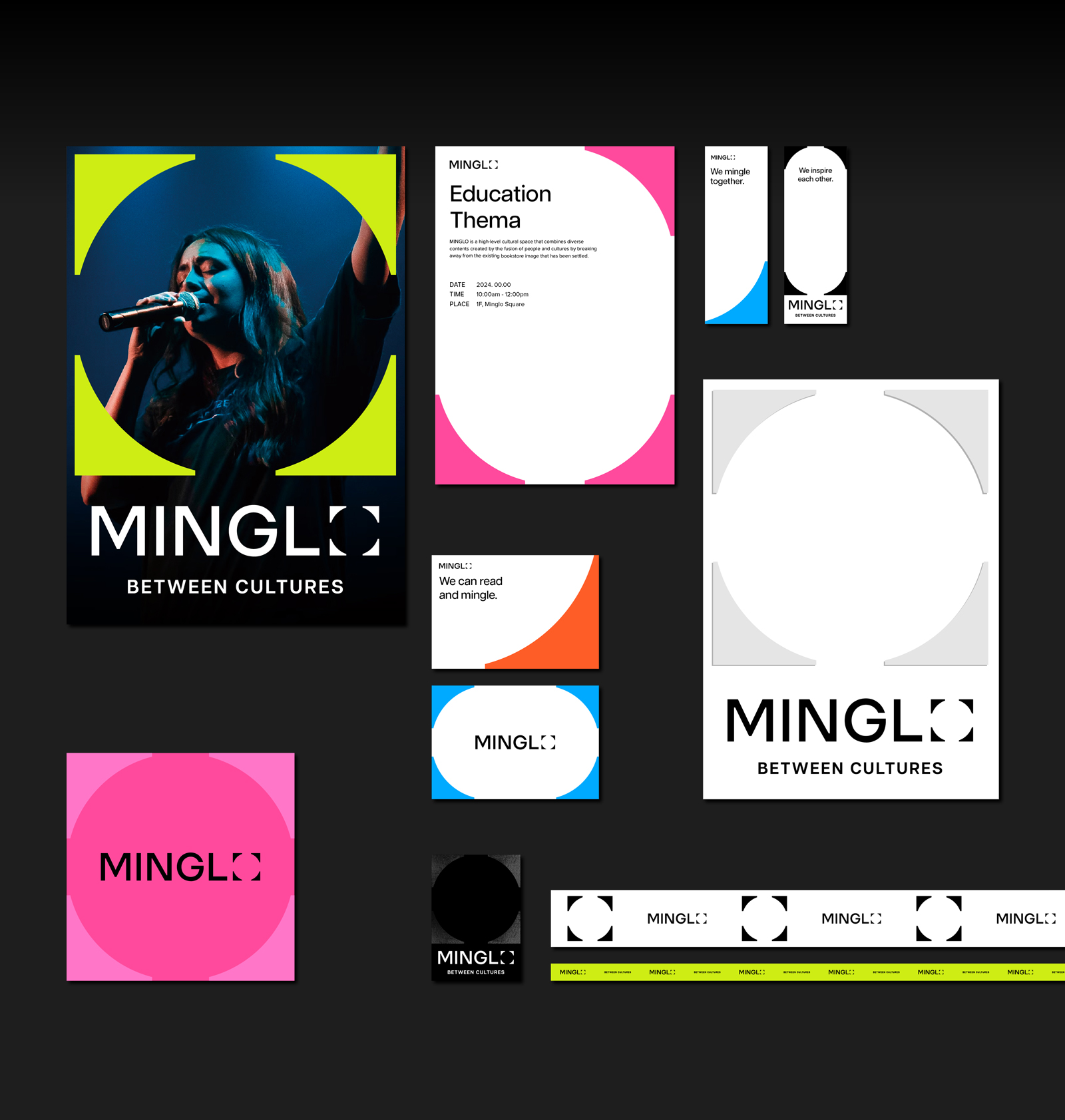
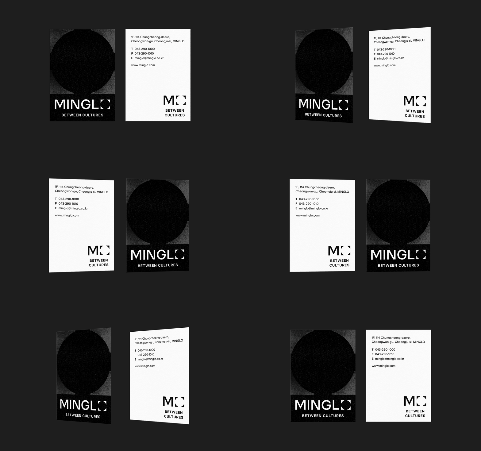
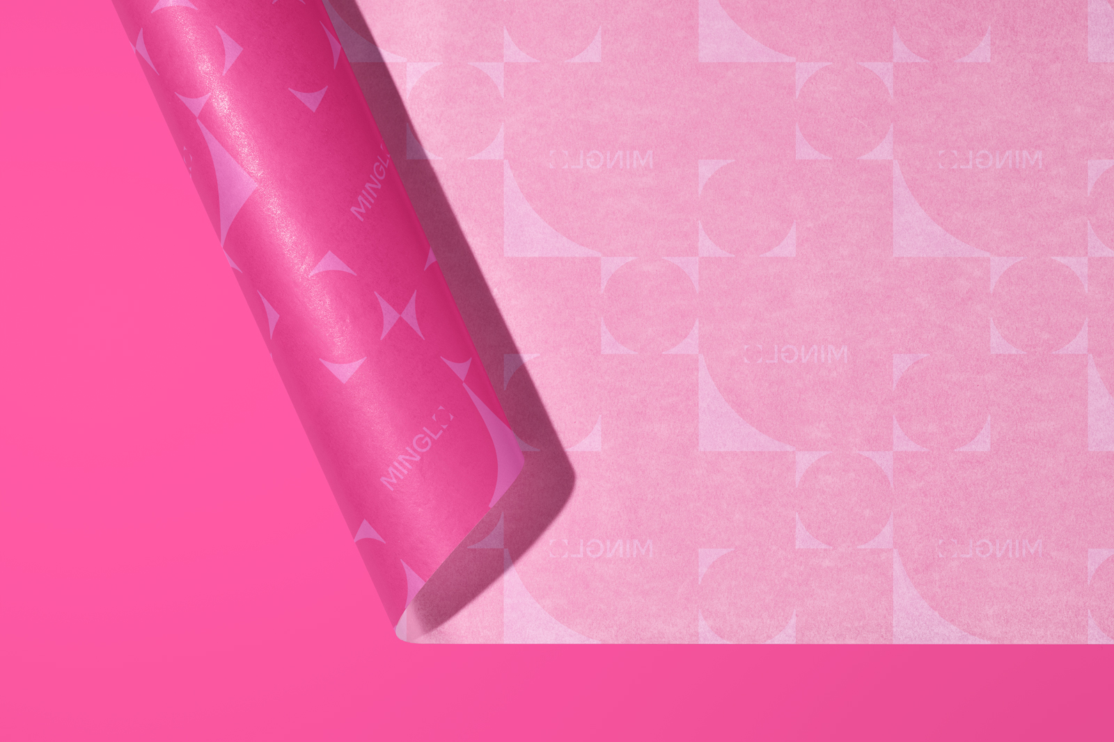
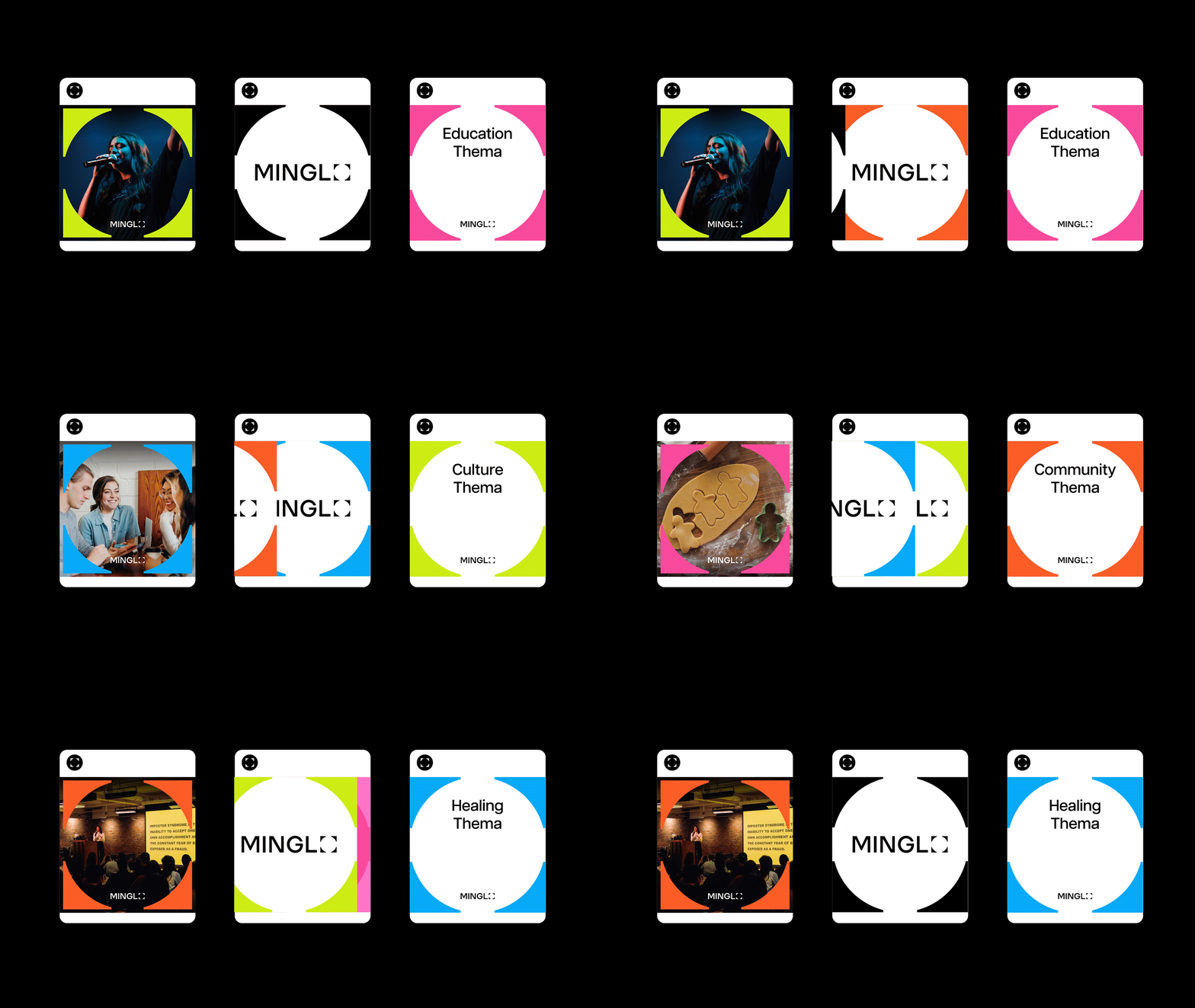
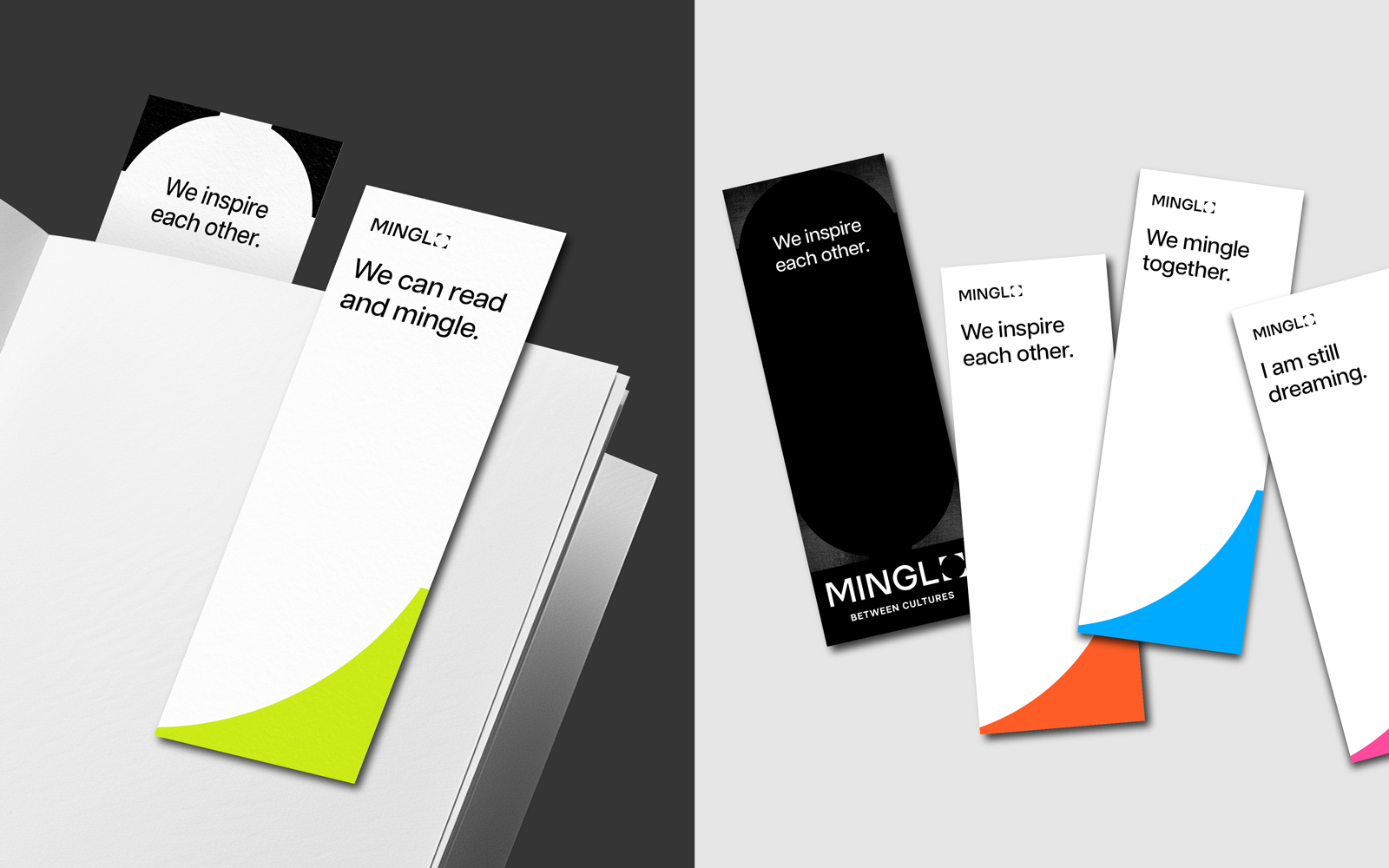
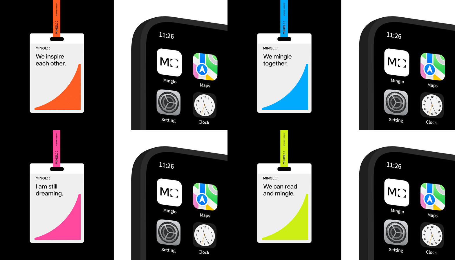
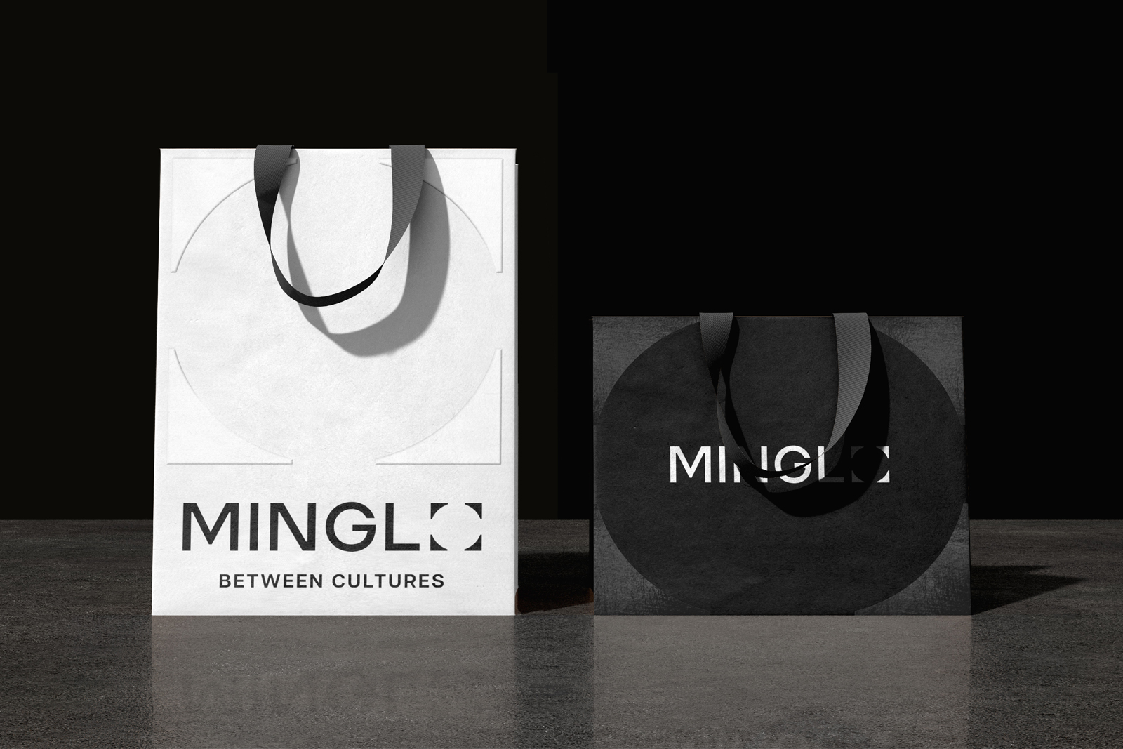
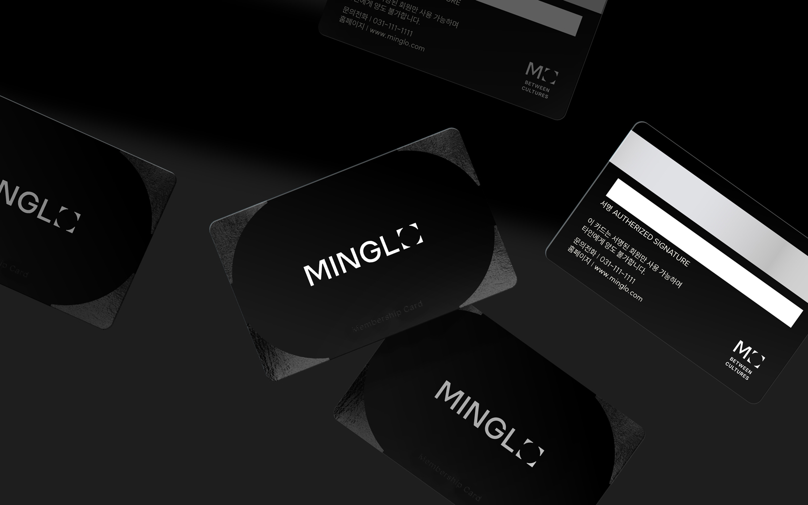
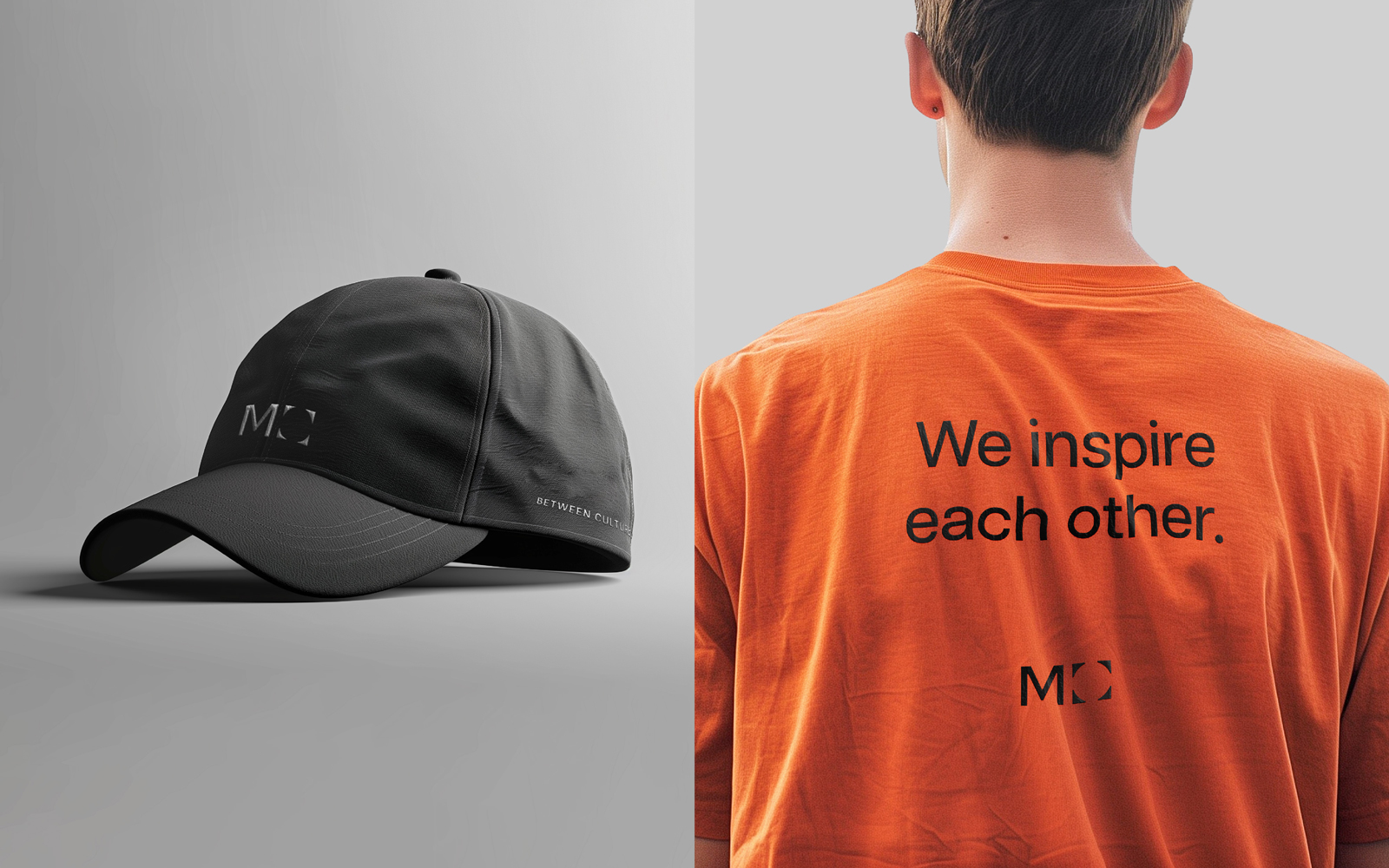
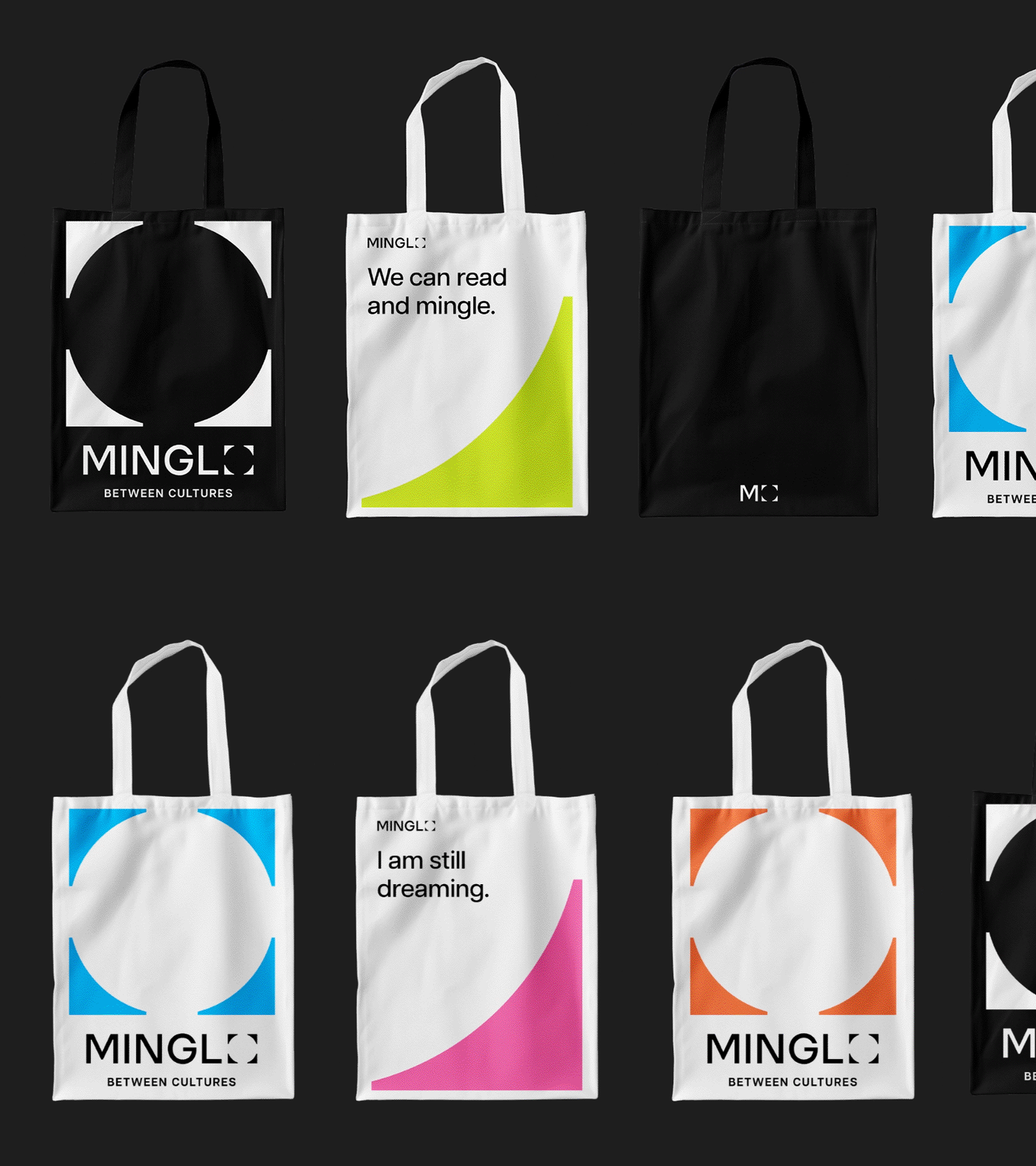
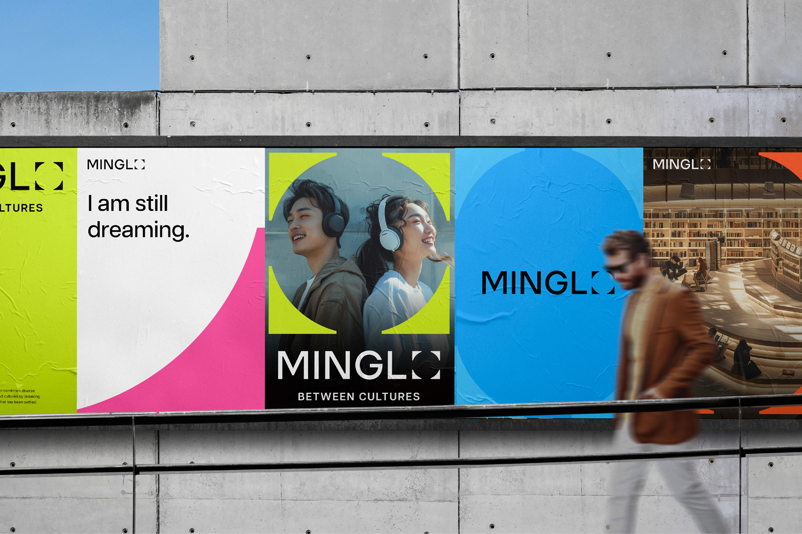
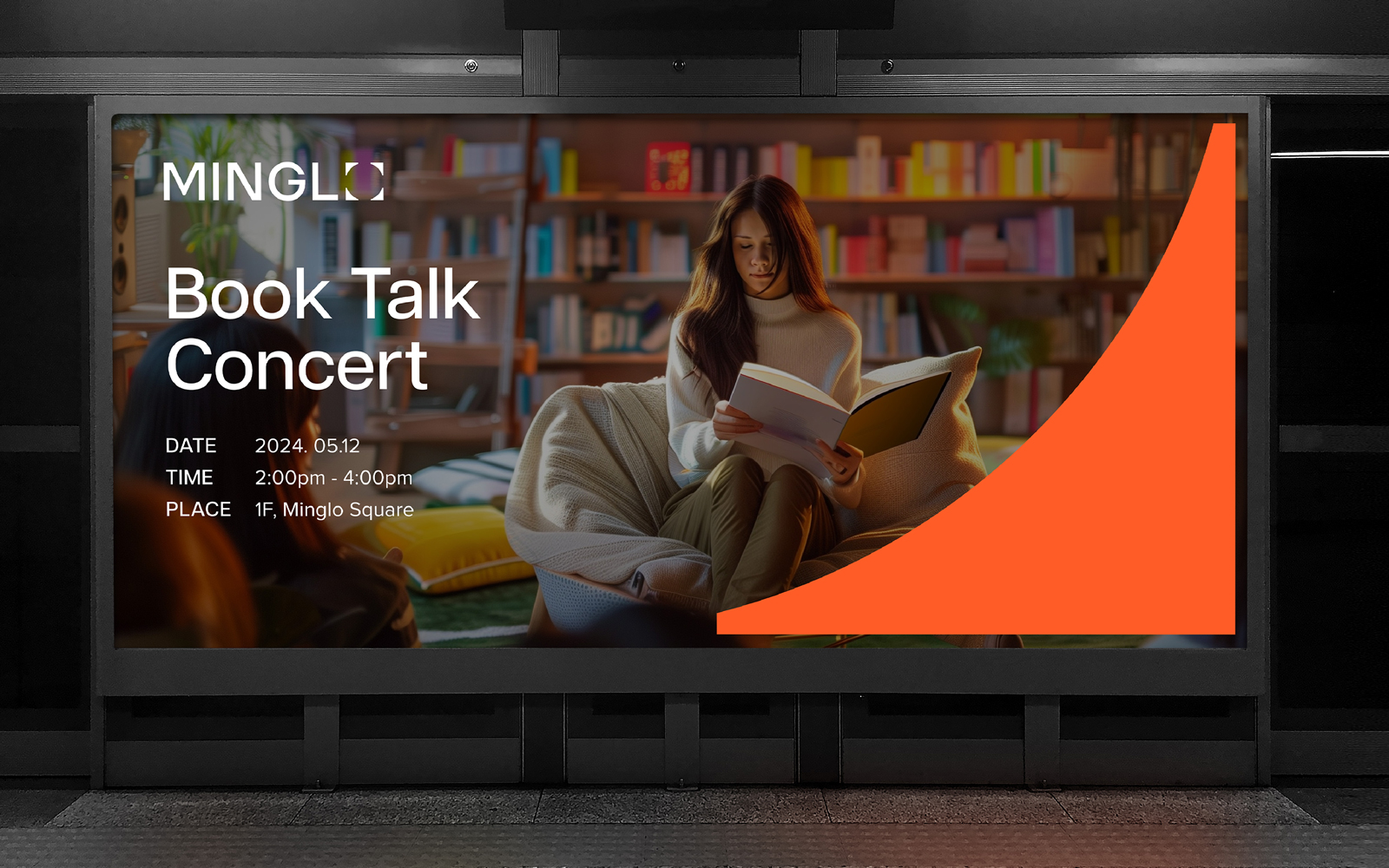
The brand name was crafted as "MINGLO," a compound word symbolizing a space where people and culture meet. This emphasizes the brand identity as a 'new high-dimensional cultural space open and intriguing to everyone'. The name, with its soft pronunciation and concise three-syllable structure, was designed for easy customer recall. The visual identity began with a minimalist and contemporary graphic mood, evolving into a design concept of 'an infinite fusion space where people and culture meet'. The logo, named 'Flexible O,' represents a negative space where a square symbolizing space intersects with a circle representing people and culture, conveying the message of endless values converging within the space. The color and graphic motifs were designed for an efficient brand system capable of encompassing all types of content. A colorful system symbolizing each content, along with the 'O' in the logo, was utilized as a graphic motif to create a flexible application system. Typography was composed of a concise sans-serif font that harmonizes with the logo type. Phrases were developed to succinctly convey the brand message, actively used across various applications. Through total branding from verbal to visual identity, a consistent brand message was delivered, establishing an intuitive and sustainable connection system between customers and the brand.
브랜드 네이밍은 “밍글로(MINGLO)”로, 사람과 문화가 만나는 공간을 상징하는 직관적 단어들의 합성어로 구성되었습니다. 이를 통해 ‘누구에게나 개방적이고 흥미로운 새로운 고차원 문화공간’으로 브랜드 정체성이 강조되었으며, 또한 부드러운 발음과 간결한 3음절 발음으로 고객이 브랜드를 쉽게 기억할 수 있도록 기획하였습니다. 비주얼 아이덴티티는 심플함과 현대성이 강조된 그래픽 무드에서 시작하여 ‘사람과 문화가 만나는 무한한 융합의 공간’이라는 디자인 컨셉으로 발전해 제작되었습니다. ‘Flexible O’로 명명된 로고타입의 O는 공간을 상징하는 사각형과 사람, 문화를 상징하는 원이 만난 네거티브 스페이스로 표현되었습니다. 이는 공간 속 다양한 가치가 만나 무한히 퍼진다는 브랜드 메세지를 전달합니다. 컬러와 그래픽 모티브는 다양한 콘텐츠를 모두 아우를 수 있는 효율적인 브랜드 시스템을 위해 설계되었습니다. 각 콘텐츠를 상징하는 컬러풀한 컬러 시스템과 함께, 로고타입의 O를 그래픽 모티브로 활용해 다양한 어플리케이션에 유연하게 적용될 수 있는 시스템을 제작했습니다. 타이포그래피는 로고타입과 어우러지는 간결한 산세리프 폰트로 구성되었으며, 브랜드 메세지를 함축적으로 전달할 수 있는 문구를 개발해 다양한 어플리케이션에 적극적으로 활용되었습니다. 버벌부터 비주얼 아이덴티티까지 토탈 브랜딩을 통해 일관된 브랜드 메세지를 전달하고, 직관적이며 지속가능한 고객과 브랜드의 연결 시스템을 구축하였습니다.