AEROTITAN
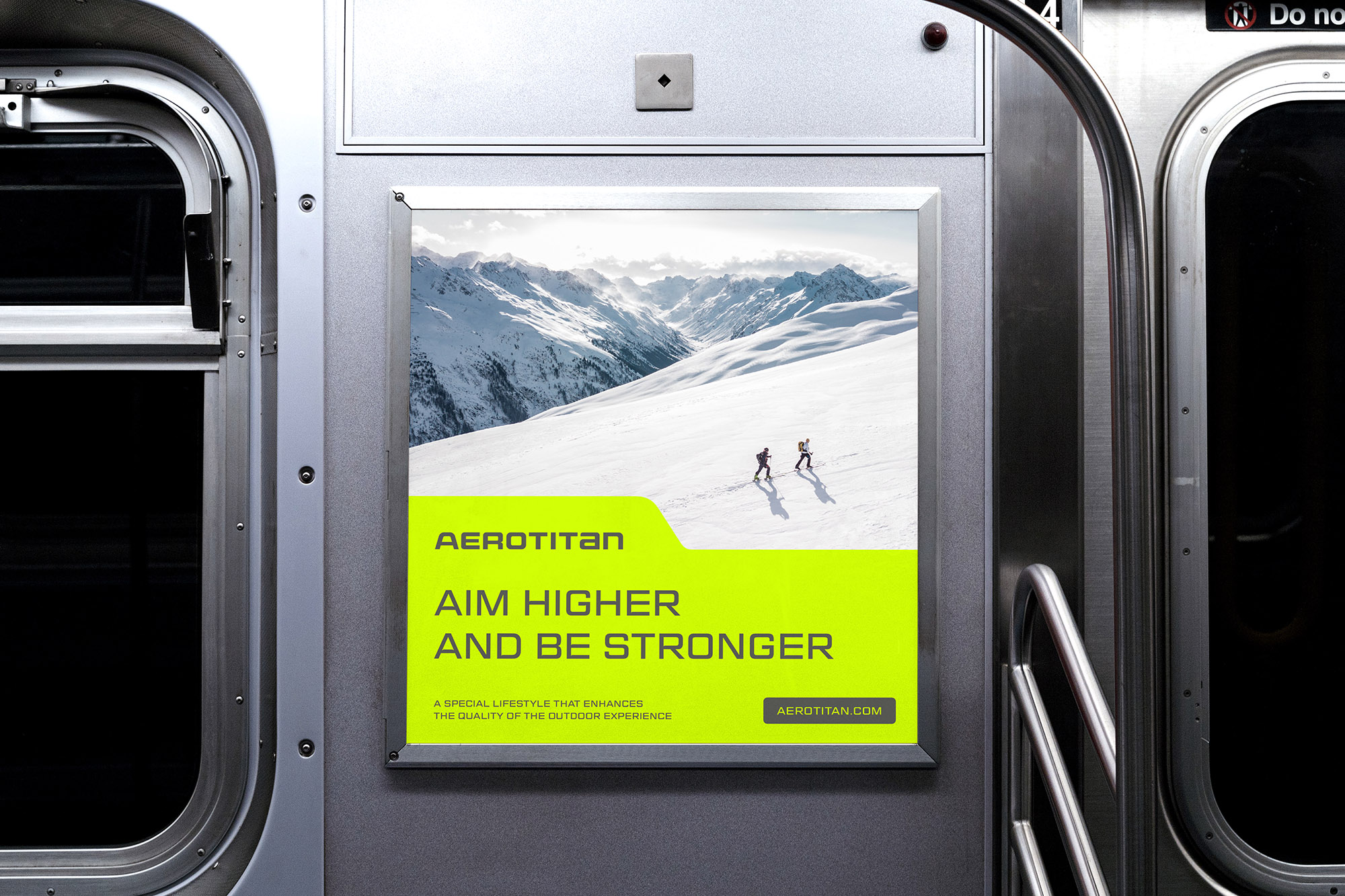
Aim Higher and Be Stronger

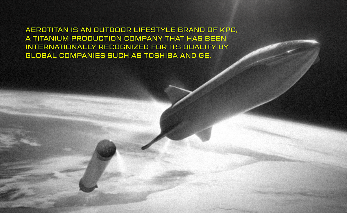
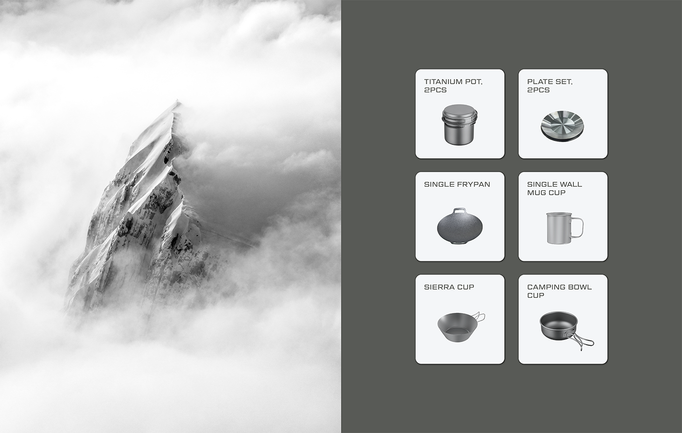
Titanium, which is sturdy while light, is an excellent material used in various fields, such as golf clubs, semiconductors, medical devices, aerospace, satellites, and missiles. However, only a few companies with excellent manufacturing technologies can produce titanium products because it is difficult to process. AEROTITAN is an outdoor lifestyle brand created by KPC, the company that made titanium products for the first time in Korea in 1990 and has contributed to the aerospace and military fields. As a company with more than 20 years of know-how in handling titanium and innovative technologies, AEROTITAN develops innovative titanium products that add value to life with its expertise and provides a richer outdoor experience to those who enjoy outdoor life.
가벼우면서도 단단한 성질을 가진 티타늄은 골프채는 물론 반도체, 의료기기, 우주항공, 인공위성, 미사일 등 다양한 분야에서 활용되는 우수한 물질입니다. 하지만 가공이 어려워 우수한 제조 기술을 보유한 소수의 회사만이 티타늄 제품을 생산할 수 있습니다. 에어로타이탄은 1990년 한국 최초로 티타늄 제품을 생산하여 우주항공 분야와 군사 분야에 기여해온 티타늄 제조 기업 케이피씨(KPC)가 만든 아웃도어 라이프스타일 브랜드입니다. 20년 이상의 티타늄 제강 노하우와 혁신적인 기술력을 가진 에어로타이탄은 전문성을 바탕으로 삶에 가치를 더하는 혁신적인 티타늄 제품을 개발하고 아웃도어 라이프를 즐기는 이들에게 더욱 풍요로운 아웃도어 경험을 선사합니다.
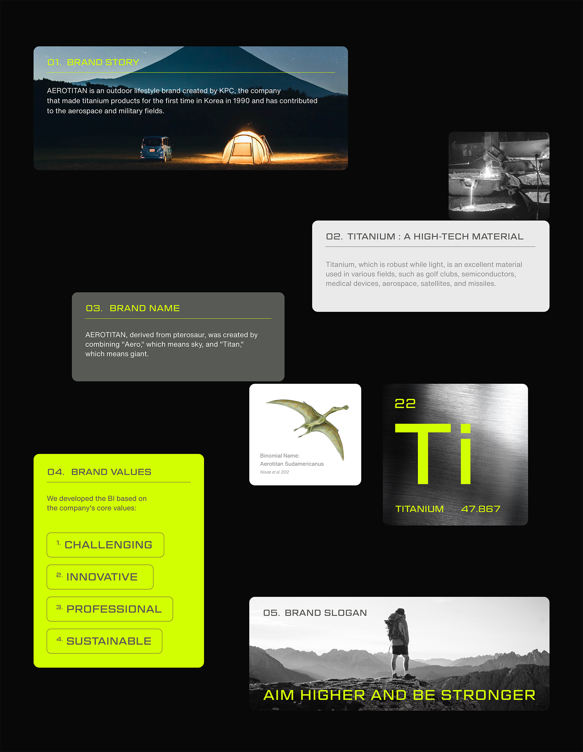
The major challenge of the AEROTITAN branding project was to develop a brand slogan, story, and differentiated brand identity. The brand name, AEROTITAN, originated from a pterosaur discovered in 2012 and was coined by combining "Aero," meaning sky, and "Titan," representing giant. Just as a pterosaur with enormous wings and a strong but light skeleton could fly in the sky for a long time, AEROTITAN's strong but light titanium products will provide a richer experience for those who enjoy outdoor life. YNL Design wanted to develop a verbal and visual identity reflecting how AEROTITAN was established and its core brand values.
에어로타이탄 브랜딩 프로젝트는 브랜드 슬로건과 스토리, 차별화 된 브랜드 아이덴티티를 개발하는 것이 핵심 과업이었습니다. 에어로타이탄(AEROTITAN)의 브랜드 네임은 하늘을 뜻하는 "Aero"와 거인을 뜻하는 "Titan"이 합성어로 2012년 발견된 익룡의 이름에서 유래했습니다. 거대한 날개와 강하고 가벼운 골격을 지닌 익룡 에어로타이탄이 오랫동안 하늘을 날 수 있었던 것처럼 가볍고 강한 티타늄 제품은 아웃도어 라이프를 즐기는 이들에게 더 풍부한 경험을 선사합니다. YNL Design은 에어로타이탄의 설립 배경과 브랜드 핵심 가치를 반영한 verbal, visual identitiy를 개발하고자 했습니다.
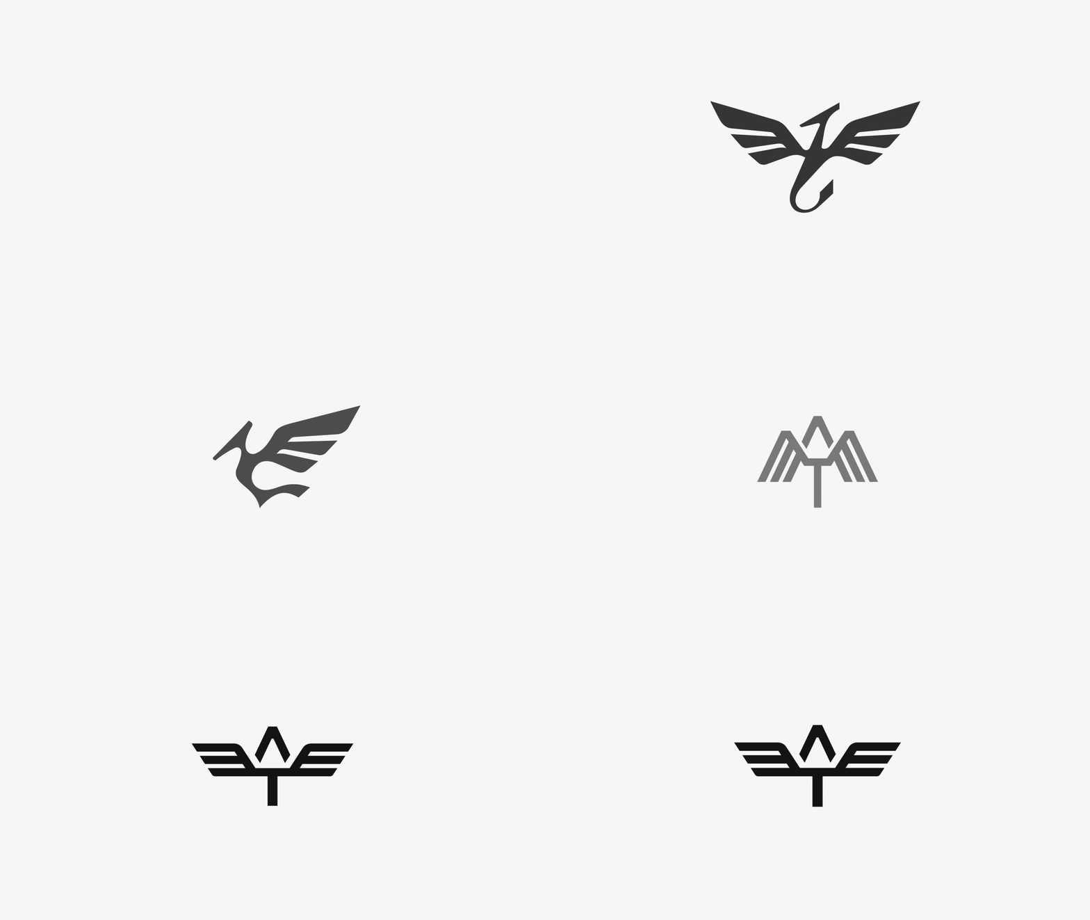
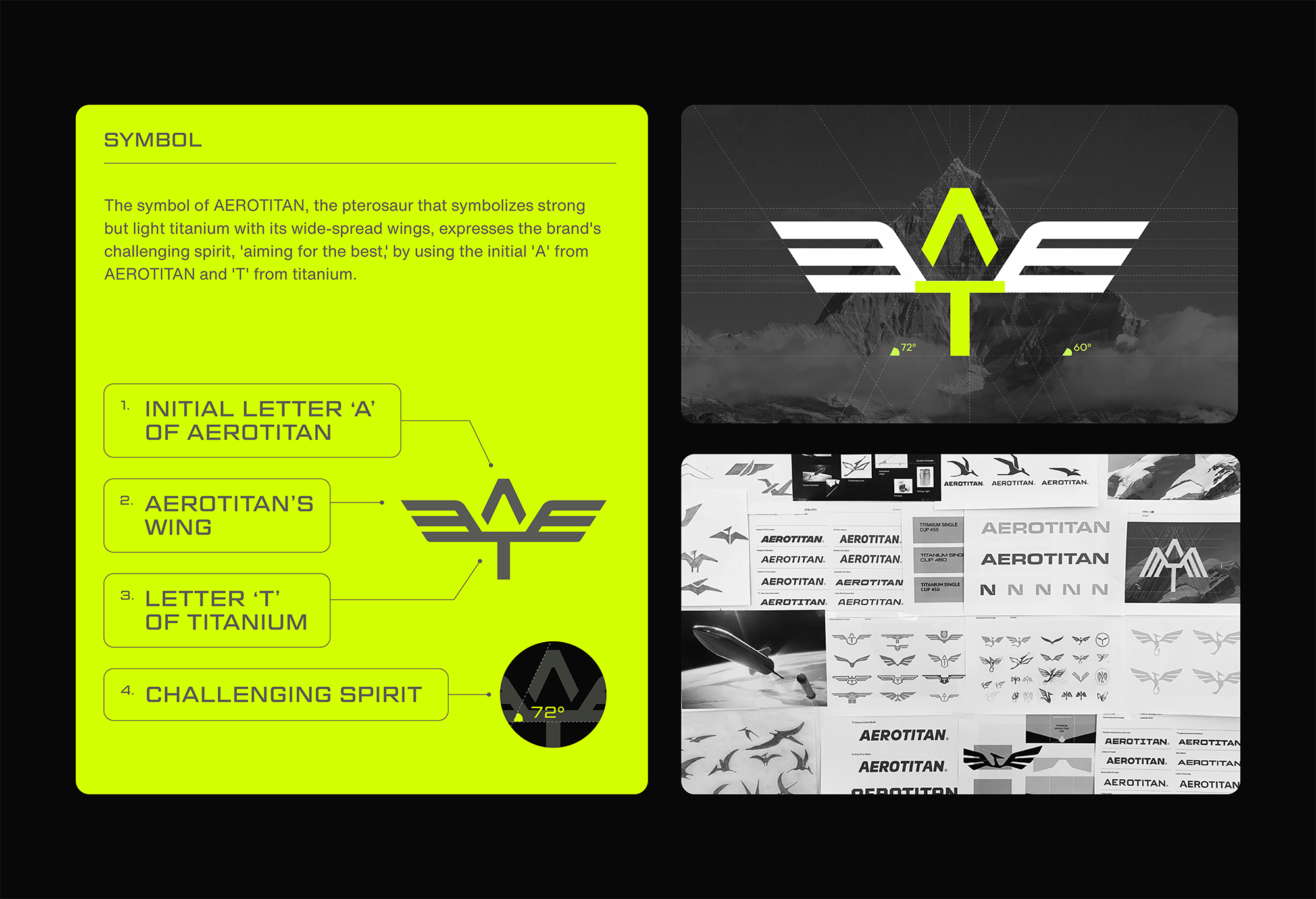
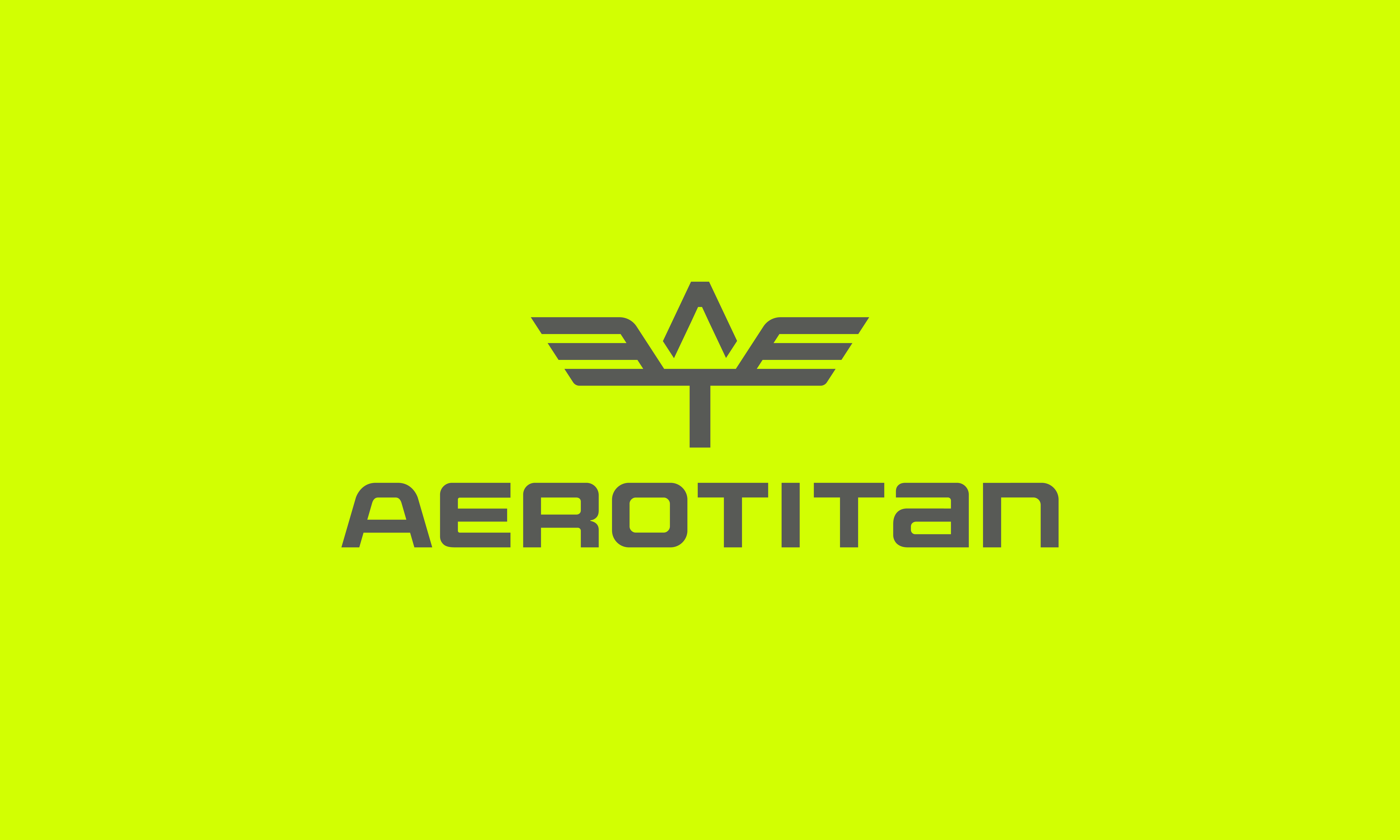
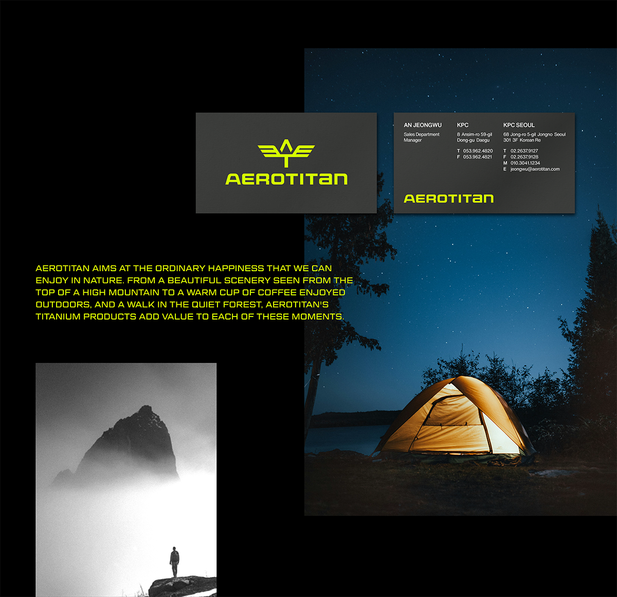
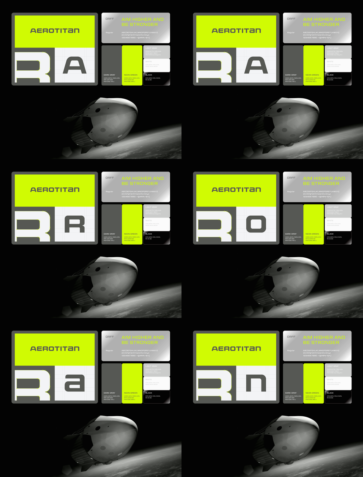
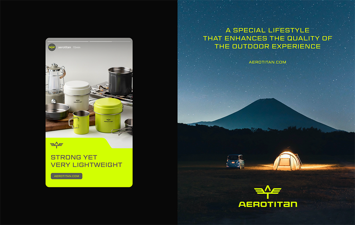
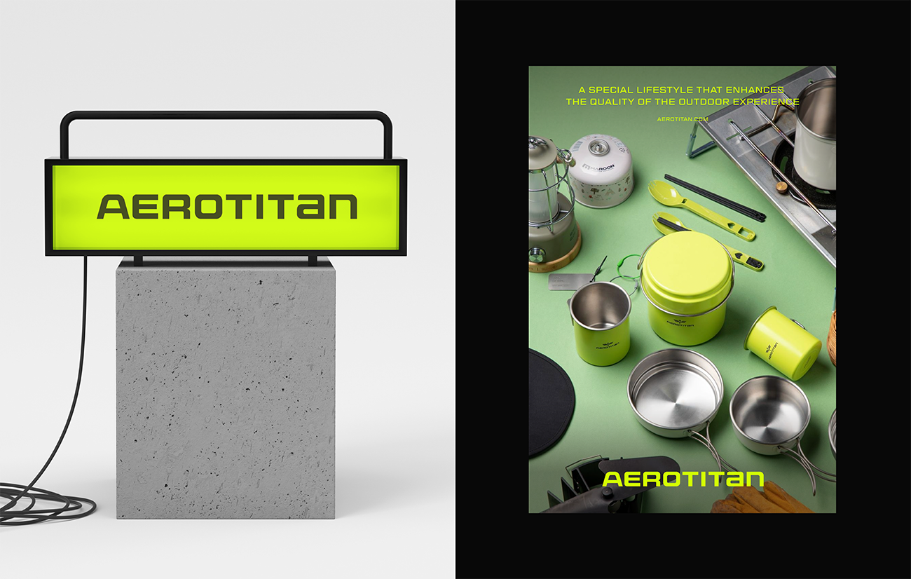
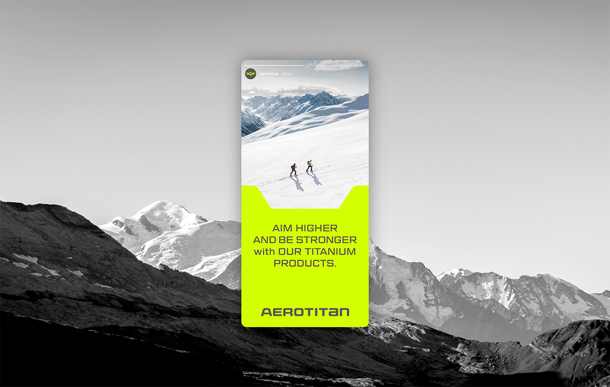
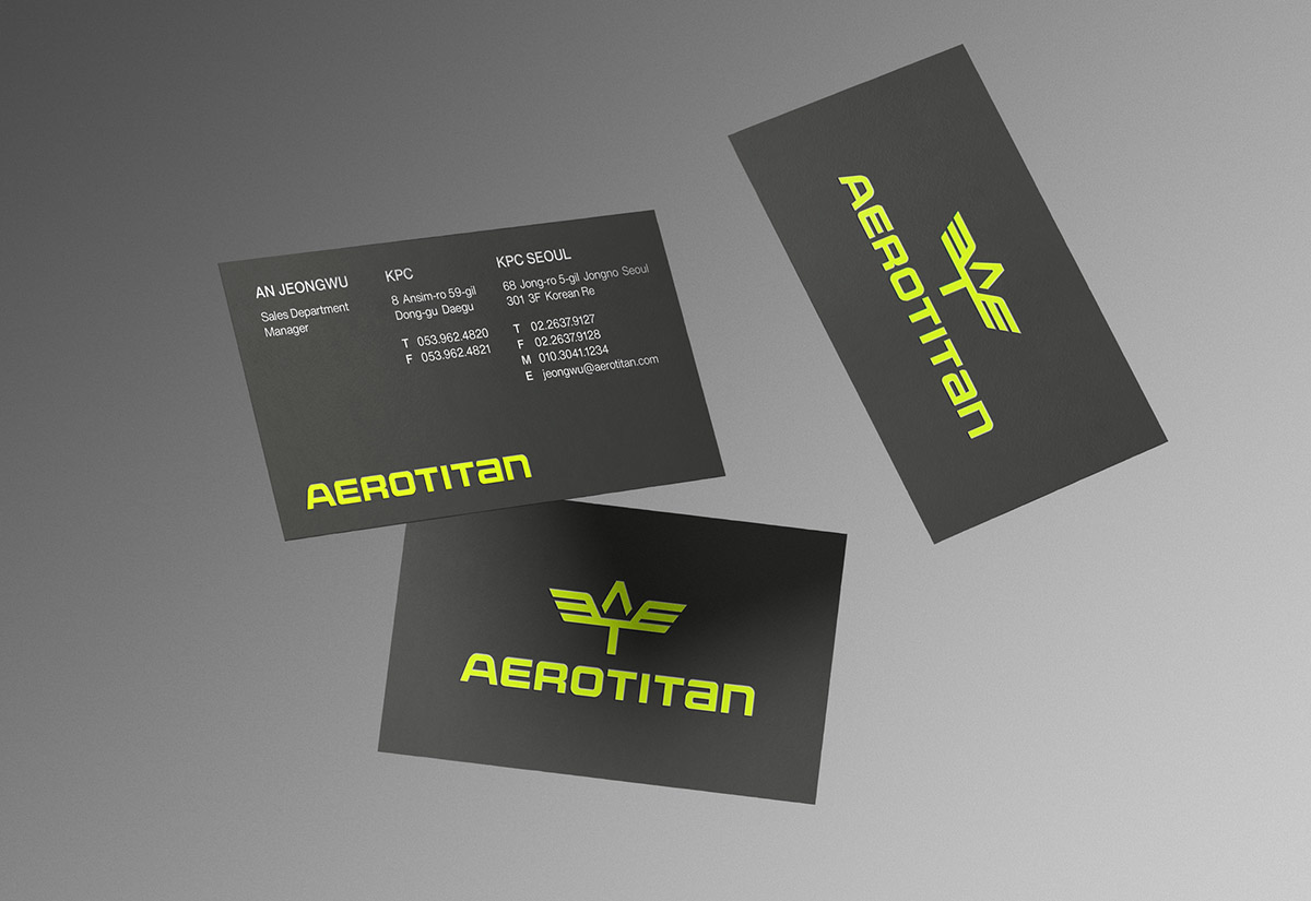
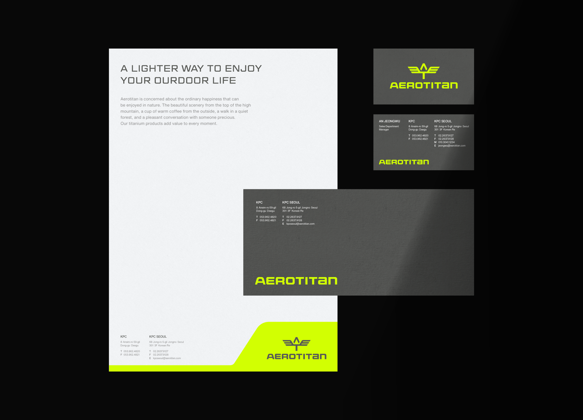
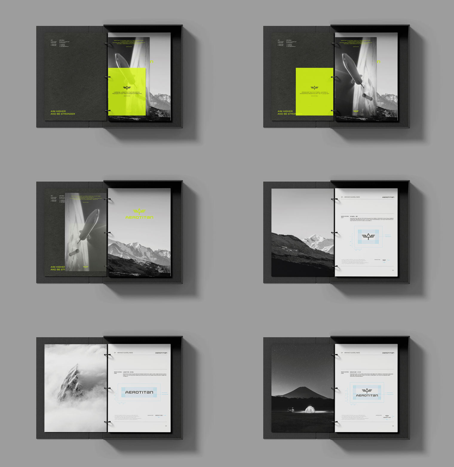
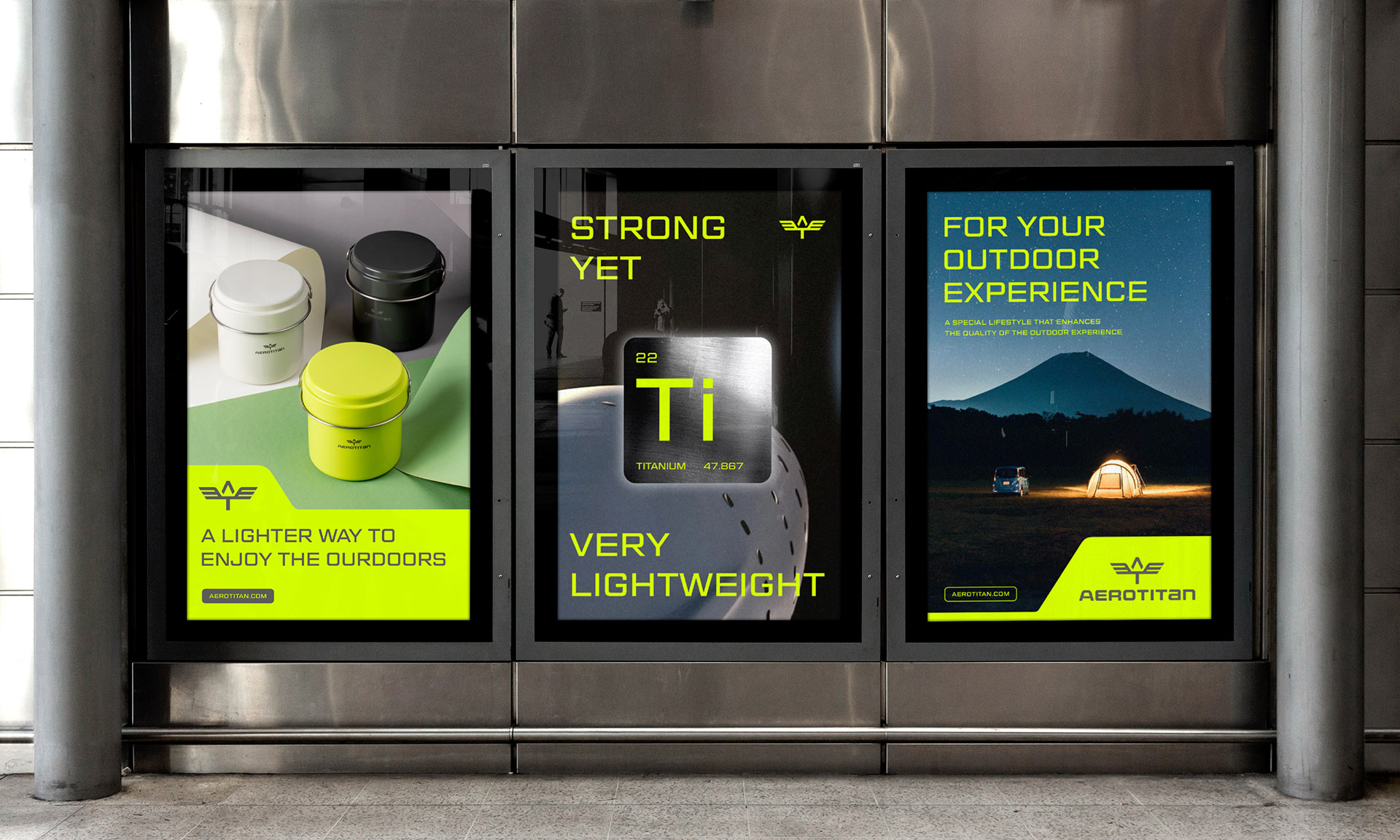
YNL Design developed the brand slogan, story, and visual identity of AEROTITAN based on the company's core values: challenge, innovation, professionalism, and sustainability. The brand slogan, 'AIM HIGHER AND BE STRONGER,' means adding values to customers' lives with innovative titanium products and endlessly challenging to reach a higher level. The symbol of AEROTITAN, the pterosaur that symbolizes strong but light titanium with its wide-spread wings, expresses the brand's challenging spirit, 'aiming for the best,' by using the initial 'A' from AEROTITAN and 'T' from titanium. The bold logotype developed from a sans serif typeface intuitively conveys the excellent technology and expertise required to manufacture titanium products. We used the gray color that symbolizes titanium and neon green to express the quality of products developed with the highest grade titanium used in the aerospace field with a confident brand image.
YNL Design은 도전과 혁신, 전문성, 지속성이라는 핵심 가치를 바탕으로 에어로타이탄의 브랜드 슬로건과 스토리, 비주얼 아이덴티티를 개발했습니다. 브랜드 슬로건인 ‘AIM HIGHER AND BE STRONGER’은 혁신적인 티타늄 제품으로 고객의 삶에 가치를 더하고 더 높은 레벨에 도달하기 위해 끝없이 도전한다는 의미를 담고 있습니다. 가볍지만 강력한 티타늄을 상징하는 익룡 에어로타이탄이 날개를 활짝 펼친 모습의 심볼은 에어로타이탄의 이니셜 A와 티타늄의 T를 활용하여 ‘최고를 지향한다’는 브랜드의 도전 정신을 표현했습니다. 산세리프 서체를 기반으로 개발된 볼드한 로고타입은 우수한 티타늄 제조 기술력과 전문성을 직관적으로 전달합니다. 티타늄을 상징하는 그레이 컬러와 네온 그린 컬러를 함께 활용하여 우주항공 분야에 쓰이는 최상급 티타늄으로 개발한 제품의 퀄리티를 자신감 있는 브랜드 이미지로 표현합니다.