HOLLYS JAPAN
Bringing a Vibrant Taste of Korea to Japan

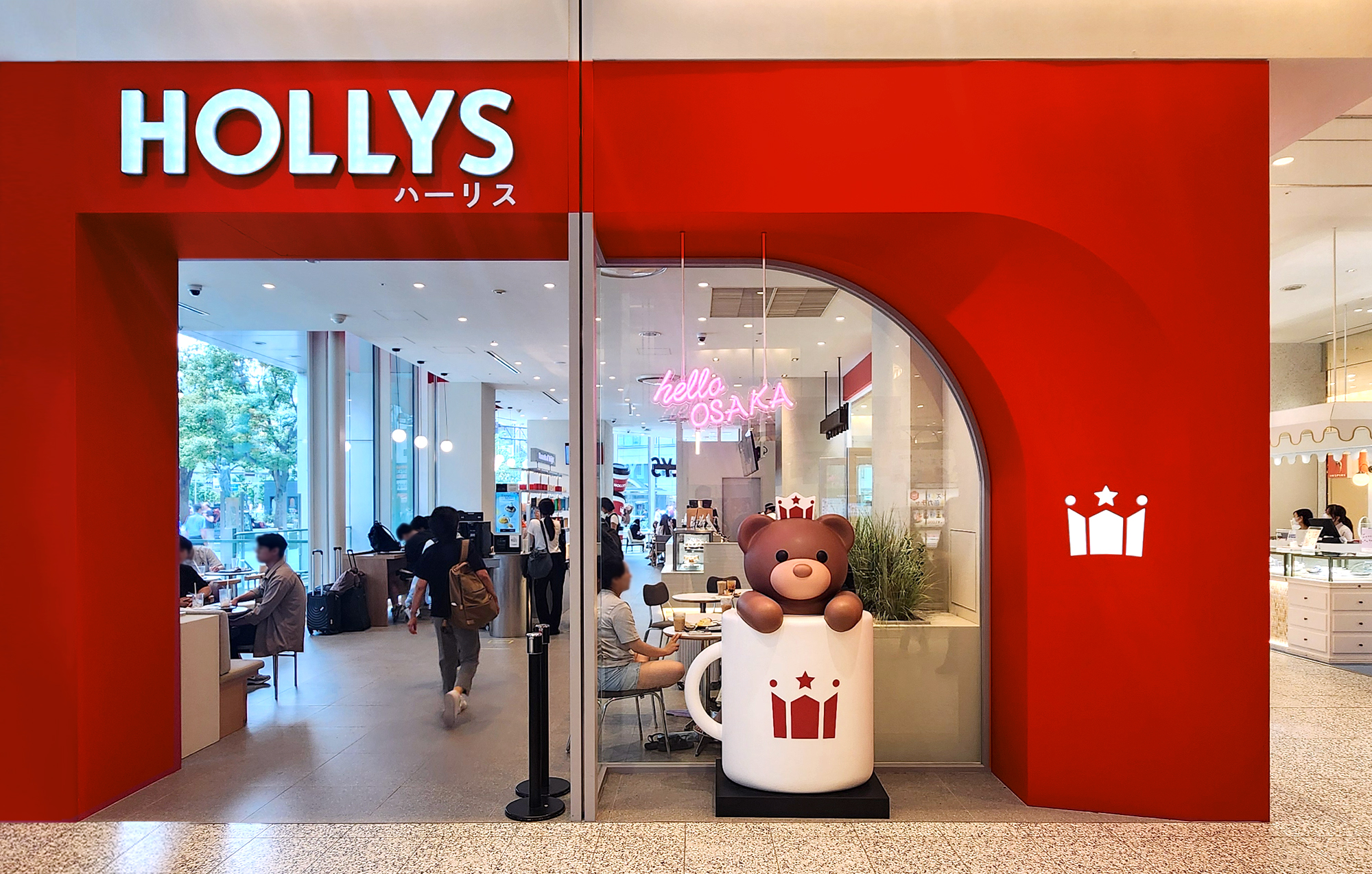
Hollys Namba Marui Store marks Hollys' first global expansion into Japan, the largest coffee-consuming country in Asia. Since its inception in 1998, Hollys has built a solid reputation and expertise in the domestic market, now leveraging this to enhance its global competitiveness. Hollys Japan's first store is located in the Namba Marui Department Store in Osaka, known as a popular meeting place. This strategic location aims to establish Hollys' competitive edge in both the Japanese and global markets.
할리스 난바 마루이점은 아시아 최대 커피 소비 국가인 일본에 할리스의 첫 글로벌 진출지입니다. 1998년 시작된 할리스는 국내 시장에서 쌓은 신뢰성과 노하우를 바탕으로 글로벌 경쟁력을 갖추어 일본 시장에 진출했습니다. 할리스 일본 1호점은 오사카 난바의 ‘만남의 장소’로 알려진 난바 마루이 백화점에 위치해 있으며, 이를 통해 일본 및 글로벌 시장에서의 경쟁력을 확보하고자 합니다.
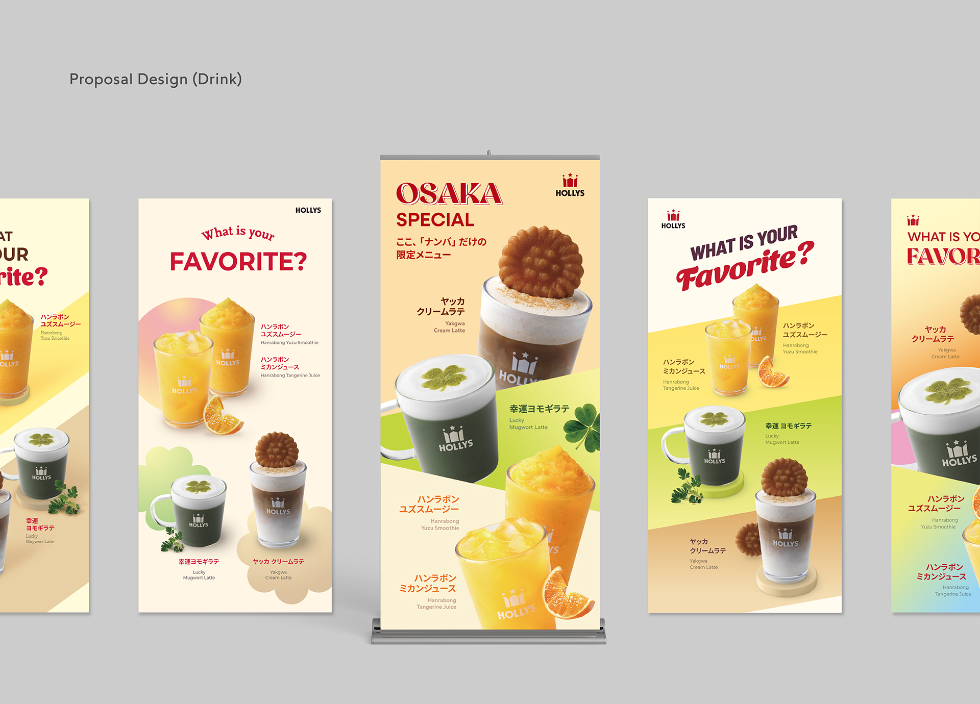
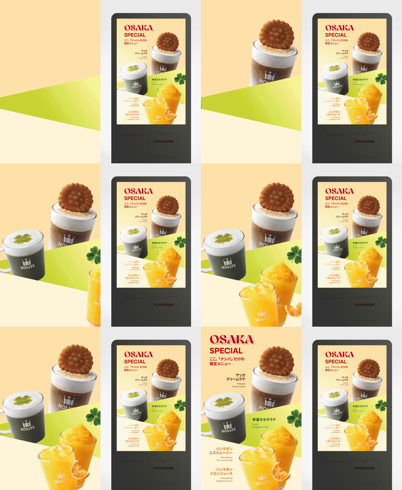
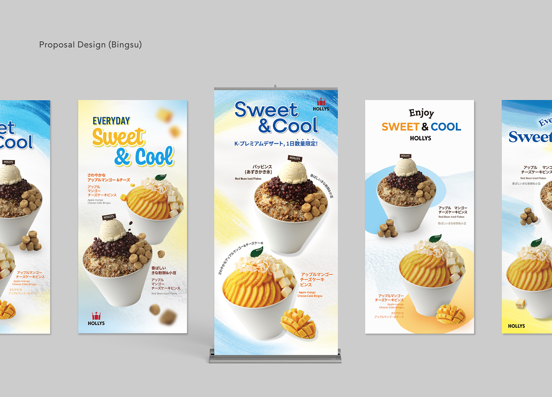
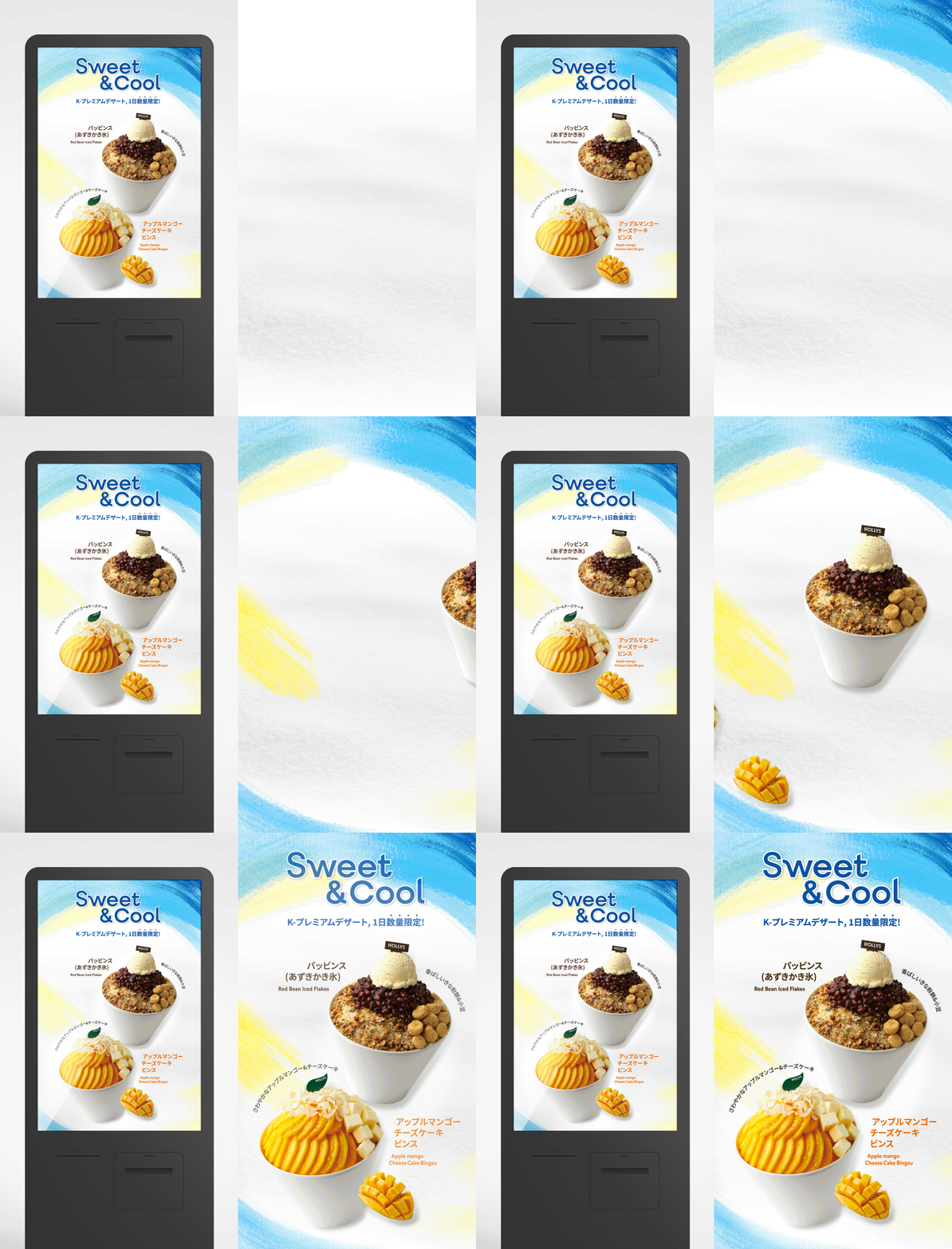
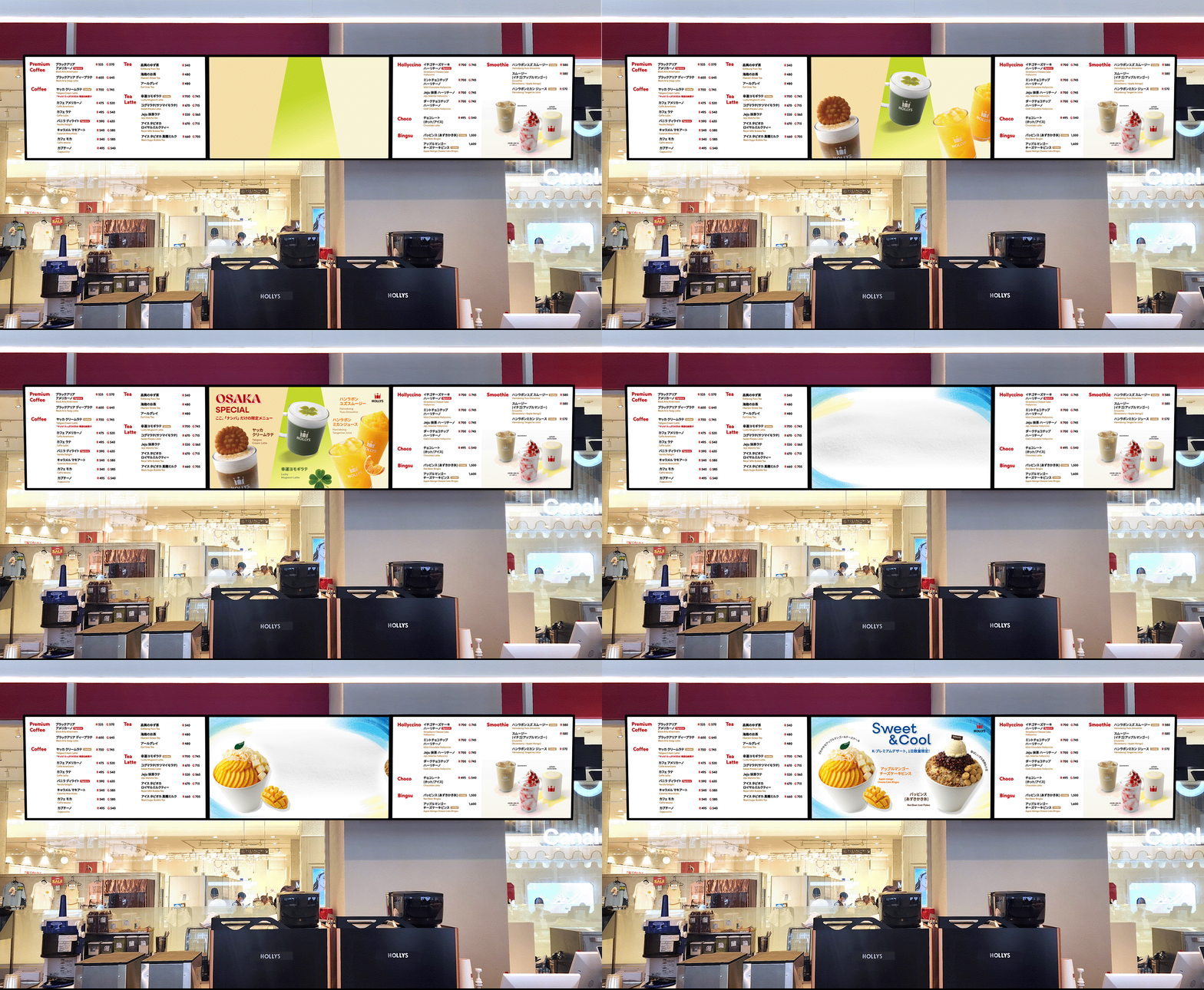
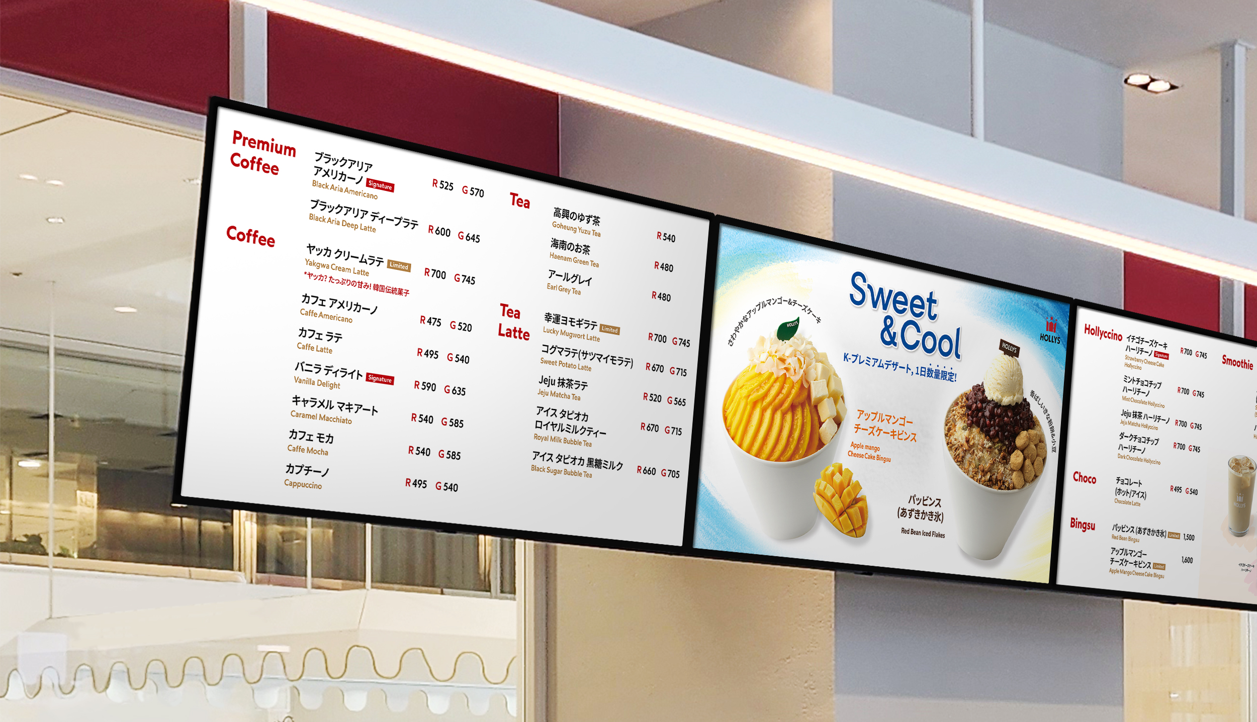
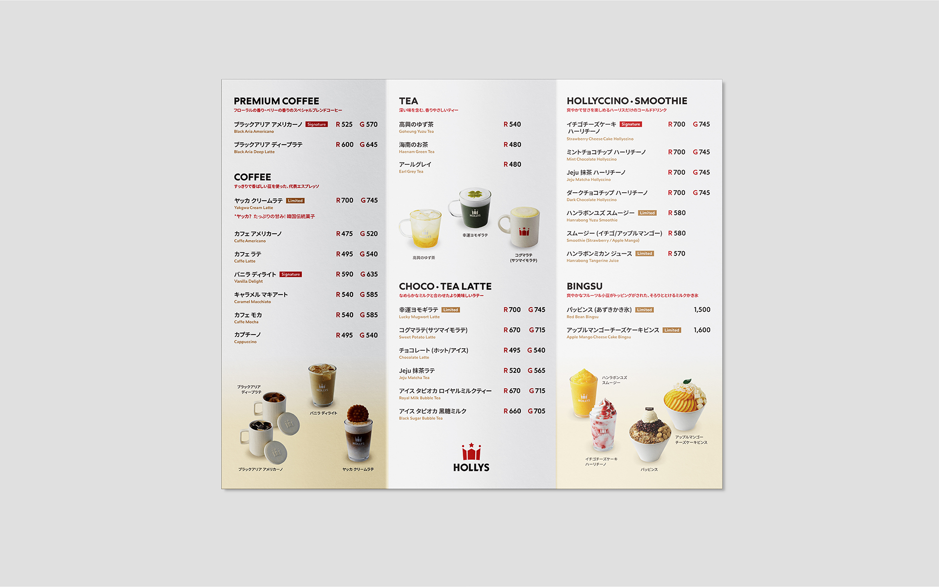
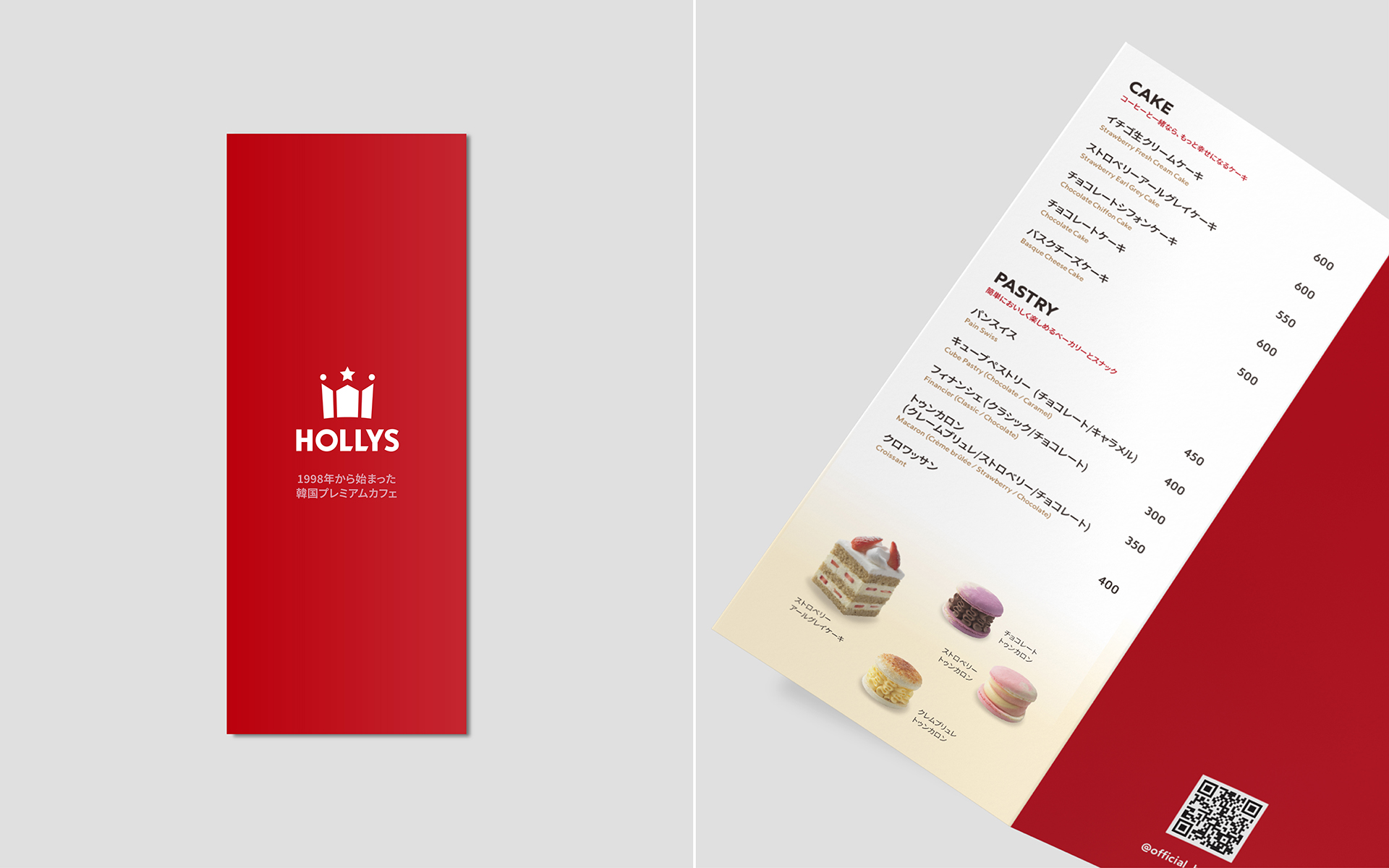
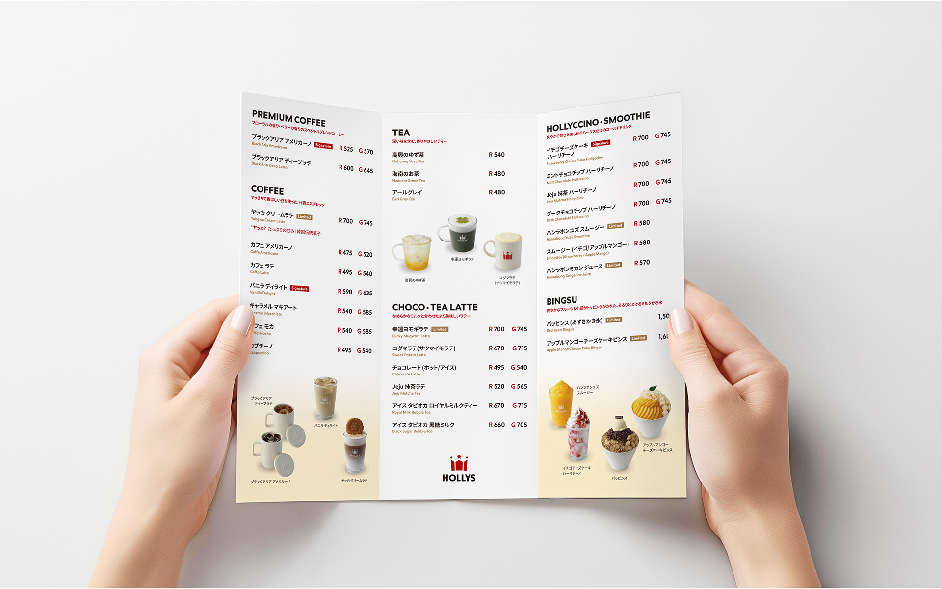
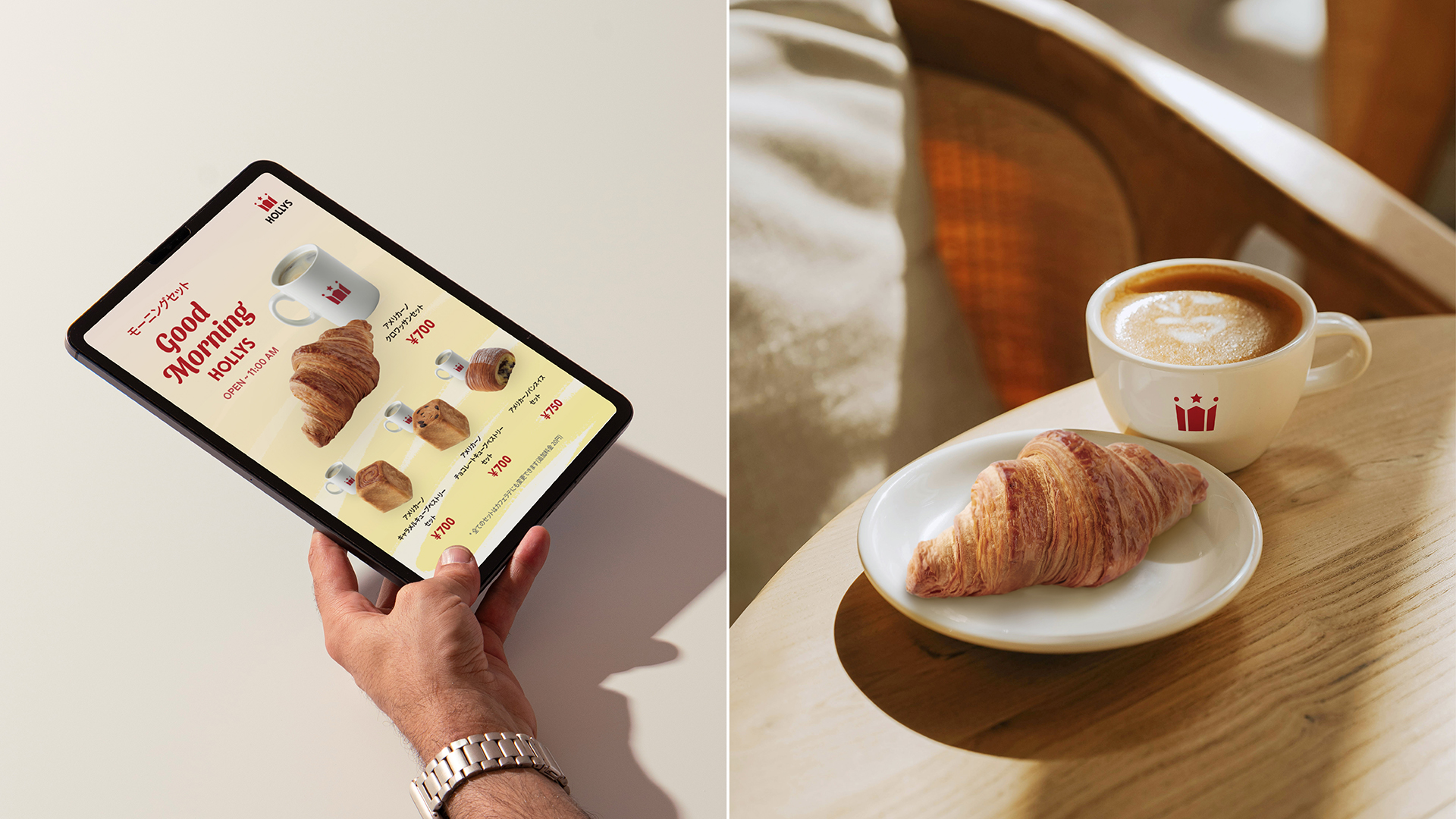
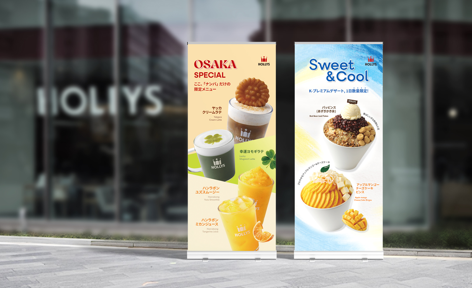
The goal was to effectively highlight Hollys' diverse and attractive menu. The beverages and desserts were visualized to evoke a sense of sizzle, making them enjoyable and delicious. Additionally, the layout was designed to be flexible for easy application across various media such as stand banners, kiosks, and digital signage. To align with the mood of the Japan branch, we aimed to develop vibrant and playful visuals rather than static graphics.
할리스의 다양하고 매력적인 메뉴를 효과적으로 표현하고자 했습니다. 즐겁고 맛있게 즐길 수 있는 음료와 디저트를 시즐이 느껴지도록 시각화했습니다. 또한 스탠드 배너, 키오스크, 디지털 사이니지 등 다양한 매체에서도 쉽게 적용할 수 있도록 유연하게 레이아웃을 구성했습니다. 일본 지점에 맞는 무드를 위해 정적인 그래픽보다 화려하고 플레이풀한 비주얼을 개발하고자 했습니다.
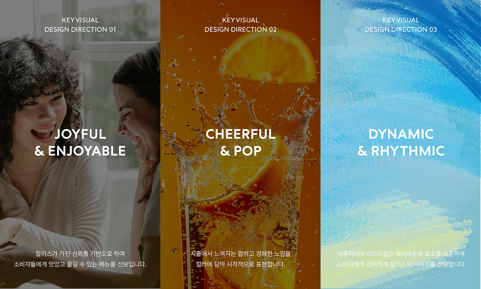
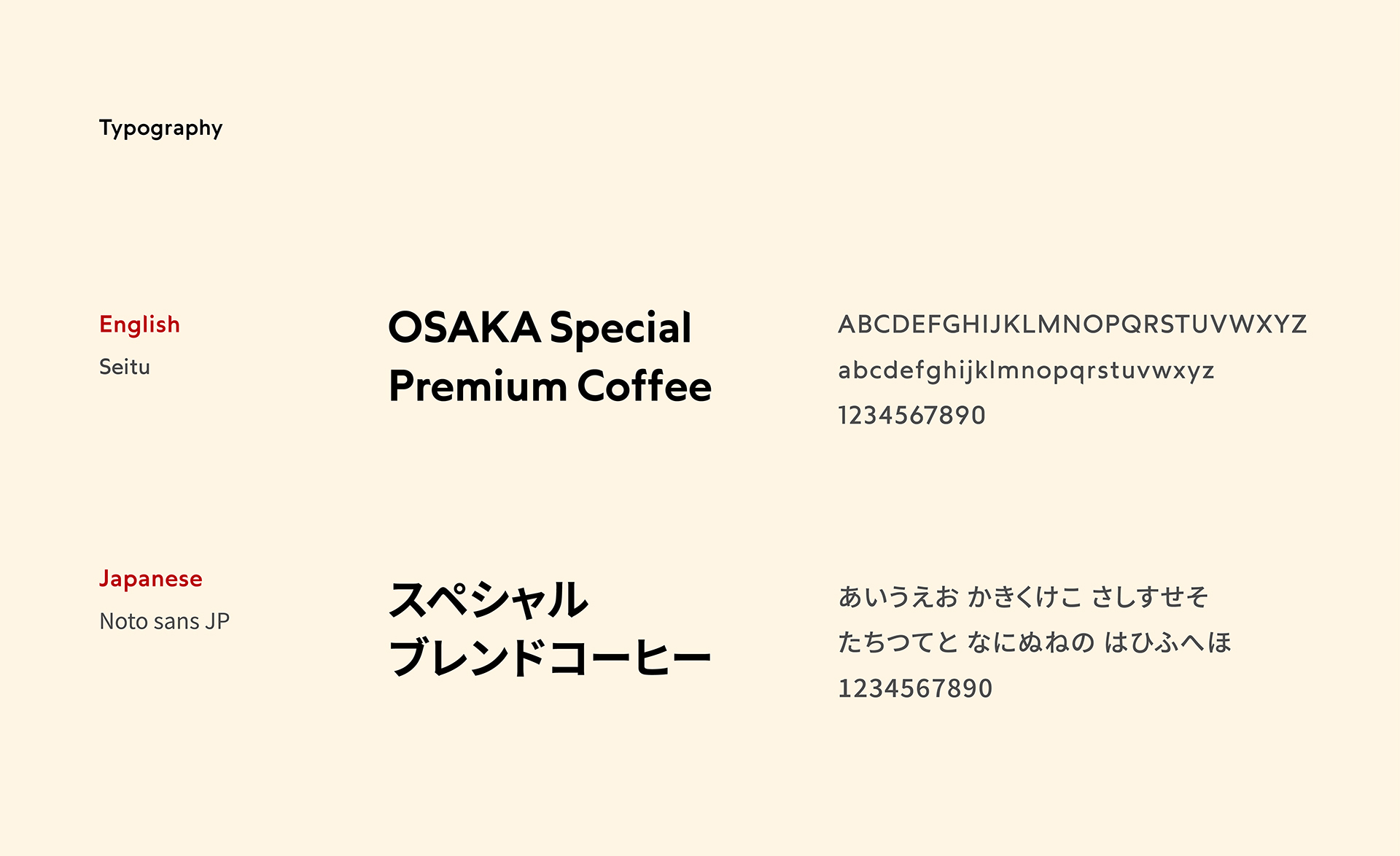
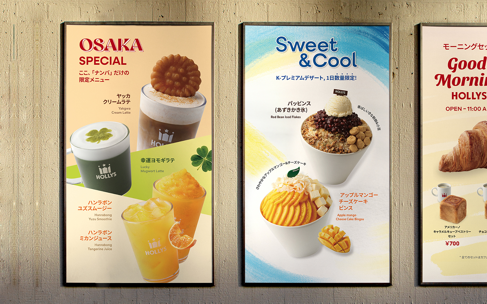
The graphic motif for Hollys Japan visually expresses a sense of sizzle and enjoyment. The key visuals for the beverages use bold plane divisions inspired by Hollys' symbol diagonal lines, creating a three-dimensional and dynamic feel that emphasizes the pleasure of consuming the products. The color scheme actively incorporates vivid colors that convey a sizzling sensation, making Korean beverages, which may be unfamiliar in Japan, appear comfortable and trendy. The title colors maintain Hollys' identity by using its main color. For the shaved ice visuals, elements with brush textures were used to depict the cool and refreshing sensation of ice. The typography follows the sizzling image with rounded shapes, creating a friendly and rhythmic mood. The color scheme emphasizes the coolness and freshness of the shaved ice by using blue and yellow.
할리스 재팬의 그래픽 모티브는 시즐이 느껴지면서도 즐거운 느낌을 시각적으로 표현했습니다. 음료의 키비주얼은 할리스 심볼이 가진 사선을 사용한 과감한 면 분할을 적용하여 입체적이고 다이내믹한 느낌을 보여주며 먹는 즐거움을 강조했습니다. 컬러 스킴은 시즐이 느껴지는 팝한 컬러를 적극 활용하여 일본 현지에서 낯설 수 있는 한국적인 음료를 편안하고 트렌디하게 전달합니다. 또한 타이틀의 컬러를 할리스의 메인 컬러로 사용하여 할리스의 아이덴티티를 유지합니다. 빙수의 키비주얼은 브러쉬의 텍스처가 느껴지는 요소를 사용하여 살얼음이 느껴지는 시원한 이미지를 시각화합니다. 타이포그래피 또한 시즐의 이미지를 따라 둥글게 써져 있어 더 친근하면서도 리드미컬한 무드를 형성합니다. 컬러 스킴은 빙수가 가진 시원함과 상큼함을 블루와 옐로우를 사용하여 강조합니다.